
Don't wanna be here? Send us removal request.
Statistics
We looked inside some of the posts by madiblog and here's what we found interesting.
Average Info
Notes Per Post
1
Likes Per Post
1
Reblog Per Post
0
Reply Per Post
0
Time Between Posts
5 days
Number of Posts By Type
Text
16
Last Seen Tumblr Blogs


Fun Fact
After the announcement of the deal with Yahoo!, there were 170K signatures of unhappy Tumblr users petitioning to prevent the sale in 2013.
Text
Final Reflections
At the beginning of this module I was extremely overwhelmed. Adobe is so new to me, i'd had it on my laptop from high school and tried to look at in my own time but it scared me.
Illustrator: After doing a few weeks of drawing bezier curves and starting to understand the importance of control over handles I feel pretty confident drawing shapes. Shortcuts were a BIG HELP here. The pengin week is still pretty confusing to me but the basic skills I feel confident on. I can see myself using Illustrator a lot in the future, it's good for making posters, drawing and making logos etc. I do prefer tracing on an app like procreate on the iPad but Illustrator definitely producers better quality images.
Photoshop: I very much enjoyed playing around with curves and hue saturation on photoshop. I don't fully understand how to cut things out well but thats okay. The tools are a little confusing. My friend Sophie sits next to me and luckily she has experience in photoshop. She helped me a wee bit here. I'm very grateful this was one of the first things we looked at because it lined up with my first project in photography. Having both classes at the same time ment my confidence build faster.
InDesign: This program is still very confusing to me. I think i'm starting to get it. The one thing I really can't figure out is how to get page numbers to look nice. It felt like there were A LOT of tools and settings and it could be hard to find where they are. Just like the photoshop, InDesign lined up with Graphic Design and made it easy to carry over knowledg between the two classes.
A struggle in this class was definitely following along and keeping up. I am proud of how much I was able to keep up but i did get a bit overwhelmed sometime.
0 notes
Text
24th May PDFs & Exporting
Export shortcut = command E
Select all = command A
PDFs great for printing, if we exported as a jpeg the file wont look as great for printing as the colours change from CMYK to RGB. CMYK is the colour settings printers use with inks. RGB is what screens use to display colour. PDFs can also hold links, audio, video, image. These features don't always work successfully on mobile.

When exporting you are able to change the file size you export in. The smallest file size would be ideal for sending clients work in progress demos.
Adobe Acrobat is a useful app to view pdfs.

To import a pfd into photoshop go to the file window, then open and then open the pdf. You can then select the book pages you want on the booklet mock up.
We used smart objects/ smart layers to select all of the page then paste it onto the layers.
This is a pretty cool tool to be able to use to display work without having to have it fully printed and have a photo shot.
0 notes
Text
Children's Book
We were set the task of designing a children's book.
Parent pages: Parent pages are an easy way to set up a setting that you want on a number of pages. I wanted this pink border around all my pages so I set that up under "parent page A". I was then able to put this parent page on all the pages desired.

above is the parent page and on the right photo are the pages, where there is an A s where parent page A has ben applied.
On parent pages you can also apply page numbers that will automatically change depending on what page you are on.
Parent pages are super helpful to make quick changes over a number of pages.

This is a screen grab of the bunting I drew using bezier curves. I copied and pasted these and changes the bunting colours and changed what was infront and under.

My book cover is very simple and i'm not super chuffed about it but thats okay. I used the pen tool to draw different outlines and shapes. The clouds are pngs . When we exported the book the clouds were lower quality.


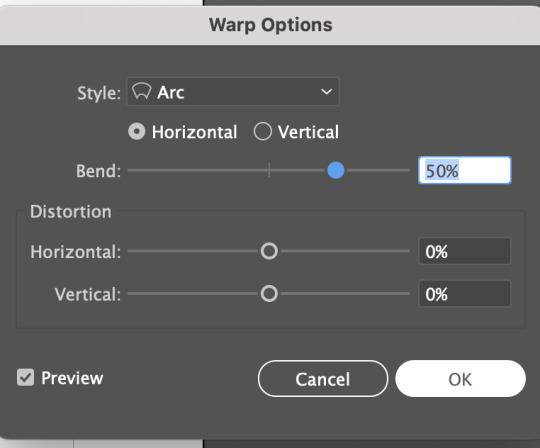
I uploaded the photo of the globe and hands. Then I added text and then warped it within the globe. This was used within the 'envelope distort' then make with warp. This image was made in Illustrator and I then pasted it as a linked image on the book. This enabled me to go back and edit the illustrator file and save it, then it would change on my InDesign file.
Reflection: I did a pretty shocking job of documenting this proses of designing/ making this wee book. But the pages I did manage to do I am happy with. InDesign is a tricky program to wrap my head around but I think i have gained the basic skills on how to link images, use parent pages as a template and use layers/change colours.
0 notes
Text
17th May
Today we looked at how to make tessellation pattern designs. These could be used in a multitude of ways, we looked at using them as end pages of our books. End pages can be used to tie in designs from within a book and create interest.


first on an A4 landscape page we drew a black square and then drew an image on the box. (I kinda drew a bird lol). After I was happy with the shape then Pull the image into the swatches menu. This adds it as a swatch that we can then fill an object with.


Net I drew an outline with horizontal and vertical handles, making sure that the handles are all the same length on both sides. Then we filled the shape just for fun. Then we filled it with the pattern we previously dragged into the swatches menu.

We can create a grid by double clicking the pattern in the swatches menu and then click the Pattern Options we can then change how the patterns stack together, under the Tile Type menu. In the image above it is in the Brick by Row style.

We copied the same proses and as above but in a hexagon. The Tile Type used in this image is Hex by Row.
0 notes
Text
10th May
InDesign - Week 2
Today we looked at how to add pages, parent pages, how to automatically number pages, changing margins


A four page book will be one page of paper. When adding pages it is helpful to increase the book by four.
Parent Pages.
A Parent Page means we can make all pages the same elements.
This could be useful to add a the book name on the top of each page or the chapter name.
To change page parent pages, drag the page next to the parent page name onto the page in the page menu. Eg pull none onto the cover to the book name is not on the cover page.
Page Numbers:

Under the a parent page write the text number on the bottom of each page. Highlight the page number before going into the type menu at the top of the page to select Insert Special Character, Markers, then Current Page Number. To apply the parent page to the page drag it on. You can then change the size, font, weight on all page numbers under the parent page.


To change margins do this under the layout menu on the top. You can change the margins on all sides. It's important to keep text away from the edge incase the text gets cropped off. Also there may be a gutter in between the two pages. Sometimes a large margin can be really effective in terms of how the pages are designed.
Click the chain icon so you can then change the margin length for each side. (chain icon is shown on image above)
0 notes
Text
3rd May
InDesign
Indesign is combining text and image. We are wanting to make things legible and easy to read.
Paragraph Styles


To open Paragraph Text go to Windows, styles and then paragraph styles. From here you can make new paragraph styles.
Highlight text
change text styles, weight, leading ect
click + on paragraph styles menu
Double click new paragraph style name ( rename body text, heading ect)
Character Styles
To change the character styles it is pretty much the same proses as changing the paragraph styles.

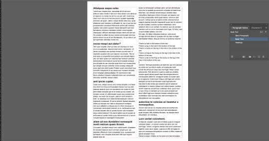
The first section in the image above controls the number of columns of text we have. The second setting controls the gutter, which is the amount of space between the columns
Bullet Points


When we add bullet points to the text it can have funny spacing (as seen in left image above). To change this we want to move the left indent to 3mm and change the first line indent to -3mm. This is shown on the Bullet or Number position screen grab above.
We also changed the spacing above and below the bullet points under the 'indents and spacing' setting.
Widows and Orphans
These are lonely words from the top pr bottom of a paragraph. To change this we can soft return and move some letters down from other lines. This bulks up the bottom line.
Images
Note to self: Please keep linked files on hard drive! this keeps them al together and helps things to open properly
Cropping images. Using direct selection tool change edges.
How to scale images?
Command - changes image and box
Command & Shift - Changes with proportions
Option & Shift - Crops from center
Wrapping text

To wrap text there are are options under the text wrap section in the image above. To change the distance between the image and the text use the tools under this section. In the image above you can see ive moves the box 2mm away from the text.
0 notes
Text
May 1st
Homework- coloured drawing


I will be drawing Peppa Pig. Above is the coloured photo from the web and my hand drawn scan.
Just like the previous post I scanned the pencil drawing, took down the transparency and locked that layer. Then in a new layer began to draw the outlines of peppa using the pen tool.
I placed the original coloured image and then used the eyedropper tool to collect all the colours used and made them swatches.
From here it was pretty easy to choose that colour the stroke and fill would be to match the original image. The stroke point was 4 for everything.
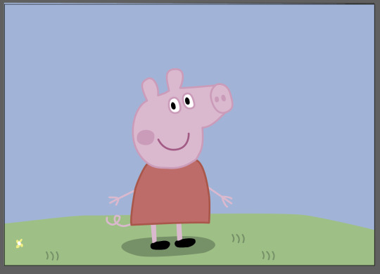

Oh I also used different layers for different parts of the body.
(Im not sure why the colours look so muted int he bottom photos)
Over all I thought this was very fun and I liked this.
0 notes
Text
April 26th
Today we drew and scanned an image before tracing it on Adobe Illustrator.


I found this flower image online and thought it had a nice mix of sharp and curved edges. This would push me outside of my confront zone to try different directions of handles .
On the right is my drawing of the image, I drew the where I thought the anchor points should be and which direction the handles should go. I wasn't confident about what direction the handles would go.

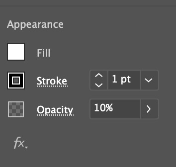
I added the scan of my flower with the anchor points drawn to an Illustrator file before changing the opacity to 10%. Next I locked the layer, this enabled me to be able to use the drawing as a guide when I drew with the pen tool on a second layer. It was super easy to draw especially with the anchor points already drawn on.
A shortcut I used lots was holding down option when creating a corner at handles.


After the flower was drawn I bumped up the stroke point.
Above the anchor points and handles were selected. I am definitely starting to get the hang of the
0 notes
Text
29th March
we looked at tracing using points with the pen tool.
pen tool modifications:
option = whilst dragging handle to make a broken point
command = whilst placing a point hold command to reposition it
also, edit handles made earlier in the path


Once we had traced the lemon we duplicated the background, made the tracing a new selection. Then we made it a new mask and changed the hue saturation.
At the moment I'm getting used to making the curves and the handles to minimase the amount of points I use on the objects. The shortcuts bullet pointed above are definitely helpful I am just not used to them yet.


In this image I used the object selection tool to make a new mask, I then painted over it with white to paint the photo back in the image and black to remove the image around the guy jumping. Using the [ &] keys to change the brush size.
I then decided this was not the mot accurate way of doing this so I started using the pen tool. I am starting to understand the option and command hacks, this is making life easier and building my confidence in the Adobe software.

We then saved out our image and opened it on Illustrator before drawing a squiggle over top of the guy on a separate layer. We hid the rest of the layers then saved this Illustrator image out.
Opening photoshop we placed the linked ai image (check media box) as a new layer.
because the squiggle is a linked image we can then go back in the illustrator file and add more on there, once thats also been saved the linked image will change on the photoshop file also.
HOME WORK::: Work on photo, how can it be improved?
Add new background, can change squiggle a bit more (play with colours?)
0 notes
Text
22nd March
Looking at tools to isolate parts of images. Selection tools and methods, masks, paths and layers. How to apply adjustments to targeted areas.

Looking at making new layers, changing the opacity, size and setting of brushes and erasers. We looked at moving layers and changing the order of layers. We also looked at adding the marque tool to select a bit of the background and then pulling it out.

We also pulled bits out of an image by using the elliptical marquee tool, pressing the V key to then pull the bit selected out.

By adding another copy of the background we used the rectangular marquee tool to select the boat. Under the layer mask use the brush tool paint with white to remove the background and black to paint the image back on. To change the opacity click 1-9 &0 which will convert to the % of opacity (eg. 7 = 70%). You can also change the size of the brush by pressing [ to reduce the size and ] in increase the size.


I wont lie, I'm not sure how w did all this but its on moodle. We used masks, selections tools (lasso tool, magnetic tool), hue saturation ect.

we used bezier curves to select the 5 middle leaves, using the direct selection tool you are then able to move the handles and lines to make the shape fit closer to the image outline.
Then we converted the shape into a path in the path menu. Then we changed the saturations and made it do it only did this on layer. To do this place the hue/saturation above the mask (in the layers menu) Press the wee square with the arrow.
0 notes
Text
16th March - Homework
colour correct 4 images, 2 black and white, 2 colour
Write what you did, why you made changes and what changes you made.


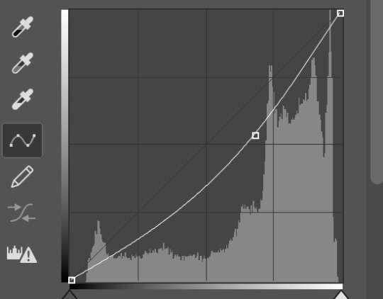
In my first black and white image I thought it was quite bright and I wanted darken the mid tones. I did this by using the curve tool and moving the curve down a little.


In this image the faces are washed out, there is a high contrast between the dark background and the light faces. To modify this I used the curves tool and pulled the lightest point down to make the highlights darker. I also tones the mid tones down a little bit.


The original image had a high saturation and had a sort of blue tint to it. I pulled back the saturation under the Hue/saturation menu. Then under Colour balance I pulled back the yellow in the shadows (-14). Also in this menu I increased the red in the highlights (+16) and decreased the yellow (-8). These changes muted the saturation and made the image less blue.


I felt as thought the original image was a bit dark so i wanted to bring some light onto the face. I used the finger tool under the curves tool to pull the white in the background down. I then moved the dark end of the curve to the right which made the image lighter.
Next I used the Hue/saturation tool to change the saturation and lightness. I made the saturation +6 and the lightness -10. This made the lighting on the face more even. The image itself is not the greatest quality with did make it a little tricky as it had a lot of pixels.
0 notes
Text
15th March
Adobe - Photoshop
In photoshop we will look at colour correction, colour grading and image adjustments. Today we did some image adjustments.
adding an adjustment layer at the bottom of the adjustment layer opens up the properties.

adding an adjustment layer at the bottom of the adjustment layer opens up the properties menu. (what we use in the images below)


On the left side is the image before we moved any curves to manipulate the tonal range in the image. The right side is after we adjusted the curve to make the image a bit darker, by adding the curve point we make the middle ground darker.


Another example of adjusting the brightness and darkness in a black and white image.

Hue saturation and brightness
First I adjusted the brightness using the curves tool. then used the saturation slider.
Colour balance can add colour tints on the shadows, midtones and highlights.
What else we looked at today...
we looked at tint and shade, what saturation is, hue, what it means for an image/ project to be non-destructive vs baked in.


Left = unedited image Right = Edited image
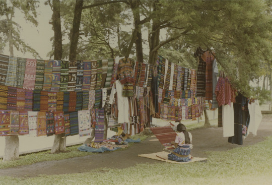
The image above has been edited by using curves to make the image brighter. When I used colour balance I increased the red by +31. By doing this it meant the blueness was taken out of the image.
I also pulled the Hue back -7 this made the image a little more green opposed to being blue. I also shifted the lightness down -11 this had the effect of enhancing the shadows.


Left (original) Right (edited)
I started in Colour Balance by changing the highlights to be a bit more red (not shown above) then the midtones I moved down to the cyan side. I played with the Hue/saturation, in here I increased the saturation and decreased the lightness.
0 notes
Text
8th march
Adobe Illustrator - Bezier curves
On this week we looked at how to use bezier curves and layers to draw a penguin. Also looked at filling shapes with colour and changing the stroke point (thickness).
Disclaimer: I didn't get great photos at the time of making the penguin, but Ill do my best job to explain what we did and why.
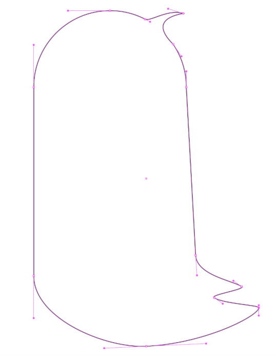
We stared by drawing the body outline. Above is the photo of this, you can see where the handles are. I am happy with this shape.

Next we made eyes:
Make the eye outline by drawing an oval with the Ellipse Tool.
Open the Gradient window
Select the middle gradient option (the one with the light in the middle and dark around it)
Using the slide but on the bottom of the gradient window select where you want the gradient to be. (the closer they are together the more black in the middle)
Bump the stroke point to 4
Draw another smaller oval with the Ellipse Tool
Fill the smaller oval with white and give it no stroke.
Select the whole eye, copy and paste it in place to be two eyes.

Making Feet was next: Tools used, reflect and pathfinder
Draw half the foot with pen tool, black stroke no fill
Using reflect tool click one anchor points on the foot, hold down shift and option and click the other anchor point. This will reflect the half you drew and make one whole foot.
Some of this defiantly went over my head, and I couldn't keep up the whole time. But I defiantly learnt some great skills that will carry over to other work. Some of which are changing stroke thickness, creating a gradient fill, changing the order of layers.
0 notes
Text
Homework from the 1st - 7th March
For this work we received an image from another classmate and then drew it by hand before drawing it on Adobe Illustrator. I found this task semi difficult if i'm being completely honest. Although I received some helpful advise from my classmate.
I think what I found most difficult was making the initial circle. Below is you can see the original image (top) drawn image (mid) and my illustrated image (bottom). The shape is a little funny.

I don't have any screen grabs of me making these faces on Illustrator sadly.
Reflecting back I found this so difficult because I didn't yet fully understand where anchor points and handles were supposed to go.
0 notes
Text
1st March
Today we looked at bezier curves and drew single arc curves, multi arc curves and closed curve shapes. We looked at how the anchor points are at the end of the lines and handles are what manipulate the curves. The handles determine how arch the curve is. A tip regarding handles is to keep them short as it makes it easier to manipulate.
Below are some notes from my workbook about Bezier curves. There are drawings of different kinds of points, some of these are corner points, curve points, hybrid points and broken points.

Below are single arc curves I have drawn on Illustrator. In the right image you are able to see the anchor points and the handles which create the curve.


In the images below are drawings of single and multi arc curves. Again the left image shows the handles, for these curves it was important to keep the handles short and horizontal or vertical. This keeps the curves tidy and accurate.


The images above are multi arched curves. On the right you can see the handles. For these curves it was important to keep the handles horizontal or vertical and to avoid angled handles. I did a pretty good job considering I'm very new to using bezier curves.
Reflection: This week went well, It was helpful to learn some more of the basics around curves and have a deeper understanding around how they are manipulated.
0 notes
Text
22nd feb
During this week we looked at Adobe Illustrator and some of the basic skills around this software. The first skill we learnt was how to draw line straight images using bezier lines.
Below is is a list of shortcuts from weeks 1 & 2. As this was my first time using the the Adobe software it was very useful to have these tools.


The two left images above are hand drawn straight line images. We drew these by hand to compare the experience of drawing by hand and on Illustrator. The images on the right side are the straight line images I drew on Adobe Illustrator.
I found that the lines were not too hard to draw. I like the fact that you are able to edit the points after the image is drawn.
1 note
·
View note