Statistics
We looked inside some of the posts by maggievolkart and here's what we found interesting.
Average Info
Notes Per Post
2
Likes Per Post
2
Reblog Per Post
0
Reply Per Post
0
Time Between Posts
1 month
Number of Posts By Type
Text
15
Video
2
Last Seen Tumblr Blogs


Fun Fact
28.6 is the average number of monthly visits per US mobile user.


Text

One fact that has really surprised me while looking back is my final render ended up looking exactly like my first unfinished concept of my Harpy. Mighty and strong, flying through air and preparing to strike. Even though I doubt I expected her to come out looking anything like she is in the render, it all came back all the way around and made me feel like my concept sketches weren’t all for nothing.
Unfortunately, I only used them as inspiration in my first couple of weeks of creating her shape and form, starting off with the armour. But unlike in my concepts, she doesn’t look as seductive yet scary, she resembles a look of a warrior. At the beginning of my project I have fished to give her sharper edges and feel, unlike most of my previous characters who were cute and morbid, I wanted to give her the look of a natural-born killer.
You can see it as she licks the blood of her finger over the lake of dead bodies while her pet crows finish of the leftovers of her prey. I was really excited about her hairpiece idea and I am still a little bit upset I couldn’t fit wings into her hair in the final render as I felt like it would look like an overkill in her final scene, having added a lot of the feathers in her final pose.
I am especially proud of this concept, as I usually struggle in doing backgrounds for characters, this particular painting has made me feel proud, although it wasn’t finished, it has set me the right mood to create.
1 note
·
View note
Text
render ideas and iterations
Since this is the last week of my project, I ended up slightly rushing through the lighting of my scene since I haven’t finished texturing the character yet. It gave me a good idea of how lighting and colour values would look on Flora in the final scene.


After checking how painted albedo looks in a marmoset, I brought the model to a Substance Painter at university and adjusted a lot of different material values. I added more damage and metallic effect to the corset and the yellow parts of the bodysuit.


Got a few critiques from coursemates regarding the texture of the flooring for the scene and realised that after being exported as a marmoset viewer it doesn‘t display parts such as focus and blur whilst losing the effect of a few lights.

0 notes
Video
tumblr
An unfinished render of the model. I decided to throw together my idea quickly and see how it looks all together. I didn’t use any Normal maps in this scene as there are still quite a few adjustments to be made.
0 notes
Text
This week I’ve realised that this could be the latest that I could start on creating my sword if I want to give it a good professional look. While I was trying to come up with new ideas I had a chat with on of my coursemates Danny and he has offered me help with the project. Danny said that he is struggling with an artblock and since he likes the idea of my main inspiration he can try and distract himself with a different design to work on. Dannys work has really helped me to speed up the process of creating a weapon for my character and get inspired to work on it in more detail.


After finishing the main blockout of my sculpt I have realised that the design of the sword looks a bit too evil like for my character so I have changed it to look like a kukri knife.


-finished the full retopology and projected all the detail onto it in zbrush.
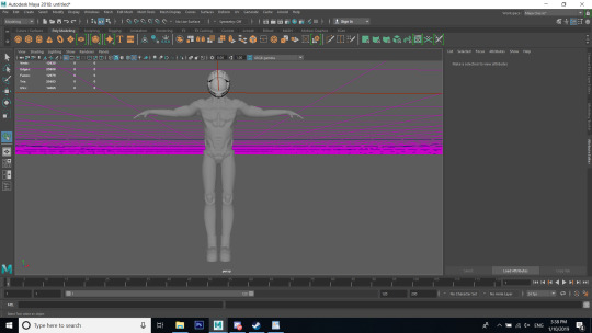
It took a bit longer than I thought it will projecting all the detail onto low polies as some of them had errors and I had to resculpt a lot of the detail back onto the high poly. I have also lost the uv map a few times while combining different subtools so I had to go back to Maya and re-UV a few parts of the model.
0 notes
Text
Zbrush
This week I’ve realised that some of my characters face anatomy looks as if it is lacking the fine detail and I worked on making her eyes as that might be the reason I’m not making some details correctly. I sculpted into the eyes and added more mesh for them I kept sculpting over to make sure the eyelids look similar to real ones but also looked into examples of how they are made on stylised characters. I worked on making the eyelashes and eyebrows exactly how I saw them in my concept art. Since I just began re-sculpting her face, I made eyebrows too early, which made them look out of place. But after a while of sculpting in, I have made it look better.
Sculpting int sleeves
For the retopology, I have looked up a few different techniques and tutorials to see the ones that would look for me. I tried my best to make her topology fine and clean. The only places I’ve had problem retopologizing are underneath her armpits and elbow.
https://80.lv/articles/stylized-character-production-techniques-in-ue4/
inspiration https://www.artstation.com/artwork/2xWDvA


0 notes
Text
Zbrush
Thinking over my project, I realised that I really need to plan out the way I will render my character and pose for the final image. So far I have had a few ideas - since I base her on post mortem I was thinking of placing her on a fancy flower shaped throne/fancy chair (posed for the photo).
I have noticed that I’ve had a few issues with my anatomy on the characters’ hands and gave them a makeover. Most of the problems were with the way I have located the big finger as it was facing the wrong way.
I began slowly run down on my inspirations and ideas on the project, not being fully aware of whether I should iterate on her overall idea to give myself a boost.
Since I worked so far into the character, I got a suggestion from Sharon to work on more assets. Looking through Artstation I came across a concept art of a chest I quite liked and I got in contact with the artist. His name is Igor Ersh, and he is a Russian beginner concept artist. I thought it could make a good 3D model in my portfolio but after sculpting for a while I ended up leaving it be since I wasn’t sure if I enjoyed sculpting it.
It improved emotionally on my project and gave me more motivation to come back to my project and think on the idea overall once again. I have had a big change of mind and I no longer wished for my character to have a sad and morbid feel to/ Unlike in her design I wanted to give her more colour and a childish, more playful look. Since the initial idea was to make her into a spirit, I was thinking she could appear to be a tiny flower fairy. Since my idea has shifted so much, I took more time thinking of how her sword would look like.
While looking for inspirations for my character’s sword, I’ve discovered my new main inspiration of a sword design I would like to create. The post by Cordell Felix not only featured a good step-by-step view but also contained information about brushes the artist has used to create his design and I tried them out since they give a perfect stylistic mood and bring much more detail to life. I’ve downloaded hem to give my girl and the upcoming sword and more sharp of a stylized feel.
Detail brushes reference and sword research https://www.artstation.com/artwork/W2GWxD
2D inspiration https://www.artstation.com/aliszombie
https://www.artstation.com/artwork/rxGYa


0 notes
Text
Zbrush

Most of this week, I’ve been finishing up my painting of the jellyfish girl. I tried my best to interpret it as “candy” like to King as possible to make sure it fits colour wise with their style.
The rest of the week I’ve spent re-sculpting shoes and giving small details to the character mainly her costume, facial expression and the hair. During my work in the lab, I have shown my work to a few lecturers and they have highly suggested not to overdo on the number of details I bring into the picture while creating my character. Strong detail of the hair and sleeves don’t look fluid enough and too rough making it look as if she has her hair braided and her sleeves are made of something too rough to be fabric.
I have also noticed that most of the female face has to be moved higher to make sure it doesn’t look like her lower jaw is too low down. Going further with my character I need to think about moving her hands up into the T-pose shape or something similar to make it easier to be posed and rigged. I am also planning to test whether the big sleeves like this are possible to be animated or is it a bit far too puffy to be this way.

0 notes
Text
Free week (new ideas) (polishing my portfolio) (research companies)
I decided to dedicate this week to processing all the information I’ve been given earlier by Marco Rizotti and creating more work to do with my future job which would mean that I have to create more 3D pieces for my portfolio to show that I can not only create characters but also work on small assets and have a good sense of style and presentation.
I decided to take my old concept for a character to the next level and redo her in 3D as well as fix my old drawing to a more updated (to my current skill) version. I wanted to give my initial painting the feeling of reason.
unfortunately I decided to drop creating the 3D model of it as there were just too many things about her design that I haven’t properly thought through


0 notes
Text
Character Anatomy
This week I have fully concentrated on the details and the design of the character as mentioned previously. At first, I have replaced the wings to go from the underneath of the character as it gave her this fantasy/anime feel. However, once I showed my progress to Nigel, he recommended that I changed the location of the wings as it would feel anatomically incorrect. Since the butterfly wings are located on their backs, the wings have to remain there, but the shape and form is definitely something I can improve upon.
After a few attempts of placing them in various places, I realised that the wings would work if they were placed underneath the corset, with the corset being designed in such a way to allow the wings to be visible from the outside. Rather than have the wings upward on the back, they will be lowing down under the corset. At first, I wasn’t sure if the idea would work in practice, but in the end I decided to stick with it for now, as I believe that, for the time being, this is the best-case scenario for this design.
I’ve been considering adapting her facial features and expressions at the end of the week. While this wouldn’t be exactly what I had planned for, it does give me the chance to improve on her anatomy and to see if I could take her design further. This is not something that I’ve worked on yet, but it has crossed my mind and I am keeping it as a consideration.
Looking back on my design, I neglected to see the immense amount of time doing individual frills and petals on her shoulders and legs would take. It worked on the concept art fine, however for some reason, I could not replicate this on the 3D version. It was very time consuming and frustrating fruitlessly perfecting these as the character ended up looking more uncomfortable than without them. As such, I have decided to remove the frills from the design but keep the flower petals.
I have also spent this week thinking about the design of her shoes but since the girl's overall design is very clustered, I decided that simplicity would be best as to not overcomplicate the character and to draw the attention towards the intended areas.

Over the course of this year, I have greatly improved my understanding of shape and form and I am very pleased with how this character is progressing so far.
New Ideas:
Now that I am getting closer to the ideal look for my character I have realised that the original idea of post-mortem might not be the most suitable style for the character's story and description.
Job Research:
I have spent the last few days looking at different job opportunities I could undertake in London. I am currently split between continuing my studies at NUA to push my skills further and improve my portfolio by studying for Masters or getting work experience by working in the industry.
I’ve been especially looking into jobs that would be a good fit for my artistic style and workflow as well looking into the complexities of visa and relocation etc. Unfortunately, most of the jobs I have found have been small, niche companies who aren’t interested in Character Artists or can’t assist with relocation.
Funky Panda has caught my attention with their very cartoony and playful designs and their stylistic choice of shape and form. I am considering amending my portfolio and CV to try applying for this company specifically.
https://uk.linkedin.com/jobs/view/game-artist-2d-3d-at-funky-panda-games-1080508645
I have also been thinking of setting higher goals when it comes to choosing my future job. Being a big fan of the Blizzards character designs, I decided to check out the job offers and opportunities I could undertake if I were to apply. Unfortunately they require at least 3 years in the industry but I am still considering getting in touch with the company in the future once this project has been completed.
Yesterday, I have purchased the book “The Art of Blizzard” featuring concept art for games such as “World of Warcraft”, “Diablo” and “Starcraft”. I wanted to set myself an artistic goal going ahead with this project. Although it only showcases concept art it does a good choice showing exactly how they have planned their designs to look like and the style of texturing they go for in their characters.
https://www.artstation.com/jobs/EkJG
•new personal side projects (thinking about spending some time on the free week painting and polishing out my old projects)
I’ve been in conversation with industry professional from King, Marco Rizzotti. has helped me realise that I need to improve upon my style and be slightly more ambitious when it comes to framing my work and catching the viewers attention. In the not-so-distant future I want to look into more varied concept artists and other works on Artstation and see which ways of framing work catches my eye and how I could improve further on my portfolio.
•my inspirations (https://www.artstation.com/alina) 3D
In my first year at NUA, I came across the artist Alina, but didn’t give enough attention to their work. Back then I was sure that I will become a concept artist, and even though I admired their beautiful work, I didn’t think I will be using them as one of my references. Alina showcases her work on both Artstation and YouTube. Using her characters as a benchmark in terms of quality, complexity and influence of style helped guide my vision. It is also a good reference when it comes to looking at the way character topology has to be done.
0 notes
Text
Polishing the figure and the final idea
I’ve really liked my progress so far things that look well in 2D don’t always work out looking well in 3D. In industry, it has always been a thing tweaking old designs to make them look more practical and realistic. The more natural something flows and feels, the better it looks to the customer’s eye.
For this weeks presentation, I had to make sure I get my character to look as her design as fast as possible and also give myself a better Idea of what needs to be fixed and replaced, I feel like a lot of my initial ideas would physically not work and need some logical polishing towards them.
Having a presentation of blocking out the overall idea is useful. It lets you realise all the mistakes and flaws your idea has had a right in the beginning. Even though on the concept my characters wings look great, it will take much more time thinking of their presentation and the overall shape and form to get the presentation of the character to have a good base.
While I was creating her corset I realised that a soft wide belt just didn’t give the right feeling of the character- she didn’t look morbid enough. So I looked back to my old idea of how her corset would look like. My first idea was to make it a rib cage of an animal. But since it widens the opposite way round, I turned the corset itself upside down to make sure it shapes finely just as her body does.
I found it time-consuming creating her sleeves as they have so much detail I am considering making the flow much softer and wider to give it the proper stylised cartoon look.
The more I work on this character, the more it reminds me of companies like Blizzard. I have been highly inspired in the past by this company and I am considering to use their games and style as my main inspiration and quality standard for this project.

0 notes
Text
New ideas and thinking of the project scale, character poses
Research:
While getting reviews on my design from my coursemates on Thursday, Ron gave me some very useful research advice for my project.
He compared my character to an old photography style of the 19th century called post-mortem. Since photography used to be something not everybody could afford to have during their lifetime if a member of a family died with no one taking a photo of them they would dress them up in their finest clothes, paint their skin in lifelike colours (even painting their eyes onto their eyelids) and pose them together with their family. Since my concept art for the girl has been drawn with her eyes closed and in a still pose. It gives off the impression that she has been cast into a deep sleep. Hence mirroring the vanitas style, of the beauty of life, and the morbidity of death.
Currently, I am contemplating whether I should keep her eyes closed in the 3D model or interpret her story as a spirit in another realm, adding to the fantasy world the character will be set in.
Building on Ron’s initial advice, I have added more details to my design to reinforce the post-mortem style, including her skin having a pale- blue hue and more details to her outfit. Since she is assumed to have died there needs to be some subtle signifying eluding to that idea.
At first I drew her necklace in a shape of a skull to emphasise the morbid look, but since some suggested I make her more styled, I decided to go for a more Vintage look by including a rounded brooch with portraits on them.
To add to her ghostly appearance, I looked into other morbid paintings and photography, including mourning portraits of the deceased and unwell. A big influence was to change the figure and look of the character by researching models that had the heroin/TB chic body type, to emphasise the post-mortem style
Here are some step-by-step shots of my 3D sculpting

Whilst sculpting my model I began thinking more about the style and the amount of detail I would like to have in my project. Whether it would be realistic or hand-painted and how stylised I would like my character to look like. I feel that more research on a similar project has to be conducted before I can begin creating this character, to ensure it is a smooth process.
2D: ideas for background/small iterations
Another idea that got suggested was painting the character with different expressions and backgrounds/small editions. Similarly to post-montem imagery of people sitting on chairs and thrones making it look like they are alive.
Unfortunately, I am unsure whether I should concentrate on the concept too much and keep in mind how much I need to make within the given amount of time. I’ve learnt a great deal about the planning and preparation stages of a project in my previous work and how important it is to know ahead what exactly you would like to create.
I was interested in making the wing attachments of the character as realistic as possible, I used Alexander McQueen’s design of a metal spinal corset as a reference for this idea, as it adds to the post-mortem theme of having a fashionable, Victorian Era accessory presented in such a morbid manner.


references to images and research:

https://en.wikipedia.org/wiki/Post-mortem_photography
https://culture.pl/en/article/post-mortem-the-story-of-polish-mourning-portraits
https://www.sweetyhigh.com/read/gorgeous-insects-012717
https://marketplace.secondlife.com/p/Eclectica-Belle-Decroissance-Skull-Brooch-black/9067787
https://www.vam.ac.uk/museumofsavagebeauty/mcq/spine-corset/
https://www.vam.ac.uk/museumofsavagebeauty/memento-mori/
https://www.pinterest.co.uk/pin/494692340314289889/
0 notes
Text
Beginning of the Project, Research (Vanitas) and concepts
I planned out my character designs earlier to ensure I was happy with how the character will turn out. The planning phase is also important in determining time management by planning my resources day to day and using realistic timescales to ensure I will not cause stress by rushing the project.
In terms of the specifics for this project, my plan is to create a stylized character with a weapon that will be posed suitably for the style.
I aim to use this project as an opportunity for self-development and personal growth in my work. During the course of my previous project, I over complicated the planning phase and gave myself unrealistic deadlines that I would never meet in reality. I also didn’t do any contingent planning for the inevitable errors and idea changes along the way. To help stick my schedule, I’ve used this week to research for ideas and brainstorm designs for the new character. I decided that my character this term will be female. I have a lot more experience drawing girls and have become used to drawing feminine body proportions and facial features, and with my degree almost finishing, I am aware that this will be my last opportunity to show my strengths and add to my portfolio. While I valued the learning curve and challenge of drawing a man, and aim to build on my experience in future, I want to use this project to highlight my strengths and utilise my skills wisely to ensure I get the best result at the end of it.
I started my research reflecting on things that are more personal to me as I wanted it to be a project closer to my heart. I wanted to end my degree getting back to basics, and rediscovering the passion that got me into art in the first place. To do this, I focussed on my childhood influences on my drawing. I was always fascinated by butterflies and birds, and these featured heavily in some of my earliest drawings. It wasn’t just their appearance but the sense of grace and beauty that comes with flying. I wanted to take these characters as a representation of my character, that she is graceful and elegant, which inspired me to incorporate butterflies into both the character and the weapon.
While doing my research and small sketches, I recommended looking into the “vanitas” art style and its representation.
The paintings of vanitas really encapsulate the essence of this project and helped to manifest the clear vision I developed for this project. The Vanitas style is about the juxtaposition of the beauty of life and the certainty of death in one painting, something that for many is prominent throughout their life. This philosophy provided the clarity of vision needed to make the character look both more classic, but also conflicted. Between the innocent beauty of a butterfly and the murderous nature of a blade, and the contract between the Victorian Era clothing with a sci-fi twist by adding butterfly wings. After researching more into Vanitas I decided that using moth instead of a butterfly would be more representable of being dark but beautiful.


0 notes
Text
Project Overview
Over the course of this project I have been very critical of my own ideas and vision. While I started out with a clear plan of what I will do, my constant self-critique meant that several changes to both the concept and the design have meant that the written and designed project are unrecognizable when compared to my original plan.
Whilst I do feel like this refining process has reduced the quality of the result due to constantly scrapping work and starting new work, I am happy with the end concept and am glad that through great trial and error, I have produced something that I can feel proud of.
In hindsight, there is much that I wish I could have done, the most practical of these would be to apply for an extension early, even when I was on schedule. One of the most important realisations I have come to with this project is there will be things that you simply cannot foresee, from losing work, to designs not turning out as I wanted. I feel I should have taken the precaution early and tried to get an extension on the deadline, however towards the end of the project I felt so overloaded with work that I felt that applying for a deadline would be accepting defeat, by the time that I realised I was going to seriously struggle to meet the deadline, it was already too late for submission.
After much trial and error, the I am really happy with the way the textures turned out on my model. I am very glad that I spent the extra effort on them as they have gone from looking not as good as I hoped, to being much better than I expected. If I hadn’t have lost my work and applied for the extension, I think the other parts of the project could have been just as good, however the modelling aspect took up so much of my time that I feel I neglected the other aspects of the project.
When I started this project, I knew I had a lot to learn and overcome. However I feel that the biggest obstacle I came across was not the work itself but the way I reacted to it. I was not prepared for the emotional pressure of so many things going wrong. Now that I have had this experience I can see just how important planning contingencies are, as these would have helped to not only keep me on track, but to stay calm throughout the process.


0 notes
Text
Final Week
Tweaking mistakes, fixing as much as I can and Texturing
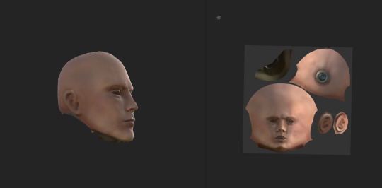
Once I got to texturing and fixing problems in my assets I have found quite a few errors that I tried to fix my best in the short period of time that I had left.
I completely failed to see the parts underneath and after I’ve modeled and textured the model I relaised I had to go all the way back and completely redo it. I’ve triedmanipulating mesh in lots of different ways to make it work with the new details, sawing the new parts on etc but nothing seemed to work. So in the end I decided to do the uv map all over again.
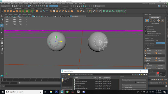
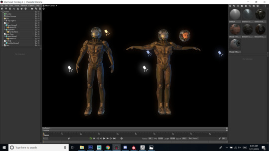
in my final marmoset I have icluded both versions of the models
Once I came back to uni on my last day I’ve also noticed how important it was to work on small assets before and have a look at them personally. Only on the last day once of my friends showed me that meatgrinder can be taken apart pice by piece and I ‘ve relised how much detailI have missed just by looking at the details on the photos on the website. (https://vle.nua.ac.uk/pluginfile.php/96138/mod_resource/content/0/Workshop_Assets.pdf?fbclid=IwAR28JM3OiaEeYxumNp5nn8X6bHyVXxBm2ln9bgNgDGHlz8jWQZ5qyxFIhos) I mean this link..
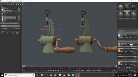
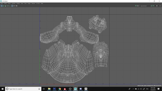
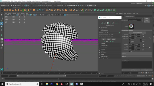
Retopologizing the helmet was quite hard since the zbrush models surface was half reverted and I had to reverse them bit by bit until I could finally retopologize it. Once I got my low poly I tried throwing textures on it but noticed and unusual error on the bak of the helmet coming from both sides where I’ve a stripy pattern. I tried to re uv map it a lot of times but it kept getting worseeach time I tried a new method. Since the time was ticking I had no choice but to leave the error in and see if I’ll have time to fix it later.


I uvmapped the eyes the way I saw most of 3D artist online Uv map them previously. Unfortunately I ddidn’t have enought time to make my own texture so here is the link to the one I’ve used.: filterforge.com/filters/1174.jpg


While texturing the face it tok me quite some time to get aay from using all the pale colours and starting to risk it and picking more saturated and even dark colours.I tried to inspire myself looking at other peoples work and seing how my texturing style is different and how could I bring it up to the next level.
To make sure the mechanical part seems in place I used a hard surface normal of a similar shape to make a rought edge and make it look much more smooth.

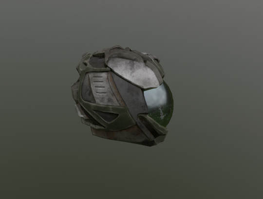
I wasn’t entirely sure what kind of colours I’d like to prioritise in my model at first so I decided to go with one of my favourite colours - green. I tried to hide some of my sculpting mistakes and the fact the the edges aren’t sharp enough by using worn down textures to give it a very grungy look.

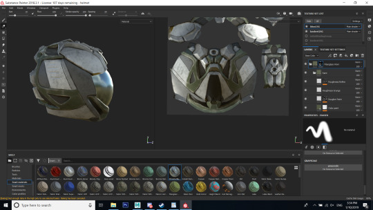
I decided to start putting my models up in Marmoset together straight away to keep making sure that they all go together and have the same colour scheme and texture layout.
Reference: one of the materials used was Falcon Hull that was downloaded from substance Share but unfortunately I can’t link it down as it got taken down from the website. The material got used to create the grey parts of the texture.
0 notes
Text
Week 7 CV, Production Document and preparing for the submission
Important Message about CV:
Due to the fact that I’m currenly working for a company I didn’t want them to misunderstand and think that I’m leaving the job so I decided to refrain from asking my employer to be my referee.
- Which mistake has been the most useful, and how will it change your work in the future?
There were some design probems with my production document that got pointed out by a few lecturers. They said it will look nicer with the dropped shaddow on the backround and less screenshots. And I feel like now it looks much less tacky and way more confident. At first I’ve wanted to include my concept art sketches as well but in the end I’ve just left the finalised ideas and concepts I’m most proud of.
- How has your work this week helped you develop the skills you are working towards and future employment?
Recently I’ve been applying for a job so rewritting my CV didn’t cause any issues and I’ve easily completed it by just tweeking a few things on in to make it look like I’m applying for a job in my field. The lecture about writting a CV last week was very informative and I was very glad to have it stated that the “Concept CV” is not a great idea in practice unless it’s done with a reat style.
In comparison to my last CV I was asked to point out only my strength within my school grades while before I got told by people to write all of the grades on paper no matter what.
The only problem I’ve faced with creating my CV is wether I can put an event in it that’ll be happening in the future. I won’t give too many details about it yet as it hasn’t been confirmed. But I have to apply till the 30th of May.
I feel like trying to create an artistic CV would be more approprite in the beginning of next year as I’d have more information to state about my past jobs and gallery entrys.
How will the result of your project be displayed and for whom? Who is your audience? Is your format or interaction appropriate for the intended observer/consumer? amazing pieces up on our portfolios
My team and I are planning for the game to be displayed on Norwich Gaming Festival and a few months later- to get an official release. In my opinion giving the game an official release is a great idea as it gives us a chance to have amazing pieces up on our portfolios as well as a great summer project ahead.
0 notes