
mai's blogs!! blog: ss25 collection📸studying level 3 fashion🏹
Don't wanna be here? Send us removal request.
Statistics
We looked inside some of the posts by maiss25 and here's what we found interesting.
Average Info
Notes Per Post
0
Likes Per Post
0
Reblog Per Post
0
Reply Per Post
0
Time Between Posts
3 days
Number of Posts By Type
Text
12
Last Seen Tumblr Blogs


Fun Fact
Tumblr has been banned in Indonesia for providing people with access to pornographic content.
Text
to complete our second unit, we were tasked with creating a commercial to advertise our ss25 collection.
-
i created my commercial by gathering all of the relevant timelapses and pictures i had taken to document my work and put it into an album. i then went onto youtube to screen record a video of an instrumental that i liked. i ended up choosing “just dance” by lady gaga. i then went onto capcut and converted the video into an audio to speed it up a little to avoid being copyrighted. i then assessed what timelapses i had and cropped the parts of them that i wanted in my video. i wanted to try choose all the clips i had that were of me working on the designs i chose to keep, not discard. due to me going over the minute mark with them, i then sped up some of the videos to shorten them. next, i added all of the text that i needed. i used the “fade in” and “fade out” effect to make it look more seamless rather than the text just popping up and disappearing. i then went ahead and did this with the pictures by using keyframes and opacity instead as there isnt the fade effect. finally, i then added my logo at the end and in the corner so it was present at all times.
-
i feel like this task was a success because i ended up with a commercial that is clear about what it is advertising, my ss25 collection “ethereal forties” which has been designed for the pop music artist “sonder” who is going on tour and will be wearing the clothing.
-
if i were to make this commercial again i would try to emphasise the fact that this collection was inspired by the 1940s. i also feel like its very boring and unoriginal, so next time i will try to make it look more exciting and more engaging to watch. i however like that i followed the beat in some parts of the commercial, though if im going to do that i should probably keep it consistent throughout.
-
youtube
0 notes
Text
after this task was completed, we were then onto the second task of the day, the final moodboard!!
-
this moodboard has been made up of all of the different things that inspired us from start to finish to make these collections, the decade, things from our original boards, trends and illustrators. to do this we used powerpoint as you can remove the background of images on there for free.
-

-
overall i found this fairly easy to do as it was just combining things from previous boards into one. after a few mistakes were corrected by my tutor i feel it turned out good. i feel like you can easily tell what the moodboard is about and what it represents.
0 notes
Text
our next task was releasing a press release. this is important to a collection because it specifies key things like what will it consist of, colours, fabrics?? what’s the inspiration??
-
before we started though we had a little lecture about press releases and the basics of them. more importantly we went through some different designer’s collections and did collaborative text mind maps on them. we were then able to steal ideas and write down words that we believed represented our collections. we also thought about the fabrics that we wanted to use for our collections and were able to google some as we haven’t really learnt about them yet. to record our ideas and findings we used our notebooks.
-


-
to do this we typed it up on a word doc. we then added key features such as adding “for immediate release” in the right hand corner which is vital for a press release to have. we then added our logo at the top to make it look official. we then wrote out the pr and added ‘###’ at the end to indicate that it’s done. we also added our blog and instagram to it.
-

-
i found this task to be a success because for not having done a press release before, i think that my first one turned out pretty decent. it definitely helped that we were able to look at previous examples for structure and that we went through how to do one before we started.
0 notes
Text
now that we had chosen our final designs and they were transferred onto drawing paper, we could now start experimenting with media!!
-
while this is similar to the 7 types of media task we completed in unit one, it’s different. for that task we copied reference pictures so we didn’t have to think about anything, we just had to draw the reference and pick the closest colours we had to the image. however, now we have to fully think for ourselves and consider things such as: what colour will best suit this design? how do i make it look like a certain fabric?
-
since i have always struggled to make coloured pencils look good, i decided to fully focus on that in class today. i also wanted to ensure that i knew how to use skin tone coloured pencils correctly as i haven’t ever used them properly.
-
i based my colour scheme off of the clutch that i took inspiration from for the design, yellow and green. surprisingly, i found this to be quite relaxing to do, even more surprisingly i found it fairly easy. to make sure i knew what i was doing i would swatch my ideas at the side, making sure things such as colour would layer the way i wanted it to.
-
0 notes
Text
after creating 12 initial designs, we had to expand our collection by adding another 8 designs. by doing this we then had 5 designs for each moodboard.
-
after doing this we then had to choose a total of 12 designs to finalise.
-


-
-
after we selected our final 12 designs we then had to trace them onto a different sheet of tracing paper so that we could draw faces and hair on them. this is a key step because it gives your designs much more personality.
-


-
after doing that and ensuring we fixed any mistakes and were happy with each one, we could then photocopy them onto drawing paper.
-
i thought that fine lining the designs would be a waste of time so i went ahead and fixed up any mistakes in pencil and photocopied them. however upon reflecting i think it would’ve been worth sitting there for 10 minutes and fine lining them. i could see most of the lines but i did have to sketch over quite a few so i could see what i was doing which did eat into my time a little.
0 notes
Text
finally, our next task was to start creating our first ideas of the designs for our collection.
-
to do this we used tracing paper so we could trace over the poses that we had drawn on our face mash up pieces. we could also easily fix mistakes and they wouldn’t be permanent. to get inspiration for our designs we had to use the moodboards that we had previously made. we needed to do at least a few designs for each board that were as dissimilar as possible as it’s good to get a range of different ideas.
-

these designs were inspired by my moodboard on old hollywood
-

these designs were inspired by my moodboard on swing jazz
-

these designs were inspired by my moodboard on hair and accessories
-

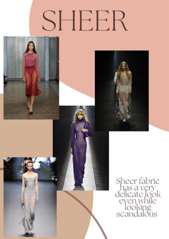
these designs were inspired by my moodboard on architecture
-
i feel like this task was successful because i met the minimum of what i had to do and my ideas did vary in range. i feel like i could’ve definitely done at least one more for each as there was definitely space on my tracing paper.
-
if i were to do anything differently i would try to go more over the top with my designs as that’s a lot more exciting than plain and simple
0 notes
Text
next in illustration, we were focusing on poses and faces. our task was to draw 3 poses for each of our faces, then draw a face to go with it.
-
we were given this task because a lot of us needed to get more used to and confident with how to draw bodies, hands and faces.
-
for the poses we were given templates to base them off of. however, we couldn’t just copy the template, we had to change it up to make unique bodies. this is because the fashion industry is forever evolving, it’s now been recognised that it’s very unhealthy to exclude someone’s body type from being shown because it doesn’t look a certain way. all body types should be accepted and loved, we need to show understanding of this by including this in our work.
-
we were also told to draw the heads bigger so that we had more room to draw the faces. after i drew my figures i realised the heads i drew were too small. to fix this issue i took another sheet of paper and traced the neck down to the start of the shoulders. then by looking at the face i drew the same shape around the original lines to make the head bigger.
-
to complete the faces we needed to take inspiration from the face mash ups that we had previously drawn. we had to take things such as the eyes and the lips and incorporate them into our work. we could also take inspiration from the shape of things. for example, on the bob incorvaja and malik robert’s face i drew, i took inspiration from the shapes on the back of the 2nd head for hair. the circle is the shape of a bun and the rectangular shape gave me the idea of a ponytail.
-
after i was finished drawing the faces onto the newly drawn heads i then cut them out and stuck them onto the body that it belonged to. however i didn’t think and i drew the hair onto the paper that i was cutting, not the original sheet. because of this i had to redraw most of the hair i drew which did waste some of my time.
-


-
-
after we had done 3 poses with faces for each face mash up, we then had to flip the paper over and do it again. we had to trace over the body shape to try get used to drawing them without using a base template. then we had to change up the facial features and the hair to ensure that we were comfortable with drawing that sort of thing.
-


-
i found this task to not only be successful, but helpful. it reminded me that even though i don’t draw things like this i can still do it. even if it’s difficult to do at first, after a few tries i can get it. the thing i found hardest to do in this task was starting to try and draw faces as i’ve never really liked doing that. however once i started to get it right and move on i realised its not that bad and that it’s an easy enough skill to pick up if i keep trying my best at it.
0 notes
Text
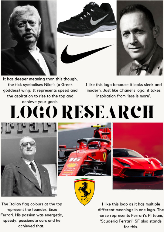
during the same day we were then given the task of researching 4 logos and then creating our own.
-
to present our research on the logos we used canva and made posters. i decided to condense it down to 2 posters so it looked sleeker on my blog.
-

-
to make our own logo we used powerpoint and played around with fonts, i found doing my initials MH to be easier than incorporating my middle name into it, which makes my initials MWH.

-
after doing some quick fire logos with different fonts i decided to use the first one i made, i then had to use something like a symbol to elevate it and make it my own.
-
i tried to use the taurus star sign symbol as i am a taurus, and then the symbol for venus because taurus rules venus, along with libra. i couldn’t make it look good so i decided against it and tried to think of something else that had meaning to me. i then thought of a sewing needle, i made it cut across through the two letters and i immediately knew that was my logo.
-
i chose the sewing needle because i’ve struggled in garment technology, it’s what i’ve found to be most challenging. as time has passed though, i’ve found myself getting better at it. i didn’t let myself give up on the industrial machines and now most of the time i can control it. so for me my logo has the meaning of never giving up, if you never give up you’re bound to end up doing something that you’re proud of.
-

0 notes
Text
next, for the marketing part of this unit we were asked to create our customer, who are we designing this line for? who are they as a person? what kind of life do they live? what do they do as a job?
-
to complete this task and fully understand who we are designing for, it was broken down into two parts. first of all, we needed to create a customer synopsis about them. we did this because a synopsis about someone goes into great detail, this way we get a real insight to who this person is. we then had to create a digital moodboard about our customer. this gives a short and sweet version about who the customer is while being very visually appealing to look at. it tells you everything about this person on the surface level.
-

-
i found the idea of making a customer synopsis to be very easy because how hard could it be? it’s just doing some descriptive writing about a customer you’re making up so that you have somebody to design your line for. however, when it came to starting to write it up i found that it wasn’t as easy as i thought. even though the idea of it is simple, i found it to not be. this is because i’ve never written a synopsis before and i had no idea how it should be structured. due to this while i was writing i felt like this was a really messy piece of work and it had no direction to it.
-

-
as always i struggled to start making the moodboard, though once i started to just gather pictures i wanted and messed around with it i found the task to be easy. i liked how it didn’t need a structure like a written piece of work, a moodboard is free to look however you want it to look. its a flowy piece of work and an appealing way to present your customer.
0 notes
Text
after completing our research, we were now fully equipped to complete the next tasks ahead of us.
-
for this specific task we were asked to print out images of illustrations that we liked the best from our researched illustrators. we focused on faces because we had to take different elements from the illustrations and mash them up to create a unique face.
-
i found this to be enjoyable to complete because it was fun to take different parts from different art pieces and watch something totally new be created. we had to complete 3-4 of these, i completed 3.
-

-
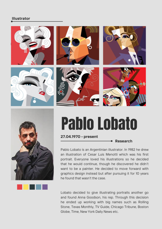
this face has been developed from pablo lobato and blair breitenstein’s work. i took the facial and shoulder structure from lobato, as well as the hair and the hand. from breitenstein i took the eyes, the glasses, the nose and changed the hand to look more like hers.
-
to complete this face i used pro markers for the hair and the body, i then used watercolour paint for the face, the hand, the lips and the red detailing. for things like the black part of the glasses and the eyelashes i used a fineliner.
-

-
this face has been developed from pablo lobato, bob incorvaja and blair breitenstein’s work. i took the face shape, hair and neck from incorvaja, then i gave the male face lobato’s work and the female breitenstein’s. i kept the forehead the same as incorvaja’s art because i wanted it to look like they had masks on which i don’t think worked out too bad.
-
to complete these faces i used pro markers for the hair, the foreheads, the necks, the glasses, the eyes, the moustache and for labato’s lips. for the skin on the left side i used acrylic paint pens, for the blue i used a pro marker. for breitenstein’s lips i used watercolour. for thinner outlines i used a normal fineliner, for thicker ones i used a black acrylic paint pen. to write “love” on the necks i used a white gel pen.
-

-
this face has been developed from bob incorvaja and malik robert’s work. i used the whole of incorvaja’s work but worked in how roberts splits faces up. to achieve this i decided to use 2 different colour pens, black and blue. to make it more obvious that i had used robert’s work for this face i added in the blue and gold details, i tried to add the white necklace but it didn’t show up on the drawing very well.
-
to complete this face i used blue and black biro pens for everything, over the top i then used blue, gold and white acrylic paint pens.
0 notes
Text
after making 4 moodboards, we were then given 2 research tasks.
-
we had to research 3-4 different illustrators that had diverse styles, they couldn’t be the same. we then had to research 4-6 fashion trends that we enjoyed from ss25.
-


-
to complete this task i made a canva poster for each illustrator and trend
-
i found researching my first two illustrators easy as there was information about them online as they are very established, especially breitenstein. however, i found researching the last two to be more challenging, especially incorvaja. there was some information on roberts but incorvaja is just an artist who posts his work on both instagram and facebook.
-
i found researching trends to be fairly easier as there are websites such as vogue and fashionunited that cover all of the trends that we saw on the ss25 runway.
-
however i should’ve definitely done more extensive research into these trends as compared to my illustrator research this just looks extremely lazy. next time i will do a poster similar to this and then research the history behind the trend and put it into my blog to show that i have taken the time and thought about my trend choices.
-


0 notes
Text
to kickstart the 2nd unit of the year, we refreshed our memories about each decade in fashion history ranging from the 1920s to the 1980s. to do this we did collaborative text mind maps, to complete this we scan a qr code on our phone and there are 5 text boxes. in these we type a trend, designer or an iconic moment and submit our answer. it then pops up on the board and we all see what everyone puts, however it is anonymous. we can submit as many answers as we want depending on how much we remembered. we got up to the 40s and then we couldn’t continue with this activity because there were no more free uses left. however to make sure that we had substantial information for our blogs, our tutor went back and did the rest for us.


-
after we did this we then had to pick a decade at random out of lots of little pieces of paper that were in a clear folder. the options were again through the decade 1920 to 1980. i chose the 1940s which at first i wasn’t happy with because i thought it was a boring era in the fashion world. however after a few minutes of thinking i realised it wasn’t, it was a very eventful decade for fashion!! things like world war 2 and hollywood were happening in this era so i decided i was happy with what i had chosen.
-
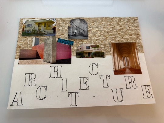
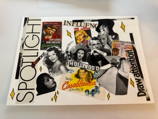
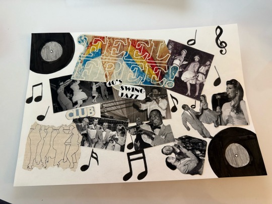
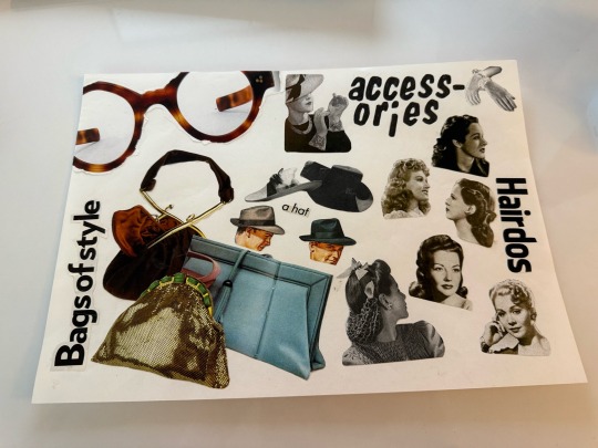
we were then instructed to create 4 moodboards (not of clothing) of things from that era. it could be things like major political events, architecture, toys, anything!! i decided to choose architecture, swing jazz, hollywood and hair and accessories.
-
to create these moodboards we had to look through magazines and books to gather images for them, we could also use the internet. i found trying to get pictures for this that weren’t from the internet challenging because there were no books in the library from the 40s and the magazines in class start from the 60s. luckily i was shown a couple books by my tutor that i could photocopy things out of and i could use the internet. because i had no imagery from magazines i looked for words instead that i could stick onto my moodboards which sum them up.
-
i also found presenting it hard at first, but with some help i was soon on my way and completed all 4 of them. we could also add little drawings on them which i found elevated them even more.
-
-
i decided to complete my 4 moodboards based on the following themes; architecture, hollywood, swing jazz, hair and accessories.
-
i took the idea to do architecture from my tutor as she recommended considering it to be one of our moodboards as it’s very good to take inspiration from. this is how i also got the idea to do hair and accessories. the two i decided to do were hollywood and swing jazz. i chose these as they both had significant impacts on america and the people living there. hollywood movies distracted people from the great depression and swing jazz was helping racism to slowly be a thing of the past as people enjoyed this type of music.
-
if i were to do anything differently i would definitely change one of my boards to the ending of world war two, probably the hair and accessories one. i would do this because this event had such a big impact on the 40s and changed everyone’s lives.
0 notes