Don't wanna be here? Send us removal request.
Statistics
We looked inside some of the posts by majorprojectsami and here's what we found interesting.
Average Info
Notes Per Post
0
Likes Per Post
0
Reblog Per Post
0
Reply Per Post
0
Time Between Posts
6 days
Number of Posts By Type
Text
17
Last Seen Tumblr Blogs


Fun Fact
Forty percent of Tumblr users are between the ages of 18 to 25.
Text
TECH ISSUE
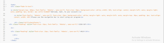
Due to a tech problem with my laptop, the colours show up slightly differently on my screen to how they do on other peoples screens. This has meant that it has been a bit more difficult with the design process of my web-app.
This also means that the screen recording I am handing in shows the colours slightly differently to my blog, and the actual coding files as this is a recording off my laptop, therefore shows the colours slightly differently to what they are.
0 notes
Text
Reflective summary
I was excited to begin this project as my dissertation module was one that I was really interested in and passionate about, so I was glad that I could continue this module. When I started this project I was new to coding, only using it once before for a project in second year. This meant with the development of my web-app there was a lot of trial and error in order to create something that I was happy with. COVID-19 also meant that we were online for the whole of this project, meaning that there was no face to face teaching which would have benefited my project a lot as coding is more difficult to review and get feedback on online. Another challenge I came across with this project was with using the software Github, I wanted to use Github to publish my web-app, which would have meant it was easier to submit my work and for the tutors to view it. Unfortunately, my login page code would not run in Github, meaning I was unable to do this.
The aim for this project was to create a program that could be used in prisons to give inmates the opportunity to start preparing their life outside of prison. I think with what I have designed, I have succeeded and developed a functional web-app using HTML & CSS that educates prisoners and directs them towards a better lifestyle for when they are released. Overall, I am happy with what I produced, my HTML & CSS skills have developed massively during the course of this project which I think will benefit me in the future too.
If I was to continue this project, I would want to make it fully functioning. For example, adding the section in where the inmate completes the work. I would also like to add the page in where the inmate can search for jobs to apply for, this would require partnership with companies that would employ ex-convicts so I was unable to do this this semester. I would have also liked to have done some user testing as I was unable to due to COVID. However, I am happy with what I have produced this semester and think I have succeeded in reaching all the goals I set for myself in this project.
0 notes
Text
HAND IN
Unfortunately, I have been unable to fix the problems I was having with Github. This means that I won’t be able to hand in my work in Github like I was planning to. After speaking to Juan about this he has said to hand in all my files for hand in, I am going to hand in Brackets files as this is what I did my coding in. I will also hand in a screen recording of the final web-app as I want to ensure that you can view the work that I have produced through my HTML & CSS in Brackets as sometimes Brackets can be hard to share with other people.
0 notes
Text
Final run through of prison rehabilitation web-app
https://www.youtube.com/watch?v=EDE1Gj6WtUA
0 notes
Text
A1 Poster
This poster should give a summary of your project, outlining design decisions, process and conclusions. It should also include links and actions calls for further engagement.
In regard to the A1 poster we need to create for this project, we haven’t been given much guidance on how it should look. Juan has said that this poster needs to be like a condensed version of my casebook, displaying my project.
I’m thinking that I will design this poster so that I have writing explaining my project on one side and some pictures on the other side. This is almost like the look of a magazine.
I will also add QR codes at the bottom for direct access to a full video run through of my web-app and a direct link to my blog where you can view my whole process and journey with this project as it is hard to fit it all onto a poster.
The sections I think I will include is the concept, the design and project conclusions.


0 notes
Text
GitHub
Juan has suggested I use GitHub Pages to make it easier to hand my webapp in as this means I can just send a live link for them to look at.
GitHub Pages is a static site hosting service that takes HTML, CSS, and JavaScript files straight from a repository on GitHub, optionally runs the files through a build process, and publishes a website.
I have started copying the code over from Brackets to GitHub, everything seems to be working fine and the design all seems to be the same as in Brackets when I open in with GitHub Desktop, apart from my index.html page is not working the same as the other pages its as if the CSS isn’t being applied to the page.


This is a problem I am trying to fix at the moment by watching videos and researching what the problem could be seen as I have no experience with GitHub, and the code runs completely fine on Brackets Live Preview.
This is a problem because Github would have been a good way for me to hand in my work. I think I will have to hand in the Brackets files and a screen recording of the web-app if I can’t fix the problems I am having with Github.
0 notes
Text
Development after feedback
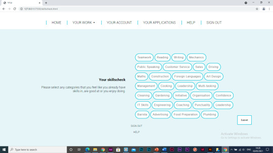
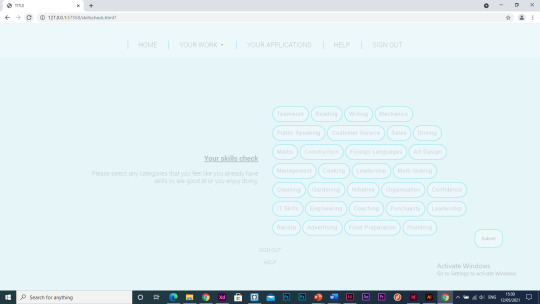
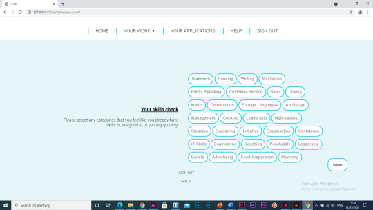
I have made the font sizes bigger on the skills check title and in the buttons. I have also changed the text to “please select any categories that you feel like you already have skills in, are good at or you enjoy doing”, this is because previously I have mentioned about inmates literacy skills all being different so I think I need to limit the amount of reading in the web-app, especially large amounts all at once.
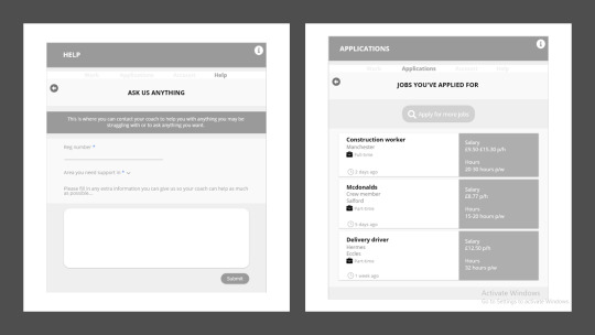
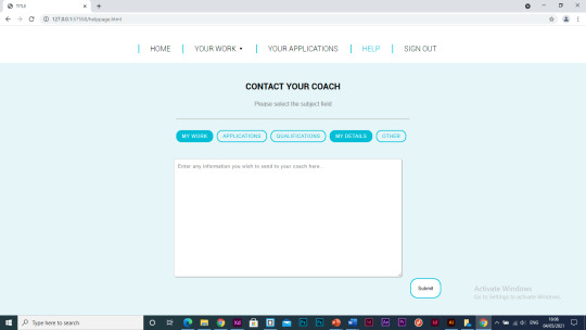
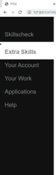
I have started working on the ‘help’ page, this is a similar layout the to ‘extra skills’ page as they both have the same use on the webapp, where the user can input information and submit it. I have added a dropdown menu where the user can select the subject that most suites the reason they are contacting their coach, this makes it easier for the coach to categorise what messages are most important to reply to.
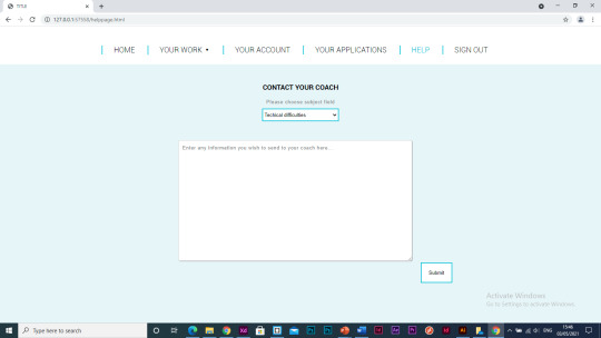
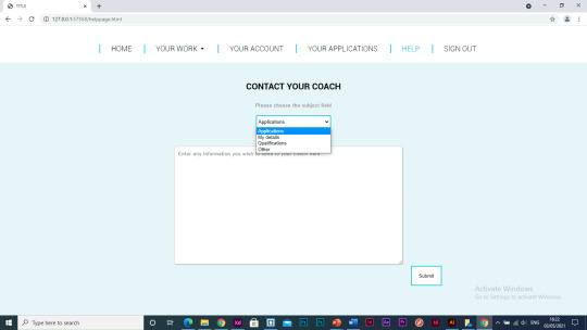
I have decided to use buttons that the user can select as this is the style I used in the skills check section so it makes sense to lay it out like this and I think design wise it works better than the dropdown too.


I have decided to remove the ‘your account’ section of the webapp as there was only a small amount of information I could include in that section therefore it meant there was a large amount of negative space and it almost made the page unnecessary as it was a collection of information that is already specified on other pages.
Juan suggested I add a hover feature to the log in button as there is animations like this on the other pages so I have added a hover feature where the colour of the button changes when its hovered over.
Seen as I took the ‘my account’ page out of the webapp, I needed a page that the program would take the user to after submitting their extra skills answers otherwise it was taking them straight to their work which didn’t flow right. I have started to make a welcome/landing page that the user will be taken to after submitting their answers.
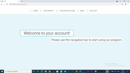
When the user enters this page the text will fade in.
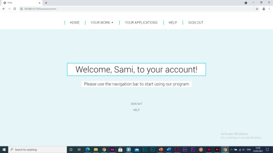
I like the use of the blue border around the white background on the welcome page so I decided to use it in the work pages too as I want the design to be coherent throughout the program and I feel that adding these borders adds extra dimension to the title and makes it stand out more.
Another thing I want to look at adding to the program is animations between the pages as at the moment it jumps between each page which I think looks a bit like the webapp is lagging and it makes it look less professional and like a real-world webapp, I think it will improve the user experience.
I have started adding a fade-in effect to each page when you open the page.
I’m not completely happy how this transition looks between the pages so I want to try out some other code I can use to get it exactly how I imagine it to look.
I managed to create an animation where the page went from small to big on the page but I don’t particularly like this either. The thing I’ve found when researching animations in code is that a lot of the examples that come up include JavaScript which I am not experienced in and for this webapp I am just using HTML and CSS so this is holding me back a bit in regard to what I can achieve.
0 notes
Text
Presentation & presentation feedback
PRESENTATION
https://www.youtube.com/watch?v=IsC5CAS_vD0
Tutor feedback:
- Impressed with HTML and CSS skills
- Likes the animations
- Increasing the size of the fonts as its quite hard to read
- Well developed in terms of micro interactions ( Micro-interactions are events which have one main task — a single purpose — and they're found all over your device and within apps. Their purpose is to delight the user; to create a moment that is engaging, welcoming and, dare we say it — human)
- Impressed with the level I am achieving
- Look into intelligence systems ( Intelligent systems are technologically advanced machines that perceive and respond to the world around them. Intelligent systems can take many forms, from automated vacuums such as the Roomba to facial recognition programs to Amazon's personalized shopping suggestions)
- Not the same advice for everybody, looking at who you are and how you can give them the best advice
- Developed a lot better than last semester (XD)
Peer feedback:

0 notes
Text
Effectiveness of using animations in web design
I have really enjoyed the use of animations in my web-app as I feel it makes the page more interactive and it engages the user more. Alongside this, I think it makes the pages design a lot more enjoyable to look at and can save the page from looking boring, creating a better user journey for the audience.
Web Design Trends Analyzed: 8 Effective Types of Animation
https://www.uxpin.com/studio/blog/web-design-trends-analyzed-8-effective-types-of-animation/
1. Loading Animations
One of the oldest uses of animation for the web is to distract the user from loading times. As stated in Interaction Design Best Practices:
“Best case scenario, the animation influences your users’ perception of your product’s technology, making it seem better than it actually is. Worst case scenario, your users have something fun to watch while they wait, improving the overall experience.”
Even short loading animations still add a little sophistication or at least entertainment during the dead time. Loading animations are popular for flat design, minimalism, portfolios, and one-page sites — all of which are inherently simple.
Remember that loading animations are best when simple. Forget extraneous effects like sound or outlandish designs. Animations should match the personality of the site itself, whether fun and cartoony, or professional and elegant.
2. Navigation and Menus (Nonscrolling)
In order to save screen space, a recent trend is hidden navigation menus that are revealed by clicking on buttons (like the hamburger icon). For these, animation is essential for visually connecting the two elements and preventing a jarring transition.
3. Hover
Hover animations are very practical for conveying that an element is interactive. In some cases, this might be the only sign that a button or piece of text is clickable. When a user is in doubt over how an element functions, they tend to move the mouse over it anyway, making hover animations fairly intuitive.
Hover features are something I have used a lot of in my web-app, most of these are over ‘submit’ buttons to highlight to the user that this is a clickable button. I also think features like this make your web page look more professional.
4. Galleries and Slideshows
Animated galleries and slideshows showcase multiple images without distracting the user.
How fast and how many images cycle are up to the designer, but these decisions should not be taken lightly — even slightly quickening the rate at which images change could give the site an unwanted “rushed” feel.
Galleries and slideshows are easy to use because they naturally mimic real-life photo album functionality. However, we wouldn’t advise that you take that metaphor too far with a skeuomorphic visual treatment. Minimize the actual design of the slider or gallery, then ensure you show each image for 5-9 seconds.
5. Attracting Attention
Any biologist will tell you that the human eye is attracted to motion. This makes animation the perfect tool for controlling your visual hierarchy, especially as part of a site with mostly static images.
This is a feature I have included several times throughout my app. Like I have said before, I think interactions like these save the page from becoming boring, as there is something for the user to look at and engage in. With my web-app, it is purely educational so I think its even more imperative that I have used features and interactions like this.
6. Scrolling
The success of a long-scrolling navigation — another trend discussed in the free e-book Web Design Trends 2015-2016 — relies on the quality of its animation. A site simply can’t scroll smoothly without it. One of the main advantages of scrolling is the control it gives to the user, and for that, animation dictates the pace.
7. Page Motion
Minor page motions, from AJAX loading options to simple shakes, add a little something extra to your site’s delightful design. These rarely have any practical benefits, but do well in making the site more enjoyable.
8. Backgrounds
While distracting if excessive, a modest animated background can add a certain vitality to a website. The key is moderation — individual sections at a time, or perhaps a gentle movement of the entire image.
This is an effect I have used in my login page as it is a page that only needs minimal content, so adding a slow pace animation to the background of this page really helped to add another dimension to my web-app.
0 notes
Text
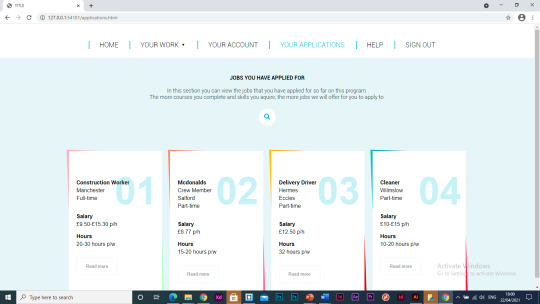
Web-app / applications
With the design of the applications page it is the same layout and style as how I’ve done the design of the ‘work’ pages as I feel the style needs to be consistent throughout the webapp.
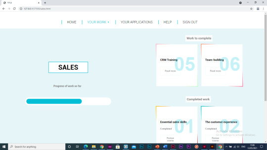
In this section I have included the jobs that the user has already applied for, this helps the user keep track of how many/what jobs they are waiting for responses from. The details about each job include the location, full/part time, salary and hours, these details are all important to include as I feel this is the information anyone outside of prison would receive so its only right that the prisoners receive the same information as one of these jobs might be one they go into when they are released.


I have added a search bar to this section so that if the user has a particular job in mind that they want to apply for they can search it here and see if there are any vacancies available that they are qualified enough for.
This is a feature where the user hovers the mouse over the search bar and the text box will open for them to search the jobs, I feel like features like this are effective in making the webapp interactive and and increase the users experience without causing a distraction.


0 notes
Text
Webapp / ‘my account’ & extra skills
The page for the users account was more difficult to get the right design.
At first I wanted to include a profile card type feature but I felt like this left too much negative space so wanted to try some different designs and layouts that could work better.

I liked this idea of having minimal information on this, just their details and their chosen skills and skills they’re working on. Although I still don’t feel like this design suits the style of the rest of the webapp, I also feel like this page looks a bit boring so I want to try out some other designs that can use more of the space on the page as well.
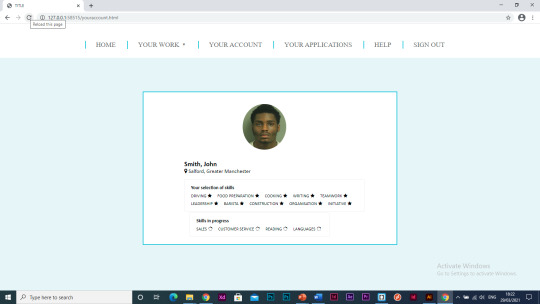
I like the idea behind this design but I don’t feel like I can execute it to its full potential. There is a lot of negative space, which ended up with the page looking bare, which I think can make the page look pointless in the web-app and I think this page is an important page as its where the user can see all their information regarding their own details and their progress and work form other pages all in one place.


I think this could work better as its more simplistic and the previous design felt like there was too much going on on the page. I need to change the design more to fit the style of the rest of the web-app.

Extra skills
The extra skills page was very simple to make, I have included a text box in the middle of the page where the user has the choice to add any extra skills that they may want to improve on during their time using the program.


0 notes
Text
Webapp / navigation bar
I wanted to add a navigation bar to the web-app. This is because it will ensure the user journey is as easy as possible, as the prisoner will most likely be using the online program by themselves as there wouldn’t be enough officers to monitor each inmate, so I want it to be simple and easy to use.
At first I tried a side navigation bar, which I liked but the design didn’t look good and I wanted something that looked sleek and made the web-app look professional.
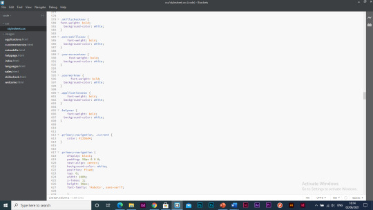
I have designed and added a nav bar at the top instead. This nav bar includes a drop down menu for the users work to make it easy to switch between the pages. I have continued with the blue theme, but I have toned it down more than the previous nav bar which I think makes it look more professional.


https://neilpatel.com/blog/common-website-navigation-mistakes/
Visitors expect to find horizontal navigation across the top or vertical navigation down the left side. Putting your navigation in standard places makes your site easier to use. That means a lower bounce rate, more pages per visit and higher conversions.
Be expected. Yes, marketing is about differentiation, but your navigation style isn’t the place to do it. Your goal is to help people find your content, not show them a new way to get around a website.
I think this is especially important in my case as inmates may not have used websites in a long time so features like this should be kept consistent to other websites to ensure a good and easy user journey.
0 notes
Text
Web-app / ‘your work’
Something I wanted to include on the work pages was a progress bar as I feel like this is a good visualisation to show how much work you have completed compared to not completed which I feel like can be good motivation to users to finish this work. I also think a progress bar is effective at helping the user organise which work is most important to do eg if they haven’t completed much of it yet.
I also think a progress bar will encourage the user to complete work as it is satisfying to see the progress bar fill up.
I tested out a few types of progress bar or circles that I could use.


I decided to go for a progress bar like this that is animated to load to the progress of work so far when the user opens the page to that specific topic.


I have started adding in categories for the work that the user needs to complete and what they have already completed.

When you hover over the box it comes up with an option for you to read more about the course or to review the course (if the course is already completed).


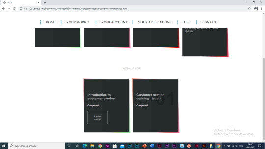
I am trying out different colours for the boxes I have added in as one of the main feedback points from Juan last semester was that I shouldn’t use grey, I quite like the look of the design with white and then a colourful border as I think its good to add in pops of colours, especially in this sort of web-app as the colours can be conveyed in the users emotions.


I have added a light blue background as I feel like it makes the page look less flat.
I have also added titles to each page, I think I will change the design of these titles but I think this is important to help with the ease of the navigation of the web-app.


I have changed the positioning of the boxes to the right and the title and progress bar on the left. I think this uses the space on the screen better than it did before.

0 notes
Text
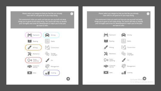
Web app / skillscheck page
I have started to create the checkboxes for the ‘skills check’ section of the web-app but I still need to refine the design.


I have started playing with the design, I like this design where you can select the skill and it will fill it with colour and you can also click it again and it will de-select it. This design also allows the user to select as many or few skills that they feel are applicable to them.
It’s important to use categories in this section rather than the user entering the information as this avoids input of irrelevant data and inmate’s literacy skills will differ, so this makes it easier to use in these cases.
I am still using the colour blue, following on from the login page, as I will with all the other pages to make the design of the web-app coherent.


The positioning of the text next to the categories is something I am still playing about with as I am not happy with how it is sat so far.
I have added a pale blue background to this page which I will carry on throughout the web-app.


I don’t think the white background around the text is working so I have designed it so that the text is on top of the blue background which works a lot better.

0 notes
Text
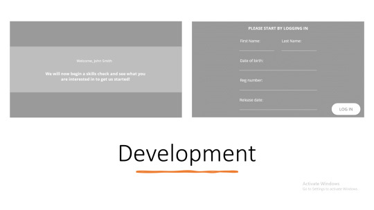
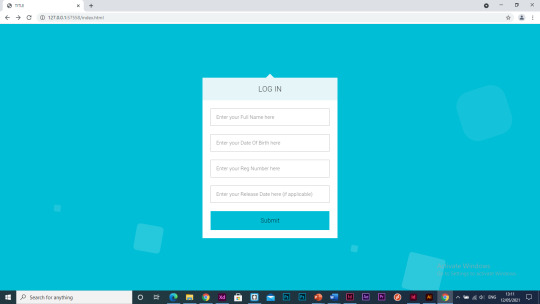
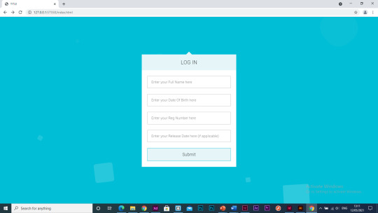
Web-app development / login page
Juan suggested that I could create this web-app on a website called ‘webflow’. I thought that I’d give it a go so that I could see if I liked using this rather than Brackets which I have used before. This website allows you to visually code your website by adding features to the screen such as text boxes or buttons and it adds the html tags for you. Although I thought that this would be easier than coding the web-app from scratch myself, I actually think I found it more difficult because I was restricted to what I could add as its just the options that they offer on their website. Alongside this, you can only add two pages for free and then you have to pay for a plan and seen as I want to try to create a functioning web-app, I would need more than two pages.
This is what I created in Webflow to see if I liked the software.

I think I have decided to use Brackets to code this web-app properly. I have experience using Brackets from 2nd year so I think I can get the hang of it much quicker and I feel like this allows me to add all the features that I want to rather than being limited.
I have started to code the log in page, this is just a rough layout, coding the page to be functional and then I will design it accordingly to how I want.


I like the use of the colour blue as through research I found that blue was found to be a calming colour, which I think is quite fitting for a web-app that is intended to be used by prisoners as the rest of their experience in prison is unlikely to be calming.
Colour theory for designers
https://www.smashingmagazine.com/2010/01/color-theory-for-designers-part-1-the-meaning-of-color/
Blue is often associated with sadness in the English language. Blue is also used extensively to represent calmness and responsibility. Light blues can be refreshing and friendly. Dark blues are more strong and reliable. Blue is also associated with peace and has spiritual and religious connotations in many cultures and traditions (for example, the Virgin Mary is generally depicted wearing blue robes).
The meaning of blue is widely affected depending on the exact shade and hue. In design, the exact shade of blue you select will have a huge impact on how your designs are perceived. Light blues are often relaxed and calming. Bright blues can be energizing and refreshing. Dark blues, like navy, are excellent for corporate sites or designs where strength and reliability are important.


Alongside using the colour blue I will use neutral colours like grey, black and white. Neutral colors often serve as the backdrop in design. They’re commonly combined with brighter accent colors. But they can also be used on their own in designs, and can create very sophisticated layouts. The meanings and impressions of neutral colors are much more affected by the colors that surround them than are warm and cool colors.
My design

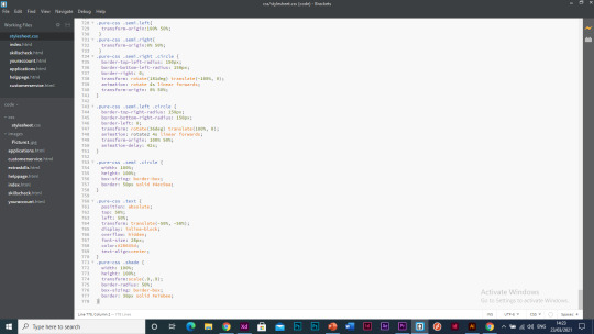
I decided to add an animation in the background of the login page as it was looking quite bare, the animation is minimalist but I think it is effective in making the interface more aesthetically pleasing and I think it can also give it a calming tone.


I haven’t been happy with any of the designs I had done for the login page so I have tried a new design. I like this design, it uses the blue colour that I have been using throughout the rest of the design for the web-app, its simple yet effective and it has an animation in the background which makes the web-app more interactive and interesting to look at to hold the users attention as otherwise this is a boring educational web-app so I need to include features that can prevent this perception.

I have changed the background to white as this will fit in with the design for the rest of the web-app better.

0 notes
Text
Feedback
- When I first heard this idea when presenting your dissertation idea Sami it sounded incredible. Really creative project that you don’t usually hear about so well done. It sounds like you are really interested in this project. It's great to see! Interested to see the final outcome.
- Love this idea Sami, its really nice that you are trying to help towards this social cause and your presentation was fab. Can’t wait to see the app developed further than it already is :) smashed it!
- Great idea! Can’t wait to see you keep developing this.
-I really like how clearly you speak and the project is so interesting in terms of topic, you have gained a lot of confidence in your presentation skills and I think its very impressive, proud of u!
- Really glad to see you’re carrying on with this project from your dissertation. You have clearly collated a broad range of well informed research which will be so useful in informing your practical development. Its clear you have properly segmented the different sections of your app based on this. You already have a good idea of the functionality, it would be good to see some more thought for the aesthetics. Maybe look at colours with positive connotations and how the psychology of this can be used in the app, for example.
0 notes