
My Art Blog, where I post Art, Art guides, and Tips. Oh and also art-memes. My ArtStation: mantacid.artstation.comPlease follow my main blog @mantacid as well; I tend to accidentally post things to the wrong blog quite frequently.My art is not to be used by, in, or for any AI.
Don't wanna be here? Send us removal request.
Statistics
We looked inside some of the posts by mantacid-art and here's what we found interesting.
Average Info
Notes Per Post
613K
Likes Per Post
372K
Reblog Per Post
241K
Reply Per Post
675
Time Between Posts
11 days
Number of Posts By Type
Text
15
Note
1
Photo
1
Last Seen Tumblr Blogs


Fun Fact
The total number of visits Tumblr.com received during January 2021 is 327 million.
Text
Bill Braun creates paintings that look like construction paper!
59K notes
·
View notes
Note
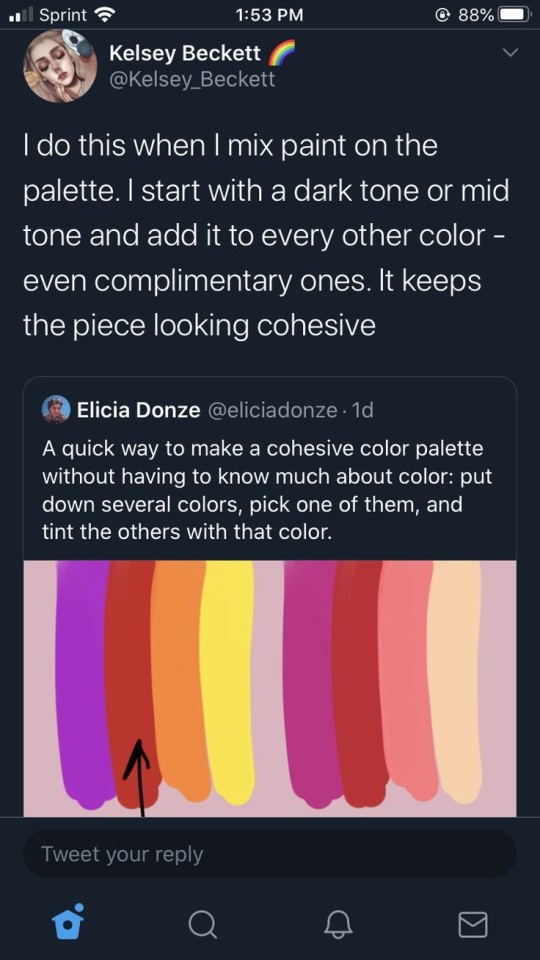
Not quite certain if asks like this are allowed, but any suggestions for a color palette that will make the art physically hurt to look at? I'm doing an experimental project and need it to be near unbearable to perceive (before anyone asks, yes it will include an eyestrain warning)
high contrast, bright saturated colors, etc. this isn't exactly related but i saw this study in a cursory google search and thought it was interesting:

Color Hurts. The Effect of Color on Pain Perception
674 notes
·
View notes
Photo

Ethel Greene, “The World’s Greatest Parking Lot,” oil on canvas, 1969
20K notes
·
View notes


Text
Our local newspaper ran a story about the legendary graffiti artist who recently passed away and. Literally everything about it is fucking insane. I'm insane about it.
So this guy has been extremely active for around fifteen years, during which he spread these beautiful, high quality pieces all over the country, way over a thousand of his standard signature, and probably thousands more. He did completely batshit stuff like literally spray painting an entire train from top to bottom or leaving his signature at the top of a 600ft tall overpass and this whole time, only five people from his crew know who he really is. To everyone else it's a complete mystery.
And then he dies at the age of 35. A few weeks after his death, his crew shows up at his completely unassuming parents' doorstep, reveals who they are and asks if they can host a memorial exhibition of his art.
Turns out, this dude has been leading an insane double life. In the daytime he was a meek little office worker with a partially paralyzed arm and no social life to speak of. In the nighttime he was a fucking legend. Not only did he climb that fucking 600ft overpass, he did it WITH A PHYSICAL DISABILITY. THE MADLAD. And throughout the entire time, fifteen years, he got caught once. ONCE. HE DID ALL THAT UNNOTICED. THAT'S INSANE.
48K notes
·
View notes

Text


I was asked by a friend yesterday if I could offer basic tips about comic paneling. As it turns out, I have a lot to say on the matter! I tried breaking down the art of paneling using the principles of art and design, and I hope it helps you out!
EDIT: uh uh there are a lot of people reblogging this, so i figure i may as well append this now while i can lol
This whole thing was very much cranked out in a few hours so I had a visual to talk about with a friend! If this gives you a base understanding of paneling, that's awesome! Continue to pull in studies from the comics you see and what other artists do well and don't do well! You can tell paneling is doing well when the action is flowing around in its intended reading format.
Here's the link to the globalcomix article from which I pulled the images about panel staggering! Someone sent in a reblog that it wasn't totally clear that the 7th slide mostly covers what NOT to do in regards to staggering, and that is my mistake!
I saw in a tag that someone was surprised I used MamaYuyu too, and I don't blame them lol. If I had given myself more than a couple hours maybe I would have added something else on, I just really admire MamaYuyu's paneling personally.
uh uh, final append: I am by no means a renowned master of paneling, so if you find anything off base here, by all means, counter it with your own knowledge and ways you can build upon from here! Art is always a sum knowledge of everything we find. 💪
30K notes
·
View notes
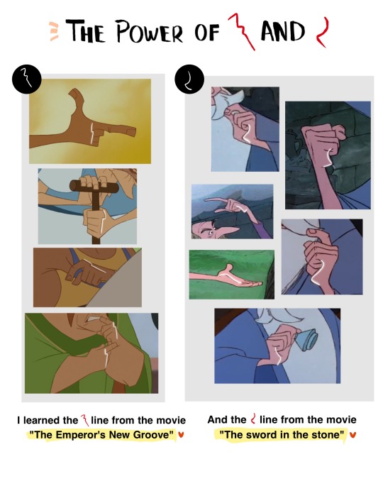
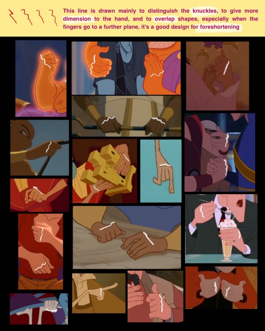
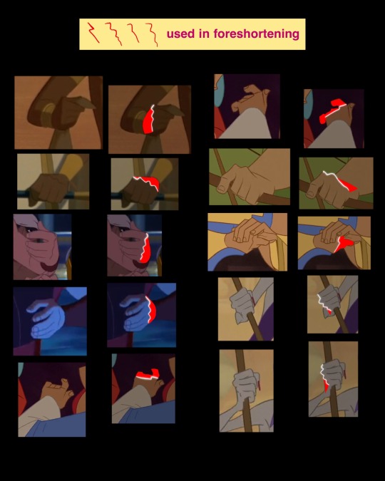
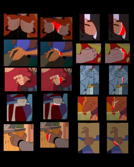
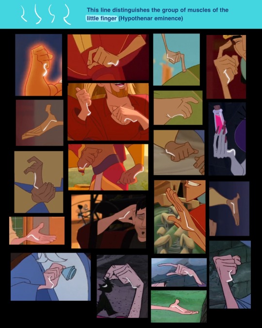
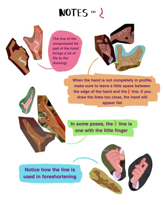
Text
Drawing Hands (all from Pinterest not mine)


Hope ur all well ★
634 notes
·
View notes
Text
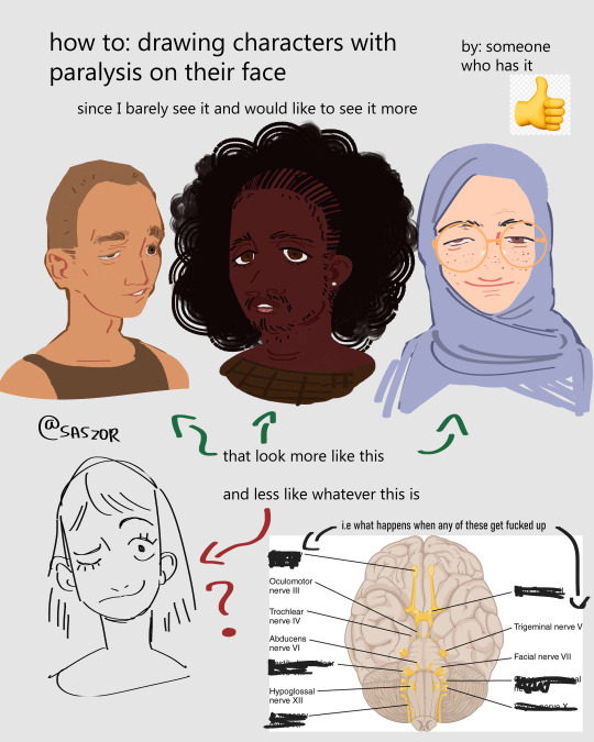

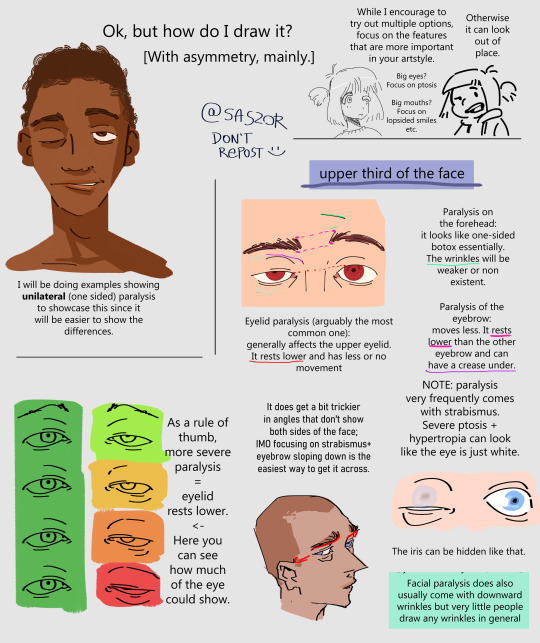
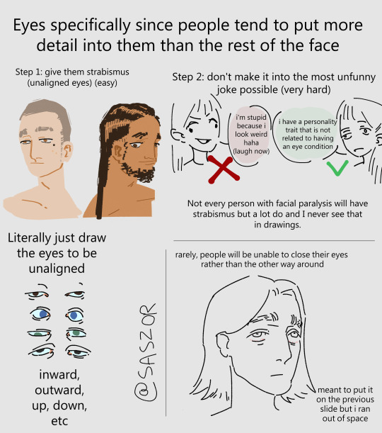
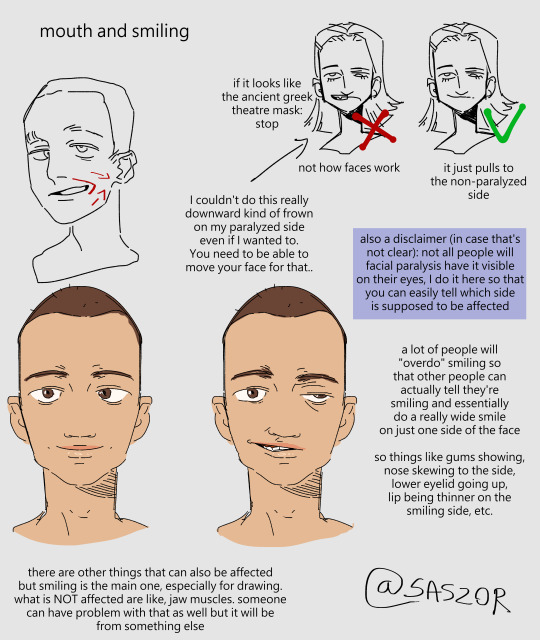
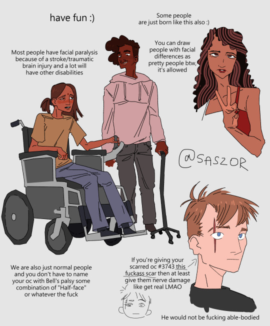
[ID in alt]
Tutorial on drawing characters/OCs who have some sort of facial paralysis. It doesn't cover all possible variants because I was using mirror as my main reference lawl
Keep in mind that this is an introductory drawing tutorial and has some generalizations in it, so not every “X is Z” statement will be true for Actual People 👍
Consider supporting me on ko-fi if you find this to be helpful.
26K notes
·
View notes
Text
Mauro C. Martinez (American, 1986) - Trust (2022)
129K notes
·
View notes
Text
DEAR ARTISTS, PLEASE READ THIS POST I STUMBLED ACROSS
IF YOU ARE NOT DOING THIS ALREADY, YOU SHOULD TRY IT
I even tested it out myself, it works great
69K notes
·
View notes
Text
shoutout to when you’re drawing and you think you’ve made a masterpiece but then you sit up straight and it’s all stretched and disproportionate


231 notes
·
View notes
Text
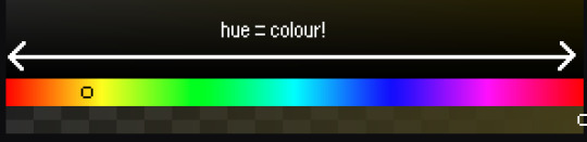
⭐ Pixel Art Fundamentals - Hue Shifting
This technique is not uniquely specific to pixel art, but it's a very common term to hear when starting out watching those "dos and don'ts" videos. So what is hue shifting?
Hue shifting basically means to change the hue when making your shade darker or lighter. In this context, 'hue' = colour!
You may hear 'you need to hue shift more' when getting feedback on your art, but what does that mean really? Here are some examples:
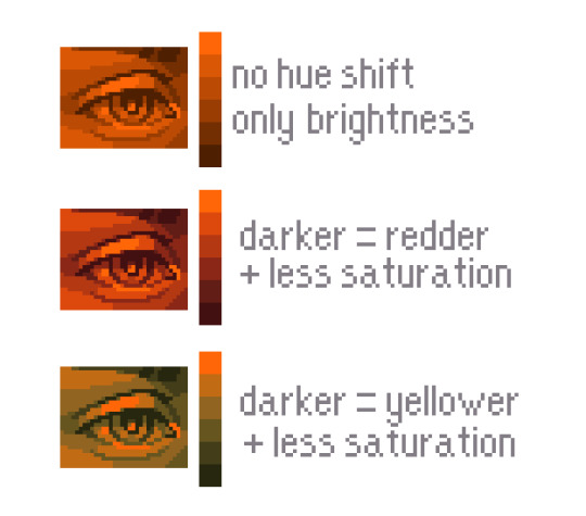
We can see even with just a bit of hue shifting, we have quite a different vibe for each drawing. In warm / daylight settings, no hue shifting can sometimes look a bit muddy or grey.
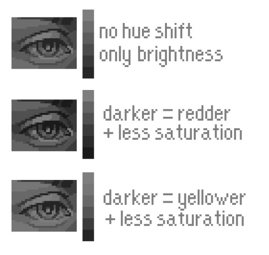
If we swap the image to grayscale, you can see that they look much the same:
As long as the hue shifted colours have a brightness that makes sense, they usually will work. You can get quite wacky with it.

But is hue shifting always good? Not necessarily.
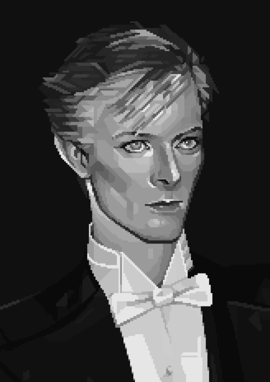
Below is some of my art where I intentionally didn't hue-shift at all. You can see it gives them an uncanny, digital, or photographic kind of look. As always, techniques are about your intention, or personal style.
I recommend trying different hue shifting methods! I especially love to use a cool blue or teal for the lighter shades.

Thanks for reading and I hope this helped a little! Have fun with it!!
⭐ Read my full pixel art guide here!
6K notes
·
View notes
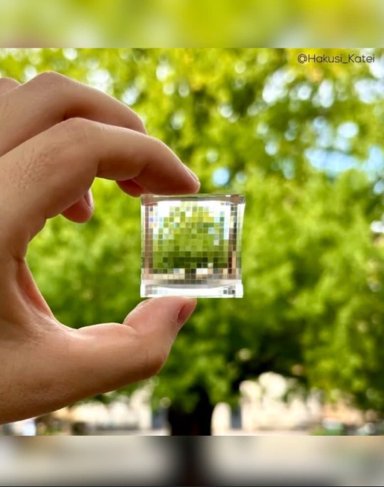
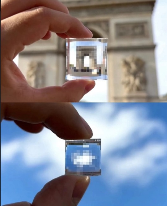
Text
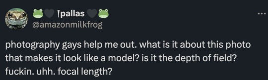
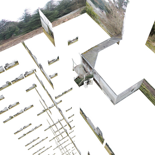
The short answer is... a tilt-shift lens.
The slightly more complicated answer is... Mister Rogers.
Depth of field is the area in front and behind your chosen focus point that remains in focus and then slowly gets blurry as you get farther away.
Shallow depth of field only has a narrow slice of the image in focus and gets blurry super quick. This is caused by a large lens aperture and being close to the subject.

Deep depth of field can extend through the entire picture if your aperture is small and you are super far away.

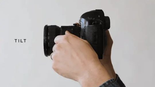
Usually the depth of field lines up with the image sensor of your camera. So if it is tilted forward, the plane of focus matches.
The stuff outside the green area would be blurry. The edges of the green would be slightly blurry. And the dashed green line would be the sharpest area of the photo.
But the tilt-shift lens allows you to create chaos with your plane of focus. In most cases, you would use this to flatten the depth of field so you can get a 2D plane entirely in focus.
If you were to use a normal lens, the bottom left and top right would be blurry.
But with a tilt-shift lens you can do this.
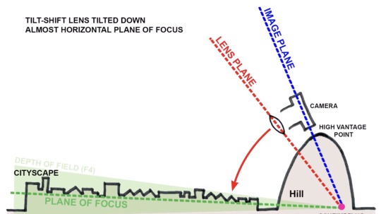
The green area is taking a little nap on the floor.
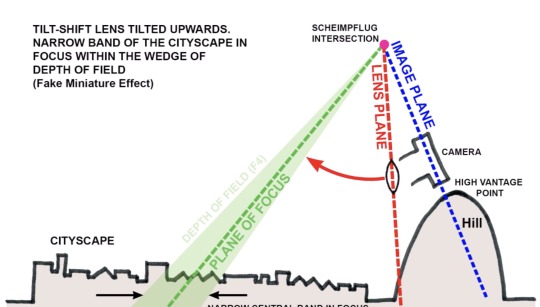
However, there is an unintended side effect created by this lens. (The "Scheimpflug intersection" if you want to go down the rabbit hole.) You can choose absolutely wacky planes of focus that create a very narrow depth of field over a geographically large area.
Believe it or not, this is when psychology comes into play.
And possibly Mister Rogers.
youtube
Our only reference for such a large area having a shallow depth of field is our memories of miniatures on TV. So Mister Rogers and Thomas the Tank Engine trained our brains to see this effect as... small.
Depth of field shrinks the closer you are to something. And when filming miniatures, you are placing the lens close to the scene. But the scene represents something big in our minds. We buy the effect, but not 100%. That blurriness wouldn't be there at a regular scale. So our subconscious remembers we are watching small things pretending to be big. It just files that away in the back of our mind.
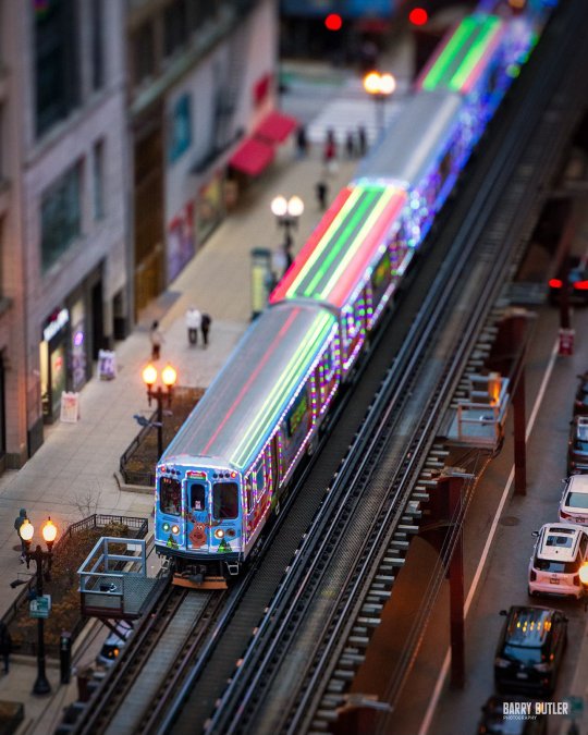
And then when we see something like this...
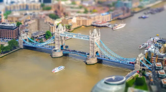
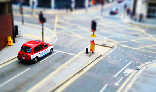
Our brain is all, "Look at all that tiny shit!"
Without Mister Rogers, our brains may have never made these connections and tilt-shift photography may just make us wonder why everything is all blurry. That connection to past experience is vital for this effect to be convincing.
Brains are neat.
25K notes
·
View notes