
Last Seen Blogs


Photo

Paul Wilhelm Tübbecke (German, 1848 – 1924)
In the Ettersburger Park, 1870
Watercolour on wove paper, 45,1 × 23,2 c.
750 notes
·
View notes
Photo

Alexandra Exter (Russian, 1884 - 1949)
Woman at the window and dog, 1927
Gouache on paper, 46 x 38 cm
90 notes
·
View notes
Text


COMPUTER magazine covers. 1970s.
Oh, that time when computers, Star Wars and nerds all belonged in the same corner. I remember that, you know. If you owned a computer then, you were a nerd. If you liked Star Wars, you were a nerd. A nerd with glasses and a digital watch. My brother was known as “Mr. Star Wars” to his classmates, and it was meant to be a derogatory nickname. (I bet they’re taking their kids to those Disney Star Wars films now.)
2K notes
·
View notes
Text


NASA art by Rick Guidice. I love the first one especially, art for the Pioneer to Jupiter Mission.
2K notes
·
View notes
Text


Daniel Johnston’s self-released HI, HOW ARE YOU (1983). When Kurt Cobain wore a print of the album cover on a T-shirt, Johnston received instant cult status. That may be a somewhat overlooked part of Cobain’s legacy actually: he introduced many kids of my generation to scores of unknown or neglected artists, either by covering their songs, mentioning them in interviews—or wearing shirts with their names. Part of him felt uneasy and even guilty about the fact that he had so much success and they didn’t, a guilt that continued to nag at him until he died.
In 1993, Johnston was commissioned by the Sound Exchange record store in Austin, Texas, to draw a mural of Jeremiah the Innocent, the frog character featured on the cover.
25 years later, Cobain is gone, Johnston died in 2019, and the Sound Exchange store no longer exists (though the mural is still there). Everything is fleeting.
2K notes
·
View notes


Text


Vintage illustrations from Russian magazine, Technology for the Youth.
2K notes
·
View notes


Text


Folk tale illustrations by Russian artist, Natalia Trepenok (b. 1953). 1990s.
3K notes
·
View notes
Text


Illustrations by Bulgarian artist, Nikolay Stoyanov for HOW THE CROW BECAME A SINGER (1973).
2K notes
·
View notes
Photo

Minoru Nizuma (Japanse, 1930-1998)
Stone Flower, 1974
Granite atop stone and wooden bases, H.: 48 cm
40 notes
·
View notes
Text
undefined
tumblr


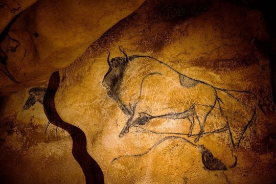


The Chauvet cave, France, the art of prehistory.
In 1994, three friends discovered in the south of France a cave with magnificent cave paintings, more than 30,000 years old.
Under the ground of the Ardèche region, an invaluable treasure is hidden for its antiquity, its conservation and the pictorial quality of the representations; one of the oldest and most splendid examples of Arieñaciense parietal art, dating approx. between 40,000 and 30,000 B.C.
https://www.instagram.com/p/BWfRerMFMCO/?igshid=yqzbqgvny71t
97K notes
·
View notes
Text
Graphic Design in comparison...
To compare contemporary trends in graphic design to other design periods, is unfair. I would argue that these major periods of design contain more parallels than they are different. The current state of graphic design is a result thousands of years the social and technological progress. It is a domino effect, where one period is a result of the previous. As our society has evolved and progressed from paleolithic hunters and gatherers to 21st Century technophiles, so has our means of communication. Our current state of graphic design could not exist without the legacy that spurred it. If we begin with the cave painting at Lascaux, in this 17,000-year legacy, the technologies within each era have been leveraged to consistently form more complex means of visual communication. This history includes the cultural and social ramifications of visual technologies upon humanity. With every major graphic design innovation, the accessibility of information and the ease in which we can communicate has challenged cultural norms and created social upheaval.
Examples of this include the Gutenberg press which allowed people to share nonconforming religious beliefs that would create communities that would challenge the religious status quo. The industrial revolution and its mechanization increased the rate in which social and technological progress would occur. At the turn of the 20th century, these means of mass communication would work hand-in-hand with perpetuating new social ideologies that would usurp monarchies, and challenge political and economic systems. The 21st century would see the creation of social media and an immediate and rapid means to communicate. Once again, in the early 2010’s these visual communication technologies would assist in overthrowing governments in the Middle East, which we now refer to as the Arab spring.
In fact, we are living in a historical moment where the course of our American society is filled with unrest. This is due to the ease of creating media, that allows anyone to share this information with everyone. Concern has emerged about the integrity of our political process due to the proliferation of manipulative information from outside governments. More recently we have seen a rise in violent crimes and mass shootings possibly driven by social media. This accessibility is asking us to question the meaning of freedom and the liberties that are tied to our first amendment. Only time will tell how this will transpire. I would surmise that limits will be placed on restricting certain types of speech tied to violence and political manipulation.
Back to the notion of comparing a design period covered in Megg’s with today. I would like to compare and contrast the International Type Style to our contemporary design practice. It was the Bauhaus and other early 20th century avant-garde schools that set the stage for the International Type Style’s serious study and systematic approach towards the design process. The International Type style, sought efficient and objective forms of visual communication. The designer would remove their ego from the work to produce unbiased content. The design language used san serif fonts, left aligned text, negative space, an asymmetrical layout, grid systems, and clean flowlines which strive for a new professionalism and the timeless aesthetic. The process was filled with serious research and investigation for the sake of finding the most logical solution. The designers of this era such as Max Huber, Max Bill, Ernst Keller, Edouard Hoffman, Max Miedinger, Emil Ruder, Armin Hofmann, Josef Müller-Brockmann, and Jacqueline S. Casey to name a few, defined a system and design approach that is the apex of modernism.
In contrast, our contemporary design is a legacy of the rejection of modernism. This began to a degree by the New York school which thought innovative an experimental way to create new forms of visual expression. I am not stating that the NY School rejected modernism, in fact they perceived their work as an extension and adaptation. However, it was a break from the formality of the International Type Style. This rejection of modernism grew in the psychedelic movement where design embraced aesthetics from movements prior to the Bauhaus. Art Nouveau and the arts and crafts movement became a foundational design language for psychedelic posters and commercial work of the 1970’s. An example of this is Herb Lubalin’s expressive and decorative typographical combinations and font designs, which looked at the late 19th century for inspiration. His work would become the huge influence within the design world and continue the break from modernism.
Eventually a period of design would emerge that would challenge all of the notions the modernism. Today we refer to this as postmodernism. Postmodernism, rejects the social conformity and rules that are bound to modernist ideologies. This period of design coincides with the emergence of the digital revolution. The digital revolution, created a unique environment where it gave those who were not formally trained in design but were technically capable to use personal computers and desktop publishing software, access and the ability to producing visual communication content. An example of this would be the surfboarding teacher David Carson, who like many designers of this time rejected modernist ideals and embraced the postmodernist approach of, “concept was more meaningful than form”. This era of design is filled with those who are referred to as “The New Primitives”.
I would argue that these two specific events coinciding with one another, created a perfect storm that left an intellectual design void. Art and Design programs in academic institutions have been filled with artists and designers who follow postmodernist theories. And as a result, have perpetuated the idea that concept is fundamentally more important than form to a generation of young designers. As a result, design theory has suffered, and students have suffered by not gaining this information.
While we have gained the flexibility the enormous capacity to mass communicate through digital media the question is, “is it good design?” The quest for creating and understanding good design, has created a drive to seize this information. Today, I believe that we are trying to recapture some of the fundamental rules and the understanding of sound design that was described and researched in the first half the 20th Century. Gestalt, gridding, sound typography, and an appreciation for the Bauhaus and other formal schools of design have emerged as a common design practice. Companies such as Apple and Google have embraced and perpetuated the formal design process, reestablishing a visual vocabulary for great design.
I believe that the benefits of graphic design today are not in the quality of the work per se. Rather it’s in the possibilities of what we are able to accomplish as designers. I state this because for the first time in history we have this 17,000-year legacy at our finger tips. We have the ability to research, visually understand what was created before us, reflect, incorporate and constructively apply all of this information in the work that we produce. Paula Scher is a wonderful example of a designer leveraging the past for contemporary graphic design, and visually communication. Our reliance on mobile devices has fostered us to engage with visual information on a constant basis, this has assisted in making us more visually sophisticated.
Graphic design, like never before is more woven into our social fabric. Is graphic design today superior to the International Style? Is it superior to any period of design? Only time will tell. We should revisit this question in 25 years, and reflect on graphic design of 2020 and how it fits into our history.
5 notes
·
View notes


Text
Reflections on Meggs’ History of Graphic Design 10.2, Chapter 24:
The Digital Revolution and Beyond.
This last chapter focuses on the last forty years or so. The early 1980's and the proliferation of personal computers create a fertile ground for industry to create design software and hardware that would change the face of the industry. It is scary to think that this conversation begins with Apple in the 1980's. What is even more scary is that I remember, observed and participated in many of the innovations of this time. The personal computer, the mouse, bitmapped fonts, postscript fonts, bezier curves, PageMaker, Quark, Adobe, Photoshop, MTV, Hypertext, etc etc. I was right there with these changes. I was one of “the new primitives". A curse and a blessing.
In the 80's and 90's David Carson, and daV1D car5UN 1mITat0Rs were everywhere. Today, he is relatively unknown among young designers. I believe young designers see him and his design methods as a novelty. At that time, he was part of the zeitgeist. His worked captured the spirit of "Anything goes, technological excitement, counter culture, and the dawn of a new age, BLAH BLAH". Ray Gun was a huge inspiration, for me. I recall going to Tower Records and looking at this and other "Extreme!" design content. At the time, I did not fully understand the context in which all this was occurring. Carson was my design hero, and like many other young designers of the time, was a huge influence in my ideas and aesthetics. I realize now, that the controversy around his work was justified.
However, it is interesting to consider all of the history and technological advancements that created the perfect environment for a surfboarding teacher with a the experience of a handful of design workshops to become one of the most influential designers at the end of the 20th century.
I wish I could go back in time and bottle the energy and excitement of that time and bring it back with me. Wait,..... I sound like an old man. Remember kids, don't mistake legibility for communication.
This last chapter seems a bit rushed to me. It is very dense and could be broken into its own four chapter sequence. Chapter 24 is a sprint to the end.
The END.
0 notes