
Don't wanna be here? Send us removal request.
Statistics
We looked inside some of the posts by marinareifenrath-blog and here's what we found interesting.
Average Info
Notes Per Post
1
Likes Per Post
1
Reblog Per Post
0
Reply Per Post
0
Time Between Posts
7 days
Number of Posts By Type
Text
15
Last Seen Tumblr Blogs


Fun Fact
Tumblr is available in 18 languages.
Text
Week 15 - Final Thoughts
The future of design is so prevalent all around us, but there are certain areas of design that I find will be fundamental in pushing us forward as a society. Some areas of design are fun and communicative in a way that sparks a creative energy upon seeing it. I believe, as a fun sector of design, that package design is being pushed to new limits and breaking down new barriers in terms of visual communication. One thing that stands out to me in general is craft beer and wine packaging as it is a popular consumption among younger generations and young people are always looking for things that are essentially eye catching and are naturally in tune with good design. Another sector of the future of design that I think goes hand in hand with one another is political campaign and marketing design and designs created by young creatives that communicate messages of solidarity in politically polarizing times that favor one side of the political spectrum. Design is a powerful way of persuasion in the young people of our society and it is important to create engaging visuals that capture the attention of those looking and implement a message of great importance. I see design from young people as they rally for things that are important to them in the streets and in front of government buildings and I see their signs with engaging phrases and visuals to catch the attention of those that are watching. I see design so important and so prevalent in that aspect and I also see the importance of design in political campaigns that are geared toward reaching the young people as they are a huge voter demographic. I feel that it is important that political campaigns and politicians know that the design of their promotional ads and webpages make a great impact on their target audience.
0 notes
Text
Week 14 - Your Choice
With my exposure to design methodologies and practices I have in turn become more self aware in how I make design choices and how I let design choices inspire me. I have become more aware of design choices used in pieces all around me, such as book cover design, can design, bottle design, movie and tv show branding, logo design and branding, and so much more. I am able to easily identify things such as which typefaces are utilized in designs and what kind of impact they have on the overall design. I am also recognizing how popular the Futura typeface is, it is literally used in so many places and is able to communicate a wide variety of messages and meanings. I’m really looking forward to being able to recognize even more typefaces and design nuances that make up prevalent designs around me. I am also coming across and understanding how designs I see can be made better, but I realize design is entirely subjective most of the time. I most often see things and think about how it can be changed or how it is a good design and what constitutes it being a good design. Something that has captured my attention recently and has made me more aware of new designs and what makes them catch my eye is craft beer package design. I have an affinity for creative and innovative designs that are featured on craft beers as they are unique and unlike any other package design. One of my favorite brewing companies that has really done a great job with experimentation in design is Door County Brewing Company. Their individual craft beers each exhibit a different design that is fundamentally eyecatching and creative in a way that I have not seen very often in the design world.
0 notes
Text
Week 13 - New Media
The definition of digital aesthetics refers to the sensual properties of and responses to artwork and in turn is a reflection of art and culture in addition. Digital aesthetics are so prevalent in our lives in so many facets. There are multitudes of companies and designers that exist that carry out their own aesthetic to target a certain audience of people by addressing their visual needs and desires. Their visual communication is directly affecting and enticing the moods of those who pay attention to them and it serves directly as a technique to draw audiences in. One company that comes to mind when I think of digital aesthetics and representation online is the Billie company that aims to provide products for womens’ wellness in a way no other company has done before.

People of all kinds are represented and their products are designed and packaged with solid and minimal colors that pop vibrantly in all new shapes and sizes, and therefore stick out in one’s mind as they are able to remember it better. Billie reflects feminine culture in order to reach a target audience by speaking to their troubles and doing it while maintaining a visual style and brand.
Another online presence that impacts me with its take on digital aesthetics is the houseplant company The Sill.

The Sill has an incredibly earthy and organic aesthetic that reflects on green thumb culture with minimalist tendencies. Their digital aesthetic is communicated with simple digital visuals that closely but abstractly mimic plants with slightly muted colors and their posts to reach out to their followers are plentiful of bright whites and memorable greens. The Sill also does its job to reflect culture and community by representing people of all kinds with their plants to make their content more relatable and to reach out to anyone and everyone. Their aesthetic sends the message for their viewers to cultivate an organic life.
0 notes
Text
Week 12 - New Media
When thinking of interactive design, I categorize it into things that I come across on a daily basis, as interactive design is embed very deep in our modern lives. Interactive design is very widely used in website and mobile app design, which requires quite a bit of ground work from multiple specialized designers to make it happen. To reach a desired audience or come to a desired goal in interactive design, there needs to be interference from software engineers, computer scientists, web designers, graphic designers, marketing creatives, creative writers, and so much more. With interaction from each of these fields there can be abundant success in the experience of interactive design. Computer scientists and engineers work within the coding behind the physical touch and click of an object on the screen as well as the sound that can accompany it. Web designers are specific to the layout of interactive design and new media to make it look physically appealing, as they specialize in layout design and know the exact spots that are attention grabbing to the general public. Graphic designers understand the small minutiae detail that comes with layout design and understand that the visual appearance has to be aesthetically pleasing in order to satisfy the needs of a particular audience and achieve visual success. With creative writers there comes the power behind words and how they can appeal to an audience. The words hook themselves into people who choose to look and can be incredibly influential in how a person decides to use interactive technology. In order to launch a specific platform of new media and interactive design to an audience there has to be a team of specialists who understand what people want to see and interact with, and that is particular to people who market different types of media.
0 notes
Text
Week 11 - Graphic Design
The “Citizen Designer” is a subset of designers or professionals who attempt to address societal issues either through or in addition to their commercial work. Designers commonly confine themselves to working and creating within the parameters of client and designer relationships focused on solving aesthetic and visual issues, but there are some that believe the field of design must confront and take on the problems that we face as a society. This is relevant as there are numerous pressing social issues that affect us as designers and people everyday and it is a natural reaction to want to become involved or act on the urges. In addition to that, if there is something that people listen and respond to whether they know it or not, it is art and design. Art and design is a visually engaging field that demands the attention of viewers. It captures the lingering eye of those not sure what to look at and implements a message to anyone who looks. Design is imperative to how we as people perceive things and the methodology of designs and designers can be highly influential in how people decide to take in information. As an artist and designer, I have urges to act on my thoughts and feelings and get them out in a visual manner, and these thoughts are heavily influenced by the pressing societal issues that surround us everyday. In times like these, with increasingly important issues such as COVID-19, the 2020 Election, the current Presidential Administration, and so much more, more people are creating than ever before. Visuals are so eye catching and people take in information based on design. Design can power the way we think and can implore us to feel a certain way. In addition to societal pressures, it is natural that people respond in the ways that they feel are appropriate, and that can be translated into creating and reciprocating design.
0 notes
Text
Week 10 - Graphic Design
My favorite section from the readings of typography in graphic design was the international style and corporate identity at Ulm found in the Triumph of the International Style. In Germany, there was an abundance of graphic designers with plentiful opportunities in industrial design as Europe got back on its feet in the post World War II years. Designers emerging from the Hochschule für Gestaltung, a design university in Ulm, Germany based on Bauhaus principles, found many opportunities to design corporate logos. The enriched faculty at Ulm consistently brought the most advanced philosophical issues into the classroom and for the first time, designers began emerging that were not self taught and gained intellectual structure in their work. Their work was based around Semiotics, the academic study of signs and symbols that convey meaning and focuses on how to “signify” in society. In 1969, designer Otl Aicher created a new logo for Lufthansa, a German airline, and paired a soft blue and yellow color scheme and devised a sleek version of the crane that sits in a circle in the Bauhaus manner that makes up the logo. Aicher also made Helvetica the standard face for the airlines name.

Furthermore, Anton Stankowski, who taught at the Hochschule für Gestatlung in the 1950s, designed a new corporate identity for Deutsche Bank in 1974 with the slash and square emblem that represents “an abstract version of timeless strength and security.” Stankowski devised a recognizable color for the identity as well which led to the development of “Deutsche Bank Blue.” In the era that followed World War II, many financial institutions turned away from styles that suggested permanence or stability and went with the “new timeless” International Style.

Lastly, Aicher and Stankowski were important figures in the design for the 1972 Munich Olympics and created a system of pictograms that were intended to be understandable despite the language boundaries that might be encountered by athletes and spectators.

0 notes
Text
Week 9 - Industrial Design
Brooks Stevens was an incredibly significant figure in Milwaukee’s industrial design history and was a piece in putting Milwaukee on the map in many ways. Stevens was one of the first and most notable industrial designers in the country and was influential and directional in how things in everyone’s daily lives should look. He created some incredible feats in automotive design but had a hand in just about everything design wise. Brooks Stevens design firm had a handle of about fifty names of business and corporations in Milwaukee that were clientele and therefore so many things in Milwaukee were under the influence of Brooks Stevens designs. It was an incredibly large control and handle in the city and throughout the country. Although Brooks Stevens stayed in Milwaukee because of his close proximity to business and creating deals with local corporations, he created designs that reached the farthest corners of the country, such as his design of the Olympia Hiawatha train, which was operated by the Milwaukee Road to further put Milwaukee on the map for industrial design and was one of the last great steamliner designs that was utilized for transportation in America. Brooks Stevens was also the only midwestern founder of the Society of Industrial Designers and therefore represented Milwaukee and the midwest for being one of the greatest and most pioneering places full of industrial design. Stevens was connected and intertwined with so many companies and corporations locally, nationally, and abroad and has touched so many lives in the process. Since his designs are so wide ranging and do not stick to one necessary product, they are so versatile. His designs are multifaceted and are implemented in the everyday lives of so many people, and in turn his effort and legacy has given Milwaukee a place as one of the most revolutionary cities to house industrial design.
0 notes
Text
Week 8 - Industrial Design
In the past few weeks, I have been lucky enough to witness industrial design and its process from up close. I have been a part of a demolition and reconstruction crew on a house renovation project and learned the stages of how a house can be completely transformed.

There is a space in this house where a closet was built in and it disappeared completely after demolition!


These are the constructed fake walls that supported the absence of the walls that were knocked down, and kept the weight of the ceiling up.

I understood the process of how and where to start when doing house demolition, as well as what to take down and how. It was so interesting to see how much a house can transform with different industrial materials. The most interesting part of the transition in the house for me was the process of taking down a wall, constructing fake walls to surround it and support the ceiling from falling, and replacing the wall with a large beam that supports the weight of the ceiling and takes the place of the weight bearing wall.

The Kickapoo Coffee house in Downtown Milwaukee’s Third Ward shows an intentional element of industrial design with exposed ceilings and cement wall detailing, as well as iron casted decorations around the interior.


These are two digital drawings I had recently completed of a street in Lisbon, Portugal and the Barcelona Cathedral in Barcelona, Spain. These two have seen much progress since then and required enormous attention to detail.


Lastly, an incredibly important place comes to mind when I think of industrial design and that is the still unfinished Sagrada Familia in Barcelona, Spain. It is an incredibly ornate basilica with many colorful windows that bleed colorful light throughout the interior, and are surrounded by the many towers that still remain unfinished.
0 notes
Text
Week 7 - Architecture
When thinking about universal design and how it appears in my daily life, there are many examples I can think of where diversity and inclusion being the common denominator. First of all, universal design is something that is characterized as design that is inclusive to all or most and is made with either a large or certain group of people in mind. There are several principles that make up the universal design concept in order to accommodate to many different people. One concept that I will elaborate on and provide an example for is principle number 3: simple and intuitive use. When I think of designs that are made with simple and intuitive intentions, I think of signs and directories in airports. Airports are places that host a great plethora of people and therefore require directions that are quick to read, easy to understand, and can transcend language barriers. Airport directories are simple and easy to get by regardless of one’s experience or current concentration level, as they contain minimal symbols and words to get a point across in an efficient way.

In addition to airport directory design, there are many other examples. The second concept I will go over is principle number 6: low physical effort. In regards to low physical effort, I think of installations that appear in the modern world that accommodate to many types of people regardless of physical ability or cognitive understanding. An example of a design that can be used with low physical effort is an automatic door that is opened when motion is detected. Automatic doors are seem in many unique and different places due to high volumes of people that might revolve through a certain area in a day. They are helpful in accommodating to those with physical disabilities, cognitive disabilities, or people who could be carrying large loads of items and need to get into a space.

0 notes
Text
Week 6 - Architecture
Milwaukee is home to many notable architectural elements that are visually pleasing and symbolic of the city itself. Throughout Milwaukee, I have taken pictures of architectural elements that fascinate or please me the most, and have a significance to the image of the city.

In the Historic Third Ward in Milwaukee, the buildings are a mimic of European row house designs, and bring an other worldly and old feel to an increasingly modern city. Walking through the Third Ward seems like walking through a different city, as it is a past factory district that has turned into a major retail and restaurant area that feels quaint compared to the downtown area right next door. The architectural elements of these buildings emulates this specific feel.


The downtown area of Milwaukee offers an entirely different feeling in part to its architectural differences to the Third Ward. In the downtown area, the buildings rise to high heights and gives a small feeling to those walking around. The shapes and high rises of these buildings have notable characteristics to the Milwaukee skyline and are particular to the city as they are recognizable by their architectural designs and design aspects. The sleek window designs that cover nearly all high rise buildings contribute a significant image to the overall look of the city skyline as well.

If any architectural feat has put a city on the map, it is the Milwaukee Art Museum. This design, created by the Spanish designer Santiago Calatrava, has become one of the most recognizable symbols of Milwaukee, and has midwest outsiders flocking to the city.

Lastly, the Mitchell Park Domes are an exceptional example of interesting and complex architectural design. Walking underneath the glass construction in multiples makes one appreciate the general ambiguity and sheer scale of the architecture as it towers over visitors.
0 notes
Text
Week 5 - History of Design
While exploring examples of design that has been translated into modern use through the assigned readings, I had found a few that seemed relevant to design today and where its origins came from.
The first example I had found was the new phase of typography that emerged from the Bauhaus era. On page 230, this section states that “an essential component of modern graphic design espoused at the Bauhaus was the use of rational, geometric letterforms” (Eskilson 230). An example of a font that came out of this era is Joseph Alber’s Stencil, a geometric sans serif font that came out of the Bauhaus as well as Bayer’s Universal. Bayer’s Universal is a letterform that feels uniquely modern as there is a logical progression in the letterforms and it was designed as a single case alphabet. It is a readable and sleek design that reflects that of modern taste and could easily be found in society today.

Another important feature that was influential in the Bauhaus era was the use of the Futura font created in 1927 by Paul Renner. It has the longest lasting impact on modern typography and is still especially influential today. In the Bauhaus movement Futura became the typographical basis for the stationary that was designed by Kurt Schwitters for the city of Hanover in 1929.

Lastly, a modern aspect that has been rooted in historical design is the mentions of fashion magazines and design such as Vogue, Vanity Fair, Seventeen, and much more. It is interesting how these fashion companies had advertised past design and progressively showed off new art forms. “Vanity Fair was the premier periodical of this era to focus on modern art, often publishing reproductions of Cubist, Futurist, and Expressionist works” (Eskilson 247). Vanity Fair featured heavy Art Deco style on its covers especially, and that is an interesting feature when thinking about how design has changed and how Vanity Fair promotes design in the modern world.

0 notes
Text
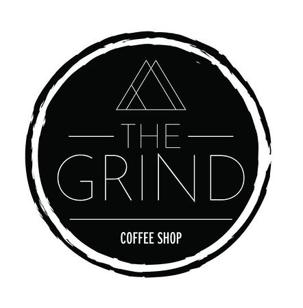
Week 4 - Found Object
While intentionally looking around at my surroundings of my everyday life, I happened to look for things that feature design elements that ignite a gut reaction in me. Something I came across, and used as an example in another class as “Bad Typography” was the logo of the Grind Coffee Shop on the University of Wisconsin-Milwaukee Campus. It obviously incorporates an element of design to reach an audience, but I just do not understand the methodology and thought process behind this design.

The typeface is interesting, as it seems it is a manipulated font to make it appear uneven and almost aggressive. The layout of the font is asymmetrical and the thickness of the letterforms do not match across the word. It appears jagged and cut up as well. I understand that with a name such as the “Grind” that the overall appearance of the logo should come on strong, but I feel as though this overdoes it.
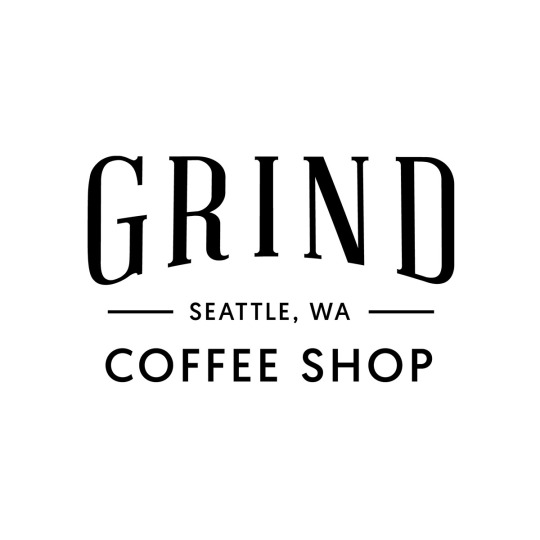
As I thought into this concept more, I figured that the “Grind” has to be a common name for coffee shops and is the name for coffee shops beyond the UWM campus, and I took it upon myself to research coffee shops in the world that also go by this name but have different logos or typefaces to represent their business.
Upon my finds, I found several coffee shops that also go by this name, but have logos that I found more visually appealing. I came to the conclusion that with a name such as “The Grind” that the logo and typeface should appear strong, definite, and straightforward while also maintaining legibility and cohesiveness, and the examples below proved my thought. These show the overall importance and prevalence of the coffee shop name without being overbearing, displeasing, and semi illegible. There is a simplicity to them that is not overdone or far too manipulated and can be enjoyed by all.

0 notes
Text
Week 3 - History of Design


As I read through the chapters that outline design history in certain places, I came across this historical art piece in the French Art Nouveau section. This piece is in great significance to me! I have known it since my childhood since it was hung up in the veterinary office that my dad worked in, and I always recognized it since as the “black cat picture.” In the past few years as I’ve been educated in art history I’ve understood the significance of this piece even more, and the recent reading further clarified it for me as stated in the notes I had taken on it to remember. Japonsime was a movement curated out of the Japanese art work presented at the Paris world fairs and was appropriated and influential in the Art Nouveau movement in France. It featured bold and flat colors that were asymmetrical in very clearly two dimensional spaces.


Furthermore, as I think of design history I think through the area of practical designs in the Milwaukee Art Museum as they have captured moments in history of design for everyday use and in industrial production. The chairs featured above are foldable chairs that were created for the purpose of fitting in the limited trunk space in cars in the early 20th century. There are materials featured through industrial production and were focused on solving a growing problem that people in the early 1920s began to face as they wanted chairs to become portable and be able to travel to new locations.


I wanted to observe modern design influence that spoke to me, solved problems or appealed to me in a way that was helpful, and looked visually pleasing. Throughout this experience I observed merchandise that targets a certain audience or demographic and I had found these examples while looking through the Milwaukee Public Market. These were featured at the Milwaukee merchandise booth and I had recorded my thoughts about how they appeal to the public methodically.

Lastly, I had remembered something that was appealing at an interesting restaurant that I had been to!


This was a restaurant with a progressive function, it had posted its menu on the wall and there were no physical copies of the menu. To me it showed the lack of waste and growth of interaction and adventure as customers had to take initiative in their own hands and walk to the front to order. It is a design that shows modernism in restaurant and social function. In addition, it shows a very visually pleasing menu that feels very hip with small illustrations and interesting hand lettering.
0 notes
Text
Week 2 - Design Thinking
After reading “Design Thinking” in the Harvard Business Review, I have an entirely different view on what design really is, and in my opinion I believe my understanding now is concurrent with the evolution of design usage in general. Previously, I thought of design as a purely creative process that one or a few individuals went through to create a product that was solely visually appealing. Now, I understand and would define design as an extensive process that is created in an innovative and technical way to solve a problem and produce an efficient outcome. To emphasize on design thinking in my life and how it is used in products that are familiar to me I’ll elaborate on the technology that I frequently use. I’m constantly working with my computer and phone and after reading “Design Thinking” I understand that there is a dedicated process behind the creation of these products. They are used by millions of different people worldwide who are a part of different cultures that speak different languages who operate about in their lives in many different ways. The designers behind these devices are required to imagine the process from many different perspectives to meet the needs and behaviors of their consumers which involves intensive collaboration to accommodate to all (Design Thinking). In addition, another aspect of design thinking culminates in the business aspect of major technology companies such as Apple or Microsoft. Business strategy requires design in the idea that there is need for a design method for marketing and other operations that work in an efficient manner to target their audience and help the audience believe that their needs are met by the company’s designs and developments. The most significant concept that I grasped from this is that design is not exclusively art, it is a method that is applied almost everywhere to produce efficient systems that work for people and help them work effectively and feel as though their needs are met.
0 notes
Text
Week 1 - About Me
My name is Marina Reifenrath and I am a sophomore in Peck School of the Arts majoring in Design & Visual Communication and Digital Studio Practice. I thoroughly enjoy design whether it be digital, analog, two dimensional or three dimensional. I have experience in drawing and other dry mediums as well as digital design programs and three dimensional modeling programs such as blender. My experience feels relevant to the evolving world and I am excited to learn more. I have been involved in art for a majority of my life and it’s a very important part of me! I feel drawn to design and am always looking to do everything I can to learn and discover more about it. I took this class as part of my compulsory design journey and to gain enterence into the Design & Visual Communication program, as well as to learn more about all kinds of design to better educate myself on what is out there. Things all over the place inspire me everyday: stories, people, images, places, the internet, games, food, drinks, etc. and I always act on what inspires me in an attempt to create something that feels right. I’m always looking for inspiration as well as I want to be exposed to designs and methods that could be important or purposeful to me. More often than not, I choose things with the intention of choosing the best design, and when it comes to buying goods, it’s a very important thing. It’s seen almost everywhere and a universal feeling to buy things that look the best whether it be clothing, food, supplies, etc., it almost seems like human nature to buy the things that look the best, and sometimes it’s beauty over practicality. For example, I purchased a pencil case off of amazon for mainly it’s design, and not for its practical use. There were others in the search results that were entirely more practical and had more space and storage, but in all honesty it was more important to me that it looked cute. It’s often a problem for me, but it shows how important visual design is to me!
1 note
·
View note