
I like minimalist front end design, candle lit dinners and long walks on the beach.
Don't wanna be here? Send us removal request.
Statistics
We looked inside some of the posts by marksleatorblog-blog and here's what we found interesting.
Average Info
Notes Per Post
2
Likes Per Post
2
Reblog Per Post
0
Reply Per Post
0
Time Between Posts
7 days
Number of Posts By Type
Text
17
Last Seen Tumblr Blogs


Fun Fact
China blocked Tumblr because of pornography and censorship problems in 2013.
Text
Merchandise #4 - Postcard
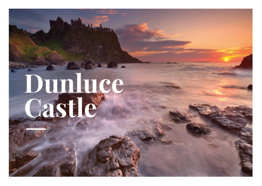
As I said in the last part, postcards have a traditional layout, while I still wanted to experiment I wanted to stick to this layout as much as possible. I spent sometime working with the composition, trying a few of offset styles that appear throughout my brand.
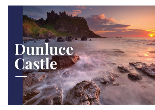
I thought that the demographic I would be reaching for would be tourists. Tourists can be of any age and so I thought I my design should attract the widest demographic, this is why I settled on the traditional postcard layout even though I quite liked the example with the navy bar down the side.
Another consideration was that now that I have been accumulating merchandise of the brand, the style was getting more defined and so future examples would need to fit within this brand and framework.
2 notes
·
View notes
Text
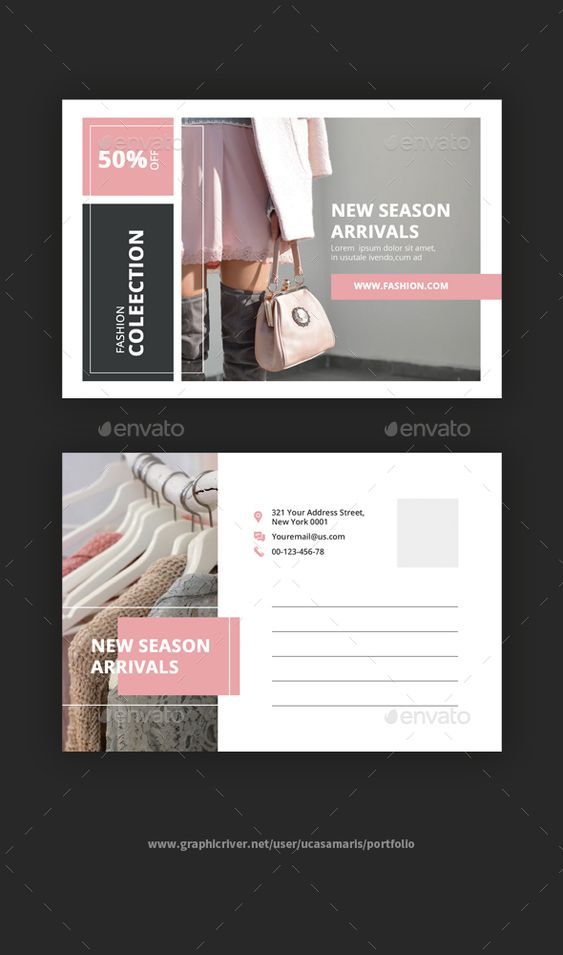
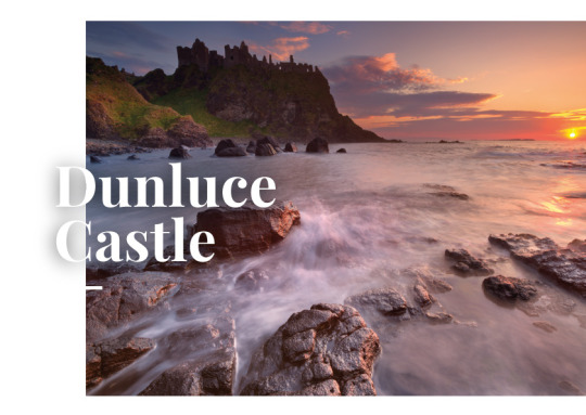
Merchandise #3 -Postcard


When it comes to postcard design there is a familiar template that’s been used for seemingly forever. I wanted to do something slightly different however I still wanted all the typical elements in place such as the stamp area in the top right hand corner and an area for someone to write a message.
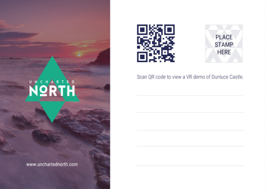
I actually struggled trying to fit all my elements into a layout that looked balanced and aesthetically pleasing. I look for inspiration by examining traditional postcards and looking for space to include a logo and a QR code. I even debated removing the traditional elements altogether as I’m not sure how many people actually still send postcards? But I decided to keep it in just in case, I quite liked the idea of a traditional postcard plus a gateway to a VR demo.
As you can see I tried out a number of different styles, but I eventually settled on the last example as a layout (which would get developed further).For the stamp area, I decided to take my arrow logo and repeat it to make this textured background.
0 notes
Text
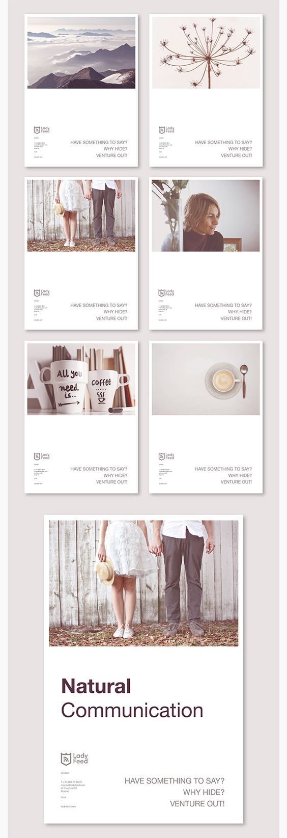
Merchandise Inspiration #2 - Leaflet


I initially wanted to do something different than a standard layout. I particularly liked the top example and I felt I could work with the Uncharted North arrow to make it fold out in an interesting way. However I felt for a first time leaflet I should get more familiar with the format first before experimenting. Also I had a restricted budget and any extra bells and whistles could raise the cost significantly.
Next I focused on my design for the leaflet, the third image has a similar style to my brand in certain ways. The overlapping text with the imagery and the unorthodox layout. While I was inspired by these examples, I decided to take a utilitarian stance on the design, as these leaflets are meant to function as a way of spreading word about my app. I felt these beautiful but chaotic designs wouldn’t be the best choice. As you can see from last two images I decided on something more traditional but still in keeping with my overall brand.
Looking back at this design, I wish I included a small description of each location to encourage the viewer to visit these locations or at least give them an idea of what to expect.
0 notes
Text
Merchandise Inspiration #1 - Leaflet


I’ve never had to design a leaflet before, so in order to get the ball rolling I read a few articles about the essentials. The article below proved useful and influenced my design ethic.
https://www.fastprint.co.uk/blog/how-to-design-the-perfect-leaflet.html
At first I needed to choose a layout, as you can see from the top image I had quite the selection. I tried a few rough designs but I eventually settled on one of the two layouts - Roll fold and a Tri-fold.
I knew one side would contain my 3 VR experiences and a QR code to access a VR demo. It made sense to have them altogether and so this realization left me with the roll fold as the only one left. One side would be the cover with a flap that folds inwards and explains how to access the demos, while the inside would contain the 3 experiences.
I looked at a few design ideas such as the ones above, however this was just to get my head into the right space to design.
0 notes
Text
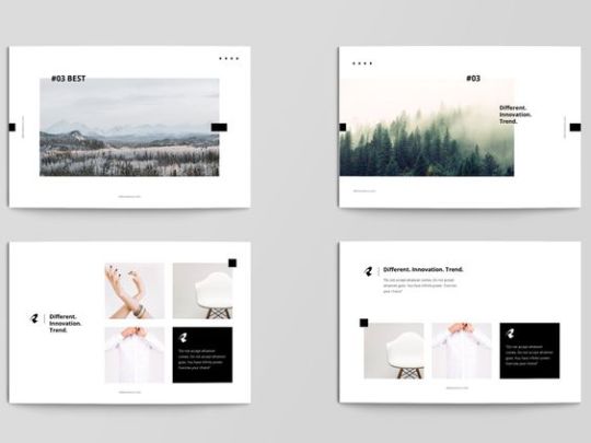
Colophon Inspiration #3
I wanted some “normal” pages throughout my Colophon. By normal what I mean is a 50/50 split with no overlapping elements. The design would be split with the spine of the book.
I was inspired by the above examples, I was inspired by their use of detailed imagery, mixture of serif and sans-serif text and the rather simplistic nature of the layout. Instead of adding elements like I did with previous examples, I started out with the bare minimum and tried a number of layouts. The key was for everything to be in harmony with each other and for the elements to be balanced, often this is the hardest part about designing for print or for web.
As you can see from the second last example, I just did a rough draft and then slowly added elements (such as the number design from my content page.)
Overall I am pleased with the result.
0 notes
Text
Colophon Inspiration #2


These are some of the examples that would inspire my Chapter Title pages. I loved the way in which the serif text would bleed into the imagery and I wanted to replicate this in my colophon. As I stated previous times before, I wanted to use unorthodox layouts and make it a key part of my brand. I basically had my brand designed I just needed to focus on laying everything out. Other than the texting bleeding into the imagery, I also wanted the imagery to go across the main spine of the book. It basically follows the “rule of thirds” in photography as shown in the husky image above.
The first iteration of my chapter title design has much more in common with my VR experience modules evidenced in my app. However I felt all the decoration around the imagery was superfluous and didn’t really add to the overall look and feel of the composition.
If I wanted to pursue my minimalist style I should go all the way. The last example was the one I settled on and I feel it is by far the best of the two.
0 notes
Text
Colophon Inspiration #1


For my Colophon I started by looking at examples of interesting book designs and ways in which I could get inspired and perhaps adopt some elements.
As you can see I was inspired by the above example “Run Before You Crawl” and particularly by its content page. I tried out a number of different styles. I originally tried to adopt this layout however after some experimentation I settled on the final bottom design.
Even though I had first tried to adopt this layout I settled on something that does look quite different but still bears some of the DNA of the original.
0 notes
Text
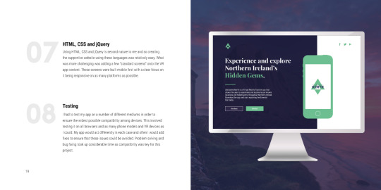
Uncharted North Website Inspiration - #1


The top 3 images were some of the designs that inspired my site (the bottom image). As you can see I took inspiration from their rather unorthodox layouts and way in which they segregated the websites.
I wanted my site to be modern, minimalist, brightly coloured and even slightly different or quirky. I really liked the mixture of a traditional decorative serif and a minimal modern san-serif as evidenced by some of the designs above.
0 notes
Text
App Inspiration #2 - Curved Menu

https://curved-menu-inspiration.glitch.me/
I had always intended to have a 360 curved menu however I was having difficulty in achieving this. The curvature of an object is measured by “theta-length” in A-Frame and it can be a dark art getting all the measurements exact and relative to each other.
By examining this example I was able to dissect the process needed to create my version of a curved menu.
0 notes
Text
App Inspiration #1 - Menu

https://menu-japan.glitch.me/
For my VR Tourism app I was mainly inspired by other projects that use A-frame. Unfortunately these are often hard to come by due to the relatively new creation of A-frame.
One such example that inspired me was the one above. I quite liked the hover effect of the images and it helped me raise the bar of my own app. It caused to start thinking about how things would interact with each other and all of the smaller animations between scenes.
While I decided to choose a different style compared to this example, for a number of weeks I was thinking of choosing this flat style of menu instead of the rounded and curved version I ended up with.
0 notes
Text
IXD503 + IXD504
Everything beyond this part is for IXD503 + IXD504
0 notes
Text


After looking at all this amazing flat design I decided to take the plunge and try another redesign. The DNA of this redesign consists of the above examples and below is my attempt at this style. I quite like it. Once again it requires more tweaking but I feel like I’m going in the right direction.
As you can see there is a similarity in the colour schemes, that is not an accident. I love the off kilter design and the overlapping of simple shapes to make something new. I could have brought the design further but I didn't want it to seem alien or unrecognizable to the viewer.Its like walking a tight rope between being adventurous but also being recognizable.
I feel like I will extend this aesthetic to the rest of the app to see the result.
0 notes
Text
VR Design Inspiration

This is another example that uses flat standard shapes in interesting ways. I also love the smooth interactions, it is hard to tell what elements within the page will move when you select them, but it keeps the viewer interested.
I like these seemingly random movements but it goes against one of the vr design best practice aspects I read earlier (Don’t redesign UI). Perhaps there is some happy middle ground here between the two.
Although I considered an animated logo, I have still not considered transitions for my VR app. I don’t want to be too extravagant with them as my A-Frame skills are still limited but its something that I will need to think about and develop.
0 notes
Text
VR Design Inspiration

I love this design aesthetic and had been edging towards this during my redesign process. I wonder how this would look in a 3D environment. As discussed previously if you gave each element a different distance would it look as good? I could imagine the text hovering over the imagery and with stereoscopic vision it might jump from the page. Perhaps add a drop shadow to exaggerate the effect?
0 notes
Text
VR Module Inspiration

This is another example that inspired my module design. Simple and flat, but the differing colours give each section a unique touch. Unfortunately the images I used didn't differ so much as the above examples and so I couldn't quite achieve the same aesthetic. This app was the first time that I tried to do “Modular Design” in which I would design each part separately and try to piece it together. I feel it works well when you are designing in a template style. I have 4 experiences that all follow the same design and so Modular Design made sense. However I have noticed that I need to go back and redesign and tweak aspect to give that full brand feel.
0 notes
Text
Logo Redesign Inspiration


Much like I was refining my app design I also felt it was time to develop my logo further as I wasn't entirely happy with it. It transformed from “voyager” to “Uncharted North.” I have included some examples that inspired this development.
As you can see I wanted a thick sans-serif font to reflect my brand however I wanted something memorable or something that would make it more unique than a standard word in a standard font. I got the idea of combining fonts to make something new.
This wasn't easy as the fonts had to be similar enough but yet still differ enough to stand out and give that quirky touch. The 3 examples above are what helped me solidify this concept. I liked the quirky nature of the underlined O in octavia and combined this with a sharper version of the fonts used in Up North and Celine. I’m not 100% sure of they are the same fonts however they certainly are similar.
I eventually reached the font combination as evidenced in the bottom image.

0 notes
Text
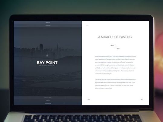
Information Overlay Inspiration


I’ve always been a fan of split screens and flat design. I wanted to continue the minimalist brand I had created within my Main Menu to other aspects of the app. You can see the progression I had taken with my information screen design, constantly refining it until I was happy with the result. (The top 4 screens). The top example is my final design. However I was originally inspired by a design aesthetic evidenced in the bottom 3 examples. As you can see I analyzed and took at the parts that I liked, but also changed and experimented with it to make it something truly mine.
0 notes