
Statistics
We looked inside some of the posts by marsrubyfulbrook and here's what we found interesting.
Average Info
Notes Per Post
0
Likes Per Post
0
Reblog Per Post
0
Reply Per Post
0
Time Between Posts
11 hours
Number of Posts By Type
Text
17
Last Seen Tumblr Blogs


Fun Fact
In 2020, Tumblr had 29.4 million users in the US.

Text
Insect Plushies - Research!


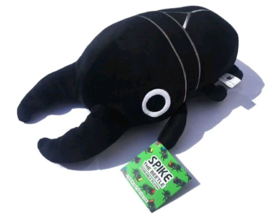
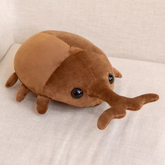
The cartoony versions of insect plushies are very endearing to me, I like when the spindly legs are changed into fat and stocky ones - the lack of visible eyes and the frankly absurd amount of legs on some insects gross me out a lot, so I think it's a good edition to them!
It helps that many insects like beetles, isopods and caterpillars are quite round in appearance anyway and people tend to like chubbier animals and stuff like that, so its easier to make them into cutesy plushies.
Certain types of beetles are also very colourful, so a large array of designs can stem from that.
0 notes
Text
Geminoids - Research!
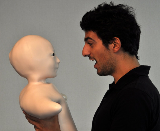

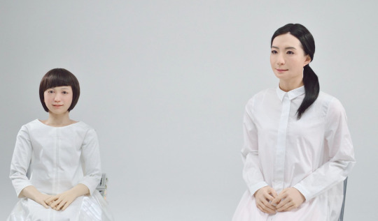
I absolutely hate the way the androids look, though I can tolerate the human looking ones more than the telenoids. You can't help but be shocked and bewildered by how great the technology is, though watching them try to behave like humans is utterly terrifying.
The way the telenoids move, the lack of definition in their faces and the lack of limbs makes them extremely jarring. While I think the more humanoid robots lack a depth in their eyes that you'd see in an actual person, the telenoids almost look like they have too much life in their eyes.
Due to the fact that their creators haven't changed the eyes to match the lack of definition in the rest of its model, it looks more like a person trapped beneath a layer of silicone.
0 notes
Text
Eric Geusz Spaceship Designs - Research!
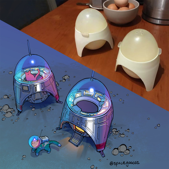
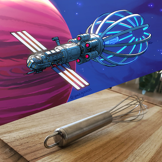

I really like how intricate all of Eric Geusz's designs are, the perspective and line art are both really well done and work well in contrast to the flat colouring beneath it.
His colour palettes are very bold and vivid, making all of his art look very lively. Despite the colouring for the main body of his ships being quite flat, he emphasises other elements that make it look more realistic (fire coming from the engines, highlights indicating glass, etc.)
0 notes
Text


Making Label for Plushie - Process!
Due to the fact that I’d gotten my label from home, it was decided that I wouldn’t be going through Illustrator to make one and I’d instead use a typewriter so that the writing would stay even and not wonky.
It was fun using a typewriter writer for the first time! I did several lines of writing to get used to it and to figure out how my name should be placed. My last name was too long for it to all be on one line, so I put it down a row and centred it.
0 notes
Text
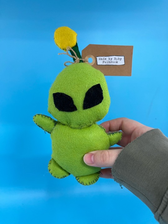

Alien Plushie - Outcome!
I'm very happy with how my plushie turned out, especially when I had lost hope after sewing the eyes on. I chose to not include the nose or mouth to my alien in the final result because I wasn't sure I'd be able to successfully embroider either onto it and pencil would look out of place on his face. The big forehead is what has made me the most happy, as it was the part of his initial design I liked the most.
However, there are many things I wish I could redo - like the antenna so it wouldn't be as wonky, using a singular stitch style for the entire plush to keep it consistent, maybe gluing on the eyes instead of stitching them on, etc. Though I think he's very cute, these things do annoy me and would be something to improve on for next time.
0 notes
Text


Making Plushie - Process!
I took my plushie home to work on because I feared it wouldn’t be finished on time if it stayed at college.
While at home, I filled him with more stuffing and sewed the gap in his head up. The first load of stitching looked more like he’d gotten a head surgery and had obnoxiously prominent stitches to help heal, it didn’t match the rest of him so I took it out.
I kept to the same sort of stitch but didn’t do it with as much haste and tried making it smaller, which doesn’t look as egregious next to the backstitching done for the rest of the head.
The next challenge was sewing his head to his body, as both were quite fat with stuffing and with the head so large, I didn’t want it to drown out the rest of his body.
It was a struggle to sew him together so I used a silky looking light green thread to help blend into his skin if his stitching ended up too messy, which definitely helps as I had done quite a few layers through the back in the fear that his head would be floppy.
0 notes

Text


Life Drawing - Process!
This was so much more enjoyable to do than when we used charcoal and graphite, I'm a lot more comfortable using a pencil and it makes life drawing a lot more enjoyable - which I hope shows in my process. The struggle was a lot less and I felt comfortable enough to shade some parts of the body, though the face was purposefully avoided just because of me not being amazing at scale and perspective.
I'm not confident at drawing hands, purely because of how easy it is to make them look sloppy and completely ruin your picture - I was mainly focused on the hands positioning and the arm length being correct, which is also something I do suffer from. Overall, it was a lot more enjoyable and is something I look forward to doing in the future!
0 notes

Text

Alien Book Cover - Progress!
While creating the book cover, I wanted it to look somewhat symmetrical so that it seems like it’d actually be put on a purchasable book. Inspired by what was posted on Google Classroom, the UFO and abduction is the focus of the drawing.
I found that after looking at the sketch, it felt as if the background was too baron and it felt overly simplistic. I added the house and fence floating upwards by the sidelines in the hope of it causing some interest or questions in the readers head, which would then inspire them to read the book.
Working with a restricted colour palette was actually quite fun, I find it quite irritating to figure out a colour palette for a drawing without it looking messy or too overloaded.
0 notes

Text
No Mans Sky - Research!

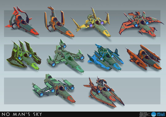
No Man's Sky doesn't stand out to me in any major way just based on the promotional art and the gameplay screenshots, though I do appreciate the use of colours throughout it all.
The landscapes in particular are very beautiful and I love how the colours compliment each other, though it's very unfortunate that the environments themselves aren't much special.
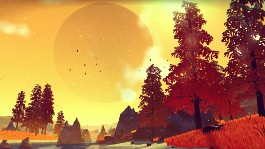
0 notes
Text
Dust Bunnies - Amanda Louise Spayd!
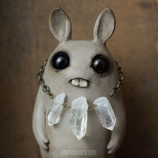
I personally wouldn’t seek out to buy any of these bunnies, just because the hyper realistic “cute” creature look really isn’t something I enjoy.
Aside from that, the concept of them as collectibles is good and very marketable - especially the fact that they’re different colours and different textures.
0 notes
Text
Love and Sandwich - Etsy!
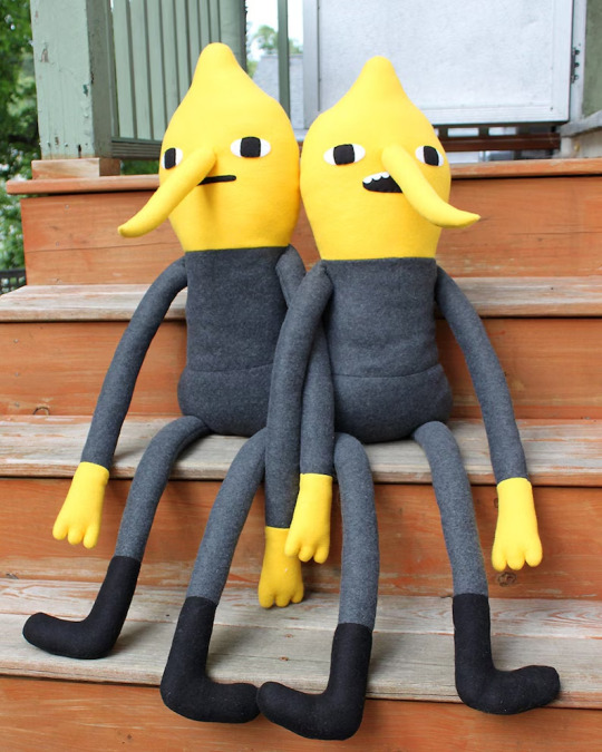


Her work is immensely professional, practically seamless and very consistent. I adore the simplistic look she takes with her work, making it easier to produce and consistently create.
They're also cute or made in the image of a beloved media (lemon grab, soot sprites, etc.) which gives her a specific kind of audience.
0 notes
Text


Alien Plushie - Process!
Stitching the eyes was so unbelievably frustrating, I'm sure they aren't hard to sew on whatsoever but I struggled with them a lot. They were redone around 3 times, which is more than evident when you see how fuzzy and uneven the fabric I used had become by the time they were sewed on correctly.
The eyes are closer together than the concept image was, which is upsetting when his eyes being far apart was something I really liked about the initial concept. However, with the way I struggled to even get them sewn on, the idea of redoing them again really put me off and I had convinced myself that it would all be improved by a lot of head stuffing!
0 notes