
Don't wanna be here? Send us removal request.
Statistics
We looked inside some of the posts by marszarafuller and here's what we found interesting.
Average Info
Notes Per Post
1
Likes Per Post
1
Reblog Per Post
0
Reply Per Post
0
Time Between Posts
1 day
Number of Posts By Type
Text
17
Last Seen Tumblr Blogs


Fun Fact
Women make up for the other 50% of Tumblr’s audience.
Text


As a smaller side idea I was told to make something along the lines of a “call girl”/prostitute sticker but in the form of an alien species to be stuck on the vendor shop front to exaggerate the dodgy and scandalous design. I found this particularly challenging because my skills in drawing full body people is awful. I have been trying to work on my proportions for quite some time and in the past have looked at a lot of tutorials. For the final fish girl I ended up using a grid guide to help with measurements and worked from a photo. I drew a couple of ideas out but was unhappy with a lot of them. Aidan helped come up with the slogan and the number placed on the design is something I found on google. Supposedly the number should ring to a rick roll but I don’t think it works. In my own time I like drawing things slightly inspired by comic books so i thought since I’m drawing out of my comfort zone I should do something I’ve done before.
0 notes
Text


This is the final project completed and put on display. I really like how this has come out and how displaying everything slightly unevenly really helped build the shop front as slightly dodgy and strange. I think from an outsiders perspective it’s probably a bit confusing as to what the purpose of the work is but having a range of pieces incorporate eyes, sticks and bags it made the design cohesive. Having the bagged pieces attached at the top together makes sense and reminds me of going to a fair and seeing cotton candy hanging. I think that my dice works well with the other non bagged items. I think what could have been interesting is if the board was spray painted with space like symbols to emphasise that it’s about Mars.
0 notes
Text


In addition to animated logo and website design I also had to research visual examples of food machine such as touch screen or vending machines.
Chris discussed several ideas surrounding fast food and how we receive and place our orders through touch screens. Highly emphasising Japans culture and influence on the development of technology since the country has had some of the greatest advances in the world due to its highly educated population. Japan’s knowledge within mechanics and computers could help push me in my project to think of ideas about what the fictional future of self service and dining could look like.
I think touch screens have become more of an expected device within fast food restaurants. Whilst looking at automated food delivery/ordering I came across a video where Lindt chocolate dispensed sample products for customers to try in a really unique way. Which I thought was kind of relevant to this.
0 notes
Text
As my project consists of making an animated logo it was beneficial to look at some examples:
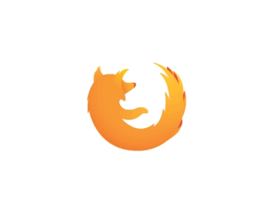


It’s notable a lot of these are circular designs that have a sort of spin to them. I don’t really know why but I presume it’s likely just easier to animate. When trying to think of animated logos Netflix was the only one I could come up with but after a bit of research I found out there were a lot more than I thought. I actually really like burger kings animation however in my design I think I took more inspiration from the Firefox in the way the tentacles within my design move.


My next step was to research some website designs for food. So I presumed this meant look into takeaway websites. Once again I think Burger King probably has the best design/style. Personally I think it’s because they colour their background and it just seems like they’ve taken more time into developing there website. The other examples are very similar in the way they just place a photo on the website with a white background.
0 notes
Text
https://sites.google.com/wsc.ac.uk/mars-bar
I’m happy with how this all came together and seeing everybody’s designs put together on the website looks really good.


0 notes
Text

Here I completed my website pages. Initially I did the design portrait but was later informed the design needed to be landscape as to fit the webpage format. So I just readjusted the text and image size. I didn’t have any thoughts about what the ingredients or snack would be so I decided that maybe that everything about it should just be unknown. I did consider linking back to the “trap” ray gun but I felt that photosynthesis is a bad ingredient description. Aidan helped name the snack “caseeno” to link the idea of casino dice and eyes. Having a name helped inspire the rest of the web page image for example the green background comes from a typical roulette table.
0 notes
Text
Charles Darwin’s On The Origin of Species, in which he writes of his theories of evolution by natural selection, is one of the most important works of scientific study ever published.Darwin’s theory argued that organisms gradually evolve through a process he called “natural selection.” In natural selection, organisms with genetic variations that suit their environment tend to propagate more descendants than organisms of the same species that lack the variation, thus influencing the overall genetic makeup of the species.Darwin, who was influenced by the work of French naturalist Jean-Baptiste de Lamarck and the English economist Thomas Malthus, acquired most of the evidence for his theory during a five-year surveying expedition aboard the HMS Beagle in the 1830s visiting the Galapagos Islands.
https://oll.libertyfund.org/page/darwin-s-historical-sketch-on-the-origin-of-species
From my assumptions I believe the initial response to the publication of Charles Darwin’s theory was taken quite negatively due to the fact it contradicted a large proportion of religious beliefs. (I think when I completed my gcse science i was taught a bit about his research and that it consisted of a lot of bird related information.) Evidently in his sketches he looks at a lot of birds from a variation of areas on the island in order to study the shape of their features. In particular looking at beak size and shape depending on what food was locally available to the birds to determine evidence of evolution.
http://darwin-online.org.uk/graphics/Origin_Illustrations.html


0 notes
Text


HR Giger was a Swiss artist best known for his airbrushed images that blended human physiques with machines, an art style known as "biomechanical". Giger later abandoned airbrush for pastels, markers and ink. He was part of the special effects team that won an Academy Award for the visual design of Ridley Scott's 1979 sci-fi horror film Alien.
https://www.artsy.net/article/artsy-editorial-nightmarish-works-hr-giger-artist-alien
In 2009 HR Giger discusses the design for Alien was molded from an early fascination with “skulls and mummies and things like that,” as well as mentioning drawing inspiration from his own nightmares/dreams. From my perspective the creatures he crafted are heavily representative of bugs and insects. With the hard shell of a beetle as Alien’s head however as for the rest of the body I definitely do see the link to skeletons in which the chest is crafted like ribs and exaggerated collar bones.
Similarly Guillermo Del Toro often draws inspiration from bugs to shape a character. I don’t think the features of insects are as obvious with Toro as they are with Giger. However in his movie Cronos it’s clearly inspired by a beetle. In particular an encrusted Maquech Beetle that were popular as living jewellery when Toro was growing up in Mexico.
The following link has a better explanation of the point I’ve briefly tried to make.
https://clarkesworldmagazine.com/grey_03_15/
0 notes
Text


Once again this has been a project where the class has individually been working on pieces where they will be brought together in this case onto a display board designed to be/look like a stall. With non edible foods individually designed to hang in bags or stuck on sticks to appear for sale. The board was kindly built and painted by other members of the class but I did help paint some of the screw/bolt pieces.
0 notes
Text
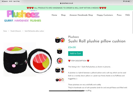
The following links display plushies made in the shape of foods with eyes which is basically what I will be creating.
https://www.kidrobot.com/collections/yummy-world
https://plusheez.co.uk/collections/cute-cuddly-food
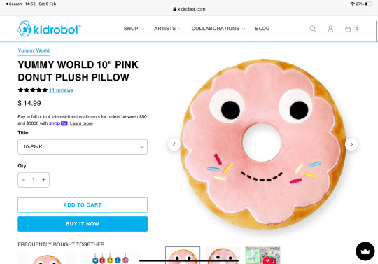
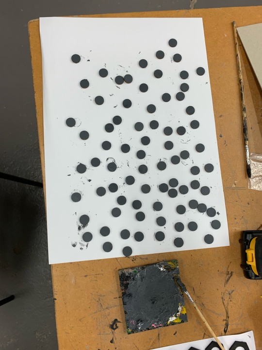
However will differ slightly as my plushy will be based on the “dice thing” (a very sophisticated term I will proceed to call my work) I drew previously. I think the website creations are too cute to be sci-fi inspired so I created my eyes out of super sculpey. This was probably the worst idea I had. It was incredibly time consuming and every time I tried sculpting an eye I was unhappy with it. Kyrstie helped show me how to make them more real by layering sculpey to build up creases and indents in the eye lids and sockets. I think in total I had made 42 not including the ones I scrapped and replaced. Once again never doing that again but after painting them up I was happy with most of them. Before making the eyes I had cut and sewn some red cubes which I actually liked doing and wouldn’t mind sewing again in another project.


Coincidentally during the time I was completing the plush work I saw a video on Instagram of a grocery store where every item was made with felt. Which apparently is a real place called “sparrows market” in Los Angeles. I believe it may have been created as an exhibition but I may have been reading the wrong article.
https://www.smithsonianmag.com/travel/los-angeles-grocery-store-has-31000-items-and-you-cant-eat-any-them-180969990/


0 notes
Text
Guillermo del Toro Gómez is a Mexican film director of films like Pan’s Labyrinth and Hellboy. In 2013 Del Toro released a book called Cabinet of Curiosities: My Notebooks, Collections, and Other Obsessions. The sketchbook gives a personal look into how Guillermo creates his stories and creatures through an archive of notes and sketches.
https://keyconceptsinmc.files.wordpress.com/2014/10/guillermo-del-toros-cabinet-of-guillermo-del-toro.pdf
From his sketchbook I thought it would make sense to look at a page called “Meat market” since my work has been about markets and food. Even though I haven’t watched Guillermo’s movies after taking a brief look at clips and images from Hellboy you can clearly see his input into the design and aesthetics of the sets and characters. From a glance I’m not sure what this page in particular is about but his notes are likely to give a better depth of what he wanted to create visually. I think how scruffy the sketches and notes are probably a representation of his work process of just getting every idea down before they are forgotten which is something I relate to as my thoughts tend to disappear as quickly as they arrive.

I also read that he would choose to sketch rather than take a photo for reference. Which I find kind of interesting since his illustrations are not necessarily a masterpiece so I would have thought it would be more difficult to display a concept to others with very rough designs. Or maybe it’s better since it helps avoid copying a real life source for something that’s supposed to be fictional.
As I mentioned you can see del toro’s notebooks influence in overall style but also impacted the props within the film. For example the Excerpt from the manual that describes how to operate the Cronos device was made by Felipe Ehrenberg to look similar to Guillermo’s book.

1 note
·
View note
Text
Inspired by my animation I created the wrapper paper (kraft wrap paper) with a repetitive pattern of octopus. Kyrstie said about drawing two octopuses so that it looked almost like movement. I really liked that idea so I completed one and used that as a guide to complete a second one where the tentacles shifted with closed eyes.


Throughout my work I’ve been incorporating a specific symbol. I imagined that it would be representative of either the stall or maybe the Tortuga planet.

0 notes
Text


Since cinema 4d is no longer part of the criteria, we were given a new assignment in which we would develop advertisement in the form of an animation. My idea for the “animated logo” strayed from the idea of the snack being snatched away. From this I thought about some ways in which this could happen but I was really set on using tentacles because I felt that hands grabbing it were to normal to be in the Mars project. I wanted the tentacle to wrap up around the stick of the snack but for me I find the process of animating really long and repetitive so I decided to cut the length at which the movement goes for. And in place of this I had the eyes blink and shift the “new” sticker back and fourth.


In my tentacle design I did try drawing in the suction cups but when I did I realised they looked a little strange and outer place even though in the real world they would have them. I think that because the project is Mars the creations are all fictional even though I may draw inspiration from real life I think it’s okay to not incorporate certain features which in this case were the suckers.
My choice to use octopus as a reference point probably strays from the fact that (according to the national geographic society) 80% of the ocean remains unexplored. Which i believe is similar to space due to the fact there’s so much unknown information that many theories and ideas can be formed. And with just some of the smaller discoveries of sea creatures it’s easy to build a gallery of strange creatures to develop characters/designs from.
0 notes
Text


Josh got us to do a little task of designing what the skeleton of inanimate object/foods would look like. I actually really liked this. I ran out of time so I didn’t bother giving the butter knife a skeleton but that was the original plan
0 notes
Text


I think the vendor and raygun looked a bit out of place so I went back and altered those.
0 notes
Text


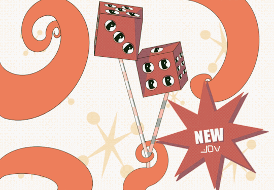
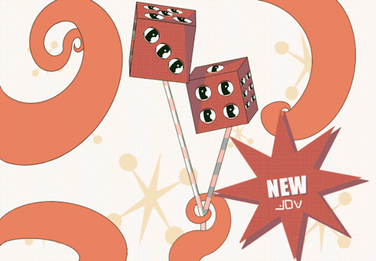
I had been thinking about my snack idea and I wasn’t feeling happy about it because it didn’t represent the retro appearance I wanted it to have. I went to Pinterest for some inspiration of how I could either improve or redesign the entire design. I ended up changing the eyes and making the design like Rubber hose animation. On my wackyraces blog I have a bit more of an explanation of this style https://zarafullerwackyraces.tumblr.com/post/669182014679859200/as-an-introduction-we-made-characters-from-two. I was looking at custom cars and saw an image of fluffy dice hanging from the rear view mirror and decided that this would be an interesting concept as food. So I redesigned my snack.

As I was looking for references for dice I read about the purpose of fluffy dice and from some online sources I discovered they were originally put up by pilots with the purpose of luck.
“During World War II, pilots would carry good luck trinkets with them aboard their aircraft. Gambling items like dice, cards, and chips were popular tokens of good luck because if they brought you luck at the gaming table, they could bring luck while flying a dangerous mission.”
0 notes
Text

This is my vendor Melvin. Initially I had started with the idea of chicken legs from there I decided that I should just have a full chicken to sell products. But I didn’t believe this was “alien” enough. So inspired by my first snack design I included multiple eyes. I ended up leaving the legs till last where I contemplated some alternate ideas such as hooves or paws but landed on human legs. Josh suggested I have different ethnicities as if the legs had been stolen however when I tried this it didn’t look right and made it look like an issue with shadow/perspective. Kyrstie mentioned that I should incorporate chicken like qualities such as the comb on the backs of the leg or just general chicken features. However I really liked the idea that the legs were stolen and that the limbs are exchangeable such as the eyes are just an excessive collection and are not necessary for sight.
0 notes