
Visual Communication student at Arts University Bournemouth
Don't wanna be here? Send us removal request.
Statistics
We looked inside some of the posts by martinafrancula and here's what we found interesting.
Average Info
Notes Per Post
1
Likes Per Post
1
Reblog Per Post
0
Reply Per Post
0
Time Between Posts
2 days
Number of Posts By Type
Text
10
Video
6
Link
1
Last Seen Tumblr Blogs


Fun Fact
Tumblr has a 66 index score for customer satisfaction in the US.
Text
Final evaluation!
The first two short projects: Will it blend? and Translate + Transform had been a really gentle and much needed introduction to this unit. I usually don’t like the one-week projects, but this time it was different. I didn’t put any pressure on myself while doing them and I enjoyed them quite a bit! Will it blend? project really pushed me outside of my comfort zone because illustration and animation are not my strong suit. However, since I was more focused on the growth and practice rather than the end result, I was enjoying it. I took the Translate + Transform project as a chance to research and experiment with something I’m passionate about - yoga. Although I knew the final outcome could have looked more polished, I was still happy with the overall project.
Moving on to the main project, when I first went through all RSA and ISTD briefs, I was immediately most drawn to the RSA’s long-term thinking brief. It seemed fairly difficult and I had no idea how to approach it. It was challenging to me and I liked that. Hannah suggested looking into speculative design and although my final outcome was not a piece of speculative design, this part of the process reasonably affected my approach and my way of thinking.
I was starting to realize that design doesn’t always have to be in the service of industry, it can also be in the service of society and that, as Dunne and Raby (2013, pg. 12) argue, ‘…separation from the marketplace creates a parallel design channel free from market pressures and available to explore ideas and issues’. This was a breakthrough for me because my relationship with design was always influenced by the pressures of marketplace, mostly because other than in university, I worked with clients and I am working part-time as a designer for an IT company.
The realization that design doesn’t always have to provide answers, it can also ask questions and that it doesn’t have to change the world to suit us, it can also change us to suit the world brought me a sense of freedom and excitement. I started looking at design differently. I was focused more on the process, than I was on the final outcome.
In this unit, I have spent much more time researching, thinking, contemplating, than I did making finishing touches to my design. This allowed me to have a mindful approach when designing the app and to understand my target audience much better.
My project has gone through many changes if you look at it as a whole. I started with one idea, which then developed into a totally different one. I had a lot of shifts and twists. However, when I settled on creating an app as the final thing, it went smooth from there. I only had some fine detailing to do.
When it comes to tutorials and feedback I got, I often felt misunderstood at my tutorials. I felt the tutors didn’t really understand my ideas and my point of view or what I was trying to convey. However, I am aware that having tutorials online and discussing ideas this way is not the same as having them in person. I guess it was just one more challenge to tackle in this unit.
In all my evaluations until now, I mention that the area of the design process in which I need more practice is the initial phase which involves structuring of the ideas. But this time, I really feel like I have made progress in this area. I believe it was because I gave myself time and space to research and contemplate without putting the unnecessary pressure of knowing what the exact final outcome will be. That allowed me to, again, focus only on the process and not what will come out of it.
I have learned so many things from this unit of study. The biggest one is the mindset shift I experienced, but some of them are skills as well. This was the first time I used Photoshop to create a video mockup. I was also able to use the knowledge I gained this summer while working part-time. I designed apps in Adobe Xd and it was useful because when I worked on ‘One small change’ I really knew my way around the software and that allowed me to express myself more freely and creatively which further improved my skills. When it comes to theoretical knowledge, I really enjoyed learning about speculative and conceptual design or design about ideas.
On reflection, there aren’t many improvements I would make to my final outcome, I only see room for expansion of the idea. For instance, including the power of social media to drive more people to use the app, or if I get to make the short film, ending the film with a call to action to use the app. Overall, this unit has been challenging for many reasons, but I can see the progress in my work and that matters the most.
1 note
·
View note
Text
Portfolio pages
I also created some classic, simple portfolio pages with mock-ups, as well as a page explaining the problem and the solution/idea in couple of sentences.

I wanted these two pages to have a continuous pattern in the background, so my final presentation can look cohesive and almost like an animation. I did this by taking the first image and mirroring it.


0 notes
Video
tumblr
Animated portfolio page ‘Learn’
I wanted to go an extra mile and create some really eye-catching portfolio pages and mock-ups for the app. Ever since I first saw examples of animated portfolio pages on Behance, I knew I wanted to create something similar for this project. I decided to create four pages, one for each section. Each page had a short description and a matching graphic in the background.
0 notes
Video
tumblr
I also wanted to create a mock up version of the prototype, I’m very happy with how this looks! :)
0 notes
Text
Abstract graphics
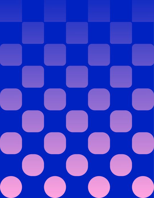
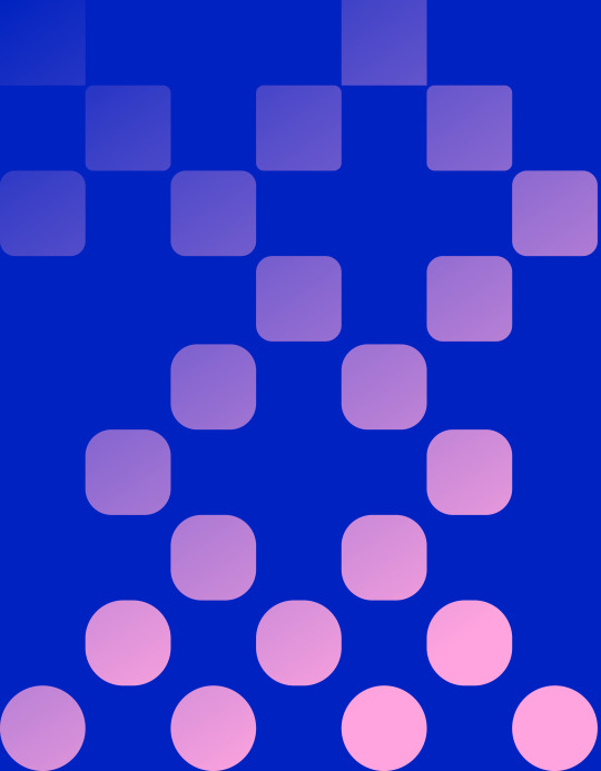
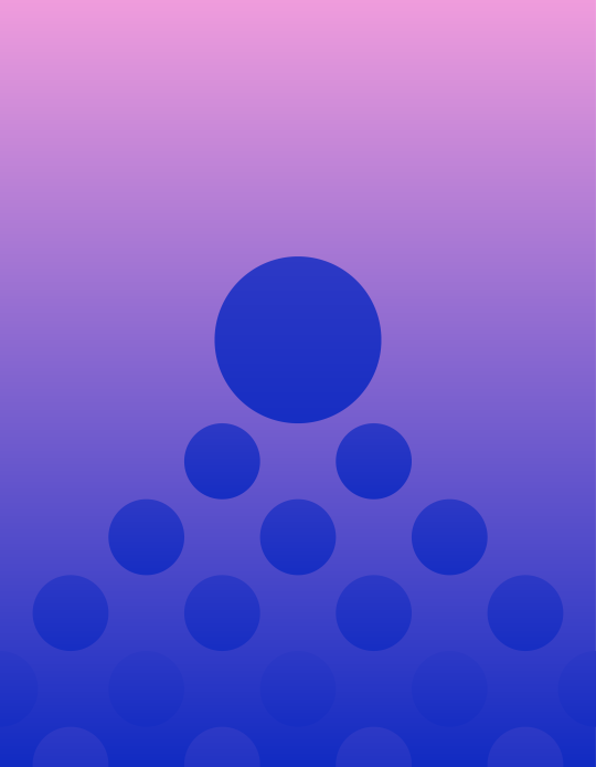
I wanted the graphics to look abstract, but still have some kind of symbolism. That’s why I kept the circle and the square shape.
For instance in ‘Evolve’ graphic, I wanted to show how a square transforms into a circle, while the ‘Connect’ graphic shows a chessboard that slowly converts from squares into circles.


0 notes
Text
The concept of the app
I knew I wanted to have four main parts of the app, now I had to make them work in terms of user experience and think about what would be most intuitive for the user.
At first, I thought that the first few screens could be showing the three main problems of the future, just to make people aware that we need change now. But when I continued to develop the structure, I realized it wouldn’t make much sense to have that first because people would easily skip over that.

I created a home screen where Lead, Evolve and Learn sections would be, while the Connect screen would be accessible through the menu at the bottom of the screen.

However, after my 1-1 tutorial I realized that this kind of home screen wouldn’t be the best solution, it would look overwhelming to the user and the illustrations can be barely seen so I have to find another solution
0 notes
Text
Illustrations
While figuring out the visual style, I was also thinking about the illustrations that would accompany the app. I knew I wanted some really simple illustrations for the Learn section. The topics are complicated and I wanted the user to feel as if it was the opposite.
Growing immigration crises:

A country of old people:

Rising sea levels:

0 notes
Text
Visual style of the app
As I was creating the app branding, I was simultaneously trying out different visual styles for the app. I was drawn to gradients and I wanted to keep the circle symbol so I tried out different ideas.


0 notes
Link
Visual Inspiration
I found this UX design on Behance by Valery Kasilin for an app called Out Loud. It has a really interesting concept, but what I loved the most about it was the presentation. It has animated portfolio pages and they all look seamless, like they were one long page. Also, the elements in the background are corresponding to what’s happening on the screen of the phone, which I also loved.


0 notes
Text
Branding / User Experience - Typography
For my logo and for the app, I chose the Gopher typeface family because I was intrigued by the reverse contrast and the boldness of the typeface. A typical contrast has thicker vertical strokes and thinner horizontal, but Gopher provides a unique look by switching that contrast.
I found that to be perfect for my aim with this project, because it offered something different, something new, some kind of a change to the mundane.


0 notes
Text
Branding - Final logo for the app
I decided to go with this logo because I wanted to keep some of the Croatian chessboard symbolism, but have a simple, contemporary logo to suit the target audience.


0 notes
Text
Branding - Progress
I continued developing the branding since none of the logos I created didn’t really work.
I played some more with the openness of the circle shape, contrasting it with the restrictions of the rectangular square shape. I wanted to convey the message that we should become more open to change. The symbol shows that when just one individual makes a change, the whole picture changes (chessboard made out of red and white squares).

0 notes
Text
Branding
I started to develop the branding for the app. Using the Croatian chessboard on our flag, I began with just moving one of the squares to express how we should move away from our closed and conservative culture.

I tried different fonts, I even tried writing the title by hand to get a slightly more playful look.
I made tiny variations to the title to try and illustrate the change. I kind of liked the pencil shape the letter ‘A’ was making when I rotated it. However, none of it really worked for my idea.

0 notes