
Last Seen Blogs

schwul-kat
Schwul
audity25
Your Favorite Onlyfans Girl. 💕
therovingrunner
The Roving Runner
diaperdragon1
ich liebe windeln aller Art😁

komansopng
제목 없음
Text

(تلخيص البحث)
عنوان البحث:
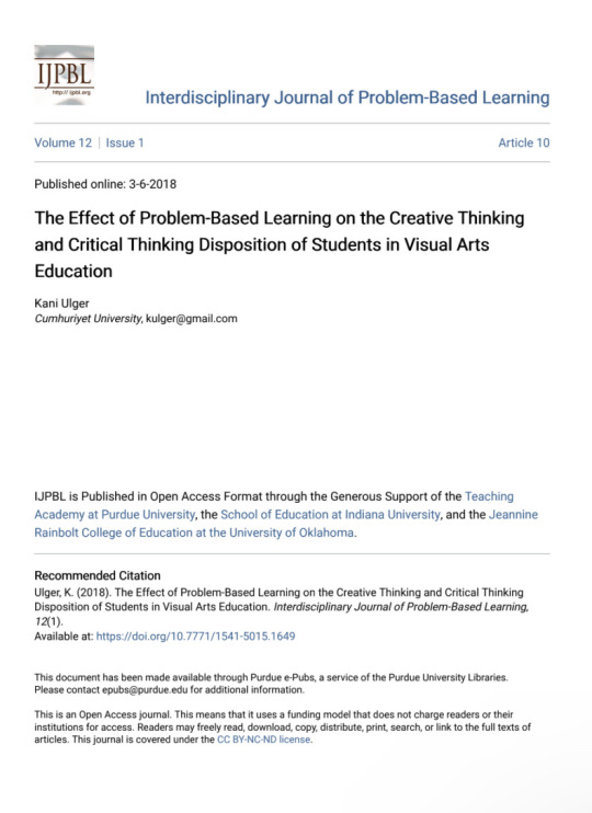
The Effect of Problem-Based Learning on the Creative Thinking and Critical Thinking Disposition of Students in Visual Arts and Critical Thinking Disposition of Students in Visual Arts Education Education
اسم الباحث:
Kani Ulger
عدد صفحات البحث: 21 صفحة
تاريخ النشر: 3-6-2018
تلخيص: مريم حسين أحمد خليفة
يمتاز هذا العصر بالتجدد المستمر في مختلف الأمور وجوانب الحياة، ومع كل هذه التجديدات تتجدد المشاكل حاملةً معها الكثير من التحديات والصعوبات، مما يجعل الحاجة لحلها مستمرة ومتجددة أيضًا وذلك بالطبع يتطلب كثيرًا من التفكير الإبداعي والنقدي. وتنقسم المشاكل إلى صنفان، أولها: مشاكل روتينية، وهذا النوع من المشاكل لا يتطلب حلها مجهودًا لتكرارها فيحلها من يواجهها بشكل تلقائي وآلي. ثانيها: المشاكل غير الروتينية، وهذه المشاكل تحمل جوًا جديدًا حيث تختلف عن غيرها من المشاكل بسبب عدم تكرارها، مما يجعل حلها يتطلب فكرًا إبداعيًا ونقديًا كبيرين. وعلى هذا الأساس يتحدث البحث عن تأثير التعليم بحل المشكلات غير الروتينية على طلاب الفنون البصرية من ناحيتي الفكر الإبداعي والنقدي كونهما مكملان لبعضهما البعض، حيث إن الفكر الإبداعي يعمل على إظهار أفكار جديدة، بينما يعمل قرينه النقدي على تقويم الأفكار وتحسينها وتطويرها من خلال الكشف عن نقاط الضعف فيها.
تعتبر كل الأعمال التي تُطلب من طالب الفنون البصرية مشكلة، حيث يعد إعداد شعار لجهة ما مشكلة لأنه يتطلب تضمين الكثير من التفاصيل منها: الرمزية، الاستعارة، التوافق بين الخطوط والأشكال، الوحدة، الاتزان، وتضمين الدلالات، الحركة، الجمال، الإيقاع، وغيرها الكثير من مبادئ وعناصر التصميم التي لابد أن يحتويها أي شعارٍ ناجح. وتعتبر هذه الأسس والعناصر والمبادئ علاقاتٍ يجب توظيفها في حل المشكلة هذه. وهكذا كان المتطلب الأول وجود مشكلة في هذه التجربة موجودًا. وتم وضع بعض المشاكل الأخرى و الموازنة بينها مثلًا: عدم وجود نص واضح وكون الخيارات مفتوحة ليشعر الطالب بعدم اليقين التام فتكبر المساحات التي يبحث فيها ولا ينحصر في مسافة معينة. حصل الطلاب في هذه التجربة حينًا على الإرشاد من المعلمين أحيانًا ولم يحصلوا عليه أحيانًا أخرى، بالإضافة إلى ذلك كانت المشكلات تتناول أو تدخل بطريقةٍ ما في ظروف العالم المتجدد مما يساعد على مواكبة التغيرات والتطور والإبداع في حلها. كما تضمنت تجربة العمل في الأستديو ضمن المتغيرات، كما تم تجربة الطريقة السردية في طرح المشكلات وغيرها من المتغيرات الأخرى، وتم ملاحظة الصفات والبيئات للمجموعات وللعمل ضمن جماعة وتأثيرهم على الفكرين الإبداعي والنقدي، كما تم قياس الفكر الإبداعي من خلال معايير عديدة أهمها: الطلاقة وسرد القصص، الحركة والفعل، التوليف والتوفيق، التصور العادي وغير العادي، الخيال، توسيع الحدود وكسرها، التعبير العاطفي، المهارات اللفظية. ووضعت هذه المعايير كونها تتفاعل مع الجانب البصري.
نتائج البحث وتوصياته والملاحظات: التعليم عن طريق حل المشكلات لطلبة الفنون البصرية يعزز بشكلٍ كبير التفكير الإبداعي كما أنه يعزز التفكير النقدي ولكن على مستوى أقل من الأول. المشاكل السردية تعزز من ذلك أيضًا. كما أن العديد من العوامل تؤثر إيجابًا على ذلك منها، العمل ضمن فريق: حيث يحصل التفكير النقدي في المجموعة قبل مراجعة المعلم الذي يأخذ دور المرشد ضمن هذه التشكيلة كما أنه ولتعدد الأفراد يتنوع النقد فيثري العمل ويزيد الفكر الإبداعي. العمل في أستديو أيضًا يشبه العمل ضمن فريق لكن بأعضاء أكثر إخلافًا فكانت النتائج أكبر أيضًا. وجود مساحة من عدم اليقين وإعطاء الطالب المعلومات الأساسية يعزز لدى الطالب مهارات البحث كما أنه يعطيه الفرصة في توظيف معارفه لحل هذه المشكلة دون قيود مما يتيح له مجال إبداعي أكثر، كما تم ملاحظة مجموعة من الصفات عند الطلبة والمجموعات الأكثر إبداعًا منها: المهارة اللفظية العالية، القدرة على المزاح والحفاظ على جو مرح حتى في الأمور الجدية، الإيجابية، وجود التشجيع اللفظي كثيرًا، المثابرة، بذل الكثير من الجهد، كما ذكرت ملاحظة وهي أنه وللحفاظ على التغير والنتائج الحاصلة لابد من أن تكون مدة التجربة طويلة نوعًا ما وممتدة. وتم تضمين توصية بتطبيق هذا المنهج التعليمي في مختلف البرامج.
@uob-funoon
3 notes
·
View notes
Text
(تلخيص بحث)
عنوان البحث:
The Effect of Problem-Based Learning on the Creative Thinking and Critical Thinking Disposition of Students in Visual Arts and Critical Thinking Disposition of Students in Visual Arts Education Education
اسم الباحث:
Kani Ulger
عدد صفحات البحث: 21 صفحة
تاريخ النشر: 3-6-2018
تلخيص: مريم حسين أحمد خليفة
يمتاز هذا العصر بالتجدد المستمر في مختلف الأمور وجوانب الحياة، ومع كل هذه التجديدات تتجدد المشاكل حاملةً معها الكثير من التحديات والصعوبات، مما يجعل الحاجة لحلها مستمرة ومتجددة أيضًا وذلك بالطبع يتطلب كثيرًا من التفكير الإبداعي والنقدي. وتنقسم المشاكل إلى صنفان، أولها: مشاكل روتينية، وهذا النوع من المشاكل لا يتطلب حلها مجهودًا لتكرارها فيحلها من يواجهها بشكل تلقائي وآلي. ثانيها: المشاكل غير الروتينية، وهذه المشاكل تحمل جوًا جديدًا حيث تختلف عن غيرها من المشاكل بسبب عدم تكرارها، مما يجعل حلها يتطلب فكرًا إبداعيًا ونقديًا كبيرين. وعلى هذا الأساس يتحدث البحث عن تأثير التعليم بحل المشكلات غير الروتينية على طلاب الفنون البصرية من ناحيتي الفكر الإبداعي والنقدي كونهما مكملان لبعضهما البعض، حيث إن الفكر الإبداعي يعمل على إظهار أفكار جديدة، بينما يعمل قرينه النقدي على تقويم الأفكار وتحسينها وتطويرها من خلال الكشف عن نقاط الضعف فيها.
تعتبر كل الأعمال التي تُطلب من طالب الفنون البصرية مشكلة، حيث يعد إعداد شعار لجهة ما مشكلة لأنه يتطلب تضمين الكثير من التفاصيل منها: الرمزية، الاستعارة، التوافق بين الخطوط والأشكال، الوحدة، الاتزان، وتضمين الدلالات، الحركة، الجمال، الإيقاع، وغيرها الكثير من مبادئ وعناصر التصميم التي لابد أن يحتويها أي شعارٍ ناجح. وتعتبر هذه الأسس والعناصر والمبادئ علاقاتٍ يجب توظيفها في حل المشكلة هذه. وهكذا كان المتطلب الأول وجود مشكلة في هذه التجربة موجودًا. وتم وضع بعض المشاكل الأخرى و الموازنة بينها مثلًا: عدم وجود نص واضح وكون الخيارات مفتوحة ليشعر الطالب بعدم اليقين التام فتكبر المساحات التي يبحث فيها ولا ينحصر في مسافة معينة. حصل الطلاب في هذه التجربة حينًا على الإرشاد من المعلمين أحيانًا ولم يحصلوا عليه أحيانًا أخرى، بالإضافة إلى ذلك كانت المشكلات تتناول أو تدخل بطريقةٍ ما في ظروف العالم المتجدد مما يساعد على مواكبة التغيرات والتطور والإبداع في حلها. كما تضمنت تجربة العمل في الأستديو ضمن المتغيرات، كما تم تجربة الطريقة السردية في طرح المشكلات وغيرها من المتغيرات الأخرى، وتم ملاحظة الصفات والبيئات للمجموعات وللعمل ضمن جماعة وتأثيرهم على الفكرين الإبداعي والنقدي، كما تم قياس الفكر الإبداعي من خلال معايير عديدة أهمها: الطلاقة وسرد القصص، الحركة والفعل، التوليف والتوفيق، التصور العادي وغير العادي، الخيال، توسيع الحدود وكسرها، التعبير العاطفي، المهارات اللفظية. ووضعت هذه المعايير كونها تتفاعل مع الجانب البصري.
نتائج البحث وتوصياته والملاحظات: التعليم عن طريق حل المشكلات لطلبة الفنون البصرية يعزز بشكلٍ كبير التفكير الإبداعي كما أنه يعزز التفكير النقدي ولكن على مستوى أقل من الأول. المشاكل السردية تعزز من ذلك أيضًا. كما أن العديد من العوامل تؤثر إيجابًا على ذلك منها، العمل ضمن فريق: حيث يحصل التفكير النقدي في المجموعة قبل مراجعة المعلم الذي يأخذ دور المرشد ضمن هذه التشكيلة كما أنه ولتعدد الأفراد يتنوع النقد فيثري العمل ويزيد الفكر الإبداعي. العمل في أستديو أيضًا يشبه العمل ضمن فريق لكن بأعضاء أكثر إخلافًا فكانت النتائج أكبر أيضًا. وجود مساحة من عدم اليقين وإعطاء الطالب المعلومات الأساسية يعزز لدى الطالب مهارات البحث كما أنه يعطيه الفرصة في توظيف معارفه لحل هذه المشكلة دون قيود مما يتيح له مجال إبداعي أكثر، كما تم ملاحظة مجموعة من الصفات عند الطلبة والمجموعات الأكثر إبداعًا منها: المهارة اللفظية العالية، القدرة على المزاح والحفاظ على جو مرح حتى في الأمور الجدية، الإيجابية، وجود التشجيع اللفظي كثيرًا، المثابرة، بذل الكثير من الجهد، كما ذكرت ملاحظة وهي أنه وللحفاظ على التغير والنتائج الحاصلة لابد من أن تكون مدة التجربة طويلة نوعًا ما وممتدة. وتم تضمين توصية بتطبيق هذا المنهج التعليمي في مختلف البرامج.
@uob-funoon
2 notes
·
View notes
Text


نبذة القصة:
تدور أحداث هذه القصة عن رحلةِ فُسْتُق مع عائلته، والتي سنتعلم من خلالها أننا نحتاج أن نطلب المسَاعدة أحيانًا ، لكن تُرى كيف سيتعلمُ فُسْتُق هذا الدرس؟ ومالذي سيمر به؟
@uob-funoon
8 notes
·
View notes
Text

Peoject 1 : Critical analysis and assessment of an Advertisement:
This advertisement promotes the purchase of sunscreen, this advertisement contains a lot of people who are sheltering in the shade of the sunscreen in the picture, which makes them protected from the harmful rays of the sun. That's a beautiful metaphor. We can read the design as follows, first we see the sunscreen, then the shade, then the people in the shade, then the background that contains greenery and the sea, then the small strip on the right. Since the first element that caught our eye was the sunscreen ,so the sunscreen is the most important element in this design . From my point of view, this advertisement is good because of several things: firstly because of the use of metaphor in it, secondly because of the clarity of the idea and the message, so the recipient does not need an explanatory sentence or someone to explain the idea to him, thirdly, the designer was able to use a lot of elements in the design without making the design crowded and Narrow, fourthly, the designer used attractive and vibrant colors in the design and suitable for the design idea as well
14 notes
·
View notes
Text

Project 1 : analysis a logo
The logo in the image is a text and an illustration. The illustration in it is a mixture between a footprint and a lamp, where the footprint indicates a step, progress or decision, and the lamp indicates a creative or smart idea.
The text in the design comes to clarify the idea in the illustration, saying: (Smart steps). The logo was designed in a very smart way for several reasons, the most important are: First, the designed logo combines two metaphors, second, the designer made the toes in the place of the light emitted by the lamp.
The data has been arranged in an ordered and balanced manner so that it is easy for the viewer to see and read the logo. The designer used the principle of repetition when he repeated the toes , He also used contrast in texts by bolding the word (SMART) and unbold the word (steps )and that gave the word smart more importance, The designer also used a color contrast, as the design consists of black and white, and this would make the design more clear. Based on what we mentioned, we can read the design as follows: 1- The illustration / 2 - The first part of the text (smart) / 3 - The second part of the text (steps). From my point of view, this design is very creative, especially that it can be placed on different backgrounds of different colors, but it contains something that distracts the viewer. When we look at the illustration we find a trace of one foot but the text does not tell us that, it is saying steps instead of saying step so I think it is better to replace the word steps with the word step
13 notes
·
View notes
Text
Project 1 : Interview 2
With Fatima Sadeeq Almadhoob / Visual Artist and a student in the university of Bahrain
A visual artist, studying at the University of Bahrain, majoring in art and design, loves to make small models and excels in them. She started her artistic career from a young age with the help and support of her father.
some of her works:


The interview:


18 notes
·
View notes
Text

Project 1 : Interview 1
With the calligrapher Hassan Zohaira .
A calligrapher who writes Arabic manuscripts, he started from a young age and is still continuing in this field, he studied at the hands of Professor Aziz Qassem in Diwani calligraphy and patchwork, and he also studied self-study to learn in this field and began studying ancient manuscripts .
The Questions of the interview :
What are the factors that affect the accuracy of manuscripts?
In your opinion, which is more helpful in doing an accurate manuscript, doing the work manually or doing it digitally? And why?
In your opinion, what are the differences between doing manuscripts manually and digitally? What are the unique features of the handwritten manuscripts ?
What are the unique features of the digital manuscripts ?
What kind of manuscripts do you prefer and why?
What do you think of ready-made templates for manuscripts in the computer? And can it compete with handmade manuscripts? And what are the things that need to be developed in these templates?
The link of the interview : https://youtu.be/hqwMzoyZZD8
Some of his work :


11 notes
·
View notes
Text


Project 1 : The Art Exhibition (On Wall 3):
The exhibition (on the wall 3) was opened on the 22nd of March and continued until the 24th of the same month in 2022, at the Bahrain International Exhibition Center under the umbrella of Interiors Exhibition, coinciding with the Gulf Real Estate Exhibition and the Gulf Building Exhibition. Many famous artists participated in this exhibition, including the artist Abbas Al-Mousawi, the artist Khalifa Shwaiter, the artist Ali Al-Fardan, Khalil Al-Madhoun and others. Among the participants were University of Bahrain students, such as the artist Noura Akbar, Zahraa Ismail, Mansour Yassin and others.. The exhibition was distinguished and full of life, as if it was a free workshop for the exhibition visiters. In all the days when the exhibition was opened, the artists were drawing live drawing in front of the public, allowing the opportunity to exchange information and experiences with the attendees and with the artists themselves, among the artists who They drew the live painting, the artist Abbas Al-Mousawi, Ali Al-Fardan, Elias Rasti and other artists, and what is remarkable about the exhibition is that it was not limited to the participation of the artists participating in the exhibition, as the exhibition's pioneers such as the artist Jassim Al-Maqabi participated in the live painting. This exhibition contained many wonderful works, but what caught my attention the most in the exhibition was two landscape works, one by the artist Hassan Al-Sari, and the landscape contained plants and one man in a field, while the second landscape was by the artist Abbas Al-Mousawi, and it was an old market And the predominant color on the painting was blue, both paintings were painted in the style of the Impressionist school. Of course, there were many other works worth seeing, such as Khalil Al-Madhoun's sculpture of the Camel, which contained Arabic letters. The exhibition was good, but it needs development in several aspects: First, this exhibition contains many angles that need to be clear and esay to see or to have someone guide the location of the paintings.we spenderd around 4 hours in the exhibition but we did not see all the artwork until we talked with the artists, they guided us to their works so we sew them afther a loge time in the exhibtion, and I do not think that everyone will spend this time in an exhibition. Secondly, there are no names for the works in the exhibition. From my point of view, the name and explanation of the work are considered an identification card for it. The artists will not stand near the work for only a days and explain the meaning of the work and its name, so there must be a work identification card bearing at least the name of the work.
9 notes
·
View notes
Text


Project 1 :
47th fine art exhibition of Bahrain
The 47th Annual Fine Arts Exhibition was opened on July 14, 2021 in one of the halls of the Bahrain National Museum in Manama. The first opening of this exhibition was in 1972 and it continues to this day, as every year it comes out with a new version, and in its 47th edition, 57 plastic artists participated in the exhibition, where each artist uses different tools and materials. The exhibition collected many works, including sculpture and drawing and more. This exhibition was supervised by the Bahrain Authority for Culture and Antiquities. When I visited the exhibition it was arranged as usual so that you can see the works comfortably and easily. Many works caught my attention, including the work of "Insomnia" by Khalid Waleed Al-Abbas. And the work ( The Time) by the artist Rawan Al-Hosani and the work (AlSouq) by the artist Abbas Al-Mousawi, but the most work that caught my attention was the artist Zainab Al-Sebaa, which is (Rather, you are days) . What is striking about the work of the artist Zainab El Sebaa is that it is movable, as it is a glass box containing sand and inside it is a sentence (Rather, you are days) and the box contains holes at the bottom, which makes the sand seep down. The sand in this work is similar to sand in an hourglass and indicates age and it permeability. The work of Zainab El Sebaa won the Audience Award, as it won the admiration of many, and I was among those who admired this wonderful work. The exhibition was worth a visit, but unfortunately it ended, however, and fortunately we can still see the works in a brochure on the website of the Culture and Antiquities Authority, you can see the works where I put the link below in the next slide .
9 notes
·
View notes
Text

Project 1 : critical analysis and assessment for a logo
This logo consists of an illustration and text. The illustration is a coffee bean with a house in it. Smoke comes out of the house from its chimney, splits the coffee bean in half, the coffee bean may look like a sky cracked with smoke, the text is two words (coffee house), the illustration is clearly more important than the text because we see it first and because it occupies more space in the design. In the illustration, the rising smoke may represent the smoke from brewing coffee, and the length and slit of the smoke cloud to the sky may indicate the strength, taste, and aroma of the coffee, and this will support the logo. The designer used a color contrast, as the design consists of black and white, this should make the design more visible. There is also a contrast in the texts where we can see the coffee text more clearly than the word house because it is written in a larger font and this gives the text a type of contrast that is used to clarify the most important elements of the design. From my point of view, this design is good because of what we mentioned earlier, especially that the illustration is a face that may mean a lot, and this design can be applied to different backgrounds in different colors comfortably, and this gives it more strength, but the design contains a small problem, which is that the word house is smiley so that it is difficult You have to read it
7 notes
·
View notes
Text

Project 1 : critical analysis and assessment for an advertisement
This ad promotes the purchase of pillows, Many people use sleeping pills to have a comfortable nap, and this ad comes out to say that you don't need pills, you need to change your pillow, and in the illustration, the pillows were placed in the pill wrap as if they were the cure for the problem of comfortable sleep. The main element of this ad is the illustration, where our eyes fall on it first, and then our eyes fall on the leaching that exists, not just pills and a pillow, and then our eyes on the word IKEA . The designer used repetition in the pills saver. I think that the designer has chosen the background, as the blue color gives a feeling of comfort and lightness . From my point of view, this advertisement is good. There are several reasons: First: the use of metaphor, because it initially communicates the idea of a large volume of messages with as few words as possible. Second: because of the good selection of the background color and its consistency with the design. Third: Because of the simplicity and balance of the advertisement, as it does not contain many elements that make the advertisement crowded (the best of words is what is less and denote).
11 notes
·
View notes
Text

Project 1 : Workshop 1 , with the artist Robert Burridge .
In this workshop, the artist started by talking about the color composition and the importance of choosing it. He talked about the color circle, and that there are many different color circles that help to choose colors in an attractive way.
In the color circle, the artist chose the following colors: orange as the center of interest in the drawing, megwnta and yellow-green, to paint them around the center of interest at 5%, and blue for the background, and as we note that these colors contrast with each other, so the result will be bright and striking eyes
He started by drawing with paper and brushes and the four colors that he chose from his color circle, which contains only 10 colors. These colors were acrylic ink. He used the color gradients of the colors and added white to them to change the color tone, and the result was wonderful, because the colors are vibrant and active and It attracts a lot of attention, and this is how the artist explained to us the importance of choosing color and metaphorically using the color wheal
https://youtu.be/CNUwBUGl-PA
youtube
11 notes
·
View notes
Text

Project 1: Workshop 1 , with the artist Robert Burridge:
In this workshop, the artist explained how to draw an object with a reflection of light on it in a dark place, as the artist explained the gradations (value) and the (value scale) and how this scale starts from 0 until it reaches 10 and how it is employed in painting
The artist began by taking a white paper and placing a middle color on it so that the degrees become clear when placing the colors on top of it.
Use a dark background behind the place the light falls and a light background in the place of the shadow on the ball. This makes the shape start with light dark and then light dark, and gives the shape a three-dimensional shape
The artist mixed the colors in a light way in order to keep the brush strokes clear in the drawing, after that the shape became a ball that reflects light on it, (in this painting he used white and worse), but as soon as he finished he turned it into a yellow ball inserted behind it a blue background, and all this depended on On the scale that we referred to earlier, and after that he applied the same plan on another body to show that this plan is the beginning of mastering this process in the shape of the circle and understanding the reflection of light on it helps to understand the reflection of light on differently shaped bodies .
https://youtu.be/s7rNABusu5s
youtube
11 notes
·
View notes
Text

Assignment 6 :
Using the principle Emphasis
20 notes
·
View notes
Text

Assignment 5 :
To get a redesigned logo to redesign it I go out and photograph the different logos to choose from and after taking pictures I came home and noticed the things that needed to be changed in the logos and then chose the one that needed more change in my view. Next, I jotted down the negative and positive points, the strengths for maintaining them, and the weaknesses for changing them. The strengths were in the clarity of the font, the simplicity of the logo, and the fit of the logo colors with the idea of the project. As for the weaknesses, the line was natural despite its clarity and that the illustration was not related to the idea of the project as it was not clear. Then I started thinking of ways to keep the simplicity of the form and convey the idea of the project, and I started to imagine what if the brackets were something else? The number of braces was 2 and the beneficiary of the project was 2 the mother and her newborn, so I wondered what if she made the mother and her newborn braces? I started working on Illustrator by adding some changes to the main logo, and changed the look of the text
19 notes
·
View notes
Text

Assignment 4 :
First,I researched the designs that were implemented in this topic previously, for two reasons, the first is to not repeat an idea previously implemented, and the second is to get some visual feedback. When I finished, I started searching for a suitable set of images and started imagining the possibilities of adding a cartoon to the image. I found among the pictures the picture that holds the lighting, and the possibilities that can be applied are: (a person who studies or reads under lighting) (a person who fixes a toy under lighting) (a person who sleeps under lighting) and I chose the last idea.
@uob-funoon
15 notes
·
View notes
Text

Assignment 3 :
First, before embarking on the design, I researched the designs that were implemented in this topic previously, for two reasons, the first is to not repeat an idea previously implemented, and the second is to get some visual feedback. When I finished, an idea didn't cross my mind, so I decided to write random words to give me an idea, what I wrote (Binoculars/Broom/Ladders/Transducer) and that method didn't work either. So I decided to write the characteristics of the code, (this code is a code with information inside, we can often find this code in purchases, since most of the information is about the price of the product, the country of origin, and other information. In addition, we often see the special code With food, we consume it daily, so this symbol often carries nutritional information as well), and then I wondered, what if the symbol was a thing, what would it be? Then I had the idea of a pregnant woman with money and some information. The woman is the symbol. Carrying the code for the price of the product and some information about it is the same as carrying a woman with the coin and information about it. There is also a similarity between the code and the pregnant woman. The code is not yet known. Scan it, and the pregnant woman does not know what she is pregnant until after doing an x-ray, that is, scanning.
@uob-funoon
19 notes
·
View notes