
Statistics
We looked inside some of the posts by matkinsarts102-02 and here's what we found interesting.
Average Info
Notes Per Post
0
Likes Per Post
0
Reblog Per Post
0
Reply Per Post
0
Time Between Posts
14 days
Number of Posts By Type
Text
17
Last Seen Tumblr Blogs


Fun Fact
12.7% of mobile users access Tumblr.
Text
V+V Final blog reflection
Although this class did not have many projects this semester, I found it to be a very difficult but rewarding course. My crafting skills were truly challenged, as well as my creativity.
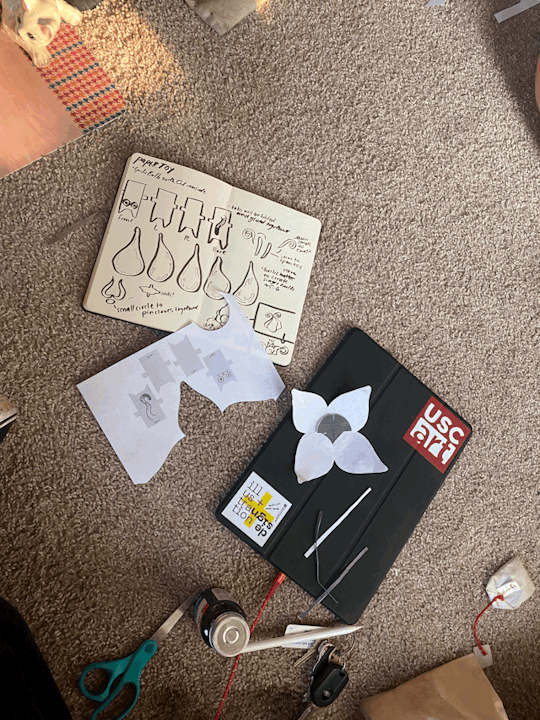
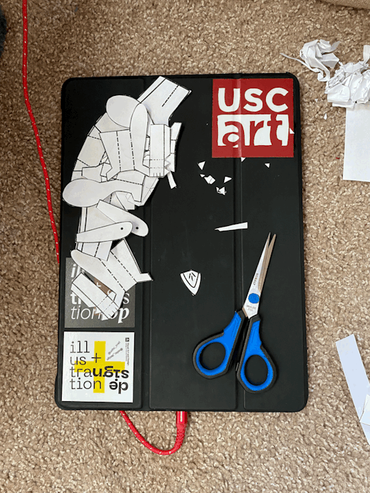
PAPER TOY
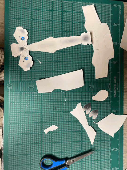
For our first project we were assigned to create a paper doll. I had never folded anything like the examples in class, and am use to creating in a 2D workspace, so I felt quite lost. My original idea was to create a small paper cat inside a large folded paper head of garlic, to symbolize my own cat, whose name is Ajo. (Ajo is the Spanish word for garlic). The prototyping for this idea was quite easy. I was able to draw a few ideas that looked foldable. I would print them, cut them, and fold them, but was never able to get the shape I wanted for the garlic head. My most successful attempt was a box-character cat around 1 inch tall and a quadrant petal cut out that folded together to create a structure around the cat. It held together by tabs cut into two petals.
I liked the idea, but didn't think it was very fun. I started over and started focusing on just the cat. I sketched multiple body parts, printed them, and folded. I failed a lot at this stage, but was finally able to get something that resembled what I was after. I made final tweaks and started working on the final result. I digitally rendered my working sketches, added a few touchups, color, and fit the pieces onto two sheets. I printed the cat onto thick paper, which was a struggle to cut and fold. I had to use glue, which interfered with the look of my project. If I had to redo the toy, I would make sure to use thinner paper, be more careful with adhesive application, and not include dotted lines in my final design.

MAGAZINE
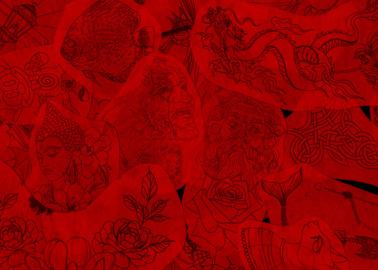
I chose to do a magazine about tattoos. I enjoyed my topic from start to finish, but had a hard time getting inspired for content and design. I began with the idea of an 8x8 square magazine with heavy black and white imagery. However, I had a hard time working from this idea, and got "stuck" while trying to think of ways to make the magazine experimental. In the meantime, I traveled to take pictures of a tattoo shop my friend works out. I knew that I wanted to incorporate a lot of photography into my magazine, and figured that taking pictures would put me in a better position to get ideas than continuing with content layout. At the shop, I got a lot of good pictures, and was also able to pick up some tattoo stencils to serve as my found object. I would later scan these stencils and overlay color on photoshop so that they could serve as my end pages. (The ink on the stencils transfers very easily and has a hard time coming off, and I didn't want to risk loosing my final product).
After getting photographs, I worked on illustrations. I started working on a tattoo flash page of multiple designs to go in my magazine. I had wanted to make a usable tattoo sheet, but abandoned this idea pretty quickly. I also did content research and designed a few spreads. Things still were not looking right.
My PC died and never recovered a few days before the magazine's due date. Luckily, I was able to access a PDF file of my magazine to look at as reference, but decided to start anew and untether myself to my existing ideas.
I spoke to a professor who told me my 8x8 looked like "a museum dedicated to tattoos" and I didn't want it to be seen that way. Adopting new font choices, trading all-black backgrounds to white, cutting down on text, and changing the size of my magazine made all of the difference I needed. My photo spreads looked much more impressive, and content pages looked generally cleaner with more breathing room. The size change also gave me the opportunity to work with hand-rendered font which was something I had wanted to create with my process book last spring. I swapped out the flash page with playful illustrations to contrast the quite serious photographs. I think tattooing as an artform is quite diverse in the first place, as pieces can range from silly and playful, to serious and detailed; it's not limited to just one perspective. I found I wanted my magazine to reflect that, so that it is more susceptible to a variety of audiences who have an interest in tattoos.
After getting over the hurdle of printing, I was very pleased with how the magazine turned out. Crafting it was terrible on the first one, but much better on the second. Cutting bottom to left corner and scoring before folding is the way to go.
This is the first project that I have an interest in revisiting. Here is what I would change:
add a statement of intention that shares my interest with the audience.
be more conscious of word spacing, and font size (could go a hair smaller)
utilize photoshop to enhance images for more drama
explore different binding options
be more conscious of gutter size for binding
making the cover a different paper type would be intresting
not leave it out where my cat can take a bite out of the good copy (It was double wrapped in a bag, so I thought it would be fine).


POSTCARDS
I really enjoyed using the RISO machine! It was difficult at first to figure out, but I loved the look of my end result. I got a lot of compliments. I would like to use it in the future for some of my projects.

0 notes
Text
V+V November 3 Blog
This week’s blog was on “Conversations with Designers”.
When Carin Goldberg said “I usually work on insanely short deadlines, so there is no time to get into any kind of mood other than a bad one. Usually, I panic and go into idea over-drive. I sketch like crazy until something clicks, and then I work like a maniac until I design something I’m happy with.” That really resonated with me. Reading through other designer’s creative processes made me feel better about my own. Often times, my ideas come very sporadically without planning. Sometimes these ideas turn out to be better than the ideas that I sit on and wait for inspiration to come to fruition. It feels good to know that I am not the only person who’s creative process works like crazy. In the editing segment, I really enjoyed what Ben Kiel had to say about his typographic editing process. He said a bulk of the editing process comes from research, sketching, and investigating into what the client wants. Then, it comes down to experimentalizing. What fits the space and what doesn’t? He also mentions gut instinct for working with clients, and going for what the artist thinks will fit the particular client’s needs.
0 notes
Text
V+V October 13 Blog
This week, our reading was on How to Create Form: Form vs Concept, Physical Thinking, and Alternative Tools. I enjoyed the case study for Physical Thinking; I thought that creating 3D forms out of written poetry was really cool, and I enjoyed reading about the progress. I want to start creating more physically, outside of a computer. My pdf of the textbook did not include Form vs. Concept, or Alternative Tools, despite them being listed in the TOC.

0 notes
Text
V+V October 5th Blog
This week, our reading was on How to Create Form- Sprinting, Alterative Grids, Kit of Parts, and Brand Languages. The book defines “sprinting” as thinking outside of the box of your usual design choices to help with the process of creating new things, but moving quickly onto something else. According to the book, “. Each concept becomes less precious and easier to explore and then discard.” Alternate grids is applicable to our magazine that we are working on right now in ARTS 345. Our professor is encouraging us to explore grid structures that are experimental, in order to take our publication to the next level. I personally really enjoy experimental design, but have a bit of a blank when trying to create something. I will come ack and reference this chapter. I didn’t really understand the Kit of Parts segment, but enjoyed reading the case studies for the section.

0 notes
Text
V+V September 29 Blog
This week’s reading is on How To Get Ideas: Rhetorical Figures, Icon, Index, Symbol, Sandboxing, Co-Design, Visual Diary, and Lost in Translation. I had learned about Rhetorical language in my many English classes that I had taken, but never thought that the concept could apply to images as well. The textbook uses the chairs as a case study example, and shows how adding personification, allusions, and metonymies can help viewers and designers alike understand a problem and solve it outside of a simple solution. Icon, Index and Symbol page taught me a new definition (Semiotics, the study of signs and how they work).
An important element of design that I have learned before even reading the ‘Sandbox’ segment is that individuality in group projects will often not yield successful results. It takes a village to raise a child, and it is the same for projects that require teamwork. One idea will not propel the entire project. The Visual Diary segment hit a chord with me. I recently started to journal for my metal health and to keep track of my day to day activities. Often, I find myself doodling in the margins, or taking up pages to draw silly pictures. According to the text, "Designing something new everyday can be as healthy for the creative mind as eating fruits and vegetables is for the body.” I like that. I’m going to write it and put it on my wall.

0 notes
Text
V+V September 22 Blog
This week’s reading is on How to Get Ideas: Visual Brain Dumping, Forced Connection, Action Verbs, Everything from Everywhere. For a long time, visual brain dumping has been my go-to for getting my ideas for a project down on paper. I have been doing this for years, and my sketchbook is a testament to it. I really enjoyed learning about Everything From Everywhere this week. It inspired me to pay more attention to my surroundings, and record what I see. I very recently redownloaded Instagram for the first time in years, with the intention of starting an art page. Following different art accounts, even if their style isn’t my personal taste, is a good way to stay inspired, and I thought of this example while reading Everything From Everywhere chapter. I even think pasting clippings from print I find into a new sketchbook would be taking from this chapter, and keep me inspired for my next project.

0 notes
Text
V+V September 14 Blog
This week our reading was to finish Chapter One, “How to Define Problems”. The sections we are reading are Brand Matrix, Brand Books, Site Research, and Refining the Creative Brief.
Sections Brand Matrix and Brand Books go hand in hand. Both are used to study and understand a brand better to create successful marketing strategies. Tea prototypes were used in the case study for Brand Matrix, and it became easier to understand how this ‘device’ can be used to break down the desire that a certain company holds to cater their product to a certain audience. Brand Books was a design strategy that I had never heard of before or even considered. Bringing a brand to life (ie text + illustration that conveys the brands’ personality and mission with their project) could be very helpful to members inside and outside of the company.
I recently had a friend who obtained an internship at the South Carolina Statehouse, and brought to my attention that there is an interest in creating a mural on one of the sides of the building. If I were to gain access to this project, Site Research could become very important. The Creative Brief would also be helpful during this hypothetical process, as the designer and client need to stay in frequent communication to ensure that the product lives up to both party’s expectations.

0 notes
Text
V+V: September 8 Blog
This week’s reading is on How to Define Problems: Brainstorming, Mind Mapping, Interviewing, Focus Groups, Visual Research; Chapter 1.
Brainstorming and Mind Mapping seem very similar from the reading. Both are all about “attacking” a problem with lots of ideas, in the hopes that some of them stick, to induce a probable outcome. I had heard of and was familiar with brainstorming long before I read this chapter. We used to have to do it in grade school, and it’s integral now as a Graphic Design student. However, I had never tried “mind mapping”. These two terms serve the same purpose, just in different formats. When I personally brainstorm, I like to make lists. As someone who enjoys illustration, I think that incorporating an illustrative version of mind-mapping may help my creative process.
I have also utilized focus groups before, without knowing the term for it. Often, when I have ideas brewing for a project, I like to gather friends and associates together (a mix of people who are not studying art or graphic design and those who are) to pitch ideas to. These sessions tend to be very helpful. Friends will most definitely let me know if they think an idea will work or not, and I take their opinion into account while moving forward.
Currently, I am using almost all of these methods (aside from interviewing) in another class, Verbal Interaction. For Visual + Verbal Interaction, I am only in the Visual Research and Brainstorming segments of my magazine project.

0 notes
Text
TYPO I: MAY 24
TEXTBOOK: Today’s reading was on designing typefaces. I enjoyed looking at the process of designers’ hand-drawing out their typefaces. Creating typefaces has always been a strenuous task, even today. For 500 years, typeface had to be set and created manually, and it wasn’t until the introduction of desktop computers that creating typeface began to be accessible to everyone. COURSE REFLECTION: this course has flown by in the past three weeks. I have had a lot of fun, but have also faced many challenges. One of which is my craft. I knew this was a struggling point before, but this class has really highlighted on it. In the future I plan to take more time, and not rush my own creative process. This class has also pushed me as my abilities as a creative, and has opened new doors for what I know I am capable of.
PROCESS: Today is our last day of the Maymester. Out of all of our assignments, the last rebranding one was my favorite. It provided challenges for me but also gave me the opportunity to stretch my abilities as a designer and illustrator. I really enjoyed creating mockups for this project. This was the first time that I was able to create my own mockups and I was really pleased at how they turned out! Creating a label for my nasal spray was the most fun, but creating my mural was also great fun! I struggled the most with my secondary logo and getting it just right, but overall I am proud of my work and the cohesiveness of the redesign. I had shown one of my friends who is in the USC pharmacy school my work (specifically the nasal spray) to see what she thought, and she said “Wow! That looks like something I would see on the shelf at Walgreens!”

0 notes
Text
TYPO I: May 23
TEXTBOOK: Today’s reading was on Editing. Editing my pieces has been a struggle for me since I started tis class. Often times, I will look over my work and fix all of my mistakes (well, I think I do) but there’s always a pesky something left that I have missed. Going forward, paying close attention to detail is going to be my focus. The textbook taught me about the phases of editing a text for publication: Developmental Editing, Copy Editing, and Proofreading. Developmental Editing focuses on the structure of the work, Copy Editing focuses on the grammatical aspect of the text, and proofreading checks the consistency and flow of the design. I never anticipated printer errors when I started taking design courses, and they are honestly so frustrating. Humans make mistakes, so it makes sense that the machines we create sometimes make mistakes too.
PROCESS: Today is our second to last day of class and I am quite excited for the semester to be over. I am also excited about our final project, and I made a lot of progress on it yesterday. As of now I have 6/8 pieces of my presentation left to complete, along with my script for tomorrow’s presentation. I have really enjoyed reworking the Kleenex brand, and have learned a lot in the process. I didn’t know that Kleenex originally sold cold cream in the 1920’s, and eventually started marketing their tissues as, well, tissues, until fans of the company wrote in explaining their new use for the previous cold-cream removers! I decided to stay with a blue color palette for this project but have reworked my logo at least three times. I am still unsure of my secondary logo, but plan to ask about it in class today.

0 notes
Text
TYPO I: May 22nd
TEXTBOOK: Today’s reading was on Dashes, Spaces, and Punctuation. Last semester I learned the difference between em and en dashes (en dashes are used to link numbers and show connections between two terms, ex) pages 1-2 in textbook; Bad-Ass Coffee Company. While em dashes are used to replace commas, ex) my dog – who loves her dinner – ate so fast she got choked up.) However, this book has taught me (via TYPE CRIME) that en dases and hyphens should NOT be interchanged. One of my favorite punctuation pieces (the ellipsis) uses it’s own character instead of three dots ( do this: "..." not “…”.) Elipsies doesn’t include spaces. This segment of our reading taught me about prime marks used for describing feet, and regular quotation marks aren’t used. I will have to watch this when I am creating something new!
PROGRESS: We have started a new project, creating rebrands for well-known companies. I was given Kleenex. At first, I was not the ost excited, but as I sat down and began working on ideas, I’ve realized that I will enjoy this project quite a lot. Today, logos and secondary logos are due. Mine still need to be vectored in photoshop, but I am working with ideas involving “togetherness” or “unity” as my theme. After all, doesn’t everybody use tissues? Kleenex brand has been around for quite a long time, over 100 years to be exact! I am surprised that they do not offer other products other than tissues, and I intend to expand on this as I continue through the project. We are required to create a promotional product, and I plan on designing a cool label for Kleenex brand nasal spray.

0 notes
Text
TYPE I: May 17
TEXTBOOK: Today’s reading was on Letter Families and Big Families. I did not know that typically, Roman book faces tend to have less “family members” than san-serif faces do. Many families have serif and sans-serif options such as Thesis and Scala. From this reading, I did not know that pseudo bold, italics, and small caps were a thing. I didn’t even know you could fake something like that! I learned that organizing typefaces into families has been around since the 16th century, but became standard practice in the 20th century.
PROCESS: I have done my research on my fonts for my Remaking Language project. Didot font was created by the famous French printing company of the same name. For around 100 years in Paris, the Didot family worked as designers, writers, publishers and printmakers. Firmin Didot began cutting the family fonts between 1799 and 1811. American Type Founders manufactured News Gothic around 1908, and heavier strokes were introduced in the 1940s and 1950s. For my serif font, I have decided to combine the letter X and E to make a “she” sound. For my News Gothic, I have combined R, I, and S to create a “Riz” sound with a rolled R.


0 notes
Text
TYPE I: May 16
TEXTBOOK: Today’s reading was on Alignment, Vertical Alignment, and Hierarchy. Our class has talked many times about the importance of text alignment in the world of design. Left and right justified text can make clean paragraphs, but can also leave weird gaps between letters, depending on the font and size of the text. I enjoy flush left/ragged right, and often see it in poetry. I have also been a frequent user of Flush Right/Ragged Left text alignment, but have to be weary of hanging punctuation. I didn’t realize that centered text has a history of traditionalism. I had honestly never given much thought about vertical alignments as a designer. I have not had the opportunity to use them in my work. I learned the most from this section…stacked lowercases are a big no-no, however uppercase stacks tend to be more stable. Text hierarchy can be expressed through small caps, italics, font changes, line breaks, and indentations.
PROCESS: We have moved on from grey readings and are now working on “remaking language”. Thus far, I am enjoying this project because I can utilize my illustration skills. For my sans serif font, I have chosen News Gothic. For my serif font, I have chosen Didot. I have not researched the history behind them yet, but I have started playing with new letter forms. For my Didot forms I have focused on A+I, Q+U+A, A+L, and L+ Ö. For my News Gothic letterforms, I have focused on R+I+S, I+N+A and X+E.
I prefer the looks of serif fonts as compared to sans-serif in most cases, so the News Gothic fonts are posing more challenges for me.

0 notes
Text
TYPE I: May 15
TEXTBOOK: Today’s reading was on Anatomy, Size and Clarification. These pages directly tie in with our Grey Readings Project. I didn’t realize that the standardization of type was a thing…let alone that it began in the eighteenth century. The point system as well as leading became the standard for determining type sizes, and is still in use today. Many fonts may read differently, even if they are the same point size, and this is because different typographic fonts have different x-heights, and line weight. Classifying typefaces became popular in the nineteenth century. I found it very interesting that these classifications very closely resemble Renaissance, Baroque, and Enlightenment periods in literature and art.
PROCESS: My mom and aunt came to visit me for the weekend and brought me plenty of old magazines that I could use for my Grey Readings Project. I picked out a variety of pages, but also used some pages from multiple art books in the Graphic Design Lab at McMaster. The physical process of cutting and pasting is going a lot smoother than the last project, and I have come up with some pretty cool experimental grids. Experimental grids are my favorite form of gridlines. I think for one of my projects I will include a modular grid to indicate that I understand the basics and fundamentals of this project.

0 notes
Text
TYPE I: May 11
TEXTBOOK: Today’s reading was on Kerning, Tracking, and Line Spacing. I have had experience with kerning struggles in Type II, specifically in bigger texts. In the textbook, it is mentioned that designers have to fine-tune bigger texts for the letters to have no funky spacing. I always avoided messing with the kerning between two letters, in fear I was breaking some kind of “designer’s law” and often opted for fonts that would resolve spacing issues on their own. Now that I know that messing with kerning is a natural part of the design process, I will be fine-tuning my texts, regardless of their font. Letter tracking however, is not a tool that I shy away from. I enjoy the look of spaced out, capital letters, and I am glad the textbook agrees. The physical print of the textbook became really fun on page 83, which discusses line spacing. Each column showed good examples of line spacing in text from really close together, to spaced way far out. I didn’t know that the default setting in most line spacing layouts is slightly greater than the cap height of the letters.
PROCESS: Our class was warned about the Nine Square Project in Type II by students who had already taken Type I…I thought they were being dramatic. The craft aspect of this project is very tedious. I have cut the same face of Dolly Parton 11 times now, and only three have been successful. I have used copy paper and cardstock and found the most success with cardstock. I also prefer to use a box cutter for precision instead of an xacto-knife. One of my biggest helps in this project are needle point tweezers and a dixie cup for easy scrap disposal.

0 notes
Text
TYPE I: may 9th syllabus

first blog post for Maymester ‘23
0 notes
Text
TYPO II: Week Eleven

This week’s reading was Chapter 12, Typographic Design Process. The chapter explored the process that all artists and designers experience when creating a project, with typographic elements to aid in the (sometimes) frustrating process.
One of the biggest parts of the chapter that I paid attention to was the written process of creation, defined by Defining, Gathering, Ideating, Synthesizing, and Realizing. The book pointed out that many believe that these steps of the design process should occur in a linear manner, but because all artists and designers are different, they may occur at various times, depending on the person (Carter, pg 222). This chapter also had lots of great examples for sketchbook planning, which I will utilize in my next project(s). Often times, I have a lot of great ideas that I want to immediately execute perfectly. I almost never do, and it leaves me frustrated, and often times, drives me away from a project. I believe that taking the time to sketch these ideas out with clear notes (a lot of them) will help me moving forward.
(Image sourced from Google).
0 notes