Don't wanna be here? Send us removal request.
Statistics
We looked inside some of the posts by maxataut and here's what we found interesting.
Average Info
Notes Per Post
3
Likes Per Post
3
Reblog Per Post
0
Reply Per Post
0
Time Between Posts
4 days
Number of Posts By Type
Text
17
Last Seen Tumblr Blogs


Fun Fact
There are dozens of funny blogs to kill time on Tumblr.

Text

Parent page i made for my explanatory document, made by following panopto video tutorials
0 notes
Text

2.7 Process Annotation
Coming into this second part of the project, I knew I need to change my site of connection. This is due to feedback received on my formative assessment. I chose to go with the Mangemangeroa, a reserve close to home that is meaningful to me. I did not only change my site but the overall theme and design of the poster itself. I decided to go with something cleaner and try show more information on the poster to be more in line with the brief. I took past photos I had shot on 35mm film of the reserve and brainstormed with them until I found one that I liked, I then used Photoshop and InDesign to manipulate this image to stick to the brief. When it came time to make an animated version of the poster I spent some time researching different animations and motion graphics as it was something that I hadn’t done before. I ultimately decided on a text typing animation for the information on the bottom of the design. I ran into trouble when doing the Illustrator workaround into After Effects with my colours changing between programs. After researching and discussing with lecturers I concluded that this was due to the differences in CMYK and RGB colour profiles, one lecturer told me there was no real fix and to try and recreate the poster in RGB as closely as possible. After doing this I was able to create an animated poster that I am proud of as a first time After Effects user.
0 notes
Text
2.6 Conextual Annotation: Motion Graphics
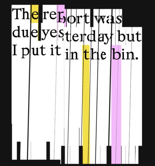
This motion graphic designed by Rob Farmer shows the text “The report was due yesterday but I put it in the bin. The design reminds me of shredded paper, which is fitting when considering the text. The animation has the shredded paper moving up and down and it almost looks as if it is being pieced back together before the animation repeats and you can see it is still destroyed. This design almost strikes me as antiestablishment in a way, as if Farmer is using this design to channel his own feelings towards a boss or client. This graphic shows me that an animation shouldn’t just be the text on a poster getting bigger or smaller, but it should help communicate the message of the original design and theme.
0 notes
Text

2.5 Contextual Annotation: Animated Poster
This animated poster designed by Studio Feixen depicts a poster with the words “water fall” repeating and falling like a water fall would. It uses smooth position motion to have the animation repeat in a slow, soothing way before falling off screen. The simple repetitive animation does exactly what the minimal text on the poster says it will, leaving it up to the viewer to come to their own conclusions about what deeper meaning the design may have. I personally appreciate the simplicity of the animation and how it doesn’t take away from the original design, this is something that I would like my own poster animations to accomplish when it comes to making them in After Effects.
0 notes
Text
After effects practice, text being typed effect thing
1 note
·
View note

Text

Helvetica Movie annotation
I rather enjoyed the Helvetica movie. It is a well-made and researched documentary, which although long and wordy at times, redeems itself with a good soundtrack, imagery and information. I was already aware of the cult like following that Helvetica had in the art community and this film made me see why that exists. I would definitely use Helvetica in my designs as it is such a pleasing font to look at, it could be the main focus of your design or just used to convey information and would work just as well in either context. In the future I would like to try making designs specifically centered around the font itself and see what I could come up with.
1 note
·
View note
Text

updated poster, with colours that make more sense and including the local iwi name (dont know why colours are so off)
0 notes
Text

Wāhine Toi Annotation
This poster designed by Angelika Smuga was designed for the Present Tense : Wāhine Toi Aotearoa project. It contains pictures of earth from an image search on a white background. The absence of text in this design doesn’t take away interest as the images of earth themselves are intriguing, however this does allow the viewer to come to their own conclusion on the meaning of this artwork. The designers own meaning is that we have lost touch with our earth and become observers instead of participants in the state of our environment, a change of perspective is needed.
0 notes
Text

Week 5 personal favourite so far, this is the one i tiled on a2
1 note
·
View note

Text

another attempt at modernism, colours are weird and distorted when uploaded to tumblr, but they are both more muted than this
0 notes
Text

An attempt at modernism, using a brick colour to represent the old buildings and an olive green to represent the nature, helvetica ofc
0 notes
Text

This is a practice design I did at home. I was feeling inspired after watching the helvetica documentary, so i wanted to create soemthign using that as the typeface. 1847 is the year european settlements began in Howick, originally Owairoa meaning long waters. I used a red and yellow colour palette as I love how the 2 look together. Although now looking back at this all I can think of is Maccas. The hillish shapes in the background of the poster are to represent the landscape of Howick which is full of hills and gulleys, such as the Mangemangeroa Reserve or Stockade Hill, which was once the home of a Maori Pa. If I were to continue with this design I would change the colour palette to something that represents Howick better, such as blues and yellows for the many beaches around the area or shades of green to reperesent the nature. I would also use more text to fill out the page. But overall I'm happy with this as a first design draft and am eager to continue it.
0 notes