
Statistics
We looked inside some of the posts by maximeehmann and here's what we found interesting.
Average Info
Notes Per Post
0
Likes Per Post
0
Reblog Per Post
0
Reply Per Post
0
Time Between Posts
3 days
Number of Posts By Type
Photo
14
Text
3
Last Seen Tumblr Blogs


Fun Fact
In 2020, Tumblr had 29.4 million users in the US.
Photo

My printed version, Made a few edits as I noticed a few spelling errors and image failures.
0 notes


Text
week 9 grids
Continuing the collection of concepts for the final publication we were taught the use of grids in publications and their effect. I do not usually use grids when it comes to text in a design.
“The space between each column can determine the readability of text. The wide spaces between columns containing large amount of text make the columns less intimidating to the eye and easier to read.” https://designshack.net/articles/layouts/practical-tips-for-utilizing-columns-of-text-in-your-layouts/
0 notes
Photo

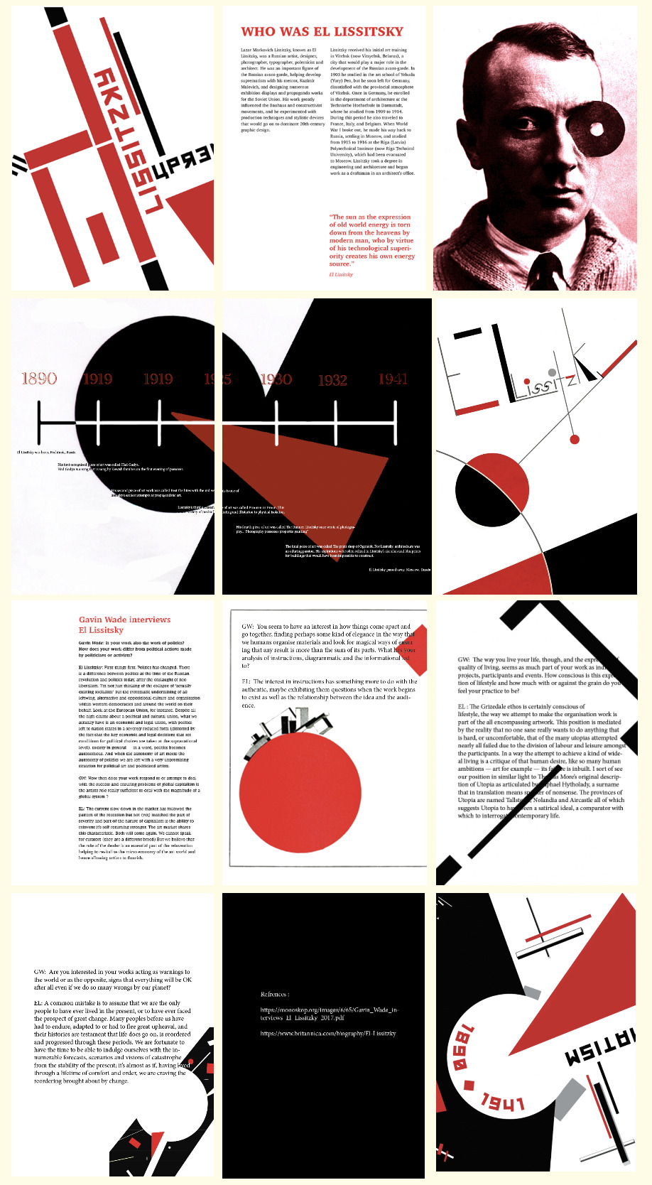
This is my final publication, I edited the fonts to more of a softer font, made my timeline easier to read and edited my pictures to reduce pixelation.
0 notes
Text
feedback
After my feedback i needed to change my timeline, font and certain images to improve my publication.
0 notes
Photo
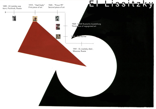
This is what i created as my first test for my publication.
0 notes


Photo


I will be using these colours as this is the colour scheme Lissitsky uses.
0 notes
Photo
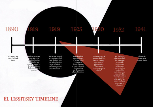
Final Timeline
This timeline more accurately represents what El Lissitsky portrays as a designer. I also made it landscape to properly sit into the publication.
Reflection
Overall I am happy with my process and my final product. El Lissitsky has a style that i usually would not use on other design projects, so this pushed me but I enjoyed the new concepts.
What went well:
I feel that the combination of the timeline layout and el lissitsky’s style complimented each other well. I am happy with the simplicity as I think it mimics Lissitskys work well.
What could have been improved:
Although I am happy with the final timeline I feel that my process could have been better. I could have taken more time to do deeper searches into him, more specifically his design style.
0 notes


Photo


Here are some typography examples and some of El Lissitskys styles.
0 notes
Photo


Some examples of el Lissitzky’s typefaces
negative space
Lines , Circles
Red Black White
Typography plays a big role
0 notes
Photo

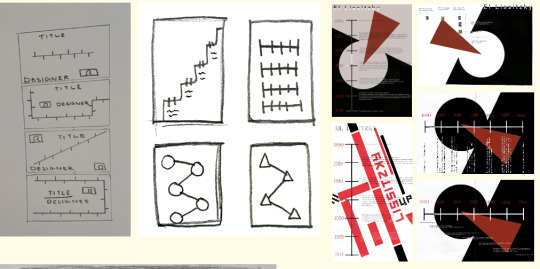
Here are some examples of my timelines I made.
First Timeline Attempt. These timelines are not made well, they do not fit the space and are slightly chopped up. The negative space is good, but not used correctly. The way the information is displayed is simple and can be improved to be more interesting. This design correctly represent his colour scheme most commonly used (red, white and black.)
I have inserted all my timeline practises.
0 notes