Don't wanna be here? Send us removal request.
Statistics
We looked inside some of the posts by mazenghanidvc-blog and here's what we found interesting.
Average Info
Notes Per Post
1
Likes Per Post
1
Reblog Per Post
0
Reply Per Post
0
Time Between Posts
6 days
Number of Posts By Type
Photo
17
Last Seen Tumblr Blogs


Fun Fact
28.6 is the average number of monthly visits per US mobile user.


Photo
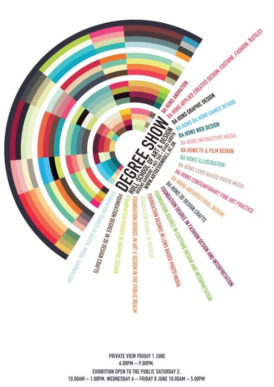
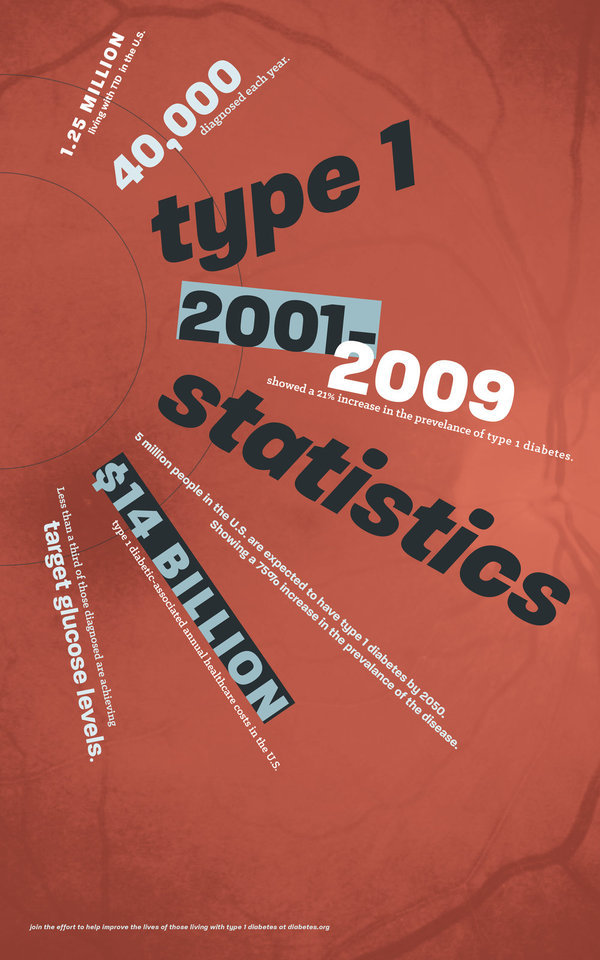


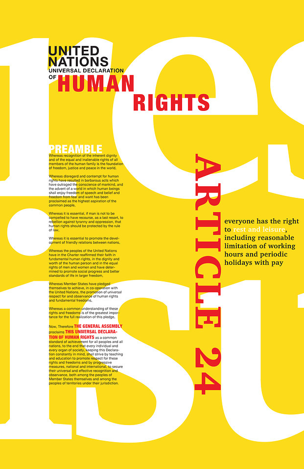
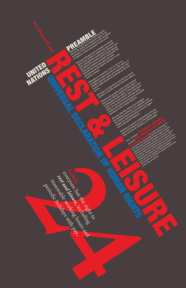
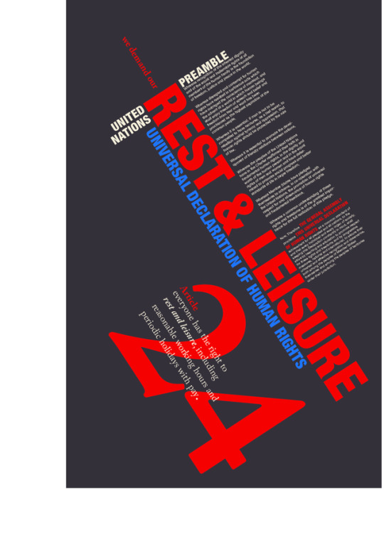
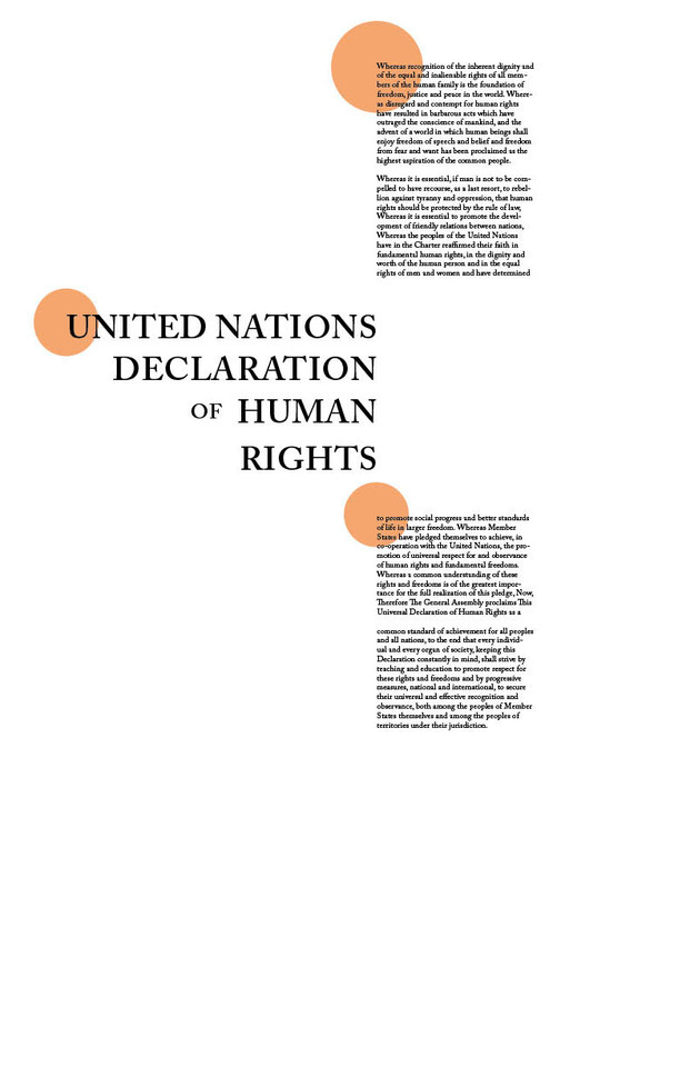
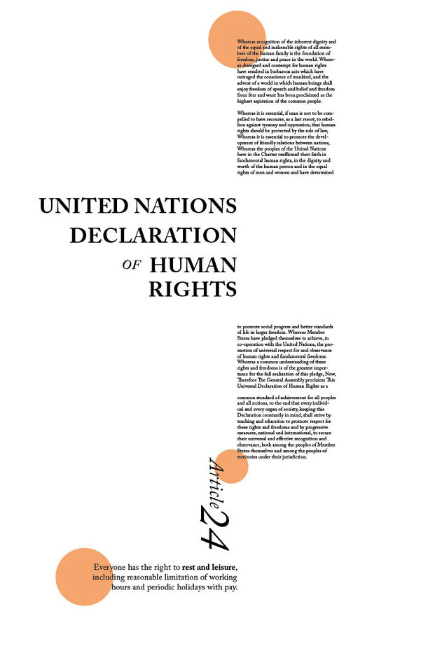
(top) Radial Grid Systems
The poster on the left shows both a radial and axial grid system being utilized and I love how the color palette is used not only as a graphical element, but as something to support the poster’s narrative.
The poster on the right uses only a radial grid system and has more of a loose, scattered typographic design compared to the other radial poster. Its use of type hierarchy––by using different weights and contrasting font sizes––made it stand out to me while doing my research.
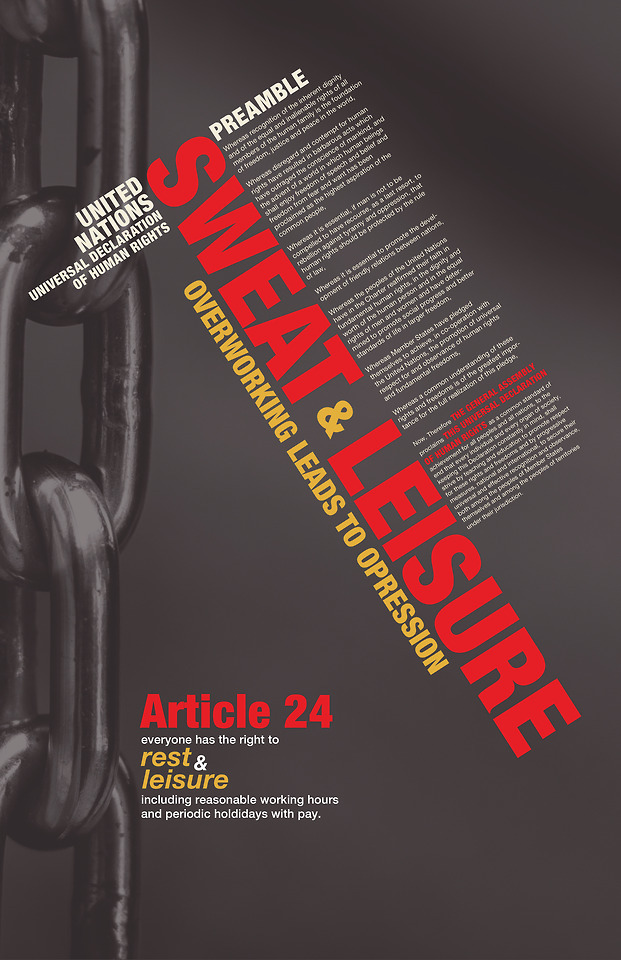
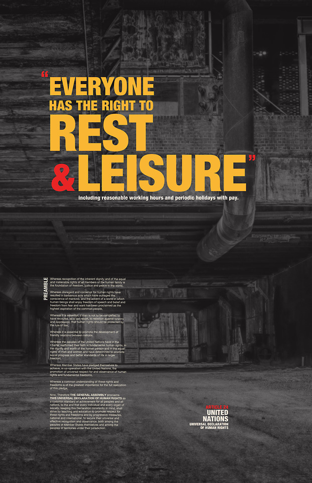
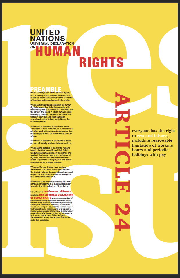
(bottom) Dilational Grid Systems
The poster on the left has mainly a dilational grid but utilizes elements of an axial grid. Initially what caught my attention was the contrasting color palette as well as the relaxing, inviting aesthetic with flowing organic shapes and calming tones of blue and white and accents of orange.
This last poster on the lower right uses a dilational grid and what influenced me to choose it is how it uses type in a very intriguing way and graphical elements in the background, as well as its dark and minimalist color palette.
0 notes