
Don't wanna be here? Send us removal request.
Statistics
We looked inside some of the posts by mdxmacontextualstudies and here's what we found interesting.
Average Info
Notes Per Post
1
Likes Per Post
1
Reblog Per Post
0
Reply Per Post
0
Time Between Posts
1 month
Number of Posts By Type
Text
5
Photo
8
Last Seen Tumblr Blogs


Fun Fact
In 2020, 44% of users from Denmark used Tumblr daily.
Text
WEEK 4- Revealing The Self
- The text discusses numerous examples of The Self being found in travel writing. For Instance, Sir Walter Ralegh used his accounts to highlight the virtuous behaviour he imposes on his men in an attempt to redeem himself in the eyes of Queen Elizabeth. In A Tramp Abroad, Mark Twain interject his account with his own personal feelings and emotive responses, allowing the reader to share them.
- The presence of the Self can be a useful when doing research around a narrative based subject. For instance- if you are writing a graphic novel that includes real life events it is important to not only nail the factual details but also the emotive, personal response. The more voices and experiences you expose yourself to, the broader a scope of characters you may find yourself able to write. Reading personal reactions help colour how fictional characters might react to a similar situation.
- I think it is impossible to completely divorcee yourself and your interests from the work you produce- especially if it is self initiated. Aspects of your personality are bound to be present and as a result the topics you research will reflect this.
- I think this depends on how closely your topic of research aligns to your own personal interests and sense of identity. If the new information you uncover elicits an emotional response this can also help you form a better understanding of your views and opinions.
- The text states that writers use the experience of travel to increase their understanding and the validity of their voice. Illustrators will often use field-work as a research tool, creating drawings from life – weather they be of locations or objects to help authenticate the work they produce. For example one of the MA students on our course spent 3 weeks in Penang drawing the city and interviewing the city’s inhabitants. This in turn gave him a much richer, more sensitive understanding of his subject matter.
- One of the characters in the graphic novel I’m currently working on for my FMP is an architect. As the moment of their introduction drew nearer I realised that the research I was pulling from the web (job descriptions/video interviews/ articles ) wasn’t giving me a full enough picture of what the job entailed and the minutia of it that would make my rendition feel authentic.
I reached out to a number of architects- as it turns out the graduate from our course who went to Penang also works as one and I was able to spend a morning interviewing him and looking around his Clerkenwell office. The trip was an incredibly illuminating experience. While photos can give you a fine over all view, they do not let you see the finer details of a place; The atmosphere and vibe (focused and intense- you could really pick that up in some of the people we spoke t- especially one who was in the middle of a massive project), the work place detritus (drawings, files, sketches- but then the personal artefacts as well such as reusable coffee mugs). I also had a chance to have a look at some of the software used- as well as gain an understanding of how projects runs.
It was an invaluable experience- even though the presence of the character’s work place is a background feature I feel much more confident rendering the space following this trip.
0 notes
Text
WEEK TWO- WELSH DRESSER
1. How does Jane Rendell account for the approach taken in ‘The Welsh Dresser: An Atlas’? What is the overall impact of this text, for you?
The photograph of single objects lacks context and objectivity- however, by seeing an isolated image of them the viewer is allowed to hone in on them. Rendell Makes this experience all the more absorbing by combining the image with a list of definitions as well as a allegory from her own past. All are then juxtaposed with an end note that zooms out to a wider, view (i.e the Diary section- which Rendell pairs with Sulieman’s musings on women’s history and the sense of inferiority she had from relaying her own). Together these attach many different levels of meaning to the objects photographed- lending them a personal touch as well as placing them in the wider discourse.
2. What is the significance of Rendell’s reference to Joseph Kosuth’s work ‘One and Three Chairs’ (1965)? What commentary do Kosuth’s and Rendell’s works make about language?
Kosuth’s ‘One and Three Chairs’ presents us with a physical chair, a life-sized photograph and a print out of a dictionary definition. Like Rendell’s presentation all versions are indeed the chair but make us consider the nature of meaning verses physical objects. Is one form of representation more valid than the other? By itself the physical object may lack meaning. Is it our memories that make things what they are? Or a prescribed definition? Or their place in History?
3. What other examples of works can you identify that intentionally work across both visual and written language? How does the interplay between text and image affect the meaning of the works?
In his 2009 graphic novel Asterios Polyp David Mazzucchelli weapon-ises lettering and form to add extra dimension to his characters. As well as each being drawn in a distinct style that reflects their nature (e.g Asterious, a rigid architect, is composed of exaggerated geometric shapes while his artist girlfriend has a more fluid asthetic- and this treatment is carried across the entire cast). As their relationships to and perceptions of one another change we see the style they are drawn in change, reflecting harmony or conflict. As well as this, each character has their own type-face allocated to them with the fonts carefully selected to reflect their voice. In this way the text becomes part of the asthetic whole, adding an extra layer of context. The book also deals with memory- one of the major themes in Rendell’s exercise and how this can change and shape objects or moments over time.


4. Pick one of the themes you have enjoyed from Rendell's text that you can relate to your own creative practice, and use this as a starting point to identify one more credible research text, that can help you to think about your own relationship with writing as part of your practice or discipline.
https://www.cambridgescholars.com/download/sample/60858
One aspect of Rendell’s text I particularly enjoyed was the way in which she wove personal memories in with her cataloguing. Out of all of the forms of definition these were the ones that helped me connect with both her and the Welsh Dresser itself. But it was also interesting to see how her memories twisted the meaning of these every day articles into highly nostalgic objects.
In Molly Pulda’s article PORTRAITS OF A SECRET, the author examines how Alison Bechdel’s memories and objectives transform fact and family history in her autobiographical graphic novel FUN HOUSE. In the book Bechdel examines her distant father’s sexuality, using the fact that they are both gay to create a link between them.
Pulda argues that comics, like all media, are a mixed and use both text and imagery to create meaning. Throughout the graphic novel Bechdel includes painstaking recreations of family photos “trying to discern their hidden messages.”
“What does an author attempt to reveal to the reader, through text, image, and their combination? Can the reader “see” a secret in a portrait?” Indeed, we learn as much about Rendell and Bechdel through their investigation of family objects and members as the objects and people in question.
Indeed, Bechdel wonders in the article if her eagerness to claim her father as gay rather than bisexual was almost an agenda, slanting her depiction of him.
0 notes
Text
WEEK ONE- OBJECTS OF DESIRE
In his article Stewart explores the various different meanings that can be attached to an object. These can either be through its relation to the past or place; a historical moment or social movement (all of these relate to the idea of object as souvenir; the context it is found with in and it’s uniqueness (the collection). All of these in turn effect the relationship to the owner of the piece- whether it is an artefact of something they have experience or their attempt to gain ownership over a specific moment in time or place.
The Works Project Administration (WPA) was created as part of Roosevelt’s New Deal. The agency hired millions of unemployed Americans for public works- including artists. One of the outcomes of this was the creation of thousands of posters- including the iconic National Park series. Off set against bold type, these frequently feature images of jaw-dropping natural spectacle- a visual trope that was commonly used in travel posters of the time.
These images instantly conjure up a sense of majesty and nostalgia (which in itself might be because they transport us back to memories of bygone family holidays from our own past). Recently we have seen a re-appropreation of this visual language. In the 59 Parks series, a selection of artists have recreated these posters as screen prints. All lettered with classic fonts set amongst spectacular settings these instantly conjure up the posters of the 30s and 40s.

Equally ‘National Parks of the USA’ (written by Kate Siber with illustrations by Chris Turnham) is a picturebook that plays with the visual language of the national park posters. The worn, rough, flaky digital brush work recalls the feel of those original screen prints and each park’s title page features large titles embedded within the scenery. It also incorporates aspects of the scrapbook- a faceimally of stuck in photos (maybe taken on holiday while visiting these sites) and use of a font that envokes hand written notes about the flora and fauna one might encounter across the USA.

There are a number of methods used by illustrators and designers to evoke a sense of time. Mostly these will involve finding ways to evoke past aesthetics through choice of font (which can immediately give your work the flavour of a certain time period), composition or approach to medium. Indeed, even though more and more artists are working digitally we often see them striving to emulate traditional media. Creators such as Kyle T Webster have created cottage-industries producing brush sets for software such as photoshop and procreate that allow digital artists to transform their tool-set into a near perfect replica of oils, watercolours, ect. The flavour these can give your work
In 2017 I helped organise There and Back Again, a travel themed exhibition by the Drawn Chorus Collective. For the show I created a series of illustrations-cum-travel posters for fictitious locations and was very conscious of the treatment of text (big and bold) and use of composition (the spectacle of location) to visually call back to those original images.
0 notes
Photo

This paper originally appeared in Issue 107 of Feminist Review in 2014. While geared towards an academic audience there is much in the journal for anyone with an active interest in Feminist issues. The paper provides footnotes and context, making it quite accessible. Theresa O’Keefe is a lecturer in the Department of Sociology at the National University of Ireland Maynooth and also teaches on the Community Education, Equality and Social Activism Masters. She researches gender, social activism and radical social change using intersectional analysis. She has written books on the subject of Feminism and Activism as well as contributing to a number of journals on this theme.
In this essay O’Keefe looks at two recent forms of feminist protest- Slutwalk and Femen. Both seem like a fitting outlet given the sexually liberated nature of 3rd wave feminism (“The postfeminist woman has total body freedom and, unlike her prudish ‘Second-Wave mother’, embraces sex and sexuality; she flaunts them and, in turn, feels empowered by them… femininity is rooted in sexualized and patriarchal notions of autonomy and agency…), however each have their issues.
Both aim to reclaim the female body, using it as a site of protest. However, there is the challenge of making the ‘patriarchy’ recognise and acknowledge that the media is the message- O’Keefe argues dressing (or not) in this manner is just a pastiche of sexualised male imagery, doing nothing to challenge it (this is evidenced by the bemused reaction of male commenters).
There is also an issue of inclusivity; in terms of race the organisers of Slutwalk and Femen are predominantly white and use language that alludes to their white POV (for example black women don’t feel as though ‘slut’ is a term that they can reclaim and is heavily loaded). There are also instances of cultural insensitivity, e.g. the use of racial stereotypes to protest against Muslim nations participating in the 2012 Olympics and declaration of international topless jihad day. There is a sense that these women are suffering from a white saviour complex.
Finally there is still is the way in which both organisations present them selves which raises the question of the sort of bodies that can partake in these protests-Femen in particular was found to be deliberately casting protesters who are white, athletic and ‘sexy’. Organisers even admitted this was done almost as if it was a marketing ploy.
Since this article their have been moves to make Slutwalk more inclusive. Since 2015 socialite Amber Rose (who is of Cape Verdean, Irish and Italian descent) has been hosting her own Slutwalk event which has been credited with opening the movement up to women of colour and the LGBTQ community. In the same year Rose and her crew performed at the MTV Video Music Awards literally wearing the sort of slurs commonly hurled at women who exercise their right to express their sexuality through their dress.

Rosea Lake’s photographic piece ‘Judgment’ explores the expectation put on how women choose to dress, looking at the fine balance between being perceived as a prude or a ‘whore’.

QUESTIONS
-Do all forms of protest need to be totally inclusive?
-How could the organisers of Slutwalk and Femen adapt their methodology to make the delivery of their message more effective?
0 notes
Photo
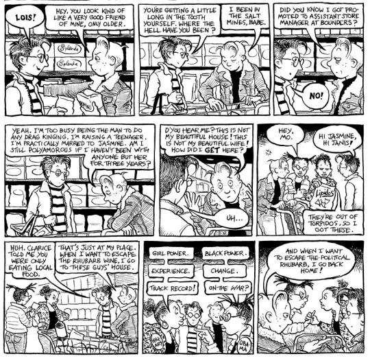
‘No muscles, no tattoos’ originally appeared in issue 61 of Eye Magazine, a quarterly international review of graphic design and visual cover. The magazine is aimed at professional designers, students and anyone interested in critical information about graphic design and visual culture. There is a particular emphasis on type (every few issues they’re focus on that as a topic).
(Due to their distinct asthetics and design, Jop van Bennekom’s seem like the perfect material for them to cover).
The article is by Alice Twemlow, a writer, critic and educator who’s work focuses on graphic design. As well as being a regular contributor to Eye Magazine, she has an MA in design history from the Royal College of Art and V&A Museum. She is also a guest critic at the Yale University School of Art, MICA and RISD. In ’06 the New York School Visual Arts appointed her chair of its Master of Fine Art Arts in Design Criticism.
In this article Twemlow interviews Dutch editor, publisher art director and designer Jopp Van Bennekom about the three trend-bucking magazines he had created by 2006 (the time when the article was published);
- Re-Magazine
- Butt
- Fantastic Man
Each cover their own neich topic but there are running themes that unite them and make them feel like the product of their creator.
Re-Magazine (1997)- Initially started out as Van Bennekom’s thesis project while studying at the Jan van Eyck Academy in Maastricht in 1997 but was encouraged to turn it into a real magazine. Rather than be yet another fashion or photography magazine, Van Bennekom used RE to interview his friends about the minutia of their lives. Topics include home/bordom/sex. (After it’s 9th issue the magazine underwent a restructure but still focused on subjects such as ‘food coma’ and features with titles like ‘a stream of consciousness by the first member of generation not’.
‘Aesthetically and conceptually it was very much in tune with ideas about everyday life and culture at the time.’
- Andrew Blauvelt, design director at the Walker Art Center
It’s here we see the emergence of one of Van Bennekom’s main preoccupations; The idea of the normal and every day, and making the personal compelling and relatable. We see this even more when looking at his next magazine;
BUTT
In 2001 Van Bennekom teamed up with fellow publisher and editor Gert Jonkers to create BUTT, the critically acclaimed pocket-size magazine by, for and about homosexuals “where gays can speak candidly about their ideas, work and sex lives.”
Both in design and content BUTT is authentic representation of Van Bennekom experiences as a gay man (it has been described as “a reality gay porn magazine”);
Simple design and uniform layout (images as examples)- plain speaking aesthetic which also compliments the style of the magazine’s interviews (these are delivered in direct Q&A sessions and there is no editing around and awkward answers.
Deliberate font choices- Van Bennekom chose a rounded American Typewritter font for because it felt like it was a ‘really gay font’. The Compacta Used for the headings feels tough, speaking to things like leather culture. Against the pink paper Butt is printed this also plays with the duality of butch and femme.
This realism is also present in the photos featured in BUTT. Non of the portraits of the interview subjects feel like the results of over produced photo shoots- all the men feel like every day people in their own clothes. When we look at how the subjects are treated in other gay lifestyle magazines we can see the difference. The images are often glossy, glamerous and stylized with men appealing to different subcultures of taste (i.e. the leather daddy). This seems in direct contrast to Van Bennekom’s maniphesto of ‘No muscles, no tattoos .
All of this helps BUTT feel more relatable- it’s a real reflection of a common existence which possibly helps explain it’s appeal.
There are many examples of creators drawing on their own experience to create a familiar world within the field of independent comics. Two examples of creators who do this while working with LGBT themes are Alison Bechdale and Jeremy Sores;
- Bechdale’s ‘Dykes to Watch Out For” ran from 1983 to 2008 and was one of the earliest ongoing representations of lesbians in popular culture. The strip followed the lives of divers cast of characters from different points on the LGBT spectrum as they discussed day-to-day events, political issues and the way lesbian culture was changing.
- Jeremy Sores is another queer creator who produces work on this theme. In 2015 The Comics Journal commissioned Scores to work on their journal comics- a series of lo-fi autobiographical strips. Much like BUTT and RE-MAG these short, slide-of-life of life sotries deal with the modernity of Scores day to day life as a gay man.
Representation:
“I wish Butt had been around when I was 22 and insecure. Other gay magazines have cut-and-paste, retouched bodies unlike any you’ve ever seen in real life and certainly not like mine.”
- Van Bennekom
This quote speaks directly to the very human need to see accurate representations of ourselves in the media we consume (something which we touched on in our discussion of ‘Forever in Kente).
Since the 1960s, research has found expressions of unequal power in media can be “very dangerous” and “very damaging” to people watching (although we don’t need research to tell us that).
“I think the moral argument is self-evident. Stories matter… [they] affect how we live our lives, how we see other people, how we think about ourselves.”- Morgan, former professor emeritus at the University, Massachusetts at Amherst
“There’s this body of research and a term known as ‘symbolic annihilation,’ which is the idea that if you don’t see people like you in the media you consume, you must somehow be unimportant.”
- Nicole Martins, Indiana University.
At the time of BUTT’s creation there wasn’t anything like it in the market so Van Bennekom essentially created a magazine for himself;
‘Not being represented means you have to start something yourself that does represent you,’ – Van Bennekom
This quote from lines up with what the readers of BUTT say about the magazine;
‘For me Butt is important. It has given voice and visual presence to those of us who are trying to figure out our own worlds.’
One example of a contemporary designer who is also actively working to share his experience through his work is illustrator and comic book artist Ronald Wimbly;
Wimbly has worked on a number of projects that are outspoken about authentic black representation in the media. His critically acclaimed comic-essay Lighten Up (wherein Wimbly illustrates an argument with a Marvel editor about the skin tone of a character of Mexican/African American decent) and Black History in its Own Words both speak to this, however it is his latest project, LAAB MAGAZINE which most reflects Van Bennekom’s make-it-yourself attitude.
LAAB MAGAZINE is cartoon news paper which deals with black identity and how it is treated in the media ‘in an age of white supremacists in the Whitehouse”.
These ideas of authenticity and creating content for people like JvB’s are pursued further in his and Jonkers’ next magazine, Fantastic Man.
HM is mostly black and white, with its rule lines and two-column layout, it’s pared-back design and reams of text set it apart as a fashion magazine meant to be read and not just looked at.
“What’s more sexy than a handsome man with a whole page of text next to him to read?”
(JvB is his own audience)
Fantastic Man sets out to reject “fashion as fantasy”. Partly a rejection of the types of depiction of men that were appearing in current fashion magazines;
‘Seeing young boys dressed in expensive designer clothes isn’t sexy. It’s just disconnected.’
Fantastic Man is a throwback to the magazines of the late 80s (men rather than boys). When models are used they feel like real people, shot naturalistically.
0 notes
Photo

Pamela Church Gibson currently lectures at the London Colledge of Fashion. She has written extensively on the subject of film, fandom, history, heritage and, most pertinent to this article, fashion and celebrity culture. Her books include Fashion Cultures Revisited: Theories, Explorations, Analysis and Fashion and Celebrity Culture.
This is intended for a specialised audience (indeed, Gibson makes a rather telling comment that readers of her article would not be familiar with many of the women on FHM’s annual list of “Hundred Sexiest Women) with an understanding of the world of fashion and representation (the article refers to the work of numerous designers and feminist writers and discusses it’s subject in an academic tone).
Gibson argues that there are two systems in fashion; Firstly there is high couture look of the fashion elite- designed for female gaze and is asexual in nature. The second is an overly sexualised look that we see sported by celebrities and the stars of reality TV (Made in Chelsea/ The Jersey Shore). It is this latter ‘pornostyle’ that is being emulated by the every-day consumer- indeed so much is it’s popularty that we see models like Kate Moss and Mario Testino participate/produce images that engage in this sexualisation.
Gibson posits that this new look is problematic and is causing friction within the feminist movement; this new look is an emulation of the styling of men’s magazines and women are intentionally dressing in a way that makes them subjects of an over-sexualised male gaze. Feminists such as Annette Lynch worries that this is placing women at risk. There are those who argue that revealing dress and pornography are both empowering to women (the website feministing.com acts as a platform for such views), however the baggage of class that comes with this topic has stunted any debate.
“Pornostyle” is a recent article published in 2014. Since then the debate on porn and its impact on society has raged on. These days there are a large number of young female illustrators who are tacking this issue of sexualised female representation. Though the women of Sara Andersson’s work are often nude, they come in a variety of different body types which exude a sense of self confidence and strength that doesn’t seem dependant on the approval of the male gaze or social norms;


“I try to make careful decisions in my work and strive to create images that aren’t reinforcing stereotypes… I identify as a feminist and I do consider some – but not all – of my work a form of low-key activism... Often it’s just really simple things like disagreeing when being told – for no apparent reason – to ‘slim down’ a female-coded body or change the colour of the skin into ‘something lighter’.”
Another contemporary artist dealing with female representation is fashion and editorial illustrator Laura Callaghan;

“I want my characters to be diverse, to use their bodies for many things, to lounge hungover on a filthy carpet, to cradle a houseplant, to propel themselves up a cliff face, to play a competitive game of tug of war with a sweatshirt. I'd like to capture something real and relatable about living in this sack of flesh and bones.” Again, Callaghan’s draws on a diverse cast of women, displaying curved and strong bodies that aren’t over sexualised but remain sexy.
0 notes
Photo

Both Busch and Haug are currently Associate professors at Danish Universities. Busch (based in the dept. of Philosophy and History of Ideas at Institut for Kultur og Samfund) has written a number of papers on the ethics of decision making. Haug is based in the Department of Entrepreneurship and Relationship Management at Syddansk Universitet.
In this article the authours explore a paradox faced by the fashion industry- how does a business built on increasing obsolescence reckon with a world that is increasingly environmentally aware? It identifies the different ways in which the industry is problematic (environmental impact and poor working conditions)
While large brands are investing in eco-friendly practice, ethical fashion (at the time of writing) only makes up a tiny proportion of the market. Cheap sweatshop labour and lower garment prices are two of the issues limiting this.
“Ethical fashion represents an approach to design, sourcing an manufacture… which maximizes benefits to people and communities while minimizing the impact on the environment”.
The article also deals with the problematic nature of the term ‘ethical’- it can relate to a number of issues (ethical/environmental/social/). Effectively conveying what it means to consumers in this context is challenging. Indeed, they are also part of the problem, often opting for the cheapest retail option (even if this isn’t inline with their own personal ethics) and suppliers also play a role in this. In the end it is concluded that the media and fashion providers are the ones with the most power to influence the ethics of fashion;
“Since these parties to a large extent are the ones defining what is in fashion and what is not, they have the power to make ethical fashion fashionable and unethical fashion unfashionable.”
The 2013 Rana Plaza disaster (1,135 garment workers were killed, and thousands injured, when a building collapsed in Dhaka) seems to have been a watershed moment for ethical fashion. The fallout from the tragedy lead to the creation of Fashion Revolution Week. In recent years there have been a crop of new fashion brands formed with sustainability at their core (Nobody’s Child, Veja and Reformation to name a few), something which suggests we are seeing a shift in attitudes.
Environmentalism is a growing concern and increasingly we are seeing illustration being used as a means to address it. Indeed, two of the winners of this year’s WIA awards (an international award run by UK and US illustration associatins) tackled these issues. Chen Winner’s ‘Econundrum’ uses playful visuals to make the point that “there will be more plastic than fish in the sea by 2050” and make the case for switching to reusable bottles to help cut down the amount of pollution created.
vimeo
In the context of children’s books efforts are also being made to promote environmental awareness and an understanding of the damaging impact of capitalism. In ‘We are Extremally Very Good Recyclers’ the eponomous Charlie and Lola of Lauren Child’s massively popular series enlist the help of their class to win a recycling completion on a book printed on FSC-approved paper.

In Elys Dolan’s subversive ‘Mr Bunny’s Chocolate Factory’ we get to witness first hand the effects of capitalism unchecked as Mr Bunny cranks up production at his chocolate egg factory while ignoring his workers pleas for salads and aerobics (which can easily be read as a comment on sweatshop conditions).

QUESTIONS:
- As content creators should we be making more of an effort to challenge the environmental impact of our medium? Both children’s books and graphic novels are traditionally produced on paper. Should we be doing more to move to digital platforms and championing the use of recycled paper stock?
0 notes
Photo

Pete Jordan is an American author who has lived in Amsterdam since 2002. His interest in the city’s cycling history was the basis for his second novel ‘City of Bikes’ and he regularly leads bike tours that explore this culture. His book is incredibly accessible and entertaining, requiring little-to-no pre-existing knowledge.
These two chapters explore the relationship between the cyclists and both the political and physical structure of the city of Amsterdam. The version we are introduced to in the 70’s is a liberal, open-minded safe haven for the world’s counter-culture youths. This is in contrast to the city’s attitude towards cyclists as transport structure favours cars. Over the course of these extracts we see how bikes become tools of activism (cycle protests), to being accepted by the government (several protest movement members were elected as wethouders) and reshaping the city’s travel infrastructure. Eventually, cycling becomes so popular that the liberal attitude of cyclists (ignoring traffic rules/widespread sale of stolen bikes) clashes with police. We also see how the bike is a key part of Amsterdam’s identity (the cycling monarchy/press flurry over whether the heir to the throne’s Argentinian girlfriend could cycle).
Cycling is painted as a romantic ideal; chapter 20 opens with an anecdote about Jordan’s experience of cycling with his son and how it brings them closer together. In the previous chapter following the first Sunday driving ban in ‘73 an observer commented, “…on streets where cars would otherwise usurp all the asphalt, we now saw a couple peaceful cycling beside each other…”. The language used by both protesters and Jordan further vilifies the car as dirty and smelly.
The concept of sustainability and eco-structure are touched on in a number of ways. Firstly, the cyclist rights were greatly aided by the Arab oil embargo. The number of bikes needing to be manufactured fell in the 80s due to the bike becoming such a key component of transportation that the police implemented a number of measures to tackle bike theft (these also involved government sanctioned programmes to recycle abandoned bikes).
An underlying theme in this article is how the bike challenges capitalism and bureaucracy. Politicians feared the oil ban would cripple business; Roel van Duijn’s bike use was ridiculed as antiquated and other politicians feared it could ruin Amsterdam on the international stage.
In the City of Bikes is a relatively recent release (2013). While Amsterdam is still one of the most bike-friendly cities, the rest of the world is yet to catch up. Though some action has been taken to tackle the issue of overcrowded roads and high carbon emissions (electric cars/A.I. drivers/the rise of car hire through Uber) there are still a great number of issues to be tackled (i.e the US threatening to pull out of the Paris climate agreement.
The Red Bicycle (2016) is an illustrated picture book by Jude Isabella (Author) and Simone Shin (Illustrator). Telling the story of a boy who has outgrown his bike, we follow its journey as it is donated to a charity where it finds a new lease of life in Burkina Faso. As well as promoting the message of recycling we also see how the bike is a key part of it’s new owners life.


Questions:
1. When we first encounter the bicycle it is a method of transport of liberals and activists. Does its growth in popularity mean clashes with authority are an inevitable part of it’s identity or can it ever be successfully integrated into the city’s infostructure?
2. Why were cyclist rights groups so successful in Amsterdam compared to other countries?
0 notes
Photo

The Lure of the East- A page from Craig Thompson’s Habibi
1 note
·
View note
Text
The Lure of the East
This Essay breaks down factors considered by the curators of Tate Britan’s 2008 exhibition ‘The Lure of the East’. These included;
-How to curate the work
-Availability of desired work to include in the exhibition.
-Creating an exhibition that didn’t play down the problematic nature of this subject, was conscious of the fact it was taking place in a post 9/11 world and understood the culture that was being depicted.
- Who is the audience is another question facing the curators as well as the marketing.
“Sometimes presumptions are incorrectly made about what is unacceptable to Muslims and this can be counter-productive”
“… what was important to me was the perception of the West as ignorant and insensitive to Islam and Muslims.”
“By it’s sheer nature of subject matter, the exhibition shoulders a grave responsibility…”
The question of pre-existing knowledge is addressed by the text. As the this essay assumes the reader is familiar with Edward Said and Orientalism it is safe to say this is for a specialist audience. The language is also rather academic.
Writing in 2011 Riding is very conscious of the time and how to approach a subject Orientalism in the shadow of 9/11 is something the text deals with. The fact the exhibition was designed to avoid tropes and stereotypes such Eastern mysticisms and sexually exploitative marketing feels in keeping with a growing cultural awareness (or at least the call for) within the artistic community. Conversely, a look at the current political climate would suggest the opposite.
Craig Thompson’s Habibi tells the love story of two slaves set in a fictitious Islamic landscape. Thompson has stated the book was written in response to the US’s post 9/11 Islamphobic tendencies. Thompson has also clearly taken the time to learn about the culture he is writing about. Habibi plays on the tropes of Orientalism, however it does also contain problematic echoes. (Thompson, a white western artist, never actually visited the setting of his book and his heroine is often sexualised). This issue of understanding the culture you’re depicting is something lecturer Sabrina Scott argues for on her blog; “
If we take illustration seriously as a form of intellectual and cultural production that influences, reproduces, and reinvigorates public and private discourse, what do the pictures we make and the way we represent human bodies within them say about our personal (as private persons) and public (as creative professionals) understandings of race and gender? Do most of today’s award-winning illustrations challenge dominant power paradigms, or consolidate oppressive hegemonic representations as common sense? What happens when illustrators try to depict The Other? How can we avoid these pitfalls and their consequences?”
0 notes
Photo

Ottomania- Panels from Marjane Satrapi‘s auto-biographical graphic novel Persepolis
0 notes
Text
Ottomania
This article was written by Elif Batuman. Asides from being a staff writer for the New York Times since 2010, Elif has received a number of awards for her writing and she seems to have an interest in the cultural context of media. She has a PhD in comparative literature from Stanford University and was writer in residence at at Koç University in Istanbul.
Magnificent Century tranforms the court of Sultan Süleyman into a scintillating soap opera. With it’s lavish production values it celebrates Ottoman Empire, something which Turkey’s current political leader Erdoğan’s policies are trying to re-invoke.
“Magnificent Century” has accomplished one of Erdoğan’s main goals: making a powerful, non-secularist, globally involved version of Turkey seem both plausible and appealing.”
“Turkey has a thriving television industry… and a prosperous family-oriented middle class of observant Muslims eager to watch their own values reflected in a historical imperial setting.”
Erdogan has, however condemned the show. The article looks at the tension in Turkey between modern secularism and traditional values, both historically and at the time of writing.
“The debate over “Magnificent Century” touches on one of the key issues in Turkish politics: the question of national identity.”
“Magnificent Century” is set in a world where nationalism hasn’t won yet. It works in precise opposition to the A.K.P.’s neo-Ottomanist program. In no meaningful sense is Ibrahim of Parga actually from Parga. On entering Süleyman’s household, he leaves the domain of nationhood for that of the purely human—a world where the family drama expands and fills up the space of the political.”
The text is presented as magazine article. It uses the discussion of Magnificent Century to explore Turkey’s history and draw parallels to the current political climate.
Unlike the 2nd reading this article goes into great depth explaining the context of the article. Drawing together a number of threads and is aimed at a curious, intellectual casual audience (indeed, this is a typical characterisation of the readers of the New Yorker).
This is a reasonably recent article written in 2014. Since then Erdogan has tightened this control over the media and freedom of speech. His critics have been increasing drawing parallels between him and the old Turkish Sultans.
Marjane Satrapi‘s Auto-biographical graphic novel Persepolis also explores the tension between tradition and more modern attitudes. In the book Marji struggles with Islamic values and a love for her country following the cultural revolution. Through her eyes we witness the clash between liberal values and the encroaching fundamentalism. As in the article the main narrative is intertwined with the historical background. Writing during the time of the Giza Park protests, Batuman is similarly swept up by the sense of revolution.
0 notes
Photo

Javier Gimeno Martinez is a lecturer in Design Cultures at the VU University in Amsterdam and the author of the book ‘Design and National Identity’ which was released last year (September 2016).
This article looks at the influence of nationalism on graphic design and how that in turn influences it’s reception. Martinez explores this through the lens of Spain’s ‘rebranding’ of its individual states following the end of Franco’s dictatorship. Reinventing itself as a democracy, it also became “…both globalized and internally fragmented” and there was a desire for the “…adoption of international features, derived from the entrance into the E.U.”
As well as a move away from Franco-ist signifiers (street names, e.c.t), a new edict was passed to regulate all national flags and emblems. These new ‘logos’ would follow the rules of corporations- designed to be easily reproduced (while adhering to strict guidelines) and read by a global audience.
The article first sets out to define what nationalism is before identifying the difference between the traditional coats of arms and the new logos of the Spanish Autonomous Community. Martinez then explores the reaction to these new designs since the Socialist, Conservative and Nationalistis political parties of these regions each had their own expectations and agendas of the new logos; Conservative voting communities strived to preserve their traditional coats of arms. Catalonia and The Basque Country in particular strived to create logos that harked back to their recent independence. In contrast the socialist state of La Rioja aimed to eliminate all links to the dictatorship.
Martinez then transitions into an examination of how the people of Spain reacted to these new symbols- in the case of the Andalusian coat of arms the transition was a gradual one which made it’s implementation more digestible. Other factors touched upon are the history of the region, the approach taken by the designers, the identity of the designers (e.g local) and the nature of the design itself. He concludes that “Neither governments nor designers is fully responsible for the resulting symbols… the origin of the logos must be sought in the collective interaction between commissioners, designers, and consumers.”
Martinez does not write for the casual reader- the text assumes knowledge of Spain’s political history and many key quotes are in Spanish with no translation offered.
Though the text is just over a year old the political situation in Spain has escalated rapidly with Catalonia, Basques and Galicia striving for greater automany. In the case of Catalonia this reached a peak earlier this month when the state voted in favor of independence.
Boiling down regional signifiers to an easily readably, universally recognizable is a tactic we often see deployed in super hero comics. Nationalistic characters with patriotic roots are often shown in costumes that transform their home-country’s flag into a piece of couture (Captain Britain, ). Marvel’s Captain America was designed as a supersoldier who often fought the Axis powers of World War II. During WW2 he was an example of patriotism, often depicted beating Nazis and reflecting US ideals (all while sporting the stars and stripes). Conversely, Collective Man was another Marvel character who’s Republic of China costume signified his place of origin. Created prior to the Regan era Collective man was in fact an identity shared by the Tao-Yu quintuplets. The fact that they would fuse together to combine their powers reflected the communist government of their homeland. This character was created in the 80s when relations between the US and PRC were growing increasingly fractious.


0 notes