
Statistics
We looked inside some of the posts by meaningful-object and here's what we found interesting.
Average Info
Notes Per Post
1
Likes Per Post
1
Reblog Per Post
0
Reply Per Post
0
Time Between Posts
2 days
Number of Posts By Type
Text
16
Photo
1
Last Seen Tumblr Blogs


Fun Fact
The Tumblr office adopted Tommy, an 11-year-old Pomeranian.
Text
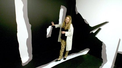
Ikon Gallery Project
Since I had some free time on my hands, I tried doing one of the activities posted on the Ikon gallery website: https://www.ikon-gallery.org/wp-content/uploads/2020/04/KS3-Activity-Pack-John-Newling-and-Judy-Watson-1.pdf
I chose to do the one where you draw on a piece of paper and keep cutting and moving it so in the end when scanned and multiplied it creates a pattern because I liked the idea of work both with paper and my laptop.
So I did my pattern on a piece of paper just like they told me and then I scanned it and sent it to my laptop. I chose to do flowers because those are currently the ones that are in the garden of my house, and they are quite personal since they keep us busy these days.
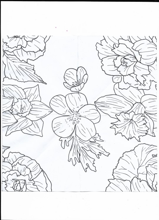

So I opened the picture in Photoshop and cropped it then plyaed with a few settings so it all looks as clean as possible. I could have left it like that but I decided that I want to actually colour in the flowers so the next step was to open it in Paint Tool Si. I applied the base colours and then did some shading.

This is what came in the end. One last step was to multiply the picture and arrange everything so it looks like a repeated pattern:

So in the end I reached what I wanted to. It was quite interesting being able to use the scan function aswell and take something traditional to turn it into something that looks digital. I think I will try this process again but with different textures and lines.
0 notes
Text
Artists that worked in Isolation part 2
Just like last time, in this blog I will talk again about 2 artists that worked in isolation and came out with amazing outcomes.
Ibrahim El-Salahi
Ibrahim El-Salahi (born 5 September 1930) is a Sudanese painter, former politician, and diplomat. He is one of the foremost exponents of the hurufiyya art movement, which sought to combine traditional graphic forms, especially calligraphy, into contemporary artworks with a distinct Arab identity, in the late 20th-century.
The Inevitable
1985, Germany


Just like another artist from the last post, Ibrahim also had to face isolation in prison in mid 1970′s. Since the prison didn’t allow such activities as art, he had to be very sneaky with his ways. He would scribble plans for future works on the back of cement pavings and then bury them in the sand whenever a guard would come by. This whole method of his actually led to the creation of “The Inevitable” The surrealistic painting was done in detail and great technique by the experienced artist. His work only came out finished later in 1985 but the results of his hard work and sneaky ways in prison sure are some pretty ones.
The painting is definitely really detailed and worked on with an incredible amount of patience and care. Ibrahim states that the message of his work is people standing against the evil, the society, the ones that corrupt and want to steal us from our reality. Looking at the picture indeed it is quite complicated to make out stuff due to the use of lots of shapes and details but if you take your time and try to look from Ibrahim’s perspective you can make out silhouettes raising their hands to the sky, almost like in a fighting position, like they are ready to fight those that rob them of their freedom. There’s lots of sharp shapes, straight lines but they all seem to be oriented to the sky. All the weapons and corners and whites they are all reaching up, all ready for that war.
Ibrahim managed to work in a style that not any artist can tackle. Surrealism is one interesting area but if not done the right way, it loses all of its spark. It’s not always about drawing skills but ways in which you send messages and thinking of how to put everything together on a canvas using your imagination aswell. A surrealistic painting even if done with major drawing skill, if it’s meaningless of a message, of an understanding, then the whole thing itself is empty, just a shell of something that looks good but tells nothing. But Ibrahim made sure to work in such a technique where not only his drawing looks flawless but the message behind the image is also sent in a really sensible, abstract sort of way. The monochromatic choice also adds to the impact and quite good contrast between the white blank spaces fading out between the painted areas like a sort of ink being diluted into a lake. His ink does have a strong sense, it’s opaque but it can also fade in a way that he can go from really soft lines and spots, to something harsh and dark meant to stand out.
The fact that Ibrahim went through all the pain starting from when he was in the prison just to create this amazing piece is completely admirable. Not only was he able to memorise every bit that he sketched out whenever he found some safe time alone, but he also risked his life by doing it in the first place. But it was done so well with such dexterity that no one ever caught him and he successfully has taken his planned work to the very end.
Alfred Wallis
Alfred Wallis (18 August 1855 – 29 August 1942) was a Cornish fisherman and artist.


Out of all the artists I have reviewed until now, this one has a slightly different type of isolation going on. Alfred decided by himself to live in self-isolation in his home from St Ives. He did all of his paintings from memory, not using some actual reference or painting some sort of view. While this choice of secluding himself from others might help with more time allocated to art and imagination, on the other hand there are also other various inconveniences. For one, Wallis was pretty broke not having a job and being always by himself so his working media was severely cut off as he had to paint of bits of cardboard that he would rip off from boxes and also limited his colour palette as to not use too much paint.
The paintings themselves say a lot about Alfred and mainly the fact that it can be noticed they were done from memory. They all have this sort of “amateur” look to it, like most paintings kids have done and that is because he was missing any type of reference or image to work after. All of his paintings seem 2d, they do not variate in shapes and depth and objects aswell as house and boats seem to be one sided shapes seen from a really odd perspective. That is mainly what happens when artists are lacking reference and study on certain stuff. You first need to understand how perspective and certain objects and anatomy works so then you can draw it yourself. But he was in his house, away from places where he could look at something and see the exact structure and how it overlays with the background and the other elements. You can easily tell he was drawing it all from his mind since elements seem to not have depth, they all have the same size or look odd when put next to eachother overall making everything oddly static and kid-like.
But overall this can inspire any person stuck at home right now to try out painting. He’s done it without any research at hand whatsoever which means that basically everyone can give it a go and enjoy it in their own ways. I encourage everyone to have fun and experiment and even though it does not look perfect, enjoy the process and the fact it was done by you with your hand and mind. Letting our imagination run free can bring lots of wonderful things and creations no matter who or what we are good at.
0 notes
Text
Artists that worked in Isolation
Just like we are facing an isolation situation now in 2020, many other people have experienced this along the time and some of them happened to be artists who knew exactly how to take advantage of the time and create breathtaking art pieces.
The Tate website, brings us an amazing article talking about various artists from various eras showing how they overcame the situation and let their imagination run wild: https://www.tate.org.uk/art/talking-point/making-art-isolation
After reading it, I decided that I want to talk and get into detail about some of the artists that caught my attention due to their situation or art pieces. Of course, the website brings way more examples so I suggest reading it if you’re looking for inspiration or simply want to learn some new stuff.
Irina Nakhova
Irina Isayevna Nakhova (Russian: Ирина Исаевна Нахова; born 1955 in Moscow) is a Russian artist. Her father, Isai Nakhov, is a philologist. At 14 years old her mother took her to Victor Pivovarov's Atelier. Pivovarov played an important role in her life and later became her mentor.
Room nr. 2
1984, Moscow
Constructed room with vinyl, canvas, 7 photographs, gelatin silver prints on paper and 1 work on paper, graphite, gouache and ink on paper, on board
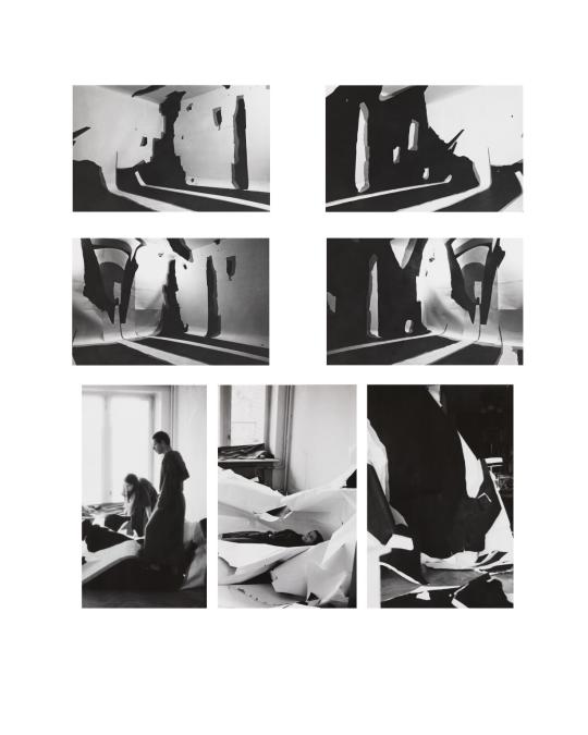
Time in self isolation
Nakhova was stuck in self isolation due to the Soviet era that was going on at the time. Due to the free time on her hands, she had time to work on her project between 1983 and 1986. Her project stood in one of the rooms of the apartment that belonged to her parents in Moscow. She mentions that it started by covering the whole room in white paper. She then cut out shapes from black and grey paper and stuck them the walls covered in white paper. The result was a full room with an interesting 3d effect to it.
The way Nakhova cut out and stuck her shapes on the walls and floors creates and interesting illusion. The grey bits seem to be the ones that give the depth, while the black ones represent the dark areas. In my eyes, her work reminds me of a building in ruins, the white paper sort of standing for the world outside while the black and grey are the walls that look torn down and in really bad shape. Nakhova mentions that it reminds her and her friends of the inside of a crashed plane. It’s these illusions that make each one of us see something different based on our cognition, For me it’s more like a scenery from inside a house after a war. Or maybe some ruins in the middle of nowhere, left after horrible fights.
But I also see some good in it if you are to think about it from a more abstract way. I think the holes in this so said building are the freedom, the freedom to be able to get out and enjoy life like any other that Nakhova was feeling all these days she was captive in her own house. The walls are the walls of the apartment that keeps her trapped but maybe at the same time they are also the walls of her mind; the mind that she broke free so she can let her imagination go and play. I believe maybe some of these thoughts were put into the work when it was being made. The choice of materials not was easy for her to reach for and acquire, but the colours also helped to get in the idea of this “dark” place that’s being broken over to freedom, the white, the opposite colour while the grey stood in between captivity and freedom, being a mix of both.
Her way of media and using materials is what stands out the most probably. It’s really creative how instead of using the room to create something, she created the room with that something. The way she came out with something so unique and eye-catching using purely paper and some type of glue to create this is simply incredible. She saw a way she can get out of her comfort zone, think outside the box and she totally took it. Now obviously we can’t really be doing the same thing in our homes in 2020 unless you somehow are able to. But still I think it’d be interesting if people studied more working with illusion patterns that look 2d but give a 3d effect. Maybe if you were to use a box that could somehow stand for the room, you could work with the inside of it as if those are the “walls”. Yes, in Nakhova’s case, the size of her project does matter a lot since it gives this effect that you are actually stuck between the ruins but hey trying at least could still help you learn some new stuff.
Gulsun Karamustafa
Gülsün Karamustafa (born 1946, Ankara) is a visual artist and filmmaker recognised as "one of Turkey’s most outspoken and celebrated artists." Using personal and historical narratives, Karamustafa explores socio-political issues in modern Turkey and addresses themes including sexuality-gender, exile-ethnicity, and displacement-migration.
Prison Paintings
1972, Turkey
Acrylic paint, graphite, crayon, and ink on paper


Time in prison
Unlike Nakhova, the type of isolation that Karamustafa is going through is completely different in the sense that she is stuck in prison. Gülsün Karamustafa was incarcerated in Turkey for aiding and abetting political activists after the military coup of 1971. Her work stays in 15 different paintings, all depicting various people in prison doing different actions. All the paintings were made after she got out of prison, therefore she made these all from memory as she didn’t have any ways on painting while in prison.
What stands out in Karamustafa’s case, rather than the work itself quality, it’s more about the message behind it. All these paintings, the 15 of them have captured personal and private moments of all the people that were serving the same fate as the artist herself. The way the drawings are painted you can see a lot of stylistic choices. Some of them remember me of old christian paintings depicting saints and God due to the colour choice and this sort of not accurate but realistic enough way of drawing humans. The colours definitely look odd and not seem like they are working together , aswell as the fact that shading is minimum so all of these factors do make the arts look not realistic at all but that makes sense. They were all painted from memory, if Gulsun spent time on each one individual of them so they look as realistic as ever, her memory most likely would have faded away, so she had to be quick and it’s already impressive as it is that she managed to do 15 of them.
Even tho not realistic, the paintings still speak a lot and show so much insight on how prison was and how it felt like for the prisoners You can read the pain and sadness from their faces as most of these people were probably put inside for no fair reasons. Many of these females are old or have kids which only puts emphasis on the unfairness and tough life that they had to bear. Looking at the background we can also guess that prison life was very different back then compared to the relatively good conditions we have in some of the prisons nowadays. There was no such thing as uniform, the walls are brown, the floors are dirty and it seems like barely any conditions for a living human.
But she was able to capture it all: the true feeling of being isolated. Isolated in pain with no conditions, forced to watch others suffer alongside you. She put all of this madness of a canvas, she made sure that all of us can look at her work and feel the exact struggle and grim times that were going on at that time. She didn’t focus on quality or skills or how eye appealing it is, but stuck with the message and the feelings that almost drag you in and for one second it’s like you yourself are in one of those prison cells.
I think it should really send a message to the people nowadays who are complaining about being bored in quarantine and wanting to go out really bad. Yes it may be tough since we all got used to the outside life, but it could be way way worse. The simple fact that we have technology makes this quarantine 10x easier to cope with. But I believe these are the perfect challenging times when it would be good for us to experiment with art as much as we can.
0 notes
Text
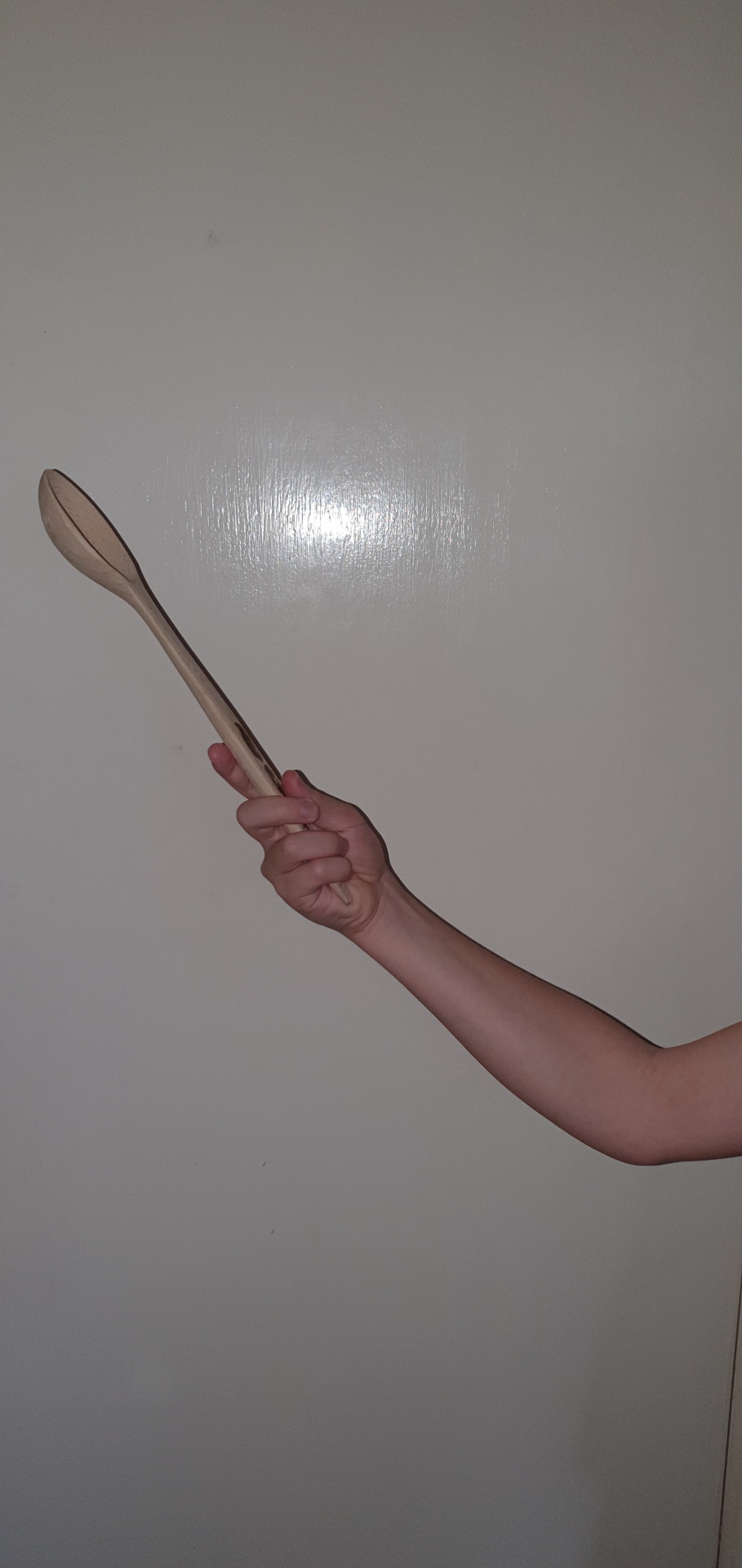
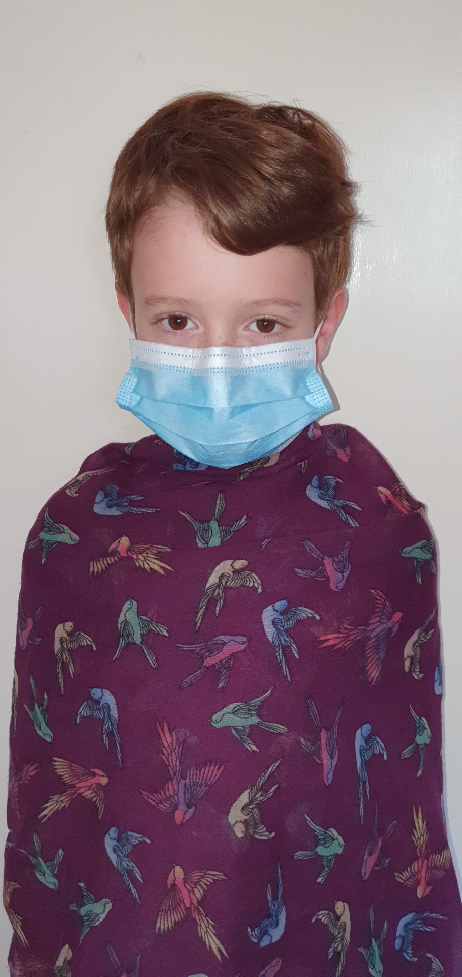
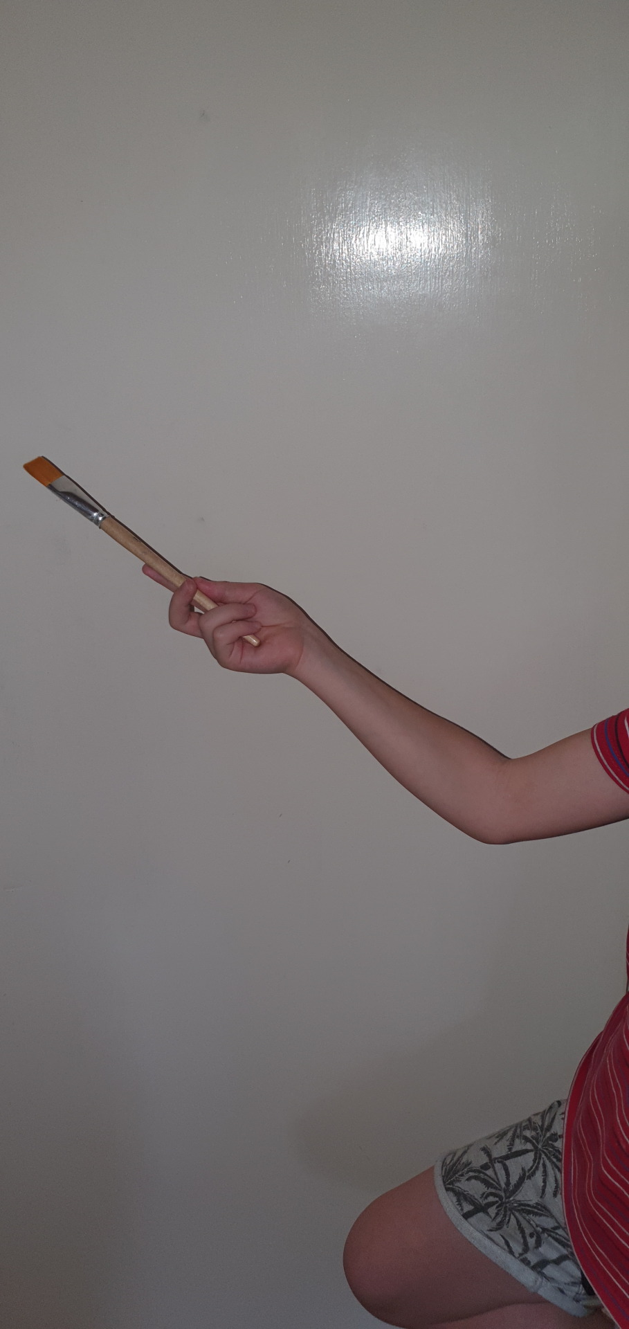
Individual work on Photoshop

Since I had some free time on my hands due to the current virus situation, I actually decided to do something new. I decided to do some work in Photoshop. I call my piece “Hands of creativity”.
I did my project simply using my little brother as a model and different objects that I found around the house. I started by photographing each individual piece in front of a white door. I needed my background to be as white and clear as possible for this to work. I also used my flash to get rid of the big shadows. My flash did add some other additional shadows but they were small so I was able to get rid of them on Photoshop. These are some of the pictures before anything was done to them:
As you can see, the pictures needed to be cropped a lot, played with the lightning and overall edited. After using the magic wand tool on Photoshop, I was able to get rid of the backgrounds.


But the pictures still needed to be worked on since they looked so dark and discoloured, so I opened them in Lightroom to play with some editing a bit. Mainly the lightning and saturation were changed, but here are the results after:
They look way more bright and clear as well as lively. So with all the pictures prepared (I had to edit each one of them), I could finally assemble them all in Photoshop. So I opened the main one, which was the body, resized it to fit nicely and then slowly brought in all the hand png’s, setting them in place one by one. It took me a bit until I placed all the hands in a way which I liked but in the end it was done. For a touch of realism, I decided to add shadows behind all the elements and this was done by simply drawing it with a black pen and then adding the Gaussian Blur effect on them; finally I lowered the opacity on all of them a bit.
And this brings me to my last step, and that is the part that brings the 3d realistic elements together with the 2d doodle ones. The background was white and simple so I felt like it lacked something. So I started adding various triangle shapes in different bright colours. Afterwards, I tried to make the main element stand out by drawing a lot of wobbly lines around it in different colours. My last step was doing little doodles to each one of the objects presented.
The picture seems really abstract as in it doesn’t make a lot of sense if you look at it in an individual way. And yes maybe to some extent I meant to create something with a bit of nonsense, with a trippy feel to it. But that is not all that there is to it. I think the main thing that you notice once you look at the picture, mainly around these hard times is the surgical mask. I tried to create this whole thing based on the virus situation going on right now to send a message but to also somehow include it in my project since well, it is part of my life and I feel like art is a way to share your inner thoughts about it. So yes the mask is meant to represent the virus, the horrible pandemic but at the same time it’s also meant to represent protection and hope, a sort of barrier that we can still create between us and the danger. All various objects held by the hands are the possibilities, the ways of escapism from this sad cruel situation. Each one of them stands for some type of activity like cooking , writing, painting etc. and each one of them is a way to get your mind away from what is going on outside. They are ways that would encourage people to stay inside, be responsible and realise that even in these challenging times, we can still accomplish. Think outside of your box and try things that you haven’t tried before, think about stuff that’s new, disconnect from this whole madness. All the 2d doodles I drew are meant to stand for your imagination; your imagination spreading out, trying new things, turning these normal objects into something magical. It is hard but we can do it together, we can pull through but we have to try, we have to work for it, we have to achieve it.
1 note
·
View note
Text
Painting Monochromatic Pictures
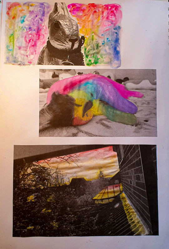
I saw this idea on the internet at first while I was doing some research for an artist and I got hooked up on it quite quick. The basic idea is that you print out a picture that was taken in black and white and using watercolours or other materials you go over it and paint the white spots. It’s pretty straight forward when you think about it. So of course I tried it aswell.
The middle picture was my first try, therefore it makes sense it looks pretty bad, but I didn’t want to get rid of it because in art every mistake is an example and it must be showcased. My main mistake was that I put too much colour pigment. You want your colours to be watered down and see through for this specific exercise. So with that in mind I moved on to my second picture and that is the bunny one. Having an empty canvas for a background, I wanted some funky design that stands out so I went for a sort of tie-dye pattern where I used lots of water and let the colours spread on their own.I actually like how they look around the bunny which is completely black and white, it has a good contrast.
And lastly, I took that picture of a sunset but since it’s monochromatic you can’t tell much, so my plan was to colour it as a sunset. So using very little amount of pigment I worked with the colours yellow orange and red only. I did have fun with this one as it had a lot of blending to do. But I actually quite enjoy this way in which I didn’t only colour the sky, but the buildings and walls aswell, as if the light reflected on them.
It is a fun concept because basically you can create whatever you want and also liven up your pictures a bit. Might try it again in the future as it doesn’t take much time or effort to perform.
0 notes
Text
Sketchbook Drawings 2
Picking up from where I left off last time, I did even more meaningful object drawings using different media, materials and techniques.
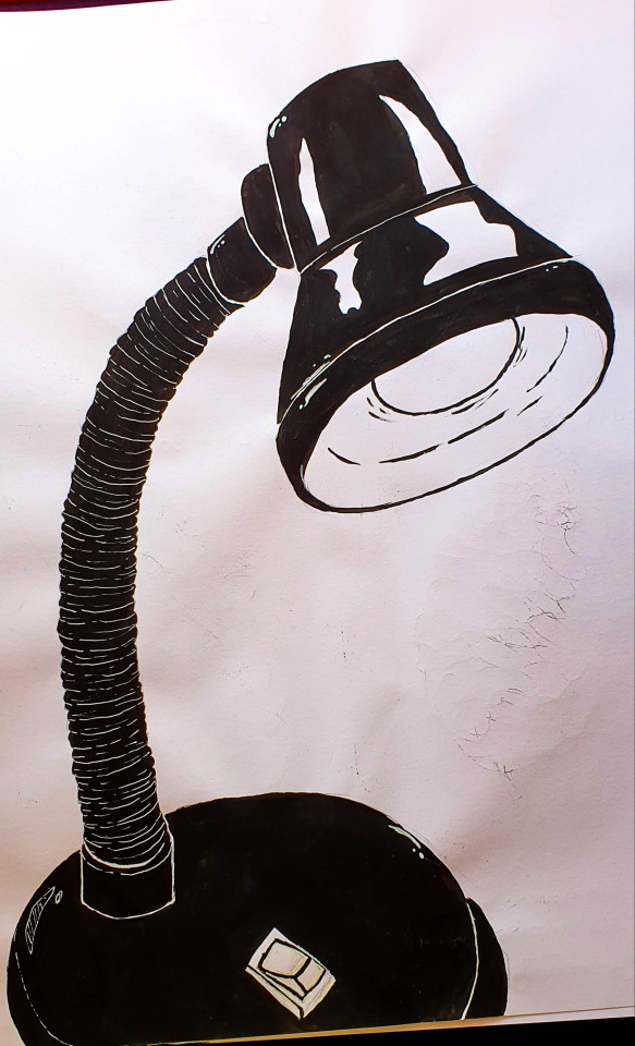
The lamp drawing was meant as minimalist, stylised. It’s simple yet it catches your attention. It was done all in black acrylic paint with the highlights being drawn with a white pen. I wanted to do this sort of “opposite” drawing, where instead of the object being left white, I colour it black and leave the background white. It’s actually one of my personal favourites because of the use of this sort of blocky, shadow style.
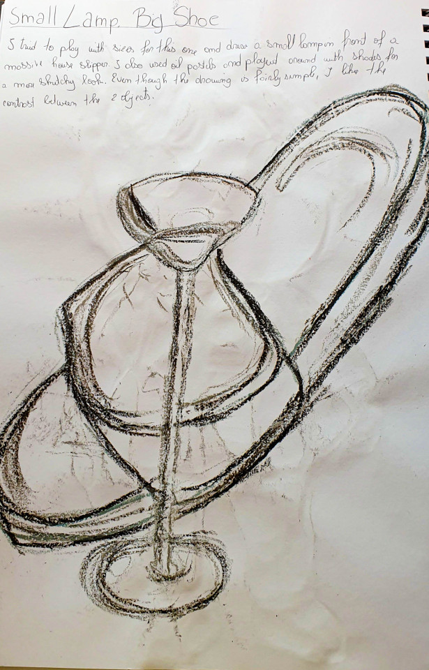
The Small lamp, big shoe
I think this one was done more for the sake of playing around with scales and objects. Normally a shoe is the small one and a lamp is way bigger but I wanted to do it the other way around here. It almost has a comedic effect in a way, seeing a house shoe so big near a tiny lamp as because of their sizes they are both kind of useless now since they can’t be used for their initial roles anymore. The drawing was done in various grey shades of oil pastels because I was looking for a sketchy effect.
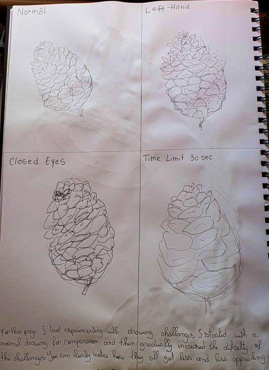
This is more of a challenge rather than an actual detailed drawing. Basically I tried different ways in which I can illustrate a cone, an object that is actually quite detailed. As you can see, the quality of the drawing kind of goes down as it reaches the last one. But I’m surprised to say that I actually think the left handed one turned out pretty decent despite it not being my dominant hand.
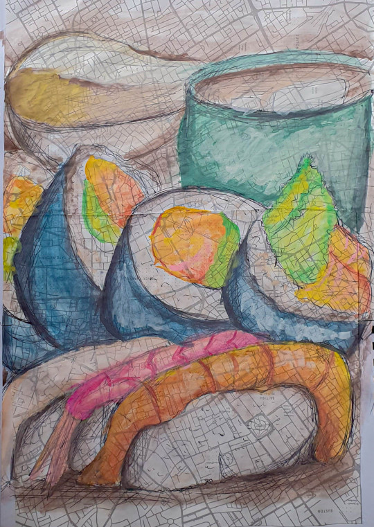
Biro work with watercolour. Here I went for a more smooth lineart rather than the sharp simple line one. I thought that biro would be a good choice since the lines are really sketchy and you can create this sort of not whole effect. I also chose to colour it with watercolour since it again makes it look more smooth and really brings out the lineart. As for the background, I chose this sort of map-like pattern since I like experiencing with textures.
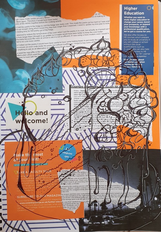
Finally my last one is the collage drawing. For this one my main goal was to create an interesting build-up as the background. I used various written texts, pages of magazines and even printed out a few pictures. And then I finally proceeded to draw something for the actual collage. This time I went with a cake topped with fruit and dripping chocolate. I drew it in sharpie and tried to get my lines as thick as possible while shading some areas so the drawing stands out on top of the collage. I also used a white pen to go over the sharpie and it gave me a pretty nice effect, especially on the area with the darker image.
0 notes
Text
Update on Monument Project

I come again with an update on my Monument Photoshop Project, although this time kind of small.
What I did this time even if you maybe can’t spot it directly, I made the background behind the cone slightly blurry. When taking a photograph, the objects that are in front will be focused and clear while the back part will go unfocused, therefore it will be blurry.
Basically I used the Gaussian blur again on the background image, set it to low and then used an eraser with a low opacity and soft edge to get rid of the blur effect on the water in front of the cone. It doesn’t seem like a lot, but it adds a factor of realism to it.
For now I am not sure if I will add new stuff to this piece as it seems sort of finished even though it doesn’t look as realist as ever. I will have to email my teacher and ask more details about what I can fix or play with.
0 notes
Text
Michael Craig-Martin Inspired work


Once again I tried adapting an artist’s style of work, except this time it was for art. Michael Craig- Martin (born 28 August 1941) is an Irish-born contemporary conceptual artist and painter. Here is some of his work for reference:

As you can see there are a few elements that stand out when it comes to his work that make it so iconic. First of all the use of plain, solid colours that are not complementary with each other at all. You’d think that this would make a drawing look worse but it’s actually one of the main things that makes Martin’s work pop out. The way the colours fight eachother actually makes people look at it more. Although in some cases, the colours are so saturated and bright that it might cause some people to feel uncomfortable. The second thing that stands out are the elements Michael draws and how he draws them. Everything he draws are objects. Objects drawn in a very simplistic yet realistic style.The bright colours combined with the simple line, realistic lineart makes these drawings look like something out of an old pop art poster.
Now on my side of the drawings. Michael did his using acrylic paint on a canvas even though it might not look like it. His method was done so perfectly that it looks like he actually did these drawings digitally. And that’s exactly why I did make mine digitally instead. I knew that if I did them with acrylic paint there was no way I could have done it as good as Michael did it, so instead I settled for doing them on my laptop so they actually do look alike a bit. I did them using a program called Paint Tool Sai, which I actually use on a daily basis since I am into digital art a lot. I started with a simple sketch based on real life objects, then did the lineart but made sure there’s no pen pressure so my lines look like Michael’s. And finally I coloured them in with different funky colours. I did 3 different versions playing around with the layout. They all give me a specific 80′s vibes, especially the cupcake one.
All in all I am actually pleased with my work and I like how I was able to recreate the same energy that Martin’s work sent off. I might have used a different medium but hey adapting is improving. I would actually like to include more of my digital work in my project since it is something I actually really enjoy doing and I would like to share my passion with everyone else.
0 notes
Text
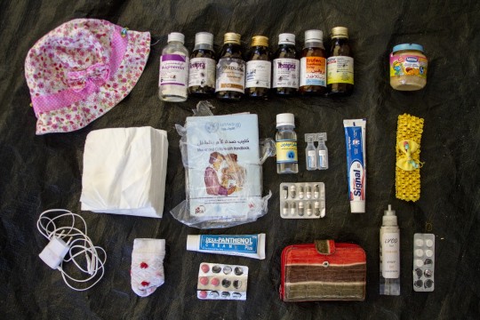
What’s in MY bag?
Last time I covered the subject of a research about refugees documented online, using photography as a media to spread awareness. I talked about meaningful objects, how they relate to our course and how the objects in the picture were important to the people they belong to. So now I took some pictures myself, in the same style of my own objects.
Now, I know that I am not anywhere near being in the same case of the refugees and having to depend on these objects, but I tried to pick what would at least hold a lot of a personal value to me.
There is one major difference between the first and the second picture.
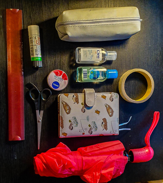
I’ll talk about the second picture first. What objects can be found?
Umbrella, ruler, tape, journal, pair of scissors, lip balm, hand sanitiser, glue, pencil case
Yes, these are some of the objects that I have daily in my schoolbag. Why are they meaningful? They are day to day basic objects that I need in school. They are important because of their use. Maybe they don’t hold any personal value , but they hold other types of values. Am I attached to them emotionally? No. But do I need them in my life? Yes. This is exactly the case of the people who had objects such as medicine, clothes and food in their bags. They aren’t important for your soul but they are important when it comes to your life. Meaningful objects don’t have to mean or tell a story; as long as you need them in your life, they are already meaningful enough.
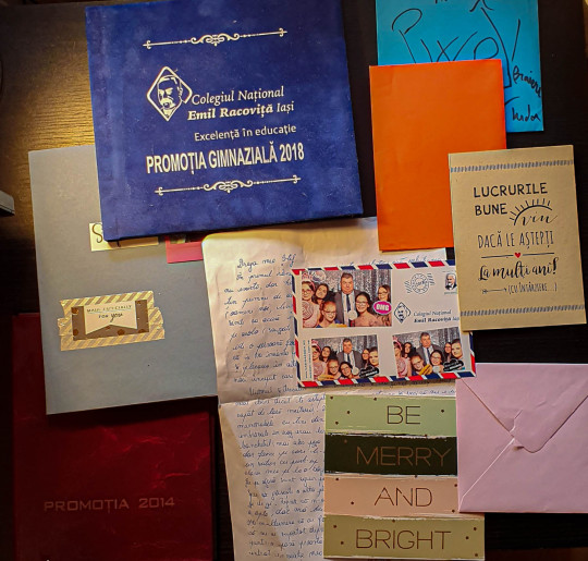
Now let’s go back to the first picture. What we can find here:
2 school albums, cards, a prom photograph, a letter, a notebook
Right from the start you can notice the sudden change in objects compared to the second picture. You don’t even need my explanation to be able to tell that all of these hold emotional value to me. In order to explain my own linking to the refugees object pictures, I will have to say a little of a background story. I moved to England 2 years ago; before that I used to live in Romania. Moving has come really hard to me and it took a big hit on me as I had to leave behind my house, my friends and my family. The day that I left, I made sure to grab with me my “bag of memories”. No, they don’t have any functional matter, but I took them because for me they matter so much. The picture was taken on my day of prom, the day that I will never forget; the cards are all from my friends; the letter was written by someone who gave it to me before I left.When leaving I also had to pack whatever I needed the most (of course I was able to pack way more than in the refugee case so comparing this is sort of not accurate), but I made 100% sure that I take my bag with me. So, this is exactly it, my bag of memories, filled with objects that have such a deep meaning and hold so so much emotional value for me. Again, meaningful objects, but in another way.
Now onto the technical photography side, I also had to slightly alter and edit these pictures aswell, but I tried to do it as minimal as possible, as to keep the pictures simple like I said in my last post. Here is a before and after:
And here are the settings:

I only played around with what I could so I make the picture pop out more, but I didn’t go too much into it. Mainly worked with the black, whites and shadows since the lightning bugged me a little. But yes, in general a simple picture that holds a message, a message that is important to me since it reminds me of my home.
0 notes
Text
What’s in my bag
“What’s in my bag” is a research documented on a website, done by the International Rescue Committee. The research looks upon refugees from Turkey and other parts of the world; mainly putting focus on what some of these are carrying in their bags from the day they had to leave their houses. This is the link to the site itself: https://medium.com/uprooted/what-s-in-my-bag-758d435f6e62
What has caught my attention is how they are using photography as a medium to spread awareness. The refugee’s bags and objects, aswell as the people themselves have been photographed in really sensible ways.
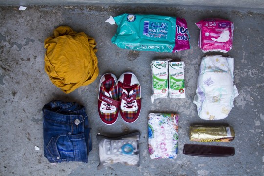

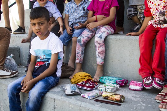
These are just few of the examples, but you can look at even more and read the story behind them on the official website. The pictures have been taken by photographer Tyler Jump, who seems to have a history in working with refugee campaigns, as well as other noble causes. Here is his website, which includes all of his work: https://www.tylerjump.com/#/
I think this whole research matches perfectly the type of message we are trying to send and create in our project. All of these objects are meaningful, actually the most meaningful since they are the only ones that the refugees took with them. Each single one of them is either essential for their survival or has some personal connection and they simply couldn’t leave them behind. Most of these people have objects such as meds, phones or little amounts of food; they might seem like any everyday objects but for them, in that specific day they had to leave everything behind, these are the most important, they are more than just belongings, they are part of their life. It’s completely terrible how the world has become so heartless and so cruel that people have to leave their houses out of safety, only carrying a single bag with 10 objects at most with them.
The way photography has been used up in order to spread awareness over this alarming situation is also to admire. The pictures are simple: they only feature the objects carefully arranged on the ground as well as a single photograph of the owner. But the simplicity of it focuses on the message and on the real thing that we have to drive our attention to, and that is the refugees in danger. And yet the pictures still hold a strong emotional power with a strong message even though they might seem so simple and lacking elements of dynamic. And that is exactly what I look for when I work on this project: ways in which my photography can reflect upon my objects, their meaning and their message. Simple isn’t always worse, but simple can be straight to the subject, simple can really put out the potential behind a picture, the potential of the subject. And that is exactly what I work my way to right now and I hope I can learn to convey messages with a picture that maybe doesn’t seem a lot at first sight, but after you hear the story, it suddenly feels completely different than before. These pictures sure say a lot about the refugees; about their pain, about their fear and insecurity and surely all of these traumatic memories that no one should have to ever experience in their lives. I want to be able to work with that emotion, to send it forward and to be able to make others feel.
0 notes
Text
Response to Nicholas Nixon

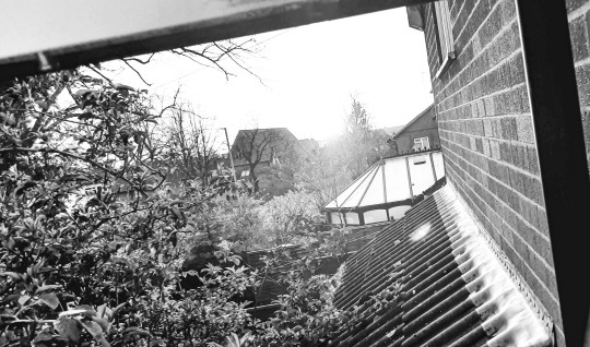
After studying Nixon’s pictures and getting inspired by most of them, I finally was able to take my own photographs around my house. I went for really familiar things like, the view out my window or simply my working desk. Again I did keep the monochromatic palette for my work as I wanted to match Nixon’s and because I just love experimenting with it. My main thought about them is: they do look very homemade; but afterall I think that’s exactly what I went for in the first place. Something familiar, that feels at home, that feels personal to me and to which others can relate with their own homes. And I do believe I achieved that quite well. They aren’t complex photos, they are quite simple, done in basic ways but, isn’t that what matters actually? The simplicity and somewhat beginner nature of it really brings it out in my eyes.
Another thing that stands out and I tried playing with, are the glow in the dark stars pictures. I have 3 different pictures, out of which one of them is actually my blanket that also glows in the dark. Sure they look quite different compared to Nixon’s but I kind of like them as they are. I like them because they are mine, in my house and they feel familiar to me; they are the same stars I look at before going to sleep every night.
Here are my favourite picks:

Here is my process on the glow in the dark picture.
First this is the picture before and after:
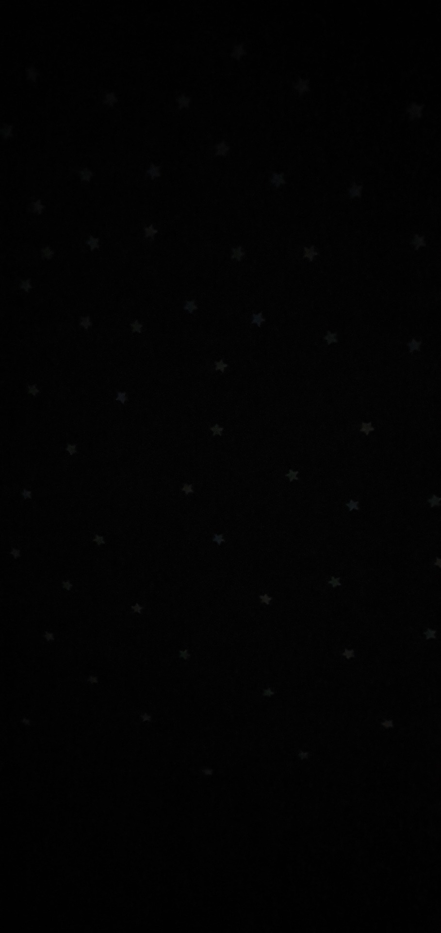
And here are my settings:

As you can see, the exposure as well as the contrast had to be raised to the max in order for the stars to be lit up and glowing. Most settings were lowered so the stars can be noticed easily, so the shadows whites and texture were completely shut off. Finally, you can probably notice that one difference between my picture and Nixon’s is that mine does in fact have colour. That is because my stars came in 3 different shades: pink blue and yellow. When they glow, they all look white but by turning the vibrance to 100, I was able to get those colours to show. It is true that the yellow looks more green and the pink is faded, but the blue is clear and you can still pretty much tell there’s colour.
0 notes
Text
Looking into Nicholas Nixon

Nicholas Nixon (born October 27, 1947) is an American photographer, known for his work in portraiture and documentary photography, and for using the 8×10 inch view camera. In 2005, just like Blakemore, he also published his own book called “Home”. His book features mainly pictures taken around his house, with various objects, scenery and family people. I got interested in this one book of his particularly because given the quarantine situation we are in right now, I could get inspired by his work and do my own shoots around the house. Just like Blakemore, his pictures are also monochromatic, which gives me even more chances to practice my black and white photographs which I love so much. There isn’t a specific pattern in his work, like Blakemore had his tulips and shadows, but his work is still impressive and it shows a really good look and perspective into living in your house and the day to day life of a normal human. I think it really makes you notice the small things, like your front garden, your view from your bedroom window, your family having a nice evening watching tv or your family pets. Everything that seems so normal everyday, becomes so beautiful and out of the ordinary when photographed and put under an artistic light.
The following 2 pictures are what interest me and I will try to retake with my own object versions from my house:
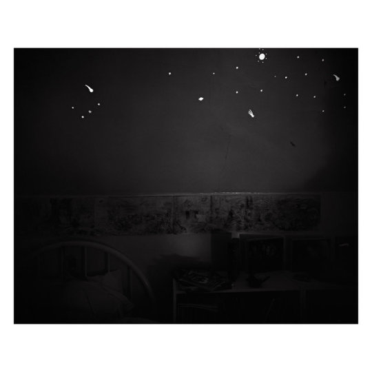
The first picture features the bedroom of a child who has glow in the dark stars put up on the walls. Since me myself am a big fan of glow in the dark objects, I also have so many stars put up in my room so I could make my own version of Nixon’s work. I really like how the room is dark, but only the stars are so bright and seem to shine in a way like real stars on the night sky.
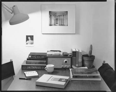
The second picture, is a more simple one, purely showing Nixon’s life. The photograph features a table filled with Nicholas’ belongings which he uses daily. Things like books, a radio, a mug, a cactus, a journal and a pen can be noticed; things that really you would find in any house, but the fact that they belong to him and they make up his life, makes both these objects and this picture special. The picture is cut in the 2 parts, the top, which is the wall and it is white and clean, and the bottom which has various shades of grey and black and somewhat contrasts the top part which looks so empty. The light source is not natural, but comes from a lamp situated in the left top corner side and it shines upon the table. The light looks soft on the table side, but the one on the wall is cut abruptly. The picture is simple when it comes to photography terms, but it has to be simple, in order to have the message and the importance and impact those objects have on Nixon stand out.
By studying his work, I think I will manage to take my own “Home” series pictures black and white, just like he did.
0 notes
Text
Various Shoots


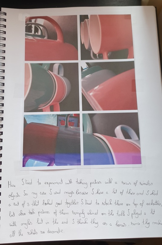
Various shoots I did over the time and put in my sketchbook.
0 notes
Text
More Cardboard Sculpture Artist Research
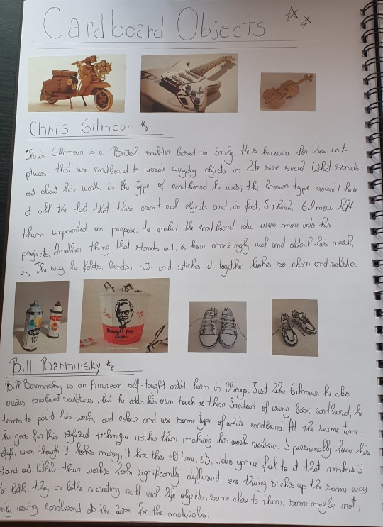
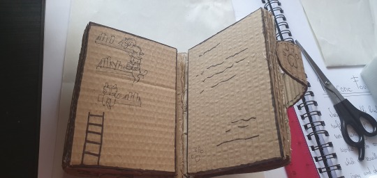
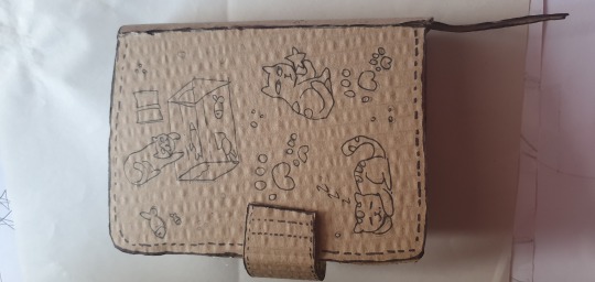
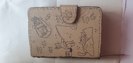
Just like with Michael Leavitt, here I researched even more artists so I can build more cardboard sculptures myself.
0 notes
Text
Mike Leavitt Research and Response

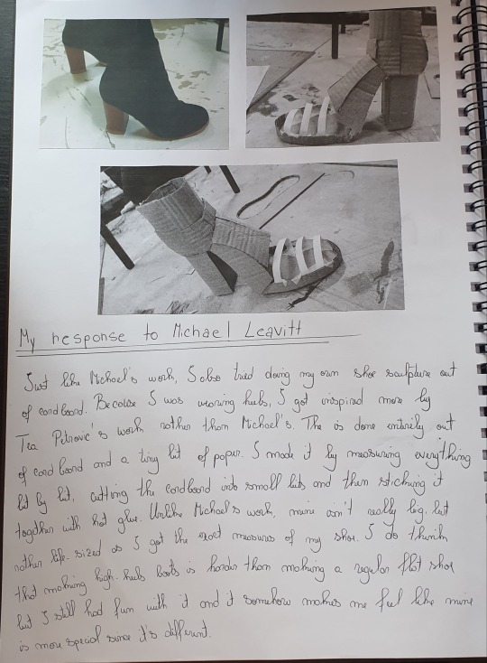
The Mike Leavitt research I did for my 3D classes, where I also made my own shoe out of cardboard.
0 notes
Text
John Blakemore Photography Practice
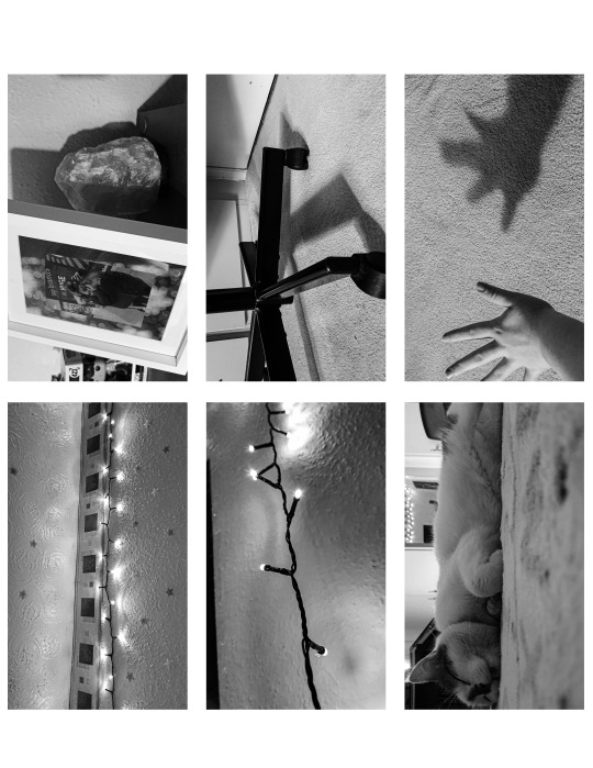
So as mentioned I tried to do some pictures in his style myself. When trying to recreate them, 2 things stood out: 1. they have to be black and white 2. I have to include shadows and how lightning affects pictures. I think the way that these were taken in a monochromatic way puts in emphasis the shadows and contrast between the colours even more and they look more impactful, elegant, pleasant. Monochromatic pictures have an aesthetic of their own I believe, they have this beauty and feeling that comes with the lack of colours, it feels as if the lack of colour makes you focus on the message of the picture and ambience. They feel so dreamy and soft at the same time that I can’t stop admiring them. I have to admit that taking monochromatic pictures might be through my favourite photography preferences.I will try to focus on black and white this week and create more similar pictures that send different messages and feelings.
Here are my 2 personal favourites from the ones I took:


For these pictures in particular, since there are no colours, I had to focus mainly on texture, clarity and lightning. The picture above is the after but here is the one before it was edited:
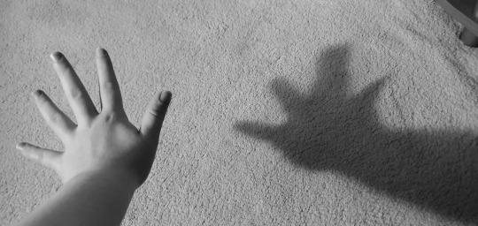
Of course, here are the settings aswell:

As you can see, the texture was increased a lot, and that is because indeed I had a lot of texture to show off due to the detailed carpet from the background. The clarity was increased a bit aswell since it looked a bit cloudy before. The shadows and blacks were slightly increased so the shadow of the hand can pop out more on the white carpet. You can really notice how these small changes really brought out the picture and turned it into something quite eye-catching.
0 notes
Photo
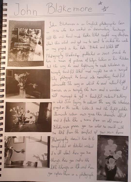
After checking out @thephotoparlour on Instagram, I found some posts about The parlour games. I watched the first one where a series of photographers that took pictures around their house were shown. So I settled on choosing a few, doing some research and then trying to take pictures in their styles. The first one I picked was John Blakemore and the detailed research can be read in the picture above.
0 notes