Don't wanna be here? Send us removal request.
Text

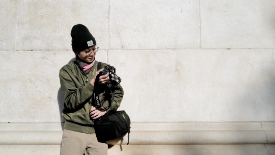
Headshot of my sister, who works as a chef
0 notes
Text
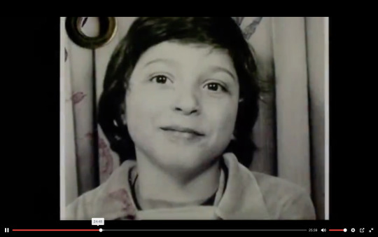
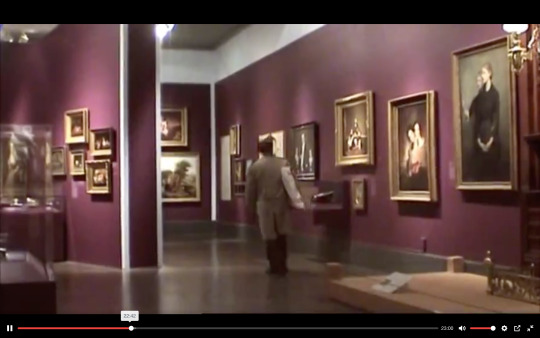
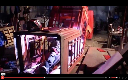
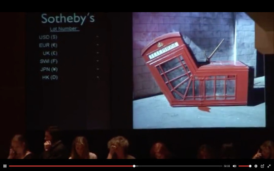
I thought it was really informative and crucial to learn about the circumstance of Thierry's mother death and how it shaped his life.
Really loved the way he went about sneaking up to hang the painting.
I really liked the humor of the British phone booth.
Great story arch of how street art went from this 'contraband' act to being highly appraised and sought after collectors' pieces .
0 notes
Text


The first screenshot is from when Nas and Jungle were talking about their mom. This part captures Nas' vulnerability, which is emphasized through the close-up shot of his face and low-key lighting.
The second screenshot is taken from a low angle and focuses on the background action as opposed to the foreground. I like how the focus is on the children as they play with the sprinkler because it shows life in Queensbridge.
The third screenshot is a photo of Nas as a teenager. I really like the use of old footage intertwined with the interview.
This screenshot is also archival footage, showing an 18-year-old Nas performing. It is really cool to see the moments that shaped Nas' career and cemented his spot in the music industry.
0 notes
Text


This was an excellent establishing shot, and I like how the color of the buildings contrasts against the blue sky and mountain.
I liked this part of the documentary because it captured the culture of street food in Chiayi, and it portrayed its importance and popularity.
This scene was really fascinating because it documents the process of the 3-day 3-night goat stew. This part really exhibits the cultural and familial significance that food can have.
This screenshot is from when Uncle Goat had dug the 3-day and 3-night goat stew up. It was interesting to see the process of preparing this meal.
0 notes
Text


I found the first screenshot interesting because it is the archive of the Helvetica font. You can see a faint drawing of the letter "A" drawn in the Helvetica font. I found this really cool because you can see how the font was first designed.
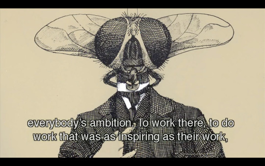
The second screenshot came from Paula Scher's scene when she was talking about big corporations using Helvetica for logos. She implies that Helvetica was the font of the Vietnam war because it was used by big corporations that supported the war.
The last screenshot is of Stefan Sagmeister. He expresses during his interview that he is disappointed in modernism because its boring. I found this part funny but its also really fascinating because I feel as though modernism and technology are taking the place of art and artists.
0 notes
Text


I really liked this first screenshot because it comes from a beautiful scene of Ushio and Noriko at the park smelling flowers. The scene cuts back and forth between archival footage and recent footage, which creates an interesting comparison of the past versus the present.
I chose to screenshot this part of the documentary because I really liked this specific part and the framing of the scene. It is taken from a high angle and leaves most of the screen covered by the concrete wall yet which creates an interesting frame for the people below. The stillness of this shot was really beautiful.
This is a screenshot of Ushio in action as he creates one of his pieces by punching and spreading the paint around on the canvas. It documents his rebellious approach to art that I found very fascinating.
This is another screenshot of Ushio creating a painting. His movements are sudden and incalculable which I think adds passion and feeling to the painting's meaning.
0 notes
Text


I found the first screenshot really interesting because it was old archival footage and photographs that were added to show the transformation of the Public Theater, and it was really cool to see one of Paula Scher's first projects.
The second screenshot comes from a short montage of Paula Scher's work, specifically her use of different typefaces. I chose this screenshot because I really liked what she said at this point in the documentary, she states, "You can create an identity for a whole place based on a recognizability of type."
This third screenshot is from Paula Scher's map paintings, and I chose to screenshot this because I really liked when she said, "its not factual, its emotional... I'm not making something designed to answer questions. It's more a design to raise them."
0 notes
Text


The first album is for The Velvet Underground & Nico and I really like this album cover because it features Andy Warhol's famous work. The bright yellow banana contrasts with the plain white background and the album has become famous and easy to recognize because of this.
The second album is from Cage the Elephant and I like the strong black lines that direct your eye to the abstract bust. The colors of the face contrast with the black and white lines.
The third album is from The Strokes and the artwork is by Jean-Michel Basquait. There are a lot of contrasting colors and the work is very expressive.
0 notes
Text

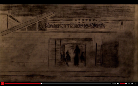
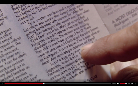
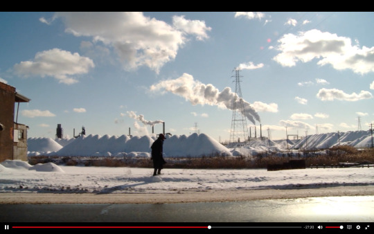
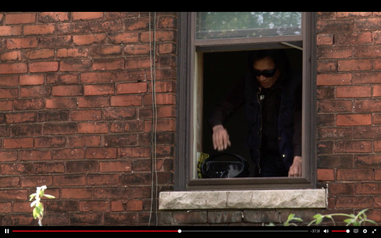
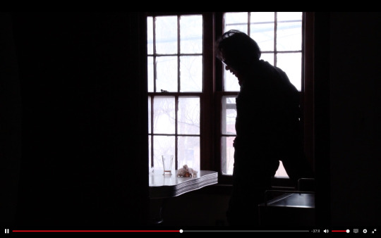
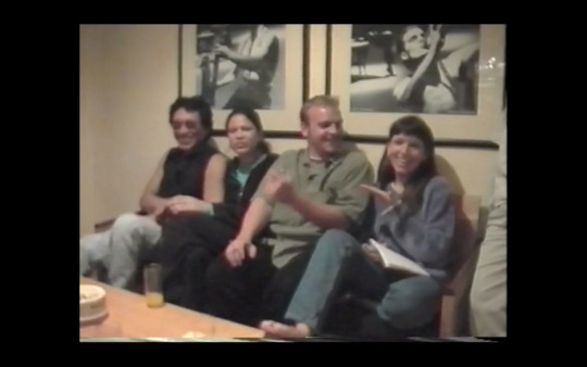
This documentary blew me away. It is the best (and now officially my favorite) documentary that I have ever seen. I was moved to tears on a few occasions while watching it. There are many inspiring points and moments that I will remember for my own work. And I am super happy to have discovered it thanks to this class.
I found the cinematography stunning. Full of texture.
Really liked the addition of drawings and animation. I felt it brought so many other dimensions of medium and content, making it a richer audience experience.
I really liked the way the story structure was crafted. "Any musicologist detectives out there?" is a line that marked a turning point in the story. It also is placed at the end of Act 1, if one was to break down the structure of this documentary in terms of traditional script writing format.
There were so many stunning images and moments where Rodriguez is walking, that gave me a feeling of music videos. And brought a sense of rhythm and movement that I really appreciated. It gave me as the audience member room to breathe, process the narrative, and to just be with this profound and touching story.
and 6. followed each other and cut on action. I really liked this choice of Rodriguez seen looking out through the window, and then in the next sequence, seen in silhouette against the backdrop of a window. I liked this choice a lot both as an aesthetic and continuity decision.
I really liked how archival footage and photos were incorporated into the structure and plot. The trip to South Africa of the entire family proved to be a life changing event for not just Rodriguez but others as well, in a positive way.
0 notes
Text


I liked this close up shot because it felt particularly vulnerable and emotional. The documentary really captures the human element in a very capitalistic factory setting that prioritizes output and efficiency.
I liked the colors of the blonde and pink against the factory setting. Something about the combination makes for interesting cognitive dissonance.
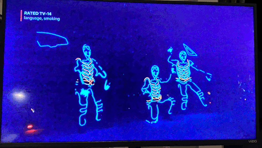
The dance at the celebration felt a bit ironic to me, with the neon suits looking very futuristic and robotic but also human at the same time.
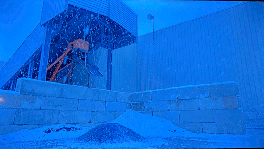
The sound of the glass falling into the pile feels symbolic and indicates how tumultuous Fuyao's state of affairs is.
0 notes


