
Don't wanna be here? Send us removal request.
Statistics
We looked inside some of the posts by meelalatta and here's what we found interesting.
Average Info
Notes Per Post
2
Likes Per Post
2
Reblog Per Post
0
Reply Per Post
0
Time Between Posts
9 days
Number of Posts By Type
Text
17
Last Seen Tumblr Blogs


Fun Fact
Women make up for the other 50% of Tumblr’s audience.
Text


To start with I needed to set up my paragraphs with Paragraph Styles. Window>Styles>Paragraph Styles.

Before I could apply a Paragraph styles I liked I needed to to get rid of all the hard returns from the text i pasted from elsewhere. I first picked the largest text so that it would be easier to adjust the rest as they are smaller. First i backspaced either twice or just once like shown above, so it was one long line. Then I did adjusted the line spacing by doing a soft return, which done using Shift Return.


Once all text was soft returned, I then double clicked on my body text to show my paragraph styles and adjusted the space after to be 2.5mm. I could see what is was changing as i had preview on. Once i liked how the the text was looking, i saved it by pressing okay.
Next I soft returned the rest of my 4 lullabys and applied the body text paragraph style and adjusted accordingly to the size of each.
0 notes
Text


Here are all of my shortcut notes
- These were always so handing to have next to me to refer back to in case I missed a step in class.
0 notes
Text

We then looked at aligning everything using indents and spacing.


Today we used in design for the first time in this class - although I have previously used it to make a magazine in school - so it was quite easy to follow along even I have used it in a while. We focused on paragraphs styles first doing lots of playing around with different types.
We did basic paragraph tools like different fonts.
We created a basic paragraph, body copy and headings ( pictures in the panel above)


We then moved onto bullet points and numbering in the paragraph styles panel.
We pasted text from Moodle and added bullet points to the text and then went back into indents and spacing to arrange and align it in the best way.

I forgot to get screen grabs the process of creating the frog and its back ground- but it was a lot of what we have done on previous days - using fill tool and bring the frog image to the front.
- But the new tool that we all learnt very well was shift + command would helps you scale everything all at once and is so useful when we placed our frog image into our page of writing.
Another thing that learnt was to add columns to give it a tidier look. This also helped with when u want to add image to text it’s all balanced out in a presentable way.
0 notes
Text

Changing the page numbers was easy for me although you have to make sure you have selected the right parents page otherwise it won’t work. First we started just doing pg 1 and 2 and then selected A parent page and went type - Insert special character - Markers - Current Page Number. This updated all of the other pages to the correct page numbers - I thought was quite cool.


We next went on illustrator we where used the pen tool to draw a bird and filled it with a colour of our choice. Next we created a square and placed the bird on top. Then we added this to our swatches menu. We drew a random shape to add our newly created swatche to. We then learnt how to change the pattern using pattern options ( double click). In this panel we could choose grids and that would change the arrangement of our birds - lots of girds would make the pattern much more busy with lots of birds.

We then decided to take it further and instead of a square we the another shape with the polygon shape. Here we changed the colour and added to our pattered swatches panel. After that to make it more interesting we decided to duplicate the bird ( select and drag while holding option) and made two more birds of different sizes.

This is my final page end pattern which I really like and was so fun to do - I didn’t know that you could make your our swatches.

I forgot to take individual screen grabs of when we create the cover and back cover pages, but that was what we completed first using very simple text box and select tools to position the text where we wanted.
This is where we got up to with our book - with the added in patterns that we created. - seen at the top is my completed pattern endpages which I’m quite proud of - this was definitely was of my favourite thing we did in this task.
0 notes
Text


This was quite a big task with lots and lots of different tools used. First we used the object select tool to select the whole jumping man. We then created We then created a solid green layer to see what was showing up in the cut out that we need to go and fix.
For the touch ups I used:
The brush tool - especially for the hair it took a lot of back and forth to make sure it didn’t look to choppy or that I brushed over too much of an area. I zoomed so close in to tidy up the details of everything.
Brush tool white - We used this add back what was maybe accidentally brushed over too much.
Brush tool black - we used to remove what we wanted gone.
The polygonal Lasso Tool - it helped me catch and delete any leftover stray pixels especially around the hands and arms
Option + Delete - a cool tool that we used to fill in any missing areas with the foreground color.
shift command I + invert selection - This was the most trickiest shortcuts but it was so useful once i used it a couple times. When cleaning up the shoelace for example we had to invert the selection to see what we actually needed to cut out. I used it in other areas aswell while cleaning the cut out up.


After everything was tidied up we moved our man in illustrator to create the S shape
We used the pen tool to do the Snake S shape and then we changed the stroke to be much thicker.
We then picked two colours and used the gradient tool to colour the snake shape ( the panels are shown in the photos above)
We then grabbed an image of a road from google and arranged the S shape in a specific way so that run in front and then behind his legs and arm.
We pasted the google photo and brought the jumping and S to the front and the last screen shot in my finished result - which I’m quite happy with.
0 notes
Text


This was the first of colour homework photos. I wanted to brighten it up and make it not as blue cast. I first used the brightness and contrast tool to make the photo a bit more hazy and sunset vibe. I used the curves tool to make the sand dunes stand out more and make the figure more silhouetted against the sky. I then used the hue and saturation tool to make the bring a more orangey sunset tone.
I think if I would adjust this photo more I might make the sky a bit brighter to contrast to the clouds.


This black & white was quite easy to adjust I played around with the curves a lot to for a good contrasted outcome - I wanted the vines against the window to stand out but I also wanted to look very dark and shadowy so I just the brightness and contrast tool as well as a photo filter to slightly might it not so stark.


This one is my favourite of this homework task. The colours of the stain glass we so fun to play with the hue and saturation tool. I used curves to extenuate the architecture of the church and contrast with the brightness of the windows. On right the final result shows the panel with all the tools I used. Including :
Brightness and contrast tool
Curves tool
Vibrance tool
Exposure tool


For my last one I really wanted to highlight the shadows of the mountain, I used brightness and contrast a lot to achieve this look. I also used curves to bring up the highlights of the sunlight in sky and further darken the mountains shadows and the chairlift.
I think I might have darkened it a bit too much, but I’m happy with contrast of sunlight and the mountains.
0 notes
Text


We then moved onto adjusted photos.
With this black and white lady we learnt about how to use histograms and the curve tools. In my notes that I posted they explain how when you move the curve in certain directions it’s either darken or lights highlight or lowlights. These are called Values.
With this image we used curves to darken the image and make the black very dark and create more intense shadows.


Here we used the exposure tool. We learnt how to brighten the image by adjusting the exposure.


With these face images we learnt about the hue and saturation tool. We played around with all the different colours and how to adjust them.
With the landscape photo we also just hue and saturation and learnt to use the photo filter tool which there are many different types to make the photo different tones of colour.


Which this photo we continued with adjusting the colour with brightness and constrast tool and hue and saturation, as well as the curves tool to bring out the colour even more. We wanted the green of the tree to pop and the colours of weavings. We also added a photo filter to this add even more life and vibrance to the photo.


This is where we learnt about the gradient tool. It is a very fun tool I loved playing around with it. In this photo we split the image so that we could brighten the foreground with brightness and contrast tool and keep the sky similar. But then we used the gradient tool to adjust the brightest of the sky, making to lighter into a more darker blue. This was my favourite task of all the photoshop adjustments.
1 note
·
View note
Text

Next this is one was super tricky. First we wanted to make the wing more defined before we cut it out so we used the pen tool to make the curves of each feather.


Next we made a layer mask of whole humming bird so that it was easier to focus on just the outline shape of the bird.
Once we were happy with the shape of the wing we used the blur tool to give the effect of a fast flapping flying wing. This took quite a while of blurring the edges until I was happy.

The final step was to use the perfected cut out to transfer it onto a realistic background. We used flip tool to make it face the flower.
This was a really fun and tricky activity - but I think I got the hang of it quite well.
0 notes
Text


This task was quite difficult for me. First we used the ellipse tool to roughly select around the orange, then the tricky part… we used shift = add and option = delete. This is how we went around the whole orange selecting and deleting where necessary.
I struggled to complete this quickly - I definitely need some more practise with this.
We then used hue and saturation to change the colour, but had to make sure we just changed the colour of the selected orange.

We then practised it on the lemon aswell. But this time instead of adding and deleting to select the object we just used the object select tool to do a quicker and easier way. - I learnt that it’s probably good if you want a more perfected result to take the slower selecting route like we did with the orange.
0 notes
Text


Our next task on photoshop was to duplicate this boat. We did this by using lots of new tools.
We used the marquee select tool to cut out and make a copy of the boat. We did this using a the layer mask tool, and then we used the blur tool to blend it into the first original layer. We then shtick it down so it looked like it was more in the distance, and then changed the opacity to make it look more realistic like it was further away.
I really enjoyed this task, and I think the tools we learnt will be very useful for future projects.
0 notes
Text

This my ‘masterpiece’, it was just a play around for our introduction into photoshop. We learnt to the use the following:
- The brush tool ( shortcut ‘b’)
The brush took we learnt how to change the opacity of the brush and also the shortcut of ([) to decrease the size of the brush and (]) to increase.
We also try out different brush types ( there are so many to play around with)
- the Eraser tool
We played around with eraser ing different parts of brush strokes
We also learnt how to change the backgrounds and use layers.
0 notes
Text


This task I found very tricky. We selected the five leaves and then We used the pen tool to carefully work around all the edges of the left to select it.
Once it was selected we created a layer mask. Then we proceeded to use the hue and saturation tool to change the colour of the selected leaves.
This was a very cool task although I was very slow completing the pen selection.
0 notes
Text


Here is my vector drawing homework. I am very proud of this one because I did it mostly by myself.
I used the pen tool to draw out all of the shapes (which there are quite a few). I learnt how to lock objects so that it is easier when drawing shapes to connect to another but need to be separate.
I also enojoying playing around with the shapes of the smoke - direct selecting and adjusting til i was happy of the shape.
I really enjoying using the fill to colour it all in at the end.
1 note
·
View note
Text

Here is the very beginning steps of making my penguin using Illustrator. We made the body by using the ellipse tool spitting the circle in half and separating them to make the top and bottom of the body. Then we joined them by using a new tool the Join tool(keyboard shortcut command + J) We then adjusted the bottom circle to make the flick of the tail we did this by adding two anchor points (+) to the path to be able to manipulate it outwards.
We made the top feather on its head by adding multiple anchor points to the very top right of the circle, we then used closed curves and then readjusting the handles after to create the spiky effect.


Next we used the rectangle box tool to create the general shape and size of the beak. This first screen shot is where I chose to position the beak of my penguin. We learnt how to use the little circles shown in the screen when selected can curve straight edge anchor points to achieve the rounded look, shown in the last screen shot.
We then did the wing, we created a bezier curve, and adjusted it to get shape we wanted using direct select tool on the anchors.
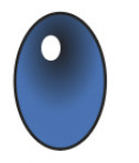

I forgot to get screengrabs of the process of the eye as it was a very new and a bit tricky at first process with lots of new tools. We learnt how to add layers using the little plus in the bottom right corner of the layers panel. The other new tools that we put on display were swatches and the gradient tool. We selected the radial gradient tool and selected from the swatches panels a colour of our choice i really like the blue colour I chose. Once we selected the colour we had to carefully drag it from the swatches into the slider of the gradient tool and adjust it to the gradient we liked. We added a white fill to make the pupil and held option to duplicate to make two.
I found this first use of colouring very fun, and i'm happy with out they turned out.
0 notes
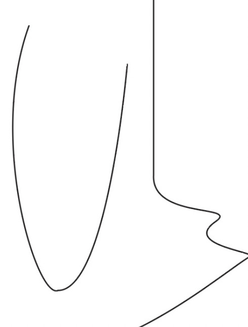
Text


Here are some more complicated single and multi-arc curves. It was harders to position the handels right for these as they had multiple arcs in one shape. The first picture is showing all the handels used to shape each curve.
0 notes
Text

Next we moved onto making the feet. This possess was quite tricky and you had to be very precise with your use of tools, and keep up with each step, again i forgot to take screen grabs of this process as I was trying to stay very focused. We used the pen tool to draw out the top half of the foot. We then learnt to use a new tool called the reflect tool( shortcut command O) this took the top half selecting both end points by holding shift and option together to create the position for the reflect tool to copy and flip the top half.
We then used select tool and while holding option duplicated so we then had 2 outlines of the foot, we proceeded to to make the feet 3D looking. We did this by deleting the top paths of each toe, and then duplicating it to create layers toes. We used command J to join them together. We used an orange fill(tool) (two different shades) to create the raised 3d look. - we also learnt to scale the feet to be the right size in proportion to our penguin bodies.
My favourite new tool we learnt to use was under Object and arrange; where you can bring an object to the front/ send to the back to get the perfect layering. - We used this for the feet and also for the legs.

And here is my finished Penguin, which i am very proud of. I learnt so much creating this, so many new useful tools. I also really enjoy using illustrator.
0 notes