
Statistics
We looked inside some of the posts by meghanhalpin and here's what we found interesting.
Average Info
Notes Per Post
0
Likes Per Post
0
Reblog Per Post
0
Reply Per Post
0
Time Between Posts
6 hours
Number of Posts By Type
Link
1
Photo
12
Text
4
Last Seen Tumblr Blogs


Fun Fact
Tumblr has a 66 index score for customer satisfaction in the US.
Photo
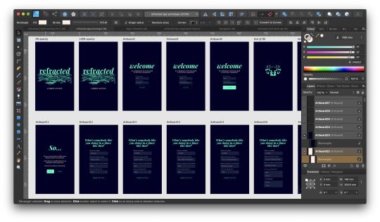
Prototypey type things. Kyle recommended creating the beginnings of an app to complement the physical deck, I agreed and thought it was important that people who might not be able to fork out for a physical card deck could have an entire refracted experience digitally.
Not just a digitised version of the deck, but a unique digital experience. So I went with a trifecta: daily card pull/journal/inspo. The daily card pull is very reminiscent of single card tarot readings and allows people to digitally pull a single card. These can then be pondered in the journal section.
The inspo section is supposed to a grid of nice quotes, task ideas etc. I think this could be a crowd driven sort of thing. People can submit their ideas for tasks and their favourite quotes and we could build an expansion pack where everyone is credited, or just credit people digitally if they were an app only release.
0 notes


Photo

Putting together mockups for socials and the promotional website. I’ve found using the nude ties everything together really well and reduces the harshness of the contrast between my true navy and electric teal.
0 notes
Text
Mockups


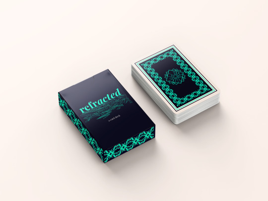
Mockups with finalised card dimension, full card back and box design
0 notes
Text
Finalised quote card design

My finalised design for quote cards. This is actually my favourite quote from all the dozens I researched and made note of. I’m quite an anxious person so anything about letting go of fear and embracing who you were born to be really resonates with me.
0 notes
Text
Instagram feed
I set up an instagram for refracted to develop the product identity further. I really love when accounts do the alternating grid pattern on the gram so wanted to replicate it with the design elements I had ay my disposal. (This was done before mockups, hence their absence.)


0 notes
Photo

Playing with borders. Really liked this idea but it would only work with the question cards and I wanted the borders to be the same on all three sections so the brand identity is maintained.
0 notes
Photo

Originally I wanted the card deck to be the size of tarot cards, but I wasn’t happy with the dimensions, so I went through various card deck dimensions and went with poker card sized cards.

After a LOT of faffing about with borders and margins I finalised the borders and spacing. It makes such a difference and gives such a polished, professional look to the cards.
0 notes

Photo


Task Card Illustrations. I had originally done these in a much more sketchy style in procreate, but deleted them forgetting I had no wifi so they weren’t backed up to my iCloud. Raging but hey.
0 notes
Photo


Brand Guidelines, finalised! (As an addendum I added this final collage of the symbols I’ve used and some of the pattern work that makes refracted so gorgeous!)
0 notes
