
meghansouthgatetextiles-blog
3rdYearPDP
Instagram- @meghan__southgate
76 posts
Don't wanna be here? Send us removal request.
Last Seen Blogs

yd4576
제목 없음
porciaenjoyer
✮ one day you'll know what you're talking about...

cosmoandvitamin
そっと。

jln15
Jln15
geno-blogs
what
Photo
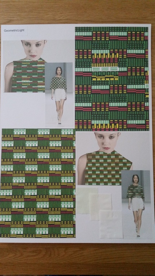
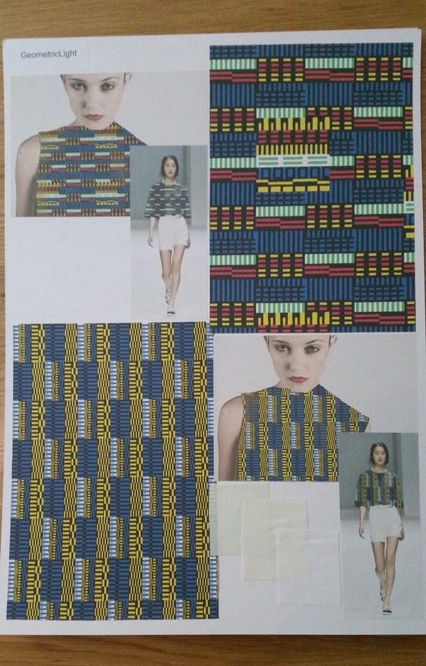
GeometricLight
I have named these designs GeometricLight as I wanted to show where my inspiration is from as well as what my designs are. These boards are not so simple as I wanted so show the materials I am thinking my designs could be printed on and also show two different context images to show close ups of my designs on the body and also ones that arent so close to the body. I think the context images on these boards have worked a lot better than my interior ones as the shaddows and highlights have nade the designs look more realistic. I think showing both images help show the scale im trying to achieve as well as showing the design images to show the detail in the designs. I wanted to show the details as some of my final designs have got texture within them and I wanted to show this.
0 notes
Photo


TechnoStripes
I have named this collection techno stripes as I used both inspiration from drawing light and thenresearch I have done with visual music. I wanted to give both of my collections names as it is easier to reference them and also feel it makes my projects become more mature. I have tried to make these boards simple as to reflect the inspiration board but also to help reflect the simple rooms I have tried to put my bold designs into. I wanted to use modern minimalistic interior images to put my designs onto so then it creates a more dramatic effect as well as make my designs become a bold design feature.
I think my contextualised images have worked alot better this term as they have become more realistic however I still feel like it is an area I need to keep working on. I always find creating context images for interiors a lot more difficult than I do for fashion. I think this is due to lighting and scale but this term I have tried to experiment with my final designs with scale and used different images to experiment with scale. I have made my designs a larges scale as I think the designs look better larger due to the designs being so busy.
I have used samples from my first warp as well as my second warp as they both link pattern and colour wise. I think they both show the final colour pallet I have been using and also show clearly how my project has developed this term.
2 notes
·
View notes
Photo

Inspiration
I have created an inspiration board thats shows my initial drawings and primary pictures. I wanted to show where my ideas started and also show my initial colour pallets. I wanted to keep the board simple as the patterns on my drawings are very detailed and I didnt want to make it confusing and difficult to look at. I have only created one inspiration board as I had the same source of inspiration to create both my fashion and interior designs. By doing this it has helped me show where my project started which when placed next to my other boards you can see how much it has changed and developed.
0 notes
Text
LinkedIn, Instagram
https://www.linkedin.com/in/meghan-southgate/
https://www.instagram.com/meghan__southgate/
Other online portfolio’s I have been working on. I have been trying to develop and extend my online presence this term as I keep thinking of what I am going to be doing once I leave uni and what I will need to do and achieve once I've left. I want to be able to keep people up to date with my work as well as show potential employers what I am interested in/my skills I have. I have found my Instagram very useful this term as I have been reflecting on my work and keeping myself up to date with what I have been doing.
I also made a LinkedIn page so I am able to look for jobs in areas i am interested in as well as be able to contact people that are interested in similar things. I think this will be a really good way for me to be able to make contacts in the design industry when i want to try and get myself out there and working within it.
0 notes
Text
Website
https://meghansouthgate.wixsite.com/meghansouthgate
I have been creating a website to help me create a bigger and better digital portfolio. It had current work from this project and I am planning to add more work from previous assessments to show my diverse skills in textile design. I wanted to create a website as I feel it looks more professional and it will be a lot easier for potential employers or people wanting commission or collaboration projects to find my presence online as well as what I have been working on. The website is still a work in progress but it is something I want to show I have been working on as well as something I am planning to continuously use. I think I could begin to use my website as another way I can blog about my work and a way to get feedback so I can reflect on my work in a more professional manner.
0 notes
Photo


Digital designs
I have been digitally experimenting with different colour ways to see how different the designs turn out. I wanted to see what colours work best together as well as see how the designs change when the colours are used for the different patterned areas. I have also begun to take colour out of the designs as I wanted to continue to look at and develop my colour pallet. It was also mentioned in the last group tutorial that I have used blue throughout the term so I should experiment with not using it and see what the designs would look like when they had no blue. I think the designs look really good when there is no blue in them as i think some of the designs I have included all of my colours from my colour pallet in have become to complicated and the colours make the designs look messy. I think playing with the idea of removing a colour and using only a few colours from my colour pallet I am able to create more mature and developed looking designs.
I have begun to add texture into some of my designs as well as I want to try and make some of my designs look more like woven drawings. I think this helps see the correlation between the development in my digital work and my woven samples. I have used only one type of textured pattern in them so far as I just want to experiment with the idea to see if I am able to create more interesting designs. I have coloured the textured areas in shades of the colours below so I am able to create a tonal idea rather than just a pattern. This could also make my designs become more interesting when I play with scale as when they’re smaller the pattern will be more tonal whereas when its larger it will become another pattern on top.
0 notes
Photo


Outline
I have been looking at ways I can create different digital designs to develop my work as well as try and find some more interesting outcomes. I have looked at removing the colour from my designs and creating layered drawings with the black outlines. I began to play with colour, scale and different backgrounds to see what would happen and what they designs would look like.
I think it is very interesting to see what the colours look like when layered as they are the same colours I have been working with in my digital work but they look like different shades/colours when they are above or below certain colours. I wanted to try and use the same drawings I have been using currently to try and create something new however I don’t think they have been very successful as some of the colours appear muddy, I also think some of the designs are to complicated and so the colour balance was hard to get right. I want to continue with this idea to see if I am able to get the right designs together to see if I can create some successful layered designs.
Reflection/Development-- I have continued with the idea of layering my designs and have even tried to add texture to some of them however I still feel like they are not successful. I like layering my work as I like to see what other patterns they create once they have been moved and parts have been taken away. I also like to see the different effects colour can have on the designs, but I think there is so much going on in the designs even when elements have been deleted so it makes it difficult to create more mature designs.
0 notes

Photo


The woven samples I have been creating have been really interesting however I am not sure if the samples I have created in yellow look how I wanted them to look. I think its due to the colours changing once they have been woven to create colours that are bright but not the shades i wanted them to be. I also think that they don’t look as much like my drawings as my previous woven samples. It almost looks as if I the colours are completely different to what i have been using before and not like a development from my previous work. I hope when i get to weave the green and the darker green that the colours don’t have this effect.
I think it will be interesting to see what happens to the colours in the weft change when the colour transitions from yellow to green, this might help my designs look more like a development. I have used similar patterns as in my last woven samples as they were so successful before hand and I want to see what they look like with these colours and I also want to show similarities between the two warps as well as use aspects from the previous designs that I really liked and thought were the most successful.
3 notes
·
View notes
Photo

Ava.
My first Ava attempt, experimenting with texture and looking at different colours in a more playful way. I continued to use the rectangular shapes but begun to layer to see what would happen.
0 notes
Photo

Printing onto higher quality paper.
Once I began printing onto higher quality paper I began to appreciate my digital drawings a lot more as they to looked a better quality. I printed some designs in A4 and others in A3 to see if the scales changed the look of the designs in any way but I feel they look so similar that I am going to continue to pint in A4. I also think with the block drawings I have created could do with added textures so I am going to try and add textures onto these drawings as well as the ones I have drawn directly onto the computer.
0 notes
Text
Tutorial with Nick
I had an individual tutorial with Nick where we discussed the A1 drawing I had begun to do, he suggested to try and make the shapes and repeats larger as well as use the drawings I have already done. We also spoke about creating more drawings with the backgrounds coloured like a warp with stripes and different colours going though. I think this will help my drawings develop as well as help give me something else I can explore in my digital designs.
He also showed me how to use Ava and how I can add texture into my drawings as well as colour separate my drawings so I can easily make my designs a block colour and can explore different colour ways for my designs. I’m extremely excited about trying Ava and the different features as well as beginning to expand on my digital skills. I think this will also come in handy for quickly creating digital designs as well as a range of the. I am also interested in using the textured features to help me create a woven texture on my drawings to see what my drawings would look like if it was woven.
0 notes
Photo


Threading up and scott weave
Before setting up the loom I began to mess around on scot weave to try and see how I could set the 16 shaft loom up rather than the 8. I had a chat with Daid and we started to set it up so the threading up was similar to how I had the last warp but to also make it possible with the correct lifting patterns it will create different patterns next to each other. I wanted to be able to do this as I wanted to my weaving to represent my drawings repeated patterns, and I think the designs I will be able to create with this warp will be interesting and look like my drawings.
I am enjoying playing with scot weave as I am able to look at what my designs and ideas could look like before I weave them. I am also going to use the programme to help me create my technical file as it saves all of the information needed and creates a professional sheet that any weaver will be able to understand.
0 notes
Text
Group crit with Nick
The group tutorial with Nick helped me show some more of my previous woven samples as well as show Nick how successful they had been. We spoke about how I can begin to develop my drawings by changing the backgrounds to become striped like my original woven samples to see what effect this could have. We also spoke about how I could digitally play with both my drawings and my woven samples to add texture into my drawings to see what happens.
We also spoke about my colour pallets and that its not clear on where I have been getting my colours from so i have been thinking about creating a few colour pallets that show my original inspiration and what colours i took from them and finalising with a final colour pallet. this will help show where the colours have come from as well as show my original imagery that I used to create this work.
Nick also suggested to try and change the scale I am working on to see if that has an effect on my designs. I think this would be really good to try and explore as I will be able to see what my designs look like in other scales like I was trying to do with my digital work. This also made mt think about what size paper I could print my designs out onto, I think I will continue to print some on A4 but I would like to see how some designs would look on A3. Nick also suggested to try and print my designs onto better quality paper as he felt some of the designs I had printed out had lost the colour once they had been printed.
0 notes

Photo

Colour matching
Once again I am in the dye kitchen trying to get my colours right ready for my next warp. I am going to be using the same red, blue, yellow and black for my weft as I have decided that those are the colours I want in my colour pallet. I have also decided to go with a bright green to be used in my drawings as well as in my woven samples. I have decided to dye my warp part yellow, green and blue. I decided to go with three colours as I wanted to try and create samples that stuck to my colour pallet but wouldn’t all look the same like my previous warp. I began to try and colour match my green and I found that I could create the perfect green by dipping the dyed yellow yarn into the turquoise dye. I first dyed the yellow part of the warp then proceeded to dye the green and blue. However due to the yellow still being slightly wet the blue didn’t go as blue as I wanted it but it did go to a slightly green’y’ blue that I have also been using in my drawings.
Colour matching the yarn has been extremely important for this project as i wanted my samples to look as similar to my drawings as possible and nothing has been more important to me than colour in this project. I think all of the colours I have used help make my samples look similar to my drawings so all my digital work and woven look like they could be from a similar collection.
I think that dyeing my warp slightly brighter will be good as I will be able to make bright bold woven samples that look more similar to my drawings. I also think the changes in the colours will make them become interesting if i can get the colour change within one sample so you can see the transaction between the colours.
How should I thread up my loom?
Should I continue to play with colour?
How could I add texture to my digital drawings to look more woven?
0 notes
Photo


Digital work on Photoshop
I created these different compositions on Photoshop by putting different drawings I have done next to each other, to try and experiment with colour, pattern and scale. I think this has been an interesting way to see how my designs look next to each other, and to see how the scale effects the designs. I also found it useful as I think my designs look better when the scale is larger.
I have looked at repeating the different patterns next to each other in different ways as well so I could look at the different repeats to see what works and what doesn’t. By doing this I am able to create work faster as well as see what works and what I could use for my next drawings.
I have also used this as an opportunity to look at the different colours I have used and what colours I want to continue using for my colour ways. I want to begin to limit my colourways again like I was at the beginning of the project so I will be able to focus my work and designs back into similar ideas rather than having random colours that don’t seem to fit in with the rest of my work.
What colours are going to be in my final colourways?
What should I do next with my digital designs to develop them further?
0 notes