
Statistics
We looked inside some of the posts by mehagoenka-blog and here's what we found interesting.
Average Info
Notes Per Post
2
Likes Per Post
2
Reblog Per Post
0
Reply Per Post
0
Time Between Posts
7 days
Number of Posts By Type
Video
1
Text
9
Photo
1
Last Seen Tumblr Blogs


Fun Fact
Tumblr was created by web developers David Karp and Marco Arment.
Text
Assessment 3 _ Animated movie (2d animation)
For my animated movie, I have designed in illustrator and worked in aftereffects, it is a 2D animation.
The movie is 1 min 20 seconds long.
It is a ‘Save the Date’ invitation created to be sent as pre-wedding invitation.
Concept :
This movie works on the concept of a 2D animated ‘save the date’ for a wedding invitation.
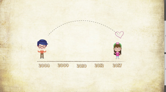
It tells us the story of a boy and girl, connecting their relationship to the viewer. The mains points of their relationship are highlighted, and a timeline follows the movie, to show the viewer how this relationship progressed.
The theme and concept are visually cute, fun, and designed to appeal to all audiences.
the characters are designed based on the timeline, as the movie progresses we see an adult version of the boy and girl, and for the final frame we see them in wedding attire.
Story Narrative :
I have broken down the narrative structure of my movie below :
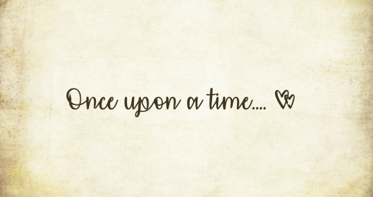
opens with an opening line, which is commonly seen in Disney movies, telling a story of two people. It is an introductory heading or title.

the entry of the boy and girl, with the timeline - this is an important element as it tells the viewer that the movie will progress on this timeline.

the screen dissolves into the wedding announcement- thus informing the viewer this is a wedding announcement. the colours are brigh,the lines at the back spin around and engage the viewer.
the marigold and lotus are common flowers used in Indian weddings, the text is animated here.

the next scene starts with ‘lets go back to 2008′ , the classroom scene is created, with a first meeting - ‘hey’, a large heart takes up the screen and dissolves these elements moving onto the next frame.

the following text appears on screen, thus emphasising the first meting and love at first sight concept.
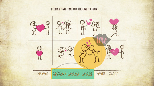
this scene is added to bridge the gap between the previous scene and next one. It shows years 2009-2012 : where the boy and girl were dating, there are stick figure illustrations which are popping up and getting highlighted.

the map and this frame represent the start of the long distance relationship - in 2012, a plane flies from India to Australia, the heart follows it in a circle.
there is also text added into the narrative structure, as there are multiple elements and scenes, I felt this would easily convey the idea to the audience in a more resolved manner.


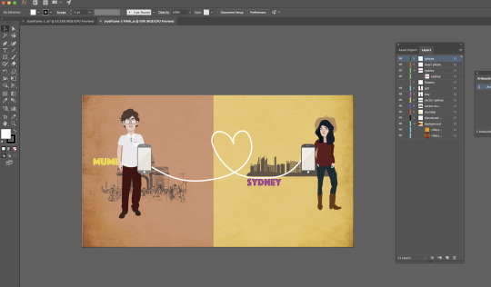
the above frames are the Sydney-Mumbai long distance relationship scene : we can see them in two different cities, there are visual elements from each city :
Mumbai - gateway of India illustration
Sydney - Opera house
the cell phones connect them in todays world of technology and the text here is added ‘Sigh..’ to further convey the emotional effect of this long distance relationship.

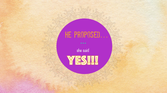
these scenes show the proposal, the timeline continues into 2016, text is added and animated for the proposal.
Also added is a spinning mandala design behind the purple circle, to make the frame more engaging. I have reduced the transparency of this mandala to make it look like a watermark against the painted background.
the background colours are bright, with a watercolour effect.

this scene shows the bride and groom, transforming into their wedding clothes, and elephants, marigold etc. are added to further connect to Indian wedding culture.
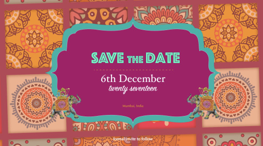
this is the final frame - the background is a collection of prints, which revolve and are of reduced transparency to not distract the viewer too much from the centre of the frame.
the centre shape has the wedding information- the words 'save the date’ and the date, month and year.
it brings the movie to a resolution with all the elements coming together and a final set of text that connects it together.
it then goes into the wedding elements and the announcement of the couples names along with certain traditional wedding elements with fun bright colours.
a later scene depicts a part of their relationship where the boy and girl were in two countries
the timeline is getting highlighted as the movie proceeds
and the elements keep entering as per the scene
Mise - En - Scene : an analysis of the main mise-en-scene elements from my movie :
Storyboards :
The following storyboard follows the flow scene in the movie.
starting with the opening line.. ‘Once upon a time..’, going onto the main scenes and events ( meeting in school, years spent dating, long distance relationship), leading to the proposal, and finally the wedding information.


Colour Palette :
The colours used primarily are a combination of bright, complimentary colours for the scenes which are meant to engage the viewer, get their attention specifically.
Hence used in the beginning scene where the wedding is being announced, and the final scene where the wedding information is given with the date and location.

Frame Details :
Perspective zoom in - follows the text line ‘Let’s go back to 2008..’ as the scene starts.
Then the text reduces in size, and places itself on the blackboard.
Hence making the frame into a perspective shot.

the below frame - is a zoomed in shot : the back ground zooms in and out, making the colours change scale across the background.
Also the size of the bride and groom with the ring changes as the background zooms in and out.

Rule of thirds : composing a frame :
the following scenes are representative of the rule of thirds, in composing the style frames.

Plot Structure :
The set up - introduces the concept of the movie, with the boy and girl, timeline, and their wedding announcement.
The confrontation - is when they have to do long distance, the map and visual cues are shown to highlight this.
Resolution - is when they are finally engaged and they come together in the final frame with the wedding details.

Research & Design Development :
The concept of this movie is Indian-Western : therefore I have taken inspiration Indian wedding invitations as well as ‘Save the Date’ ideas and designs done in animation and more in western countries as well.
Combining both these styles, I designed the final look for this movie.

Sketches done during the design development :

Earlier designs and style frames :
these are images showing the earlier designs I have worked on, which have changed slightly from the final movie now.

I had previously designed this for the introduction scene, however I felt the typeface used for the names was not very readable and the circular shape was distracting. Hence I changed this in my final design.

this was an option designed for this frame - the colours I felt were not engaging and the flowers were falling flat. Hence I altered these elements in my final design.
Mood board :
this moodboard represents the colourful design elements used to connect the movie to Indian culture and wedding scheme.
I have used the marigold and lotus flowers, Indian attire, and the mandala shape and patterns to effectively communicate this.

the below mood-board is representative of the western elements used in the design - heart designs, stick figure drawings, and fun, bold text as opposed to the Indian elements.
I have used this to express the fun and childlike element to this movie, as I did not want the movie to get very culture specific or fall flat overall.
The use of these elements which those of the above mood-board have resulted in a good balance of design and visual look overall.

Character Design :

Tutorials : After Effects software :
these are some of the online tutorials I referred to in making this movie :
youtube
youtube
Used in ‘ Once upon a time...’
youtube
used in the text : Rahul and Anjali
Typefaces :
these are the following typefaces used in the design by me :
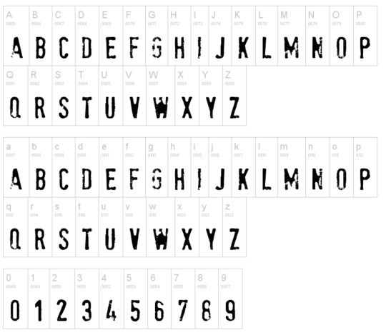
Name : Stampete
Name : Affectionately Yours

Softwares used :
Adobe Illustrator : used to design style frames and all design elements.

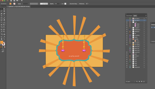
creating individual style frames for each composition in adobe illustrator
Adobe AfterEffects : used to add animation to the movie, effects, and final render.
Animation of text ‘Rahul and Anjali’ in Aftereffects
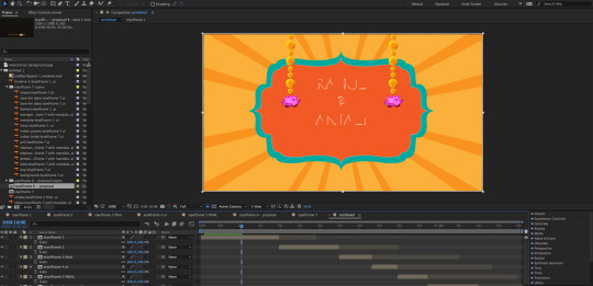
Animation of the spinning lines in the background in Aftereffects : Effect applied to the lines to make them dissolve.

Adobe Audition : used to edit the soundtrack.

Adding sound to the movie :
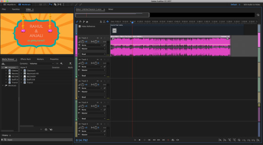
Sound :
Marry You by Bruno Mars
The soundtrack I have used is ‘Marry You’ by Bruno Mars. This is a popular commercial song, the lyrics are appropriate for my movie as it speaks about love, marriage and the story of a boy and girl.
The beat is also upbeat and catchy, hence adding life to the animation.
I have edited the start of the song, to make sure the lyrics start with my movie.
I used Adobe Audition to edit the sound for this movie.
0 notes
Text
Case Study 3_’The Claiming of Things’ by Joan Ross
Artist : Joan Ross
Animator : Josh Raymond
Sound : Ben Butler
Introduction :
Joan has created a hand made style to this animation, using collage elements taken from various place, and imposing them on an existing image of a painting by John Glover.
She has used collage, cut/paste methods to get these elements, and the computer animation has been used to add movement to these objects. As well as animate things within the original image.
She has worked on Adobe Photoshop and After Effects primarily to create this. The animation is done by an external source (Josh Raymond).
This work was displayed in a gallery as a projection on a screen.
Mise - En - Scene
The mise- en- scene in this 2d animation video work by artist Joan Ross is of particular importance as, lacking in the 3d visualisation aspect, the setting and design of each frame, sound, colour and character/object design is what the viewer see’s and engages with.
Absence of dialogue also adds to the importance of creating the correct mise-en-scene.
Setting & Design :
The setting of this work is the original painting by John Glover, called ‘Bath of Diana’ which was done in 1837, its an early colonial Australian painting.
Space :

The representation of space here is very vital in the design and concept of the animation’s story narrative and reality representation : the setting of the original painting is given as the background and the camera angle is in the center of the frame, to show the space as the landscape with the rocks, mountains, river, perception of depth and the clouds/sky.
the space is maintained throughout as the same set up, only zooming in to highlight the action of the colonisers.
Joan has changed the space by addition of colonisation elements using colours as a method of juxtaposition.
Camera :
the beginning of the video starts with a zoomed out - mid level shot with the camera at a perspective showing a vanishing point where the river leads.
this is the main camera angle which follows throughout the video.
as the first few seconds proceed, the camera zooms in and out to engage the viewer into the landscape. Joan has animated certain parts of the landscape : the river flows, the clouds move, while the camera remains at the same angle.

The camera angle remains at the above point until the entry of the colonisers:
it then shifts to a CU shot ( close up shot)

The camera zooms into a close up to show the actions of the colonisers, it remains at this point as the women spray paints ‘Banksia’ on the rock in the landscape.

while the main camera angle remains at a wide angle perspective shot for the remainder of this video, in the below scene there is close up of the colonisers created by making them appear on screen at a front level, the size of them is increased, which gives them a larger perspective.
Hence with the background in the same size and position, by changing the size of this layer (the colonisers) Joan has achieved a change in the viewers perspective.
the scene proceeds to employ the same technique, when a branch (larger than the colonisers and the background) falls into the frame and knocks the colonisers into the water.
This engages the audience once again, into the perspective of the branch being in front of all the other elements, by making it fall from the top of the frame, and having it overlap all the behind the layers.
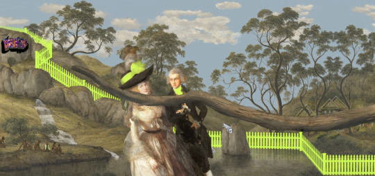
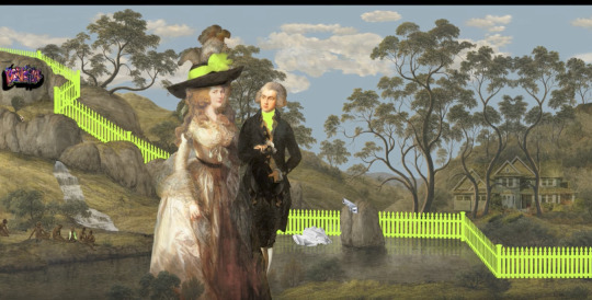
following this, the other elements of colonisation are added, following the movement created with the picket fence, they are kept in different sizes following a rule of perspective where they get immersed in the water eventually.
The camera shot does not change here. It remains at the same fixed point as the video beginning : with the movement only of certain elements which are animated turn by turn.

Rule of Thirds :
the below image shows how Joan has used the rule of thirds in this work :
the main action is focused in the center and right ie. 1/3 & 2/3 of the frame.
This is the setting for the conclusion of the work, the objects remain in this position for a good duration of the conclusion.

the below image is the setting of this work:
The image has been placed in this way that the vanishing point perspective of the river going through the mountains is in the center of the 3 part grid.
This set up is followed through the animation. Therefore we can say, Joan has infact used the rule of thirds as a base for the backdrop, then added elements following into separate sections of this grid ( shown above).

Storyboard :
the below storyboard is a break up of the main scenes and actions showed in this animation.
Starting with the original painting, and ending with it , Joan introduces elements of colonisation, and then fades them away.

Use of foreground, middle ground and background to communicate depth:
Joan has used the technique of layering objects upon the same background, to create a sense of depth and space.
Lighting :
The lighting of this video art projection can be divided into two main categories:
for the beginning and middle of the video , the lighting does not change, it remains a neutral form - working with the existing lighting done by John Glover in his painting. It is represented as day, with sunshine, the clouds, the landscape is lit well enough to see the trees and other nature elements.
The conclusion of the video brings about a dark background, the storm comes in, it starts to rain. We can see the lighting change to show the dark, dull atmosphere created.
The main change is to the sky : filled with dark clouds (below), this affects the mood of the entire frame and conveys the change in tone to the viewer.

There is no contrast lighting, focused lighting or three point lighting style used here.
These features are brought about by the character designs and colour choices used by Joan which I will be exploring below :
Character Design :
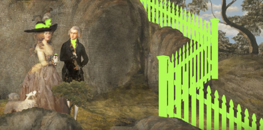
Joan has designed a stark contrast between the main characters ie. the tribals and the colonisers. She has also connected the elements of colonisation to the colonisers through the use of colour.
the below images show the tribals enjoying the land : the skin colour, tone and body language used here shows the level of comfort of the tribals and she has blended them in with the landscape tones.
this emphasises the connection between the tribals and their land.


the below images show the design of the colonisers and elements of colonisation :
the colonisers are wearing the traditional outfits of their country and that time period.
the colour palette is neutral of their clothes however, it is highlighted with fluoro colour (the hat on the women, tie on the man)

You can see a connection to the 21st century world with the elements of colonisation, in bright colourful tones, with fluorescent highlights - make a connection with the colonisers and the elements.
the picket fence design is also in connection the above - this is the first object introduced into the frame with the fluro colour.
Colour :
I have discussed this in my earlier post ( kindly refer to mood boards from assessment 1) however I will be mentioning a few points which have importance in the representation of reality and the setting of this animation.
The use of colours in this animation are employed by Joan Ross to convey her message. Without this, the video would fall flat.
Being a 2D animation, the colour choices add the elements lacking such as lighting change, camera angle shots, and contrast created by rendering.
Primary colour palette :
1) Fluorescent colours
Why ? Joan has used this on all elements of colonisation - the objects of the 21st century world, the colonisers, the picket fence.


graffiti :

objects of colonisation - 21st century elements :

“I USE FLUORO AS A METAPHOR FOR COLONISATION. I SAW THE INFLUX OF FLUORO AFTER 9/11 – IN A WAY, FLUORO REPRESENTS A TYPE OF COLONISING, BUT ALSO A TYPE OF FEAR.” - Joan Ross
2) Neutral Colours

the above image shows the neutral colour palette ie. nature colours which are browns, greens, sky blue, white, beige etc.
These colours are a part of the painting done by John Glover, which Joan has kept in its original state.
The reason in using this as the backdrop and the bright/fluorescent palette over it, is to convey Joan’s concept of taking over another land, the emergence of the 21st century objects, and the problems it got with it.
Both these colour palettes provide contrast and depth into a 2D animation work. Since the camera and lighting does not change much , using this technique has successfully worked to create an impact to the audience.
Sound :
Joan has used sound cues to guide the audience through the video.
Starting with the the river and landscape set up, sounds of nature are introduced.
As things enter the water, she adds sounds to convey the actions shown.
the helicopter enters and drops the picket fence : helicopter sounds, suspense sound introduced.
Colonisers : then moving on the colonisers, the act of graffiti - the can of paint sound , the sound of paint being sprayed.
when they enter there is a stage introduction sound played, as though they are guests on a talk show.
the tractor comes in with all the elements of the 21st century/ colonisation objects, she adds sounds to all these actions.
There are constant background sounds of ambulance, activity, movement etc during the second half of the video.
All this symbolises the mess and problems created by colonisation. The lives lost, the loss of land.
As the rain starts and storm comes in, sound cues of falling rain and thunder are introduced.
When the storm fades, all the background noise fades away and the storm clears, the elements of colonisation fade away and the scene is restored to its original state, only the sounds of nature remain.
Comedy :
She furthers uses satire through visual cues and sound to relate a comedic approach to colonisation , where the colonisers are attempting to cross the river and get thrown back in when a branch hits them.
She has added ‘audience laughter and applause’ these guide a viewer into interpreting the scene in the way she intended.
References :
Joanross.com.au. (2017). Joan Ross. [online] Available at: http://joanross.com.au/2012-The-claiming-of-things [Accessed 6 Sep. 2017].
Museum of Contemporary Art Australia. (2017). The claiming of things. [online] Available at: https://www.mca.com.au/collection/work/2015.6/ [Accessed 9 Sep. 2017].
Theaustralian.com.au. (2017). On the bright side. [online] Available at: http://www.theaustralian.com.au/arts/review/joan-ross-tackles-australias-settlement-in-video-work-colonial-grab/news-story/cd5bed76d523e90ba96f56528057a7b8 [Accessed 10 Sep. 2017].
0 notes
Text
Inside Out _ Assessment 2
Storyboards :
the below images show the story boards for the opening scene of inside out.
it follows the sequence of main events shown in the scene.
this helps us understand the structure formed to follow the movies final animation. The storyboard works as a frame or base to start the animation.
Animatics are formed based on the storyboards, which are then put into final CGI with character development.
Storyboard 1 :

Storyboard 2 :

0 notes
Text
Kanye West ‘Good Morning’ _ Assessment 2_ Representing Reality
Creator details : Original story : Kanye West | Director : Takashi Murakami | Animation Production : OLM + OLM Digital
the below images list the team behind the making of this music video.
it has helped me understand the different aspects in making a CGI animated video, the departments a team would have and the separation of tasks within the making. (eg. texture, storyboards, character design)
This music video was displayed at : Museum of Contemporary art in L.A & Brooklyn Museum in New York


Storyboards :
the below images show the storyboards followed for Kanye West’s music video “Good Morning”.
This works as a structure and base to design the final animation.
Storyboard 1 : the introduction to the city, the main character, start of his morning struggles. Highlights elements of a psychedelic and futuristic world, kanye personal symbols.

Storyboard 2 : continues on the struggles faced, links more to murakami’s art with the dancing mushrooms and football players, shows a change in lighting, re enforces the idea that the video is a self portrait of Kanye and the conclusion.

Mise - en - scene :
Setting and Design : (breakdown of the key artistic styles used in this music video)
Collaboration between Takashi Murakami and Kanye West has been one of the most notable pairings between the art world and pop culture : ( below image of Takashi Murakami and Kanye West )

Takashi Murakami :
known as the ‘Warhol of Japan’, Takashi Murakami is a prominent contemporary artist who is known for his colourful, psychedelic elements that are a feature in his work.
Design & Setting of Good Morning music video :
Creating ‘Universe City’ :
To understand the creation of the setting of this music video; the creation of ‘universe city’, we have to understand the style of Murakami’s art.

Murakami’s collaboration with Louis Vuitton (above)

Murakami’s signature ‘smiling flowers’

The above images are Murakami’s signature art pieces.
Murakami’s art in the music video :
These are scenes depicting the correlation between Murakami’s art and the design/setting of the music video.

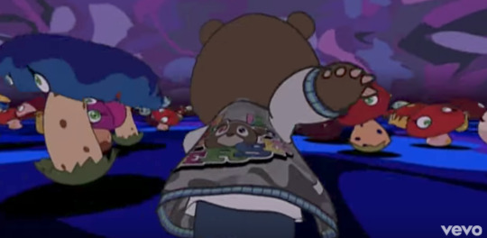
dancing mushrooms - psychedelic world

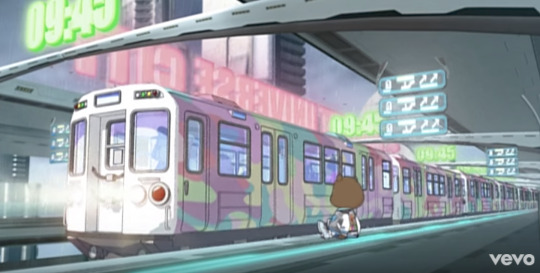
Main features : Font style, colour palette, flying words through space, the background setting of tall buildings , shaded sunset sky.

pastel coloured sky train, futuristic look of the city, subdued colour pallete in the background strongly juxtaposes the train colour.
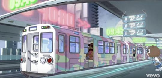
pastel coloured train, with pastel neon lights in the background.

rainbow colours, bright outfits, the other classmates are different animals, the psychedelic look of the entire scene.
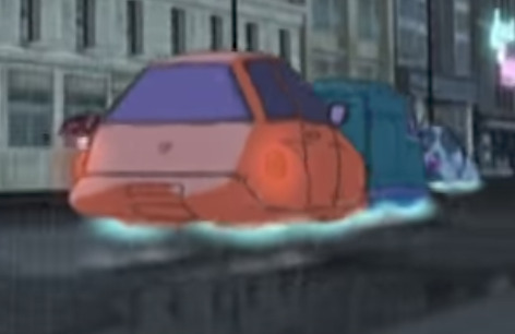
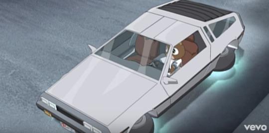
cars with glowing lights instead of wheels


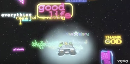
above three images show Kanye’s song titles through the video, in bright neon lights : Murakami has highlighted these in these vivid colours making it stand out with the dull background.
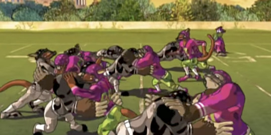
Murakami’s touch of crazy football teams - bright pink outfits, Kanye bear running through them.


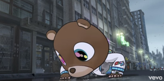
Ending scene - the design and features of these above two images are Takashi Murakami’s art style - the futuristic and unreal look of these objects, large details, the eyes, the teeth, the colours used, and wide angle to close up shot of them make the viewer really engage with the video in a true psychedelic sense which is all Murakami’s work.
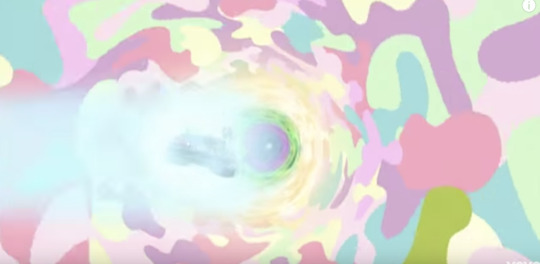
conclusion scene, bright pastel colours immerse Kanye bear and friends in the car, a colour immersion created by Murakami. The use of pastel colours is prominent through the music video.
Creating Kanye Bear :
The main character and album cover of the album ‘Graduation’ features Kanye bear, an animated version of Kanye designed by Takashi Murakami.

Kanye Bear sculpture by Takashi Murakami displayed in 2009.
This bear is clearly a self portrait of Kanye West himself, Murakami has blurred lines between personal identification, music and art in his collaboration with Kanye.

Album cover designed by Takashi Murakami for the album ‘Graduation’
The above image links directly to the design and concept of the Good Morning music video : the final scene in the video shows the Kanye bear in a very similar scene, where he goes through space in a flying car. (below images)


Cel shaded animation :
this is the technique used my Takashi Murakami to design and create the kanye bear. Cel shaded animation deals with the rendering of the 3d animation to make it look hand drawn.
the below image represents the difference in regular rendering (left image) and cel shaded animation render ( right image)

As visible, the right image has a flatter and more hand drawn aspect to it, than the one on the left.
The Kanye bear has the same type of render, it gives Murakami’s work a more realistic feel and goes with the psychedelic look and style of the entire music video.
Lighting :
Low key lighting :
the below images represent low key lighting used to create the mood and sense of danger and darkness as the Kanye bear goes through obstacles to get to his ceremony on time.
There is no direct fill light, and we can see shadows very clearly. This is done to increase a sense of danger.

the dark shadows on the blue flooring emphasise this below

Three point lighting :
the below scenes show the lighting in relation to the storyline - there is a focused light indicating sunshine on on the main subject. There is also a background light for the backdrop setting. The backdrop is kept in darker tones, while the focused light draws the viewer to the subject and the goals he is achieving as the story progresses. The fill light is ensuring the shadows are cast from the key light.

Camera Shots :
CU shots : Close Up shots
the two images below show close up shots of the Kanye bear in important emotional states. The first at the beginning of the video, the second is towards the end.
Features : the eyes are very expressive through this video (we see his eyes drooping shut in the first scene as he wakes up, going onto a state of surprise and wonder at the end when he receives his degree )

Wide angle shot : (below)
This is a wide angle shot it starts with the train departing the station and the camera follows the train going through ‘universe city’. The below image shows a zoomed out version of this camera shot. It makes the viewer understand the wideness and space, the feel of a city and the futuristic design of it.
The first image also show the ‘vanishing point’ perspective used in designing a camera shot.


Below image:
Wide angle shot leading to a zoomed in perspective - action focused in the center (1/3 rd)
this is the conclusion shot, where the car goes through this whirlwind of colours and comes out on the other side : the camera is angled in a way that takes the audience through this, there is definitely perspective used, to create a feeling of a vanishing point - however, this is focused centrally not angled as the above images.

The Rule of Thirds - composing a scene :
The below images show how the rule of thirds has been used while creating this animated music video.
Image 1 : the kanye bear is taking up 2/3rd of the camera shot.
Image 2 : the water splashing on the kanye bear is the main action here, focusing within 2/3rd of the camera shot.
Image 3 : When the kanye bear finally receives his degree from the university - the camera shot focuses on this in the center of the shot. (within the grid of 3 divisions - not the center divided in two)

Editing :
1) Scene matching - continuity editing
The position & The Movement ( these two aspects have been matched in the below images )
The below images show the continuous flow in matching scenes, within a few seconds of the video we see the Kanye bear wake up, run to the bathroom and brush teeth and run out towards his car.
The flow of this is important to the screen narrative as well.
1 - wakes up and running

2 - brushes teeth

3- runs out of the building to get to the car

the matching of the scenes - camera angle, front view of the bear is maintained at all times, the side angle or back view don’t interfere as he goes through these actions.
1) the face direction is maintained
2) the position & movement - running style and direction are maintained
Sound :
Since this is a 3d video animation for a music video, the storyline ( narrative ) and the representation of reality ( mise-en-scene ) are done to match the lyrics of the song, and the message of the artist (Kanye West).
The speaks about Kanye’s opinion of college education, the struggles faced in life, whether a college education is worth anything and has a personal message through it where he conveys his own journey in life.
Takashi Murakami has creatively animated and designed this through this music video, the dancing mushrooms, the highs and lows shown go in accordance with the music lyrics.
References :
Butler, M. (2017). 5 Relational Editing Techniques by Vsevolod Pudovkin | Film Fu. [online] Filmfu.com. Available at: http://www.filmfu.com/relational-film-editing-techniques-vsevolod-pudovkin/ [Accessed 8 Sep. 2017].
rccartespinosa. (2017). Takashi Murakami. [online] Available at: https://rccartespinosa.wordpress.com/2016/02/26/takashi-murakami/ [Accessed 9 Sep. 2017].
0 notes
Photo

The making of Inside out ( focus on the opening scene)_ Case Study 1_ Assessment 2
Research done to develop memory balls and develop the animation.

- the developers went to an egg farm ( above images ) to see how the eggs were sorted. This was then animated into the long and short term memory wheels ( right image ) shown in the opening scene.
Development Process ( the main emotions & characters ) :
Form & shape of each emotion : sketch
first stage of animation :

without lighting :

with lighting : final animation

The above two images represent the lighting in CGI animation. As visible, use of lighting adds to the character design, and the overall setting of each scene.
Camera shot : the camera is placed at the center to get a wide angle shot of all 5 emotions with the background shown of ‘headquarters’
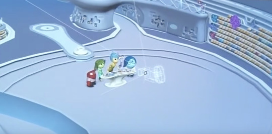
Lighting :
Three Point Lighting :
there is three point lighting used here : as we can see a background light, a side light casting a shadow, and the key light highlighting the object (here the baby face ).
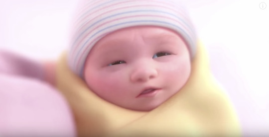
Colours used :
Background is white : this scene shows the birth of Riley - the colour and lighting is bright and happy with no dark areas. It invokes happiness and joy in the viewer.


High Contrast :
The above two images show a high contrast lighting used : the background is dull and dark focuses on the emergence of the main emotion - joy whose character has aglow around it all times, making it stand out.
The lighting focuses on sadness holding the memory balls and the dull glow is made to stand out with the light focused on her, keeping the background in a low light and darker colours.
Foreground, Middle and Background ;

Camera shots :
the below images show a few of the ‘22 frames that always work which have been employed here’ :
Back of head & front of head
over the shoulder shot

Editting :
Simultaneity (cross cutting) : this editing technique has been used in the below scene from the opening sequence of Inside Out.
we can constantly see a correlation between Rileys outside world and the world inside her head. The camera keeps cutting between the action performed outside , and how her emotion react inside.

the camera shots follow a sequence to make the audience understand the correlation between the two worlds being shown here.
scene 1 : broccoli is being fed to Riley
scene 2: disgust the emotion is in charge
scene 3 : a green memory ball is formed to store this memory.

scene 1 : anger the emotion
scene 2: Riley is angry
scene 3 : a red memory ball is formed to document the emotion that just took place.
Rule of thirds :
the below images show how the ‘rule of thirds’ has been applied to different shots in the opening scene.

the action is centered ( yellow circle) as well as 2/3rd of the shots is occupied with the main focus on the broccoli being given to riley.


the memory wheels form 2/3rd (large yellow circle) , with joy in the 1/3 section.

180 degree rule :
Through the opening scene, you can see the 180 degree rule is followed, the camera never takes a complete turn; at moments it almost goes to the end of this axis, but for the most part it stays within the same side of the shot.
Character development : design, research, voice
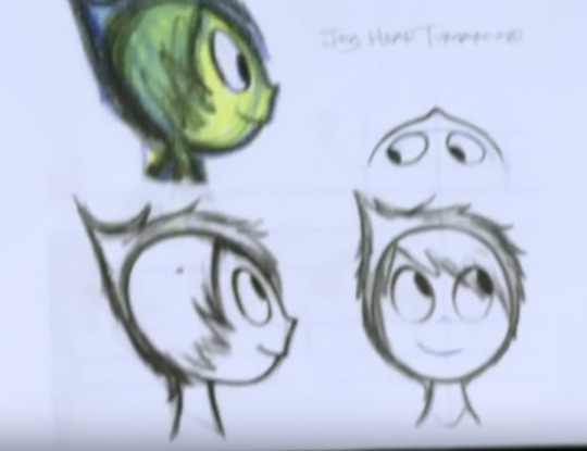
Disgust :

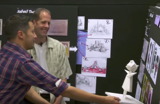
The above image shows Pete ( director/producer), reacting to the word disgust based on research done, this emotion took the longest to develop - the above and below images show the variations the emotion took, before they settles on the final design.

Character design : modelling done - to make the emotion take on a human
form. Testing all the arm and body movements, to facilitate humanity.

Anger :

Sadness :

Joy :

Sound :
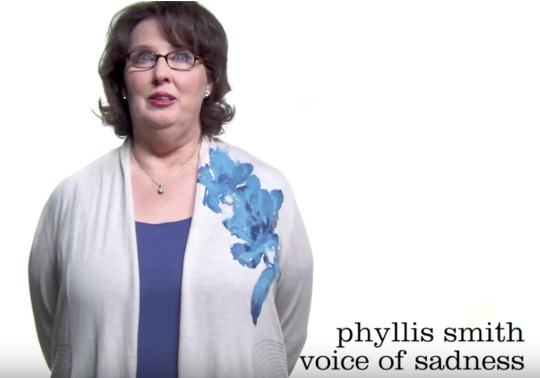
Emotion voices - these are the celebrities chosen to do the voiceover for each emotion. The choosing of the celebrity is essential, as the voice adds the audio element to the emotion, making it human.

The voice of joy - Amy Poehler was instrumental in creation of the storyline and design development of the character as well.

References :
Fantastic Memes. (2017). The Basics of the Animated Mise-en-scène. [online] Available at: https://frogkun.com/2016/07/20/the-basics-of-the-animated-mise-en-scene/ [Accessed 5 Sep. 2017].
Sen, K. (2017). “Mise en scene in Animation”. [online] Walkthetalktalkthewalk.blogspot.com.au. Available at: http://walkthetalktalkthewalk.blogspot.com.au/2008/07/mise-en-scene-in-animation.html [Accessed 7 Sep. 2017].
Washington Post. (2017). Pete Docter’s inspiration behind Pixar’s mindful ‘Inside Out’? This one goes to 11.. [online] Available at: https://www.washingtonpost.com/news/comic-riffs/wp/2015/06/18/pete-docters-inspiration-behind-pixars-mindful-inside-out-this-one-goes-to-11/?utm_term=.3a050f901d74 [Accessed 8 Sep. 2017].
YouTube. (2017). CGI Making of Pixar Animation Inside Out. [online] Available at: https://www.youtube.com/watch?v=K-gPD00ksxQ [Accessed 8 Sep. 2017].
YouTube. (2017). Inside Out: Blu-Ray/HDX Bonus Features & Making of - Pixar Animations. [online] Available at: https://www.youtube.com/watch?v=dp0EBozkw6s [Accessed 9 Sep. 2017]. YouTube. (2017). Inside Out (2015) Making of & Behind the Scenes (Part1/2). [online] Available at: https://www.youtube.com/watch?v=6TTeIYSYyyc [Accessed 10 Sep. 2017].
0 notes
Text
Case Study 2_The Claiming of Things by Joan Ross_Story Arc, Plot Structure & Mood board.

Plot Structure reflecting the story narrative in Joan Ross’s video animation.
The video animation starts with the introduction to the setting, the original painting and the animation of the elements of nature. It proceeds to introduce the elements of colonisation in a bright fluorescent colour, this build up the animation and increases activity on screen. The ending is brought about with a sense of resolution, bringing the painting back to its original state and the removal of all elements of colonisation.

Story arc reflecting the story narrative in Joan Ross’s video animation.
The above story arc is a comparison of the tension vs. screen time reflective in Joan Ross’s animation. As the elements of the 21st century keep getting added, the tension mounts, with a rapid fall when the storm starts and the elements disappear, restoring the painting back to its original state.

Mood board indicating the main theme’s of Joan Ross’s video animation. The colour use here is very importance, as it adds that contract between the tribals and their land and the work of the colonisers. From the picket fence to the pile of elements dumped in the river, and the graffiti painted on the rocks, the colour tones juxtapose the background strongly.
The graffiti is also of importance, drawing us to the contemporary street artist known as Banksy, hence making the colonisers paint ‘Banksia’ directly references this.
The graffiti also signifies the act of invading ones space, that is not your own.
0 notes
Text
Case Study 2 _’The Claiming of Things’ by Joan Ross.
Video Link : The Claiming of Things by Joan Ross.
youtube
Background :
The Claiming of Things (2012) , is a video animation by artist Joan Ross.
Taking the setting of the painting by John Glover, Joan has added and animated various elements. The animation is done by Ben Butler, sound by Josh Raymond. This was displayed as a video projection on screen in a gallery.
Use of CGI animation to convey the story narrative :
It is 2D animation done using Adobe Photoshop & AfterEffects. Joan has also used cut/paste/collage and hand-drawn methods to create some of the elements that are animated. The computer graphics here, are vital to entire theme, the first few seconds of the animation of the the sky and zoom panning, create a visual which immediately draws the viewer in.
The use of sound cues guide the audience into understanding Joan’s message on colonisation.
Concept :
The work is Joan’s interpretation of colonisation using a juxtaposition of John Glovers painting in its historical and ancient tones, with the use of fluoro colour and other elements of the 21st Century. The original painting is called ‘Bath of Diana’ by John Glover. It’s a humorous and comic take on colonisation, the problems it brings and the taking away of land from the original tribals.
Story Narrative breakdown : ( using stills from the video )


Setting of the video animation : It starts with the original painting by John Glover (The Bath of Diana).

The animation of this video starts with elements of nature and wildlife - merging with the background, these follow the same tones and texture of the original painting.
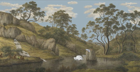
It further progresses into life of the tribals - enjoying their land. They are also merged with the background. The tribals are shown as enjoying the land, playing in the water and sitting by the grass. This is important to understand the storyline as colour tones is a main avenue used by Joan here to differentiate between the existing land and act of the colonisers.
The presence of a ‘security camera’.
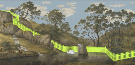
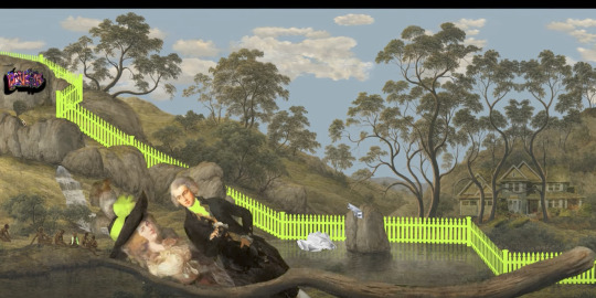
A helicopter enters the scene and drops a fluoro coloured picket fence, across the entire setting, creating a division. The significance of this fence is the colonisation of things by making boundaries.
Introduction of the colour ‘fluoro’. This is used throughout the animation to signify products and acts of colonisation. Influx of fluoro into our world now and it is a prominent visual of the 21st century.


introduction of the colonisers
graffiti painted on landscape
spells out ‘Banksia’ in reference to the street artist Banksy - a contemporary artist today. ( reference to the current world - and how its integrated into our society - the cultures and trends of today juxtaposed with the natural beauty and untouched land of the original tribals. )
Comedy introduced. The use of sound effects here lead the audience into following Joan’s message and comic element.
The background music here is representative of a comedy show or play with the audience laughter and applause at certain moments.
Joan shows the colonisers attempting to cross the river and getting pushed back in by a branch, while their dog escapes.
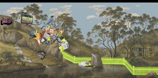
Other elements of the 21st century are added and rolled downwards, into the stream collecting there as ‘rubbish’.


PREPARE TO MERGE
EXPECT DELAYS
These 2 signs flash boldly towards the end of the video.
representative of colonisation taking over another’s land and the problems it brings with it.

The video starts fading out with the onset of a storm, and each element added from the beginning starts to disappear.
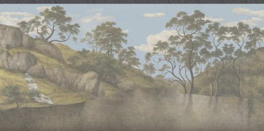
The conclusion of the video is the artwork being brought back to its original beauty and state of pure nature, without any of the colonisation elements.
-----
Why Australias Colonial history ?
The land was originally the tribals, it belonged to them. Joan shows the tribals merging in and out with the background itself, and using the land for its own purpose, in its original beauty. While the colonisers came with their own set of products and agendas, and have transformed the same land into the world we are currently living in, with all of its problems and destructive elements.
youtube
Artist Interview :
Referred to me as research into the story narrative and making of this video animation.
1 note
·
View note
Text
Case Study 1_ Inside Out (opening scene)
youtube
Background :
Inside Out, is a Pixar production. Directed by Pete Docter and Ronnie Del Carmen. The idea was conceived and co-written by Pete. It released in 2015.
Use of CGI animation in conveying the Story Narrative :
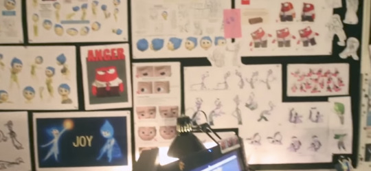
This movie is done in CGI animation completely. The development of each character started from research into what these emotions mean, people’s reactions into these emotions, from sketching to model making, the process was created.
Concept :
Inside Out, is the journey of a young girl through her adolescent life. We are shown the life of a 11 year old girl, through her personality, consisting of her five main emotions. The concept of this movie reflects around the inner workings of the main character Riley’s mind. Each emotion is given a form and we see how each event in her life, in controlled by these emotions. It explores concepts of psychology such as core memories, long and short term memory and personality development.
Narrative Analysis :
• Inside out focuses on the life of Riley, it starts with her birth and takes us through her adolescent life.

• The opening scene, starts with the birth of Riley, and we are taken within her mind to see her first view of her parents smiling at her. This is when Joy, the first emotion is introduced.

• The space within Riley’s mind, where all her emotions operate is referred to as ‘headquarters’ throughout the movie and it’s the inner workings of her personality. ( above )

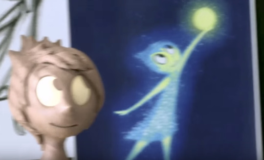
The creation of ‘Joy’, this is the first emotion we are introduced to.
There is a constant glow around her at all times. This is important to notice in character development and story narrative as it adds to the look and sound of ‘Joy’. The developers have captured the feel of every emotion to the highest extent as per research and common perceptions about these emotions.


The formation of a memory : we are introduced to these memory balls : they indicate each and every event in Riley’s life. The memory balls are of different colours based on which emotion is dominant. Hence here, its yellow (above) based on Joy’s colour.

Memory wheels - memories getting formed. - the storehouse within Riley’s mind, the creators have actually shown how an event is directly linked to an emotion, which leads to a memory and this gets lodged in our minds for a period of time.


The above 2 images, represent the network of neurons in our brain. This is how we think, imagine, make memories. This concept has been explored in the above image (the multi-colour wheels with Joy standing by it) in Inside Out.
The animation has perfectly captured the actual storage house of ‘memories’ that exist in a human, and shown us how these memory balls go through wheels of motion and get stored.

Joy meets Sadness - The first scene between two of the main characters that follow through the movie. This first meeting conveys a strong sense of each of these emotions, a strong contrast between joy and sadness can be seen. From the animation of each emotion, the colour, voice and dialogues, along with tone of voice immediately tell us about them.

Joy and Sadness meet Fear, the facial expressions are very representative of each emotions core.

Joy, Sadness, Fear meet Disgust

Anger, is introduced to the rest of the emotions.
• The opening scene takes us through all her emotions, based on various events in her life. Joy meets Sadness, Fear and disgust, and lastly Anger.
• Explores the themes of psychology, emphasising on personality development, formation of memories, long and short term memories.
Plot Structure & Story Arc _ Inside Out Opening Scene

The above plot structure is a breakdown the path taken in the opening scene of Inside out. The set up, introduces us to the main character and the concept of the movie, leading upto the confrontation of all five emotions being present, and Joy losing charge of Riley. The conclusion is the return of joy, and anger being pacified.

The above story arc is comparison of the tension vs. screen time of the events in the opening scene of Inside Out. Visibly, the tension mounts as each emotion comes onto the screen, and the main emotion (joy) loses control to anger. The tension reduces as Joy is back in charge. Screen time varies across the scene, with the main amount of time given to the introduction of each emotion. The introduction and conclusion are the smallest in time slots.
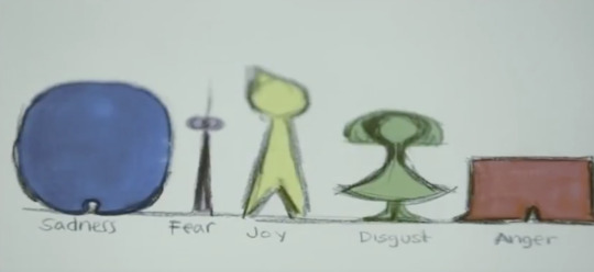
• Each emotion is given a different avatar, voiceover and colour. The concept of each emotion is linked to what a person would feel. For example, ‘Sadness’ is portrayed as a short, slightly plump girl, speaking in a low voice, in a dull blue colour. In contrast, ‘Anger’ is a bright red man, stout and speaks in a high irritable voice at all times.
Mood Boards ( concepts, colours & ideas )
Mood board indicative of the overall colour palette :
Used to conceptualise and create each emotion. This is important to the story structure as it makes the audience differentiate between emotions clearly, the design of each emotion ( body, voice, colour, height ) all add to the story narrative. Each event shown in the opening scene is connected to a specific emotion. Riley’s face and behaviour is shown to change as per this.
For example, we see Riley being angry about eating broccoli and then the scene shifts to headquarters, where anger is in charge of her. So there is correlation made between the external and internal world constantly to keep the audience in tune with the movie.

Mood board indicative of the concepts and idea’s :
The memory storage - the stages of a memory forming following through to the storage a memory.
The memory wheels - linked to actual working of a human brain. The neurons of our brains, are constantly linking to each other as we keep thinking/ going through different events and behaviors. This is shown when Joy follows the memory ball, into the storage area when Riley see’s her parents for the first time and experiences Joy,

Mood boards representing the colour concept behind the creation of each emotion :
Disgust : Colour analysis and character development

Joy : Colour analysis and character development

Sadness : Colour analysis and character development

0 notes
Text
Case Study 3_Good Morning Music Video by Kanye West_ Mood boards

The above mood board is reflective of Kanye West’s self portrait told to us through the story narrative in the music video. The elements which draw me to make this conclusion are highlighted ( University degree/ Shutter Shades/ Song Titles ).

The above mood board is based on Takashi Murakami’s design style ( the animator and creative head ). You can see a direct link between Murakami’s fantastical and iconic flowers, colour palettes and fun and psychedelic artistic style in Kanye West’s music video.
He has designed the Kanye bear, and the fantastical city of ‘Universe City’ following the same style.
It is vital to the story narrative as it adds to the humorous and playful theme of the music video, with the animation of Kanye’s personal accessories to match his own style, the music video has captured a perfect balance between Murakami and West.
0 notes
Text
Case Study 3_ ‘Good Morning’ music video by Kanye West
Video Link : Good Morning by Kanye West
youtube
Story Narrative :

The introduction begins with the above words : Welcome to Universe City- flashing across the screen.

The kanye bear is getting ready to go for his graduation ceremony ( alarm clock rings, brushing teeth )


The video follows a series of events - His car breaks down, there’s a long line for the bus, Can’t catch a cab, water gets splashed from the pavement & he misses his train.
There is an increase in tension and urgency conveyed through these scenes.
He gets sucked into a fantastical world of dancing mushrooms, where he tries to run and escape. Finally he is thrown onto the pavement.

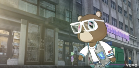
Shutter shade ( sunglasses ) are a signature of Kanye West’s own style.
The Kanye bear is thrown into sunlight, the darkness of the video until now evaporates, the sun comes out, he puts on the shades and reaches the graduation ceremony.
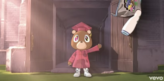
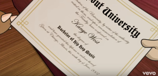
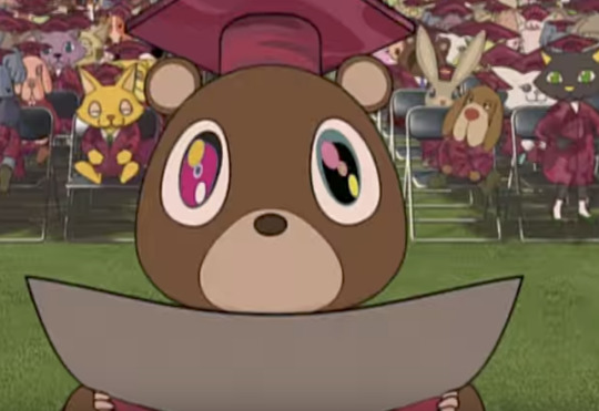
Graduation Ceremony - Bachelor of Hip Hop Music - Name written is ‘Kanye West’ - We are directly shown the self portrait nature of this entire music video. BY putting his own name on the graduation certificate and qualifying in ‘hip hop music’, the viewer can definitely link this to Kanye West’s own life.

The music video ends with the Kanye bear celebrating with his friends, and going through the sky/space in this fantastical world.
Plot Structure & Story Arc

The above plot structure is representative of the set up, main body ( series of events which take place) and finally the conclusion where the bear reaches graduation ceremony.

The above story arc is a link between the tension on screen, vs the screen time given to it. The bulk of the screen time is devoted to the events that take place in the bears journey to his university.
0 notes