
Don't wanna be here? Send us removal request.
Statistics
We looked inside some of the posts by meiguiyu and here's what we found interesting.
Average Info
Notes Per Post
6
Likes Per Post
4
Reblog Per Post
2
Reply Per Post
0
Time Between Posts
11 days
Number of Posts By Type
Text
17
Last Seen Tumblr Blogs


Fun Fact
69% of Tumblr users are millennials.
Text
Getting and clean data
The most frequently used methods to exam the data before clean it.
dim(pack_sum) # get the dimemtion of the data frame
str( pack_sum ) # get a very detailed information of the structure of each variable
head( pack_sum) # get the first few observations
pack_sum <- summarize(by_package, count = n(), unique = n_distinct(ip_id), countries = n_distinct(country), avg_bytes = mean(size))
> quantile(pack_sum$count, probs = 0.99) 99% 679.56 > top_counts <- filter(pack_sum, count > 679)
It is a good way to turn the data frame into data frame table when manipulating it because the output is much more informative and compact than a data frame. We use tbl_df() method to do it.
Use chaining operator to concatenate the methods together without repeating stating the data frame.
data%>% select(id:exams, -contains("total")) %>% # subset data from column id to column exams, exclude columns contain “total” gather(part_sex, count, -score_range) %>% # merge columns separate(part_sex, c("part", "sex")) %>% # separate columns filter(count >= 10, country == 'US'| country == "IN", !is.na(r_version)) %>% # filter specific observations mutate(total = sum(count), prop = count / total) %>% # creat new variables group_by(part, sex) %>% # group the data arrange(country, desc(count)) %>% # arrange data in desc order unique %>% # obtain all the unique rows print
0 notes
Text
Dates and time
Dates are represented by the 'Date' class and times are represented by the 'POSIXct' and 'POSIXlt' classes. Internally, dates are stored as the number of days since 1970-01-01 and times are stored as either the number of seconds since 1970-01-01 (for 'POSIXct') or a list of seconds, minutes, hours, etc. (for 'POSIXlt').
> d1 <- Sys.Date()
> class(d1) [1] "Date"
> d1 [1] "2017-05-12"
> t1 <- Sys.time()
> t1 [1] "2017-05-12 20:42:35 EDT"
> class(t1) [1] "POSIXct" "POSIXt"
> weekdays(d1) [1] "Friday"

> t3 <- "October 17, 1986 08:24"
> t4 <- strptime(t3, "%B %d, %Y %H:%M")
> t4 [1] "1986-10-17 08:24:00 EDT"
> class(t4) [1] "POSIXlt" "POSIXt"
> difftime(Sys.time(), t1, units = 'days') Time difference of 0.004016399 days
The most frequently used package to deal with date and time is lurbidate. The methods in lubridate may be a little different from the above one.
To view your locale, type > Sys.getlocale("LC_TIME") [1] "English_United States.1252"
> library(lubridate)
> help(package = lubridate) # bring up an overview of the package > today() [1] "2017-05-12"
> mdy("March 12, 1975") [1] "1975-03-12"
Note that we can parse a numeric value here with leaving off the quotes.
> dmy(25081985) [1] "1985-08-25"
But it is hard for R to intrepret ambigous information.
> ymd("192012") [1] NA Warning message: All formats failed to parse. No formats found.
To resolve it, we need to add two dashes OR two forward slashes to "192012" so that it's clear we want January 2, 1920.
> ymd("1920/1/2") [1] "1920-01-02"
Parse time only.
> hms("03:22:14")
[1] "3H 22M 14S"
We can also parse data and time at the same time.
> ymd_hms(dt1)
[1] "2014-08-23 17:23:02 UTC"
> wday(dt1, label = TRUE)
[1] “Friday”
We can apply the above methods to a vector too. Which is convenient in dealing with the whole column in a data frame.
> dt2
[1] "2014-05-14" "2014-09-22" "2014-07-11"
> ymd(dt2) [1] "2014-05-14" "2014-09-22" "2014-07-11"
If you want to make some change the date and time, we can use update() method. Remember to assign the changed date and time to the origianl variable to make this change validate.
> this_moment <- update(this_moment, hours = 10, minutes = 16, seconds = 0)
> this_moment [1] "2017-05-12 10:16:00 EDT"
To find the current date with specific time zone.
> nyc <- now("America/New_York")
> nyc [1] "2017-05-12 20:15:35 EDT"
One nice aspect of lubridate is that it allows you to use arithmetic operators on dates and times.
> depart <- nyc + days(2)
> depart [1] "2017-05-14 20:15:35 EDT"
> arrive <- depart + hours(15) + minutes(50)
Change the time to another time zone local time.
> arrive <- with_tz(arrive, "Asia/Hong_Kong")
> arrive [1] "2017-05-15 21:24:35 HKT"
Use interval() method to calculate the span between two different time.
> how_long <- interval(last_time, arrive)
Use as.period() to see how long the span is.
> as.period(how_long) [1] "8y 10m 28d 21H 24M 35.5586559772491S"
0 notes
Text
My first R functions
best <- function(state, outcome){
#laod data data <- read.csv("outcome-of-care-measures.csv",colClasses = "character") #subset data subdata <- subset(data,State=state,select = c(State,Hospital.Name,Lower.Mortality.Estimate...Hospital.30.Day.Death..Mortality..Rates.from.Heart.Attack, Lower.Mortality.Estimate...Hospital.30.Day.Death..Mortality..Rates.from.Heart.Failure, Lower.Mortality.Estimate...Hospital.30.Day.Death..Mortality..Rates.from.Pneumonia)) #change the columns names names(subdata) <- c('State', 'Hospital',"heart attack","heart failure","pneumonia")
##check validation validation <- state %in% subdata$State if (validation == FALSE){print('Invalid state')} validation2 <- outcome %in% c("heart attack","heart failure","pneumonia") if (validation2 == FALSE){print('Invalid outcome')}
#order subdata based on outcome ascendingly ranked_subdata <- subdata[order(subdata[,outcome]),] best_result <- ranked_subdata[1, ] best_hospital <- best_result$Hospital print(best_hospital)
}
rankhospital <- function(state, outcome, num='best'){
#laod data data <- read.csv("outcome-of-care-measures.csv",colClasses = "character") #subset data subdata <- subset(data,State=state,select = c(State,Hospital.Name,Lower.Mortality.Estimate...Hospital.30.Day.Death..Mortality..Rates.from.Heart.Attack, Lower.Mortality.Estimate...Hospital.30.Day.Death..Mortality..Rates.from.Heart.Failure, Lower.Mortality.Estimate...Hospital.30.Day.Death..Mortality..Rates.from.Pneumonia)) #rename columns names(subdata) <- c('State', 'Hospital',"heart_attack","heart_failure","pneumonia")
##check validation validation <- state %in% subdata$State if (validation == FALSE){print('Invalid state')} validation2 <- outcome %in% c("heart_attack","heart_failure","pneumonia") if (validation2 == FALSE){print('Invalid outcome')}
#deal with missing value subdata <- subset(subdata,heart_attack != 'Not Available') subdata <- subset(subdata,heart_failure != 'Not Available') subdata <- subset(subdata,pneumonia != 'Not Available')
#order subdata based on outcome ascendingly ordered_subdata <- subdata[order(subdata[,outcome]),] total <- nrow(ordered_subdata) #create a new column Rank ranked_subdata <- mutate(ordered_subdata,Rank = 1:total)
#validate the num value num_hospital <- length(unique(subdata$Hospital)) if (num == 'best'){ranked_result <- ranked_subdata[1, ]} else if (num == 'worst'){ranked_result <- ranked_subdata[total,]} else if (num > num_hospital){ return('NA')} else {ranked_result <- subset(ranked_subdata,Rank == num)}
best_hospital <- ranked_result$Hospital print(best_hospital)
}
rankall <- function(outcome, num='best'){
#laod data data <- read.csv("outcome-of-care-measures.csv",colClasses = "character") subdata <- subset(data,select = c(State,Hospital.Name,Lower.Mortality.Estimate...Hospital.30.Day.Death..Mortality..Rates.from.Heart.Attack, Lower.Mortality.Estimate...Hospital.30.Day.Death..Mortality..Rates.from.Heart.Failure, Lower.Mortality.Estimate...Hospital.30.Day.Death..Mortality..Rates.from.Pneumonia)) #rename columns names(subdata) <- c('State', 'Hospital',"heart_attack","heart_failure","pneumonia")
##check validation validation2 <- outcome %in% c("heart_attack","heart_failure","pneumonia") if (validation2 == FALSE){print('Invalid outcome')}
#deal with missing value subdata <- subset(subdata,heart_attack != 'Not Available') subdata <- subset(subdata,heart_failure != 'Not Available') subdata <- subset(subdata,pneumonia != 'Not Available')
#split data into a list of data frame states_type <- split(subdata,subdata$State) length <- length(states_type) #get the specific ranked hospital of each state for (i in 1:length){ #get data frame for each state subdata <- states_type[[i]] #rank data based on outcome column ordered_subdata <- subdata[order(subdata[,outcome]),] total <- nrow(ordered_subdata) #check if the data frame is null if (total > 0) { ranked_subdata <- mutate(ordered_subdata,Rank = 1:total) # validate num value num_hospital <- length(unique(subdata$Hospital)) if (num == 'best'){ranked_result <- ranked_subdata[1, ]} else if (num == 'worst'){ranked_result <- ranked_subdata[total,]} else if (num > num_hospital){ ranked_subdata$Hospital <- 'NA' ranked_result <- ranked_subdata[1, ] } else {ranked_result <- subset(ranked_subdata,Rank == num)} #set the index names row.names(ranked_result) <- ranked_result$State result <- subset(ranked_result,select = c(2,1)) print(result) }
}
}
1 note
·
View note
Text
AUC in machine learning
The AUC value is equivalent to the probability that a randomly chosen positive example is ranked higher than a randomly chosen negative example.
First, to understand the meaning of AUC(Area under the curve), we need to know what is confusion matrix.

Classification (Accuracy) Rate: 100 * (TP + TN) / (TP + FP + FN + TN)
Misclassification Rate: 100 * (1 – ( (TP + TN) / (TP + FP + FN + TN)))
True Positive Rate: 100 * TP / (TP + FN)
True Negative Rate: 100 * TN / (TN + FP)
Below is the ROC(receiver operating characteristic curve) plot, AUC means area under the curve, so AUC is the area under the ROC curve. The higher the AUC value is, the better the effect of the classifier is.

We can calculate the AUC value in R or Python or Excel.
1. Calculate AUC in R:
library(ROCR) > value = c(0.5,0.3,0.45,0.55,0.7) > label= c(1,1,0,0,1) > pred = prediction(value ,label) > perf = performance(pred,”tpr”,”fpr”) > plot(perf, color=”blue”,lty=3,lwd=3,cex.lab=1.5,cex.axis=2,cex.main=1.5, main=”ROC plot”) > auc = performance(pred,”auc”) > auc = unlist(slot(auc,”y.values”))
> print(auc)
2. Calculate AUC in Python:
from sklearn.metrics import roc_auc_score value = [1.7,2.2,0.5,3.8,0.9,1.5,2.2] label= [1,0,1,1,0,1,0] auc = roc_auc_score(label,value) print ('AUC:',auc)
3. Calculate AUC in Excel:
There are a lot of ways to calculate AUC in excel. You might need to use a lot functions to compute each threshold and then sum their rectangle areas. Remember, you need to standardized the data you are going to analyze when compute the thresholds.
0 notes
Text
8. Tuples.
Unpacking tuples:

Access tuple elements:

Python for Data Science
Introduction Python for Data Science
list: data[1,2,3,4,5, ‘list’, dog, 5.7] #order matters
1. Select the first element and the last element in the list :
data[0]=1 data[-1]=5.7
2. List slicing:
data[2:5]=[3,4,5] data[ : 3]=[1,2,3] data[5: ]=[’list’, dog, 5.7]
3. Change, add and remove element:
data[0]=10 #change the value of the first element to 10
data[1:2]=[20,30] #change a list of value at the same time
data + [rose, 27] or data.append(rose, 27) #add new elements to data list
del(data[-1]) #remove element from data list
4. Behind the scene:

If we use list() or x[ : ] function to create list y, then the manipulation of y list does not affect the value of list x.

5. Change list to numpy array for mathematical operations:
Numpy array can contain only one type, the same operation would hebavior
differently in array and list.

6. Numpy subsetting:

Intermediate Python for Data Science
1. Using plt.yticks() to customize the y axis.


The y axis is displayed using 0, 2, 4, 6, 8, 10.

After customizing, the new list 0, 2B, 4B, 6B, 8B, 10B is corresponded to the 0, 2, 4, 6, 8, 10, which increases the interpretability of the plot.
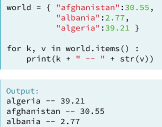
2. Change, add and remove element in Dictionary:
world={
‘China’ : ‘Beijing’,
‘United States’ : ‘Washington DC’,
‘Italy’ : ‘Romen’
}
world[’Thailand’] = ‘Bangkok’ #add element in a dictionary
world[’Italy’] = ‘Roman’ #change element in a dictionary
del(world[’Italy’]) #remove element in a dictionary
3. Read a csv file and set the first column as label:
Use the argument index_col to set the row label. index_col =0 means use the first column as the name of row label. If index_col=False, which means to force pandas to _not_ use the first column as the index (row names).

4. DataFrame access:
Column access:
Use double square brackets, so that the data type would be DataFrame.

Add another column name inside the inner square bracket to access two columns.

Row access:
Use slicing inside the square bracket. Select row two to row four:

Use loc() to access the rows. (loc is label-based)

Use loc() to access row and column.
You can use : to select all the rows in the DataFrame.

You can also use iloc() to access row and column. (iloc is position-based)

5. Boolean operators: and, or, not.
You need to use logical_and, logical_or, logical_not if there are more than one boolean type.

Filter pandas DataFrame.

6. Loop different data structures.
Loop list:

Loop dictionary:
Loop 2D Numpy Array:

Loop Pandas DataFrame:

7. Add column in Pandas DataFrame.

1 note
·
View note
Text
Python Data Science Toolbox(Part 1)
1. Single-parameter function that return single value.

2. Multiple-parameters function that return multiple values using tuples.

3. Nested Function and return function.

4. Default and flexible arguments.
Functions with default arguments:


Function with variable-length arguments (*args):

Function with variable-length keyword arguments (**kwargs):

5. Lambda function.
Some function definitions are simple enough that they can be converted to a lambda function. By doing this, you write less lines of code, which is pretty awesome and will come in handy, especially when you're writing and maintaining big programs.
For example:

Map() and lambda functions:

Filter() and lambda functions:

6. Error handling.
Error handling with try-except:

Error handling by raising an error:

0 notes
Text
Data Visualization for Python
1. Set the x-axis limit and y-axis limit.
Separately: use xlim() and ylim(). You can use square bracket too, like ([1947,1957]).

At the same time: use axis()

2. Generate a plot with legend and annotation using plt.legend() and plt.annotate().


3. Generating meshes.
Use the meshgrid function in NumPy to generate 2-D arrays.


4. Display 2-D arrays using plt.contour() or plt.contourf().


5. Plot 2-D histogram using hist2d() or hexbin().


6. Working with images.
The ratio of the displayed width to height is known as the image aspect and the range used to label the x- and y-axes is known as the image extent.


7. Higher-order regressions.


8. Grouping linear regressions.
First, we can group it by hue argument.


Second, we can group it by row or column.


9. Seaborn package for univariate data visualization.
Strip plot for univariable analysis. Tips are displayed based on different days, set argument jitter=True so that the dots would overlap each other on the same y-axis.


Swarm plot automatically arrange repeated value on the same line to avoid overlap. Use argument hue to group sex variable.


We can change the orientation using orient argument. Remember to switch the x and y variable and change the orientation.


Box plot and violin plot are more useful when you have a great amount of data.


Combine plots for the same data set. For example, combine strip plot and violin plot for tips.


10. Seaborn package for multivariate data visualization.
Use joinplot() for bivariate data.


Add argument kind=‘kde’ to change the plot to contour plot.


Use pairplot() for multivariate data.


Use covariance plot to see how two variables correlate each other.


11. Visualizing time series.
Selecting and formatting dates.

Then plot the formatted dates on the x-axis with a rotation of 60 degree.


12. Histogram equalization in image.
Cumulative Distribution Function from an image histogram.


Equalizing an image histogram.


0 notes
Text
Python for Data Science
Introduction Python for Data Science
list: data[1,2,3,4,5, ‘list’, dog, 5.7] #order matters
1. Select the first element and the last element in the list :
data[0]=1 data[-1]=5.7
2. List slicing:
data[2:5]=[3,4,5] data[ : 3]=[1,2,3] data[5: ]=[’list’, dog, 5.7]
3. Change, add and remove element:
data[0]=10 #change the value of the first element to 10
data[1:2]=[20,30] #change a list of value at the same time
data + [rose, 27] or data.append(rose, 27) #add new elements to data list
del(data[-1]) #remove element from data list
4. Behind the scene:
If we use list() or x[ : ] function to create list y, then the manipulation of y list does not affect the value of list x.
5. Change list to numpy array for mathematical operations:
Numpy array can contain only one type, the same operation would hebavior
differently in array and list.
6. Numpy subsetting:
Intermediate Python for Data Science
1. Using plt.yticks() to customize the y axis.
The y axis is displayed using 0, 2, 4, 6, 8, 10.
After customizing, the new list 0, 2B, 4B, 6B, 8B, 10B is corresponded to the 0, 2, 4, 6, 8, 10, which increases the interpretability of the plot.
2. Change, add and remove element in Dictionary:
world={
‘China’ : ‘Beijing’,
‘United States’ : ‘Washington DC’,
‘Italy’ : ‘Romen’
}
world[’Thailand’] = ‘Bangkok’ #add element in a dictionary
world[’Italy’] = ‘Roman’ #change element in a dictionary
del(world[’Italy’]) #remove element in a dictionary
3. Read a csv file and set the first column as label:
Use the argument index_col to set the row label. index_col =0 means use the first column as the name of row label. If index_col=False, which means to force pandas to _not_ use the first column as the index (row names).
4. DataFrame access:
Column access:
Use double square brackets, so that the data type would be DataFrame.
Add another column name inside the inner square bracket to access two columns.
Row access:
Use slicing inside the square bracket. Select row two to row four:
Use loc() to access the rows. (loc is label-based)
Use loc() to access row and column.
You can use : to select all the rows in the DataFrame.
You can also use iloc() to access row and column. (iloc is position-based)
5. Boolean operators: and, or, not.
You need to use logical_and, logical_or, logical_not if there are more than one boolean type.
Filter pandas DataFrame.
6. Loop different data structures.
Loop list:
Loop dictionary:
Loop 2D Numpy Array:
Loop Pandas DataFrame:
7. Add column in Pandas DataFrame.
1 note
·
View note
Text
Machine Learning Foundations(week 1)
This week we learned how to build simple regression to predict house price.
I built three models using different features, then evaluate the models fit and compare their RMSEs.
Question 1:
I run the BoxWhisker Plot for zipcode and price, the zipcode of the highest price is 98004. I filtered the data using the zipcode and calculated the mean.

Question 2:
I filtered the data that sqfy_living is greater than 2000 but smaller than 4000, then I count the number of its rows and the number of rows of sales data set, and got the fraction of all the houses in this range.


Question 3:
Compared the RMSEs of the learned models. Obviously, the more features I included, the less RMSE I got.

Python code for reference:


0 notes
Text
Regression modeling in practice week 4 (Logistic Regression)
I chose the data set of nesarc to test logistic regression.
I am going to test the correlation between binary response variable alcohol dependence and binary explanatory variable panic disorder.
We got a significant p value and a positive parameter estimate from the results. Therefore, alcohol dependence and panic disorder are statistically significant. Let’s look at the odds ratio, people who have panic disorder in the sample are 1.2 times more likely to have alcohol dependence than those without panic disorder. We can also get a confidence intervals for the odds ratio. The odds ratio indicates that there is 95% that the population odds ratio falls between 1.06 and 1.40. So those with panic disorder are anywhere from 1.06 to 1.40 times more likely to have a alcohol dependence than those without in our population.

However, when we add another explanatory variable major depression to this model, panic disorder is no longer significantly associated with alcohol dependence. We would say major depression confounds the relationship between alcohol dependence and panic disorder because the p value is no longer significant after adding major depression to the model.But the p value for major depression and alcohol dependence is significant. Thus, people with major depression are 1.4 times more likely to have a alcohol dependence than those without after controlling for panic disorder. The odds ratio indicates that there is 95% that the population odds ratio falls between 1.27 and 1.62. So those with panic disorder are anywhere from 1.27 to 1.62 times more likely to have a alcohol dependence than those without in our population.

We can continue to add other variables to test the logistic regression for our response variable alcohol dependence. We can interpret the odds ratio and confidence intervals for those variables that have a significant association with alcohol dependence. From the results, we can see that people whose father had drug abuse are statistically significant with alcohol dependence. By looking at the odds ratio, those whose father had drug abuse are 0.5 times more likely to have a alcohol dependence than those without.

Python code:


0 notes
Text
Regression modeling in practice week3( Multiple Regression Model)
Multiple Regression
For multiple regression analysis, I chose the gapminder data set.
First, I am going to do a multiple regression analysis for three variables. Response variable is breast cancer per100th, explanatory variables are CO2 emission and alcohol consumption.
As we can see, both p values for the explanatory variables are less than.05, but the CO2 emissions parameter estimates is very small, nearly to zero. So I would generate the linear plot to see their correlation. From looking at the plot, it seems there is no correlation between breast cancer rate and CO2 emission. Therefore, I would say even though the p value for CO2 emissions and breast cancer rate is less than .05, the coefficient is too small to conclude they are statistically significant. However, the alcohol consumption coefficient is positive, indicating that there is a positive relationship between the alcohol consumption and breast cancer rate. In other words, breast cancer rate is positively associated withe alcohol consumption after controlling by CO2 emission.


Second, I want to examine the confounding variable for the association between urban rate and breast cancer rate.
I test the linear relationship between urban rate and breast cancer rate. We can see from the significant p value and positive parameter estimate that urban rate is positively associated with breast cancer rate. That is, areas where people have higher breast cancer rate, there is higher urban rate. And areas where people have lower breast cancer rate, there is lower urban rate. If we control internet use rate for this model, as you can see, breast cancer rate is no longer significant with urban rate, and the breast cancer rate coefficient decreases from .57 to .14.
Therefore, we would say that internet use rate confounds the association between urban rate and breast cancer rate.


We can continue add variables to this model in order to evaluate multiple predictors of our quantitative response variable, urban rate. Here when evaluating the independent association among several predictor variables and urban rate. Internet use rate and female employ rate is statistically significant with urban rate, while breast cancer rate, CO2 emisions and income per person are not.

Polynomial Regression
Based on just looking at the scatter plot of urban rate and income per person. It seems like that the green quadratic line fits the data better the blue straight line. Let’s examine it by adding a second order polynomial term to the aggression model.

Regression test for urban rate and income per person
First, we already test the linear regression between urban rate and income per person before. There is a significant association between them. So the blue line in the scatter plot is statistically significant. The R square is 36% percent indicating that 36% of urban rate can be explained by income per person. But what happen if we add a second order polynomial to the regression equation?

Add a quadratic term to the model
As we can see, the quadratic term is negative and p value is significant, indicating that the curvilinear pattern we observed in our scatter plot is statistically significant. In addition, we can see the R square increases to .49. Which means that adding the quadratic term for income per person, increase the amount of variability in urban rate that can be explained by income per person from 36% to 49%. So the results suggests that the best fitting line for the association is the one that includes some curvature.

Evaluating model fit
First, let’s add another centered variable, internet use rate, to our regression equation. The result shows the p values for linear and quadratic income per person remain significant after adjusting for internet use rate. The association between urban rate and internet use rate is also statistically significant. The higher internet use rate tends to have higher urban rate. The R square is also higher after the association controlling for internet use rate. But there is 53% urban rate can be explained after adjusting for internet use rate. So there might be some error in estimating the response value, urban rate, with this model.

Qq-plot
Now, we are going to see the residual variability of this model. The qq plot shows that the residuals generally follow a straight line, but deviate at lower and higher quantiles. This indicates that our residuals did not follow a perfect normal distribution, the curvilinear association we observed in the scatter plot may not be fully estimated by the quadratic income per person term. There may be other explanatory variables we might consider in our model that could improve estimation of the observed curvilinearity.

Standardized residuals for all observations
We can see that most of the residuals fall between -2 to 2, only very three residuals more than 2 standard deviation above or below the mean of 0. With the standard normal distribution, we would expect 95% of the values of the residuals to fall between two standard deviations of the mean. And the fit of the model is not poor.

Additional regression diagnostic plots
To better explain the urban rate, we need to add another explanatory variable, internet use rate, to the model. Let’s look at the Partial regression plot, the internet use rate shows a non-linear relationship with urban rate after adjusting for the income per person, so it meets the linearity assumption in the multiple regression. In addition, many of the residuals are far away from this line, indicating there is some urban rate prediction error. This shows that although there is a significant association between urban rate and internet use rate, the association is pretty weak after controlling for income per person.

Leverage plot
From looking at the leverage plot, although we have few outliers greater than 2 or less than -2, their leverage values are very small or close to zero, suggesting that they don’t have undue influence on the estimation of the regression model.

Python code for reference:


0 notes
Text
Regression modeling in practice week2(Basic Linear Regression Test)
Basic linear regression test for two quantitative variables
I chose the data set of gapminder, to test the linear relationship between income per person explanatory variable and internet use rate response variable. First I run the scatter plot for these two variables. We know that there is a positive linear between these two variables. In order to find the best fit line, we need to run the regression test.

From the 183 samples, we got a large F value and a very small p value, which considerably less than .05. Therefore, we can reject the null hypothesis and conclude that income per person is significantly associated with internet use rate. Next, let’s move to the coefficients, the coefficient for internet use rate is 333.06, the intercept is -3557.25. So the equation for the best fit line of this graph is:
internet use rate = 333.06 * income per person -3557.25

Basic linear regression test for categorical explanatory variable and quantitative response variable
I chose the addhealth project to examine the linear relationship between categorical explanatory variable married status and quantitative response variable hang out times.
As we can see, the p value is very small, much less than .05, so we can reject the null hypothesis and conclude there is a strong linear relationship between married status and hang out times. Move to the coefficients, the intercept is 2.00 and the coefficient for married status is -0.92. So the equation for the best fit line is:
Hang out times = -0.92 * married status + 2.00
For those married:
Hang out times = -0.92 * 1 + 2.00 = 1.08
For those not married:
Hang out times = -9.20 * 0 + 2.00 = 2.00
we could examine the mean and standard deviation for each level of married status. Obviously, the hang out times per week for those married is about two times a week, the hang out times per week for those not married is about one time per week. We can also generate a bar chart of the means in different levels.


Python code for reference:


0 notes
Text
Regression modeling in practice week1
About my research
My major interest is to analyze the association between married status and hang out times in Addhealth project, data source can be found here: http://www.cpc.unc.edu/projects/addhealth.
My main research interest is: Is there a correlation between married status and hang out times?
Sample
The sample is from The National Longitudinal Study of Adolescent to Adult Health (Add Health), a longitudinal study of a nationally representative sample of adolescents in grades 7-12 in the United States during the 1994-95 school year for wave 1.
Add Health project combines longitudinal survey data on respondents’ social, economic, psychological and physical well-being with contextual data on the family, neighborhood, community, school, friendships, peer groups, and romantic relationships, providing unique opportunities to study how social environments and behaviors in adolescence are linked to health and achievement outcomes in young adulthood.
Add health Project contains data from a pair of schools in each of 80 communities (Some high schools spanned grades 7 through 12; for those, a separate feeder school was not recruited.) There are 132 schools in the core study.
The primary sampling frame for Add Health is a database collected by Quality Education Data, Inc. Systematic sampling methods and implicit stratification ensure that the 80 high schools selected are representative of US schools with respect to region of country, urbanicity, size, type, and ethnicity. Eligible high schools included an 11th grade and enrolled more than 30 students. More than 70 percent of the originally sampled high schools participated. Each school that declined to participate was replaced by a school within the stratum.
The data analytic sample for this study included participants grades 7 through 12 who were asked to identify their racial background.
Procedure
Data were collected by In-School Questionnaire, In-Home Samples and In-Home Interview.
In-School Questionnaire is a self-administered instrument formatted for optical scanning, was administered to more than 90,000 students in grades 7 through 12 in a 45- to 60-minute class period between September 1994 and April 1995. There was no "make-up" day for absent students. Parents were informed in advance of the date of the questionnaire and could direct that their children not participate.
In-Home Samples contains two parts, Main (core) sample that all students who completed the In-School Questionnaire plus those who did not complete a questionnaire but were listed on a school roster were eligible for selection into the core in-home sample. This is a nationally representative sample of adolescents in grades 7 through 12 in the US in the 1994–95 school year. Students in each school were stratified by grade and sex. About 17 students were randomly chosen from each stratum so that a total of approximately 200 adolescents were selected from each of the 80 pairs of schools. A total core sample of 12,105 adolescents was interviewed, and Special oversamples that Based on self-reported data from the In-School Questionnaire, four supplementary ethnic-group samples were drawn.
In-Home Interview is In-home interviews were conducted between April and December 1995. All respondents received the same interview, which was one to two hours long depending on the respondent's age and experiences. The majority of interviews were conducted in respondents' homes. To protect confidentiality, no paper questionnaires were used. Instead, all data were recorded on laptop computers. For less sensitive topics, the interviewer read the questions aloud and entered the respondent's answers. For more sensitive topics, the respondent listened through earphones to pre-recorded questions and entered the answers directly. In addition to maintaining data security, this minimized the potential for interviewer or parental influence.
Measures
Married status(Categorical variable), Hang out times(Quantitative variable) were measured by In Home Questionnaire.
Explanatory variable, married status, was generated based on Yes or No. Response variable, hang out times, was counted based on the married status.
The result is that people got married hang out one time less than those not married.
0 notes
Text
Analysis week4(Statistical interaction)
Testing moderation in the context of ANOVA
I chose the data set of addhealth project to analyze whether repeated a grade variable effects the association between married status and hang out times. I run the analysis of variance for each level of the third variable, repeated a grade.
First, when we run the analysis of variance of married status and hang out times per week, we got a significant p value. And when we compare the means of hang out times, obviously, those got married hang out 1 time less than those are not married.


Then we test moderation in the context of ANOVA. Those without repeated a grade shows a large F value and a significant p value, and the mean hang out times each week for those got married is 1 time less than that of non-married. For those repeated a grade, we also got a large F value and a significant p value. Similarly, the mean hang out times each week for those got married is 0.75 time less than that of non-married. Therefore, the third variable, repeated a grade, doesn’t not affect the association between married status and hang out times.


Python code for reference:


Test moderation in the context of Chi-Square Test of Independence
I chose the data set of addhealth project, I am going to analyze the whether the third variable born in U.S. affects the association between routine physical examination and AIDs test.
First, I run the Chi-Square Test of Independence of routine physical examination and AIDs test. I got a significant p value, so these two variables are statistically significant. Also, when we look at the bar chart, those have routine physical examination are almost twice in AIDs test of those are not.


Then I will evaluate the influence of the third variable, born in U.S., on these two variables. I run the Chi-Square Test of Independence for two levels, born in U.S. and non-born in U.S.. We got both significant p values for two levels testing. Also, we can see there is a positive significant correlation between these two variables by the third variable. So the third variable doesn’t affect the association between routine physical examination and AIDs test.


Python code for reference:


Moderation testing in the context of Pearson Correlation
I chose the data set of gapminder project, I am going to analyze whether co2emission affects the association between alcohol consumption and breast cancer rate.
First, I am going to examine the correlation coefficient of alcohol consumption and breast cancer rate. The correlation between two variables are 0.28 and I got a significant p value. So these two variable are statistically significant.

Now, I am going to evaluate their correlation by introducing the third variable, alcohol consumption. I am going to calculate the correlation coefficients in two levels, those with relatively low co2emission and those with relatively high co2emission. I got a significant p value for those with high co2emission, however, the p value is not significant for those with low co2emission. Therefore, the association between alcohol consumption and breast cancer rate are only statistically significant when people have high co2emission.


Python code for reference:


3 notes
·
View notes
Text
Analysis tool week3(Pearson Correlation)
I chose the data set of Gapminder to analyze the correlation between two quantitative variables. I analyzed the relationship of alcohol consumption between life expectancy and breast cancer rate.
The scatter plot shows the rate of life expectancy by the rate of alcohol consumption. The second scatter plot shows the rate of breast cancer by the rate of alcohol consumption. From looking at the scatter plots, we can guess that there is a linear correlation between them, and their association is positive. So we can continue the calculate the correlation coefficients for them.


First, the r value for the Association between Alcohol Consumption and Life Expectancy is 0.31 which means that their correlation is a little modest. And when we square the r value, we got a 0.09 value. Therefore, only 9% of the life expectancy variable can be explained by alcohol consumption variable. But the p value is less than .001. Even though the correlation between them is not strong, there these two variables are statistically significant.
Then, we got a 0.49 r value for the Association between Alcohol Consumption and Breast Cancer Rate. Obviously, this positive association is stronger that the above one. When we square the r value, we got a value of 0.24 which means that 24% of the breast cancer rate are explained by alcohol consumption. And we got a very small p value which is considerably less than .001, therefore, there two variables are statistically significant.
Therefore, we can say that both of these two relationships are statistically significant.
Results:

Python code for reference:

0 notes
Text
DM&V week1(Research question and association between variables)
After looking through the codebook for the GapMinder study, I have decided that I am particularly interested in suicide rate. While suicide rate is a good starting point, I need to determine what it is about suicide rate that I am interested in. It strikes me that Korea, India and Japan have very high suicide rate, but they have very different national conditions. I watched a video about people living at the bottom of Korean and Japanese societies, many of them were unemployed. Actually they owned the abilities to earn money themselves, but no job opportunities provided to them due to the economic depression. Meanwhile, some of them had jobs and they worked very hard till day and night, however, they can only afford the meals or rent every month. And the unemployed situation in India might be the reason of illiteracy. In order to survive, some of these Indians choose to steal, to rob, while others who are not able to stand the survival press choose to end their lives. Therefore, I decide that I am most interested in exploring the association between employment rate and suicide rate. I add to my codebook variables reflecting employment rate.
Second, I notice that even though drug abuse is very commonplace in United States, alcohol is controlled very strictly, especially among teenagers. However, alcohol consumption is very high in China because it is easy for anyone to buy it anywhere. Since United States owns high GDP per capita while China owns very low GDP per capita, I am interested in studying the correlation of GDP per capita and alcohol consumption. I add to my codebook variables reflecting income per person and alcohol consumption.
For my assignment, I chose the data set of GapMinder, and I will include the following variables in my codebook:
incomeperperson – income per person
alconsumption – alcohol consumption
hivrate – hire rate
suicideper100th – suicide rate
Question 1:
Do the unemployed people have have higher possibilities to suicide?
Hypothesis:
Based on the data set I chose, I drew a scatter diagram to compare the relationship between suicide rate and employment rate as below. We can see that people are more likely to suicide when the hire rate is between 0% to 5%, and there is a very low possibility for people to suicide when the hire rate is over 15%. So as the employment rate goes higher, the occurrence of suicide goes lower. But the suicide rate is not low when hire rate is over 15%, even higher than some of suicide rate when hire rate between 0% to 5%. Therefore, from the scatter diagram, we are not able to draw out the the correlation of hire rate and suicide rate.

Question 2 :
Do the people who have lower income prefer to buy more alcohol than those earn higher income?
Hypothesis:
Based on the data set I chose, I drew a scatter diagram to show the relationship of income per person and alcohol consumption. As you can see, alcohol consumption mainly located in the area where income per person is between $0 to $10,000, as the income per person goes higher, the alcohol consumption goes less. Moreover, there is almost no alcohol consumption when income per person is over $40,000. Therefore, we can say that there is a strong negative relationship between income per person and alcohol consumption.

Terms used:
1.incomeperperson : 2010 Gross Domestic Product per capita in constant 2000 US$. The inflation but not the differences in the cost of livingbetweencountrieshasbeentakenintoaccount. 2. employrate : 2007 total employees age 15+ (% of population) Percentage of total population, age above 15, that has beenemployedduringthegivenyear. 3. suicideper100TH : 2005 Suicide, age adjusted, per 100 000 Mortality due to self-inflicted injury, per 100 000 standard population, age adjusted 4. alcconsumption : 2008 alcohol consumption per adult (age 15+), litres Recorded and estimated average alcohol consumption, adult(15+)percapitaconsumptioninlitrespurealcohol
Reference:
Data set and code book of GapMinder project from Coursera.
https://en.wikipedia.org/wiki/List_of_countries_by_suicide_rate3
https://en.wikipedia.org/wiki/List_of_countries_by_GDP_(nominal)_per_capita
A video of the suicide epidemic crippling South Korea.
Python code for reference:
# -*- coding: utf-8 -*- """ Spyder Editor This is a temporary script file. """ import pandas import numpy import seaborn import matplotlib.pyplot as plt data = pandas.read_csv('GapMinder.csv') # print(len(data)) # print(len(data.columns)) #To convert the variables to numeric format data['hivrate'] = data['hivrate'].convert_objects(convert_numeric=True) data['suicideper100th'] = data['suicideper100th'].convert_objects(convert_numeric=True) data['incomeperperson'] = data['incomeperperson'].convert_objects(convert_numeric=True) data['alcconsumption'] = data['alcconsumption'].convert_objects(convert_numeric=True) data_filtered = data.dropna(subset=['hivrate','suicideper100th','incomeperperson','alcconsumption']) #Set aside the missing data # c1 = data['hivrate'].value_counts(sort=False) # print (c1) # # p1 = data['hivrate'].value_counts(sort=False,normalize=True) # print (p1) #Change the variables to categorical variables data["hivrate"] = data_filtered["hivrate"].astype("category") data["suicideper100th"] = data_filtered["suicideper100th"].astype("category") data["incomeperperson"] = data_filtered["incomeperperson"].astype("category") data["alcconsumption"] = data_filtered["alcconsumption"].astype("category") #Create the variales for x axial and y axial hivrate = [x for x in data_filtered["hivrate"]] suicideper100th = [x for x in data_filtered["suicideper100th"]] incomeperperson = [x for x in data_filtered["incomeperperson"]] alcconsumption = [x for x in data_filtered["alcconsumption"]] #Use scatter to dispaly the distribution plt.scatter(hivrate, suicideper100th) plt.title('The correlation of hire rate and suicide rate') plt.xlabel('hivrate') plt.ylabel('suicideper100th') plt.show() plt.scatter(incomeperperson, alcconsumption) plt.title('The correlation of income per person and alcohol consumption') plt.xlabel('incomeperperson') plt.ylabel('alcconsumption') plt.show()
0 notes
Text
DM&V WEEK4(Visualizing data)
First of all, I chose the data set of gapminder and visualizing some of the variables.
1. Bar chart of categorical uni-variable:
I chose the data set of gapminder and analyzed the incomer per person variable. I collapsed the income per person to four different levels, as we can see, there is very little difference between there four categories which means that the number of people are almost the same in different income level.

2. Histogram of quantitative uni-variable:
As we can see from the below histogram, it is skewed to the right, so the alcohol consumption mainly focus between 0 to 15. As the amount of alcohol consumption goes higher, the number of counts goes lower.

3. Bar chart of correlation between categorical variable and quantitative variable:
It is obviously that there is a positive relationship between income per person and alcohol consumption. The alcohol assumption goes higher as the income per person goes higher as well.

4. Scatter plot of two quantitative variables:
I set the suicide rate as response variable and income per person as explanatory variable. As we can see, the suicide incidents mainly lies in income range between 0 to 40,000, especially in range from 0 to 20,000. And there is almost no suicide when the income per person is higher than 40,000. So we can say the this scatter plot is skewed to the right.

Python code for your reference:
# -*- coding: utf-8 -*- """ Spyder Editor This is a temporary script file. """ import pandas import numpy import seaborn import matplotlib.pyplot as plt data = pandas.read_csv('GapMinder.csv') # print(len(data)) # print(len(data.columns)) #To convert the variables to numeric format data['hivrate'] = data['hivrate'].convert_objects(convert_numeric=True) data['suicideper100th'] = data['suicideper100th'].convert_objects(convert_numeric=True) data['incomeperperson'] = data['incomeperperson'].convert_objects(convert_numeric=True) data['alcconsumption'] = data['alcconsumption'].convert_objects(convert_numeric=True) #describle center distribution of incomeperperson cdistribution1 = data['incomeperperson'].describe() print(cdistribution1) # data_filtered = data.dropna(subset=['hivrate','suicideper100th','incomeperperson','alcconsumption']) #Set aside the missing data # c1 = data['hivrate'].value_counts(sort=False) # print (c1) # # p1 = data['hivrate'].value_counts(sort=False,normalize=True) # print (p1) #Change the variables to categorical variables # data["hivrate"] = data_filtered["hivrate"].astype("category") # data["suicideper100th"] = data_filtered["suicideper100th"].astype("category") # data["incomeperperson"] = data_filtered["incomeperperson"].astype("category") # data["alcconsumption"] = data_filtered["alcconsumption"].astype("category") #Create the variales for x axial and y axial # hivrate = [x for x in data_filtered["hivrate"]] # suicideper100th = [x for x in data_filtered["suicideper100th"]] # incomeperperson = [x for x in data_filtered["incomeperperson"]] # alcconsumption = [x for x in data_filtered["alcconsumption"]] #Use scatter to dispaly the distribution # plt.scatter(hivrate, suicideper100th) # plt.title('The correlation of hire rate and suicide rate') # plt.xlabel('hivrate') # plt.ylabel('suicideper100th') # plt.show() # # plt.scatter(incomeperperson, alcconsumption) # plt.title('The correlation of income per person and alcohol consumption') # plt.xlabel('incomeperperson') # plt.ylabel('alcconsumption') # plt.show() #Collapse a quantitative variable to categorical variable print("Income per person - 4 quartiles") data['income4quartiles'] = pandas.qcut(data.incomeperperson, 4, labels=["1=25th%tile","2=50th%tile","3=75th%tile","4=100th%tile"]) c1 = data['income4quartiles'].value_counts() print(c1) #Change the type of a variable to categorical data['income4quartiles'] = data['income4quartiles'].astype('category') #Graphing a categorical univarialbe seaborn.countplot(x='income4quartiles', data=data) plt.xlabel('Income per person') plt.title('Income per person in four quartiles') plt.show() #Graphing a quantitative univariable seaborn.distplot(data['alcconsumption'].dropna(),kde=False) plt.xlabel("Alcohol consumption") plt.title("Total amount of Alcohol consumption") plt.show() #Graphing bivaribale -- one categorical and one quantitative seaborn.factorplot(x='income4quartiles', y='alcconsumption',data=data, kind='bar',ci=None) plt.xlabel('Income per person') plt.ylabel('Proportion of alcohol consumption') plt.title('Bar chart of the association btween income per person and alcohol consumption') plt.show() #Graphing two quantitative variables seaborn.regplot(x='incomeperperson',y='suicideper100th', fit_reg=False, data=data) plt.xlabel("Income per person") plt.ylabel("Sucicide rate") plt.title("Scatter plot of the association between income per person and suicide rate") plt.show()
0 notes