
she/they. Welcome! This blog is being used to document my work throughout my semester one Art Lab course (and possibly more.) To navigate my posts, use the archive or scroll at your leisure. Thank you!!
Don't wanna be here? Send us removal request.
Statistics
We looked inside some of the posts by merleprocesstime and here's what we found interesting.
Average Info
Notes Per Post
0
Likes Per Post
0
Reblog Per Post
0
Reply Per Post
0
Time Between Posts
4 days
Number of Posts By Type
Text
13
Last Seen Tumblr Blogs


Fun Fact
Mobile US users spent an average of 115.8 minutes on Tumblr app monthly.
Text
Hiya There !
To navigate, please scroll to the bottom of the page and read up from there - posts should be structured in chronological order.
If there are any issues with formatting or things not loading, chuck me an email and I'll fix it ASAP :))
Thank you!
0 notes
Text
Wiki tuaono, Akomanga tuarua (6.2) - Process and Final Responses
Final Works Process and Final Thoughts:
Final Artworks (Total:7 Responses)
Thank you! :))
0 notes
Text
Wiki tuawha, Akomanga tuatahi (4.1) - Gallery Review


Photograph by Ted Whittaker.
Listening Stones Jumping Rocks is a group exhibition at the Adam Art Gallery. The exhibition itself has a wide range of artists and mediums shown - glass, painting, sculpture, photography, sound etc. Thematically what seemed to link them all were the links to the natural world and time. For instance, Sorawit Songsataya's 'The Interior' (2019) and Phil Dadson's 'Echo-Logo' (2003-04) both seemed to deal with the idea of extinction - aspects of the natural world coming to an end. Both works visually are very different, Songsataya creating large fibreglass sculptures of dead birds and Dadson capturing videos of environments including the glaciers. There was so much going on throughout the whole exhibition so I focused on my favourite artwork, Te Oro o Te Ao. I visited the gallery with a group from class and when we approached Te Oro o Te Ao - a black room around the corner of a dark hallway - initially we decided not to go in. The room itself was noisy with barely any visible surfaces, except for the outline of a bench in the middle. My first impression of the piece was that it was frightening and sounded like blaring white noise. After turning on my phone torch and making my way to the centre of the room to sit, this changed. The sounds emitted from the eight speakers positioned around the almost completely black room reminded me of waves crashing on the rocks in the ocean. Overtime this changed to what I thought sounded like cicada hums.
Rachel Shearer's work aims to 'take(s) us into the deep histories of the unfolding histories of the earth.' I think it was successful in doing this. The passage of time is communicated through the way the audio transforms and its connection to the land is heard through the audio itself, the sounds deep and familiar but also not exactly recognisable. The way the space is composed eases the sensory overload and also helps to make the listening experience more accessible and impactful. If the room had been visually noisy it might have been frightening or overwhelming.
Shearer's artwork is very different from what I'm intending to develop. But the ideas of connection, of using familiarity and composition of a space to affect a viewer's experience with the artwork - all of this I think is definitely worth considering. Placing my pieces so that their surroundings and placement affect their intended impact can wildly change the tone of what I make.
0 notes
Text
Wiki tuawha, Akomanga tuatahi (4.1) - Critique
I only had six responses, including my Mihimihi piece, to show. I was asked to work on creating at least two more by my appointment the following lesson. Unfortunately I woke up ill the day after and suffered multiple covid symptoms over the rest of the week, isolating for part of that time. I pushed my appointment to the next week and the time was used to discuss my final response project rather than critique my earlier responses.
When I did show my work in class, I received some positive feedback from my classmate Lauren which I appreciated a lot.
Everything she named as a focus resonated and is what I'd like my work to convey - especially when it comes to exploring self and those around me.
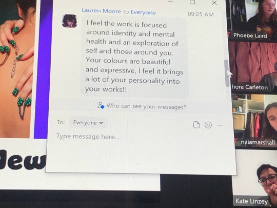
I was also told by Kate and Chora that the body of work I had produced at that point seemed very successful and that they would like to see more. I was happy to hear things were going well but wish I'd had more time to receive critique. If I had been up to date at this point maybe I would have. I enjoyed analysing my classmates work and finding thematic similarities broadly or honing in certain aspects I liked. The exercise as a whole helped me feel more open to the process of critique and putting my work out there for others to see. If anything, I've had to do that often through my initial response making period due to the spaces I've been working with or audience interaction being a part of the process.
Overall, I think I could stand to step outside my comfort zone a bit more. Having to ask other people to help has been key so many times but often I've opted to go with the work that steers away from relying on others. On top of that I want to play with scale more. Many of my pieces are very small and contained. Making pieces that are larger while managing time is something I would like to try out.
Going forward I want to use my Dale Harding response as a base. Starting this course I didn't think his art would resonate with me, but using methods to utilize space has been so much fun and I want to keep exploring that.
0 notes
Text
Wiki tuatoru, Akomanga tuatahi. (3.1) - Mark Bradford
Initial Notes for Myself
Uses found materials around him to incorporate the social and political context into his work.
Draws on urban environments
Los Angeles
Started in a hair salon - was treated poorly for being sensitive and creative
End papers - used for African American hair perms
Super cheap and had social political context
“He’s speaking directly to Black girls, Black women’
He liked it because it came from the fabric of his life
He’s gay and black and grew up downtown
Aids pandemic hit when he was in his early 20s
Carved into wall for Finding Barry (2015), map of USA with aids death stats. Similar to Dale Harding
Aids is a theme throughout his work
Using imagery related to Aids
Memory represented through his work - uses rope and then absence of rope to draw
Remakes original pieces and reconstructs, much like Angela
First creative in his family to follow his voice
Rioting in 1992 LA changed landscape
Scavenged urgent need posters
Used it in his work - political subtext.
Documents change in space with materials used
Contemporary art is for everybody
Helped found ‘Art in Practice’
‘Giving back to the community’
‘How can i represent a whole race of people? Thats ridiculous’ about himself
Class, race, gender > criticises America when he picked to represent America
Scale within space.
‘Unflinching in one’s criticality’
Described as hopeful and optimistic
Describe the variety of media that he uses and consider how the different media affect the meaning that is communicated.
Rope, paper, paint. Mostly found materials sourced from the world around him. This can range from end papers used to style hair to diagrams depicting the Aids virus. The found material Bradford utilises has both political and social context, and he actively takes note of that and how it is incorporated into his work. For viewers who understand or connect to the context behind it, it can be especially meaningful and provide depth beyond informing viewers and providing a criticism of the state of things.
Consider the roles of Site, Repetition, Rhythm, Motion, The Body, Popular Culture, Identity and sexuality in his work. compare his exploration of these to the other artists we have looked at so far in this course.
Mark Bradford's piece ‘Finding Barry’ (2015) is similar to Dale Harding’s ‘Wall Composition in Reckitt’s Blue’ (2017). Both pieces use the roles of site and identity. While both use similar techniques, they differ a lot. Harding’s work actively works against the gallery’s white wall and is done to mimic sandstone rock carving that ties into his cultural and ancestral identity. Bradford works with the gallery wall to uncover what is underneath for stylistic intent and to make his work more impactful.
Both Pati Solomona Tyrell and Bradford use identity and sexuality to reach out and connect with viewers, but also to express themselves and their values.
It isn’t listed above, but Hanne Lippard and Bradford use language in their work. Often repetition of language - for Bradford the repetition of the language in his environment that surrounds whatever meaning or context he gives his work. For Lippard, the repetition of language is used to draw attention to mundane language and alternative interpretations of what we accept, e.g. spam emails.
Can you see aspects of his work which relate to Mihimihi in a broad sense? Does the work announce his presence and locate him within a community and place?
Bradford’s work definitely relates to Mihimihi in the broad sense. His work is pulled from his landscape and his life, what affects him and others - his community, family, the people around him. Everything he makes announces this and what makes him him. Stylistically, through his techniques and use of space, he also achieves Mihimihi in his work. There is personality and a sense of introducing viewers to the ideas of the work present in what he makes.
SIMILIAR ARTIST - Adam Pendleton
When looking for an artist who had done similar work to Mark Bradford, I leaned towards collage work initially. Somehow I found Adam Pendleton’s work, whose use of the language related to his values and life reminded of Bradford’s methods. His (Untitled (A Victim of American Democracy)’ uses vertical spray painted line work and distorted language taken from a speech by Malcolm X in 1964 [1]. The choice of specific language used to create a visual impact is a method shared by both artists. The use of lines to structure the piece as well. Apart from that, his work is very different - much darker aesthetically. His entire body of work is monochromatic, including when he uses spray paint. There also isn’t the layering aspect, at least not to the same degree that Bradford uses layering. Pendleton’s layering doesn’t build up 3d textures. For example, in his piece ‘OK DADA OK BLACK DADA OK (WE NEED)’ Pendleton has sprayed and inked over layers previously written, some space left purposefully uncovered. Bradford does this when he layers and peels, choosing what to show and what to cover for effect.
Adam Pendleton, Untitled (A Victim of American Democracy), 2017 - Adam Pendleton, OK DADA OK BLACK DADA OK (WE NEED), 2018 https://www.pacegallery.com/artists/adam-pendleton/ [1]
THE PROCESS
RESPONSE
I added some details to the figure in the middle using an ink pen and an eye cut out from massive magazine.


0 notes
Text
Wiki tuatoru, Akomanga tuatahi. (3.1) - Leeroy New
Class Notes
* interest in narratives in 'real' space
* using 'improper materials.
* talks about how his works appear in public space - as mural, spatial
intervention, costume etc.
* talks a lot about his Filipino upbringing
Some talk was prompted by Kate around the potential sexism of New’s work. She didn’t provide any examples of this necessarily. Personally I think his work isn’t sexist. My dad is very into scifi so I’ve seen a lot of the old sci fi art and that tends to be very sexist. The genres of fantasy and sci fi as a whole, spanning across mediums, tends to have problems with how it depicts women. I explained this to the class and nobody said anything to disagree with it. I worry I might’ve delivered my opinion too strongly. Others did agree with me though.
Initial Notes (taken in class - very messy)
PROCESS

RESPONSE

0 notes
Text
Wiki tuarua, Akomanga tuarua. (2.2) - Rebecca Anne Hobbs
Overwhelmed by workload at this point in time so I wasn't up to date.
What are her attitudes to social, political concerns? Are they relevant here and now? Which of her concerns have particular relevance for you?
Describe the variety of media that she uses and consider how the different media effect the meaning that is communicated.
Hobbs uses video and lens. Her works center around movement and the media is chosen to effectively deliver the meaning she wants shown.
Consider the roles of Site, Repetition, Rhythm, Motion, The Body, Popular Culture, Identity and performance in her work. Compare her exploration of these to the other artists we have looked at so far in this course.
Reminds me of the performance aspect of Yoko Ono's work. Repetition and Rhythm to show a story, perhaps like Dale Harding? Very different though. Reminds me mostly of Pati's work. Pati included all of these aspects in his work.
Can you see aspects of her work which relate to Mihimihi in a broad sense, Does the work announce her presence and locate her within a community and place?
Yes, it does relate to Mihimihi in a broad sense.
Class Notes:
If a work is not immediately engaging - perhaps it just needs more time to
‘unpick’
What makes a work accessible? Why might we not aim to make a work
immediately accessible? (Thinking s—l—o—w [2] perhaps)
"246 Meter Bridge"
* Dance Hall subculture
* Youth culture alongside the 'every day' - bridge over
the Manakau Harbour/estuary
* Timing – was the video 2:46 (actually 2:47 on youtube) - is this the
'meter' of the music or a number of meters in length
* Wearing your headphones listening to music – going your own way
perhaps?
"Maungataketake"
* time' of this video is an endless loop
* Video 'performs' an endless negotiation of different values – an image
of bicultural &/or post-colonial society
* Maungataketake is/was a volcanic cone that was mined (probably for
scoria stone)
* For Māori the land is whenua/Papatuanuku (earth mother), mountains are
ancestors type identities (personified)
* For colonial, 'western' capitalism, the landscape is a resource to be used.
SIMILAR ARTIST - William Hundley
Hobb’s work, whether it is through photography or video, usually focuses on capturing motion - the potential for it, people enacting it etc. Her series of works ‘UP WITH THE FALL, DOWN ON THE DIAGONAL’ is my favourite. I think aesthetically the pieces are enjoyable and I love that the connecting factor between them is motion and capturing gravity in the works. For this reason her work reminds me of some of William Hundley’s photography. Hundley is based in the US and explores multiple mediums but predominantly photography. His collection Phenomena shows a series of photography where cloth looks to be thrown into the air. Hundley captures the motion and form of the cloth in this photography - the second the cloth is the form for his final piece. Despite this the image looks still. Hobbs does this too, her piece Bbbounce (2006-07) showing a tire hovering above the middle of a staircase. The meaning behind the two artist’s works, as far as I can tell, are very different. On a basic level, Hobbs aims to capture the land while Hundley’s photography has a portraiture effect to it.
Rebecca Anne Hobbs, UP WITH THE FALL, DOWN ON THE DIAGONAL, 2006-07 - http://rebeccaannhobbs.com/works/diagonal/William Hundley, Phenomena, ongoing(?) - https://www.williamhundley.com/phenomena
THE PROCESS
RESPONSE
0 notes
Text
Wiki tuarua, Akomanga tuarua. (2.2) - Hanne Lippard
Initial notes
Works with language - the differences between spoken and written word
A lot of performance readings
To her, her work is about language
Spam and poetry written by bots
Fascinated by this ‘degenerate language’
Collects fragments of language
Seeing text as sound
Does typography too but it moved to voice
Rhythm!
Monologuing
Can take familiar text and make it something very different
Has done a film without her voice. Attention Span (2015)
No sound except for sms messages arriving
Poetry
Melody within text - can be found in the mundane
Doesn’t just randomly select text - makes her work topical: about stress and bipolar disorder. How text online deals with this. Highlights the strangeness of it in a way.
Dadaesque - thinking back to Surrealism exhibition at Te Papa and the Dada works there.
Class Notes regarding Lippard:
Lippard's work plays with language and the intentionality of 'art as
communication'
This references some art historical movements eg. Dada (1920-30s) and
Fluxus (related to Yoko Ono, 1960-70s)
Also in philosophy: Ludwig Wittenstein
https://newn.cam.ac.uk/wp-content/uploads/2017/06/Mary-Osborne-3.pdf [1]
But Lippard goes beyond the historical ideas of Dada [2] & Fluxus
[3] regarding automatism [4] (automatic writing) and Spoken Word
[5] art/poetry by referencing contemporary methods of
communicating eg. SMS or text messaging, spam emails and the great
breadth of media messaging we receive in our 'connected world'.
As a task we used the auto complete function of a text messaging
application to 'write' a piece of automatic poetry.
For independent this either continue to work with your 'poem' by
recording it as a performance (including sounds is great) or explore
Lippard's other methods (from her website http://www.hannelippard.com [6])
and choose one as a method of responding to ideas raised by her work.
For further/later thought: if we return to the idea of mihimihi – how
is Lippard presenting herself? Is there a contradiction between 'self'
identity and automatic writing? What critique or comment on contemporary culture might Lippard be making?
THE PROCESS

RESPONSE
0 notes
Text
Wiki tuarua, akomanga tuatahi (2.1) - Angela De La Cruz
Initial Notes & Major themes
Paintings ‘as a language to express feelings and ideas’
Human-size as to personify the work? Make it relatable
Has assistants who do work for her…?
Not violent work - humorous in how she takes apart the paintings from their original format
Relies on a lot of people
Had a stroke, now not hands on with her work
Being a bit broken, something missing
Ashamed 1995 for instance has a creased canvas in the corner of the room.
Stuck (2010) is a big painting that can’t go anywhere
Humour is important, she likes slapstick. Thinks a lot of art lacks humour
‘Paintings behaving badly’
Her work is very stark? Not sure if that's the way to describe it but it's a lot of large forms of colour. Distorts canvases
From spain and london
Sculpture is her preference. Takes traditional aspects of painting and applies it to sculpture.
Using unconventional canvases
Her work engages viewers emotively
‘Using the corner as a new space to explore with painting’
Her earlier work is still connected to her current stuff.
Shows her break with painting: placing paintings in the corner, playing with scale and personifying her works through titles.
Actions Angela has done onto the work can be described through the title. For example, her work 'Crash'.’ It is a work that has been put back together by Angela or come back together and has crashed in the process. Fairly self explanatory. Gives an anthropomorphic quality - brings the piece to life in a way!
Her work ‘Self’ is a self portrait. A broken painting slumped in a chair ‘looking’ towards a painting fixed on a wall. There's this sense of the paintings being more than paintings: what could they actually be? What do they represent? - considering Angela used to be much more hands on and now post stroke she relies heavily on others to conduct her work, could represent that somewhat. At the same time, it could be anything - especially to viewers. Also a bit presumptuous of me maybe to interpret it as such. There's a lot of possible depth to the piece. Maybe about the possibility for the painting in the chair - how it could be on the wall but it isn’t.
Some of her pieces, despite the humour, have very sad qualities to them. It's a balance. She can deal with sadder themes and give them humorous qualities.
What are her attitudes to social, political concerns? Are they relevant now? Which of her concerns have particular relevance for you?
As far as I can tell, Cruz’s work doesn’t really show her political concerns, at least not in the way previous artists I’ve looked at have shown their concerns through their work. Yoko Ono’s feminisation of society work is very clearly feminist work, while Angela’s seems to be more about tackling the expectations we have for art. She takes on a purposefully playful attitude with her works, seeing a lot of art as too serious. Her pieces that are ‘broken’ and defy the standards of how a painting is often displayed show her choice to make work outside of the ordinary. In a way she is opposing the white gallery wall standard by making unconventionally structured and placed paintings. It questions how paintings have to be formed and draws attention to the unwritten rule behind a lot of painted work on how it has to be presented.
Describe the variety of media that she uses and consider how the different media affect the meaning that is communicated.
Canvases, paint and furniture. It is stated in the interviews that we watched that the furniture incorporated into the art makes it more human and helps make the works more anthropomorphic. Her canvases and paints all start out as simple painted canvases usually and are transformed through action and distortion to give personality to the work. The change from something very ordinary, seen time and time again, to something with personality adds story and depth to the meaning of the final work. A painting becomes sad and dejected, possibly even shy. The purpose of this is to engage with viewers, therefore giving the piece meaning.
Define the following terms: Destruction, Deconstruction, Reconstruction - How does de la Cruz engage with these ideas?
Destruction is to break something down, take it away from its original form often so that it no longer resembles what it was before. Deconstruction is also to break something down, but into recognisable pieces. Reconstruction is to take what has been broken and put it back together. These three ideas are present in the method behind, as far as I can tell, all of De La Cruz’s artwork.
What is the role of the Body in her work?
The anthropomorphism of her work allows for the human body to be represented in it. Paintings that slump or seemingly hide themselves, push through doorways, rest in chairs. All of this is presenting body language.
Can you see aspects of her work which relate to Mihimihi in a broad sense? Does the work announce her presence and locate her within a community and place?
Her work has recognisable style and social attitudes - her humour for instance - that announces her presence. I think her personality and values surrounding making definitely come through because of this and her work therefore relates to Mihimihi in that broader sense. I don’t know if her work locates her within a community and place.
SIMILAR ARTIST: David Murray
David Murray is a local artist from my hometown, Whanganui. The art community there is very prevalent and a lot of local works go through the Sarjeant Gallery. I’ve gone through the Sarjeant collection online before and thought of this piece later while working to make a response to Angela De La Cruz. Resign, in my opinion, holds a similar anthropomorphic quality to many of Cruz’s works. It's a slightly slumped blue glass piece, and when I connect the title to the work it seems to be describing its emotional state. Cruz also uses the title to tell something about the piece, for example ‘Squashed 5’ holds the literal quality of being squashed. Glasswork, unlike painting (one of Cruz’s main mediums), is very sculptural from what I understand. It isn’t so often expected to be hung on a wall the way paintings are, so Murray’s work isn’t pushing against that same sense of conformity Cruz does. Simultaneously, when you look at Murray’s piece you can see what it may have ‘meant to be’. A tall straight glass block. This is similar to Cruz’s reconstructed canvases - you can see what they originally were, what they maybe ‘should have been’.
David Murray, Resign, 2006 (Glass)
Angela De La Cruz, Squashed 5, 2010
MY PROCESS
RESPONSE


Title: Not Where That's Supposed to be
0 notes
Text
Wiki tuarua, akomanga tuatahi (2.1) - Pati Solomona Tyrell
Initial Personal notes
‘I Just make art for myself’
Interdisciplinary
Performance and lens
Multiple mediums: most common are costuming, performance, photography, film
Miss call me tender (?) google this piece. Exploring gender and sexuality.
Image of themself and their family in a sasa formation) dance that talks about the mundane. Want support of gender and sexuality to be seen as mundane, easily accepted
Aesthetics and space change overtime. My room as a space. Plushie pile piece???
About connecting to viewers: they are redefining narratives and creating spaces for themself and other queer Samoan people.
In Class Discussion - Notes for further research
* If we look at Pati's art as a type of mihimihi, who does he present
himself as? Do you think there is more to him than what he presents?
* Pati talks about finding and healing his identity in between various
conditions, what are some of the (binary) pairings that he talks about? Are
there times when he talks about multiple conditions (rather than just
binary)?
* What media does Pati use, as an inter-media artist? we could use other
related terms like trans-media, intra-media, multi-disciplinary,
post-medium art/ist. What might the difference be between these terms?
* Pati's video and photographic works have some distinctive qualities.
How can you describe some of these?
Some terms that came up:
* Liminal space (sometimes an actual space like the garage!) this is
another way of describing ways of being in between eg. LQBTQI might be
understood as a liminal space in between the heteronormative male/female
binary sexes.
* Chiaroscuro (see Caravaggio [1], or Mieke Bal's book on Caravaggio
[2]) use of high contrast lighting, often black backdrop and saturated
colour. Considered part of the historical (17/18th century)
and contemporary [3] Baroque
* Hybridity [4] and the range of terms that have been used historically
to indicate cultural, religious and 'racial' mixing. See Homi Bhabha [5]
* Dance as performance - Sasa [6] and other traditional dance forms -
and compared to nightclub dance
* Costume, make-up, dress/fashion, 'drag'
* The difference between still and moving image [7] (scroll down to
'p.89' for cinema…)
* The difference between live and documented performance [8]
MY PROCESS
0 notes
Text
Wiki tuatahi, akomanga tuarua (1.2) - Yoko Ono
INTIAL NOTES
What are her attitudes to social, political concerns?
Yoko- Ono is a feminist and anti-war. She explores this in her feminisation of society work and her ongoing campaign against war, which spans across many of her works. She wants women to be treated equally to men.
Very much a believer in involving yourself and taking action
Very much involves herself in issues she cares about.
Her anti war campaign (on-going)
More about interacting with the space rather than creating outside of it - artists shouldnt make more, world already has what it needs (any of her imagine work)
Her art very much seems to see the best in people - the potential is there, in the audience, within all her work.
Humorous but also serious
Layers, largely up to interpretation.
Definitely defies the white gallery wall archetype that dominates most displays of art. Her work is never ‘just’ a painting on a wall and always has more to do with what people do with this space. She believes artists don’t need to make more ‘things’, the world already has what it needs. In this sense she is somewhat defying the rules that this archetype has pushed into the mainstream. Similar to Dale Harding in that sense, although the two artists on many levels are different.
Are they relevant now? Which of her concerns have particular relevance to now and for you?
All of her political concerns - maybe less so now as personally I believe there is a lot more nuance needed in how a lot of these political messages are delivered now. Back in the day it may have been less popular and more radical to deliver the messages her work does. It is still useful and relevant but we explore these topics with more nuance generally now. I don't know if her work does this or if I’m not engaging with it heavily enough. If her pieces relied less on audience engagement, maybe they would be more personal and allow more detailed examples of the changes Ono wants.
I feel like her attitude of involvement of the audience should be relevant - people’s lack of connection nowadays because of covid and the isolation that comes with this.
Her concerns surrounding feminism and her anti-war ideas allign with my beliefs.
Describe the variety of media that she uses and consider how the different media affect the meaning that is communicated.
Seemingly a little bit of everything - furniture, voice, paint, space, text. Main component is people - her vocal contributions and the ways audiences engage with her week. The vast majority, if not all of her work relies on audience interaction to make it happen (grapefruit book, box of smiles, white chess set, etc….)
Can you see aspects of her work which relate to mihimihi in a broad sense, does the work announce her presence and locate her within a community and place?
Her wish tree (Japan)
Plastic Ono band
World Peace Bed peace
Peace tower - illuminated from Lennon’s birthday to his death. Located in Iceland - also contains every wish from her wish tree projects.
Anything she made anti war - her own experience having suffered the consequences of a war
Grapefruit - her background (ties to america and japan)
Her work has lots of distinctive and recognisable ties that announce that it's her - very disruptive and therefore announce her - both through reference and style. Definitely locates her amongst her history (with Lennon, in Japan, her perspective regards the war etc). A large amount of her life is displayed and shown through her work, and we as the public are definitely aware of this given her celebrity status and ties to John Lennon.
Introduces herself via Mihimihi by inviting people to engage and consider the weight and meaning and what is presented within her work. Very distinctive style alongside this which highlights that it is her. Definitely announcing herself and her values.
RELATED ART
Rora Blue, The Unsent Project, 2015, Medium: website, text, digital
Rora Blue’s ‘The Unsent Project’ is a collection/archive of, as it stands, over 4 million unsent text messages to first loves (acclaimedly - the website states this.) The purpose of the website is to allow those interacting to anonymously send these text messages in, providing them with an emotional outlet and in the process, creating a collection that stands both together and separately as an art piece. When sending in a message, users of the site are given the option to enter the name of their first love, their message and the colour ‘they see love in.’ Largely it seems to be up to submitters how much they choose to engage with this set of rules. I chose this body of art because after creating my piece based off of Ono’s work, I saw how The Unsent Project was similar to my work and in that Yoko Onos. Yoko Ono’s Wishing Trees are an emotional outlet, much in the way that both mine and Rora Blue’s archive are. All three use the method of audience interaction to build the works themselves. If viewers did not wish to contribute, the work would remain largely incomplete from its intended purpose. Like Yoko Ono’s Wishing Tree, the audience’s contributions are displayed, but in The Unsent Project viewers are given arguably an easier platform to engage with that work and browse through it. The website allows users to go through the archive and search for names connected to the messages that have been sent in. Source of imagery/text:
https://theunsentproject.com/about (Link to website that the project is hosted on.)
https://www.rorablue.com/about (Further information provided about Rora Blue from her website.)
Yayoi Kusama, The Obliteration Room, 2002- Present,
Kusama’s ‘The Obliteration Room’ is an installation that starts off as a stark white room with white furnishings. Viewers become participants when they are encouraged to place a coloured dot anywhere they please. Over time the space is transformed and filled with colour. The Wishing Tree (Yoko Ono), my Student Anxietree Branch and The Obliteration Room (Yayoi Kusama) all draw on that method of viewer participation and thus transformation of the art. All pieces are highly dependent on the viewer's willingness to engage with the work. I think each piece tries to be engaging in different ways: Ono’s Wishing Tree is fun and personal and probably brings about a positive message of solidarity. Anyone who enjoys her art and her idea of imagining something to bring it into the space around you would be keen to engage with her work. My Student Anxietree Branch was made knowing that, from personal experience, many young people especially students have a lot on their plate and a cathartic venting space would resonate with at least a few of the people that engaged with my work. This turned out to be true. Kusama’s Obliteration Room engages with the more positive and fun themes that come with an open forum. She doesn’t need to actively engage with the work once it is given to the public, unlike I did when it came to writing out the submissions and got and feeding back the final project to those involved.
MY PROCESS
RESPONSE (in order from last to first - anything with text is an Instagram story)


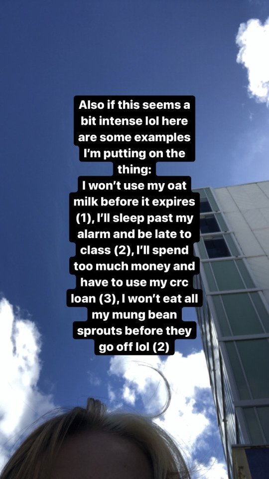

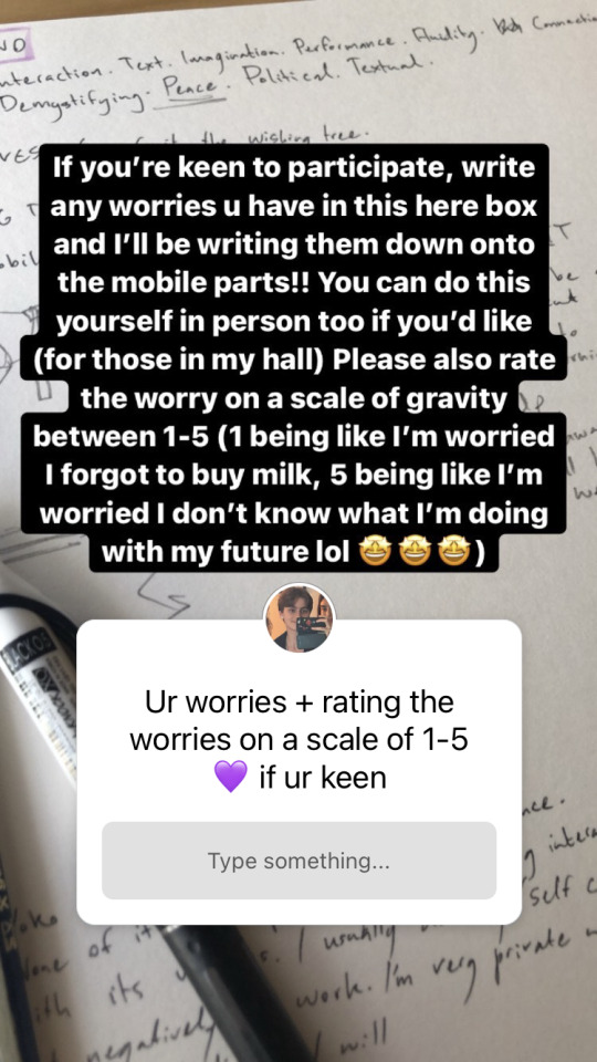

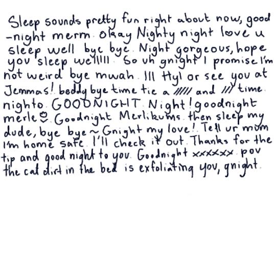
Below is the video. I found this to be unsuccessful and was really gutted how it turned out because it didn't follow initial plans timing-wise - one minute of silence and then cutting the worries down, then 30 seconds of silence. Working with others to finish the piece would've been easier if I'd picked a time that best suited everyone and conveyed what needed to be done a little clearer.
0 notes
Text
Wiki tuatahi, akomanga tuarua (1.2) - Dale Harding
CLASS NOTES ON DALE HARDING
1.2 - Dale Harding Monday, February 28, 2022 12:25 PM Who and where he is, is central to his work "couldn't" make it if he wasn't who he is What he values: he say's 'my work has to be... He feels responsible for his community/culture/people Art is a medium to keep stories going "What's the point" if you're not connecting to your people & community?
What might you be doing if you're not? - commission work for money perhaps... ○ It might be a case of employment ○ Hobby - 'selfcare' - making for 'themselves' There is a 'cause' that he is working for – presenting perspective/opinions within the community. The portrayal of the lives of Aboriginal people eg. Silent generation – is 'chilling'. Mainstream narratives are only just starting to acknowledge history. Racism and 'white washing' Work could be a bit 'preachy' Harding maintained some levity (humour) Embracing both tradition and 'modern' (narratives, contexts, techniques...?) Acts of 'inhabiting' a 'white wall gallery' space – it is an act of taking ownership of space – making a bubble of community within that space ○ "white wall gallery" see: "The Cultural Logic of the Late Capitalist Museum" When everyone is out partying he is 'playing' in his studio. How you make work can really effect both the what and why of the work/outcomes Choice of materials – expensive, dangerous, low tech etc? Technique – cross stitch Technique as remembering traditions of technology – eg liquid paint with blow paint stencils. Media and techniques form narratives What are their method(s)? Laundry whitening – Reckitts Blue – western art history reference: Yves Klein "Klein's Blue" Carving into the gallery wall – treating it like a sandstone wall Techniques of repetition of stencils that tell stories By carving it is like turning it into a permanent art work - "we're here and we're not going anywhere" ○ How it is undone also says something... acts of erasure... ○ Property and ownership - 'rights to occupy' - negotiation and community processes Installation work – how surfaces are worked on, into, repaired, layered - The space can hold 'ghosts' Importance of recognising cultural traditions of certain materials vs the 'other' materials that can be used unconventionally Respect for protocols – intentional non-traditional applications. He wants to draw in his community which might ne be an 'art' audience How much is Harding working for the public vs/and/or working for his community? Works that can 'bridge' between individual, community and a wider public
THE PROCESS
RESPONSE

0 notes
Text
Class Work No.1 - Workbook and Final
Kia Ora,
apologies for how poorly these have been scanned/photographed!
I'm currently working on using the scanner in my hall and will have updated images soon hopefully. For now please take into account that the colours and quality of the images here aren't entirely accurate.
Independent Study Task no.1 - Intial Thoughts
BRIEF: Research Mihimihi and in your own words describe what you find. Also, provide your own reflection on the potential of announcing your connections, from a Māori, Pākehā or other cultural or personal perspective. 200 WORDS.
NOTE: I wasn't sure if this task was to accompany my piece or happen before I made any works. I wrote something for both cases.
A mihimihi, under my understanding, is the act of introducing yourself and connecting with others; a greeting. This concept originates from Māori culture. Typically a mihimihi is practiced towards the end of the pōwhiri process, which in itself traditionally is used to welcome guests to the marae and has expanded to other settings. Often mihimihis utilise a person’s ancestral ties and/or connection to the place around them. At its core it seems to be about the connection that comes with greeting others and inviting them into aspects of yourself that show who you are.
Reflecting on what I’ve learned from research and initial in class discussion, I don’t entirely know what my mihimihi will look like throughout my work. On a very basic level, I can announce the places I’m from and the people in my life (Scotland, Aotearoa and my immediate family), maybe even my values, but I feel like even here there is a lot to explore that I don’t really know. A mihimihi seems like a way to establish yourself amongst others and my sense of connection is still growing as I grow. I don’t know if I’ve ever formally done a mihimihi either, so this concept is somewhat new to me.
The work below shows my response to these questions:
- What is a mihimihi?
- How do I introduce myself?
- How do I make something that introduces me?
- How do I make it so that it connects with others, like a verbal mihimihi?
Additional Notes/Brain Dump:
Connecting with others: show connection to surroundings, show self present in work, make something 'authentically me' so that viewers are forced to think or analyse piece somewhat and are engaged with my visual mihimihi/introduction. In that sense, I am introducing myself.
Think about projects I've wanted to do/ motifs I use for myself. I draw myself a lot so I do have an established sense of self within my art somewhat: draw on that.
Not just a bog-standard self portrait. To what degree do I incorporate my physical self? Personally I find self portraiture that focuses too much on just showing a person not very thought provoking. To draw a technically well done version of myself wouldn't be achieving mihimihi - might let viewers know I value realism, that I'm technically skilled (hypothetically - I'm not I can't draw realism to save my life) but says little beyond that, especially in my case.
That being said I don't know if I want to fully push myself out of the picture. It's about me!
PROCESS
PIECE


Additional thoughts throughout development process:
I want my form to be amongst thistles - no massive focus on body and not taking away from the thistles too much so that they are simply 'the background'
At same time, choose colour to help self stand out somewhat so I don't get lost amongst noisy flower field.
Expression and pose was chosen to help prop myself out of the flowers swathed around my form.
The figure I drew isn't necessarily meant to make eye contact - I didn't think too much about where they're looking but the expression is supposed to hit somewhere around contemplative, distant and neutral.
The thistles are going to represent me as well, its a mihimihi. The whole piece is an introduction, I am not just one aspect located in it - make this clear in final piece through placement of physical self.
Response to created expression of mihimihi (UPDATED):
The panel format of the piece was intentional - a reference to my love of visual storytelling - comic panels and such. I hope to be a successful storyteller in whatever medium or fields I explore. The ink pens I used are my trademark tool. Ink is also what some of my favourite illustrators use: Tove Jansson, Quentin Blake and Jillian Tamaki for instance. I am always looking up to them.
The person in the picture is myself. I didn’t want the focus to be centred too much on my figure, so the choice to have myself swathed in thistles was made. This is because the flowers around me are more important as a tool of expressing myself. The thistles are symbolic of my connection to both Scotland and Nz. I moved here as a baby and not being very connected to my non immediate NZ family along with my accent makes me feel like I’m not fully a ‘New-Zealander’ at times. Home is both here and there. The lack of an obvious figure is also a bit of a reference to my gender. While I connect to femininity strongly, it's very much my own brand and I find a lot of depictions of femininity really objectifying. When I introduce myself, I want my femininity to be passive rather than used to assess me.
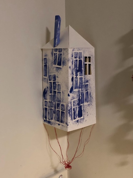
GOING AHEAD
If I were to take this piece further, I would give myself more time to add on to it. Originally this was going to be one aspect of a mobile with more components. The biggest challenge with this was trying to balance the approximate three hours I was supposed to work on it between quality of the work and what I wanted to achieve. While I'm really happy with the outcome, it's very different from what I imagined. I think it is successful even then - it shows mihimihi.
0 notes