meuikii
Anna ⭐️🌩️
She/her - 16!Multifandom/OcCringe :3
160 posts
Don't wanna be here? Send us removal request.
Last Seen Blogs
justherinmymind
Justherinmymind
forestlion
the lion, the witch and the holy spirit
cigonometry
doll parts

luisa-alejo
MIKY♡

mynotetaking
Hello there!
Text
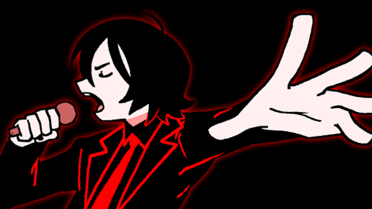
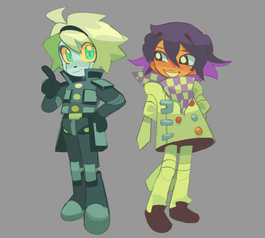
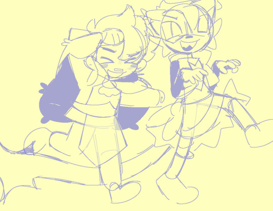
I feel a little bad for drawing Grian even though it’s Joel’s kill, but also this moment was just so incredible (and I guess it was both of their kill’s). Obsessed with those two. Love to observe them.
Closeup:

3K notes
·
View notes


Text
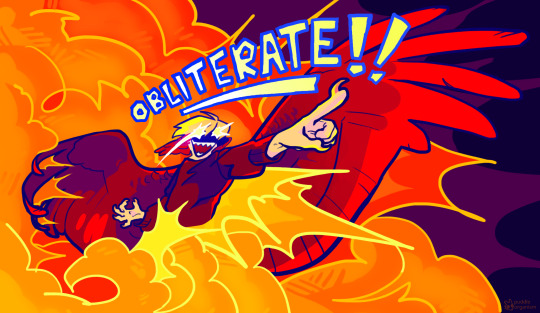
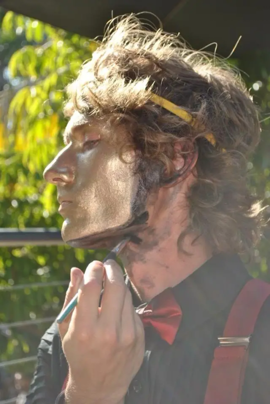
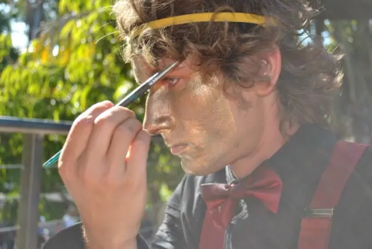
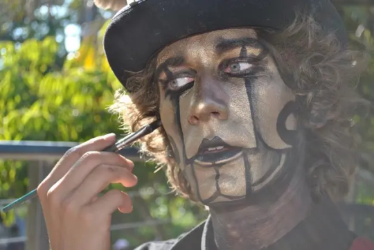
HULA HOOPING THE JON
192 notes
·
View notes
Photo

“Hello. Could I get an ice cream soda without the ice cream, whipped cream, cherry, syrup, or sprinkles? Oh, and can you change the seltzer water to Crystal Pepsi? Thank you.”
1K notes
·
View notes

Text

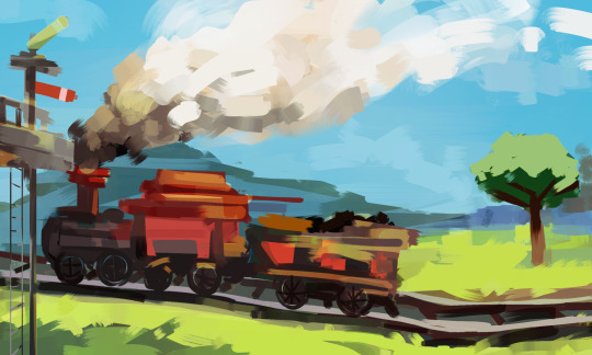
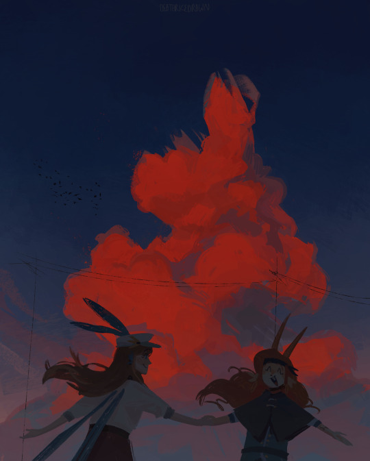
[Day 232]
Got inspired by some posts on insta and wanted to try painting more bgs and bases :D (this is so hard HASHDHSAHh)
6K notes
·
View notes
Text

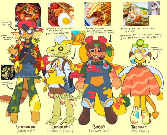

12/12 QSMP EGG DESIGNS DONE!!!
my ver of qsmp is food-based and every egg inspired by a different egg dish :3
3K notes
·
View notes
Text
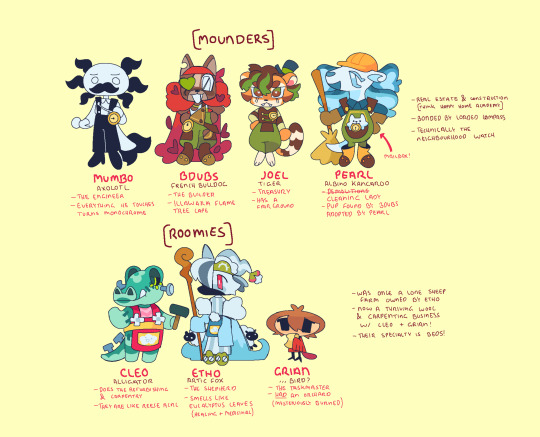
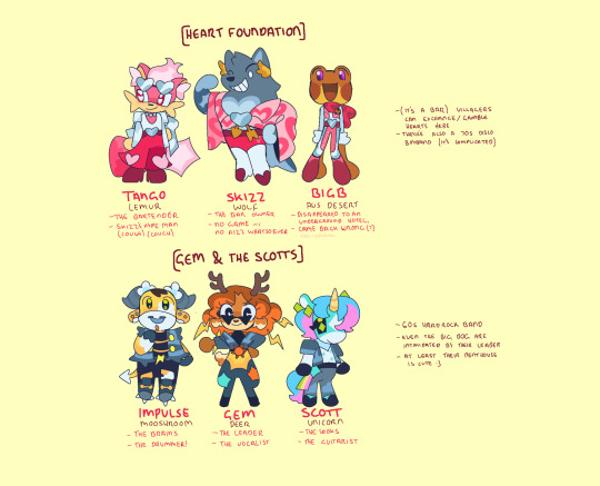
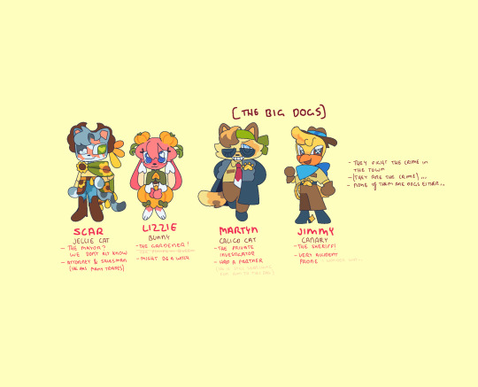
Secret Life designs for the residence of Traffic Town in ol rural Australia
6K notes
·
View notes
Note
hai! ummmghh ur like . my main inspo for art rn and like . i rlly like ur sty;le . im wondering if its polite to ask how you draw..... or sum tips.,... im sry if this is rude i just rlly enjoy ur artstyle and ive been trying to mimic it for so long noew.......
Not rude at all!! I love art analysis! [and it’s an honour Ty!]
Everything case by case and I’m not good with step by step stuff but I can provide fundamentals!
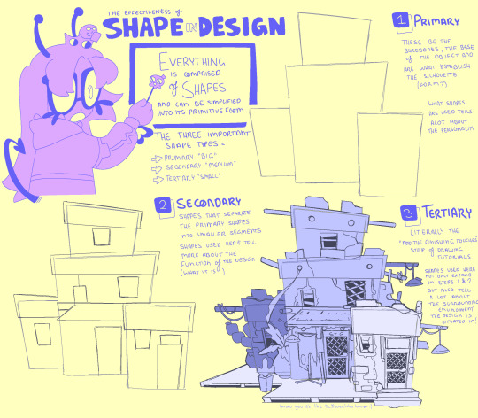

Understanding shape language to me one of the most important things to art and design yet is either overlooked, mis or under-studied in regards to why said design is successful by form.
character design AND building tutorial cuz multiple ppl asked for both
It’s not all of it but hopefully it’s enough >u<
I would have nerded out forever if I did
291 notes
·
View notes
Note
as a fellow artist im always absolutely blown away by what you come up with!!! your art is beautiful, and youre a huge inspiration to me!
If u dont mind sharing, I would absolutely love to learn more about your character designing process and any tips you might have!!!! (also, how did you learn character design and how long have you been practicing it ;u;?)
(sorry if this comes off as rude im not sure how to convey tone of voice in writing T_T im not trying to force anything! just trying to learn :'D)
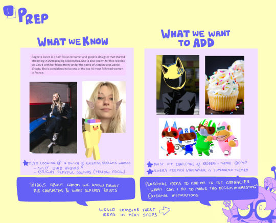
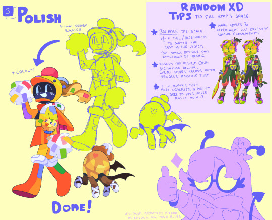
Character Design w/ alienssstufff (ft q!Baghera (and Pomme!)

I get asked this a bit and everytime i do, i do shit at explaining — so what better way than to just Show the actual designing think process myself -w-
This also ties in with the Shape Language tutorial if that helps!

365 notes
·
View notes
Note
very specific question for advice: how do manage to get your lines like so neat even for quick sketchy stuff it's always so clean?

very specific answers for a very specific question:
confession - even for sketchy stuff i go over drafts in a slightly neater sketch. I could clean it it'd be faster sure. but i dont :]
Purposes of my sketch process to be readable for when translating to cleaner lineart and colours etc - more about establishing a form, less worrying about the tinier details (eg pant belts and bdubs' flowers). Even as simpler as a silhouette is ok (see the shoes)
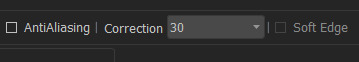
highhh stability settings (30/40 in mediabang) > faster brushstrokes without needing to care about how straight a curve is (im also left-handed 0 stability for a lefty is harddd)
anti-aliasing (the effect that makes the edges of brushes look softer) is turned OFF. Makes colouring easier + sketches look less fuzzier if ever need to Transform to adjust proportions
sketching in lighter colours gives the impression of the drawing being much neater than it actually is. Mentally drawing in dark colours, especially if your lines are very sketchy - visually feels boxed in and harder to distinguish what part of the drawing is what. Just drawing brighter, colour coding important parts of a drawing that requires that distinction (eg the impdubs sketch in different shades of blue)
this branches off the last advice - going over parts of a drawing (eg: form covered by clothing) in an eraser with less than 100% opacity to help with sketch readability
TLDR:
>Less tells more
>High stability, no anti-alias, quick strokes
>Colour coding with brighter lines
266 notes
·
View notes
Note
How do you crowd designs without making them feel…. Crowded? It’s so cool, I love all the little details you can add
jsvlssdhvj i'll try TToTT
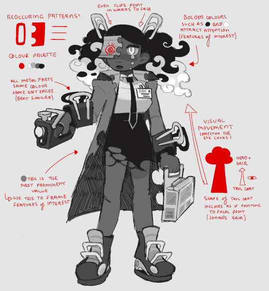
Knowing how to establish focal points (features of interest), and how to utilise elements (MOVEMENT) to reinforce this visual hierarchy.
Having consistent theme (colours, patterns and shapes) throughout the body are also what make a design coherent.
When a design is 'cluttered' or 'overwhelming' it is often due to having too many clashing themes, or no real focal point to focus on (/be directed to).
159 notes
·
View notes
Note
How do you crowd designs without making them feel…. Crowded? It’s so cool, I love all the little details you can add
jsvlssdhvj i'll try TToTT
Knowing how to establish focal points (features of interest), and how to utilise elements (MOVEMENT) to reinforce this visual hierarchy.
Having consistent theme (colours, patterns and shapes) throughout the body are also what make a design coherent.
When a design is 'cluttered' or 'overwhelming' it is often due to having too many clashing themes, or no real focal point to focus on (/be directed to).
159 notes
·
View notes