
This page features process and creations for VCD3: Web Design.
Don't wanna be here? Send us removal request.
Statistics
We looked inside some of the posts by mhennes3-blog and here's what we found interesting.
Average Info
Notes Per Post
4
Likes Per Post
4
Reblog Per Post
0
Reply Per Post
0
Time Between Posts
22 days
Number of Posts By Type
Text
3
Last Seen Tumblr Blogs


Fun Fact
After the announcement of the deal with Yahoo!, there were 170K signatures of unhappy Tumblr users petitioning to prevent the sale in 2013.
Text
Project 3
Research
We began the process with research. I looked at multiple portfolio sites including Jessica Hische and Erik Marinovich, Pentagram, and Carpenter Collective. Below are my takeaways from studying each site.

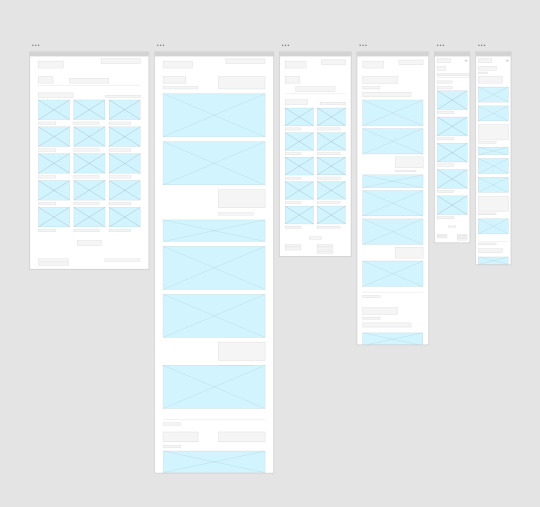
Top 3 Portfolio Site Wireframes
We then selected 3 sites to create wireframes for. I selected Jessica Hische, Pentagram, and Firebelly. I chose these 3 because I felt they were fairly different in style, and there were elements that I liked of each. I liked Hische’s process documentation, Pentagram’s neutral color scheme, and Firebelly’s simple/minimal presentation.
Hische:

Pentagram:
Firebelly:

My Static Wireframe
Gathering inspiration from the above wireframes, we next developed our own. My intended home page was strongly influenced by Carpenter Collective, and my project pages by Jessica Hische.

Inspiration
Carpenter Collective:

Jessica Hische

Interactive Wireframe
Below is the link to my interactive wireframe, which was based upon my static wireframe.
Link: https://mhennes3.github.io/project3/index.html
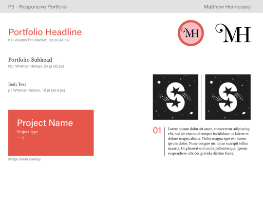
Style Tiles
The next phase of the process was making style tiles. I sought to use both a serif and san serif typeface in my design (one for headers and one for subheads/body text). I initially intended to use one color throughout my portfolio site, however I ultimately chose a unique color for each project page.
Tile 1:

Tile 2:
Tile 3:

Static Digital Layout
After style tiles, we moved on to construct static digital layouts (content included). It was also during this phase where I completed asset compilation. I chose 3 projects from Visual Communication Design 1. Although I had projects from other courses, I wanted to maintain the same style of process documentation throughout my site. This was easiest to accomplish with VCD1 projects.

Final Site
Below is a link to my final site. I was able to incorporate every intended element except one: the left-oriented header bar on my desktop-sized pages. As much as I tried to implement this, I was unable to master the code. I studied Carpenter Collective’s code itself, however I feel they may have used a template or other site to construct their portfolio. I will keep attempting to implement this feature, however I am still satisfied with how my site turned out.
Link: https://mhennes3.github.io/project3final/index.html
Other Assets:
Below is the logo that I created for my portfolio site. It changes color across project pages, and it links to the home page from my project pages, About Me page, and Resume.

1 note
·
View note
Text
Project 2
Brainstorming
Process for Project 2 began with a brainstorming session. I explored principles that I learned in grade/middle school, as well as daily and professional routines. I then considered my own passions, and how to merge them with some learned principle/routine. In the early stages, I gravitated toward my passions for running and mental health/psychology. I knew early-on that I would rather develop a learning tool than a game, so this is the focus that I moved forward with.


Initial Concepts + Wireframe Sketches
After brainstorming, I developed wireframe sketches for 6 concepts that I’d come up with. The first was a learning tool on different mental health illnesses. The second was a tool through which I could convey my expertise on running form, routines, etc. The third was a budget travel planner, with tips pertaining to each aspect of a trip. The fourth was a tool to teach cursive handwriting. The fifth was about constructing physical spaces that support psychological wellbeing. Finally, the sixth was a tool to teach about the location and functionality of parts of the brain. My fifth concept received the most attention and interest from classmates, so I decided to pursue that one.


Low Fidelity Prototype
I developed a low fidelity prototype and tested it with classmates. The testing ran relatively smoothly, but there were some concerns. One was to clearly differentiate between objects and buttons ( as I had originally intended to make the objects themselves buttons). Another concern was whether users should be able to create an account and make note of the tips that pertained to them. Finally, I was advised to keep the site applicable to all users (i.e. only rooms and objects that would be standard to every home and user).


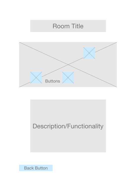
Digital Static Wireframe + Digital Interactive Wireframe
From the prototype, I developed a digital static wireframe for my site. Jordan expressed some concern with the difference in alignment between my intro section and rooms, as well as the excessive negative space. As I sought to evoke an interior design magazine through my site, I attempted to address the aforementioned issues with a grid-like format in later stages.


My digital interactive wireframe looks very similar to the final product in its styling. I wanted to get a good amount of the coding done during that stage, so I could focus on new course material (modals) and styling afterward.
Digital Interactive Wireframe link: https://mhennes3.github.io/project2-wireframe/index.html
Style Tiles + Mood Board
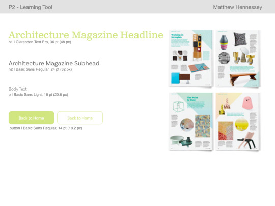
Each of my style tiles corresponds to an interior design/architecture magazine that I considered basing my site on. I pursued magazines because I am personally inspired by them, and I believed the look/feel would serve my concept well. The first tile is inspired by Architectural Digest, the second by Dwell Magazine, and the third by Adore Home (an Australian publication of the same nature).
I ultimately chose tile 2, and further explored styling and references in my mood board. I liked that Dwell was clean and minimal, with pops of color and intriguing images. In my own design, I sought to do the same; any use of color would remain subdued, for its comforting effect. I wanted to ensure that the principles I referenced in my site were utilized throughout its design.


Static Digital Layout
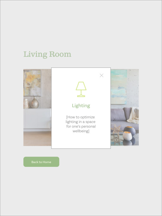
My static digital layout incorporates the aforementioned grid format, comfort colors, and Dwell styling. In transferring the static digital layout to the final product, I made some changes- such as coloring the background of each room page, and coordinating colors with the home page. I also introduced an icon to the right of the page directions, to fill the negative space.


Final Interactive Learning Tool
Overall, I feel that my site is effective and useful. I am proud of the final product, and I maintain that it keeps with the stylistic influences that I had intended. At the same time, it expresses the exact principles that are taught within it.
Final Interactive Learning Tool link: https://mhennes3.github.io/project2/index.html
1 note
·
View note
Text
Project 1
Typeface Selection
I decided to explore the letter S, because I have found the variability of its form across typefaces very interesting. I took VCD1 last semester, and one of our projects was to integrate a letterform and animal/object. I discovered many intriguing typefaces during that process, and I saw this project as an opportunity to repurpose one that didn’t make it to final. The 6 typefaces that I selected for this project were: Coquette, Ganache, Helvetica Neue, Milk Script, Mono45-Headline, and Tenso. I felt that these 6 presented a variety of unique S-forms from which to choose.
During the small group presentations of our typefaces, it was determined that Milk Script was the most visually-appealing. Its top-heavy nature led many to believe that it was inverted. At that time, I had conceptualized a cat theme corresponding to this typeface. I felt that the S-form was very feline, and I had the idea to make my button a ball of yarn or bowl of milk (see Layout Sketches below). The color scheme would evoke popular cartoon cats (i.e. Garfield, Disney’s Oliver, and Disney’s Aristocats).


Layout Sketches


Inspiration
While researching the Milk Script typeface, I found that its original purpose was for hand-lettered signage in 1920s and 30s America. As I searched for visual references, I determined that it would be more interesting to create a ‘digital sign’. Many elements of my new concept were inspired by the images below. The upper left photo inspired the green background and charcoal box of my poster. The cream and brick-red “Nice” sign inspired the color of my text. The layered headlines of these signs inspired the layering of my letterform. I sought to keep my design simple, legible, and true to historical reference.

Digital Static Mockup
Below are the mockups of my poster, and my poster with its letter analysis. For the letter analysis, I simply wanted to emphasize the most visually-appealing characteristic of Milk Script’s S - it’s top-heavy nature. I did so with circles that construct the top and bottom halves. The analysis shows that the top circle is considerably larger, and that its diameter is almost twice the length of the bottom’s. For the analysis, I decided to keep the colors in-theme; I used the same green as the background, and white for added emphasis.


Development and Final
Link to my github site:
https://mhennes3.github.io/
The live ‘digital sign’ can be found at the “functional site” link. The site features a button that toggles the analysis on/off, a scroll bar to view Milk Script characters of interest, and functional links (that lead to the sources listed at the bottom).
I found this project to be challenging and at-times daunting, but ultimately rewarding. This design is relatively simple, but I feel comfortable to take bigger risks in the future. I am satisfied with the outcome of this project, and I feel that the design is true to signs of 1920s and 30s America.
2 notes
·
View notes