
mi4013molliedriscoll
Introduction to motion graphics
23 posts
Don't wanna be here? Send us removal request.
Last Seen Blogs

infodesanews-blog
Untitled

sunnybunnyboy
Curious

thisisretarted
Untitled
jersey07105
YOU ARE YOU #jersey071055 #jersey07555

Text
Critical Analysis
Overall, I am happy with how my project came out. I found that the workshops we did in class were extremely helpful and I was able to transfer those skills into my work.
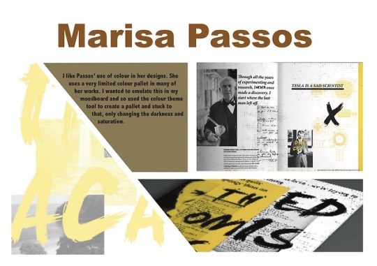
I took inspiration from Marissa Passos’ use of a limited colour pallet and created my motion graphic using only purples and yellow/peach colours in varying brightnesses and saturations. I think this made my animation much less busy so that the viewer could focus on the actual animation rather than being distracted by lots of bright colours. I used my ‘Eta Carinae’ mood board to help choose the colours I used. Putting colour scheme swatches on the mood board really helped as I could easily see what colours looked good together and I lifted the different colours directly from the space photos I found. This helped me create a more realistic looking animation.
One thing I really like about this is the way the planets look. I used CC Sphere to make them look 3D. Originally, I used photos from Google whilst I created the animation; I then decided that the photos looked too realistic in comparison to the leaf and the person so I decided to re do them. I filled in the planets as a solid colour and then experimented with how to make them look more realistic. Eventually I found a way to layer a texture onto the solid planet. Here I layered a texture onto the planets and changed the lighting and opacity. I think this method worked really well as I still kept the realistic style I wanted whilst not having it contrast too much from the leaf and person.
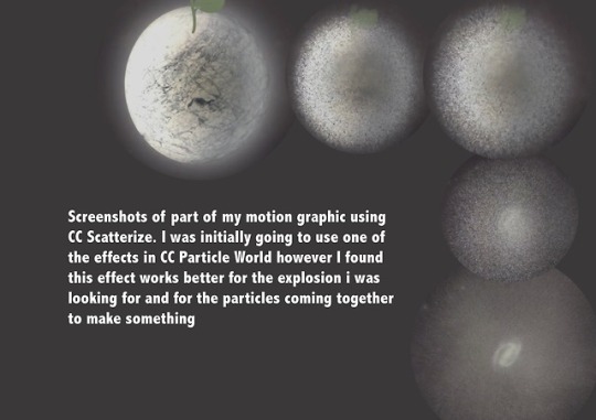
I found using CC Particle World the most difficult part in creating the animation. I needed to use this a lot in varying ways and sometimes it was difficult to get the particles to move how I wanted them to. For example in the first explosion, the particles didn't work as well as they are very soft and fluid and the explosion was meant to be violent. However, I had to use the particles here due to my limited knowledge of the programme. Although it was difficult to use, I think that the part where the particles come together to make the star was extremely successful. It took me a few attempts to get it to look the way I wanted it to and it took a lot of experimenting with Particle World however I think it's one of the best parts of the animation.
If I were to do this again, I would spend much more time creating the person. This part wasn’t originally part of my story and I thought of it whilst creating the final version and so I didn’t have the time to make it look more realistic. Because of this it doesn't really match the style of the rest of the animation. This is proof that I need to work on my planning and time management. I think next time I need to fully plan out my whole storyboard in depth before I jump into the final version.
Whilst I have things to improve, I’m happy with how my first project on After Effects turned out. I learned and practiced a lot of new techniques that hopefully I will use in the future.
0 notes
Video
Final motion graphic for my chosen TEDTalk. Unfortunately for some reason the file wouldn’t render when the person at the end was waving so i had to delete that part.
0 notes
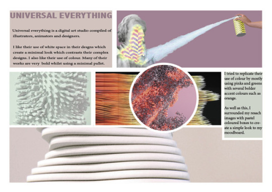
Photo


Moodboards I created on InDesign based off of graphic designers and my own work. I tried to make each one different in terms of colours and layouts. I tried to match the colour schemes of the mood boards to the images on it especially on the artist research ones. Further down on my tumblr are the original few i did with colour swatches included some of which i am going to try and incorporate into my motion graphic.
0 notes
Video
Finished animatic.
In my actual animation, i need to improve the timings as everything moves much too slowly in the animatic. As well as this i need to improve all of my assets. I want my animation to be much more detailed and realistic looking. Therefore, i think ill create backgrounds on photoshop as i can get much more detail on that.
Also, i used the original ending from the sketch animatic in this one and tried to invert the colours so that it would be white on the dark background. But for some reason this didn't work so you can't really see it.
0 notes
Video
Very rough animatic for my motion graphics assignment. Obviously needs a lot of improvements with timing etc but it gives me a good idea of what to do for my actual animation
0 notes
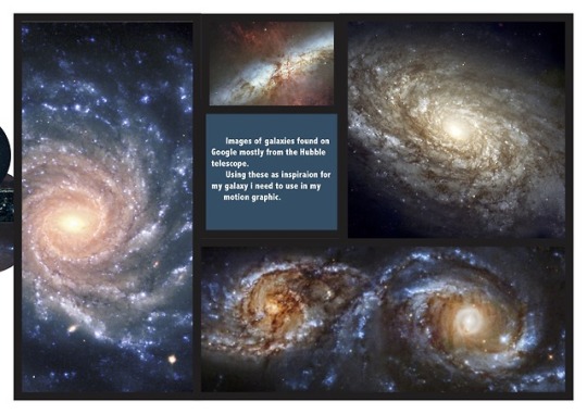
Photo
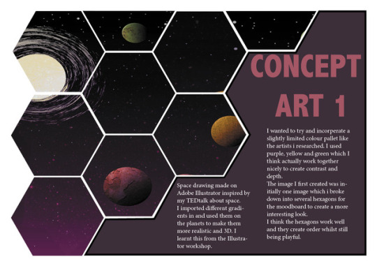
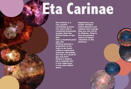
Concept art for my TEDTalk motion graphic.
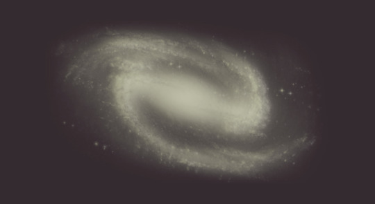
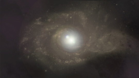
Top two images are of galaxies made in photoshop.
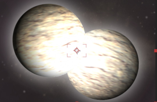
The third image is of Eta Carine made using after effects using CCSphere tool that we learnt in a workshop. I created the sphere from a rock texture i found online and enhanced the brightness and created a strong glow to show the effect of the star.
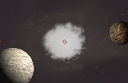
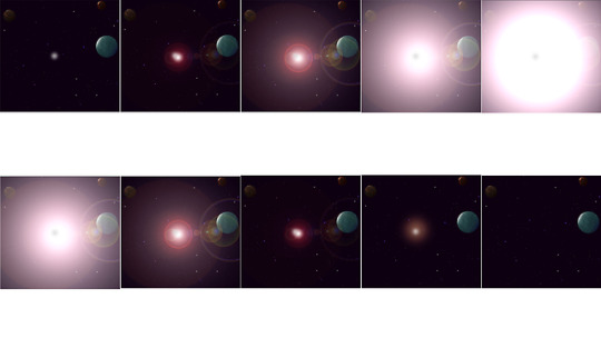
The fourth image was also created in aftereffects using the CCSphere tool for both of the planets using the same technique as with Eta Carine just without the glow. I changed the shadows on the planets to match the light from the explosion to make it look more realistic. I used CCParticle world for the explosion, another tool i learnt in a workshop. I will change the opacity throughout the animation correlating with the size so it is subtle at first and will eventually engulf the planets. As well as this, I’ll change the birth and death size throughout to make the explosion look more realistic and so it will completely cover the planets at one point. After the full explosion, im going to change the birth and death rate back down again to create more spaced out particles to transition into the ‘scattering its eminence back into space’ part of the talk.
I wanted to keep my colour pallet quite limited and simple so, so far I’ve stuck to purples yellow and orange.
0 notes
Video
Continued aftereffects workshop- moving the deer image using pins and using the video as the background and the main image by duplicating and reversing its position so the videos move against each other.
0 notes
Video
Aftereffcets workshop on creating motion graphics behind an image.
0 notes
Video
Aftereffects workshop using particles.
This part of the workshop can also be transferred into my final animation. Knowing how the particle effects work will be helpful in the explosion of Eta Carina and for the part of the talk which says ‘ it will scatter its reminence back into space adding to material that will eventually form a new generation of stars and seeding space with the ingredients of life.’
Layer-new-solid-cc particle world
0 notes
Video
Aftereffects workshop
A lot of the things we learned in this workshop will be very useful for my TEDTalk motion graphic. My talk is about space so knowing how to make 3D spheres is helpful. I might try to make my initial Eta Carina drawing 3D like the planets in this animation.
As well as this, we learned how to change the lighting on the planets to reflect how the sun would affect them. Again, this technique can be applied into my graphic when the supernova occurs and shines light on the different parts of my galaxy. Changing the lighting to match the movement of the explosion will help to create a more realistic animation.
The rocket image in this doesn't match the planets due to it being much more cartoon like, so if in my animation I have other secondary parts such as a rocket, I will have tottery to make everything the same style to create a better quality and more aesthetically pleasing motion graphic.
0 notes
Photo
Storyboard of the first scene of my animation- the supernova bit. Done on illustrator and photoshop
0 notes
Text
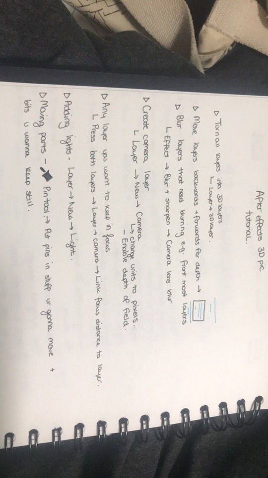
Notes from Aftereffects 3D image tutorial for future reference
0 notes
Video
Aftereffects workshop on making 2D images look 3D with movement.
In this tutorial, I created a animation of a tiger stretching its back with the camera angles moving. To create this, I used several high quality png files. I duplicated certain layers, rotated and transformed them using shortcuts (P, cmd D, S). I also altered the focus on certain things by using the camera lens blur (Effects- Blur and sharpen- camera lens blur). This effect made my composition look more 3D as I made the foreground images much blurrier like they would be in an actual video. Another thing I experimented with was the lighting, playing with light and shadows using the spotlight effect for the sun beam in-between the trees, and the ambient light.
If I was to do this task again, I would want to work on my tigers movement in its neck and back. I think its back and neck movement was too stretched and I didn’t keep the overall proportions of the image the same whilst I was moving certain parts of its body. To correct this I think next time I should use more pins to keep more of the image rigid to create a more realistic look.
Overall, I’m happy with the outcome as this is my first time creating something like this, and the techniques I've learned are transferable to my project.
0 notes
Video
youtube
Video of Eta Carinae. Inspiration for my motion graphic. Due to the nature of my TED Talk, i can make my graphic quite abstract especially in the drawing of Eta Carinae.
0 notes
Photo
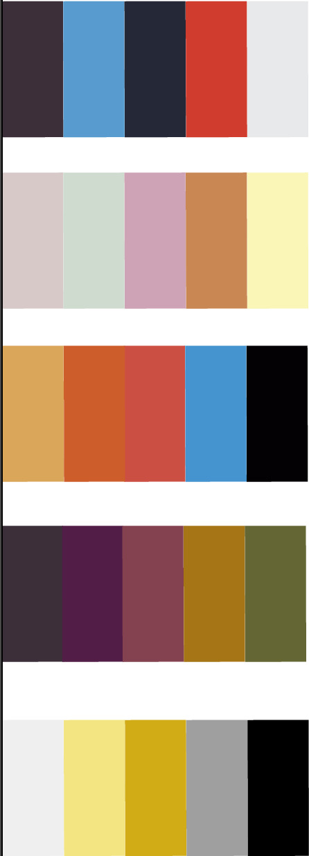
Colour schemes made from five of my mood boards. (The sixth one had the same colour scheme as number 4 but with different brightness/saturation).
Although the first one was made from the moodpboard of astronauts and space, i think the colours are too bold and clash too much to use in my final design.
The second board doesn’t fit the theme of my TED talk and doesn't look very professional and scientific due to the fun, pastel colours.
As with the first set of colours, the third set is too bright and bold with too many overpowering colours. This would create an extremely busy look to my motion graphic which i don’t want.
In the fourth set, I like how the colours are very muted and dull. I think that dulling down the strong colour scheme works well as it creates a more professional look whilst still being pleasing to look at.
I think I am going to incorperate the fourth set of colours with the fifth. I like the extremely limited colour pallet of the fifth set with only two colours that are just changed in saturation. Although I think this set looks the best, i don't think just a two colour pallet would work for my graphic, so im going to try and create a combination of the two
0 notes
Photo
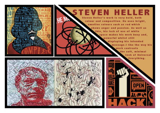

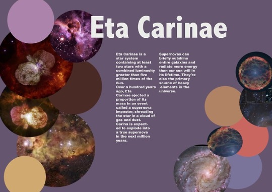
Moodboards created on Adobe Indesign. I tried to use specific limited colour pallets for each of these.
Background colours and any solid colours used were lifted from the colours in the images to tie them together and create a more professional looking moodpboard for each.
I tried to make them all quite different using different shapes, colour schemes and layouts that related to each individual topic they’re about.
0 notes
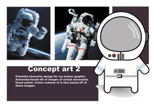
Photo
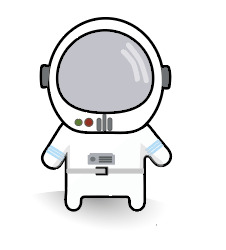
Astronaut man made on Illustrator for space mood board based off of pictures of astronauts.
I wanted to create a very simple character that would be easier to animate than a complex one . I tried to use the least amount of colours that i could whilst the image still being fun and playful. I think i managed to do this decently.
0 notes