
mi5014characterdesignhuwfenny
MI5014 - Character Design - Huw Fenny
15 posts
Don't wanna be here? Send us removal request.
Last Seen Blogs


Text
Conclusion - What I Have Gained From This Course
I think this module has helped me develop greatly in art of three dimensional modelling and character design. The development of ideas and the processed I used to develop both my characters and eventual environment, and the additional use of binary opposites did at first seem difficult. However, as my research deepened, it began to enrich my initial ideas and final character designs. Creating interesting and stylised characters in a 3 dimensional environment was something that, at one time, seemed difficult to me as I struggled with MAYA and before this had only created simplistic characters and environments, now I feel as if I have the skills to improve on these characters and create more realistic and creatively modelled and textured characters. using mood boards and various sources helped me visualise deeper contextual meanings for both my characters.
I did however struggle with some aspects of the course, for example I didn't realise I had to create and model a second character so I feel as if this process and model wasn’t up to the standard I could have created it to. Although I did this later in the process, I realised the creation and process of modelling my second character, the Priest, was easier as I had learnt and gained the skills necessary to create a semi-realistic character. There were aspects of the course I found difficult, as I had never done weight painting before I found that arduous, especially with all the complications I was having with rigging my character. But I realised it was down to the complexity of the design and the computer system MAYA crashing often, rather than my own skills. I have done this module to the best of my ability and hope to progress onto bigger and better things when I have to do similar tasks in the future.
0 notes
Video
undefined
tumblr
360 Degree View of my Final Rendered Priest, in T-Pose
0 notes
Video
undefined
tumblr
360 Degree View of my Final Rendered Creature, in Quadruped and Bipedal Stances
0 notes
Text
Lighting
The lighting in my animation was salient in the creation of atmosphere and viable cinematography. As we learnt for the Hitchcockian characteristics, we wanted the light, or lack there of, to signify impending doom or danger. We incorporated bright lights in the start of the short animation, then used lower intensity and duller colours to signify a tone shift.
We originally created the lighting on the windows with an poly plane and intended to change this into glass, placing several multicoloured lights behind it and having it reflecting through to give a dappled stained glass effect, however we decided this process was too difficult and strenuous, and the bright colours would take away from the eerie environment and atmosphere we wanted to create. We decided to fix the windows in post, in After Effects, by adding a stained glass effect over the windows. (This also did not come to fruition) instead, when asking for assistance from Gary, he suggested we scrapped the multi-coloured light idea and use two directional lights, by placing them in the windows and scaling them to size and, using the light effects in the attribute editor clicked on an option that create simulated fog, created by the directional light. This distinguished the mood and atmosphere we wanted to have for our film, and we created the additional environment lights to correlate with this effect, not wanting to over power it in any way.
The cross was something we debated on, because we had intentionally wanted to use it as mesh light however we thought it would be more effective as a bronze texture poly, using Blinn to make it reflective, and using a light, off camera to emphasise these qualities.
To create the lamps we originally used a mesh light, by using a sphere polygon and changing it in the Arnold settings, and selecting Lights, then Mesh Lights. This was used to convey a bulb effect and we thought this would be an efficient addition to our final animation, changing the intensity of the lights in the attribute editor to coincide with the scene. However, when observed through the Render View the light did not give the right effect. We then discussed this with Gary to help improve the atmosphere of the scene, he suggested we use circular directional lights and put them inside the lamps, pointing them to the direction that we needed them to be using the rotate tool, and resizing them using the scale tool. For lamps that we wanted two points of light for, for example the drawer lamp we used two lights and pointed them upwards and downwards respectively.
List of Light Used -
1 - Window Light
2 - Cross Light
3 - Drawer Lamp
4 - Tall Lamp
5 - Ceiling Light (Main environment)
6 - Manoeuvrable Lamp
7 - Ceiling Light (Corridor)

Fully Rendered Lit Scenes, Examples and Discussion of Lighting
Use of Lights 1, 3, 4 and 6
For this scene, I think the use of lighting is incredibly effective. The use of fog simulation signifies the spectral atmosphere, the environment on the outside of the scene is not clear, with gives an isolated feel to the film, showing a secluded and solitary priest in this way makes the scene feel claustrophobic and trapped. The fog creates a dusty, old effect and is akin to the low lighting of classic horror films. The audience relates to the characters fear as the low light reveals to moving, dimly lit deformed spine of the creatures back as it crawls past the door. The use of the lamps does not take away from the overall dim lighting and slightly dusty effect that the windows create, also being of the same intensity, if lower than the exterior lights.
youtube
As the creature character slowly stalks towards the camera, I changed the direction of Light 6 to exemplify the characters features as it comes closer to the light. I used this light to show the realisation of the Priest as his attacker is finally revealed in full, in a brighter light. I think as the creature character comes closer the lighting raises the dramatic tension of the scene and makes it very effective.
youtube
Use of Lights 1 and 7
For this scene, I wanted to use low lighting to show the slow reveal and stalking crawl of the creature, using Hitchcock’s cinematic characteristic of low lighting to exemplify impending doom and danger. The silhouette of the character is clearly visible from the distance it is positioned, bu not the detail of the characters body or face - giving the audience chance to assume the characters form and projecting their own fears on to him, raising anxiety from the audience. The foggy ray from the window lights that protruded through the door gives a brief, momentary glimpse of the character.
youtube
Use of Lights 2, 3 and 5
At the start of the animation, there are brighter lights and no use of the fog lights in the exterior environment, as we decided to remove these and, when there the presence of the creature character this will be changed, the scene will go from wholesome and safe to that on imminent threat. The warm lights of the lamps, Light 2, the cross light and Light 5, the ceiling light convey safety. The use of Light 2 illuminating the cross and the environment light signify the presence of God, or a higher power, the presence of the Lord protecting him. Then to counter this, in the next scene, when he turns to the door, the lights flicker, made by changing the light effects on After Effects and the scene changed to a darker atmosphere, signifying the loss of God from his life, lack of protection from the higher being and the presence of the creature is prompted in a way where it uses visual story telling rather than verbal communication.
youtube
Use of Lights 1 and 4
youtube
0 notes
Text
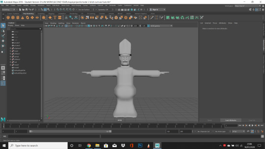
Vicar Character Modelling Process
Maya T-Pose design for Modelling
I created my Priest character by using a cube polygon, and increasing the sub divisions. I decided to learn from my last character model and only create half of the mesh on the Z-axis so it would be better to mirror when I would eventually get to this point in the process. After I created my half cube polygon I began extruding the faces into a basic skull shape, constantly referring to the smoothed version as I progressed through making the head shape.
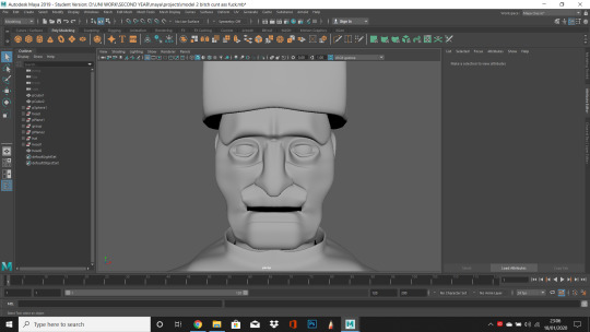
After creating the basic head shape, I added some facial features such as a nose, a protruding forehead, indentations for eyes and a nose.
Eyes
To create the eyes, I made incisions in the centre of the head with the multi-cut tool and created multiple edges. After I had created these cuts, I deleted the interior faces, making a hole in the head mesh. This was the basis for the eye socket. I then added a sphere polygon behind the empty head mesh, I then moulded the eyelid around the eyeball sphere. As I wanted there to be multiple wrinkles around the eyes to express the Priests age and show detail, I decided to follow the same process of creating my creatures rib-cage. I selected the edge tool and moved the edges into positions where the mesh would look folded, as if there were bag under their eyes. I extruded the faces on the wrinkles and moved them outwards to define them and differentiate between the sizes.
Wrinkles and Facial Details
I added several folds and wrinkles to the character, as I wanted him to look old and weathered like my concept art. I incorporated the protruding forehead by using multiple edges made by the the edge loop tool to create a thick forehead and eyebrow line. I also developed the bone structure of the face by selecting the faces and edge’s by manipulating them into positions where I felt certain indentations, such as the temple and raised, puffier skin, such as his jowls and cheekbones.

Ears
I created the ears by creating a basic ear shape on the side of the head using the multi-cut tool and extruding the shape outwards, I then added additional edges on the interior of the ear, again using the multi-cut tool to create a basic shape of the ear anatomy and using the face tool to push certain elements of the ears outwards or inverting the interior, lower parts of the ear deeper into the geometry. After I had created the basic shape of the ear, I observed how it looked in the smoothed view and defined extra elements such as the earlobe by selecting the mesh face and deforming it so it looked drooping. After doing this I realised that the ears looked too high up the face and weren’t defined enough to be seen on the front Z axis view of the character, to resolve this I selected the entire mesh faces of the ear and lowered it down the face, I then used the rotate tool to define them enough to look like they were sticking out his head, rather than pressed against his skull.
Nose, Lips and Mouth
Using a similar process for the ears, I extruded the faces I had created by cutting edges into the mesh by using the multi-cut tool. I then rotated them to make a more nose like-structure. I then move the vertices to make a more consistent shape, whilst doing this I added more edge loops around the head in order to create a deeper and accordant nose topology. I decided to make the nose more hooked and curved, as this was a characteristic of my designs when I was creating the concept art for my character.
When I had developed the nose, I moved onto the creation of the lips. I made the lips by adding edge loops around the lower part of the nose to the point where I thought the mouth would be. Additionally, I added some cuts using the multi-cut tool to create the basic layout of the lips and eventual mouth. I deleted the mesh face that was to be the mouth and moulded the lips around the mouth gap by manipulating the edges and curving them downwards and in towards the inside of the mouth.

Neck Problem
I had an issue with a deformation on the neck of my character during the creation of the chin and the anatomy of the lower part of the head. This may have occurred during the process of the extruding of the edges of the bottom of the head typology, as I think the issue may have been I created multiple faces and when connecting the vertexes together with the weld tool, I connected one vertex to an unintentional vertex, this created a slight raised line on the top of the mesh above the collar (Above). I resolved this by discovering the problem during looking through the wire frame view and realising there were several extra vertexes, I changed the view port to the polygon mesh and deleted the back of the head and corrected the mistake.
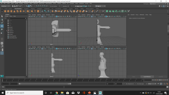
Creating the Body Posture
I created the body posture and costume by referring to my previous designs. I used a cube polygon and increased the amount of subdivisions in the body’s mesh. I then selected the faces on these subdivisions and created the general body shape by using the extrude tool and increased the size of the more defined body parts such as the belly and shoulders. i wanted the Priest to have a small torso and defined body, as it was the opposite body structure to my creatures.
I deleted the faces in the mesh where the collar would be connected to the neck and extruded the edge of the hole to create the collar by creating a curved geometry which curved inwards using the rotate tool. I then selected faces on the side of the Priest to create the arm. I extruded these and added multi edge loops around the arms, creating the basic arm shape by manipulating the edge loops by using the vertices to create the flowing fabric of the arm. I did this by lowering a single vertex and then the correlating vertexes above to create a sleeve. I then selected the edge of the sleeve and extruded it, pushing it into the mesh. I extruded this again, pushing the edge closer together, then extruded it out of the mesh. This was to become the basic geometry of the hand, I added edge loops to make it curved and less square.
I debated on making the legs long and thin, however, I liked the idea of a cloak, much like I had previously done in my earlier designs. I thought this would work as the Priest is very covered up and this is the binary opposite of the creature that is exposed and, essentially nude. I made the base of the cloak by extruding the base of the stomach and extruding the base of the body outwards. I added multiple edge loops and increased the amount of edges in places where there would be slight over lapping and change in direction. For the back of the cloak, I used the vertexes by manipulating them further back, deforming the mesh to make it look like it was dragging behind himself.
Four View Point of Priest
Front View of Priest

Side View of Priest

Creating Hands
To create the hands, I used the basic hand stump from the creation of my arm geometry, and added some edges using the multi-cut tool and extruded some fingers out of the mesh, I did this by making small squares and leaving a small space between the mesh that would be extruded, selecting only the mesh that would become the fingers, I added some edge loops to make the fingers curved and shrank the spaces between the vertexes on the tips of the fingers to make them pointed. I used a similar process to make the thumb on the side of the hand. I used the multi-cut tool and extruded the selected face to create the basic shape of a thumb. I then added an edge loop around the centre of the thumb, and selected the edge and rotated it, I then extruded the face on the tip of the thumb to extend it.
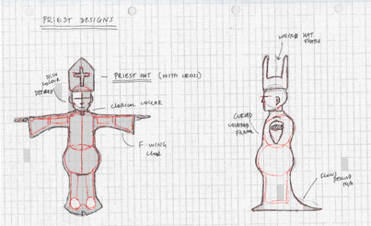
Adding the Hat to the Mesh
I decided to add the accessory of a hat to my character as I felt he needed more personality through his clothes. I created the Pope hat by using an image plane and making it into the general shape of the hat,by manipulating the vertices and deleting half of it, as it was over the Z axis, placing it above the characters head and manipulating the vertices around his head to give the impression of it fitting on his head.
I then duplicated the front of the hat by selecting the mesh by using duplicate special and flipping the dimensions of the hat, placing it on the back of his head and then manipulating the vertices around his head. I then combined both these meshes into one mesh. I selected the edged of the top of the hat and extruded them into a basic hat shape, sloping down the back of the other side. I then combined both these meshes together by using the extrude tool and connecting both elements together. Using references from Google and my designs, the curved bump in the middle was prominent. As I was using the poly view, I used the edge cut tool to add multiple edges and vertices into the centre of the head and selected the vertexes upwards to create a curved effect.
Side View of Pope Hat
Front View of Pope Hat

Side View of Pope Hat

Mirroring the Mesh
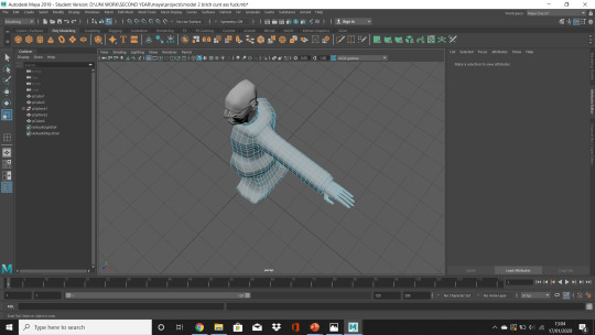
To mirror the mesh, I used the mirror tool in the mesh drop bar and duplicated the other half of my mesh on the Z-Axis to create the full bodied version of my Priest to keep the geometry consistent. The geometry automatically connected together and I thought the end product was up to scratch, as I had not designed a fully detailed human character before.
Fully Mirrored Priest
Fully Mirrored Priest Close Up
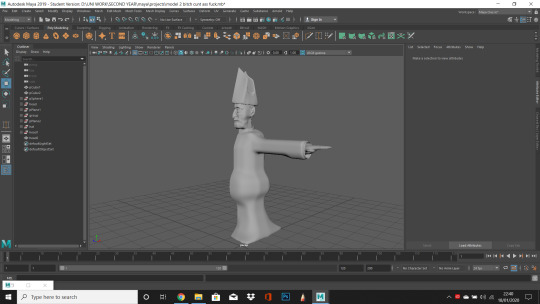
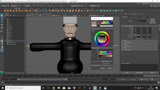
Texturing the Mesh
When it came to the process of developing my characters mesh, I decided to use the colour textures and different MAYA mesh textures to define my character. I selected the specific faces I wanted of the mesh and selected Assign New Material, for the skin, pope hat and clerical collar I used the Lambert MAYA texture, as they would be less reflective and added the correct colour using the colour picker tool, as I am colour-blind and selecting the colours off Google. For the textures that I wanted to reflect light I used Blinn, for example for the cloak, which I wanted to look like silk and the cross that I wanted to look like real viable gold.
Front View of Priest Mid Development
Side View of Priest Mid Development

Finalised Priest

I also added a cross as a final touch as I thought this would add to the relatively bare priest hat. I did the cross by using a cube polygon and increasing the amount of subdivisions. I then extruded the selected faces on either side and shrank it down to size to fit on the hat. I changed the texture to Blinn, to make it shine when light would hit it and chose a gold colour on the cross to show the, supposed, divinity of God. I then rotated it and combined it to the mesh.
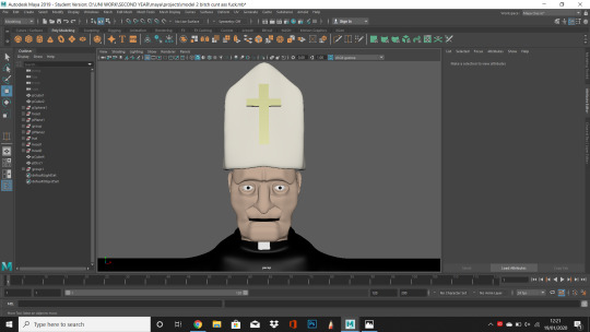
When I sent the pries into render View the texture of his cloak was incredibly shiny and did not look realistic, it looked more like a gimp suit. I resolved this by changing the cloak to an JPEG image of a black material, however it is not visible on the mesh for a reason that I couldn’t resolve due to time constraints


I decided to Render him in the T-Pose because of time restrains and i had already modelled him in this way an did not want to deform the mesh.
I then added a different colour as it didn’t match the Pope hat of my character using the colour tools.

0 notes
Text
Modelling ‘Baymax’


This exercise was essential in the project, as it helped us develop skills in modelling a full bodied character. Similar to the process of modelling Gary’s head topology, we used reference images, by importing an image onto the specific image plane onto the Z axis, for the front view and the X axis, for the side view. We then scaled the images to the corrects size by placing them in the centre of the work space and moving them back to their correlating positions.
To create the head, I used a sphere polygon and used the extrude tool to squash and stretch it to the correct position. We were told when modelling, without spherical heads, we were encouraged to use a cube polygon and increasing the subdivisions, as the edges of the spherical heads all connected onto two separate vertexes, on the top and bottom respectively and the curved geometry of the shape would make our modelling process difficult. Using this information, I used a cuboid polygon to create the body. I did this by extruding the body into the basic shape and size of the character, Baymax, and increased the subdivisions to manipulate the body where I thought the curvature of the frame would be, I used the extrude tool and move tool to do this by selecting the vertexes and the edges. Using all the view ports, like in the face topology exercise was a useful tool in the creation of Baymax.
I had an issue with connecting the head to the body, as I attempted to connect the neck with the base of the head by using the target weld tool in the vertexes, however this seemed to be a fools errand as I realised extruding the neck into the hole I had made, by deleting the mesh faces on the lower part of his head and over lapping the elements would have also given the same effect.

0 notes
Text
Gary’s Head


Face Topology
This exercise was to help us develop our skills in MAYA and using images as reference. We had to use image planes to create the facial structure of a subject, Gary, by using the images we were given as accurately as possible. To import the image, we had to first select View and select on image plane, then import in the image to the suitable view port. For example, the front facing image would go in the Z axis, and the side profile in the X axis, scaling them accurately together. We had to use all four view ports in this assignment as the vertices would be manoeuvred in different ways when manipulated due to the different view ports. We also learnt about the method of creating facial structure, or topology. After we had created half of Gary’s face, we had to mirror the mesh of the face to keep it symmetrical. To do this we selected the mesh and selected object mode, we then went to mesh and mirrored it by changing the attributes to the appropriate view port, for example the Z axis. And mirrored the mesh. This method would become helpful in the development of our final characters after we have modelled them.
Final Topology of Gary’s Head

0 notes
Text
INTEGRATION OF CHARACTER AND ENVIRONMENT
I had to scale my character and see how he looked in the environment, I attempted to scale up my character however to match the environment however I had to keep him at the same scale and scale down the environment of my scene to fit with my character.


0 notes
Text
Environment
Layout of Environment
At the start of the project, I created a general floor plan for the environment. As we wanted a large expanding room for the main bulk of the animation to take place in. We wanted a large expanse of space to, for one, show both of the characters interacting and a large area where we could have multiple cameras to show the environment using wide angle shots and zooming in shots. We also wanted a long thin corridor, as the main idea was to have my character of the creature crawling along the side the wall on the interior of the corridor. I created a cube polygon and scaled it to make the general floor shape, adding the steps later on in the process as we debated on having our character falling down them. I then created the walls by using a similar method and rotated them by 90 degrees on the Attribute Editor and added the skirting board on the bottom of the mesh by using the cut tool and extruding it out.
As we wanted the environment to look like a church, I made arching windows by removing removing faces on the cube mesh and making them into a distinct Gothic styled arches in an art Deco aesthetic. I added frames by cutting around the geometry and extruding it outwards. I used a similar method with the doorway leading into the corridor, by cutting the geometry and deleting it, then extruding the edge and binding the vertices together. I then cut around the door and extruded it creating the door frame. I moved the vertices upwards at the top of the door to make it more angular and realistic.

The Kitchen
I created an L-shaped kitchen counter top by using a cube polygon and extruding it into an L shape. I then cut the geometry at the top of the cuboid with the edge cut tool and scaled this out. I then smoothed this out but decided it didn’t look very realistic or suit the aesthetic we were trying to achieve. We wanted a humble, simplistic home and the curved counter looked jarringly out of place, so I decided to keep it as a default poly. To create the cupboards and drawers at the bottom of the counter, using my own as reference, I cut some more edges into the poly, using the cut tool, and then created handles, which I had rotated to make them look slightly curved rather than blocked.
Cupboard
To create the cupboards I used the same process of using a poly cube. I then added multiple subdivisions on the edges, then selected the faces I wanted to define as a cupboard door and extruded them out. I again used the rotate tool to curve the handles to make them look like they could be opened. After this, I duplicated the poly and added another. For the extra two, I used the same process and rotated them to look as if they were mirrored and more diverse, and ergo more realistic.
Sink
For the sink, I used a sphere polygon and deleted half of it. I selected the outer edge of the halved sphere and scaled them to look like a bowl. I deleted some faces of the top of the kitchen top and lowered the bowl in. Some faces went into the bowl and it didn’t look accurate. To resolved this I added more vertices by cutting an edge down the middle of the protruding faces and located them in a less visible position. I created the tap by using a cylindrical polygon and rotating it into a curved shape, I then shrank this down and added it to an extruded face that I had raised on the table counter. Additionally incorporated taps into my work by using a torus polygon and rotated it, then duplicating it. I then put them on the side of the raised poly on the kitchen side on opposing sides of the tap.
Kettle
I used a cylindrical polygon to create the kettle and scaled the mesh to make it fat and low. To create the lid, I used the edge loop tool and scaledd an edge inwards. I then selected the edge on the side of the lid and lowered it to give the impression that it was a shut lid. I lowered the single vertex on top of the poly to make it lower. I created the spout by cutting an edge into the mesh and extruding it out, then continued this again to make this more defined. I made the handle by doing a similar process bu deleting the larger mesh of the centre of the deformation and extruding the edges of the handle and combining the vertices with the weld tool.

Photo Frames
To create the photo frames, I used a cube poly and extruded it into the correct size, I then increased the subdivisions and selected multiple faces on the interior of the frame and used the move tool to lower it into the frame. I then selected the edge from the exterior of the frame and extruded it by shrinking it to make it look less cuboid. I duplicated this mesh and added multiple additions to the walls to make them look less bare, changing the lengths and widths to portray diversity.

Additional Attributes
I also added a light switch, which I made using the cut tool and extruding the face. I extruded a smaller face by adding more edges using the cut tool and continued this process to add extra detail for the raised switch. Also, I created a minimalist inspired by the IKEA LACK design, for this I used a cube polygon and extruded it into the right dimensions. I created a cross by using the cube poly and increasing the subdivisions and extruding the faces.
I created some lamps by using the cylinder polygon and adding different polygons to the shape and combining the attributes. For example with the large lamp I used three separate cylinder polys and combined them. For the small lamp, I used two polys and edited the base of the lamp by extruding the top, centre and bottom and combining them.

Referencing Extra Furniture from Team Mate
These are additional references imported from a Google Share Drive that my partner and I shared, these are some textured attributes that would be added to the scene, we did this to see how the environment would look and if we could add some additional attributes to the final modelled scene.

Further along in the process, I decided to add a roof to the environment as when we experimented with camera shots, the lack of environment from the exterior of the house was clearly visible. I did this by extruding the back wall higher and adding a plane and extruding the centre subdivision and raising the rest them to correlate with them. This added depth to the design of the environment as it previously looked like a flat with Gothic windows, but the addition of the roof made it look more church-like. The addition of the beams were my idea, as I thought it would add an older quality to the church-house, as if it had been refurbished and developed.
I also increased the size of the cross on the wall to symbolise how much of an presence his religion had on his life. I had also put an image plane on the back of the windows, so we could, in theory, increase the transparency of the mesh and create windows when there was lights behind them, however this effect did not look effective and we removed them. We decided that we would fix this in After Effects by adding stained glass to the windows.
Texturing the Environment
To texture the environment, I used a combination of varied textures by using images, colours and different material attributes to create diverse and distinct furniture models.

Beams
For the beams, I changed the texture from Lambert and added the texture of wood to them. I had darkened the initial JPEG in Photoshop to make them more distinct and aged from the rest of the attributes in the scene.


Kitchen and Cupboards
For the kitchen counter, I used a Marble texture from the MAYA materials and selected the faces on top and on the sides of the counter. For the base cupboards, I used an off-white colour from the colour pallet to correlate with the light tones of some of the furniture I had textured such as the cupboards and set of drawers. The combination of light and dark colours were to reflect the duality of both the characters.
For the cupboards, I used a wood texture JPEG and imported it into the attributes, I did this as the table and chairs my partner hand used were wrapped in the same material and we wanted to create some synergy between the furniture.


Kettle and Sink
I used a metallic texture for the kettle and sink as I wanted them to be distinctly metal and I though light would bounce well from them coming from the windows. Additionally when I textured these, I was unsure if it was the right texture. However, when I observed it in the Render view port, I saw that they were clearly defined metal.

Cross
We wanted the cross to be distinct and we debated on using it as a mesh light at one point in the process. Instead, we made it a light bronze and increased the shininess using the Blinn surface texture. We would then use multiple lights to define the prominence of the cross, rather than having it look like an out of place neon accessory.
Windows
I removed the plane from behind the windows to allow light to come in effectively into the room. I selected the exterior of the window frames and ledge and changed the texture, using Lambert, to a whiter, cleaner colour.

Set of Drawers
For the set of drawers I used the same texture as the cupboards. I also used this on the photo frames.
Lamps
The smaller lamp was textured using the colour pallet, I used the Blinn surface texture for the bottom half of the lamp so when the light bounced off the surface it would look effective. I used a similar technique for the larger lamp but chose a metal texture and changed the colour to a darker reddish brown.

Door Frame and Light Switch
For these I selected the wall mesh and removed the main wall, leaving only these attributes. I used the Blinn surface texture for this to make the door and skirting boards look glossier, and to give the plastic quality to the light switch.

Shelves
The shelves were textured by changing their texture to a JPEG of wood by opening the files in the render node options. I chose this as I thought it was similar to the beams but not the same, as I thought I had repeated my meshes too much with some of my texture furniture.


At the end of the texturing, I realised there were no lights in the scene other than lamps. I decided to model some more lights. I did this by using a sphere polygon and extruding it by selecting the centre and shrinking the edge, then stretching the top edges. I then used a cylindrical polygon and used this as the wire by extruding it and added the ceiling cover by using a sphere poly and extruding it into a disk. I combined all these components into the same mesh and copied the mesh to place another in the corridor. I used the colour pallet to texture the light white, from Lambert. We were originally going to use the bulb as a mesh light however, we decided to use directional light as it had a better effect.
Walls
For the walls, we were originally going to use wallpaper however this was changed to the time limit we had to texture our entire environment. We decided to use an off white that complimented the furniture and darker tones of wood throughout the house.

Final Fully Textured and Complete Environment

0 notes
Text
Creating a model on Maya
MAYA T-Pose Design for Modelling

Working from my T-Pose design for my character, I began to model it on MAYA. I used a cube poly and added multiple subdivisions on the mesh and created the basic shape and dimensions, attempting not to make the head have visible seams on the sides, as the risk with using a cube poly was when I smoothed the mesh there was a noticeable edge. Although, in the early stages of modelling my character, I used a sphere however this more difficult as I couldn’t edit the head into the shape that was more like the design of my character.

I created a separate mesh, again starting from a cube poly, to create the body, and decided to combine the meshes later on in the process. I extruded the additional body parts out of the cube poly and began to edit the mesh. Working from a T-Pose was especially difficult as I wanted my character to be both bipedal and quadrupedal, so this process was especially difficult as I didn’t know how the anatomy would look when it eventually was to be rigged and I manipulated it into a stance onto all fours.

When I was making the arms, comparing the anatomy to the rest of the mesh was hard as the comparative sides made them seem small and didn’t coincide to the rest of the mesh. I decided to define the forearms more and extenuate the muscles in it’s biceps to make it look lean rather than skinny. I also developed the legs and knees of the character by adding tentacles and definition to the anatomy of it’s backwards ached legs. I did this by using the rotate tool on MAYA and changing the angle of the originally straight leg mesh helped develop his general stance.

The tentacles looked effective however, I decided as I went through the project to add more tentacles to it’s head mesh and made them curved and overlapping, I added different lengths and widths of tentacles by using the extrude tools and rotating them to a position where I felt they would be more effective.
To create the tentacles, I cut an edge around a vertex and added several additional cuts inside the square. I then extruded them out face by face and manoeuvred the tentacles.
View of Creature’s Tentacle Development (Below)
First Stage

Secondary Stage

Final Stage

I added multiple edge loops to create the rib-cage, and additional details such as the spinal column. For these I extruded the edge loops and pushed them into the flesh and then defined the edge loops next to them.Then added additional details could have been added later on in the process as I focused on these

The Face Problem

I encountered a problem of distortion on the mesh due to the placement of the vertices and had to change the mesh surrounding the mouth. This was due to two or more vertexes becoming displaced in the mesh, this is an example of issues I had using the smooth extension (Shortcut 3), rather than working in the default setting to the polygon mesh view (Shortcut 1) as the placement of the vertexes changed during this change of view.
Changing the feet
As I was developing the anatomy of my creature, I realised the feet anatomy was more similar to that of a human. However due to the leg anatomy being based on a dogs stance, I had to change them to a more hoof-like, like a mountain goat. I did this by deleting the entire anatomy of the feet and extruding the edges of the base of the foot and creating an entirely new foot. This seemed to suit my character better and would, in effect, make the rigging of my character easier in comparison as the human rig I would eventually use would have the incorrect skeletal structure.
Foot during the Recreation Process

Foot at the end of the Recreation Process

The feet now suited the anatomy of the creature, I preferred this version overall and would make rigging easier when it came to the point in the project

Using the smooth mesh tool

Creating additional elements such as the hands
I decided to keep closer to my designs when creating the hands, rather than making them more human-like hands. I extruded two claws from the centre of the hand from the wrist and added a thumb using a similar method that I had used to previously make the tentacles to make it look more like a clawed digit.
Polygon Mesh of Hands

Smoothed Version of Hands

Mirroring the mesh
To create the mirrored adjoining part of the mesh, I selected my polygon and selected mirror polygon and changed the mirror axis position to ‘world’. I then moved the both of the creatures meshes and vertices to the central Z axis and snapped them to it. I then target welded the points together to create my final version of my creature.
Front view, almost complete version my character

An issue with this was there was missing mesh on the base of the feet. I had to extrude the mesh from the feet to combine them together, although they were not essentially symmetrical, this did not seem important because the focus of the film would not be on the base of the creatures feet.
Missing Mesh on the Base of the Creatures Feet

Finished Version of the Creatures Foot Mesh

Front View of Character (Below)
To create the complete version of my mesh. I removed the unedited half of the mesh from my previous earlier point in the process, leaving me with the fully edited half the character - for this I mirrored the edited mesh and combined both of these halves of the mesh. I snapped the centre line of the character to the front Z axis and target welded the vertices together, creating the finished version of my mesh.

Side View of Character (Below)

There is a visible seam on the the side of my creature and I didn’t realise, or didn’t realise the importance of this before the process of mirroring the mesh, although I decided that I wouldn’t resolve this due to the creature being on all fours during the short animated film.
Adding Detail to it’s Face
I decided I wasn’t sure of the look of the creatures face when it had been fully mirrored and decided to edit the mouth and teeth. I did this by moving mirroring vertices at the top of the mouth to create small vaginal folds to keep the mesh symmetrical. I also extruded the teeth by following the same principle.

Close Up of Creatures Features

Rigging (Using Advanced Skeleton)
When I had completed my mesh, I then had to progress to adding an advanced skeleton. Doing this was much simpler than when I had done it in the past, as I had created my own skeleton and had not used a plug-in reference. In the references were several different skeletons, and I had originally wanted to use a dog skeleton - as my character was going to be a quadruped and had definitively canine feet - however, the skeleton that I had loaded was on all fours and due to my character being very human like in body proportions, despite the legs, and in a T-Pose I was uncomfortable doing this. I then tried a gorilla skeleton, but that too was in a strange position. I eventually settled on a human skeleton but extended the ankles upwards to where my creatures backward facing knees were, which is why there are large red boxes over them as they were originally human feet.

I snapped the joints into place on the skeleton, positioning the joints where the joint hinges would be, where I wanted my desired movement. I used all four views of the viewing panels to get the positioning right. Additionally, I added several more joints to the creature, for the tentacles, as I wanted them to move in a certain way, I added a maximum of four joints per tentacle and had to snap them to the specific one little by little. I used the centre of the head for the root joint for this.

After I had plotted out each joint for one side of the creatures anatomy, I went back onto the Advanced Skeleton reference tab and selected ‘BuildAdvancedSkeleton’ which mirrored the joints over to the other side of the creature completing the skeleton. As my character was perfectly mirrored, it did not need editing or moving around.

I also deleted unwanted joints, such as extra fingers after the addition of the finished advanced skeleton as when I had deleted them before it would not mirror as MAYA did not understand what had happened.
Rigging and Weight Painting

When I had finally rigged my character and bound the skeleton to the mesh, I made sure all the joints were in the correct positions. I was then ready to progress to the skinning of my character. As the rig was now attached to my mesh, I could then start weight painting my character. Weight painting is essential to character animation as the rig does not automatically make the character move like a natural being. instead, when the rig is moved, and subsequently the mesh, there are distortions - faults in where the mesh has bound to the mesh making it look rubbery and can contort your character. Below is an example of what my character looked like in the T-Pose position, I had not moved any elements of this creatures rigging.

When I moved my character, some elements were warped, for instance, as I raised the arm of my character the rib cage would also follow the movement of its arm. The arm raised would produce a stretched rib-cage, likewise with the action of moving the arm down, which would buckle the rib-cage inwards. This is an example of how the influence of the joints can effect the mesh and can only be rectified by weight painting.

When my character was moved downwards into a crouching position, there was little to no distortions, however I decided to edit the legs nonetheless as the I wanted tangible movement to my entire creature and there may have been certain deformations that I had not realised during this test. It was not a risk I was willing to take for my final project.
To paint the skin weights, I first had to go to Skin in the Rigging settings on MAYA, then I opened paint skin weights and selected the Geo - the mesh and skeleton - of my character. I had to influence each joint of my rig by selecting them all singularly and painting the influence on bit by bit. As my creature character had more joints than the example/ practice test we were given, Holly, it took me longer than anticipated was an arduous process. This was due to the amount of joints that were to influence the movement of my creatures tentacles on it’s head. Another problem I encountered was certain elements, which I had previously weight painted, would suddenly reappear and distort my creature. I would have to go back and try this continuously. The only solution my lecturer Gary and I could see was to save it after each time I would paint it and hope it would stay. It did not, instead it made MAYA crash several times. Eventually, I changed computers and did it again, it did not crash and I continued with it until its completion.

Some parts of the Geo needed to be influenced differently to others, for example, if I wanted little movement or none at all, I would colour the creature’s Geo a darker tone from the Colour Gradient. If the influence needed was more malleable, I would paint it a lighter tone or white if the influence was great enough. I painted the tentacles on it’s face white, however, this took a long time and the brush would often incorrectly select the Geo behind a tentacle, which in turn increased the influence and would create a noticeable indentation in the skull of my creature.

Eventually, I could manipulate my creature into different movements without noticeable distortions in the mesh. This was useful as my character was to be positioned on all fours, which if it had been the case where I had not used the weight painting tool, would not have looked as effective as it eventually did. Below are examples of the positions my creature would be stood in during my final animation.
Texture and Texture Mapping
For the texture for my creature I decided I would use rotting flesh image and edit it on Photoshop, I thought this would be an appropriate flesh for my creature as I want the audience to be disturbed and repulsed. I chose the most revolting image from Google images of a skin infection.

To do this I had to use the UV Editor and cut the mesh I wanted to create different subdivisions of UV mesh of my creature. For example, cut the head from the shoulders and all the connecting joints from the torso. As well as this I cut each individual tentacle off of the head of my creature.
I then unwrapped the mesh on the UV Editor to make it flat and copied the UV file into Photoshop where I would then place the texture on top of the UV map. Then after I do this, I will add the file into the UV Editor and apply the texture to the MAYA mesh.
UV map on Photoshop

I used the clone stamp tool on Photoshop to copy different parts of the image onto the different unfolded UV meshes. I added different layers of the exposed flesh onto the UV mesh to create a consistent style for the skin of my creature.

Bump Mapping
My lecturer suggested I added bump mapping to my design to create a different layer of texture to my final design, so the mesh didn’t look completely smooth and had a moderately rougher texture to it. This allowed my creature to look more realistic when I added this over my original mesh and changed some settings in the attributes.

Finished Version on Texture - Layer of UV Map Removed
When I had completed the UV mapping on Photoshop, I progressed to adding it to my final meshed creature design. I removed the UV map layer and dragged the file into the UV Editor in Maya. I then applied this to my mesh. After this, I added the separate layer of bump mapping to my design to add additional texture. I then edited the colour attributes on the attribute editor to see what my character would look like with a darker tone. I also increased the glossiness of my character to make it look slippery and wet.

Checking the Final Texture in Render View
I studied the texture in Render View to see if there was anything I could edit or improve on. I used two separate Arnold light to see the mesh and check how the light bounced off the final texture.

After I lowered the mesh into a crouching stance and checked what the mesh and texture looked when he was on all fours, to see if there was any visible breaks or deformations in the final design of my character.

Finished Mesh and Texturing Side View


Finished Mesh and Texturing (Front View)

0 notes
Text
Designs
Original Concept Art for my Designs and Additional Notes

Hound Psychedelia Initial Design, Maw and Ethereal Fairy Designs

Edited and coloured version of Zrorthf, edited using Photoshop and Autodesk Sketchbook

Hound Psychedelia edited on Photoshop and Autodesk Sketchbook, experimenting with different colour schemes by decided that this was the most prominent one

Additional Probable Designs for Creature

For my Lodger designs, I primarily focused on ethereal and unnerving imagery surrounding my creature design as I wanted to invoke nightmarish ideologies to counter the wholesome and clean cut designs of the Landlord, with the detailed and alien designs I created.
I was interested in incorporating tentacles into my designs, as part of my research involved reading and researching the works of H.P Lovecraft and I was inspired by the short story ‘The Call of Cthulu’ a giant god-like, demonic entity with a head of a squid. I thought this would be an interesting, if difficult, addition to my creature design. I wanted to use this characteristic because I firstly was under the impression it would be a repulsive and disgusting to people who find creatures from the mollusc family sickening.
Continuing this train of thought, I decided to incorporate different elements of animals to my initial designs. For example, Zrorfth (The Wrath of) was one of my first designs, inspired by my own fears and anxieties, and hatred, surrounding horses. Starting with a basic model of a horse skull, I added elements of different animals, such as octopuses - Cthulu - and goats - imagery related to the devil, as well as taking inspiration from such Native American mythology surrounding a creature named “The Wendigo” - I thought turning a rather docile and simple animal as a horse into a predator would invoke a type of primal response felt by the viewer and the thing we find approachable has then shifted into something much more dangerous and fantastical.
Furthermore my later designs, such as ‘Hound Psychedelia’, incorporated more alien and demonic elements. I decided not to add a lot of human like traits or qualms, such as eyes or a human-like, bipedal posture. Instead, I decided to make it’s skeleton hunched but imposing, taking inspiration from ‘An American Werewolf in London’ and the four legged werewolf design, giving my creature a similar feel more predacious and ravenous. Additionally, I took influence from Axolotl’s, a small amphibious creature akin to a newt with external gills called ‘head ferns’ - again I took influence from a harmless creature and attempted to make the end product terrifying.
Moreover, the incorporation of a side-ways mouth was, in part, inspired by H. R. Gigers designs of the Xenomorph’s from ‘Alien’. The Xenomorphs, and their methods of reproduction, invoke thoughts of phallic imagery and rape, as they use their penile mouths to forcefully reproduce with an unwilling host. Taking this as a guideline, I re-purposed the idea into something I could use. The side-ways slit of the mouth is similar to a vagina, but instead of creating life, it takes it away from the victim. As well as these influences, I also used elements from the ‘Demogorgon’ from the Netflix series ‘Stranger Things’ and the newly emerging folklore/ urban legend of ‘The Rake’.
I also experimented with different versions of Hound Psychedelia, for example with Creepy Crawler and Lloyd (Below edited Hound Psychedelia), using similar tentacles and strange body posture to correlate with the horror aspect of the final design. but found both there designs a bit too fantastical. Although moderately good designs, the reality was I would have hand to create my own skeletons for them and the complexities of their characteristics were too much of a burden to continue creating in MAYA.
The Lodger


These are some designs of the Lodger that I created. I wanted to design him as an unassuming every man, however as my designs and idea’s developed during the creation of my creature character I wanted to make the Priest someone that I could use as a binary opposite. For example, designing the every man was simple and it was easy to use the premise of putting some attributes such as crosses and bibles in the short animation that would show this religious belief however, as the creature is an extreme - a literal demon, I felt that the binary opposite had to be a priest, or a vicar. Continuing with this train of thought, I drew some detailed priest designs and thought how they would compare with the creature design. For instance, the creature character would be exposed, muscle would be seen and it would be entirely nude with red pulsating anatomy, so I thought that the binary opposite of this would be someone who wears clothes that completely cover them and has dull colours. Additionally, I thought of different aspects of my creature, such as how skinny it is and contradicted this with a fatter, more bulbous design. For it’s hunched over and on all fours appearance I created a character that is ridged and upright. And for it’s overbearing and intimidating nature I created a relatively weak and unimposing character.
For my final design and creation on MAYA I will attempt to design a combination of all these characters

0 notes
Text
Primary research
H.P Lovecraft
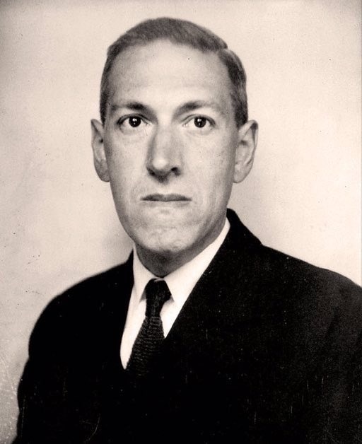
Howard Phillips Lovecraft (1890-1937) was an American born acclaimed horror-fiction writer from the 20th century. To modern horror writers, Lovecraft was an influential figure both in the genre of horror and early science fiction – his short stories and novellas laid the groundwork for generations of fans and those curious of the unknown.
The unknown was Lovecraft’s trademark, focusing on primal human fear which, arguably, hadn’t been truly mastered since the works of Edgar Allen Poe, Mary Shelley or Bram Stoker. Lovecraft created an entire sub-genre of horror, eponymously named Lovecraftian horror which explores cosmic horror tropes and is defined as “fear and awe we feel when confronted by phenomena beyond our comprehension, whose scope extends beyond the narrow field of human affairs and boasts of cosmic significance”. Lovecraft created an entire mythos surrounding the creatures and worlds which were foreign to society at the time, this had a huge impact on literature and film due to the increasing popularity of fantasy and otherworldly interpretations of life which had never been available before. Conceivably, without the introduction of Lovecraft’s work and legacy, modern day horror media would have been almost unrecognisable as certain tropes – forbidden or veiled knowledge, the fate of man and omniscient godlike beings - and inspirations caused by his work would have, perhaps, not caused a domino effect on creatives destined for success in this genre such as Universal Horror and the works of Stephen King.
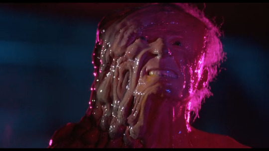
FROM BEYOND (1986) - The Adaptation of Lovecraft’s Work
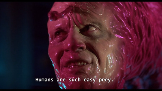
Furthermore, on my study of H.P Lovecraft’s works, I delved deeper into the adaptations of his works. I found a film based on one of his works and it follows the same idiosyncrasies and characteristics of his written short stories. Eighties creature features are the main focus of our short film and the basis of my character designs, as I wanted something so visceral and unnerving I decided to study body horror films and take influences from genre attributes that worked the best during them.
The use of a humanoid frame was something that appealed to me, for example creatures in horror films appeal to our innate fight or flight response is due to our reaction of the ‘Uncanny Valley’ - which is when something is so human but there is something so innately inhuman in it’s qualities that we are at once disturbed and disgusted. I wanted this response from my audience. The revolted reaction I had from these body horror films were something that I wanted to convey in my work.
The slimy, moist body texture was something I wanted to translate into my creature. Exposed muscle, pulsating veins and malformed flesh and skin textures inspired the general concept of the creation of my creature. In addition, the use of an unexplained ethereal plane where the creature comes from in the film From Beyond was an element that I was interested in and thought that I could incorporate this into my work.
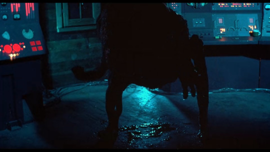
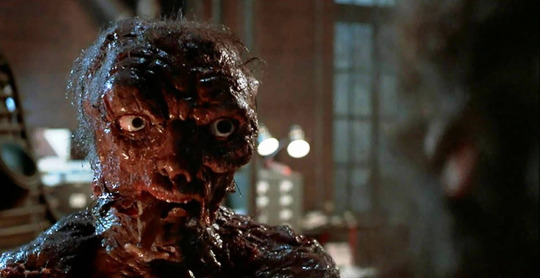
The creature slowly transforms as the influence of darkness takes hold (Above)
The darkened room doesn’t show much of the creatures design, the low light only shows the creatures silhouette and body structure. The looming, hunched frame is intimidating and shows a lot without showing much at all, influencing the audience’s own fears by triggering their own worst nightmares that are mirrored by being that is slowly revealed in front of them and is aided, in part, by the feeling of the unknown. (Below)
When the creature is finally revealed, the stark contrast of the bright lighting brings forward the detail of it’s stance, anatomy and overall design. This reveal is something that I want to incorporate into my work. By adding different aspects of lighting to the scene, certain elements of horror will be amplified and will become more effective.
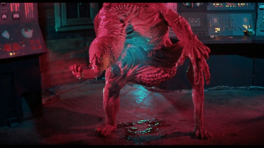
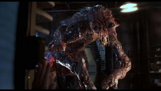
I enjoyed the serpentine head movements of the main antagonist in the film, the extruded and elongated neck really influenced my design, as well as the snake-like movements and attributes, as I though these were so inhuman I could incorporate this into my final design and general walk cycle and would get a repulsed reaction from my audience. It inspired me as these aspects of this film made me react in a fearful manner, this is how I wanted my innate audience to react.
David Cronenberg - The Deeper Meaning of the Monster
Studying film such as David Cronenberg’s The Fly helped my development in my design process. Similar to the Lovecraftian adaptation of From Beyond, this creature also has a focus on body horror. The constantly deforming and changing body of the main character as he metamorphosis into a human fly helped me realise the stance and head shape of my character. The crushing, almost depressing realism of Cronenbergs film is akin to other tragic characters in film. The inclusion of metamorphosis in The Fly helped me develop my character as I wanted it to look like a human that had been influenced by a power beyond their control, this also links back to From Beyond and the Uncanny Valley, as something that was once human is changing, or has changed, into something so inhuman. The binary opposition of the Priest characters faith and the inclusion of a tainted, satanic being appealed to me as it at once showed the difference and the distinct human quality and notion of evil. I wanted to keep my character unambiguously humanoid, as we are the only species that has the intelligence to define something as ‘evil’.
In addition to this, the humanoid shape but the animalisitc, beastly intentions are something that can influence the horror of my short film. Despite the human appearance, the demonic entity I am developing will have no human emotions. Creatures in Universal Horror films, such as Dracula (a vampire) and The Wolf-man (a lycanthrope) are innately human in appearance but can represent things much deeper than just their appearance. For example, Dracula can represent aristocracy and a hidden monster, and the Wolf-man can represent our animalistic nature which we have repressed such as rage and sexual desire. George A. Romero’s Night of the Living dead represent communism and then in Dawn of the Dead they represent consumerism. The tragedy of Seth Brundle in The Fly connotes to the slow recession into terminal illness.
Having an underly message in the creature is something that I am interested in and the inclusion of a demon tormenting a Priest can be analysed as the Priest struggling with his faith.
Seth Brundle’s transformation takes effect (Above) and the full transformation of Brundlefly (Below)
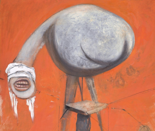
Francis Bacon - Nightmare Influenced Artwork and Creature Designs
Francis Bacon was an artist whose work often depicted the crucifixion of subjects, depictions of Popes and Priests and portraits. These visceral, often disturbing depictions of horror and anti-religious connotations greatly influenced the concept art for my creature as it links to the concept for our idea. The raw imagery is so dream-like and surreal, that I decided to study some of his works and attempted to replicate it in my own. Some of his works focuses on creatures, or surreal depictions of humans, that had ghastly and spectre-like appearances, with elongated maws and craning necks. The distorted shapes of these caricatures could have been influenced by Bacon recorded sadomasochistic (S&M) tendencies. The positions of screaming, whether this can be interpreted as pleasure or pain is subjective, the blindfolding of the creatures and the characters on all fours can be linked with these tenancies.
This creature is in a stooped position with a gaping human like mouth and human ears without no eyes, I would like to incorporate this into my work as the lack of eyes can give the impression that, if in pursuit of prey, they cannot hide from it. As the uncertainty of how it sees can bring doubt, I believe that no eyes can, ironically, encompass an all seeing presence.
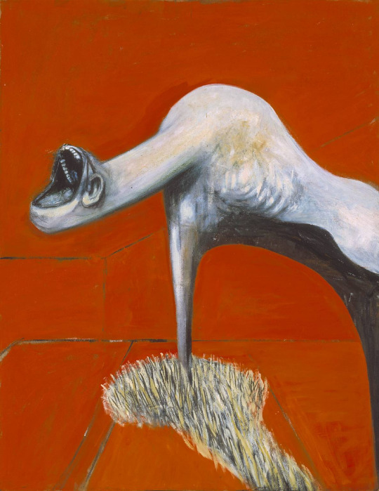
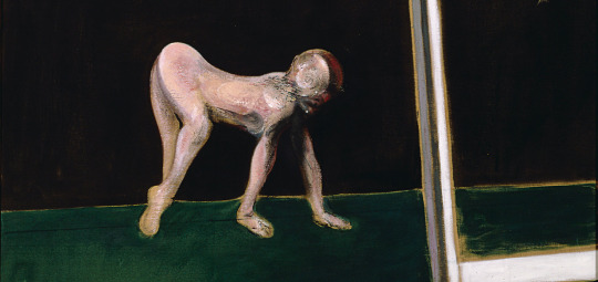
This almost swan-like craning neck and lack of detail is arguably like a devolved version of the character above. The addition of having no eyes is characteristic of Bacon’s work.
This creature on all fours considerably influenced my creature design, as the human-like body posture but devolved position is innately terrifying.
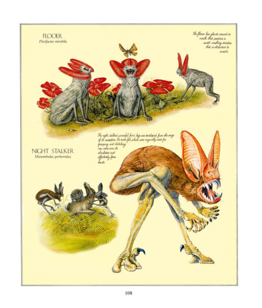
Speculative Evolution and After Man (The Works of Dougal Dixon)
Speculative evolution focuses on the hypothetical evolution of some creatures in a distant future, rather than being based on real science. Rather than being backed up by scientific proof, it is a sub-genre of fictional biology - the most notable works were created by Dougal Dixon. I found researching and reading about these helped me create a varied image of my creatures.
The designs of the Flooers and Night Stalkers also helped me develop different stances in the process of character creation. I experimented with the integration of different characteristics from multiple species and added them to a single design. In addition, the use of no eyes becomes prevalent again in my research, and digging deeper into my research I discovered the Sci-Fi television show Primeval used the concept of the Night Stalker and adapted it to create a creature called the Future predator and this also influenced my designs.
Flooers and Night Stalkers, Speculative Evolution - ‘After Man’ (Below)
The Future Development of the Human Genome - ‘After Man’ (Below)
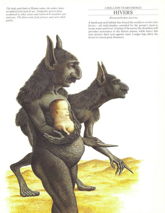
More examples of Speculative Evolution - ‘After Man’
The Priest
For the Priest, I wanted to make him an average person, an every-man for the audience to relate to. Since my primary research focused on priest and holy characters in horror films to create the basic characteristics for my character. Researching these will help me build a deeper knowledge for the nature and development of both characters.
Priests Facts and characteristics
Clerical Celibacy - In orthodox traditions, a Priest cannot marry a woman, or man, as it is an act of respect, to deny having sexual relations, spouses or children, in order to be closer to God and achieve divinity.
Clergy House (Parsonage, Manse or Rectory) - I will set the environment and subsequent animation in a house given to the Priest by the church, as it is a symbol of God.
Vestments - Catholic priests wear a uniform, vestments, to not define themselves a clergyman who does not see themselves as an individual but rather to draw attention to their beliefs and what they are performing.
Popular Media - Priests in Horror Films
Father Karras (And Father Lankester Merrin) - The Exorcist
I studied how priests and holy men were portayed in horror media. For example, both Priests fail in their attempt to exorcise a demon out of girl. Father Lankester Merrin suffers a heart attack during an exorcism. And at the end of the exorcist, when possessed by the demon inhabiting a young girls body, Father Karras throws himself to his death by act of defenestration, throwing himself out of a window in an act of suicide. He allows himself to become possessed by the demon and letting it taint him, as all acts of God he tries to perform do not work. This is something I want to translate into my work as I think my character could be shown to be subtly corrupted through character design, behaviour and the environment, as an extension of his religious beliefs.
Reverand Lowe - Silver Bullet
In this Stephen King novella, and subsequent film, the monster in question is a werewolf who is revealed to be Reverand Lowe, a pillar of the community and who is deemed to be a good man. The werewolf that resides below his skin taints his life and actions, as his selfless nature becomes corrupted by that of the beast.
Comparisons between the monster
As the characters are binary opposites, clear representations of good and evil, I want to use this idea and expand upon it. For example, I will design my Priest wear a long cloak or clothes covering up his body, using cleaner and lighter tones to represent his divinity in comparison to the monster. As well as this, I will incorporate the body composition of both characters in this same vein, for example as the creature’s torso is larger than his waist, I will make the Priest’s upper torso thinner and have his lower waist pudgier and fatter, perhaps a small indication of a sin of gluttony. Additionally, I will make the creatures features on his face phallic, such as the tentacles, and the mouth vaginal, to represent his rule of not marrying to represent the temptation that he has denied in order to be closer to God. I will also, change the vestments to an off-white or black colour to subtly indicate he has been tainted in some way.
Quotes to develop the moral compass of the Priests character
“Even though I walk through the darkest valley, I will fear no evil, for you are with me; your rod and your staff, they comfort me.
—Psalm 23:4
There will be a contradiction of this in our animation, as the Priest does, in fact, fear evil, as the creature pursues him through his house hold.
The Lord is my light and my salvation—whom shall I fear? The Lord is the stronghold of my life—of whom shall I be afraid?”
—Psalm 27:1
As the creature is revealed, there will be a change in lighting from light to dark, symbolising the powerlessness of belief in God when faced with this demonic force. The bright lights at the beginning will flicker and the lighting will change for dramatic tension.
“Do not be afraid of those who kill the body but cannot kill the soul. Rather, be afraid of the One who can destroy both soul and body in hell.”
—Matthew 10:28
As the nature and background of this sudden creature is never reveal, it is uncertain that the Priest can be saved from such a malevolent force, however, with the use of lighting and the metaphorical loss of God, it could be interpreted that his soul will not be saved either.
You believe that God is one You do well; the demons also believe, and shudder. - James 2:19
"He casts out demons by Beelzebul, the ruler of the demons." - Luke 11:15
Quotes discussing demons in the Bible, discussing the importance or not letting them in or succumbing to them, which the Priest does, unknowingly, by the creature appearing in his house. This could be an interpreted as allowing his own demons to ravage his faith, as his home is meant to be a church, the symbol of religion.
0 notes
Text
Collage
Lodger
These are my mood boards focusing on my general ideas and themes I am going to work on for my project. I have decided to make the Lodger as a creature, an ethereal being from a different plane of existence. These mood boards surrounds the ideals and general characteristics of my character. I want it to be surreal, unnerving and innately humanoid but lacking human emotions and qualities. My primary creature design will follow the ideas of H.P Lovecraft and creature designs from old horror films.


Landlord
I want the landlord to be a wholesome character, but someone who is not all that they seem. My initial idea is to have a Priest, a character that is a binary opposite to the creature character, portrayed a good character but is revealed as an antagonist. I have decided to design my Landlord character as a Priest, as they are symbols of purity and will be a distinctly different character than the creature.


Household Interior
I want the interior of the house to reflect the character, as he is going to be a Priest, I have decided to make the house a church with additional features to make it look very seventies inspired as I like the aesthetic and feel like it would work with the Priests character as I believe it will reflect how out of touch he is with the changing world - much like religion.


0 notes
Text
The Lodger
Inspirations for my own work
The story structure and raising of tension in The Lodger helped me define a view point and specific feel for our idea. The inclusion of an unwanted or untrustworthy guest compared to a relatable character was the main inspiration of our work, and the slow growth of tension will help the climax of the animation when there is an eventual confrontation between the two characters.
Hitchcockian films generally follow some general characteristics, for example they usually involve a climatic plot twist, a restriction of the scenes to a single setting, general building of suspense, normal people thrust into peculiar situations and the use of darkness to symbolise impending doom. These are characteristics I would like to incorporate into my work.
For example, for the plot twist we could incorporate a plot twist into the story however if we do not have time we will have to scrap this idea. Additionally, the building of suspense would be a key feature in the thriller/ horror aspect we are attempting to replicate, and use low lighting to show the character of the creature before the attack - much like the shark in Jaw’s only showing a small amount of the monster then at the climax, there will be bright lighting for the big reveal. The use of the Priest will link in with the people in peculiar situations characteristic of Hitchcock’s work.
youtube
0 notes
Text
The Brief
As a group, we thought as the Lodger and Landlord must be binary opposites, we needed to make two distinct and different characters with conflicting ideologies, aesthetics, personalities and appearance. We decided if we were to make one character appear human, the other must be a creature or animal - contrasting familiarity with the unknown. We decided to take influences from horror media - such as literature from H. P Lovecraft and Edgar Allen Poe, which usually focused on a person being tormented by an unknown dark entity.
Whilst delving deeper into binary opposition, I thought that although the Landlord and Lodger were different - essentially being examples of ‘darkness and light’, or ‘good and evil’ and ‘black and white’ there had to be a grey area. Which is where the idea of the characters intentions and actions were less one-dimensional. For example, The Landlord, who the audience would deem a protagonist would be revealed to have darker intentions, and the Lodger, the creature, would become something that is, at first, intimidating and scary, however becoming the unlikely hero of the animation.��
Additionally, as the characters have to be different we had to make the environment of their rooms different as well. We have decided to do similar rooms - as the rooms are in the same location, next to each other - but create the Lodgers room as a darker, twisted and alternate version of the Landlords room.
We also encountered an issue during the creative process: if the Lodger creature itself was intimidating, otherworldly or generally unpleasant to look at, the Landlord must be overly inviting and pleasant, almost wholesome. We discussed this as a class and, afterwards, came to the conclusion that the landlord must look almost like a children’s T.V character to counter the creatures design.
0 notes