
Don't wanna be here? Send us removal request.
Statistics
We looked inside some of the posts by mi5016-resit-craig and here's what we found interesting.
Average Info
Notes Per Post
2
Likes Per Post
2
Reblog Per Post
0
Reply Per Post
0
Time Between Posts
2 hours
Number of Posts By Type
Text
17
Last Seen Tumblr Blogs


Fun Fact
There are dozens of funny blogs to kill time on Tumblr.
Text
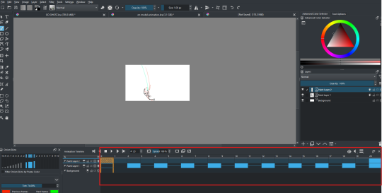
Animation 7 Analysis
This animation was created with the official model sheet and colour sampled with it as well, Ben 10 is a series that has a plethora of production materials archived. This made the recreation of the art style easier as I had every means to remain accurate to the style.


Animating on separate layers was improved upon from the other animations since here I was able to then establish the timing of both arms in succession.

This animation had facial animations to set it self apart from the Danny Phantom animation while going the extra mile with accuracy and planning.

0 notes
Text
EXERCISE PRACTICE 7
This exercise incorporates everything I've learned over the past few weeks
0 notes


Text
Animation 6 Analysis
Shot 1 was the first shot completed and shows my inexperience the most, the frames are jittery and I had not yet decided on whether or not I'd utilise the "animate on twos method". The leg movement was also heavily referenced from my personal reference video I filmed to allow me to understand the way the legs would naturally cross each other.


Shot 2 was a more ambitious shot since my references didn't include a low-angle shot of the character so I had to improvise and stretch the art style for the shot. Which animated series have done before (only for comedic effect)

Shot 2 is also a shot I had to use self-reference for. While combining the use of my own body for the pose and the series' Spider-Man physique to complete the shot I believe that the 2 were melded together well in a way that honours the art style.


Shot 3 was one of the most on-model as it was a simpler shot but for the sequence, I had an exact reference for the angle that I wanted to create. The only modification is the hair-blowing in the wind and the change of wardrobe for the character.

Shot 4 was another of the most on-model as it was a simpler shot for the sequence since I had an eye reference taken from the series.
It was the easiest shot to complete since it was just an eye animation, I purposely made the eye glisten shakey and appear like a glimmer in the eye with the multiple frames.


Shot 5 was influenced by the following and was a shot that shined from my multiple exercises in art style consistency.
The rushing background was inspired by anime and very intense animated series that I attempted to blend with the falling animation
youtube
0 notes
Text
EXERCISE PRACTICE 6
This is one of my more elaborate and more direct animation practices where I use the assets from the animated series Avengers: Earth Mightiest Heroes to animate multiple shots edit together a small sequence and see where I can apply the previous exercises.


The images above are the reference images I chose to help me see and understand certain details that keep the characters on the model since a model sheet was never officially released for the series.
I had gotten multiple images of both Peret Parker and Spider-Man to cultivate a mini library, this was done to keep myself thinking in the realm of the series and help abandon any of my personal art preferences


The images above are the backgrounds created for the animation, I had attempted to create the background with animation in mind so I had a defined colour pallet that I stuck to for consistency.
Instead of relying on lineart for the background I used shapes and shading to build the background, as seen in many television series. (This being my attempt)

Avengers: Earth Mightiest Heroes BG reference (below)

To create the backgrounds I followed a tutorial/video guide to help me understand the fundamentals of animation backgrounds and how they differ from my own Comic book esc Backgrounds.
The video helped shift my perspective and allowed me to draw them in higher resolution with the intent to have the bg move whilst the characters do, this was used during the clip where Spider-Man falls.
youtube
My personal comic book-esc backgrounds


0 notes
Text
EXERCISE PRACTICE 5
This short animation was less about proportions but more about animation spacing. This was my first time animating on two's deliberately just to test animation timing and see what kind of change they have on the speed/ intensity of the sequence.
Animating on twos allowed for a simpler structure and allowed me to space out movements better and more effectively
youtube
0 notes
Text
Animation 4 Analysis
Both animations are based on InkTank's rendition of Allmights transformation, they depict the sequence as being a grotesque body horror-esc transformation with bones snapping and muscles tearing.
Example (1:06-1:11)
This animation was meant to replicate that with less time than I had in the past to see if I could still create that despite the time constraint. Whilst animating I only thought of the shapes and proportions of the character to still keep the practice in mind.


0 notes

Text
Animation 3 Analysis
With this animation, I thought more about the animation timing and ways to make the animation look smoother and stable. The less shakey and jittery the shot, the better. The shot does suffer from some frame-to-frame inconsistencies in the colour and frames (specifically the hair highlight shuffling) but I chalk this up to my inexperience and intend on animating more characters with this hair feature to refine my skills.
I utilised an ease-in and ease-out animation pattern because it would allow me to progress my animations and transition them form shakey to stabilised.
youtube
For this animation, I decided to not draw a face on the character. this was so I could only focus on the shapes and proportions of the character, had I drawn his face I believe that my skills would have inadvertently ruined the animation by overcomplicating it. I fully intend for my next animations to include the face and include facial animations.
0 notes
Text
EXERCISE PRACTICE 3
This is meant to build upon my animation skills by using the model sheet and assets of the series as well as taking the time to learn the proportions of the character, refining my rough animatic version. During the animation process, I heavily referenced the series to see how they depict elbows and clothes and how they're drawn.
The art style utilised thickly outlined lineart and rim lighting for the characters. depending on the location and time of day this light "Halo esc" rim-lighting is what is consistent in all Danny Phantom art (official or otherwise). The only time when the series has flat colours with no rim lighting is during the daytime in more mundane scenarios.


I had to fully immerse myself in the art style and pick up on the small style choices the series utilises to remain unique.
example
Characters with black hair have it outlined by a light grey "highlight"
the characters have large hands despite their slimmer slender physiques.
1 note
·
View note
Text
Animation 2 Analysis
This animation was made without looking at the model sheet and because of that, the character is VERY OFF MODEL. The art style and proportions do not line up with how Danny Phantom is depicted in the series and if it were not for the colours it would be unrecognisable.
The transformation ring was animated with my own understanding and memory of the ring and because it was done without reference it too was off-model and incorrectly spaced.


This was the first time when doing an animation that I animated the layers individually. The body (being the only immovable part of the sequence) is the head, neck, torso and legs, the arms were animated on separate layers as they were the only moving aspect of the clip so animating them would mean that they'd have their own timing independent from the body.
This helped simplify the animation and allow it to look somewhat clean as the in motion since the only thing being redrawn over and over is the arms, preventing g the shakey line effect seen in some frame-by-frame work.


For the transformation, I had "faked" the transition from Danny Fenton to Danny Phantom by rendering an iteration of Danny Phantom as a PNG and then overlaying the Image on top of the animation prior. I then erased the PNG on top in order of what is meant to be revealed, this was meant to save time on the transformation. This ended up being the case as it simplified the process but it resulted in the animation looking cheaper and cobbled together . Upon reflection, there was no way to remove the Danny Fenton from the background so the layered effect is VERY apparent and blatant, seems less like a transformation and more like an overlay.
0 notes
Text
EXERCISE PRACTICE 2
This animation is a proof of concept to see how the series Danny Phantom handled its transformation sequence. This was done without looking at the model sheet and with my basic understanding of animation.
0 notes
Text
Animation 1 Analysis
the proportions of the characters were stretched and worped as the clip continued leading to it being accidentally squashed and stretched when big movements are at play.


the characters' size was also inconsistent their height fluctuated multiple times in the same clip. the black like was meant to be a guideline for me but that inevitably fell through due to my inexperience and lack of structure.


0 notes
Text
EXERCISE PRACTICE 1
For this animation practice animation is to see where I'm at now and the animation was to test my spacing and consistency.
The animation started with very simple shapes and proportions and to see whether I could remain consistent with drawing the same thing over time without it eventually warping and becoming misshapen.
the proportions of the characters were stretched and worped as the clip continues
0 notes
Text
ART STYLE CONSISTENCY
For my animation practice I want to spend more time on my artstyle consistency for animations.
PLAN
I will utilise the plethora of animation model sheets that can be gathered on the internet and create short animations whilst attempting to stay as on model as possible. Many animated TV series have artwork completed by character designers to get a concrete feeling for the show, they are always simplified versions of the character concepts submitted by the showrunner/ creator.


EXAMPLES
-Stephen Silver (Johnny test, Danny Phantom, Kim possible)


-Derrick J. Wyatt (Teen Titans, Transformers Animated, Ben 10 Omniverse)


-Glen Murakami (Batman Beyond, Superman the animated series)


1 note
·
View note
Text
MY ART STYLE AND ANIMATIONS
For any animations I create there isn’t any trace of my personal art style for the animations. Like any other animator, I make my work art style for any given project and adhere to that as closely as possible to allow for a smoother workflow and consistent work. Attempting to animate in the art style I use for my art would be inappropriate (as my art is more suited for posters and comic art) since it was never conceptualized for movement in a frame-by-frame medium.


My personal artwork is not suitable for animation since it’s too heavily rendered whilst being overlaid with a multitude of effects and filters to create the intended feeling, Animation art styles (even if complicated) are meant to be simple and streamlined art meant for any animator to replicate and animate.
0 notes