
Statistics
We looked inside some of the posts by miafreemandesignpractiseone and here's what we found interesting.
Average Info
Notes Per Post
0
Likes Per Post
0
Reblog Per Post
0
Reply Per Post
0
Time Between Posts
2 days
Number of Posts By Type
Text
17
Last Seen Tumblr Blogs


Fun Fact
Mobile Tumblr US users spend an average of 4.04 minutes per session on the app.
Text
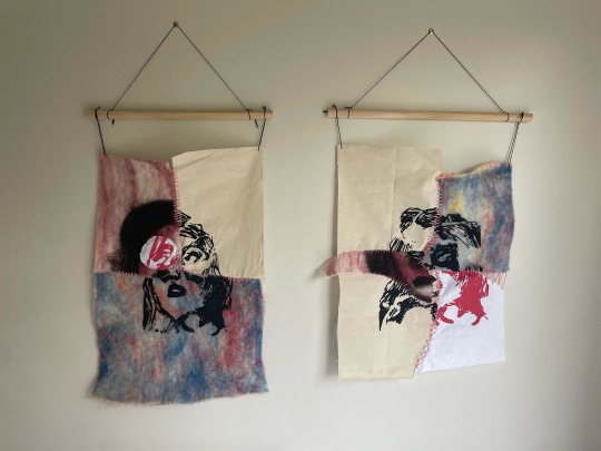
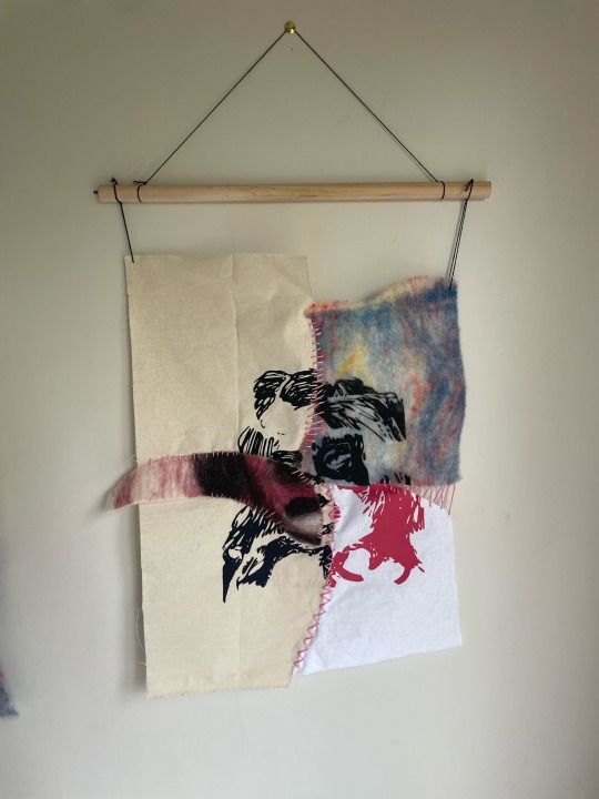
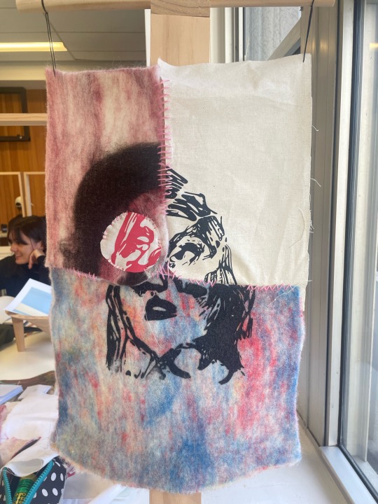
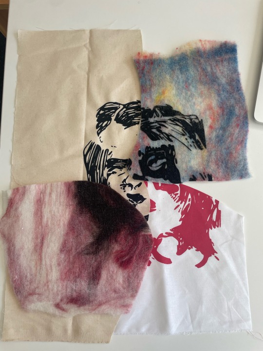
Textural Collage two, more stitching & dowels.
I used the left over materials to stitch together another portrait using the same thread and techniques, using the pink stitching to support and hold up disabled people.

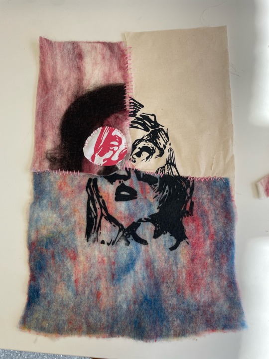
I also attached them to wooden dowels so that they can hang properly and not wrap too much. The weight of the fabric causes the portrait to warp a little bit, but I kind of like this imperfection and I think it matches nicely with the handcrafted, personal theme.

I had the idea of adding red stitching over a transparent fabric to stitch in words or phrases that convey negative experiences of have a physical disability in terms of appearance. I trailed with red thread to convey that hatred/self-loathing that is experienced by disabled people due to the influence of able-bodiedness in beauty standards.
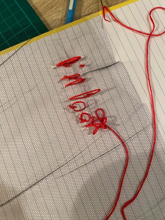
The stitching was not working well at all. The fabric kept ripping and the stitching was nowhere near as clean as a wanted it. Also layering it over the portrait just felt wrong. It completely took away from the messaged that I want to portray with these portraits, that despite public perception there is beauty in the appearance if disability. Adding this negative veil to the portrait, removed this message and creates more of a focus on the self-esteem of disabled people and it felt like it was creating pity, which I do not want to do. The portraits are stronger and provide a more positive message without this.
0 notes
Text
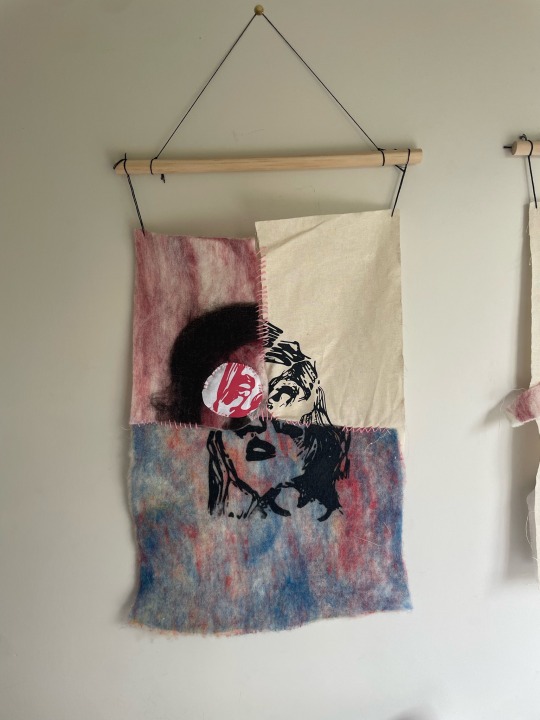
Textural collage one
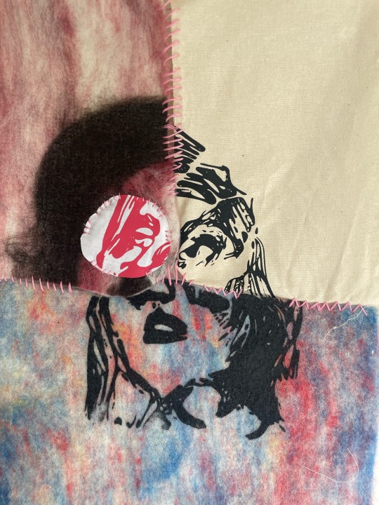
I spent today cutting up and stitching together my first textural collage. I wanted to still create a portrait with collage so I placed the fabrics together in a way that the faces I had created in all of them would be able to come together and create a stitched together face.
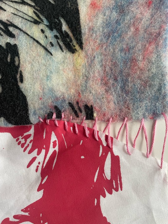
I wanted to keep gaps between my fabric and experiment with different appearances of stitching so it would look like each fragment had be carefully stitched together with a technique that would hold it best. I wanted to keep the gaps because I felt that these represented feelings of loss, like representations of what a disabled person might think is missing, e.g a gap in the cheek to represent a disabled person feeling like they are missing having normal cheeks/face due to the appearance of their physical disability.

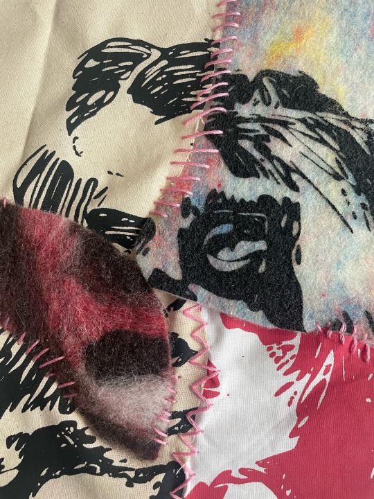
I chose pink thread to stitch everything together because it represents care and love. I wanted each fragment of the face to appear that it has been stitched together with love. This is the same reason I avoided parts of the ink/facial features when stitching because I didn't want my stitching to act as if I'm trying to cover up the disability or hide it, but rather hold the disabled person together and support them.

I'm going to use the rest of the materials/scraps to create another portrait. I have also bought a wooden dowel so I can hang the portraits once they are done.
0 notes
Text
More screen-printing
To create more materials for my textural collage, I wanted to screen print another one of my collages. I took this ripped collage, because I think it's really successful at communicating disability and beauty, and edited in photoshop and illustrator to create a similar representation as my other screen-printed collage. I didn't smooth it out as much because I wanted some difference in the graphics so when collaged together they appear like different materials with different treatments.

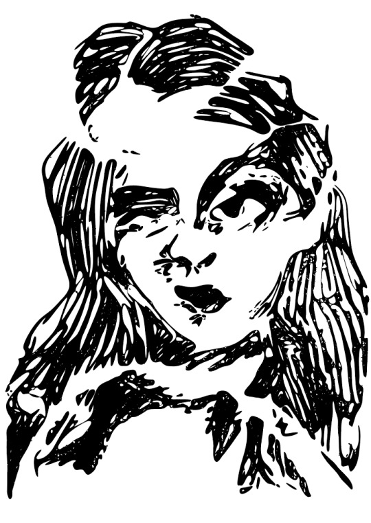
I screen-printed these on cream calico and in black ink because the other materials I've been collecting/creating are all quite colourful and wanted something more simplistic and to create a balance with the colourful materials. I'm super happy with how this print and design turned out. It's very clear that it is a face, but the treatment of the graphic still hints at that ripped, slightly distorted look. You can still see the lines of the ripped paper cutting through the graphic.


I also overprinted the first screen in pink to experiment a bit with overprinting and see how it looks. I really like the look of it but it becomes quite hard to see the bottom layer.
0 notes
Text
Holistic Statement & Feedback
FEEDBACK
My feedback is to include my exploration around my words, how did they influence my path and outcomes. I got some good advice to just start by thinking about what I've learned through the word exploration and go from there. I also didn't mention anything about failure (which I need to do) but this is because I don't think I've had any failures. Things that haven't worked out have just led to better ideas or learning and I don't classify any of those are failures. But adding in an explanation around that would be helpful.
My feedback also suggested I be more specific about why I've chosen things etc. I think because I haven't finished my final outcome it's hard to explain everything because it doesn't exist yet. Once I create my final outcome, I will be able to write a lot more specifically. It will also be good, as suggested in my feedback, to expand more on what I've learned from working with textile.
0 notes
Text
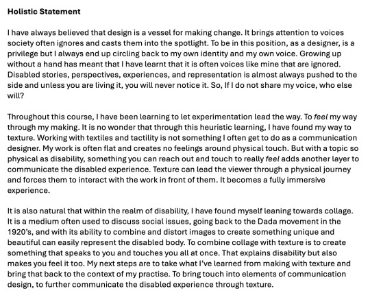
Felt Portrait

Based on some of my drawings, I created this portrait from felt in the textiles lab. This is something I have been meaning to do for awhile and I finally found the time to get wool fibres and get back into the textiles lab. I chose pinks as the main mid-tone to colour to portray that feeling of love and inclusion, and use white and blacks as highlights and shadows.
My goal for this class is to create a textile collage that includes elements of tactility and interaction for the viewer. I really want to push outside my normal practise and comfort zone by working with texture and mediums I don't normally work with as a communication designer. The plan is combine this felt portrait with other textile based portraits and stitch them together to make new unique and disfigured portraits to represent disability.
0 notes
Text
26/03 | Palimpsest Discussion

Talking through my project with Lucy was quite helpful to understand my own journey and figure out what parts of my process are important to highlight. we also talked through my next steps of my project, which is to bring the ideas I've tested through paper collage into a textile and texture space. Through talking about my work with palimpsest, we realised that collage is a form of erasure, taking away parts of the picture and replacing them with something else. It has been an integral part of my process with out my ever knowing it (I'd never heard of the palimpsest before).
Now, I am looking to re-imagine my ideas in a different form and see if they take on new meanings when elements of texture are applied to them.
0 notes
Text
T-shirt printing
Today I screen printed on a t-shirt, which is something I've never done before. Greg helped me through the process and it was really cool to see my work on something wearable. I'm super happy with how it turned out.

I decided to colour the print a pinky red because both colours bring warmth to the image and are associated with feelings of love. Pink is a very feminine, inclusive and romantic colour. Red is often associated with passion and love. In the context of the print, these colours shows that disabled women can be desired and loved. They are romantic, warm and beautiful.


Did some test prints on a lighter cotton. When overlapped they’re somewhat transparent. Could I use this in some way to create overlapping in my work?
0 notes
Text
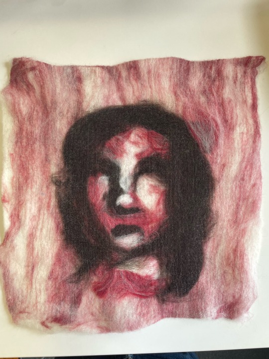
Embroidery Collage
inspired by Petra Heidrich, I worked on exploring collage with elements of stitching.
instagram
Heidrich's collage work.
I decided to create collages based on experiences of being disabled using magazines and embroidery thread. I like the simplicity of the collages, I feel like they say a lot without having to be super busy.
I had a lot of fun incorporating the different mediums. I used the thread to overlay and act like the thoughts and feelings of disabled women, things that might not be noticeable to able-bodied people but disabled people would understand. I used pink because I always want to portray disability with a lot of love and care, so using colours that represent these feelings helps display disability in a more positive way.
This collage depicts the feeling that people don't see you for a person when they see you are disabled, all they are noticing is the disability. You're dehumanised straight away (represented by the covering of the eyes) and people only take notice of disability.

This collage focuses on the way prosthetics and medical fixes can feel to people with disabilities. Prosthetics are often clunky and noticeable. You can't ignore them and they feel like they don't always fit on your body. This was my experience with my prosthetic. I found to made my disability more noticeable and harder to ignore or hide.

This collage is the feeling of wanting to cover up and hide your disability. The thread is strung across the messing arm in order to pretend it's still there, like there is nothing wrong of different.

This collage displays the heightened senses that someone who's blind might have. They're missing their eyes, but their other senses bring more value. I'm not super happy with how this one turned out and I feel it just looks sort of tacky.

This collage talks to phantom limbs. When people have amputations, it can sometimes feel like their missing limb is still there. When their eyes are closed, their limb is still there. They can feel it still attached to their body. It also speaks to the feeling of missing something that isn't there, the longing for a normal body.
0 notes
Text
New Words

From this brainstorm I did from after talking with Zach and from my formative feedback, I've decided to pick 5 new words that will lead me down a texture oriented direction. I really tried to expand my brainstorm a lot, using thesaurus to go in new directions, and pick words that were outside my comfort zone and not 'safe'.
Liquid - Knotty
Feel - Atmosphere
Combination - Weave
Kaleidoscopic - Piebald
Messy - Puzzled
I picked these words because I think they're going to lead me in a more tactile direction but still keep some of the ideas that I've enjoyed developing through my making (like puzzled and piebald relating to potential ways of collaging). Some are also inspired by some of the artist research I've done (like weave and knotty).
0 notes
Text
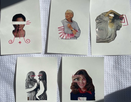
More paper ripping collages

After making this collage, I decided to try the technique out with full body portraits. I was really happy with how the face turned out and I love the way that the collage becomes more interactive.


Three full portraits.
I wanted to try connecting bodies that where in completely different shapes and poses because I thought this would create an interesting mix-matched composition.


Journey of flipping through the collage
This didn't quite turn out as well as I wanted it to. Some interesting shapes and juxtaposition has definitely been created by the use of unique poses, but I was hoping that there would be more connection between each layer. In future it would be best to plan out the full body sketches more so there is a stronger link between the poses.

Collage with leftover parts
I really like the way this collage turned out though. The poses allowed for a really dynamic composition and I love the negative space as symbolism for the loss of connection between limbs or the dissociation a disabled person might have between parts of their body that don't have full function. The collage also does not contain all four limbs, and I feel this embodies the disabled experience really well.
0 notes
Text
Artist Research - My Inspirations
Through instagram I've found a couple artists who have been playing a lot with collage and texture. The works are really unique and have opened me up to so many different ideas and possibilities of how far I could take the materiality of this project and my thesis project.
instagram
Mixed Media on Fabric & Cardboard
I really like this work and the layering of different textures. It doesn't stick to the frame that the fabric base provides, but rather explores out and isn't constrained. The layering of different materials and media creates an interesting texture to the work and makes it feel lively.
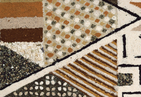
instagram
This artist stitches together different fabrics to create a layered artwork. It feels like terrain or some interpretation of land, how it combines and layers so many different textures (sand, dirt, grass etc.). I love how the collage is held together with stitching, something I haven't really seen much before. How could I incorporate elements of stitching into my work?
instagram
This is a large scale textile artwork which I think is so beautiful. Having a transparent layer on top that is embodied with details provides deeper meaning for the image behind and completely changes the viewers perception of the original artwork. It moves the concept of scribbling over and annotating to new materials and media. The monochromatic stitching and prints feel so moody and dramatic, creating an isolating but peaceful feeling. I love this work so much, how could I play with transparent textures to create a new meaning to an image?
Petra Heidrich
instagram
Heidrich uses mixed media and embroidery to create unique layered collages. Stitching and tape is used to hold the materials in place which creates a layered texture that glue is unable to create. The images aren't as strongly pasted down and therefore their is more room for shadow and textured layering. I really like the use of embroidery as a way to annotate over the collages. How could I use thread to add to the story of a collage?
instagram
Galen Gibson-Cornell
instagram
Gibson-Cornell uses found posters and imagary, weaves them together to create unique compositions that combine many different images. This technique is so interesting and I've never seen anything like it before, I would love to try incorporate this style of making into my experiments. It creates really cool abstract shapes, spotted through the mosaic of colours. Gisbon-Cornell also displays his work on raised magnets so the weaved poster sits away from the canvas.
instagram
He had more recently been weaving posters with large photographic portraits to create a new layer to an image. The mixing colour makes the emotions of the photograph seem more intense. You are more drawn to the feature that are not being weaved and it creates a clear focal point.
0 notes
Text
Artist Research - Collage
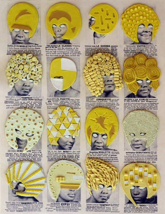
Ellen Gallagher
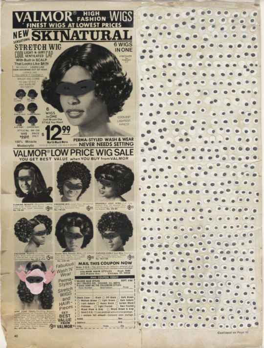
Gallagher, E. (1997). Skinatural [Collage]. MoMa.
Gallagher's collage works incorporate clay and pencil to draw and edit existing pieces of media. The juxtaposition between the graphic, colourful clay works and the original photographs creates an interesting contrast, with the clay almost bringing to life the old photographs. They bring movement and a sense of vibrancy to the work. How could I use existing images and edit over them to create something new?
Eduardo Recife
Recife, E. (n.d.). Eduardo Recife / Misprinted type. Eduardo Recife / Misprinted Type. Retrieved March 19, 2024, from https://www.misprintedtype.com/work/personal-works/collage/

I like Recife's style of scribbling over printed materials. They have this child-like sense of wonder to them and feel like someone is exploring the past through these photographic images. The limited colour palette makes the images feel nostalgic and somewhat moody, like the are portraying the cold feelings of an old era. He doesn't layer photographs with other photographs, but instead brings new meaning to them by drawing over the top. How could I incorporate this idea of annotating images into my work?
Hannah Höch
Orley, H. (n.d.). Hannah Höch. MoMa. Retrieved March 19, 2024, from https://www.moma.org/artists/2675
Cohen, A. (2019, March 11). Hannah Höch, a female dada pioneer. Artsy. Retrieved March 19, 2024, from https://www.artsy.net/article/artsy-editorial-radical-legacy-hannah-hoch-one-female-dadaists
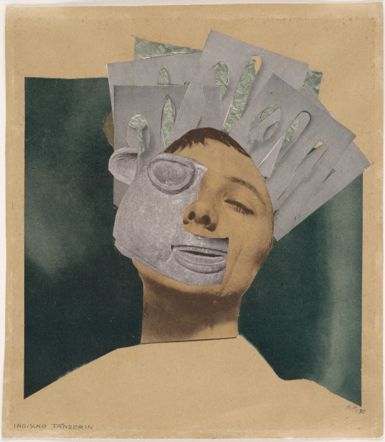
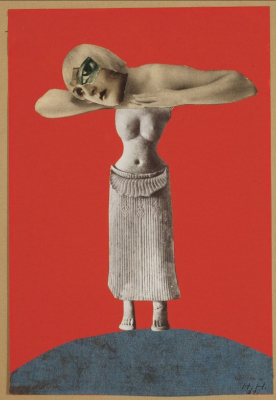
Höch's collages that challenge the idea of the 'ideal women' in the 1940's use images of the female body and symbols of the traditional women. Her works break gender norms of the time by placing traditional feminine symbols with more masculine ones to influence a new way to perceive women. The way Höch splices up the female body to portray it in a completely new way is inspiration. Her works do not need to depict women as feminine for them to be beautiful, they can be disfigured and truly capture women without presenting them in a stereotypical way.
0 notes
Text
Artist Research - Multimedia
SWOON
(n.d.). SWOON. Retrieved March 19, 2024, from https://swoonstudio.org
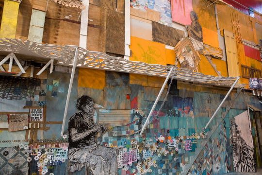
Swoon is a street artist who uses "intimate portraits, immersive installations and multi-year community based projects" to explore human complexity. Her installations use a range of materials, even combining them with wood and scrap metals to create large scenes. The texture and brightness of her work is beautiful and it's so detailed. You can really feel the emotion present because of the detail she puts into her portraits (they feel so real and convey so much personality and emotion) and into the overall scene.
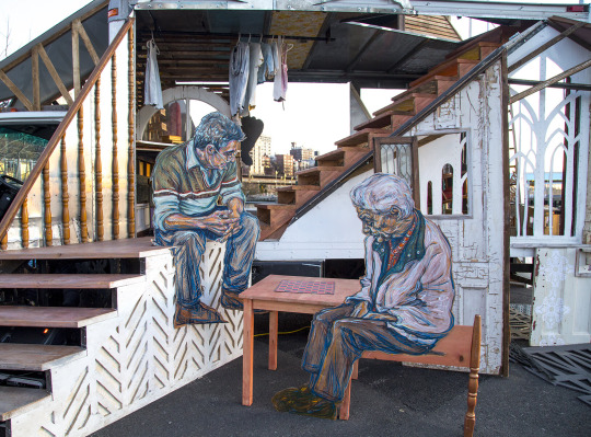
The style of the portraits is really cool. I love the detailed colour work and how it all comes together to show the form and depth of each character. Her style is still messy, using unrefined strokes, which makes it feel so personal.
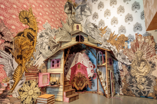
Her works are almost like large 3D collages. It feels like she's creating her own worlds that you can walk through and experience by layering large illustrations. It shows me how far you can push the mediam of collage. I don't have to be restricted to paper and small formats. I can create installations that would give me much more room to add detail and create a whole experience for the viewer.
Jan Švankmajer
Švankmajer is a Czech filmmaker using stop motion and claymation techniques to mix mediums through film. 'Lunch' is probably one of the best examples I found of this technique. The concepts of his films are very 'quirky' and strange, to me they feel very uncanny. Lunch is mostly a photographic stop motion but mixed in with some scenes in clay to distort and manipulate the characters in ways that aren't possible in real life. How could I translate Švankmajer's technique of mixing photographic with surrealist elements to manipulate and distort an image? How can combining these two things create something that communicates the perspectives of disability?
youtube
Marian Bantjes
Portfolio archives. (n.d.). Marian Bantjes. Retrieved March 19, 2024, from https://bantjes.com/work/category/portfolio/
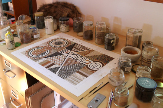
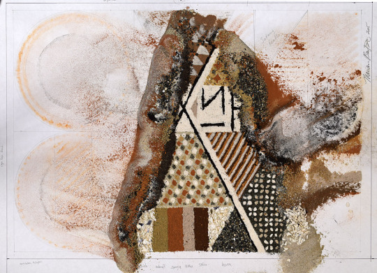
Bantjes is a designer who plays a lot with mixed media and tries to incorporate different materials into her work. In this project (below), Bantjes uses dirt she's collected over a number of years in different locations around the world to create a composition that represents 'coexistence'. It's really inspiring to see how far the boundaries of materiality can be pushed, that something as simple as dirt can be collected and rearranged to make art.
Bantjes also plays with lighting and photography to create ways to view her projects. 'MOO Cards' were designed to be written on one side, like business cards, but have a representation of the artist on the other. Bantjes's are bright, layered cards that can create different feelings in different lights. How could I play with this idea in my own work? How could lighting impact the mood and atmosphere of my project? How can colour do this too?
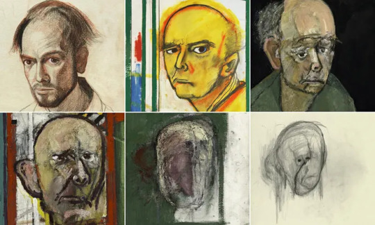
William Utermohlen
William Utermohlen : A persistence of memory - Loyola University Museum of art, Chicago - Chris Boïcos fine arts. (2016). Chris Boïcos Fine Arts. Retrieved March 19, 2024, from https://boicosfinearts.com/exhibitions/william-utermohlen-a-persistence.html
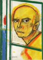
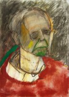
Utermohlen was an artist who suffered from Alzheimer's in his later years. He used his work to document his suffering and the gradual decay of his mind. Through his self-portraits you can clearly see how Alzheimer's impacted Utermohlen's perception of himself and his appearance. His portraits slowly become more misshapen and key features of the face disappear. The portraits carry through Utermohlen's anger and terror of not being able to remember himself and portray himself. The further into Alzheimer's Utermohlen goes, the more unrecognisable his portraits become, "they portray a man doomed yet fighting to preserve his identity".
Oded Ezer
Ezer, O. (2023, March 9). Middle E. Oded Ezer. Retrieved March 19, 2024, from https://www.odedezer.com/works/middle-e
Ezer is a type and conceptual designer. His project, Middle E., represents his identity as someone from the Middle East and showcases some of his collage/print based work. I chose to focus on this work because it is more closely related to my practise of collage and he uses this mediam to explore personal and political ideas, similar to what I intend to do throughout my thesis.
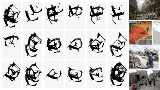
"A series of screen-printed works of the letter ‘E’ that has absorbed the spirit of a beaten and murderous Middle East"
Ezer uses collage and prints to capture the soul of the Middle East in it's now "battered" and "bloody" state due to the conflicts that have taken place there. He started with the letter in an intact form and then ripping and damaging it. Then taking the form and silk printing it to add to that blooded feel. Even just the fragments of a letter can portray so much feeling. You can feel Ezer's anger at the state of the Middle East and the emotions of the people living/connected to the Middle East. How could I use simple forms like Ezer to convey such strong emotions? How could materiality and printing techniques create certain feelings in my work?
0 notes
Text
19/03 | Class Discussions
Talking through my project with Zach, we were able to come up with some unique ideas to explore my ideas further. Could I laser cut materials to create a portrait with negative space? Could I collage this with other portraits? Could I emboss different fabrics? How else could I portray disability visually? Could heightened senses have a visual language that elevates them? Could a blind person be drawn with missing eyes but have the nose or ears with a glow or another way to highlighted to show elevated senses?

What does my work say without words?
I think my work shows that disfigurement is beauty. That different features can be admired.
At the beginning of the class I created this collage inspired by Red's way of layering pages. The collage can perceived in different ways now depending on how a person interacts with it. I think I like this because the work becomes more attached to the viewer as they can flick through it. I think it also helps show disabled beauty more. The layered work feels more interesting and colourful, there is more to see, vs once you flip although through, you are just met with a singular portrait. There is beauty in the patch-worked face.


Original portraits


Journey of flipping through the collage

Collage made with leftover pieces


Explorations with scanner. I like how flipping the first layer of the ripped collage can be layered over the collage of leftover parts to create a unique and mysterious composition.
Revisited word map
After my discussion with Zack I went to revisit my word mapping and expand in 'kookier' directions with my words, ones that push further away from my practise. I'm leaning towards words that talk to materiality and texture as this is something (after looking at inspiration) I really want to explore. There is so much possibility to create interesting combinations of media in materials if I open myself up more texturally.

0 notes
Text
Peer & Tutor Feedback
Main Takeaways
Good exploration of words and concepts.
Should explore more with different materials (e.g felt & textiles) to create something that is out of my comfort zone.
Could correlate materials to ones mental state, the more durable the material the stronger self-worth vs a weaker self worth-would equate to a less durable material.
'Disorganisation' could be a better word to explore instead of 'messy'. Think about revisiting and exploring other avenues of the word maps.
Would be good to explore the word 'liquid' more because it has such a range of ways to be interpreted (could try hydro-dripping etc.)
Look at less additive ways of making, deconstructing or taking away instead.
Artists to Check Out
Jan Svankmajer and his claymation
Swoon
Female surrealist artists
Marion Bantjes
Edwardo Recife
Ellen Gallagher
I'm happy with this feedback. It gives me a clear direction to move forward with exploring materiality more and tips for different ways of making.
0 notes
Text
Formative Presentation


FEEDBACK
The feedback I got was mostly how to push my collages further and into a more 3D space to get rid of that flat feeling. Some of my classmates gave some good suggestions for artist models and further explorations, like looking at William Utermohlen who created portraits of himself as he deteriorated from dementia. Sue suggested looking at artists who play with textural elements or 3D collages and to look at mobiles or ways of hanging the collages to create a change in perception.

I guess I'm a little disappointed with this feedback because as much as I want to explore a 3D element to my work, I was really set on creating a zine and exploring layering of materials wont work well for this. That was probably my mistake for getting hung up on the outcome of the project (which I often end up doing) and not really letting my experimentations lead the way. It's made me realise I need to step out of that mindset and focus more on letting the process lead me to a destination.
I also feel I did not explain my ideas behind the collages properly as some of the feedback I got was things that I do not want my work to speak to. Creating something that can be viewed differently from different angles (like a hanging mobile which each direction you look at it you see a different collage etc.) is not something I want to do. I don't want people to perceive the collage/bodies from different ways. As the bodies are representations of disabled people, I don't want viewers to choose how they can perceive disabled people. Often disabled people can't choose how they are perceived and I want my project to give disabled people that choice.
NEXT STEPS

Red's Illustration work
During his presentation, Red showed some illustration work he had done layered pages and cut them to create one big illustration, but you'd also be able to pull back the layers to reveal more illustration. I really love this idea and think it's super cool. It's something I want to try with my own portraits. This created a spiral of a lot of ideas and questions. Would I be able to do this collage technique with texture? Can I stitch together layers of different fabrics? Could it be hanging like a mobile? But how would I achieve this without allowing people to choose how they view disabled people? I could also explore using this technique within the zine layout.

Things to look into more:
Collage with texture
Oded Ezer
Hannah Hoch
William Utermohlen
0 notes