
Statistics
We looked inside some of the posts by miagvfx2 and here's what we found interesting.
Average Info
Notes Per Post
2
Likes Per Post
2
Reblog Per Post
0
Reply Per Post
0
Time Between Posts
5 hours
Number of Posts By Type
Video
1
Text
9
Photo
7
Last Seen Tumblr Blogs


Fun Fact
Celebrities use Tumblr as well.
Video
tumblr
Mystery Project: Final Scene
Overall, I like the way my mystery scene turned out. It isn’t entirely what I had envisioned in my mood board and idea development, however I think I was able to utilise what I know to the best of my abilities to create this outcome. I was also able to do a lot of exploration and reflection for this project, creating multiple different versions of lighting and geometry, for example. I also conducted plenty of research to inform my decisions, even including looking for locations to take photos online. In addition to this, I was able to move forward from any problems I had, by asking for help when I needed it, or looking for alternative options myself. I hope to continue this method of working in the future, as creating different iterations of my ideas helped me to choose what would be most effective for my work, while my research was really useful to refer back to to inform any decisions.
Visually, I think I was able to create a relatively realistic looking scene, with the help of grading in Nuke and the lighting I made in Maya. I chose to focus on a realistic appearance over a stylised one, as I know that my skills are still developing, so this was a good way of practicing using reference to inform the final appearance. However, because of this I don’t think it is as mysterious as it could have been. I had actually wanted to add some fog to the scene, but this caused issues with the lighting in the scene, so I chose not to add it. Had I have had a lot more time, I might have considered restarting the lighting to allow me to add the fog, however at this point I had spend a large amount of time on the lighting and was really pleased with what I had been able to create. In the future I think it might be useful for me to research how to create certain effects before I start, as I might have been able to create the fog had I done this.
Nevertheless, I do like the final outcome. I really like that I was able to create a natural theme for this mystery project, instead of something that might be more commonly considered to be ‘mysterious’. In the future I would like to continue to work in the reflective and explorative nature I did here, as it was really useful for me to consider many different options and ideas. However, it might be useful for future projects to have a more specific plan. This could consist of planning out the steps I will take to create something, giving me the chance to research anything I am unsure of. I did plan to use Maya and Nuke to create my project this time, however more detailed steps within this would have been useful.
0 notes
Text
King’s Treasure: Final Images


Overall, I am quite pleased with the outcome of my King’s Treasure images. In terms of the sceptre I added, I think it fits quite well with the scene, both visually and narratively, as it is a similar colour and style, while it also suits the royal appearance of the given items. Although the sceptre is not an object that usually sustains much damage, I was still able to create a realistic feel by adding some scrapes and dints in the metal. Because of this, it still fits in with the polished appearance of the rest of the items, while still giving me the change to work with some more detailed texturing. However, it would have been nice to create a more detailed object for the scene, which is what I originally planned to do. After facing many issues when creating my crown asset, I had to adapt and move on, leading me to create the sceptre. I hope in the future I am able to continue to use these skills of adaptability, while also improving my skills so I am able to create what I envision.
In terms of the rest of the scene, using the ai standard surface allowed me to create a variety of different textures for the other objects. I was able to experiment with the settings while referring to my reference images to create the most realistic appearance possible, while they also look coherent in the finished scene. I do think that the ai standard surface can be limited in some places, as it doesn’t offer as much detail as individually texturing the objects might have, so I hope that in future projects I can work on my UV and texturing skills, allowing me to add more individual textures where possible. I think that this would allow me to create more detailed work, that might be more effective and impressive to look at.
I know that in comparison to the work of the rest of my class, this isn’t a particularly impressive final outcome, so I know that I need to continue practicing to get up to their standard. However, I am personally quite happy that I have been able to create this, especially considering I hadn’t used any 3D software before the start of this unit. So I can acknowledge for myself that I have learnt a lot, even if it isn’t up to a good enough standard.
0 notes
Text
King’s Treasure: Putting the scene together
I began working in the given King's Treasure scene by working on the lighting. I wanted to create natural, but fairly bright light for this scene as I didn't want it to be mysterious, more regal. I did this by putting area lights outside of the window in the scene, then angling them downwards slightly to indicate that the sun is high in the sky. I also added some smaller lights around the table, these were more subtle and had a much warmer tone, as I wanted to give the idea that there were candles outside of the frame. On a more practical note, I also did this to reduce the amount of harsh shadows coming from the window, making the scene look more pleasant.
I then started to add the ai standard surface to the objects in the scene. I did quite a few of these as I though variation in the colour and texture would make for a more detailed and interesting scene. I continued to refer back to my mood board for colour and texture ideas. I gave most of the surfaces one of the ai standard surface’s presets, such as gold or diamond, before going into the settings and changing them to my liking. This consisted mostly of changing the colour and roughness, but I explored the settings as much as possible to make sure each item had the look I wanted. Again, it was useful to continue to refer to my mood board to give me an idea of how shiny objects should be, or what kind of colours would look best for the jewels. I also continued to look through the Arnold Render view to make sure everything looked correct with the lighting.
The next step was to add the sceptre to the scene and arrange the objects to my liking. One of the first things I did was to move the table to the back of the room, I felt as though the lighting looked much better in this arrangement, as you can see the way it reacts with the walls too. I then moved the objects around to make space for the sceptre. In the close up image I put the sceptre at the side of the composition, so you can see the top of it, but it also highlights the other objects in the scene. For a wider, full view of the sceptre I moved it to the font of the table and surrounded it with the objects. This meant moving some of the coins and rings to the front and hiding the sword, as it was getting in the way of the sceptre. I also moved the plates and the cup back, again so the crown and sceptre would be the pain focus in this scene. After this, I was able to render the image of the scene.
I had some problems when it came to rendering, as it kept appearing quite grainy and noisy. Because I still feel unfamiliar with the render settings, I took a step back and asked for some advice on our group Discord. I was advised to look at the size of the scene and check the camera samples, so I did this. I noticed that the image size was not in HD, so I changed that, and I increased the number of camera samples too. This created a much more detailed and clean image, so I am glad I was able to ask for help and move forward, instead of getting stuck on one specific issue.
0 notes
Text
King's Treasure: UV and Texturing


I was quite intimidated by the process of creating the UVs for the sceptre, as I had followed a tutorial for a specific object last time I went through this process. I decided to start simple and cut the cross from the top of the sceptre, as it wasn't cylindrical like the rest of the shape, but also because I knew I would give it a different texture to the rest of the model. I then cut the bottom circle off of the sceptre, before making one long cut up the side of the model. I was then able to successfully unfold these shapes, which was quite satisfying after my previous struggle with the crown. I then correctly sized each UV and arranged them in the box, before using the colour map to make sure no lines were too close together or far apart. I only had to make some small adjustments here before I was able to get it as close as possible to white. Next I exported this and brought it into Substance Painter.

I continued to refer to my mood board while I was working in Substance Painter to ensure I was creating an accurate model. One thing I noticed was the variation in metal, mostly of gold and silver, so this is something I did in Substance. The main gold section is the gold damaged smart material, as I felt this would give it a more weathered and realistic appearance in the scene. The next step was to paint the silver onto the sceptre, using the flat UV view for more accuracy here. I also applied a brushed metal texture to the cross, as I felt the different texture would allow it to stand out even more. Finally I wanted to add some dents and scratches to the sceptre; although I wanted it to be a well made and ornate object, I did want to add a few bumps and scratches to make it seem more realistic. I played around with a few tools before decided that the best result came from using the cracked effect, then smoothing it out slightly, giving the impression of a dint in the metal. I did this around any edges that stuck out slightly, and towards the bottom more so. I then added a few scratches in similar places, these were much lighter and more subtle.
I think that my texturing here was quite effective. I acknowledge that it is quite simple, but I was pleased that I was able to create something myself that I thought was on par with the rest of the items in the scene. My next step will be to add the textures onto the model in Maya, then add the model to the King’s Treasure scene.
0 notes
Text
King’s Treasure: Modelling
My next step was to model the sceptre in Maya, so I got my mood board and references ready to refer to and began modelling. I started with a cylinder which I extruded to create the shapes. I repeated this process, looking at common shapes in my references, until I reached the top. I wanted to add a cross symbol at the top of the sceptre, as it was something I had seen in a reference image, so I used the multi cut tool to cut a rectangular shape in the top of the cylinder, then extruded this to create the cross. I extruded again at the sides finish the cross shape. Once I had created the basic shape, I went back in to make some small adjustments to the edges. Although this is a well made item, I wanted to add some small bumps and damage to create a more realistic feel. I finally went in to create some extra edges on the cross, so it wouldn't become too round when the whole object is smoothed out.

I do think I was successful in creating my new asset. I think it is suitable for the scene, so will fit will with the other objects. My next step is to create the UVs and then texture the sceptre before I add it to the scene.
0 notes
Photo

King’s Treasure: Mood Board
After I had so many problems with my crown model, I decided to move on and create something new. I had also realised that part of my previous issue was a lack of planning, so I put together a new mood board to reflect the fact that I was ready and more prepared. In this mood board, I included inspiration for the whole scene to ensure I have something to reference when I am putting everything together. I also included a few images of the new object I will be adding to the scene, a sceptre.
I chose a sceptre, not only because I felt it was something I would be able to UV, but also because I think it works well narratively too. A sceptre is a symbol of royalty and often seen alongside a crown, which is already in the scene. I felt this would portray a narrative of an arrogant and opulent king, someone who shows off their wealth and opulence, hence the items already on the table.
My next step will be to model this sceptre in Maya. I will be sure to use more specific reference images from this mood board to do this, as I think this will help to improve upon my past failures.
0 notes
Photo


King’s Treasure: Modelling
After creating my mood board, I started modelling a crown in Maya to be part of the King’s Treasure scene. I started by creating a cylindrical base for the crown, adding holes in it for a more detailed appearance. I then modelled some separate jewels, which I duplicated and added around the edge of the base. Next was a more difficult part, creating the triangles that make up the decorative top section of the crown. I wanted these to be fairly thing and delicate, as I thought it would make a nice contrast to the King's crown that was already in the scene. This was a repetitive process of extruding and bridging the geometry to create this shape.
Once I was happy with the crown, I started creating the UVs. I was initially a little confused about how I would UV this shape, but I eventually decided on cutting off the inside section into one flat piece and separating out the sections at the front. However, I immediately ran into problems when I started doing this; some of the edges wouldn't cut, so I couldn't separate the back section from the crown. I spent a few hours trying to fix this, repeating my steps to make sure I hadn't made any mistakes, but I think the problem may have been with the model. I was really frustrated by this, so instead of trying to fix it again, I decided I would move on and create a new asset to add to the scene, making sure it was something I would be comfortable creating UVs for so I wouldn't run into any more significant problems.
I am disappointed that I had to leave my crown model behind, however I know know that I need to be more thoughtful in the things I choose to make, making sure they can challenge me, but not leave me stuck and frustrated.
0 notes
Text
King’s Treasure: Research
As one of our final tasks for BA1B, we were asked to create an asset for and light a ‘King’s Treasure’ scene. Before I start working on this in Maya, I have chosen to research a few ideas of what I might like to put in my scene. My main idea being a Queen’s crown to go along with the King’s crown that is already in the scene. I felt as though this would help to add a narrative element to the scene, as it would give the King a motivation for having the items we see on the table. For example, we see money and gold on the table, highlighting the King’s wealth, while we also see a sword, suggesting he might have fought for it. If I add a Queen’s crown to the scene I think it will help to tie the narrative together, suggesting that the reason the King fights for money and wealth, could be to impress his wife and present her with gifts to show his appreciation.
I also considered making the Queen’s crown look quite rough and worn, this would present a different narrative, perhaps that the King is greedy enough to avoid supporting his wife, and instead hoard wealth for himself.
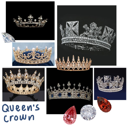
In my mood board I looked at a few different types of crowns, some more delicate with more natural shapes, and others with harsher lines and angles. I also considered what colours I might want to use, here I have chosen some red and white gems. I think these would match well with the red of the King’s crown, helping to highlight their connection to each other, which again would help to show a narrative in my scene.
My next step is to use this inspiration to begin modelling a crown in Maya.
0 notes
Photo

Mystery Project: Lighting
For my mystery scene I chose to create the lighting in Maya. The Maya lights are much more accurate than the ones in Nuke, as they include things like shadows, which help to add depth to the scene. The image above is my first attempt at lighting the scene. When doing this I referred back to my own images to ensure I was creating accurate lighting that would match the photos, and to reference photos that would help to create a more stylised look.

I used one large area light in the front and two more intense point lights on each side at the back. When I rendered these lights and but them into my Nuke scene, I felt that they were too dark to be suitable (image seen below). I knew I could have changed this using a grade node, but I decided to do a few different interactions of the lights first instead giving me a change to experiment and try to create a more accurate light.

Second Attempt:

For my next attempt at lighting the scene I chose to add some warmer toned lights, inspired by the ones in my reference images. I thought this would be a good way to highlight the statue and make it feel central in the scene, so I added it as a point light above the statue, so it glows down onto it. When I added this to the Nuke scene, I noticed that it was still too dark and actually looked slightly out of place, so I decided to give grading it a go (image seen below). Although I do think grading helped my second attempt at lighting to fit into the scene, it still doesn't look entirely accurate due to the placement and colour of the lights themselves. As much as I wanted to add a warm toned light above the statue, it only seems to highlight the fact that this wasn’t part of the original image, so I made a third attempt at creating lights in Maya.
Without Grading:

With grading:

Third Attempt:

For my third attempt at lighting in the scene in Maya I did try to keep some of the warmer tone above the statue, but made it much more subtle in hopes that it would be more suitable for the original image. Similarly, I reduced the intensity of the point lights in the back, hoping to help them fit in with the lighting behind the trees in the original photo. I then added this lighting set up to Nuke and graded it to see if it would be suitable for my mystery scene.
Before Grading:

After Grading:

Final Attempt:
Instead of trying to create more lights in Maya, I decided to grade my first attempt in Nuke, just to see if it would work, as I was planning on removing the warmer lights in my next attempt anyway. After grading it, I actually found that this worked best out of all my attempts, for this scene. Unfortunately, these warms lights weren't suitable for my photos, as they were taken on such a cloudy day, so the more neutral tone of these lights worked well and looked natural in the scene. I think they also helped to tie everything in the scene together, making the statue look well integrated into the scene. Just to be sure, I also had a friend take a look at these and give me a second opinion; as I had been looking at them all day, I thought a new perspective would be useful in ensuring I made the right choice. Thankfully, they also chose this as the best lighting set up, so I plan on using these lights to develop my scene.
First attempt after grading (my chosen lighting set up):

I understand that this still looks quite dark, so I would like to continue to develop and work with these lights until I create an interesting final scene. However, I felt as though it was important to start with realistic and accurate lights to make sure they looked realistic in the end too.
Overall, I had a positive experience working though this interactive and experimental process. It was really useful to create and test iterations, as it helped me to narrow down what did and didn't work in the scene, meaning I can be sure my final choice was the right one. It also helped to further my understanding of the lights in Maya, as I experimented with different types of lights, their properties, and their colours. I hope that this will not only be useful in finishing my scene, but also in the future when I come to work in Maya again.
0 notes
Photo

Mystery Project: Geometry Improvements
After adding lights to the scene in Nuke, I noticed that I had a few issues with the model of the statue; it was picking up parts of the background image around the edges. Because of this, I went back into Maya to amend this. The first step I took was to select some of the edges and bring in the sides slightly, this made an immediate difference, already making the model look more accurate. However, it was making much smaller changes that made it look more realistic. I picked some of the vertices around the top shapes and altered them slightly, actually making them look wonky and uneven. This helped the shape to look natural and realistic, as the actual statue is obviously quite old, so isn't just made up of perfectly straight lines.
When I added the model to Nuke, I also noticed that it looked slightly strange that you couldn't see through the gaps in the statue, so I cut these out in Maya. I only did a very basic method here, as the camera shouldn't get too close to these shapes, or move side to side in any way. I just added some new edges using the multi cut tool, to fit around the edge of the shape, then selected these faces and deleted them, doing the same on both sides of the model. Next I selected the corresponding edges on each side and bridged them, creating geometry on the inside when looking through. I also altered this slightly to allow the statue to look slightly more hollow, as the gaps we see aren't the only ones on the statue.
This wasn't something I have ever really tried before, but I was pleased that I was able to improvise when I came across a problem. Furthermore, when I added this back into Nuke, I did notice that it looked a lot better and fit in with the rest of the scene, so I know that going back and making changes or more iterations is really useful in creating our best work. I’m going to continue this back and forth process as I carry on creating my mystery scene, as I think it will help me to experiment, while I also have more of an opportunity to reflect on my choices, making sure they are the best ones for my work.
0 notes
Text
Blog Directory
Welcome to my Animation and VFX BA1B blog! I have organised this blog using tags, here are some of the most common ones and their meanings so you can reach them more quickly.
#Maya: All work I have done in and around Maya
#Nuke: All work I have done in and around Nuke
#Photoshop: All work I have done in and around Photoshop
#Research: All posts were I have researched and explored a topic
#Mystery Project: All work related to researching and making my mystery scene
#King’s Treasure: All work related to researching and making my King’s Treasure scene
#Film Language: All work I have done concerning the film language topic
#GuestLecture: Descriptions and thoughts about guest lectures I have attended
1 note
·
View note
Photo


Mystery Project: Nuke
Once I had modelled in Maya, I brought each element of the scene into Nuke to set up the scene again. I did that as I have more options for composition and grading in Nuke, while I am also more familiar with the process, so hopefully will be able to complete it to a high standard. This simply consisted of bringing in my images and geometry from Maya, adding a project 3D node and attaching them all to a scene node.
After this I added some of the Nuke lights to the scene. These are not the lights I plan on using for my final scene, however I wanted to use them to make sure all my geometry was accurate before I started. I chose to do this after reflecting on what went wrong in my Victorian street project. In this case I had gone through the whole process, adding the Maya lights at the end, before noticing afterwards that the lights highlighted some issues with the geometry, making it look less accurate. So, in order to save some time and hopefully have a better end result, I tested out the geometry with Nuke lights to see how it looked. I noted that the edges of the statue weren't quite right; they were too wide and picked up some of the background. Because of this, I know that I need to go back into Maya and alter this geometry to make it more accurate, creating a new iteration for me to try.
Overall, I think this step went fairly smoothly, as I was able to successfully bring in all my geometry and images to the scene. I am also happy that I was able to learn from my previous mistakes and test out the lighting with the geometry, not only showing that I can develop my skills, but also hopefully making for a smoother working process.
0 notes
Photo

Mystery Scene: Modelling in Maya
After I made the composition in Photoshop, I brought it into Maya to start modelling. I started by setting up the scene with a background, floor and camera to work from, I was then able to project my image onto this by setting it up as a material. Then I could start modelling some of the bushes around the edge to add depth to the scene, I did this by starting with a plane, then extruding the edges until I got the shape I wanted. When modelling the bushes, I used a version of the image that didn't have the statue in, so I could see what was behind it. I then changed this to back when I needed to model the statue. For the statue I started with a cylinder, then extruded it upwards to fit the shape. Although it appears to be a more complicated shape, it does have a fairly simple silhouette, so I found this to be the best method to use. I did have to slightly alter the edges, as it isn't a totally uniform shape, but this mostly consisted of selecting and moving some of the edges towards the top.
Once I was happy with these models, I grouped any that were close or overlapping together, and exported them. I also exported the camera, ready to set up the scene again in Nuke.
0 notes
Photo

Mystery Scene: Photoshop
Before I was able to start modelling my scene in Maya, I had to create an image with all the assets I plan to use. I was inspired by both the images I had used in my mood board, and the photos I had taken, as I wanted to chose the photos that would work best together. For the main background image I chose a photo with an open area of land surrounded by foliage and trees; this image was most similar to the ones in my mood board and the flat area of land was useful for adding my asset too. I did also add some extra foliage around the edges of the image to fill in any gaps, again using some other images from my photoshoot. Finally, I aded the statue to the middle. This is the top half of a much larger statue I took a photo of. I chose this image as I felt as though the lighting and angle were most similar to my background photo, which will hopefully mean the final image is more realistic and grounded in reality. In addition to this, it is also very similar to the photos of obelisks I have been looking at, so now I don't need to rely on a stock photo or a model made completely from scratch, which again I think will help my final scene to feel more realistic.
In terms of composition, I didn't have too many options here, as I didn't want to put the statue in front of the large tree in the background, while I also wanted it to stay close to the middle. The main thing I did was change the size a few times, before settling on something that seemed appropriate in comparison the rest of the image.
I chose not to edit or grade this image too much, as this is something I would like to do in Nuke later on. I feel as though they are similar enough in colour and lighting for this to be a successful method, however I know that I can always come back and make those changes in Photoshop if I need to. I also didn't want to change the image too severely in case it messes with the lighting later on, so I feel as though this is the safer option for moving forward.
1 note
·
View note
Text
Animation and VFX Conference: Raman Djafari
Raman Djafari is an animator and Illustrator based in Hamburg. His work is incredibly colourful and mostly character centric, often because he does editorial illustration, for example he did an illustration for the New Yorker. He tries to ask a question or offer a proposal through his art, making it really thought provoking to look at, as there are so many unique shapes and characters in the scene. Raman has also done 3D work too, working in blender to create a similar style to his 2D art, however I find it to appear slightly more unsettling perhaps, as the 3D element adds a lot more depth to the scene.
I found Raman’s work to be quite different to anything else I’ve seen, and especially different to the work we’re doing on the VFX course. Nevertheless, I did enjoy looking at his work and hearing about why and how he creates it, particularly because he attaches a meaning to quite a lot of his work.
0 notes
Text
Animation and VFX Conference: Marcus Whinney
Another talk we had was by Marcus Whinney, a character and technical artist. He graduated from NUA in 2012, then moved to working in mobile gaming, before getting back into creature and character art. However, he currently works in VR gaming.
Marcus began by telling us a bit about his process and how we can improve our own. He emphasised how important it is to have a large variety of references based on what you want to create, to ensure you have plenty of inspiration for what you want to create. After this, Marcus said he began working in ZBrush to block out the bigger shapes, which is not something I’ve used before, but he mentioned that this was an important step for him to get a good silhouette. I actually think this would apply to my work too, as getting a good silhouette helps to make the character or item more recognisable. Finally he mentioned that it is important to start with the bigger shapes, then work in the smaller shapes and finally the details.
Overall, I found this to be quite informative in thinking about how we might work on designing a scene or a character, and especially interesting because he designs so many unique characters.
0 notes
Text
Guest Lecture: Tomm Moore
We were also lucky enough to have a presentation from Tomm Moore, who is the creative director at Cartoon Saloon. Cartoon Saloon started in 1999 between Tomm and some of his friends who were also studying animation at college in Ireland; they now have around 260 employees in their studio. They originally only worked using pencil and paper, however they have moved on to creating more digital work since 2012. Because of the way they work, they don’t have a fixed pipeline, and stick to whatever is most productive for them. Similarly, they had some special sequences for their most recent film, Wolfwalkers, that used VR; because of the less structured pipeline, it was much easier for them to implement things like this to the production.
After this, Tomm also went over how they have been working in the pandemic. He said that people were enjoying working from home, but he did feel like they were missing the more collaborative elements of working in a studio. Luckily for Cartoon Saloon, they had been used to working with people abroad, so were prepared for people to work at home, and were even able to send out any supplies and equipment that people may need. Similarly, Tomm felt as though working from home was actually cheaper and more environmentally conscious, as they didn't need to pay for any travel for research or award shows. However, he hopes that they will be able to work with a hybrid of this in the future, with people working at home if they are comfortable, but also going into the studio for more collaborative work.
Finally, Tomm was able to answer a few of our questions. He began by emphasising how important it is to have an individual style, as it means you are less likely to be compared and pitted against others. Because of this, they chose to embrace the 2D nature of traditional art, even keeping some of the rough lines in the final shots to add a more natural feel. He also reflected on his own work and discussed that a lot of his films focus on darker tones. Tomm actually mentioned that he felt as though the tone may have been too dark occasionally, especially since he usually creates family films, so it is important to contrast these darker themes with a much lighter visual style. He also spoke on character design, showing us a few of his own designs that had been used in his work. One of the main things he mentioned was that it had been really important for him to base his characters on real people, as it helps them to feel more grounded and realistic. This goes for both their design and their personality, as it can help to add flaws and relatability to a character, making them more interesting.
Overall, I really enjoyed Tomm’s presentation. Although he focuses on 2D hand drawn animation, I think a lot of his advice is applicable to VFX as well. For example instead of basing a character on someone we know, it might be useful to base a scene on a familiar place. This again would make for a more realistic result that is grounded in reality.
0 notes