
Statistics
We looked inside some of the posts by milli3stuff and here's what we found interesting.
Average Info
Notes Per Post
0
Likes Per Post
0
Reblog Per Post
0
Reply Per Post
0
Time Between Posts
9 days
Number of Posts By Type
Text
17
Last Seen Tumblr Blogs


Fun Fact
Tumblr.com rank in the US is 25.
Text
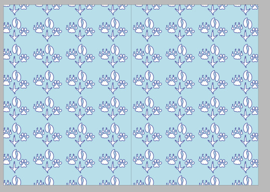
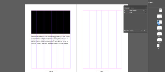
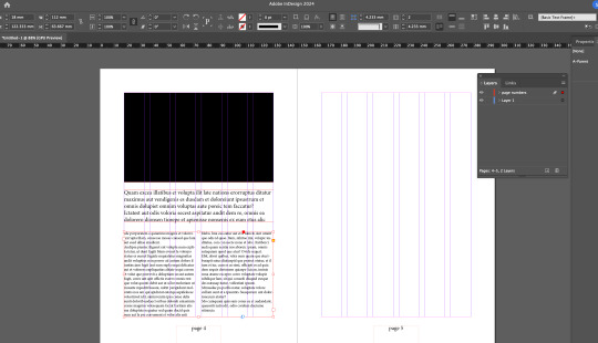
edited end pages so that some paws weren't cut off in the middle and outside.

Moving the text and titles down, so not as much negative space
0 notes


Text
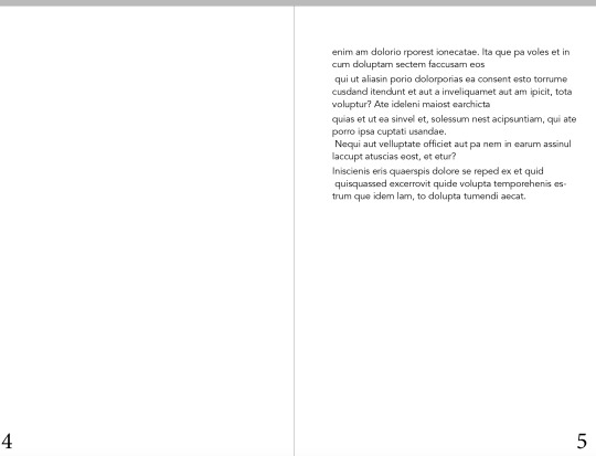
Home work children’s book pt 2

Starting to work on contents page, debating whether I have the text center aligned or to the right.
This is it to the right for comparison, I think center aligned might suit best, as it will match the rest of the text in my book and contents pages are often done like that, makes it clear and easy to read/not too clustered.
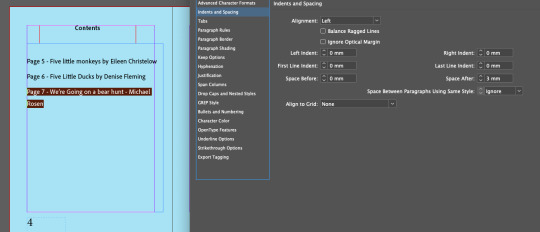
Adjusting space after to 3mm to improve readability, may have to increase more to get all text on one line and not one word on its own, or I might do soft return and put the author below the title.

Experimenting with leading to see if I prefer the distance between the lines smaller or bigger, changed it to 28.
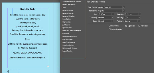
I decided to do 31pt leading, as it makes it more simple, easy to read and clearer which is good because this is a children’s book and I want the text to be easy to read and clear.
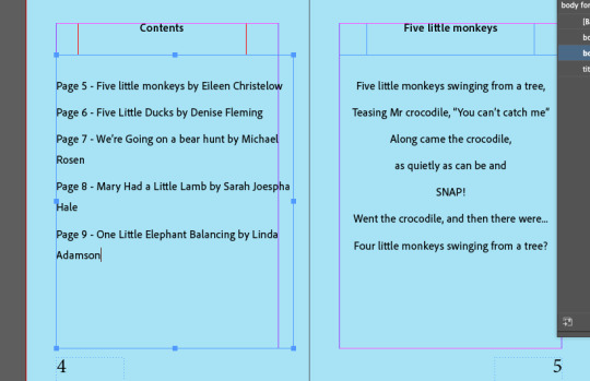
Added in all the text to my contents page but it goes outside the margin and some words are on there own which doesn’t look good, so will have to make some changes.

I center aligned the text which I think looks better and keeps consistency throughout my book, as well as I added soft returns between the title and the aurthors to give a small subtle return so it doesn’t look as broken up and spread out. I also made the text in the contents page 5pts smaller, as I feel like this differentiates it from the stories and it isn’t as important to read so doesn’t need to be as big.
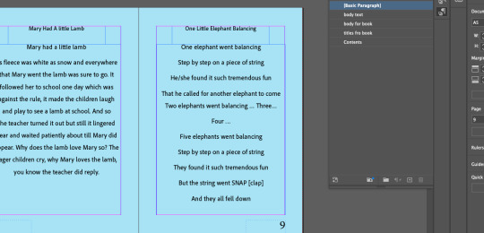
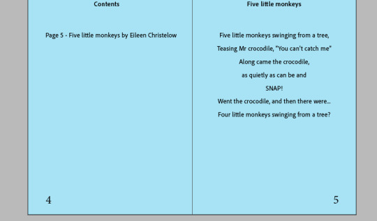
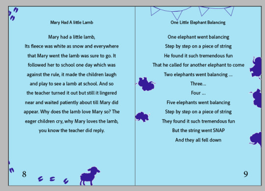
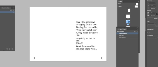
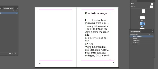
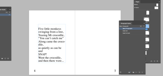
Added in my final story.

And then put in soft returns between the sentences to give it a more subtle flow of sentences and so it doesn’t look too broken up and spread out, otherwise the text/readability doesn’t flow as well.
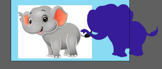
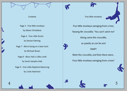
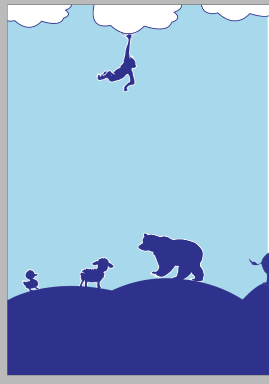
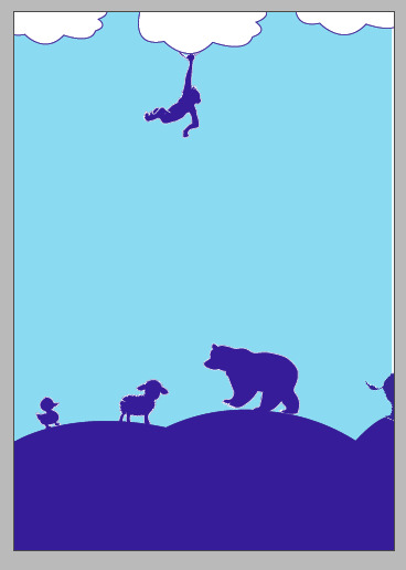
To create the imagery for my front cover and throughout my pages, i inserted an image into illustrator, and use the pen tool to outline the elephant and then fill it with colour. I did this with all animals used in my book, I did them all myself with the pen tool to create consistency and be able to change any aspects of the image I didn’t like myself.

added them all to a cover page, added text with a strokes outline to match the colour of the animal and placed them strategically around the page, taking parts of the text out by creating an outline then using the eraser, to make it look like it was bitten by an animal. I used the pen tool to create the hill as well.

I then decided to add a white stroke to all the animals to tie in the text more with the animals as the white text looked a little out of place and stood out a lot.
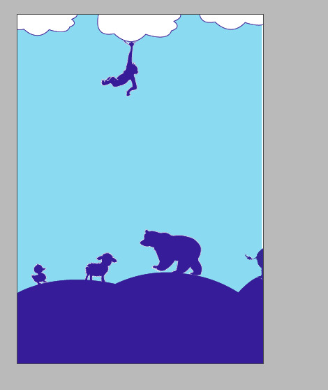
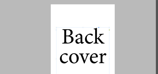
For my back cover, I wanted it to remain in theme and tie in the front cover so I removed the text and rearranged the animals.

To add imagery to my stories I took the animal from the cover page to match the story, and used to pen tool again to draw some small images that match the animal and placed them in the margin.

I mixed a variety of the stories in the contents page to bring them all together subtly.


My final pages + end pages design.
I am happy with how it turned out. I kept a consistent theme throughout my whole book, especially with the text. I used the same size text on every page, with the same margina, alignment, leading and space after to create consistency and theme. I think it is easy to read and well layed out. I am also happy with my imagery I did and my colour theme. Next Time, I would like to have more time to create more detailed and interesting imagery.
0 notes
Text
Homework - Children’s book

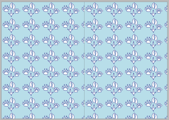
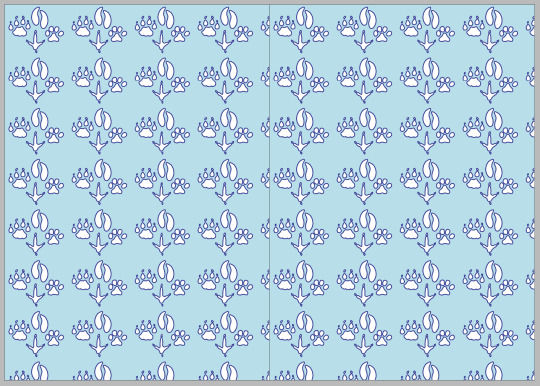
Creating a pattern in adobe illustrator for my end pages.
Created a rectangle using the rectangle tool, and filled with my colour.

Chose animal print image off the internet (animal prints because my book stories are all about animals).

Used the pen tool to draw over the image to create my own image and to change anything i wanted to (shape etc), using short cuts like doing half of the image, duplicating it and flipping it to get 2 exact same shapes but reflected against each other.

Like in this print, then using the other pen tool to fix my points and make it more accurate.

Grouping my different paw prints, placing them onto my rectangle, and then opening my swatches panel and placing it into there when the little blue line shows up.


Double clicking my swatch, then playing around with different tile types to see what looks best.
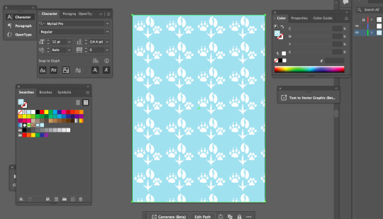
Placing my chosen pattern onto my page.

To create my cover page, I used an image of a monkey and again used the pen tool to trace over it and add my own adjustments.
Placing it overtop of text, using the same colours to create a theme and consistency.
Going into indesign, making the background of my pages the same colour as my end pages and cover by using the eyedropper tool, and doing this in the parent pages so that it transfers to all pages.

Went back and added a dark blue stroke to my paw prints so that it matches my cover page as well as makes it more clear, defined and easier to see.
0 notes
Text
Lesson 1 - 14/07/24
changing the text within the body paragraph using paragraph styles creating another basic paragraph and naming it body text then double clicking and can change fonts etc for that paragraph
press w to get preview
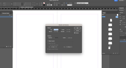
layout -> margins and columns to edit these
command A selects all text in box
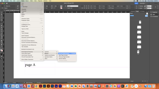
to create all page numbers go type -> insert special characters -> markers -> current page numbers and put A on both pages then check other pages (double click)
double click parent page to edit it
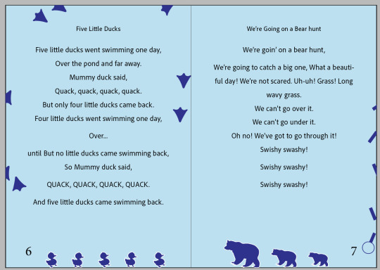
1 story per page - 5 stories - end pages with graphics
drag the blank page that says none above parent page to any page to make it blank and parent pages wont apply
to create a soft return (control the space between paragraphs/lines instead of a full return) - shift return - body paragraph - indents and spacing - change 'space after' number (like below)

Main things :
soft return is shift return
in paragraph styles - basic character styles - leading setting
indents and spacing- space after
press shift return to put a sentence all along one line
Might change margins/columns as even though they are the same the page number makes it look uneven/bottom heavy
i think this looks better and more even
Trying different fonts:

trying different paragraph alignments as well and increasing leading

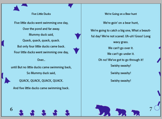
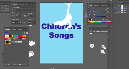
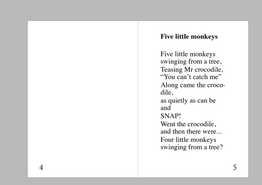
Decided on a smaller font size as my songs varied in length and smaller font size worked best. Center aligning all of the paragraphs and titles to keep consistency. Did soft returns on these 2 so far, which looks good as the gaps were too big before. i did them more strategically on the Five little ducks not doing soft returns in some areas to add dramatics around the 'over...' and the Quacks at the end, so it makes it more clear and bold and so it stands out from the rest of the text.
0 notes
Text
Indesign notes 21/03/24
window -> pages
click the plus at the bottom of pages panel to get how many pages you want (pressed 11 times for 11 pages)

creating a text box then enlarging it
W -> preview page

copy and pasting onto last page
holding option and then up arrow key shortens the gap between back and cover when text is selected
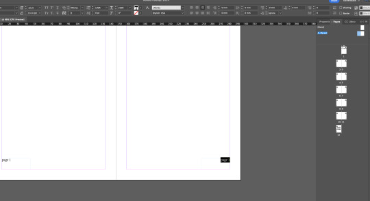
added page numbers while A-parent is selected using text tool which adds pages to rest of pages
A-parent- If selected applies something to every page when you add something
doing this to box page number on this page (page a) and doing the instructions above, changes all page numbers to the correct number.

dragging the none page onto the page you want no page number
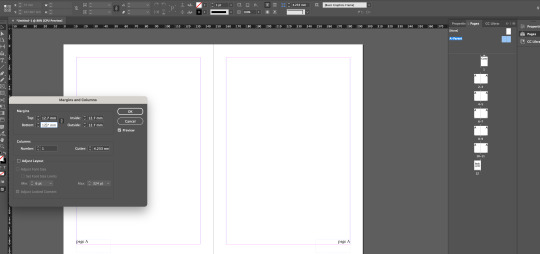
changing margin size - the chain allows you to change them separately

changing the column number

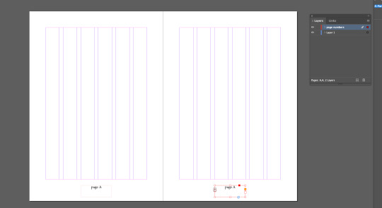
create a new layer then selecting both page numbers and then drag the little blue box in the layers panel into the new layer create (in this case page numbers layer)
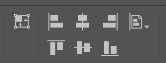
the page tool in this image is align page which is what we did to the page number while in a-parent
then centring the text inside the box

using the rectangle tool to create a rectangle which snaps to the lines in the column and the outside
creating a text box then going type and fill with placeholder text

changing the column number to 2 up the top under the normal arrow which splits the text into 2

adding too much text into the bottom text box, creating a little red square with a plus in it on the side of text box, then creating a new 2 column text box on the second page and then clicking the little red square and placing the extra text that was hidden into the new text box.
text wrap to put text in the middle of other text


adding this onto a new page
dragging both a-parent blank pages that sit next to a-parent on layers panel and dragging them to the plus at the bottom of layers panel to create b-parent

then making both text at the bottom of the page white

dragging the little right pages next to b-parent onto the right pages below that (eg onto page 7)and vice versa with the left onto the left pages, to make the white letters seen through the black.
Illustrator:
window -> control to get control panel up

using the pen tool to create a bird like shape and then direct selection tool to edit and improve it.
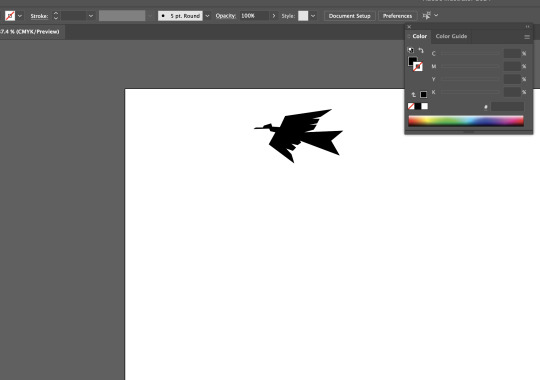
shift x to fill with black
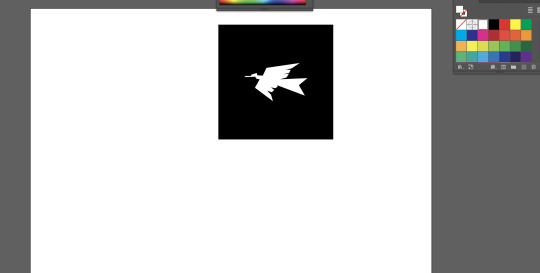
creating a rectangle and then changing the birds fill to white and arranging to front of rectangle
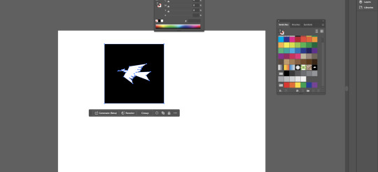
selecting the rectangle and the bird and drag it into the colour swatches panel a blue line should pop up in the panel and place it there next to the patterned square

working with the pen tool and revisiting handle sizes and lengths while getting nice curves
0 notes
Text
Notes 14/03/24
Indesign:
shortcuts:
Space = pan/create a space
Zoom = 2 mouse left click - out, right click- in
T = type tool
V = selection tool
A = direct selection
to make column, direct selection tool and change the column number to 2
to type or fill paragraph go onto type, then type bar up the top and then click fill with placeholder text

changing font and spacing under paragraph style options
pressing W = preview mode
VA - up the top changes the spacing on the lines
When in text editor shift + arrow keys to highlight text - up and down = lines, and left and right is characters/words
shift, command and arrow keys selects whole words.
Also hold command to select larger element
shift return = soft return

to get rid of hyphenations

making headings by pressing return before and after the word. highlighting the heading, making it bold, creating a new paragraph layer by pressing the + at the bottom of the panel, then clicking on the headings layer to make them bold like the first one created.

changing the space before and after
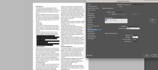
Highlighting the text, creating a new layer, double clicking on that to open the panel and changing it to bullet points and changing the spacing.

changing the character style by highlighting the text, creating a new ;ayer and changing the font style.

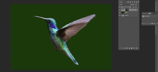
adding frog into indesign after editing it in photoshop by going window link. then refresh

The image is always in a frame
to rescale an image in its frame - shift command


Shift option to make the frame smaller/crop it and keeping it center.

window -> text wrap -> to place image in text

moving the text away from the sides using text wrap and using the text wrap panel to adjust the numbers to adjust the text spacing next to the image.
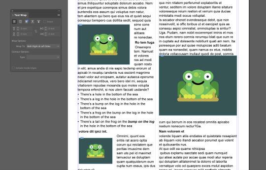

create an ellipse around the frog, click onto the outside of the circle but still on the image, then do command x, then click on the circle and then right click on the circle and click place into.

using text wrap again to go around the shape.
0 notes
Text
Homework 12/03/24

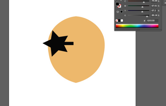
Vector image number #1
To create this vector image in illustrator I used the pen tool and create curved points by placing an anchor and then holding the point and manovering the move to create a curve ensuring that I had straight, small and even handles. I then duplicated the base shape, clicked command T to make it the correct size by making it smaller while holding option so it kept its shape, I then repeated this with the last one making it even smaller. I then filled the shapes with colour. Picking the colour for the biggest one first then using the eye dropper tool to select that colour and then slightly adjusting it for the second colour, then repeated that for the 3rd.

Vector image #2
For this vector image, I created a shape in illustrator using the pen tool that involved curves and straights, I originally created the bottom of the fire by using the pen tool and creating a curve, I then turned the curve to do a straight by holding option then releasing and creating a curve. I did this on both sides. While in the middle just doing some straight lines with the pen tool. I then used the direct selection tool to tidy it up ensuring it was smooth and even. I then duplicated this object, and made it smaller placing it inside the first object and added fill and changed the colour to both of them. I then created the yellow part with the pen tool and creating a simple straight lined shape and filling it with yellow, then using the layers panel moving it behind the other two objects.
I moved these two images to photoshop as smart objects.

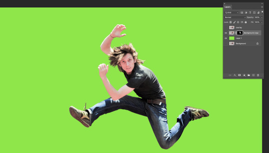
This was my original picture I aim to remove the background from, which shouldn't be too difficult considering the background is plain and the man has a clean cut out.

Because the background was plain it was easy to remove, I went to the layers panel and did command J to duplicate my current layer, I then went to the properties panel, and clicked remove background which created a mask and removed the background of my image. I used this way to do it because it was a simple background so the computer was able to pick it up easily. However, It did leave some parts of the background there around the man, so I need to remove that. To refine my edges I need to go to the mask and use the brush tools to brush off the parts of the background image that still remain.

This was the other image I aimed to remove the background from as it was more complex and detailed so therefore, harder to remove.
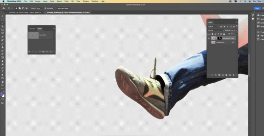
To remove the background on this image I used the magnetic lasso tool, I right clicked my Background layer and clicked duplicate layer. I then clicked the eye icon to the left of the original layer to turn that layer off. I then selected the Magic Lasso tool and started drawing along the edge of my subject with the tool. This starts drawing the path for you as you move your cursor. This took me some time and patience as I wanted to be steady, and deliberate so that I did it as close as I could as I needed to go around the person completely and connect to my starting point. I then deleted the background.

this is what it turned out like.
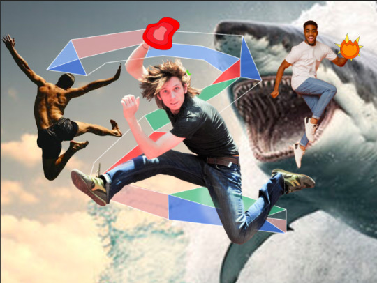
I then added all the images onto my original image.
0 notes
Text
7/03/24 Notes - selection and Marquee tools
select most of the thing using the easiest tool
work on the layer mask with more manual tools
paint on layer to finesse selection
when selecting:
holding shift adds to selection
holding option subtracts from selection
holding space allows repositioning of marquee


creating a mask and creating a shape to draw on in the mask. Editing the shape in the mask with black and white adjusts the shape outside of the mask allowing you to add or erase parts of the shape easily.

option delete in the mask with white as the colour to delete segment
command A - select all
command D - deselect
command i - invert selection
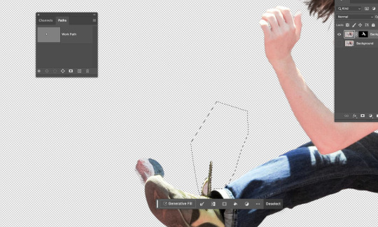
using the polygonal marquee tool and outlining the parts you want to delete then enter the mask and go option delete
using the paint brush tool to erase and tidy up the hair, adjusting the size of the paintbrush to get in between the hair, to make it less spikey and un-natural you can change the opacity to make it blend easier and look less harsh.

turned it into a single layer file and put it into illustrator and used the pen tool to draw an S like shape, then created a heavy stroke and rounded the ends in the stroke menu.

Put it back into photoshop using place linked and placing it behind the man, using place link allows me to edit it in illustrator and save it then my changes will be transferred to photoshop automatically.

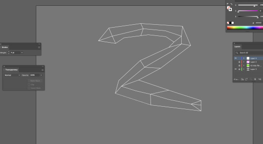
Went back into illustrator to use the pen tool to create a snake looking thing using straight lines and then adding the lines inside the snake with the pen tool and adding it to the points.

added colour to the segments by using the pen tool with coloured fill and traced the different segments with the pen tool, then saved on illustrator and it automatically updated in photoshop and then tidied it up using the paintbrush in the mask.

adding a background by copy and pasting one off the internet and pressing command t to enlarge it while holding option so it doesn't distort the image.
I enjoyed this task as it wasn't too hard but also allowed me to use and practice majority of the skills we have been working on in the previous sessions. I felt confident while working on this and was able to keep up and understand what we were doing. This task helped me to understand masks and painting with the white and black more as well as using the object selection tool to create an original cut out of the man, and then being able to tidy it up in the mask as well as with the marquee tool. It was also beneficial for me to know how to transfer images from illustrator to photoshop as that will be useful to know for projects. Overall, I felt confident with what i had done and my amount of knowledge and understanding i had by the end of the session.
0 notes
Text
Class Notes 6/03/24
practicing using the brush and keyboard cuts.
b= brush
e= eraser
[ ]= bigger or smaller brush size

changing the opacity of the brush -> can use number tools to change 0-9 on the keyboard for each percentage of opacity.
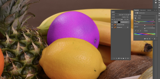
Hold down option to get the eyedropper tool to get the colour you want from somewhere else on the page.
Option delete -> will fill selection with foreground
Command and delete -> will fill selection with background colour
Command A -> select all
Command A and delete -> Clear Layer

Using the Option delete fills selection with colour, elliptical marquee tool to create the circle.
While selecting:
Shift: Add to selection
Option: Subtracts from selection
Space: Reposition marquee
V -> to remove selected part from other shape
While using move tool (v): photoshop will move whatever is under your pointer (selection or whole layer)

Have the object clicked, then option and drag to duplicate


two images on screen and then create mask
to go inside the mask -> hold option then click on the mask
using black paint brush to erase parts of the image (have to be clicked on the white box but don't have to be inside it) and using white coloured paint brush to bring it back.
use the elliptical marquee tool to select object then use polygonal lasso tool to remove and make selection to the thing its connected to and close it by clicking where you started but hold option when first placing lasso, then use hue/saturation to change colour.


I applied different selection techniques to remove backgrounds and change the colour of objects. i practiced these processes by trying it on different objects while using slightly different techniques each time. although the class was fast-paced and got more technical towards the end, i managed to keep up and accomplish the tasks. the main tools and techniques used in this were the marquee tool, lasso and the pen tool. these were good to get a hang of in photoshop and doing these tasks allowed me to practice these techniques and gain more confidence on photoshop.
Path tool:
Pen tool -> Draw a path
Arrow Tool -> Tweak paths
windows -> path
Command click on path thumbnail to turn path into selection.
0 notes
Text
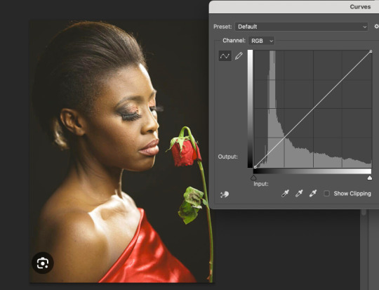
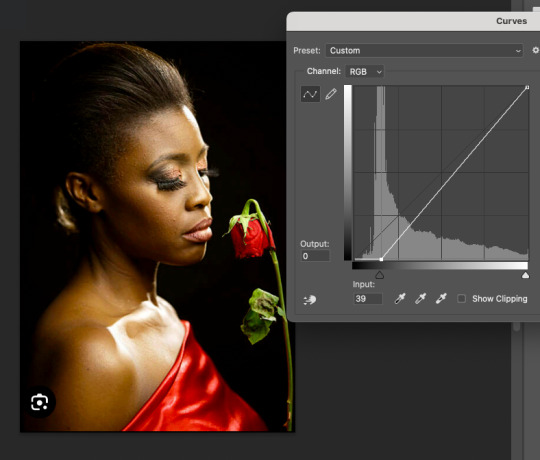
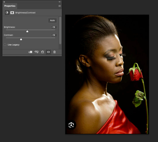
Image 4 - Black and white

Before and after of the black and white image, The original image was too light and in turn made the objects in the image lose definition as well as the image becomes low contrast and over exposed making it less intense.

By darkening the image using the histogram and adding black more into the image this already made the image more defined and added more depth while creating a more dramatic and intense contrast with the shadows and light water.

Decreasing the brightness took away some of the light that caused the photo to become over exposed and created a more realistic photograph, changing the contrast made the black and white look more defined and cleared the image up.
0 notes
Text

Image 3 - black and white
Increasing the black in the photo to change the over exposed lighting as there was too much white.
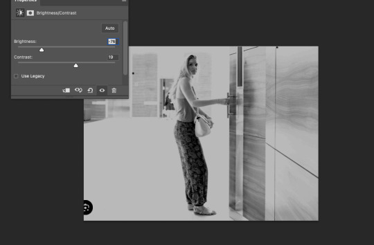
Increasing the contrast as it is a black and white photo so the contrast is high between black and white and makes the image more intense and clear. Taking the brightness down to take down the bright light that made the image over exposed and washed out.
0 notes
Text
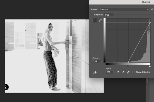
Image 2

This is the before and after of the image that I colour corrected.
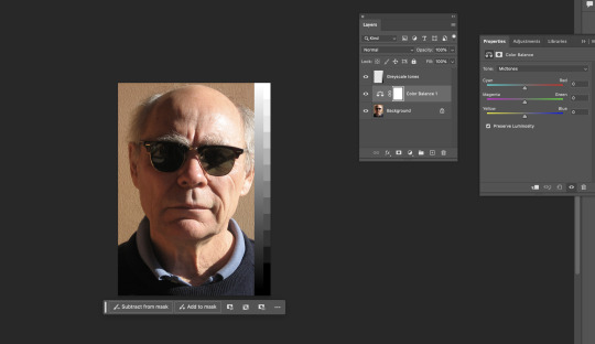
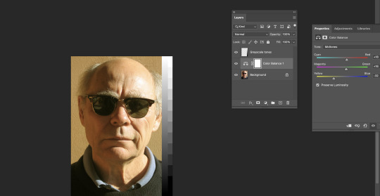
The original image is very over exposed as the image gets lost in the light and the features of the image have lost their colour and detail. This image was harder to correct due to the light colours and there aren’t many defined lines.

I changed the histogram to add more black to make the image slightly darker to bring back some of the details and colour.
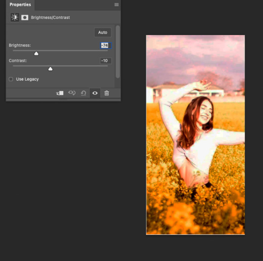
By decreasing the brightness †his made the sky more defined and darker as well as making the girl more seen and defined. However the colours don’t feel natural.

By changing the colour balance this added warmth back into the photo and colour corrected some of the colours in the photo making it look more natural and realistic. I added more yellow for the flowers, and more magenta and cyan for the sky.

By lowering the saturation it made the image less intense and a bit softer to make the colours less harsh and match the tone of the image.
0 notes
Text
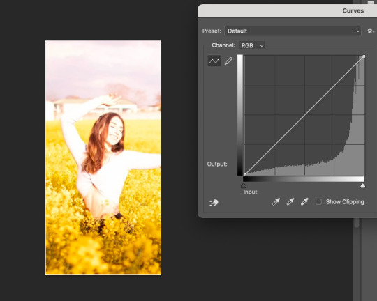
Homework - Colour correcting photos on Photoshop
Image 1

This is my Before and after of a coloured image that needed colour correction.

This is the original image that needed colour correction. This image is over exposed as the black in the image is more of a grey colour and this washes out the contrast of the black and red.
This is the original image with the histogram next to it
This is the edited histogram i did, by adding more dark and black into the photo it already looks more dramatic and more contrast between the black and red and adding more depth to the photo.
By changing the brightness and contrast it added to making it more contrasted and less over exposed.

Increasing the saturation of the photo made it more pure and more intense while adding some warmth back into the image.

The final image feels more dramatic and intense as the background in now black instead of grey which allows contrast between the red and black giving it a more intense feel, as well as it less over exposed now and has darkened areas that were lost in the bright light.
0 notes
Text

Planning for my vector image homework

Reference image to trace the shape of the face using the pen tool

Loaded it into photoshop and placed the ruler in the middle of the face, then used the pen tool to trace half of the face and used the handles to create the curve and adjusting it using the direct selection tool.
I then used the reflect tool to mirror it and create an even face that is equal on both sides.
I then used command J to join the face together.

I then used the fill tool to fill the face with colour.
To create the sunglasses I used the star shape tool and the rectangle shape tool and joined them together.
To create the eyebrow I used the pen tool using straight lines.
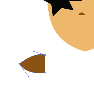
I then used the pen tool creating and straight and curved shape using the alt option to create both curves and straights in one shape to create half the lip.
I added the ear as well as the other facial elements with the correct colouring to half the face.

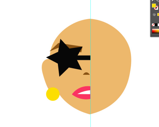
I then used the reflect tool to mirror the face onto the other side.

I joined the face together and added the hair by creating a shape and adding an effect to it to give the spikey look, I then added some coloured parts in the hair using the pen tool to create triangles and then used the direct selection tool to adjust it to fit the face.
I used the pen tool to create the neck, however with it all looked blended together as it was only one colour, adding shading will add dimension to the face and neck.

I then used the pen tool to trace parts of the necks and face and curved parts of the lines to create a realistic shadow and then used the fill tool to make the shapes darker and looks like a shadow which added dimension.
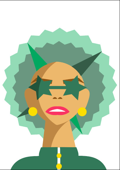
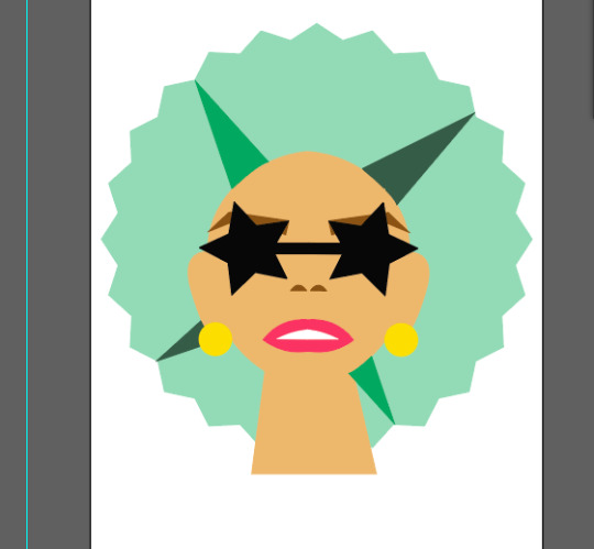
To finish off my vector image i added a jacket and shoulders using the pen tool as well as buttons using the shape tool to create even circles while holding shift. I changed the colour of the sunglasses and traced part of it with the pen tool so i could add a shadow using a darker green.
I enjoyed making this vector image on illustrator as it reinforced my knowledge I had learnt in class and continue to practice the commands on the key board as well as improving my pen tool techniques. It was good to practice adding shading and dimension to the image to make it look realistic and more technical through simple shading. I am pleased with my final product.
0 notes
Text
Notes from 4/03
Photoshop notes:
using photoshop histogram to look at colouring and contrast on the grey scale image.
Can change colouring and contrast using the histogram/curve with command m
RGB - Additive colour, CMYK - Subtractive colour
Tone (saturation)
Value:
Tint (brightness up) add white, Shade (brightness down) add black.
adjusting the values of the image to brighten it up.
by adding more white into the image it made the image more bright and added highlights to the key parts of the image.
Hue:
Hue (what colour of the rainbow it is)
Saturation:
colour intensity-
more saturation = more pure, more intense
Less Saturation = more grey, less intense

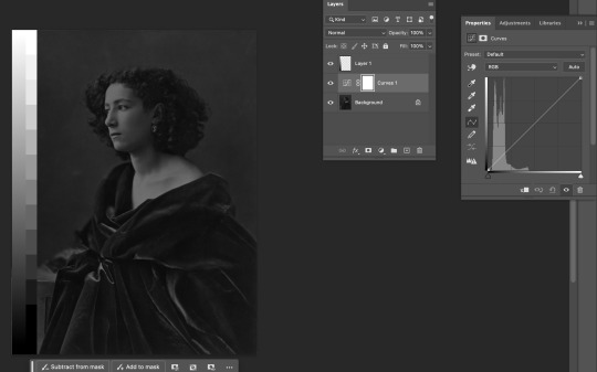
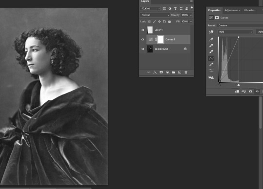
Adjusting saturation to bring out the colour of the cat. this made the image of the cat more clear and showcases the colours of it better.
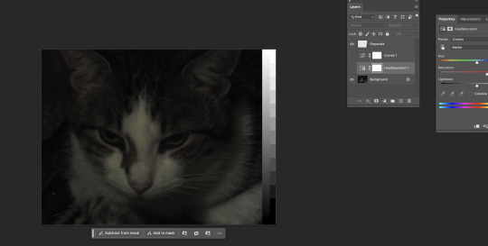
^The cat before adding saturation and changing the curve
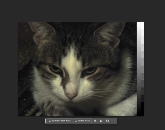
The cat after adding saturation and changing the grey scale curve using the histogram.
Adding curves to the histogram like a bezier to continue to change the saturation and contrast of the image.
Colour balance:
starting image-
dark, mid-tone and light colours of the image can be edited separately with colour balance.
adjusting the colour balance changes the tone of the image, it can make the image look warmer or colder and change the feel of the image through the colour toning. By increasing the yellow in the image it makes the image look more warm and softer.

adjusting the blue makes it feel colder and more harsh with higher contrast.

starting image ^

changing the curve and colour balance of the image to make a warmer image while deepening some of the features of the image that were lost in the lightness of the original photo. by increasing cyan, magenta and yellow this increased the warmth of the image. After the editing the image felt more realistic due to the colours like the green of the trees becoming more visible.
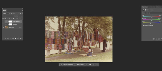
^ original

Adjusting the colours bringing out the warmer colours using colour balance and changing the shadows and highlights.

Creating a filter:
Changing the fill colour to black
option & delete - fills the whole page with black/fill colour
select the elliptical marquee tool to draw a circle
press delete so you can see the image underneath
command d to deselect
filter -> blur -> gaussial blur -> dial down opacity

shadows were too red but when we green it up we don't want to make it too cold.
Masks:
White -> show
Black -> hide

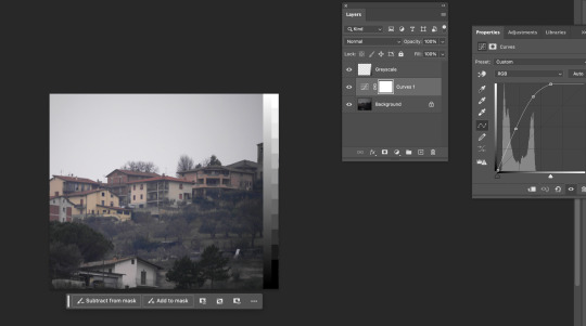
Using the gradient tool to create a split in the image to turn the sky darker without it effecting the buildings, to do this I made a mask and edited the top half of the photo, I did this through adjusting the contrast with the gradient tool on the mask.
This was useful to know, so that when editing a photo i can seperate it to edit the parts I want to without it effecting parts that don't need the same effect.
This class was a good introduction to understanding what each photo editing tool did, by understanding each element of the photograph and which tool changes what was very helpful to know what tool to use to target different parts of the image. i didn't know much about editing photos on photoshop but this was a good introduction into learning that.
0 notes
Text
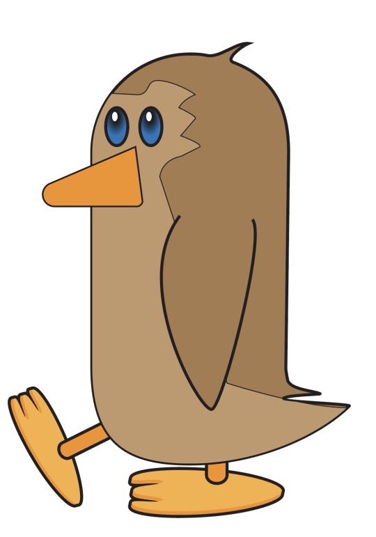
01/03
My almost finished penguin. This task was good for me to reinforce the techniques we learnt earlier in the week and put them to use in a real image where I had a goal in what I was creating. During creating this penguin my confidence in illustrator and using difference techniques increased significantly by using the pen tool to do things like reflecting shapes, using the join tool, pathfinder and gradients. I am happy with how it has turned out so far especially in such a fast paced lesson while learning many new skills. However, I will continue to practice these various techniques and shortcuts so that i develop them into my memory and they come to me more naturally in future tasks and projects.
0 notes