
Statistics
We looked inside some of the posts by minahilsheikh18-blog and here's what we found interesting.
Average Info
Notes Per Post
1
Likes Per Post
1
Reblog Per Post
0
Reply Per Post
0
Time Between Posts
5 days
Number of Posts By Type
Text
17
Last Seen Tumblr Blogs


Fun Fact
28.6 is the average number of monthly visits per US mobile user.
Text
Creative Critical Reflection
Q.1 How does your product use or challenge conventions and how does it represent social groups or issues?
Before I began creating my magazine I researched into a range of different magazines in order to identify the type of genre I was interested in basing my own magazine on. Due to my wide taste in music I decided to base my magazine on ones which I thought had covered more than one specific genre.
I started by analyzing the example magazines and so I focused on the main images first and I took this into account when styling and setting up the photo shoot for my magazine. The poses and clothing used in my images were specifically chosen in order to create a certain type of look for my artist. Another thing I noticed about the front cover images of example music magazines was that the background color is mostly neutral. The reason for this is to draw your eye directly onto the image rather than having a busy background to distract readers. So all I did was added little doodles with low opacity with one neutral color black according to my theme. For the Masthead I chose to use a Font that is different from most of music magazine just so it stands out from the existing magazines.The colors used in the issue I was annotating were black, white and red. The use of the color red was minimal as it only highlighted the more significant articles and features in the magazine i.e. the main article. I used these conventions in my own magazine as I believe that trying to cram in as many different colors and fonts into a magazine will end up making it look messy and unprofessional. These colors were also used for the Content Page and Double Spread as to go according to the theme of the Front Page.
The main concept of my magazine was to never give up on something you dreamt of as this is also the topic of my article. My target market, Young Adults play a huge rule in my magazine as every teenager these days wants to be different and unique, as music magazine related to Rap it will attract them to find their music taste and as Rap Music is a niche in Pakistan so more people will get to know about this genre. As music can be seen a very common hobby that a lot of people may pursue by buying music magazines or collecting music memorabilia such as vinyl’s. My media product does not specifically represent an ethnicity, however I believe that it would mostly appeal to geographical area.
Q.2 How does your product engage with audiences and how would it be distributed as a real media text?
The most important part of the magazine is the cover page and it is extremely essential for it to be able to attract audiences in order to have a good market. The Front Cover image is of Artist looking upwards with a dark background to represent the darkness and the hope he has inside which probably everyone needs during hard times, the colors are of three colored theme that I used but they give away a very appealing appearance and stands out from on the music magazines. Since the picture is only focusing on one product it allows it to stand out to a great extent. Also, high quality, tempting pictures tend to engage with audiences and allow them to be fascinated by what are the details related to the product and what does this particular issue include. Having a lot of text and items made it look very packed so less texts and huge font of the feature will be easier for the audience to notice everything in less periods of time. The masthead color was chosen keeping in mind the theme color of my magazine
Distribution of the magazine has been kept in mind while developing the final product. The magazine will be published online because users are digital natives and want their product available online and on every platform, this will even reach a mass audience. The online magazine can be more engaging and interactive as two way communication is possible between the reader and the author by giving feedback or questions related to the magazine. Another form of distribution can be done by offering users mobile applications where they can download Wrap-Up magazine and read through it on their mobiles conveniently. Hard copies of the magazine can be sold at local stores where the target audience can easily purchase it. In conclusion distribution of the magazine as a real media text can be done online or by distributing at the local stores. As long as it targets the right audience.
Q.3 How did your production skills develop throughout this project?
Although this was a short preliminary task it allowed me to develop sufficient photoshop and photography skills to be able to develop a magazine for my AS level final task. In the post production stage, my photoshop skills such as image cropping, resizing and adjusting the image were one of the first steps to the development of my magazine. Later, when I was working on my final task I experimented with gradient tool, shapes, margin adjusting, enhancing the picture etc which allowed me to polish my skills throughout the project. The photoshop skills I have developed as I have used a variety of fonts on the front cover and I have also used a number of different font sizes. These skills have effectively helped me to produce the product that I wanted to create as the main cover line is clearly displayed in larger text than the remaining cover lines, and is therefore more noticeable. For the images used, my photography skills developed to a great extent as I was able to capture exactly what I had in mind eventually- even though I know there were a few flaws when it came to getting the perfect picture but I tried my best to cover up by using photoshop which is always of a great help.
Q.4 What have you learnt about technologies from the process of constructing this product?
As for media technologies, I have learnt a lot of new skills from constructing my media product. I used a blogging site called tumblr which I am already familiar with as I have used to before but this time it I setting one up for my media coursework. tumblr is very efficient as it can be easily accessed and updated from smart phones as it has its own app, this came into use as If I wanted to work on blog at home or somewhere I don't have access to my laptop.

I used Adobe Photoshop CC to construct my media product. I am also familiar with this but never got the opportunity to learn it. Using different tools in this made me realize that this is no hard as I have used editing app on my mobile phone and this was just supposed to worked on more efficiently because of tons tools it has.

I used a DSLR camera to do my photoshoot though I’m already familiar with DSLR cameras as I’m interested in photography. I used different type of platforms to make my presentations like Canva to make it colorful and interesting. I also used a survey site for my Final Task surveymonkey.com which allows me to ask few questions from the target audience that I opted.
0 notes
Text
Refined Tasks.
Since this is the final task I wanted everything to be perfect so I changed somethings on my cover page,double spread and content page. On the left are the old ones that I refined later into the right ones.
So the firsts the cover page as you can see on the left is the old cover page that I made, after some refinements was exactly a perfect one on the right.
So I changed the colour and removed the stroke from the masthead, added the issue and tagline. I removed all the strokes added in the headings and changed the size of each description in a simple font. As I have mentioned in my Cover Page Task about the doodle background so thats what I did added doodles to make it more relatable to for my theme. I removed the barcode added some secondary images and changed the font,size and colour of the Main Cover Line. For the puff instead of the stroke I made a circle and wrote inside it to catch the readers eye more towards it.

The next is the content page, I didnt changed the font and size of any of the heading or descriprion but the page numbers only. I changed the background as I thought it was extra editing on the model so instead I opened a new image of the model and made it my background of content page. I also removed the rectangles and strokes from the fonts. Moved the contact us box to the right and added a box behind it.

The next is the doublespread firstly I changed the background of my doublespread as it wasnt that pleasing, Next the title of the interview so I copied the same font and size as used in the cover page.I reduced the opacity, used the picture I was using before as my second secondary image. I changed the place of the mafgazine name from bottom left to right corner of the magazine.
Then I changed the palce of my quotes and added rectangles on every line.

Im happy with the final cover,content and doublespread as they came accordingly to my expectations later.
0 notes
Text
Final Task (Double Spread)
In this task it got quite easy to use all the tools as I had to do two previous task. This task was interesting because we didnt do this in our prelimenery task
I started off by creating a new file with the dimensions of 11 inches for height and doubling the width into 16 inches in accordance with the dimensions on my magazine. I kept the resolution at a reasonable 150 pixels/inch.


Keeping in accordance to my theme, I used the paint bucket tool to colour my page black. Next, I added margins in this file, one in the middle to distinguish between the pages and then margins on 0.2 inches from the sides, two on the widths of the page and some three columns for the body copy and the content box I planned on adding later. This would ultimately bring neatness and uniformity to my body copy and double spread.

After that I decided to add my anchoring image. The image I had chosen was a mid close up of my model. I opened the image with the shortcut Ctrl O and used the move tool to then drag the image on the same layer as the file of our double spread and adjusted the image with the help of the transformation tool (Ctrl T) onto the left page of the double spread.

Next by using the rectangular tool I made a small box at the top right and wrote ‘ Exlusive’ by telling and attracting readers towards the main cover story of my magazine.You can see the font (Franklin Gothic Heavy) size and colour from the character box.

After that I added the title of the article, 'Fame AFter Failure', the same words I used for my main cover line to create a sense of an ongoing narrative and for it to be easily recognisable to the readers who may be looking for the cover story. It is for the purpose of being one of the first elements to catch the eye, making it the largest textual element on the page. I added the title with the help of the text tool and reduced the opacity.I used some of the blending options as you can see in the image above. I decided to have the title frame the anchoring image, all of it starting from the left side to create uniformity and neatness.

The next step, I used rectangular tool to make 10 boxes for each quote line. The size,font and colour are in the character box,

Next I added the standfirst with the help of the text tool by clicking and dragging till a text box of appropriate dimensions was created. as not to attract more attention but to still be the second textual element the eye drags too since its situated right above the title. This too was in white font, same as the title to stand out against the black background.


Then I added the body copy to the right page by utilising the text tool, clicking and dragging till text boxes of the needed dimensions were formed. I used the font size 12 pt and kept the font colour white which made the text stand out against the background. As you can see the Questions are in bold and in different cont and size you can see the difference in both texts in the character box above.

The secondary images I added, a mid long shot, was in the second column of the right page, in between the text. I chose this picture because the aesthetic of dark and colours not limited to the plants in the background and the picture itself captured the essence of the artist well.

Next I added the magazine name on the top right corner page with the same font but different size and colour also added a stroke by using the blending option.

The next step added the page number in the footer on the lower right corner of the right page with the help of the text tool.

I'm glad that the double spread has turned out well and how I wanted it to.
0 notes
Text
Final Task ( Content Page)
So the next task is the content page, I had fun making this too, Alot of hardworking but it was worth it. As my main cover story is on the rapper so no secondary images are used and as many music magazines mostly focus is on the cover story so I did the same.
So by doing the same first step I did on my cover page, to open a new file in photoshop with the pre-chosen dimensions


So now the new file of my content page is here.

After that I opened the image I had finalised for my magazine cover, transforming it with the transformation tool through the shortcut Ctrl T, to fit the cover appropriately, keeping the positioning of the masthead and other elements.

The next step is the typography so instead of writing content I wrote “Inside this issue” and you can see the Character box for the size,font and colour.

In this step the font is same but the size is reduced and some blending options like stroke and satin is used.

The next is the Magazine name with same font as used in the cover page but size is reduced.

Now the headings of the content page I used the following character box font size and color.

Now the descriptions are told, font size and colour are in the character box.

Now thr page numbers written at the end of every content. The font is bold so the numbers are clearly visible for the readers.

The next step I did was made a rectangle for the contact us sectiob by using the rectangular tool and reduced the opacity . I wrote a Contact us as mentioned in the character box I used the stroke option from the blending option. I also used some social network PNG’s .

Next I wrote the username to find us on, For this I used the same font as all the ‘wrap-up’s’ have in this I used a drop-shadow and a stroke to make it clear for the readers to see the right username for contacting.

So this is my final content page which Im quite happy with my content page, it is simple as simplicity is the key. The simplicity is according to my theme which I like it hope you like it too.
0 notes
Text
Final Task (Cover Page)
So after choosing the cover photo, I finally got to design our very own magazine cover for the genre of our choosing which in my case was an Rap music.
First by opening a new file in Photoshop with the pre chosen dimensions for my magazine, a conventional 8 x 11.5 inches and a sustainable 150 pixels per inch resolution.


After that I opened the image I had finalised for my magazine cover, transforming it with the transformation tool through the shortcut Ctrl T, to fit the cover appropriately, keeping the positioning of the masthead and other elements.


Next I drew some doodles on a page and scanned them and opened them in photoshop by using the blending option I decreased the lighting and merged it with the main image

So this is how the doodles merged with the main image.

Next step is “Masthead” so now I’ve placed my masthead, you can see the font, size and colour I have used on this. Also I wrote the issue date over the masthead and a tagline under the masthead.

Next by using rectangular tool I made three rectangles for the cover lines and reduced the opacity.

Next I wrote the headings of the three cover lines. You can see the font, size and colour in the character box above.

Next I wrote the cover lines under each heading. You can see the font, size and colour in the character box above.

Now I have added some secondary images that are discussed inside the magazine. This shows that the audience has a variety content to see inside the magazine.

So now for the puff I used the circle tool and reduced the opacity.

So I filled the puff you can see the character box for the font size and colour of the text also I used the the drawing tool for the two lines under the “Inside’

So now the next font is different as you can see in the character box also by using the bleding option I added a drop shadow to catch the readers eye and buy my magazine. The next text with the different font and size.

The next is the description of the Main Cover Line, I chose to write it above the cover line to make it different and unique.

So now the Main Cover Lines as you can see I chose different font sizes in this you can see the name of the font and the sizes are ‘Fame’ 277pt and ‘After Failure’ 100pt to go according to my colour palatte I chose the font colour ‘red and white’

Next I took a page and ripped it in half and scanned it, to make it more aesthically pleasing then I wrote another cover line of the magazine, see the character box for the font and size.

The cover paged turned out as I imagined and is happy with the outcome. The narrative of said media text also seemed clear through different elements such as body language, expression, special effects and even the typography.
0 notes
Text
Choosing The Cover Photo
After filtering the images I want to use in my magazine, I'm left with two very strong contenders for my magazine cover.
I did this with the help of Photoshop by overlaying both layers and decreasing the opacity of the pictures so the elements and their localisation can be seen.

Out of these two, I felt the scond option was the best fit for my theme, I also preferred the mid shot over the pre-planned mid long shot since it relays the model's expression better
0 notes
Text
Shoot Analysis (Selected)
Now I will be showing the selected pictures for my cover photo it was really hard to choose. Here are the selected pictures which are according to the theme.

This picture has a great shadow ratio as I wanted and is a mid shot according to my planning. I think this will be the best according to my planning and theme.

I really like this picture. Appropriate codes such as the cap is present. The model looks serious and striking and the red flare only works to increases the dramaticness of the picture. l might be using this for my content page if it blends well with the theme.

The picture is good for a secondary image as it's different from the primary setting, the hand gesture is representing the rapper look that I want. It will meld in perfectly with the black background of the double spread.

This too will be used in my double spread as an anchoring photo.

So this last photo for the secondary image that I’ve selected is very artistic and giving a really dark background of the model and a might be fit to the theme of my doublespread.
0 notes
Text
Shoot Analysis ( Rejected)
So after my first shoot which got totally rejected. I worked hard on my second shoot but there were obviously some pictures not according to the theme or they had some blurry, lighting or expression issues in them.

This would have been a good option for the magazine cover but it looks like his head is going backwards, his eyes look intoxicated and the prop (Cap) isn’t visible at all.

This image is too dark and it was supposed to be a mid shot, but its a mid close up.

Only if his eyes were visible this would’ve been a perfect shot!

His shirt ruined the aesthetics of this picture and also his one arm is holding the mobile for the fill light for me which totally got rejected. ( Error 101 No prop found)
0 notes
Text
Production Log
Lighting and Equipment:
This photo shoot was indoor, in the chosen location, Coffee Planet DHA. I utilised the lights already present in the basement of coffe planet. So as key light I used the head lamp coming from upwards No rim light was used and for some shoots the cell phone light was used as fill light. The light arrangments can change to needed requirements.

Epuipment:
For Equipment I will be using my own camera a Canon 70D-EOS and the lens im using is EFS 18-55 mm to take pictures for my cover photo. The camera is also accompanied by its basic equipment such as charger, a kingston memory card and battery.
Experience:
I arrived at the location at 1:30 pm and the model arrived 15 minutes after discussing the camera angles and shots we started setting up the place by removing sofas (due to tall height of my model he had to sit on the sofa for some shots) by adjusting the brightness of the made arrangements. The shoot started at 2:00 pm and an hour later
After a 30 minutes break ,we started the shoot again for the secondary pictures. This photo shoot was now relaxing since the apprehension of taking the perfect picture for the cover was now gone. We had fun and I managed to take an aloyt of good pictures in different poses. We were finished by 3:30 pm

Strenghts:
Knowing the model as a close friend made it really easy to work with him especially in terms of cooperativeness.
I was using equipment I had been using for the entire year, which meant I had been quite comfortable and had no problems.
My model is really good with cameras as he is a cinematographer himself and knows alot about shoots and lights he helped me alot in the angles and camera settings.
Since all the lights were already available on location, I didn't have to carry any lighting equipment and spend copious amounts of time setting it up and needing people to carry reflectors.

Weaknesses:
When my first shoot got rejected, I was really demotivated and lost hope for the next photoshoot because I couldnt find any model.
I forgot some basic essentials a rapper would have e.g headphones and chain.
After my final photoshoot I forgot to take the behind the scenes (proof) for my picture so we had to go back again at the location and took some pictures with which the bts was clicked by my friend.
Here are some bloopers of the model.

0 notes
Text
Equipment
For Equipment I will be using my own camera a Canon 70D-EOS and the lens im using is EFS 18-55 mm to take pictures for my cover photo. The camera is also accompanied by its basic equipment such as charger, a kingston memory card and battery.
Since I will be shooting in the indoor for the shoot the only light used will be the key light that will be the head lamp coming from above and I will use a simple (phone) torch light in case I need fill light The light arrangments can change to needed requirements.

0 notes
Text
Schedule
A well organised photo shoot, requires a schedule which is very important. A schedule ensures that tasks can be done on time if followed. So I've designed a schedule for my final photo shoot, taking in consideration the needs of all the people involved in the photo shoot whether that be the model or myself (the photographer)

0 notes
Text
Software
To edit the cover picture for my final task, and creating the magazine cover itself, I'll be using Adobe Photoshop version ( CC). This the software I used and practiced for my preliminary tasks and am therefore comfortable with the software. I can foresee myself using certain tools like gray scale and the poly lasso tool which is going to help me refine the look of my magazine, bringing it to the standard of my target market.

0 notes
Text
Industry Publishing House
DAWN is Pakistan's oldest, leading and most widely read English-language newspaper. One of the country's three largest English-language dailies, it is the flagship of the Dawn Group of Newspapers, published by Pakistan Herald Publications, which also owns the Herald, a magazine, Spider, an information technology magazine and Aurora, an advertising, marketing and media magazine.
.

Since my magazine will be in a frequency of monthly issues with 800-100 copies in circulation. With a limited supply my target distribution areas are mostly urban cities such as Karachi, Lahore and Islamabad etc. Physical paper copies will be provided at super markets, libraries and book stores. Digital version of the magazine will also be available through an online subscription method. The decided price will be Rs 300.
0 notes
Text
MISE-EN-SCENE
MIS-EN-SCENE by Minahil Sheikh
1 note
·
View note
Text
Location Recce Sheet
Location Recce by Minahil Sheikh on Scribd
0 notes
Text
Model Info
Junaid Sheikh
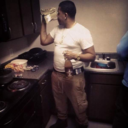
A rapper from Lahore Pakistan, (born July 14, 1996) . Currently recording at SQB studios. His songs are about: Justice, Equality, Corruption in Pakistan and The Judgmental Societies. Junaid Sheikh is trying to communicate with the Youth in his Rapping to fight for Justice and Stop being judgemental. He believes in bringing back peace and love in Pakistan.
So guys since I’m doing a feature on an artist, I decided to use the said artist on the cover of my magazine to attract the fan base and rouse the curiosity of others. I’ve decided Junaid Sheikh to be the on the main cover image as the model for my final task. The reason for this decision are many. Other than Junaid being a famous rapper his corporation making the shoot go smoothly and the end result something we can both admire. He’s exceptionally talented and I believe he can produce the look I want for my magazine. His ability to pull of any type of style and his naturally photogenic appearance also play a role in my decision.

0 notes
Text
Mock up/ Sketches
So after several sketches I was able to pick out the final designs for my cover and double spread. My cover will be having cover lines and puff (This is because I did find many puffs on rap based magazines) therefore. The main focus of the cover is on the image itself. The main cover line is presented at the bottom center of the page. For the double spread I will be using a mid-long shot of the model standing beside the wall looking in the camere and all hyped. The title is presented on the right page with a tag line introducing the topic and theme. The bodies of text are accompanied by a quote and a secondary photo on the left page.


0 notes