
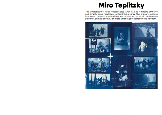
mirolovejoyteplitzky
MIRO LOVEJOY TEPLITZKY
BA Photography -- University of Westminster -- Journal
124 posts
Don't wanna be here? Send us removal request.
Last Seen Blogs

risk-toward-well-question
Untitled
adina123
Fandom ideas

disneyvacationplanner-blog1
Resort

beloligon
Untitled

neonprisma
爱到艺术
Video
Some notes and reference points for my book. It is very difficult to demonstrate certain aspects of the book in words so this is just a video, using other books I have referenced, to describe aspects like weight, cover material and embossing, themes that I intend my book to have.
0 notes
Text
‘Page’ Updates & Notes
My book is coming to completion and I am feeling good about it. I have taken some time to reflect and see if the images still stand within the narrative I have tried to weave. I am wondering if maybe adding my own text is not the way to go, however, for the time being I think it gives it the most immediate impact. For the future, I think I would like to give it to someone I trusted to write a piece as a foreword, but for now I am really happy.
I am still finalising my final piece of text to insert into the 3/4 stage of the book. I have written one piece, but am unsure as to whether it works. A lot of the writing pieces have been influenced by music and cinema, and the book as a whole really does reflect that I have attempted to use many techniques or ways of seeing cinema and film.
What has been tricky is responding and figuring out ways to think of the book from other perspectives. By that I mean to say that I have shown it to several people now and it has elicited so many different responses. In a way, that has been great in that what I want is for each person to have a very emotional and subjective response, but at the same time there have been so many differing opinions as to what they like and what they think could be different. Some people like the abstract nature of the work and that there is a fluidity in the narrative that is not altogether obvious or consistent from person to person or viewing to viewing. Others have seen that side of it as a flaw. Its a hard judgement because obviously people think in such a different number of ways, some like the linear narrative that is sure of itself, others enjoy a fractured style that may need further investigation in order to extract meaning.
Again, I must reiterate that there is no right or wrong with this book. In terms of technicalities, I have tried to be very diligent by making the font and text very similar, keeping images consistent in how they physically appear in the book. In terms of narrative though, I want it to be an homage to beauty, and that there is fear and triumph in beauty. I want it to draw you in, maybe remind you of your childhood, or of fear and pain at losing someone. Of falling in love, or of being completely lost and not knowing the way forward - its a book (I hope) that grabs at you and unexpectedly shocks your senses. A part of the text I haven't added yet reads ‘A cathedral of the senses’ and I think this is what I want it to be.
0 notes
Text
‘Exhibition’ Publications Updates
The magazine is coming along nicely, despite our difficult circumstances. We are almost at release date, and part of this has been getting things ready for our online elements. So far I have conducted two interviews - with my friend in America, Massey Blakeman (a model, business student, and musician) and Claude Scott-Mitchell (an actor, one of our contributing artists). Both went well and hopefully will be good editions to our website and online form.
The website is also up and running and looks fantastic. We will begin adding more and more to it. Our Instagram has been good so far, and hopefully our followers will expand as more and more content is published and as the days go by. Essentially, we are treating the Instagram and other platforms as extensions to the magazines pages, because of our inability to print copies at this time. This week I will be conduction another two interviews hopefully and these will either be made into live events or put up as Insta TV videos (which enables a longer discussion/video length).
Finally, I would like to add some areas to our online content that are not necessarily part of the pages of the magazine. I think other artists work might be a good thing to publicise and show online and just get things that we are generally interested in and think are worth showing involved on our various platforms. We also need to begin publicity and getting peoples attention to our events and interviews. Hopefully, because we are in lockdown, people will have time to watch/attend what we are producing and get interested in.
0 notes
Text
Exhibition Notes - Updated Foreword - 1/4/20
Since our group meeting I have re-written parts of the foreword and structured it in a way that is in line with the groups notes. It was suggested that while the abstractedness of the text was great, it was also important (given the circumstances of it now being more of an online publication) that some clear context should also be included and reasons or decisions for choosing the artists and the medium of a magazine/publication.
I think I have balanced it out nicely. It may need one more re-write to perfect it, but including what I have written for it so far would be absolutely appropriate. Below is the updated version:
FOREWORD FROM THE EDITORS
Its been exactly a month to the day since it snowed in London. It wasn’t a heavy snow, nor was it for a particularly long time. That morning, I began writing a draft for heresy as I watched the little white flakes gently glide toward the ground. It was a cold wintery day, but nothing out of the ordinary for this time of year; life was moving, the London street outside my window bustled with activity and I drank my coffee and tried to find a way to illustrate our magazine with words… It seems a world away from where I sit, hell, where we sit today. Charmingly warm sun pours through my living room window, theres a gentle breeze shifting and itching in the trees and the seeds of spring are sprouting all over. Yet the weather certainly does not represent the times. Sitting here, the day after this countries Prime Minister announced that strict measures would be active as of today to help detract from the impact that Coronavirus is having in England and in London. Yesterday, I sat thinking about how on that day one month ago I was seeing snow as a metaphor; a phenomena that blankets things with its alluring glistens, its gentle sways, while everything underneath continues to go on. It was French critic, theorist and philosopher Jean Baudrillard who devised the notion of the ‘Hyperreal’, of simulations of reality that do not at all define reality. That day I thought of snow in this way, and with the ability of hindsight I feel completely assured by the thought that things were being blanketed by distractions.
In that first draft I wrote that we live in uncertain times. That seems like an understatement in these times of ‘lock-down’, but at least I think we can agree. I wrote that cracks that had existed for decades, possibly centuries, have recently turned into ever stretching chasms. I then made notes to myself as to what this meant and examples of such division: Far right uprisings in Sweden, Germany and Eastern Europe, the Brexit referendum, Trumps stronghold on Western power, Putin’s on Eastern, financial institutions pointing towards a repeat of the 2008 Stockmarket crash, and most worryingly the devastating impact that global warming is having on our country.
(Shamefully) I had only just recently read Orwell’s book ‘1984’ for the first time and found it both immaculate, but also terribly, terribly brutal, maybe because its comparative of life off its pages. Reading this list of notes I had made back, it felt too much, too brutal and drowning in despair. Thats not to say there isn’t a time and a place for this, but here it did not feel right. It is so easy to criticise, to take a moral high ground and point out all the massive issues across the globe before finding some message to send that looks intellectual or full of moral purpose and in essence stroking ones ethical ego, but very rarely does this work, even more rarely does one find themselves not being hypocritical.
It seems we are in purgatory, a kind of holding pattern. This virus seemed almost insignificant to the west a month ago, and today the whole world seems incredibly impacted. It is still early days, but it is beginning to feel like we are going to emerge from this isolation into a world very different from the one when we entered into this. Suddenly the blanket of snow, the fog of the hyperreal seems to have evaporated and shone a very bright, early spring light on a planet that needs some tending to. Maybe it is time for America to look at its fraudulent healthcare system, for Britain to reevaluate its position and not forget that its colonial past did a lot of damage, likewise for many other European countries. For Australia to accept that climate change is real and impacting the geography of its land, and for us citizens to realise the capability of our collectivised masses and our votes. So many countries have announced that these current circumstances are wartime circumstances. If that is the case then let those who died not die in vain. Let us use this as something to strengthen our resolves, to empathise with those stronger and weaker than our own.
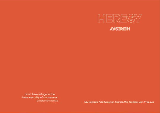
This publication is not an attempt to change the world, nor is it one that attempts to change anything really. Rather it is to redefine what being a heretic, and the notion of heresy, means. We chose this theme of heresy, as well as the magazine medium, in order to allow a curated set of artists to express issues and provide visual dialogues on topics both we and they found important. The news is so often an onslaught of overwhelming information, and the consistency to which our eyes and minds are exposed to any given topic anaesthetises our perspectives. As such, we want to provide a more unique, more subjective response to areas like politics, the environment, consumerism, war and abstract notions like fear, to name but a few. As mentioned, it is not necessarily arguing a position, rather it is offering a new way of approaching contemporary issues, and offer hope to whoever may gaze its pages.
We would like to thank the artists for not only providing us with their work, but also for approaching and creating such an interesting and eclectic range of topics that we have been able to choose from. We hope that this magazine provides a multitude of voices that you, the reader, may interact with in a multitude of ways. We feel both honoured and proud to present this work, so please get in contact with us as we are excited to see the response that this illicit’s.
— Miro Teplitzky.
0 notes
Text
Exhibition Notes - Foreword Drafts
Here is some draft versions I wrote for our foreword to the magazine. These were just early drafts, but thought it was important to show the working. We had a chat in the last week (can't remember which day precisely) after the group had read my initial version of a ‘completed first draft’ and we made some notes and I got some feedback on what it needs to improve.
FORWORD DRAFTS:
Hope is a strange concept. It is consistently vulnerable and often works to deceive us, particularly in the world of politics, social order and the environment. We live in a time where hope often feels lost; with the looming shadow of brexit, the overwhelming feeling of hopelessness in the Trumpian landscape, robots that send missiles on third world families and fires the size of countries that ravage humanity, hope begins to look and feel like morphine. A synthetic anaesthesia, that gushes over us and we can relax, sip our coffee or beer and feel like everything is under control… when its not. This aesthetic, however, is not Hope so do not be fooled. It is not an invisible entity, designed to relax our minds, it is instead a graspable feeling, a drive, to enrage us, to empower our our will, to fight for life. Hope is the desperation to survive, to grab hold of those who corrupt our worlds with economy and moral ambivalence by the collar and force change. These pages, these projects that you gaze upon; they are hope, they are the physical representation of expressing that we do not accept this world that has been designed without our consent. What you will find here is rebellion, what you will find here is fear, what you find here is chaos, but most of all what you will find in these pages is hope in the darkness.
Reality is a liquid currency, much like that of time or truth. It is a malleable concept, one that no single individual can pinpoint, despite the consistent attempt to do so. Throughout history, lives have been fraught with the struggle to comprehend what reality is and where our place is in it. Can we prescribe a single notion of this concept to every being alive on earth today… if what Greek Philosopher Parminedes argued is true; that reality is self contained - an individual experience, then the answer would suggest no. Our experience in a general sense, relies so heavily on our access to ideas such as liberty, freedom of expression, freedom of speech, economic control and even more basic access to shelter, fresh water, a hot meal and so on. I presume that whoever may be reading this has access to a majority of these daily elements and thus the point can be made that many people, in fact an unimaginable, incalculable amount of people do not have these - and I use this word in the context of this piece trepidatiously - privileges. Therefore proving that reality differs due to the context of circumstances. It would be easy to make a juxtapositional comparison between the UK and say the poorest provinces in China or or the Eastern blocks of Siberia, yet our reality is so far removed from those circumstances it hardly proves a point. Take America for example; both have English as their first language, both rely on a system of capital,
Reality is a liquid currency, much like that of time or truth. It is a malleable concept, one that no single individual can pinpoint, despite the consistent attempt to do so. Throughout history, lives have been fraught with the struggle to comprehend what reality is and where our place is in it. Can we prescribe a single notion of this concept to every being alive on earth today… if what Greek Philosopher Parminedes argued is true; that reality is self contained - an individual experience, then the answer would suggest no.
Snow gently falls in London as I simultaneously write this and day dream outside my window. There is something magical or mystical about snow, and not just in its texture, rather in the way it looks and particularly the way it falls. Rain — a constant in these periods of British winter — is heavy and immediate, its there and its frequent and it hits you instantaneously. Snow glides, it swooshes and sways, it blankets and sparkles in the light. These are probably socially or culturally cultivated notions; we associate snow with festive cheer or holidays, movies many people grew up on and childhood excitement at the spectacle of seeing it for the first time. Arguably snow is most often described as beautiful or associated with fun; that its pure and represents calm or happiness, but this isn’t altogether a truism of snow. Lets come back to that shortly.
Its becoming a cliche to say this but nonetheless true; we live in extremely uncertain times. This is not just in a national sense, but a very broad global sense. Cracks that had existed for decades, possibly centuries, have recently turned into chasms that seem to cause larger and larger divisions on a daily basis. On an immediate level, we can see that reflected in the Brexit referendum that has dominated social and cultural discourse over the last few years in Britain, America elected a now proven criminal in Trump who has essentially sanctioned racist and bigoted behaviour and given rise to white nationalism. There has been a disturbing rise in white nationalism more broadly too, with worrying signs coming out of Sweden, Germany and Eastern Europe. In 2008 there was the financial crash, not a warning sign but the result of many warning signs that left people without homes, food and in many cases without lives. Most worryingly from this however, is not that this happened, and that was and still is extremely disturbing, but rather that financial experts are prediction that the same thing will happen again because nothing has been learned. Perhaps most disturbing of all is our environment and our lack of care for it. Environmental scientists are practically shouting at the top of their lungs that we need to change and if we do not, the consequences are going to be beyond repair… Safe to say, uncertain times indeed.
I (shamefully) only just read Orwell’s ‘1984’ for the first time, having heard pretty much everything there was to hear about it. Yet, I was still shocked not just to find parallels to our current predicament, but direct links and instances where reality felt rather Orwellian. So we come to the nature of reality. Its a loaded term, each of us have our own reality that we share in a larger reality. French critic, theorist and philosopher Jean Baudrillard argued that in photography there is no link to reality, rather that photographs represent a ‘Hyperreality’ that either shows us a real version of something that doesn’t exist, or presents something to us that we know is real but cannot admit to its existence. This may be true of our political, social and cultural worlds. A good example to take would be the collapse of the Soviet Union. Before 1975, the Soviet government attempted to create a socialist economy and society, to make the union better for its people and a stronger power to the rest of the world. This attempt did not last long as very soon it began to collapse. Instead of admitting to the people that this was the case, those in power suggested that this was all part of the plan. What was produced was a society whereby the people knew that their state had failed, the lawmakers and government powers knew they had failed and yet everyone went on pretending like nothing was happening. The microcosm of this can be seen in the events that took place in Chernobyl.
It seems that we are existing in a reality that his hyperreal. We know the environment is suffering. We know that the rise of nationalism leads to wars and ethnic hatred. America pretends to define itself on its constitution yet when children are murdered at their place of education, very little is done to stop guns, rather its the fault of everything else but the gun control. I do not say any of this accusatorially, I am as guilty as anyone of not doing enough, and idly ‘watching on’. I write this purely out of talking to people, observing, reading and putting two and two together. At times I do feel that this is true, and to come back to snow, that what we are looking at isn’t as beautiful as we think. Rather that this ‘snow’ of our world often causes destruction and can also blanket us from understanding what is real and what is not.
However, we cannot despair and we should not despair. There is reason to have hope, as dangerous as that word can be.
0 notes
Text
‘Page’ Notes From Previous Post - 23/3/20
Here are some of the examples of what I meant in the last post.
This is what I was meaning when I said the text pages having the corners cut.
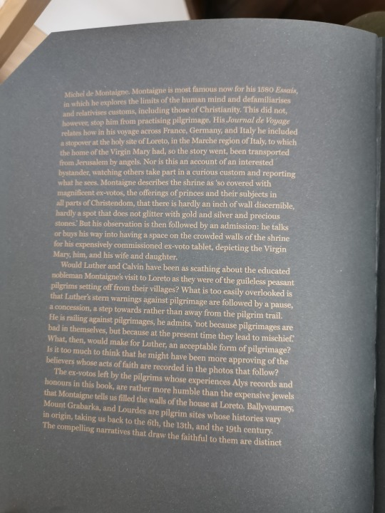
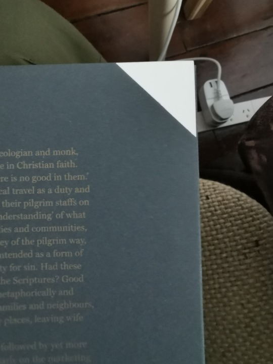
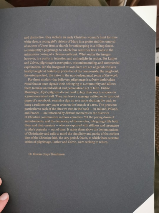
The above and below images show some examples of the different text colour and a really nice rose gold/copper tone. All three of these examples come from Albs Tomlinson’s book ‘Ex Voto 2019′.
0 notes
Text
‘Page’ - Book Decisions & Ideas - 23/3/20
I decided to list out a page where I could write down how I wanted the whole book to look in its final form. Obviously I won't be printing it in the next few weeks and maybe not even at all for the module deadline depending on how long we are in lockdown for, but I thought regardless I want to print it at some point and doing this would solidify ideas and possibly make me have even clearer decisions after seeing it written out in one section.
COVER
- A coated material that has a sort of waxen texture, in other words a coated material.
- Title name to be embossed with foil in a rose gold or copper colour.
- For the inside cover and back cover a protective page that is a canvas material and probably in black or very dark blue.
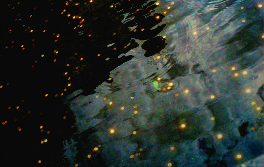
- The cover will be printed on with the image below.
INTERIOR CONTENT
- A semi-matte coated paper, something pearl.
- Text pages possibly a matte uncoated paper, different to that of the images. Including the corners cut down on the text pages to distinguish them from image pages.
- I am still deciding the font for the text.
- Possible cream colour pages for text pages, different to the image pages.
- Images, which I will upload in a later post as I can show the final version and decisions of what will go where.
BOOK DIMENSIONS
- This is still something I am deciding on. I am either thinking height 31.5cm x width 25cm. It would therefore be a more portrait shape pagination. Otherwise I am thinking the opposite of that, swapping the width and height dimensions and making it more a landscape format. I like the shape of the portrait, especially with this cover image, however the landscape is quite a cinematic style and because the book is about illusions, something extremely significant in cinematic storytelling, it would be a conceptual choice to decide that.
0 notes
Text
‘Page’ First Online Group & Individual Tutorial - 19/3/20
Our first online session, what strange times to experience. I have been creating a lot of images at home under the circumstances, however I don't want that to impact the book I am creating for this. Andre informed us that while there is still a lot to look in to for this modules progression, it might be worth looking at some online publishers. I would prefer to keep mine digital until there is the possibility of having it printed in the specific ways I am devising.
We then began to look at some slides of more things to think about in regards to creating a book. Andre pointed out for us to communicate and not to decorate too much. In terms of fonts he noted to not use more than two font families, and the same goes for typefaces. If using italics, be very aware of the word its used on as it will give it a very specific weighting.
We then looked at some examples, one being Karl Lagerfeld’s very beautiful book ‘Fotografie’ (cover below), and the placement of his titles within the cover image.
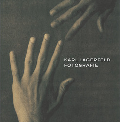
I think as far as book covers go, this is a really beautiful style. The movement of the hands with the text inside the flow of it works incredibly well.
After this we began looking at the different terminology that is used in book creation, such as tracking, heading, text width, alignment, colours (this may seem self explanatory but it essentially means the why for choosing a different text or paper colour and the means to justify it), positive/negative space.
These are just some of the terms used, and finally Andre made it very clear that a book has to have everything done for a reason, even if that reason has no rhyme or reason.
I then had my first online tutorial with Andre. He suggested, with the developments of my images and the grades I had put with them, to just continue mixing up the layout, and to figure out which pages will be double spreads and which (if any) would be single.
I then asked him about what kind of paper he envisioned for this. I had been thinking about something that is semi matte, much like a baryta inkjet paper. He agreed and thought that high gloss wouldn't work nor matte. As he put it, something pearl.
0 notes
Text
‘Page’ Session & Individual Tutorial - 12/3/20
Todays session began by watching some sections of the ‘Helvetica’ movie made by Gary Hustwit, which looks at the design aspects of letters and the different ways its possible to create mood through design and text. I took a really interesting quote from one of the scenes in which designer Massimo Vignelli said “Its like music, the space between photos is like the tones between notes.” I find music to be an unending wealth of inspiration and so found this to link in with how I often think about using music to influence my work.
I read last year or the year before that when hanging pictures and arranging images, Wolfgang Tillmans always listens to music and finds that it helps him create a path to express his meaning in his images. Likewise, Don McCullin is often quoted as saying that when printing in the darkroom, he listens to only classical music. He never mentions if this influences his dark tones or grades, but he does say that it helps give his appreciation for his own images a weight when they begin to appear in the developer.
I think music expresses so much, and seeing as I am writing this from notes I made the other week I thought I would add that a lot of the process of me grading my images includes music. Not just the grade actually, the selection and placement of images has also been influenced, but I will go into detail on this in another post.
As part of this session we then also looked at the ‘Steidl’ film, which follows Steidl himself in his obsessive quest to create books. I think this was fascinating to see the considerations that take place from one of, if not the master of book making and printing. I borrowed Andre’s copy of this and have now watched the rest and found it overwhelmingly enjoyable to see.
PRINTING YOUR PUBLICATION - CONSIDERATIONS BEFORE PRINTING
We then discussed some considerations to make before printing your final digital version.
1. What printer to use?
2. To make sure that the screen you're using is calibrated so the print doesn't come out looking drastically different to the digital version.
3. Size of the book: dimensions - This is really important and definitely impacts on image pagination, what type of images to go with...
4. Are you printing single or double sided? Do you want pages to be spread or left to one image per page turn.
5. What kind of binding will you be using?
6. Create an InDesign file for your cover that is separate to the interior of the book. The cover most likely will have a different material, hence you would either be sending it to a different printer or binder or even if thats not the case you don't want to confuse things by not doing so.
In a later post I want to update the progress of how these considerations have gone. I have made decisions and taken these ideas into consideration at the time of typing this.
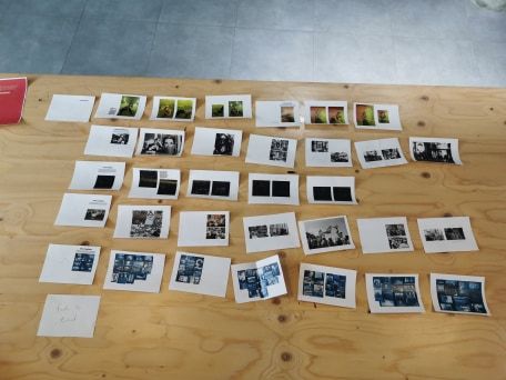
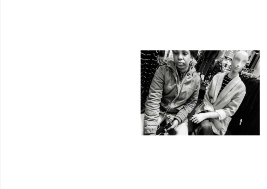
Later on the session I then had an individual tutorial with Andre’ and he had some suggestions after looking over the work I had done already, which you can see from my previous ‘Page’ post. He suggested that when I print out the low res files to use as hardcopies to make selections and choices as to which images should go together that I should also print them all in black and white to see how they look.
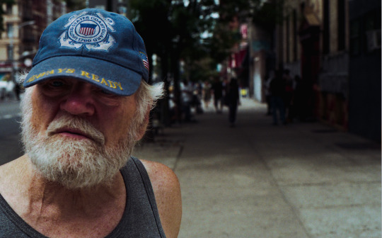
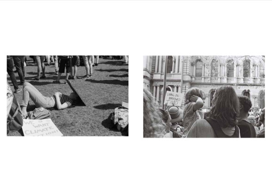
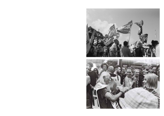
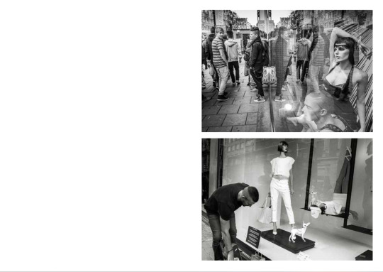
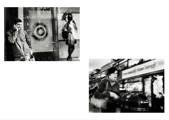
He noted that some of the images like the one below I should maybe reconsider as they may not fit the narrative of the book in the same way, the reason being is its more documentary in style and there is a less mysterious quality to them. I am weighing this up but I do see his point.
Lastly, and very importantly, he mentioned that the text I include is going to be really important in shaping the narrative and book. Regardless of the abstractedness of the text or the realism, what the writing will do is allow the reader/viewer to engage with the images under a certain context and this I really want to do.
0 notes
Text
Exhibition - Layout & Mockup Session
I met with Bronte and Savannah to go through a layout for which project should go where and we came up with a really good mockup. They then went and put the images into the template we created, below is a series of images that reflect the process of how we selected what goes where and then the most updated version of the publication in PDF form. Remember that all the text has not yet been included so we have currently got fill text that does not relate to the work I any way.


0 notes
Text
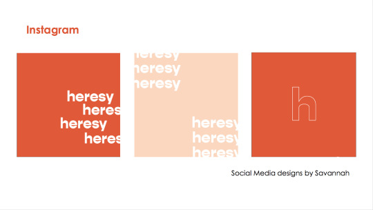
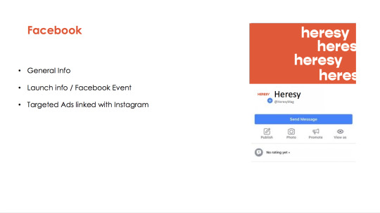
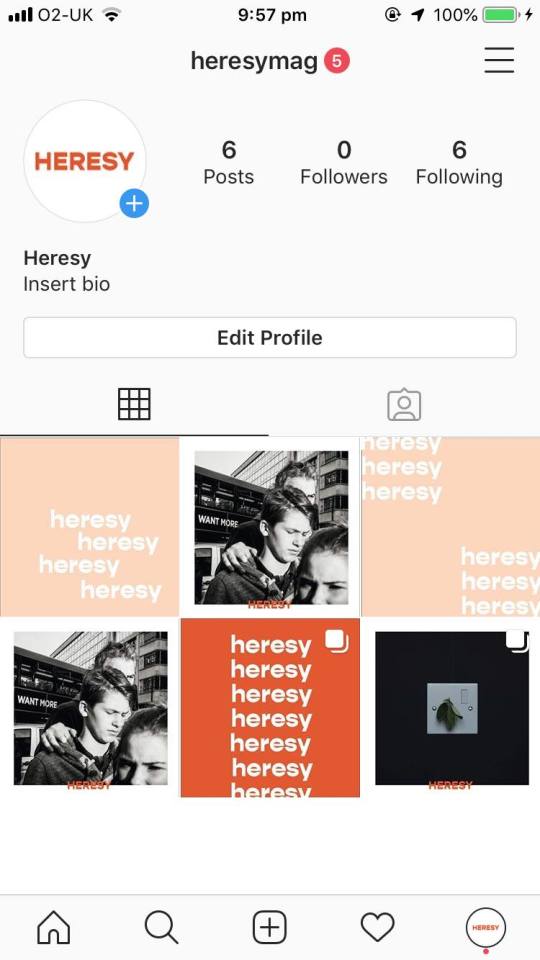
Exhibition - Social Media Design Layout & Mockup
This is how the social media design has come along and its looking really good and makes me think it will get people interested. I think everyone has done such a good job with the design of the magazine so far and the online content is an extension of that. Below is some of the images and examples of how we are proceeding with it.
0 notes
Text
Exhibition - Press Release Draft & workshop 8/3/20
We have met several times as a group to continue to decide dates and times for things like final artists work, print dates. It is included in our group journal in a gent chart as well as a mockup timeline of things to do. I have begun writing a draft of a foreword to the magazine and also a press release (the two of which relate to one another quite closely), in order to start giving our magazine a shape and context.
The draft so far for the foreword is looking at things quite abstractly although I don't think its right. I have tried to use snow as a metaphor for illusions of beauty when things are much more worrying than so appears, however it feels a little contrived and cliche’d. I want to restart it and try and approach it from a different angle before showing the rest of the group.
Below is a rough version of the press release announcing the existence of the magazine and what it includes.
HERESY MAGAZINE PRESS RELEASE
‘heresy’ magazine is a publication that brings together a select group of artists who each look at themes that vary in political, social and cultural discourses. With the digital age giving easy access to individual voices, there seems a tendency to voice opinions that are not backed up by much action. ‘heresy’ magazine seeks to curate artist’s work that redefines the notion of heresy or being a heretic. By delving into issues such as the environment, politics, humanitarian issues, war, social and cultural fear and technology, to name but a few, the magazine offers an example as to the way that art and artistic expression can offer a way to engage with a wide range of important contemporary issues and to get others to engage in them too. Through the use of images and added text, ‘heresy’ provides a refreshing, profound and emotional alternative to a range of given issues that are so often lost in the tidal wave of information and repetitiveness that can be seen on a daily basis on news platforms. While heresy is a strong word, the magazine sees it as a fitting description of a group of people talking on the very real and profound issues that plague are international society in ways that move away from simplistic imagery. Essentially, the publication is a platform, like that of a newspaper, but approaches everything from unique, subjective and personal expression or narratives that explore emotional responses to events or discourses. The publication will be opened with an event (Between April 10th and May 23rd) that coincides with the themes of the book. By this, it will host an evening with either a discussion with an artist, a panel or an experience that allows for the reader to engage in the themes that are being presented. The magazine will be sold for between £6 - £8 for a regular copy, with special editions, which include an original print, selling for a yet to be decided upon price. The profits will either be used to fund the production costs of the magazine or be put towards a charity or organisation that helps those in need (to be decided upon and confirmed).
EDITORS
Bronte Hambridge
Savannah Hughes
Liam Pyke
Cameron St John-Knight
Miro Lovejoy Teplitzky
CONTRIBUTING ARTISTS
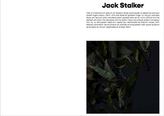
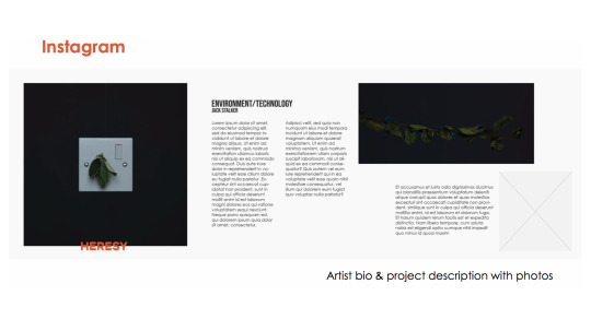
Jack Stalker
Alexander Schneideman
Claude Scott-Mitchell
Miro Lovejoy Teplitzky (Add the others names guys!)
GRAPHIC DESIGN
Bronte Hambridge
Savannah Hughes
Cameron St John-Knight
Etc…
More artists names needed to be added but I thought its better to get the text involved and interesting and add that stuff later once I can be more methodical and once we know who we are and are not including in the publication.
We got pretty good feedback from the group about it, however what was said was that it could be more directed at the themes of the work and talking about the redefining of the word ‘heretic’. I will come back to that in a later post.
I think using a photograph in the press release too would benefit its appeal, as well as including website and social media links.
0 notes
Text
Exhibition - More Week 5/6 Notes
Our funding was unfortunately not granted, however we treated this as not a huge surprise. Quickly before any more comments I just want to highlight some things we are doing and still need to do as we move forward.
- I have begun talking to venues, however have slightly held out from being to definitive about dates or ideas as we still need to put together a rough draft of the book so that I can show them what we would be presenting and what they would be advertising in their space. So far the venues include the PhotoBook Cafe (which I think would be the best option for this particular project). HotShoe Magazine Cafe (again, this would be a highly acceptable location for a launch event). Lastly, and somewhat as a last resort should it come to that, Real Ale bar on Portobello Road (not the best venue, however a great space for any gathering of people.
- We have estimated to create between 60 - 100 copies of the first issue of the magazine. We are yet to decide whether a run of limited special editions would be produced, which would include a print of one of the artists works at the very least.
- As part of the notes above, we are still clearing when work can be sent to us by in regards to the artists themselves. As we are all, in one way or another close to everyone who is publishing work it should not take too long to receive and is about persistently asking them. Thus far I have got the work of Jack Stalker, am receiving Alex Schneideman’s this week, and have scanned up my own work and am sending to Bronte and Savannah to place into the template they are creating. Bronte is talking to two artists in Australia about getting their work and both have confirmed so we are waiting for their images to come through. I still want to talk to an artist called Hannah Burton (a documentary photographer), Will Hazell (a documentary filmmaker), Claude Scott-Mitchell (an actor, drawer and writer) and one or two others so that we have a selection of work to choose from should we need it!
- As part of the event we have been estimating costs, considering our funding didn't come through, and figuring out ways of not losing money. We, as a group, decided that if we were to put the money up ourselves, that we would make a price for each copy of the magazine and sell them at the launch event as well as online (in some description) and cost the price for printing and event to what we make from the sold copies. I will update the agreed upon cost in a later post.
Other than that, personally I am just hassling artists and figuring out what the event might look like in terms of what may happen on the night. I am thinking about an artist talk/panel discussion of some description and even had the idea of trying to get a close family friend, who works in international relations at the BFI, to come and talk about the importance of art and the its crucial impact of socio-cultural discourse in the broader community.
0 notes
Text
Exhibition Week 5 Notes
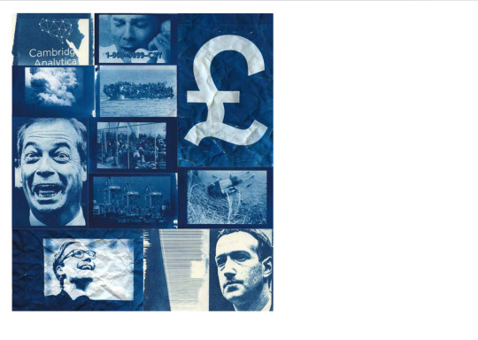
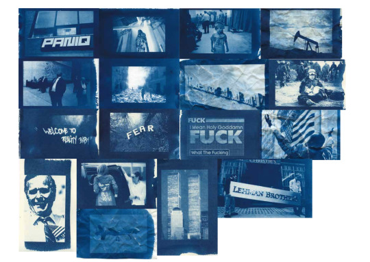
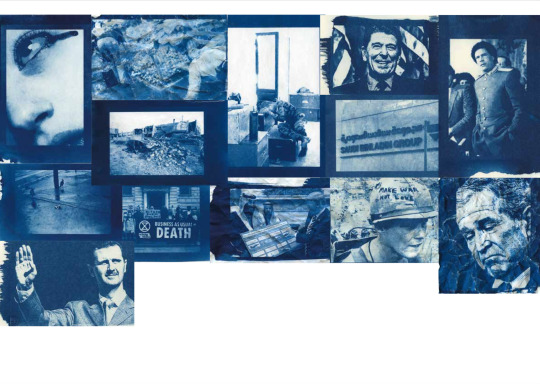
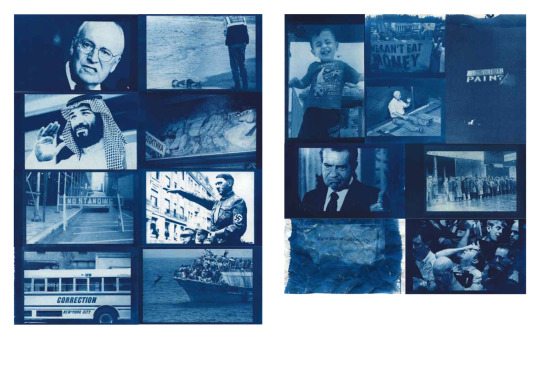
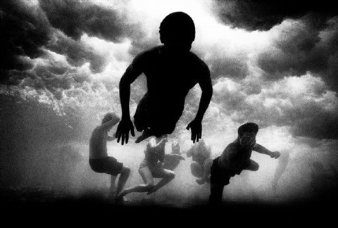
I decided to include some of the ideas we had looked at early in the process of putting together the magazine. We have looked at numerous visual examples and below are some more examples of things we had found. Obviously this has shifted as we have decided to go with a magazine rather than a zine or classic photobook, but I think in order to come to the conclusions we have arrived at, these were important references to acknowledge.

A lot of what was on this shelf related to our ideas behind the mag and while there isn't specifically magazines here, it did give us a good idea about how ‘current’ publications have approached issues like rebellion or activism in artistic forms.
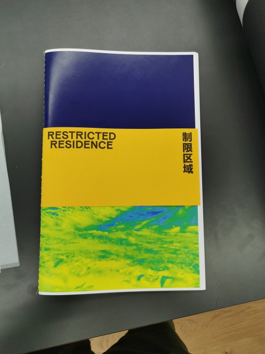
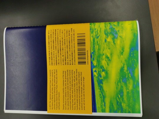
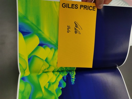
This specific example related much more to our ideas for the zine. It is by an artist called Giles Price and charts the devastating impacts of the nuclear disaster in Japan and both the fallout and political ramifications of the event. It was somewhere between a zine and book and we initially had thought about having a ‘belly-band’ with text on it, to give the publication an aesthetic lift.
Also, this week, we decided against using another writer to include a piece in the work. We had previously looked at a piece already written by someone we all know, however as the concept behind the publication has shifted and progressed, we thought that the piece didn't really fit in with what our concept was.
0 notes
Text
Advanced Concepts in Photography - Dissertation 14/3/20
I have been putting together my dissertation proposal after initially struggling with an idea. I had a good meeting with Teemu in order to vocalise ideas and thoughts I had and to get critical feedback from someone I trust with ideas. He was really helpful in helping extract and order what I was thinking, especially as he has an outward perspective, he can objectively gauge how I was thinking and what I may turn my attention towards.
He suggested focussing on photographers I really liked, and noted that I had often brought up Antoine D’agata throughout my degree so far. I gave that some thought before realising it was true. What also surprised me was how similar in many conceptual ways his work was to that of a photographer I grew up admiring on my own home walls, that being the work of Australian photographer Trent Parke. Somehow I haven't really fitted Parke into any section of my degree thus far, however, now seems like an extremely appropriate time. I have analysed a lot of his work recently and have become somewhat obsessed with how he photographs and his processes.
Then a very rare and extremely important moment happened in my photographic life. Last Saturday I went out for a pint with my boss and cousin and we got to chatting about photography, as we often do. As we discussed each others opinions, perspectives and styles of photography he said something that has really struck me. He said that my photography existed somewhere between life and death, somewhere between the living world of what we know as ‘reality’ and somewhere far beyond that in the unknown. I think for a long time now I have been looking to find a vocabulary to discuss my work and a way of conceptually engaging with theories in my practice and this really summarised how I felt and continue to feel.
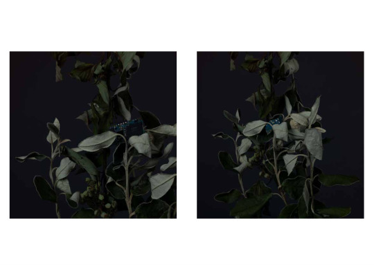
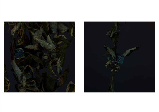
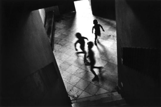
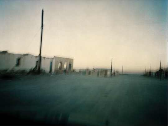
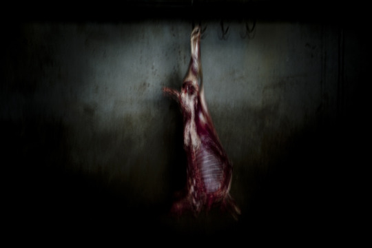
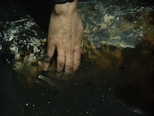
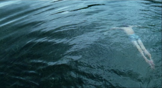
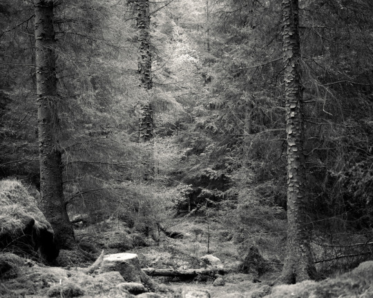
In running with this idea I want to take this in to my dissertation and look at the work of Parke and D’agata as well as Andrei Tarkovsky, Alys Tomlinson, Terence Malick, Alenjandro Inurutu, and Joel Peter Witkin - all who deal with a hybrid photography, or image narrative medium, that explore not only the meaning of life but the meaning of death and the relationship between the two. Below are some of the visual examples I am looking at exploring and that I am including in my dissertation powerpoint.
Trent Parke
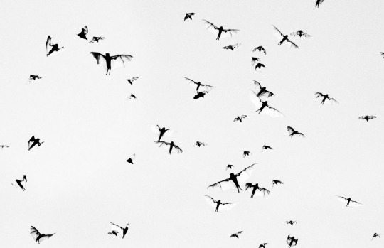
Trent Parke
Trent Parke
Trent Parke
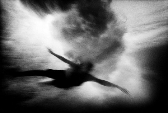
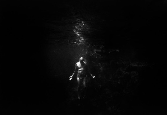
Antoine D’agata

Antoine D’agata
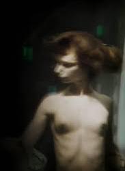
Antoine D’agata
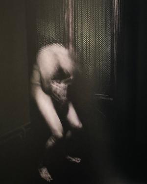
Antoine D’agata
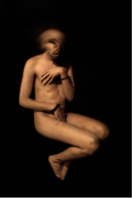
Antoine D’agata
Antoine D’agata
Antoine D’agata
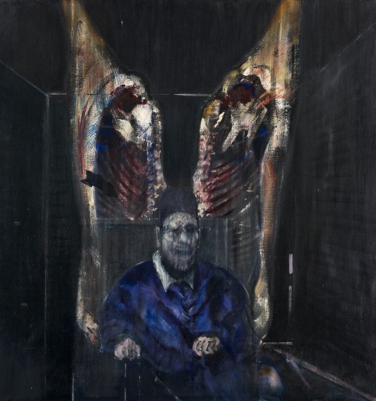
Francis Bacon
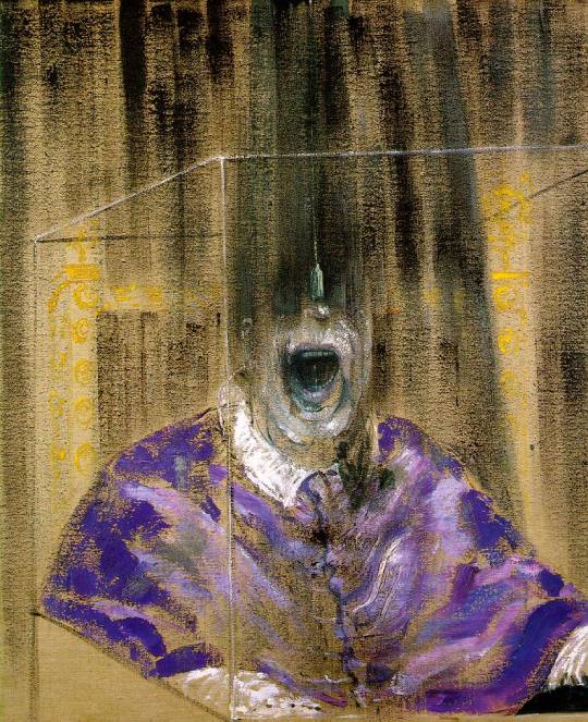
Francis Bacon
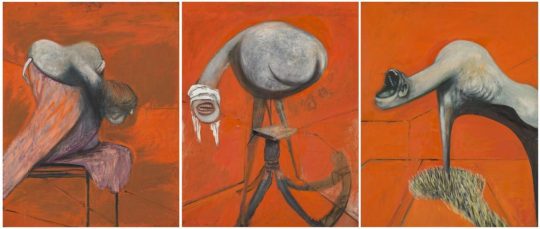
Francis Bacon
Andrei Tarkovsky
Andrei Tarkovsky
Terence Malick
Terence Malick
Terence Malick
Terence Malick
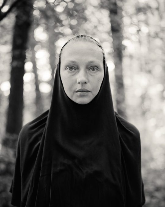
Alys Tomlinson
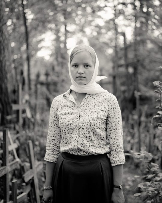
Alys Tomlinson
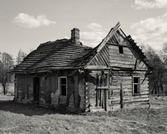
Alys Tomlinson
Alys Tomlinson
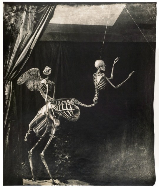
Joel Peter-Witkin
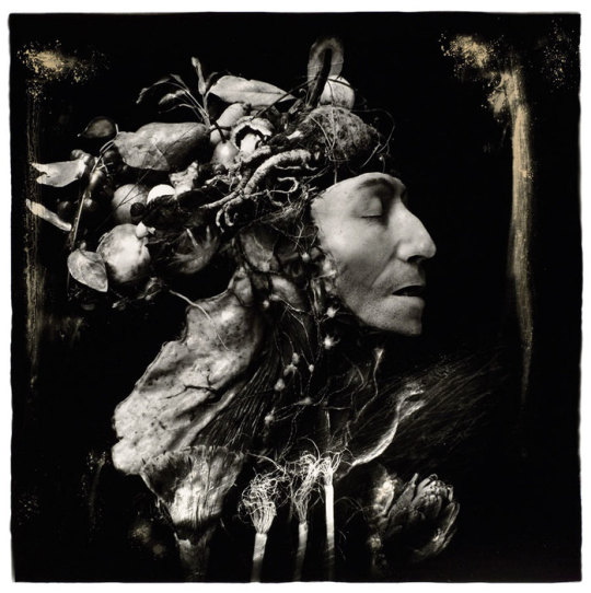
Joel Peter-Witkin
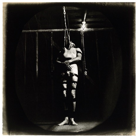
Joel Peter-Witkin
0 notes
Text
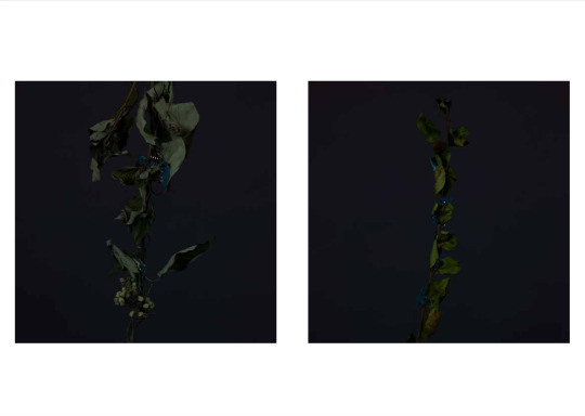
Page - Image Edit & Sequencing - 27/2/20
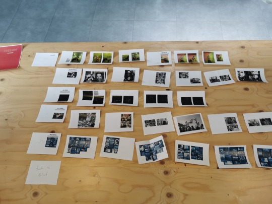
I have really started digging into editing my ideas for the book. I have chosen a selection of images to use as a first draft copy. I am currently playing around with sequencing and trying to rid any of the deadwood images that dont work. Below are some examples to show how I am editing my first draft. Its very rough thus far but I think its beginning to take shape of my ideas.
0 notes