
Hello! Welcome to my blog! ^-^Blog Website: https://mochaesartcorner.tumblr.com/
Don't wanna be here? Send us removal request.
Statistics
We looked inside some of the posts by mochaesartcorner and here's what we found interesting.
Average Info
Notes Per Post
1
Likes Per Post
1
Reblog Per Post
0
Reply Per Post
0
Time Between Posts
7 days
Number of Posts By Type
Text
15
Last Seen Tumblr Blogs


Fun Fact
Total funding amounts to $125.3M.
Text

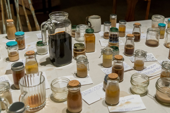
Final Project: Color Evocation
Color is often psychologically associated with emotions and how we process things. For my final project, I wanted to take items that I interact with on a daily basis or items that I have recently interacted with to see if it evokes an emotion/affects the audience psychologically. I also wanted to see how certain colors interact with each other (Color Theory) and how to apply this to artwork that I saw in some product designs and I also researched at the Fig Tree Gallery Artworks in Fresno, Ca. I feel that we do in fact see the world in color and thought this would be an interesting concept.
In order to gain a better understanding of Color and Psychology from scholarly sources, I began researching various articles and videos on how the two interact with each other. My sources included
-https://www.colorpsychology.org/
-https://appliedpsychologydegree.usc.edu/blog/color-psychology-used-in-marketing-an-overview
-https://www.youtube.com/watch?v=x0smq5ljlf4
I learned that we as consumers play into the marketing psychology aspect when we buy things. Things colored in green for "organic" or "all natural" which may not always be the case. Each color can have a positive or negative connotation linked to them. It all just depends on the consumers psychology and how they process the colors around them. It's also beneficial of course to have a variety of colors in product design too as we do tend to have favorite colors. In my case, my favorite colors are green and purple so I have a lot of green and purple items unknowingly. This is because psychologically, green and purple are my favorite colors that usually bring comfort.
Rubix Cube Color Theory/Interaction
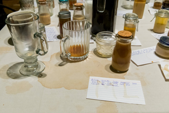
Below, I will also demonstrate how lighting/color affects other colors as well as how much it affects the emotion/vibe that each photograph gives off. Each of these photographs were taken individually under different lights.
--
Color : Green
The color green is most commonly associated with Harmony, Nature, Growth, Healing, and Relaxation. We tend to make connections especially with Nature with the green foliage we see around us. This can also evoke a sense of calmness within and allow individuals to feel more grounded when surrounded by Green. In the late 16th century, the Color Green was made by emulsifying various leaves like ferns and berries like the Buckthorn; which makes the association of environment to green natural. The color Green also has ties with theraputic/holistic medicine as well. Green can also have negative connotations to it like a feeling of disgust or feeling unwell. These are usually darker shades of Green that evoke a sense of Envy and Boredom.


---
Color : Purple
The color Purple is most commonly associated with feelings of spirituality and calmness (like lavender). Purple can also lead to a feeling of being intrigued and was once most notable for it's rarity in the Early Civilization period. The color was originally made from the Murex Sea Snail which has linkages to wealth as this snail was very expensive to come by. The color purple evokes feelings of imagination, creativity, enlightenment, bravery/courage, and connections to the spirit world/balance. The color purple is also associated with Women's Rights.


---
Color : Yellow
The color Yellow is most commonly associated with positivity, enthusiasm and happiness. Yellows cheerful tones evoke feelings of optimism, creativity, clarity, decision making, energy, and anxiety as well. Yellow is said to be a highly stimulating color on multiple spectrums due to it's vibrancy. As upbeat as this color is, it is also tied to unhealthy personality traits in individuals. Certain shades of yellow can also commonly associated with the feeling of Summer during warm happy months.


---
Color : Pink
The color Pink is most commonly associated with femininity/womanhood, love/affection and softness/innocence. In addition to this, the product design also resembles shrimp when cooked which is pink. Historically the color Pink was used for both genders but has been categorized as a girly/feminine color. However too much pink can also be overwhelming, feel vulnerable, and a sense of oblivion.


---
Color : Blue
The color Blue is most commonly associated with loyalty, professionalism, trust, wisdom, peace and sometimes relief. The images below give a sense of trust and professionalism in their product design. Historically, Ancient Egyptians and Romans revered the color Blue as they emulsified Lapis Lazuli. Shades of Blue like Egyptian Blue, Ultramarine Blue, Indigo, Prussian Blue, and International Klein Blue all have unique and specific characteristics to their color and the emotions they evoke. The color blue is also closely related to the feeling of winter due to it's cool tones.


---
Color : Orange
The color Orange is most commonly associated with warmth, a certain kindness/joy and enthusiasm. It invites you into settings and brings attention to objects (for example traffic cones, road crossing signs, workers ahead signs). Orange can also evoke feelings of creativity with the right hue. We see these in media like Nickelodeon or brands like Orange Fanta. Orange is also a color associated with Fall/Autumn.


---
Color : Red
The color Red is most commonly associated with passion/love, anger, power and excitement. Being one of the most historically used colors, Red has religious ties to it as it is commonly associated with the blood of Christ in various religions. Red also has negative connotations to it as prolonged exposure to the color red can induce feelings of great angst and stress.


---
Fig Tree Gallery Photographs : Real Time Color Evocation
Further expanding on the idea of Marketing Psychology and my idea of Color Evocation, the pictures of these art pieces at Fig Tree Garden is what I gravitated the most towards. Many of these pieces have Green, Blue, Purple, and Red colors incorporated into them which immediately caught my attention. With that in mind, the following pieces photographed may have not resonated well with other audiences. They may have gravitated more towards warm toned pieces and maybe even lighter/darker pieces that were present in the gallery. Although the artist may have not intentionally chosen these colors as a way to incorporate product design, however with big corporations/business they may very well include color psychology as a means to increase their revenue.


This project was overall extremely fascinating. Going into my Color Evocation project, I knew that color affects us psychologically, however; I never knew how much it really affected what I bought and that I had succumbed to color psychoanalysis/marketing as much as I did. I found that many items are catered towards the consumers which is honestly really great! It means that Color Theory is really a true thing and that colors do affect the decisions that we make every day.
0 notes
Text
Theme Project - Living Diaspora
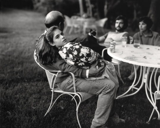
For this project, I really wanted to capture the essence of what makes up clovis/fresno. I resonate well with learning about demographics and have always enjoyed incorporating ethnicity into my work. As a mixed Afro-Asian individual, I wanted to see what that looks like through a lens other than my eyes. Everyday we pass by people not really remembering their faces; but we do remember the skin tones (at least for me) ; how much of us is represented in a communal space. I remember growing up not really knowing what I conformed too as I've grown up to be racially ambiguous, so I have always been aware of the people I interact with and if I see individuals who are of the same ethnic group. My main inspiration was from Soul Calling : Hmong Diaspora. I wanted to incorporate that idea of different living spaces/cities and who we see in these areas/how they are adjusting.
I learned that it's actually quite difficult taking pictures of people especially in public settings. For me personally, although I really enjoyed taking these pictures and documenting what I saw, I felt quite uncomfortable/really out of my comfort zone. I really enjoyed the outcome though and I hope to provide a glimpse of the Living Diaspora of Clovis/Fresno.

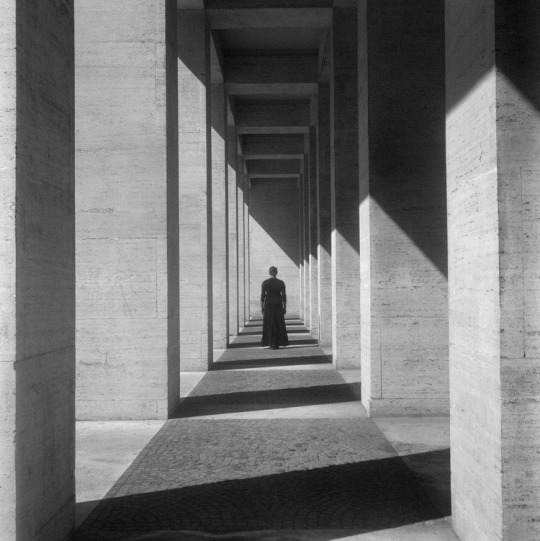
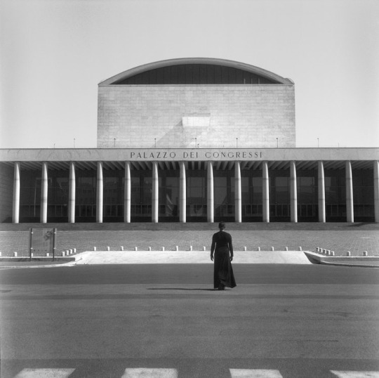
Path To Success - California State University, Fresno

Lynda & Stewart Resnick Student Union - California State University, Fresno

The Calm Before the Storm - California State University, Fresno

Family and Food Sciences - California State University, Fresno

American Vintage Thrift - Downtown Fresno

The Alley - Downtown Fresno

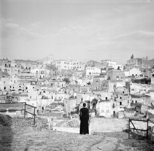
Old Town Clovis - 1

Old Town Clovis - 2

Bauble + Thread

The Alley - Clovis

Pollasky Ave

Just The Two Of Us - Clovis, Ca

Gifts - Clovis, Ca

America - Clovis, Ca

Crosswalk - Clovis, Ca

Two Cities - Clovis, Ca

Old Town Clovis - 3 - Clovis, Ca

Old Town Clovis - 4 - Clovis, Ca

Old Town Clovis - 5 -Clovis, Ca

Old Town Clovis - 6 - Clovis, Ca

Conley Art Gallery, California State University, Fresno
0 notes
Text

Research 6/6- Carmina Eliason
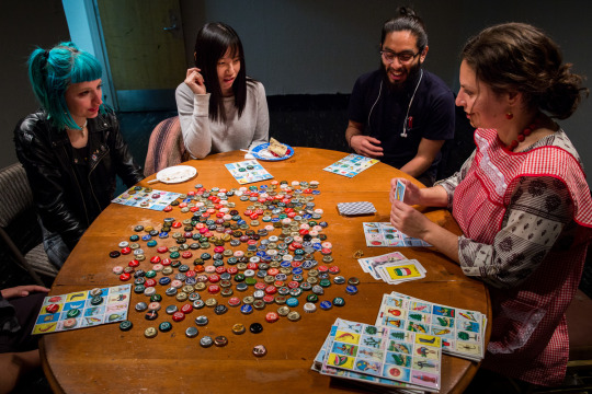
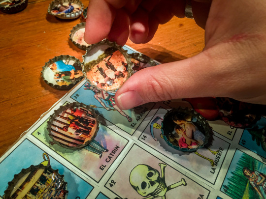
Born in the United States, Carmina is best known for her interdisciplinary work that relates to her personal experiences and sheds light on the general human experiences that people conform to every day in our society. Her process of creating includes performance art with her and her audience, contemporary artistry and historical photography practices. A lot of Carmina's work also focuses on race, language, and Mexican identity. A few of her most notable works include Cafe Con Leche, Loteria De La Via, This Is A Jar For Your F****S, Blanks, Corridos, Remexico, Blenders, Would You Like A Cup Of Tea?, and Dirty Laundry.
Below is some of Carmina's work--
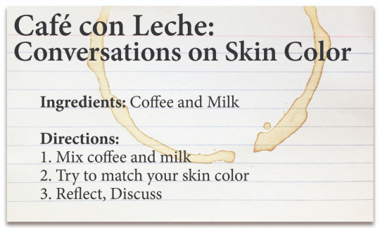
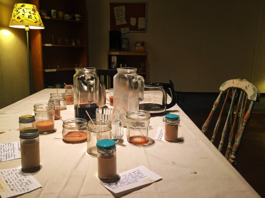
Cafe Con Leche


Loteria De La Vida
I think Carmina's work is absolutely captivating. I'm the type of person to gravitate towards ethnics in society and those dynamics so when I saw Carmina's work, I immediately gravitated towards it. Although not labelled as a professional photographer, she does capture these moments of her showcases through performance art. As someone who is multiracial and have always struggled with identity, I think Carmina's Cafe Con Leche was so beautifully done..so much so that I wish I was there to experience this moment with others who also struggle. I like to think the coffee is bitter which translates to African Americans who have a more bitter lifestyle, and those who add more milk/sugar have a more easier time. However, I got to thinking and maybe this isn't so true as I thought once. I think as a racially ambiguous individual, it's really difficult to fit within a group of people and not get rejected in African American or Asian groups. A lot of the time people guess my ethnicity in which most cases they are 100% wrong. I think that's why I really enjoy Carmina's work too. She's not afraid to speak up about these issues and showcase them to multiple audiences.
0 notes
Text

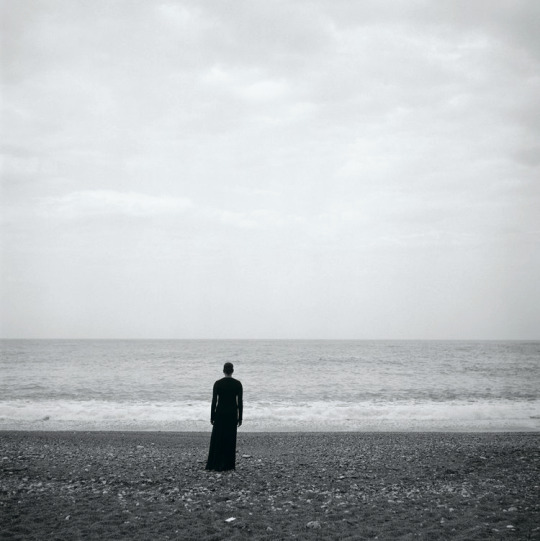
Research 5/6- Sally Mann
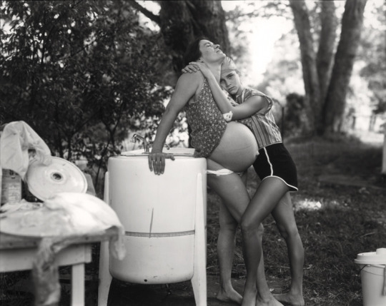
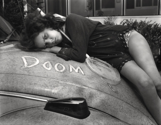
Born in 1951 in Lexington, Virginia, Sally Mann is one of the worlds most renowned photographers/artists. Titled as "America's Best Photographer", Mann focuses on sustainability, childhood and sexuality which proves as controversial in many topics. She also is most notable for her black and white photography. Mann attended Putney School, Bennington College, and Hollins University and received her undergraduate degree in Photography and her Masters degree in writing. Her most controversial works of art was her At Twelve and Dream Sequence pieces. Some viewers found that these images were disturbing and sexualized children as they were photographed in the nude. She comments on this in her book Immediate Family where she states that "many of these pictures are intimate....but most are of ordinary things every mother has seen. I take pictures when they are bloodied or sick or naked or angry". After receiving backlash, Mann resorted to doing landscape photography in the late 1990's.
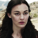
At Twelve Series
Landscapes : Georgia Series
Landscape : Virginia Series
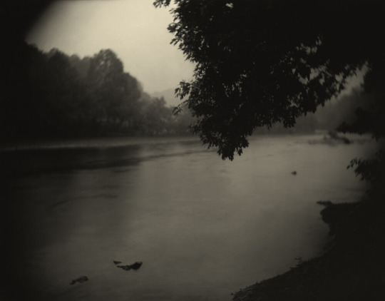
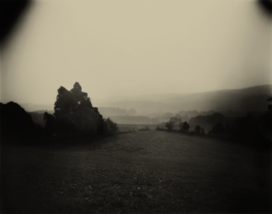
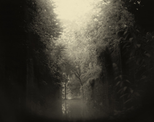
Although some of her work is controversial, I think the real reason why I like Sally Mann's work is because it reminds me of home. Especially with her landscape series. I am originally from Virginia and raised in Georgia and so the pictures she was able to capture reminds me of what it really does look like. Georgia with the marshy lakes with the weeping willow trees shrouding the space. Virginia with the winter birches and free land on the mountainside. It all reminds me of home; so its nostalgic for me to view her pieces.
0 notes
Text
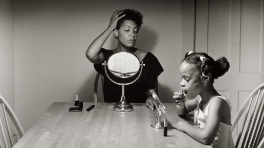
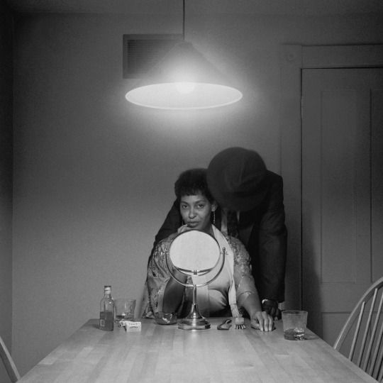
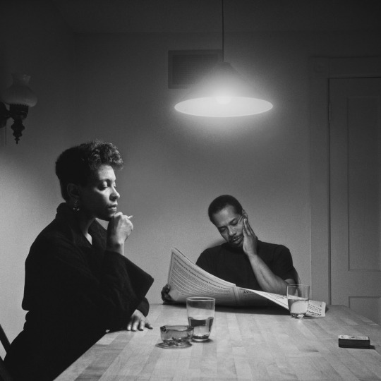
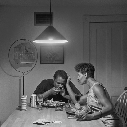
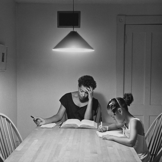
Research 4/6- Carrie Mae Weems
Born in Portland, Oregon in 1953, Carrie Mae Weems is most notable for her work through staged black and white photogaphy, and her connection to her identity, personal experiences and overall racism in society. Weems work is a showcase of activism, protest and the lives that we live everyday. Because of her powerful works of art, Weems has been a part of the Metropolitan Museum of Art in New York; the Iris & B Gerald Cantor Center for Visual Arts at Stanford University; the Solomon R Guggenheim Museum in New York, and the Centro Andaluz De Arte Contemporaneo in Seville Spain, She has also recevied a plethora of awards that include the Hasselblad Award, a Bernd and Hilla Becher Price, A MacArthur Fellowship from the American Academy in Rome, the Congressional Black Caucus Foundation's Lifetime Achievement Award, and many more. Her most famous pieces include the Kitchen Table Series and Roaming where she sheds light on facing racism across the world and a story of a black woman's complexity, strength and beauty.
Here are a few of her pieces below--
Black Love, 1990
Kitchen Table Series, 1990

Roaming, 2006
These are just a few of the many notable works Carrie Mae Weems has created. I really gravitate and honestly adore/love her photography. It's filled with so much power, strength and struggle. It's beautiful in so many ways that go beyond the surface. I think the reason why I do gravitate so much towards her work is because of her subject matter that she includes. It all tells a story; her story. Each photograph feels so raw in emotion and gives a sense of vulnerability within Carrie's work.
0 notes
Text
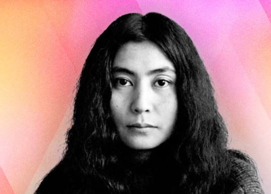
Research 3/6- Yoko Ono
Born in Tokyo, Japan on February 18th, 1933, Yoko Ono (Ono Yoko in Japanese) is an activist most notorious for her work as a conceptual and performance artist as well as a musician. She was the first woman to be admitted to Gakushuin University where she sought out to complete her Philosophy degree. Although she was not able to follow through with her philosophy degree, she did have successes in other fields outside of Gakushuin University. Former wife of John Lennon, Yoko was known to be a very controversial artist. She spent time curating music with John Lennon and was notable for her interesting and unique approach to making music. Her music is described as poetic, experimental, and intimidating. Alongside her musical experience, she also known for her contributions to visual artistry and filmmaking as well. A few of her most notable works include Museum of Modern [F]art, 1971; Bed-In, 1969; Wish Tree, 1996, and Peace Tower, 2007.
Although Yoko Ono is known for being controversial in many ways, I ask myself...what artist isn't controversial at some point. We fit within this binary way of thinking and we as artists test these societal notions and ultimately push that boundary. Although I'm not entirely a fan of her work, I think she is someone of very strong character. Someone who isn't afraid to push that boundary. An artist that truly envelopes her work by connecting it to her character and personal experiences.
Here are a few of her pieces below--
Mend Piece
0 notes
Text
Living Diaspora Theme Idea
Project 3: Art 30 Based on demographical data from Best Neighborhood , Clovis, Ca is comprised of 49.9% Individuals who are racially identified as White, 31.5% Hispanic, 11.6% Asian, 2.5% Black, and 0.3% Native American. Within the racial groups listed above, there is also an additional 4.2% that identify with a separate racial group. For my Living Diaspora theme idea, I want to include the following~
Concept: Capture the essence of communities in Clovis/Fresno, showcasing how individuals adapt and interact with their environment and how they are able to adjust to new environments while maintaining their heritage and identity. Approach: I want to photograph individuals/communities in different environments around clovis/fresno; whether it be at a festival/social gathering. I want the viewer to see that based on demographical data just how much we see this through photographical evidence of the communities here in Clovis/Fresno.
0 notes
Text

Research 2/8: For this research prompt; I chose to interview my uncle Clarence Green. Clarence Green currently focuses his work in Charlottesville, VA and is the founder & owner of Underground Shorts: Digital Storytelling. Obtaining his B.A in Communication Media/ Fine Arts from Virginia Commonwealth University. Clarence enjoys to tell inspirational stories through videography as a way to tell stories through short promotional documentaries for businesses and organizations. He specializes in Pre-Production, Production, Post-Production, Editing, Voice Overs, Audio Recordings, Motion Graphics, and Online Video Management. Clarence also enjoys developing work that stems around representation and Racial justice (Black Excellence), equity, people doing good things in the world. The work that he does and the people he works with are meaningful and the subject matter is something that connects with him as well.
My uncle's work resonates well with me as I am also someone who enjoys helping a community in a documentary stylistic way. His specialty in Pre-Production, Production, Post Production, and Motion Graphics also interest me as this is what I would like to do in the future. Because of these skillset's and qualities, It is truly inspiring and is something that I would like to apply to my own work.
His business website is : https://undergroundshorts.com
Some of his past projects:
Montpelier Demo
vimeo
Travel Scholarship Fund of the Charlottesville-Winneba Foundation
vimeo
TedX Talk : Changing the Narrative
youtube
#Vimeo#Youtube#UndergroundShortsMedia#ClarenceGreen#Videography#Photography#Charlottesville#Virginia#VirginiaCommonwealthUniversity#TedXTalks#ChangingTheNarrative
0 notes
Text

Research 1/8: Soul Calling: A Photographic Journey through the Hmong Diaspora by Joel Pickford. Foreword by Kao Kalia Yang.
Joel Pickford successfully encapsulates his inspiration of Hmong culture through his photographic diaspora. Some significant points mentioned in his book are
-Life and Death in a Hmong Village
-New Hmong Immigrants compared to Hmong Americans
-Hmong People Struggles
-Fresno and the Hmong Community
-Hmong Self Sustainability
-Vang Pao and the Secret Hmong War/Vietnam War
-Xyoo Tshiab/New Year
-Hmong Shamanism and the Sacrificial Pig (Ceremonial)
-Yor Lor Lee and her Experience as she navigates through her life. During the first 33 years of Yor Lor Lee’s life she experienced many hardships and struggles that continued even after seeking refuge in the United States. Even her experience with the Fourth of July for the first time with her kids and the PTSD that haunts her from the War. The sounds of war. Additionally her worry of her children able to finally seek refuge in America or being discriminated against in American Society. The fear of the Hmong culture and history being erased or her family inevitably falling apart.
-During the war; the Hmong had very little food and a lot of the times only had a small pot of rice to ration. After some time; the Hmong ran out of food and had to hunt/scavenge food in order to survive.
This book affected me on an emotional level. I, myself am not Hmong; but I have friends who are. Even in the case that I did not have a Hmong friend; it hurts knowing that these people; these humans with a family, with a life, emotions, experienced such a sad time in their lives. Although this is what makes up the Hmong culture/history; why did they have to live such cruel lives in constant fear. It is so disheartening. Will we ever be at peace with ourselves?


0 notes
Text
Woodward Park, CA 10/19
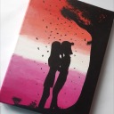
Here is my trip to Woodward Park :) Not for an assignment but I wanted to take pictures and document my trip there. The weather was beautiful and the scenery was so tranquil. It was overall a great day and ended off with a beautiful pink/purple sunset.

Bonsai

Woodward - 1

Koi - 1

Koi - 2

Koi - 3

Woodward -2

Peacocks

Waterfall

Shinzin Bridge

Woodward - 4

Sunset
0 notes
Text


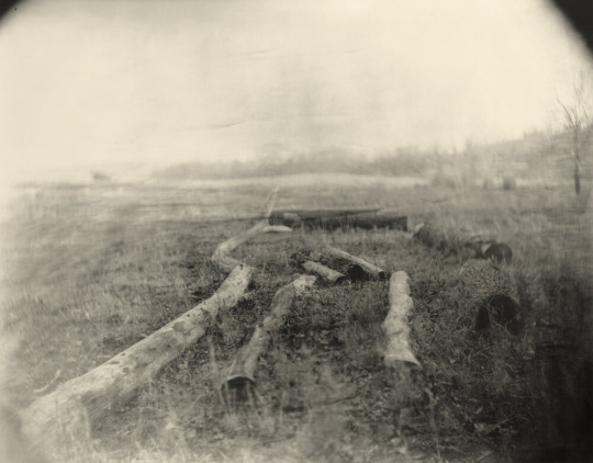
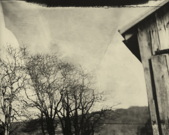
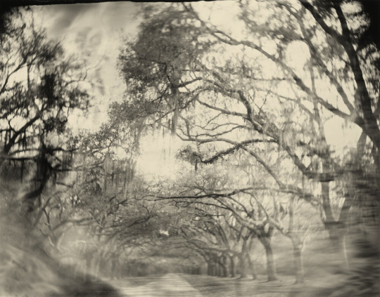
Applying Design Fundamentals to Photography Scavenger Hunt
0 notes


Text
Design Fundamentals: The Principles and Elements of Art
Line: Lines that are present in a photograph are powerful tools, they guide the viewer’s gaze throughout the image. For example, a winding road or a river can lead the eye deeper into the scene, creating a sense of journey and exploration.
Shape: Shapes arise from the contrast of light and shadow, helping to define subjects within the composition. In a photograph; shapes can be well defined within the piece.
Form: Capturing form involves using light to emphasize the 3D element of an object. For instance, the soft shadows on a round fruit or sphere can enhance its realism; this gives the object form.
Color: Color plays a crucial role in setting the mood of a photograph. Color influences the emotional impact of the image.
Value: The contrast between light and dark areas in a photograph, known as value, can dramatically affect the image’s mood as well; much like color. High contrast can introduce a sense of drama, while softer gradients may impart a feeling of tranquility and a certain softness to the composition.
Texture: Texture can be captured in photography in the sense that it highlights the intricate details of subjects like leaves, fabrics, or surfaces. This adds texture to the overall composition.
Space: The use of space, particularly negative space, can be a powerful compositional technique. This further creates depth within the composition.
Balance: Balance in photography refers to the distribution of visual weight within a composition. An off-center subject can create a dynamic sense of asymmetry, making the image feel more energetic and alive, rather than static and centered.
Contrast: Contrast helps with the visual interest through differences in light, color, or texture. For example, a brightly lit subject against a dark background can create a significant contrast within the composition.
Emphasis: Emphasis directs the viewer’s focus to a particular area or subject in the photograph. Techniques such as selective focus or depth of field can isolate the main subject, making it stand out and drawing the viewer’s eye directly to it.
Movement: Capturing movement in photography can convey a sense of energy and fluidity. Techniques like long exposure can illustrate motion, such as flowing water, swaying trees/flowers, moving cars; etc.
Pattern: Patterns emerge from the repetition of shapes, colors, or elements within a photograph. Rows of trees, windows, or any recurring motifs can create visual rhythm, leading the viewer’s eye throughout the composition.
Rhythm: Rhythm in photography refers to a visual cadence established by the recurrence of elements. This can guide the viewer’s gaze and create a sense of movement, enhancing the narrative quality of the image.
Unity: Unity is achieved when all elements within the photograph work together cohesively.
Proportion: Proportion can be used in photography in order to emphasis the relationship between size. The Golden Rule is also used commonly in photography in correlation to proportion.
0 notes
Text


Chae's Relaxing Weekend
1 note
·
View note
Text

Hello everyone! My name is Chae! I am a Senior at California State University, Fresno majoring in 3D Character Design. My goal for Mochae's Art Corner is to upload my artwork along my academic journey and to learn more about Photography! ^-^
In my free time, I enjoy spending time outside and exploring new places, spending time with loved ones, playing video games, and listening to music. I am also the President of the Fresno State Animation Club! :)
0 notes