
Don't wanna be here? Send us removal request.
Statistics
We looked inside some of the posts by moderntechnologybethanyjugg and here's what we found interesting.
Average Info
Notes Per Post
0
Likes Per Post
0
Reblog Per Post
0
Reply Per Post
0
Time Between Posts
1 hour
Number of Posts By Type
Text
13
Link
4
Last Seen Tumblr Blogs


Fun Fact
130K people were victims of a chain letter scam that affected Tumblr in May 2011.
Text
500 Word Report on Artificial Intelligence
Artificial Intelligence is an area of computer science which relates to the creation of intelligent machines, which work and react in the same way as us humans do. Making it an essential part of the technology industry. AI systems demonstrate many behaviours associated with human intelligence such as planning, learning, reasoning, problem solving, perception, motion but rarely ever creativity and social Intelligence. Artificial Intelligence has been used in recent years to develop and advance different fields and industries such as finance, healthcare, education and transportation, but it’s also developed things like medical diagnosis, electronic trading, remote sensing and robot control, it’s continuously developing.
In recent years the breakthroughs in Artificial Intelligence have been highly successful all over the world, which many of us love, but how effective really are they. Artificial Intelligence has been brought to us in the form of Amazon’s Alexa, Apple’s Siri and Samsung’s voice recognition, allowing us to gather new data with ease. This just being a few of the applications it is used for. It can successfully recognise who is in a photo, detect credit card fraud and most recently it has been used in the form of facial recognition to unlock your mobile device, or pay for online shopping. However, there are many developmental issues regarding Artificial Intelligence. It cannot simply do the jobs we do, it has no form of creativity and is no way advanced enough to have social interaction or have feelings like humans do.
The tone of voice used does not always work for all age ranges, you cannot have an app that speaks to you using slang, as it does not appeal to an older audience and vice versa. It has to appeal to every age range in order to be successful. Security is a big factor when designing anything that uses personal information, there’s a chance that it has access to personal information on your phone, this includes contact, saved card information from online payments and email data. Another big issue are security threats and Cyber Crime. In many situations a huge amount of business data is involved, millions of records and depending where they are from they can have a huge value e.g. previous transactions or medical records from hospitals.
In the last couple of years face recognition has been brought into airports. This is a way of speeding up the process of passport control, however not only has it cost the job of many staff, it isn’t as successful as first anticipated, as it doesn’t always recognise your face. The same issue comes with face recognition on a phone, if you look different, it fails to recognise it’s you. Alexa has had many problems in terms of voice recognition, it cannot always understand those with certain accents, a major flaw that has put off many from buying the product. With the expense of maintenance is it worth it. Other developmental issues of AI include that it is not always compatible with other devices, it does not always give you the right answers so it can’t always be trusted, it does not understand context. AI does not have any morals, it has not had any life experience to know standard principles like right and wrong.
Artificial Intelligence has already been introduced in different forms, with many of the idea’s being unsuccessful like self-driving cars. However, I believe that the future for AI is massive and we will see a whole range of applications using it, from around the home products like Alexa to robots in the medical industry. I think what we’ve seen already is just a taster of the potentials of AI. By 2030 AI will be that far advanced that there’s the possibility that some professions will be taken over by robots, even those in the creative industry, I believe that robots will have a mind of their own, like us humans where they are capable of making decisions of their own, putting our jobs at risk, robots could end up being more capable of completing tasks than humans.
0 notes
Text
When I was given the world issue Poverty I was a bit worried because I didn’t know what I was going to do for the campaign as I did not have much knowledge about the issue. But by having one-to-one’s with Glenn and by doing extensive research into the issue I found out that one of the main causes of Poverty is Debt and this is because people are unable to track their spending. Something that I myself struggle to do so I thought it would be perfect for me to look at. The area’s of research that I looked at helped me with the development of the campaign video and the Hook as I looked at statistics based on Poverty, which helped me to find out just how many people are currently facing Poverty in the UK and why this is. I also looked at existing videos, websites, video styles and existing campaigns which helped me to get inspiration for my video.
Once I had gathered enough inspiration I started to work up a storyboard so when it came to developing my video on screen it made it a lot easier, I had something to follow and if I was stuck I was able to refer back to it. I was a bit worried about designing the video as I have not designed many in the past and it isn’t my strong point. But I jumped straight in and I was happy with the outcome. For the video development I took all my inspiration, information that I found out, music and video and created a campaign video for Poverty and Debt. As I wanted to solve the world problem by creating an App to help people track their money I had to show the App within the video. I had also never designed an App so I was thinking of the best way to create it which would be easier for me but have the best outcome. I thought about designing the App from scratch using Illustrator, however I decided against this because there were so many to design and I had limited time to do so. So I found some templates online to help me which was a good decision as it helped me massively and I got some amazing outcomes, they look really professional and looked great in my video. I am happy with my video but if I was to re-design it I would have explored more layouts for the video. One problem that I faced when designing the campaign video was that I found it hard to download the music from YouTube for my video. Due to my basic knowledge of After Effects, I found it hard to get the timings right, things were playing too quick so you couldn’t read them. I struggled to find different effects to use in the video, at the start the effects that I was using were repetitive until I looked on YouTube and found some cool effects to use. Overall I did struggle a little with the development of it, but I managed to do it to the standard I wanted it.
Moving onto the Hook I knew from the start that the Hook would be related to the App, it would be an event, which included a talk from Martin Lewis and it would take place at school/college to teach people the importance of saving money. So taking inspiration from the research and the storyboard that I created for the Hook I developed my video. I faced a massive problem with the timing of the video, some of the text disappeared too quickly so I had to re-work this and make them appear for longer. Another problem I faced was rendering the video, I had to render it through Adobe Media Encoder but this was easy enough to do.
I had never created a website from scratch before so I decided to use Wix to help. Using one of their templates and inspiration from existing websites I developed by website. On the website I placed my App mock-up’s as I was very pleased with the outcome of these. I also added information relating to the App, the safety aspects and the users. The issue I faced when designing this was trying to get the design right, as I had never used Wix before I had to spend a bit of time teaching myself how to use it, however when I did it was pretty easy. Part from that I didn’t really face any issues.
Overall I am happy that I was given the world problem Poverty as I have learnt a lot from doing research on the issue. I also like the fact that I had to create a website, a video and an App, the three things I have not really designed before so I felt it really pushed me out my comfort zone. Yes it was a challenge but I loved doing this project and I am happy with the outcomes.
0 notes
Text
Published Website
This is my published final website design. To create the website I used a template on Wix. Taking inspiration from existing websites that I previously looked at, taking influence from the rough website layout sketch I and the App mock-up’s that I designed I create a fully working website. I played around with using different animation effects found in Wix to make it an interactive website. I also added links to social media and buttons and forms that work to make it as realistic as possible. The inspiration that I took from other websites included: The use of mock-up’s, the security section, the amount of users and the reviews section, this goes to show that the research massively helped me with my design.
0 notes
Link
0 notes
Text
Development

The first thing I did to edit the template was remove the existing image by selecting it and pressing backspace which deleted it. I replaced it with what I thought was one of my best phone mock-ups.

To upload it I clicked on the + and then ‘My image Uploads’, which brought up a screen where I could upload and store images from various places including my desktop.

To select the image that I wanted I clicked on ‘upload media’. It allowed me to chose where I wanted to source the image from, I clicked desktop and found my PNG phone mock up and pressed ‘choose’. This uploaded my image to my page and I was able to position it wherever I wanted by dragging it with the mouse. I decided that this was the best place for it, in line with the text.

Next by doing the same process of uploading images I added my final logo and strap line to replace the logo that was already in the template. I decided to keep it on the left as this is commonly where existing websites place it and I thought it would look out of place on the right.

Obviously I was not going to keep the original text so I deleted that and replaced it with ‘your all in one money saving App’ as this is what I called my App in my video. I did this by clicking on the text which brought up a ‘edit text’ box. This allowed me to adjust the text and change the sizing and font.
I also changed the colour of the last word by clicking the first A. I highlighted this word so people would understand that the website is for an App. I made it pink to link it to the logo.

Lastly for this page I changed the names in the menu by selecting the text and pressing ‘manage menu’.


Up popped this box which allowed me to edit the text.

To create the download box I went to the menu and selected the button option, this gave me a selection of different boxes that I could use. I used the third one as I liked the gradient on it.


To add the text I clicked ‘text’ in the menu which popped this box up where I could chose which size text to use.
The next part of the website involved showing how the App works. I kept the text as I felt it worked well as the title for this section, I just moved it down a little by selecting it with the mouse and dragging. I was going to change the colour but I didn’t think there was any need to.

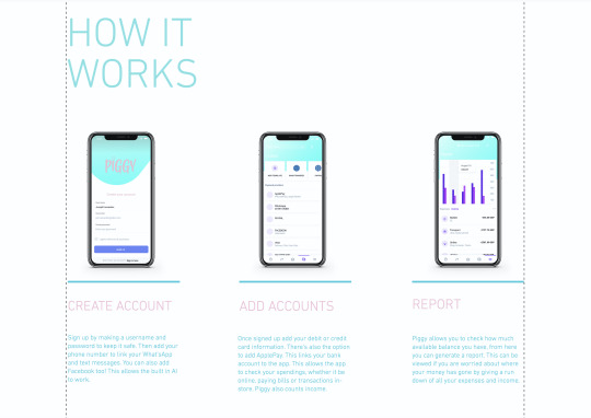
I thought that it would be a good idea to include all of my phone mock-up’s on the website to help explained how they worked. These took the place of the large numbers that were seen in the original template. To place the images in I went to add> Image> My image uploads> Upload Images> Desktop> Selected the PNG I wanted> Choose> This placed the PNG onto the screen where I dragged and positioned the image where I wanted it. Underneath each of the mock-ups I added a detailed description of what was on the screen. All the phones were in order of how the App works.

When I uploaded my images this is where they were stored.

I repeated the process for all of my PNG’s and aligned them accordingly. The website itself gives you guidelines and helps you to align them.
I decided to make no adjustments to this download button as I thought the colour worked nicely and I liked the simplistic design.

For this ‘about’ section of the website I was explaining the story of the campaign, the vision and the technology involved in detail. For ‘our story’ I said about how Poverty affects 14 million of us in the UK alone. That is 8 million adults, 4 million children and 2 million pensioners. This is due to lack of education, addiction to drugs and alcohol, people taking out loans and disabilities so people are unable to work. But the main cause being Debt because people are unable to track their spending. I then moves onto their vision: Piggy has a solution. W want to tackle Poverty with our all-in-one money saving App, that allows you to keep track of your spending, as well as upcoming bills. We want you to be able to check your bank account at a touch of a button. A piggy bank in your pocket, a place to store your money and keep it safe. But most importantly stops you from getting into Debt by helping you to save.

I also decided to add a bit about technology, its says Piggy uses AI technology to interconnect data. Not only does this help you to save by keeping track of your spending through your email, texts, WhatsApp, facebook and bank account giving you reminders, pop-up’s to put you off spending, it also used AI to interconnect with others using the App to find the best deals.
Most of the text was what I included within the campaign video, the rest were things I added which related to the App, how it works and the history behind it, why I have done it. All of the design was there already, I just edited it to relate to Piggy, I left the hexagonal designs the same, as well as the titles, I changed the colour of the title to pink and obviously replaced the body copy to my own.

I decided to add in my Hook as the ‘event’ to show that the website isn't just for the App but there is an event you can visit too. I also thought it was a nice extra and that showed off my Hook. A lot of websites that I looked at previously have a video on their website that is usually either their advert or event video.

I thought it would be best to include a safety section on the website as I didn’t include it in either of my videos, but I felt like it wouldn't be seen anyway, plus its a bit boring no one will want to read it. Using the tool to add text I typed out the word Safety and placed in at the top in the centre of the box. I found the two icons on an online icon website which I thought related well to what I was talking about. I downloaded them and saved them as PNG’s, uploaded them and placed them onto my website. For the pig I removed it from my final logo, saved it as a PNG and uploaded it and placed it on the right. I decided that I wanted to create a character or an icon for the website and I thought the best thing to use was the pig from my logo which I had already designed, I thought it worked really well. The line in the centre already existed on the page.
The safety information included basically explained that we are here to help if you have any questions, with the support link and the second paragraph of information was about encryption for personal information. I thought it was good to add on the end a bit about how Piggy does not share any personal information just so people know that none of their information will be shared.

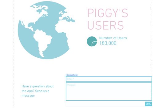
When researching I noticed that many of the websites include reviews, it is a way of showing peoples views of your App and sometimes this is what gets others to download your App. So I decided to make up some of my own as obviously the App is not a real thing. The title was already in place, I just adjusted it to say ‘reviews’. Underneath I added a couple sentences ‘join our growing group of savers and start saving now!’ and ‘So far we have helped 183,00 people, could you be the next one?’. People like seeing things like this and it gets them interested and then want to download the App. To create the boxes I used the shape tool and then adjusted the colour to pink. I duplicated the box 4 times using the duplicate option found in the tool menu on the right. For every other one I changed the colour, one dark pink, one light pink. Then using the text tool I typed out my made up usernames and reviews. I even added an icon to represent the person posting the review. Usually you see an account picture but I wanted to make mine different, plus these are made up people. When looking at the website Moneybox I got inspiration for the users section. I thought it would be a nice touch to the website, it lets people know just how many are currently using the App, so they think that it must be good. I found the globe on an icon website and downloaded it as a PNG. I uploaded it to the website and placed it on the page. The original colour was black which I thought was too harsh so I selected it clicked ‘effects’ and placed a blue effect over the top which made it appear blue. For the text I used the text option and typed out ‘Piggy’s User’s’ in capitals so it could be seen. Underneath using the text tool I wrote ‘number of users’ and the amount of people that had currently downloaded it. The circle is an animation and when hovered over the magnifying glass moves. The contact form was already in the template and actually works when you click in the box, you can fill it out and press send. I was originally going to delete this but I thought of a way I could incorporate it into my website. If they have any questions they want to ask they can ask them here and submit the form with their email so piggy support can get back to them.
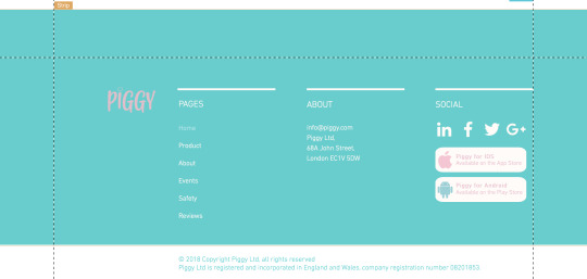
Lastly I adjusted the bottom section of the website to fit Piggy. I changed the logo and the page names to Home, Product, About, Events, Safety and Reviews as those are what my pages are labelled as. All the names were interactive, if you clicked them they would take you to that page, really cool!. I changed the About and added a made up address for Piggy and for social I kept the icons as they worked well and also they were linked so when you clicked on one it would take you to the Instagram page. I did not know how to re-link them so I left them how they were. I added the rectangles which when clicked would take you to the download in either the App Store or the Play Store depending on what phone you have. I found the icons on Flaticon and added effects to them to change the colour.
The whole website is very much interactive, as you scroll down there is a lot of movement. This is because I added effects to each object, text and image. To this I selected the item and clicked ‘effects’ and then ‘animation’.

Animation is selected green.

For all items I added a float in effect, apart from the pig character which I added a bounce in effect. As well as this most of the buttons work and are linked to other pages, social media pages and anchor points. I am really happy with the outcome.
0 notes
Text
Development


I had a look at a few more template designs and found these two that I really liked, but I couldn’t decide what one looked better. So I had a look at both to see what they included and I decided on the second one because I just liked the gradient at the top of the page, the colours work nicely with the App colour. I also liked the layout and how different things moved as you scrolled down, it was interactive. I have selected this design and will now start to edit it.
0 notes
Text
Development


I found choosing a template for my website very hard as quite frankly there are so many to chose from and many of them would work. I just needed to find one that includes everything I need it to. It is important that the layout will work, as well as the colour as it has to work with the logo and the App design.
I decided to start off by asking the website to create it for me, I chose ‘business’ as I wasn't sure what section to chose and then chose a colour palette that related to my logo. Above is the website that it produced. I liked the layout of it, as well as the colour but I thought it looked a bit girly. I tried to get the design to work by adding the logo but I just was not feeling it. It also didn’t have all the sections that I needed it to.
0 notes
Text
Deciding on a Website


The last website builder that I looked at, and have decided to use is Wix. Very much similar to the other two but it gives a whole range of template styles. As soon as you get on the website you click ‘start now’ which takes you to the page where you can chose what kind of website you want to create. You pick a section which allows you to chose how you want to create your website, whether this letting Wix ADI create a website for you or create a website with the Wix editor yourself. I have decided to create the website myself but using one of their templates. Once you click on the create it yourself button it takes you to a page full of different templates (as you can see above). This website builder is free, to use and to publish your website.
0 notes
Text
Deciding on a Website
The next website I looked at was Weebly, another website builder. The website included all of the same tools as GoDaddy as you can see in the second screenshot. You are able to adjust text, the title, add images, add buttons, spacers and even dividers. I had a look through the templates and found the one in the first screenshot which I thought would be nice to use for my website, the template would work for what I wanted to include, but it wasn't until I looked at publishing the website that I realised you have to pay to publish the website. This became my second choice, but I could fall back on this if another fails, I will just have to pay the fee.


0 notes
Text
Deciding on a Website
I have decided to create my website using a website builder. However I am unsure which one to use as I have never create one before. So I want to some research and find out which one would work best for what I want to do, something that is free, gives the best layouts, is easy to use and lets you publish online with a free domain.


The first website that I looked at was GoDaddy, a free website builder which lets you create your own websites using their templates. It lets you change the text, photography, composition, colour and add extra pages if need be. It gives you everything you need to create website, but you have to pay the 0.99 for a domain name. However, I wasn't too impressed with the templates that it gave, they looked to clean for what I was looking for, and they looked like any other website.

A few of the templates found on the website.
0 notes
Text
Layout
Now that I have looked at existing websites I have gathered some ideas for my own. This is a rough layout of how I want the website to flow and the order of things I want to include. This is just a rough sketch but it just gives an idea of where I am going with it.

0 notes
Link


Lastly I looked at the website Mint. It is very different to the previous two that I looked at, it’s very clean and uses colour in only a few areas, but it features everything that it needs to, it explains what the App is, how it works and shows various images which show what the phone looks like on screen. I want to include my mock-up’s on my website to help me to explain what the App does. I also want to include a section about security, as every website I have looked and does so I feel like I need to too.
0 notes
Link


Next I looked at Cleo and was surprised with what I found. The logo itself is light blue with a gradient background, however you see none of these features on the website. If the name was not there would you know what the website is for? However I love the design, it’s different. I like how it’s broken down into square sections and I like the use of phone mock-up’s. One thing I want to take from this website is the graph idea, could I somehow create something similar, but not copy it for my website. The website itself is animated and has various different moving items, including the phone screen, I want to take this element and use it for my design in some way.
0 notes
Link


Before designing my website I wanted to have a look at existing website designs for money saving App’s to get inspiration and see what sort of things they have included. The first one I looked at was MoneyBox, which I loved. The things I like are the colour used, the blue link’s well with their logo and you see it in various different places across the website. I like how they have explained how part of the App works at the top of the website using illustrations and phone mock-up’s, it’s a nice introduction to the website. I love the character designs and how they have added a few more mock-up’s of the App further down the page. Overall I just love the whole layout, how clean it is and the little details. I have also noticed that they include a video a the bottom of the website as well as reviews. I want to take these to aspects and use them for my website.
0 notes
Text
Website
My final task is to design a website for my campaign. So for me this will mean creating one that features my App and explaining how it works, I will also be including my phone mock-ups that I previously designed. Other things that I will include in my video are: My event, a back story of the world issue, so Poverty and Debt as this is the area that I have decided to focus on and a bit about the AI side to my App.

0 notes
Text
Final Hook and Evaluation
youtube
This is my final Hook video which I uploaded to YouTube. I was a bit worried about getting the video right and worried that it wouldn't link to the main campaign video. But by doing research into existing Hooks and Adverts, it helped me to get inspiration for what to do. To start with I wasn't sure what a Hook actually was but by doing this research, it helped me to realise what they involve and what sort of things have been done already for Hook videos. They are pretty much teasers/ an advert for something bigger whether this be a product, an event or promoting a business, hooks can be used for a whole range of things. I realised that most include dramatic music, video, still image and tone of voice to promote their ‘thing’. Some even use voice overs and detailed animation.
I took the inspiration and added in videos relating to my topic, this included a video of people shopping and someone scrolling through a phone (this is supposed to represent someone on the App). I used the same dramatic music as I did for the main video. I also added in my logo in multiple places to make sure people understand what the video is for.
Throughout the video I followed my storyboard that I previously created which helped me massively when developing the video on screen, I could refer back to it when I could not remember what the next ‘stage’ was. I found creating the video itself easer although my knowledge of After Effects was lacking. I tried my best to add in some effects that I think work well, the text works nicely, its legible and the video flows well, you can understand what it happening. It links well with my other campaign video so I am happy with the outcome. I did stumble on some problems when designing the video. I tried not to use the same effect on the text but the fade on, fade off effect worked really well, it made the text flow well so I decided to keep it. Another issue that I faced was the timing. In order for people to read each piece of text, it has to stay on screen long enough. Some of the sections had large pieces of text therefore they needed to stay on for longer, a good 5-10 seconds. After rendering out my video I realised that I struggled to read some of the text as I simply couldn’t see it for long enough, so I had to back and adjust all the timings which was a pain. But I overcame this. I ended up adding to the video something that was not on the original story board, I decided that the middle of the video was a bit dull so I decided to add in a background video of someone scrolling through their phone, this was to portray someone on the App.
0 notes
Text
Development
Now that I had everything ready for the Hook video I started to develop it in After Effects. The first thing I did was create a new composition by going Composition> New composition and changed the duration to 30 seconds. The video only needed to be short as it’s a hook, kind of like an advert.

I kept the composition colour black to match the other video

I pressed ‘ok’ which made the new composition as seen above.

Next I added in the video that I sourced from Pexels. To do this I dragged and dropped the MP4 into the layer section which automatically placed it into the composition, which also scaled it to the right size.

As I didn’t want the video to play the whole way through the Hook, I placed the current time indicator on the part that I wanted to cut, then went Edit> Split later, which split the layer in half. To get rid of the part of the video that I didn’t need, I selected it with the mouse then backspaced, this deleted it.

Next I selected the Text tool and using the font Helvetica I typed out the first line of text. To change the font and the sizing I went to ‘character’ and adjusted them accordingly.

I decided to align the text to the middle of the composition using the alignment tools. The section is found just above the character panel.


This is how the text worked on screen. I decided to keep them lower case. I tried using all caps but I felt it was a bit in your face. A bit ‘shouty’ so I just used the capital for the start of the sentence. I kept with the white colour.

Like for the previous video, I faded text in and out using the opacity tool. Using the current time indicator I created keyframes in multiple areas of the composition. What I did was place the current time indicator at the start of the video> Hit the opacity, which created a new key frame> Changed the opacity to 0%> Then moved the current time indicator along a second> Added a new keyframe and put the opacity up to 100%, this faded the text on. I did the same to fade off, just the other way around. I moved the current time indicator to about 5 seconds and hit the opacity> This created the new keyframe> kept the opacity at 100%> A couple of seconds later I created another keyframe and put the opacity back down to 0%, this created a fade on, fade off effect. It was as easy as that. I did this for most of the text.


Using the exact same process, the same font and colour I added the next piece of text. All I changed was using the text tool typed out the next piece of text which created a new layer. I aligned it to the centre and changed the opacity like before.


Again for this section of the Hook I used the exact same process, the same font and colour I just changed what the text says. I did this using the text tool and typed out the different piece of text which created a new layer. I aligned it to the centre and changed the opacity.

I decided to add my logo into the next section of the video, therefore I dragged and dropped the PNG into the layers section.

Using the type tool and the font Helvetica I typed out the rest of the text, leaving a space for the logo to fit in. I used the opacity to fade the text in and out but I had to make sure that both the text and the logo faded at the same time. I used the current time indicator to make sure the keyframes were aligned.

I typed out the next piece of information using the same process but for the ‘Martin Lewis’ part I created a new layer and made the text pink to link it to my logo design. This allowed me to fade both pieces of text on at different times. I found the icon in the corner on flaticon, downloaded it as a PNG and placed it into my video to represent Martin Lewis.
At this point I added in my image of the event which I did my dropping the image into After Effects. I cut the video by splitting it and deleting the bit I didn’t need. Where I split it I ‘showed’ this image.


Here you can see that I adjusted the position of the icon. I did this by placing it off the screen, hitting the keyframe, moving it onto the screen and clicking the keyframe again. At the same time I adjusted the opacity.

I then added ‘this will teach you about the importance of saving money to stop you from getting into Debt’ using the same process. I changed Debt to pink.

‘Are you a college student’- because if they are they can get a code at the event which allows them to get pre access to the App.

For the I changed the opacity but also added a ‘slow fade on’ effect which I found in the effects and presets section. I selected it and dragged into onto the text.

I split the event image layer and deleted the part that I didn't need and replaced it with this video which I found on Pexels videos. I decided to use this as I thought it made it look like someone was scrolling though the App.

You can see here where I split the layer and added the video

I added the next piece of text using the text tool on top of my video layer and kept it white. I was worried that the white wouldn't be legible on top of this video but I think that it works.

My final piece of text which I added using the same process as for all the others.

Lastly I got rid of the background video and left it black as I thought it would make the text stand out clearer. I typed out my text and decided to include the logo once again, so I left room for this. At the end I decided to include the Piggy which is found at the top of the I in the logo. I thought it would be nice to add at the end of the video.

This type and logo was left on the screen for the rest of the video.

By dragging and dropping the music into the layer section I added music to my video. This was kept at +0.0db throughout the entire video.

Now that the video was finished I went File> Export> Add to media Encoder Queue

This brought up this screen.

I clicked ‘Match Source’

‘Entire composition’ so it rendered out the entire video rather than just a section of it.

I pressed OK

And the green start button, this rendered out my video to a MP4 format.
0 notes