
Don't wanna be here? Send us removal request.
Statistics
We looked inside some of the posts by moonmurph-gamedev and here's what we found interesting.
Average Info
Notes Per Post
0
Likes Per Post
0
Reblog Per Post
0
Reply Per Post
0
Time Between Posts
10 days
Number of Posts By Type
Text
17
Last Seen Tumblr Blogs


Fun Fact
Tumblr has 16.74 million mobile monthly users in the US.
Text
Task 2
Movement
I created a variety of animations in Maya using the same robot skeleton that I rigged. It’s great because I can export these animations into Unreal and it’ll automatically apply them to the same skeleton and mesh.
I then create an animation blueprint which will make use of different blend spaces. Blendspaces make the transition from one animation another smoother and more natural.

At the bottom you can hold shift and preview the animations transition. You can edit the attributes to make the transition sharper or smoother. I’ve left it at the default settings as I’m happy with it’s appearance.
After creating blendspaces for
Idle > Walk, Walk > Sprint, Jump > Double Jump
I used the animation blueprint to call upon them. This makes uses of certain states and checks to see if certain variables are true allowing the robot to perform certain animations.
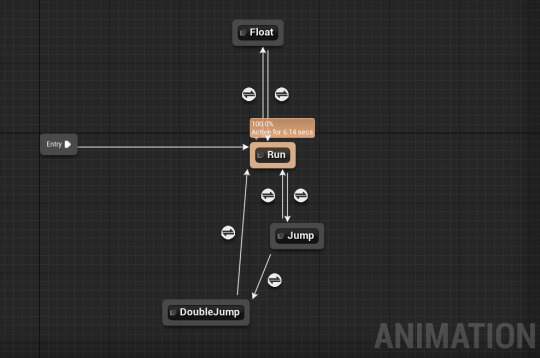
For example the run animation only begins when movement is detected. Otherwise the Robot will stay in it’s idle animation.

When the robot jumps it changes to the jump animation and only when airborne is it able to perform the double jump animation. It will then stay in the jump animation until it lands back on a walk able surface.

Each of the arrows must have a criteria set so the blueprint knows when to transition to different animations. When compiling the blueprint it’ll alert you if you’ve forgot to set criteria for any of the transitions.
I’m really happy with the animation blueprint so far. It’s been a learning curve as I’ve not dealt with it before and I’m having to do lots of communicating between different blueprints but I’m certain with practice I’ll get the hang of it.
At the moment I have all the basic movement animations created and working in Unreal. Including a float animation which increases the Robot’s movement speed! This will act as a sprint which will expend the characters stamina.

Attacks (Combo)
I’ll be creating melee attacks for my robot. I’ll make a variety of melee swings so the attacks are not repetitive. I’ll also create the special attack which will be a spin.
Whilst creating the melee attacks I had to also think about how the legs, body and non-attacking arm would move with the weight change. It looks a lot more realistic when the whole body is moving in animation rather than just a single limb.

I created 3 Basic melee attacks. One swings with the left, one swings with the right and the final swings with both arms. Later on I’ll make use of particle effects to make the attacks more visually interesting.
After exporting my animations, I created three animation montages. I then used ‘anim notify’ to show in the animation where it would make contact with the enemy.

This also is used to give a small window where the player is able to attack again and begin a combo.


An issue I came across was that it was resetting the combo too quickly. I slowed down the playback of the animation by a small amount and moved the anim notify to give the player a bigger window to combo. This way the attack animations play out a little more whilst still being able to lead into a combo attack.

0 notes
Text
Task 1

For my project I decided to change my character to a more cartoony proportions such as large head and eyes and smaller limbs. I kept this in mind as I designed my new character.

There’s a big difference between cartoon character compared to more realistic ones. I’m aiming for bright simple colours and animations to match.

I like the idea of having floating limbs like Eve from Wall-E and baby proportions. This also stays true to my project name which is ‘BabyBot’
After creating a model in Maya I also rigged a skeleton and created two animations in the previous unit.

I’m happy with the robot I created and I’m excited to begin the process of turning it into a third person player character.
I created some animations in maya such as jump, attack, walk, run, sprint. These I’ll implement in task 2.
The reason I decided to create my own animations instead of using ones found online is because I wanted to challenge myself to have a project where every model and animation was created by myself. That way I can see where I need to improve and fill in any gaps of knowledge by doing my own learning outside of college.
0 notes
Text
Introduction to Unit 52
In this unit I’m challenged with implementing a 3D character to animate in UE4.
I also need to create attributes and abilities necessary for my game play functionality.
0 notes
Text
Unit 70
Pre-Production
Inspiration

I looked at my Mood-Board that I had created for Unit 79. I decided to look into those games I mentioned and create a mood board focusing on their game environments.


I found a lot of stuff from these games which I liked. I really like the low-poly rocks and trees that animal crossing and LittleBigPlanet use. They’re also assets which can be made quickly and in large amounts so you can create a nice variety to populate the game world with. In Splatoon I like the bright billboards and signs which decorate the city. I’ll be creating an urban section to so I’ll look into how they’ve created various buildings.
Urban Environment Board

Nature Environment Board

My plan is for the player to start in the nature environment. They’ll be sent to retrieve a key from the bottom of a mine so they can enter the city. The city will be located on the higher portion of the map.
Landscape
Sculpting
I created a basic flat landscape and began using the sculpt tool to create a higher area. I then used the smooth tool to smooth the cliff side so the textures weren’t as stretched.

I also used the flatten tool which upon use makes anything you brush over the same height as what you started on. This is great for having flat ground at different heights.

I then used the ramp tool to place two points. I moved the bottom point a little closer to the cliff and adjusted the width of the lines to give the cliff a thicker walkway.

This is a great tool for creating natural ramps between two different levels in the environment. It’s a lot quicker than manually sculpting, smoothing and flattening a ramp myself.

By holding shift I can invert the brush and create crevices in my landscape. I used this to create a pond which I’ll later fill with water. I made use of the hydro-erosion and smooth tool to get a realistic slope into the pond rather then it being too sharp.
It’s important to think about how the different sections of the landscape would have different materials (when I later paint the landscape)
When creating a landscape you can also choose to use height maps which automatically generate and sculpt your landscape according the a height map image. This is great for creating huge landscapes where manually sculpting every mountain and crevice would be too time consuming. For my project however I decided to simply sculpt it myself as I’m only creating a small compact environment. A downside of this however is I’ll have to make use of fog, lighting and assets to hide the edge of the world from the player character. This becomes much harder as they reach higher areas. I wouldn’t have this problem if I had decided to the an interior of a building. I’m happy with my choice however as I’m enjoying the landscaping tools and learning a lot about UE4 which will help me in the future.
After the painting processs I went back and sculpted hills around the edge of the area to act as a natural barrier to contain the player.


Painting
To start the process of painting my landscape I first had to create materials for the different layers such as grass, dirt and sand.
I found a few images of grass and edited them together in photoshop.

I added small dots to stick to the stylised feel that I’m going for. For the dirt and sand I simply found some JPEGs from online that suited this style. I then imported the textures into UE4 and began working in the material editor to create a landscape material.
I created a layer blend with different sections for each material.

I did the same for the normal maps which I also created in photoshop.
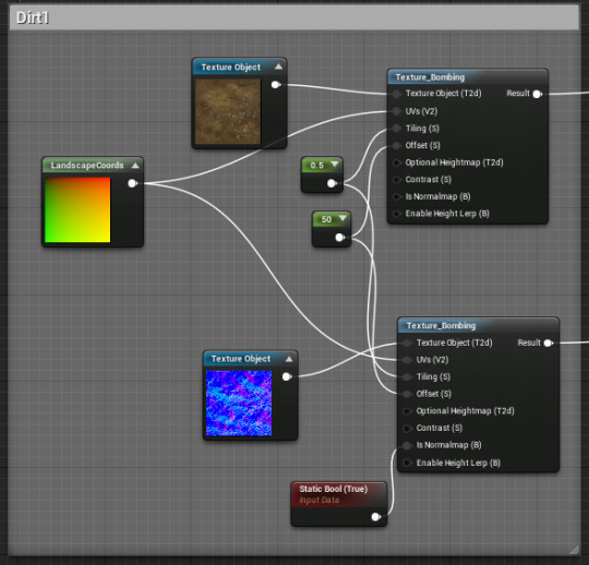
An issue I had with the materials is that they were tiling and it didn’t look good when placed on the landscape. To reduce this I used ‘texture bombing’

The texturing bombing lets me add some variety to the texture tiling. I also did the same with the normal maps so they line up correctly. The normal maps are great for giving the illusion of depth to the grass. I used similar techniques when adding my other materials.

Another issue I had with some of the dirt was I didn’t like the colour. I simply used a colour parameter to add an orange hue. This also makes the dirt work nicely with the rock assets I created.

I mentioned how it’s important to stick to a colour palette so the world looks coherent.

All the textures then connect to the layer blend which then connect to the base colour and normals. I also added a 0.5 constant to the roughness which makes the landscape reflect light a little less. I could of set it to 1 to be more realistic but I like the small shine and I’m not going for complete realism.

Painting in UE4 is really simple! You simply select the layer (after creating a landscape layer weight) and use the brush to paint directly onto your landscape. You can edit the brush size and strength to get your desired affect. I started my covering the entire area in grass then covering a pond area in sand. I blended in the two different types of dirt along the cliffside (with a low strength) to create a semi-realistic cliff-face.


I’m happy with my first attempt. I’ll make use of my dirt textures to create pathways to guide the player through the natural segment of the project. I’ll also use assets such as rocks, fences and trees to populate the landscape (and help guide the player character).
I really like how I can go back and repaint the landscape at any time. As I place assets I can change the landscape to suit the needs of the level instead of being stuck with what I’ve created at this moment.
I end up going back and editing my grass texture in Photoshop. I made it more stylised and bright.

Environmental Assets
Rocks
I began creating more environmental assets to populate my game world. I started off simple by creating stylised rocks.

Here’s the base material. I then created two material instances and made the colour a parameter. I have a dark and light one to have a difference between the sides and tops of the rock formations. I wanted a cartoony and colourful environment like I described in other units.

I created my models in Maya using tools I’ve used before such as extrude and multi-cut. I then imported them into UE4 and applied the textures to preview them.


I made sure to set the collision as ‘complex as simple’ which means the character can walk along the mesh accurately.
I’m really happy with the textures at the moment. They fit the simple stylised world I want to create. I made the top edges a little brighter as I like the contrast.


I also created normal maps in Photoshop which give the illusion of depth to the material. It’s especially noticeable when the material is reacting to light.

Trees
I experimented with different trees in Maya and settled on a smooth flat top design. This will be useful for if the player needs to jump across the tree tops to reach higher points.

I did the UVs for the tree and the trunk. It was difficult finding a good place for the seam on the tree head.

I then created the material for the tree. I began with the tree head. I used two different spot patterns to create a fun material.


For the trunk I used a wood texture and changed the base colour to be darker. I also used the panner tool so the material slowly rotates.

After playing around on the materials I placed the asset into the world and placed a few to see how it looked.

I’ll create a few more variants and use different sizes and placements to avoid too much repetition. I also want to go back and tweak the landscape materials as they’re a little too realistic compared to the cartoony assets I’m creating.

I decided I wasn’t happy with the original tree texture and went back to create better normal maps which will help improve the quality. I find when thinking of ideas in my head they don’t always look how I thought when placed in the project especially when comparing them to the game world I’m creating. It’s great that it’s so easy to go back into UE4 and make changes to textures and also go back into Maya and make changes to the UVs if necessary. I don’t feel like I’m stuck when I find something I don’t like about my models because I can always edit them.

I’m a lot happier with the appearance of the trees and I’ll continue to stick to this style as I create more.
Foliage
I need to create grass to populate my landscape to give it more depth.
I began by finding a grass PNG that suited the style I was going for.

I then created a material instance and applied it to a blueprint class of four panes (double sided).

I made sure to remove collision as the player needs to be able to walk through the grass. I went into the material editor and made some changes.

Here’s the blueprint that gives the grass movement. I can change the intensity and speed the grass moves in the wind. I also used a Linear Gradient node to ensure only the top ends of the grass sway in the wind. This movement gives the scene more life.
An issue I came across was the gaps between the panes were too dark and looked weird. To remedy this I created two more PNGS and blended them together into the emissive input.

This means the texture ignores some of the light and doesn’t cast large shadows. Here’s a before and after. Notice how the gaps between the grass are now a darker green and not completely black.


I liked the grass however it was bland just having the same thing repeated across the level. I went back and looked at other foliage that would make sense to have in a forest area near a pond.

I went into maya and created some toadstool mushrooms and also some oyster mushroom clusters. The clusters can be placed on walls of rock, or trees. The toadstools can be scattered across the ground and also large ones can be used as platforms by the player. The lily-pads will be platforms for the player to jump across the pond. They’ll sink however if the player stands on them for too long!

I placed my Lilypad across the lake to see how they looked and created the texture in UE4.

Mine Entrance
I created a simple plank in Maya and exported to Unreal. I then used the landscaping tools to build a hill and carve a hole into it. I then placed my plank and rocks to create a mine entrance. I want to keep the entrance to the mine dark as it’ll teleport the player to a different area (I’m planning it to be a boss battle room) however I do want light on the outside to show off the models.


I needed to place a light at the mine entrance but didn’t have a source for the light with my assets so I went into Maya and created a lantern model which will act as this source.


I then decided to create a minecart which I can reuse for the outside and inside of the mine. I obviously only needed to create one wheel and can simply duplicate it.


I placed a couple of carts around. In different levels of disrepair. I’m really excited because I made sure to make them hollow so I can place other assets inside them of have enemies use them for cover. I can also place useful items inside which will train the player to search them and eventually let me trick them by hiding a trap/enemy in one.
Crystals/Ore
I want to create colourful crystals/ore to populate my rocky mine area. I’ve always found them really eye catching when used in other games. I created a simple cylinder in Maya and played with the attributes such as subdivision axis and height.

I can create more crystals of different sizes and shapes with this method. I’ll then create the textures in Unreal.

I made use of the Fresnel node. I’m a big fan of how it pushes out the colour. I inverted the Fresnel so unlike the holograms I made which has a coloured centre and white outline the crystals have a white centre and coloured edge. I made the yellow a parameter that can also be changed. The great thing about using material instances is that it’s the quickest rendering and is generally less demanding on the system.
I placed a couple of the crystals in the level of different colours. I also went back and created a small smooth rock to have some jutting out of.


I created some mine tracks to make it obvious to the player that the area is an old mine and also adds something interesting to the ground which is very flat and bland at the moment.


I created three different sets which I can easily extend to make longer ones. I also made bent ones for corners and some that had an incline.
Dust Clouds
I made use of the particle system to create some dust clouds to give the impression of the dusty dry area that the mines would be like.


I set the colour, hardness and extinction of the dust clouds as parameters so they can be changed on the fly.

I created a thin and wide cylinder emitter and set the particles lifespan to a constant.


Here you can see I’ve placed a couple of the emittors around the scene. I focused on shrouding the entrance to the mine as it’ll teleport the player upon entering them to an interior scene.
Lake area
I placed a simple space plane and resized it to fill the lake area. I then turned off it’s collision so the player character can move through it.


I then added a custom material that I created to the plane.
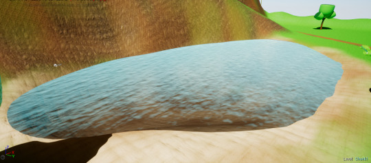

I also placed a post processing volume inside the lake which blurs and changes the tint of the screen to blue. I made it so the transition is instantaneous as the player character falls into the water.


Here’s the material that I made. The parameters can be changed in the editor which is great to easily preview how it will look. With the panner nodes I can change the speed which the water moves. I’m really happy with how my lake turned out as it’s the first time I created water. I’ll decorate the rest of the lake and great a fishing pier. I’ll also create collision boxes to change how the player character moves when inside the water.
Urban Assets
Buildings

I created a handful of small simple buildings in Maya. These can be placed together to create different buildings and give more variety. I also made sure to have sections where different materials can be assigned such as glowing sections or windows.
I placed simple placeholder textures on them to see how it looked. I used these assets for my small scene in a previous unit.

Clutter
I also created clutter such as signs, wires and lamp posts. These help populate the urban environment and make it more interesting.

This clutter can be used in lots of different ways. For example wires can hang across the street like powerlines which make the scene more interesting but also give a place for birds to sit. The same wires could instead be used to plug into a mechanical asset and give an explanation for how it’s powered. Lamp posts not only fill the street but also provide the level with a source of light which will be very useful for any night scenes I might create.
0 notes
Text
Introduction to Unit 70
In this unit I’m aiming to develop my skills in creating 3D environments to the standard required in the industry.
1. Understand the technical, narrative and aesthetic considerations to be taken into account when modelling 3D environments for computer games
2. Be able to model large-scale 3D terrains and backgrounds for computer games
3. Be able to prepare 3D assets to be used as environmental details in computer games
4. Be able to apply 2D texture maps to 3D models
0 notes
Text
Lip-Sync

I began by creating my model in Fuse and exporting it to Mixamo, I made sure to use the standard skeleton and enable facial blendshapes. I was having issues with the export failing but I simply tried it on the different computer then saved the model to my hard drive.


An issue I had was textures being transparent. I selected the textures, unclicked ‘R’ on the mesh layer and selected the ‘break’ option. This fixed all my texture issues.

I put the mesh into one view port and the controls in the other to make it easier for me whilst animating.
I downloaded my audio file as an MP3 and found a online converter to change it to WAV.

Here are the options which allowed the audio to play in Maya.
I imported the audio so it displays on the timeline and allows me to replay and slowly drag through each word.

I edited the duration of the audio to only use a short clip of it. The audio is a long monologue so I decided to cut it down to a few of the important lines.
0 notes
Text
Task 3
To start my prototype menu system I imported all the graphics I created in photoshop to my project in unreal engine.

I created a separate folder for them to keep it organised and I used the same resolution in photoshop for UE4. I made sure my canvas size in photoshop was 1920x1080 which is what I’m working in. I’ve chosen three bright colours and stuck with them throughout all the graphics. The only other colours are the white rectangles which act as a highlight for the buttons.

During task 2 I looked at ‘Hello Kitty Roller Rescue’ a game which I speak about in my history of games which was my first introduction to the playstation. It uses these white rectangles to clearly show the buttons. The splash screen and menu are very loud so it is important to highlight what the player needs to select so they know where to look.
I created a menu widget and used different canvas panels to contain the different pages of the menu.


Here’s the splash screen. The prompt to press X takes the player to the next menu. It’s also informing them that X is the select button.
After pressing X the canvas panel is collapsed and the main menu opens.

Here the player can select to Start the game, exit the game or view the credits. Each of these also collapse and open a new canvas panel. (Except for start which simply closes the menu)


If the player does select ‘Credits’ they are brought to the credit sequence. This is simply a placeholder as I’ve not added any credits yet. The credit title however is animated to tilt side to side.


The player can exit the credits which will collapse the canvas panel and return them to the main menu.
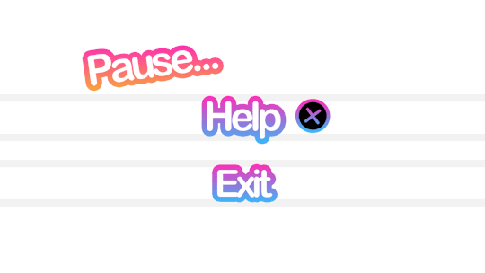
Once the player has started the game they can pause the game by pressing ‘P’ (This is placeholder as it will later be ESC on keyboard or Start on gamepad.)


I opened up the project settings and added Pause in the action mappings. I then created a blueprint which paused the game.


If the player selects ‘Exit’ it closes the pause menu and resumes the game.


On the pause menu the player can select ‘HELP’ this opens up the Help menu which displays the character controls.


The player can view the controls then select ‘Exit’ to return to the paused screen. They can select ‘Exit’ once more to resume playing the game.
Video Showcase
youtube
I’m really happy with my prototype menu so far. I especially like how the normal appearance and hovered appearance change. It makes it clear to the player what they’re about to select. I plan on adding a sound for when they select to make it more satisfying. I’ll need to ensure the sound isn’t shrill or annoying.
Issues that I came across whilst developing my menu system was that I had to manually place the graphics and size them. This caused some of them to look stretched. I realised I could go back into photoshop, view the PNG and get the exact size from there.

This allowed me to display the graphics at the exact same resolution so they look uniform.
Interactive Elements
I plan on creating an environment to be displayed behind the splash screen/main menu for before the player spawns. I’ll also add interact-able in game assets to make it more fun. It’s common in games to have interact-able elements to menus.

Skyrim lets character rotate and view in game models. I think this is a great system to keep the player entertained during loading screen and also showcase your models.

Bayonetta allows the player to practice combos. This is a great system for a fighting game however my project isn’t a complex fighting game so a system like this won’t be needed.
I’ll look into ideas for what interactive element I’d like to implement into my menu system.
I decided a fun idea would be to have clickable assets which react in different ways. I created a cute bird model in maya and exported and textured in UE4.

I created three different animations. Two Idle animations and one ‘shocked’ animation for when it’s clicked on.
I imported the mesh, imported the skeleton and the three animations and created a blueprint class actor. I then set the animation setting to ‘play animation blueprint’ I then began creating my animation blueprint.


An issue I came across was all the birds were doing the idle animation in sync which looks unrealistic. I used the random sequence player to add my two idle animations/ This means the birds will randomly do 1 of 2 animations at different speeds.

Another issue I came across was when the birds were clicked on and played their ‘shock’ animations they lost their idle animations forever. This was fixed by making the idle animations as an ‘IDLE’ state in the animation blueprint and making use of montages.

Here’s a preview of my untextured smallscene which acts as the background for the Main Menu and Level Select. As the player uses the menu they can also play around with the birds placed around the scene.
Audio
I finally got around to adding audio. I downloaded simple boop noises in WAV form and used the modulator node in UE4 to adjust the pitch and speed.


This allowed me to create two sounds one for selecting and one for going back.

Something that’s really fun that I found when using animations blueprints is you can have different ‘mins’ and ‘max’ so every time the sound is played it varies in pitch/volume. This is really useful for characters footsteps as it makes them sound more realistic. For my menu I made the pitch modulation quite small to not be too jarring.

I used the ‘Play Sound 2D’ node as it’s what you’d use for sounds which don’t exist in the game world like the interface. The other node is ‘Play Sound at Location’ which would make use of spatialization in the 3D Space.This is useful for alerting players through audio which direction the source of the noise is.
BugTesting
Most of the issues I came across were easily fixed with some workarounds however when I had issues with figuring out where in the code it went wrong I made use of my dual monitors to watch the code and see if it stopped at any points.

I also used breakpoints which freeze the project once a certain node is fired. This is great as it shows me exactly where it is in the project where nodes are firing.
Another simple way but slightly longer is adding printstrings to code which directly show text on the viewport when nodes have fired.
Updated Video
youtube
Evaluation/Feedback
I’m really pleased with my menu and the intractable birds. I learnt a lot about animations, canvas panels, cameras and player controllers. Anonymous feedback from my peers said that the seagulls was one of their favourite parts. This shows I should think about adding more ludic elements to my game. They don’t necessarily have to have any importance to the game narrative but players seem to just enjoy interaction. Feedback I received to improve the seagulls was to have some fly past during camera transitions. I think this is a great idea to make the scene more alive.
This was also the first time I used audio in UE4 and I was surprised at how simple it was. Unfortunately during my presentation and showcase of my menu, the speakers were not working so my peers couldn’t properly hear the audio. It can however be heard in the demonstration video I made.
Some feedback I received which I was really pleased with was that my ‘art style followed the same style throughout and suited my target audience’ I’m happy that my peers thought so because I spent a lot of time during pre production trying to keep my references a similar style and properly picture what I wanted to create.
The UI for example (health bar, skill bar) was received quite well. It kept to the same style suited for a younger audience.
All constructive criticism was to keep building on what I already have. To my knowledge there wasn’t anything missing that was required and the menu functions perfectly. It’s now just about going back and polishing what I’ve created. At the moment my menu system is functional and clear which I’m happy with.
I’m going to keep working on my menu system as I want to eventually make the Level Selects buttons physical objects in the small scene rather then a widget on the view port. I also want to add different interact-able elements such as clicking on lights to make them flicker or clicking on billboards/posters to change colours or pictures. I’ve created materials before where the colours change, this can be done by making the colour a parameter and making a material instance.
I implemented all the minimal elements on the assignment brief which work properly. I’ve bug tested my menu and made changes when necessary such as the animation blueprint with the seagulls. I also changed the pitch slightly on the audio to make it less shrill.
I enjoyed this Unit and I’ll be keeping this menu system in my current project which I’ll be using for the other units.
0 notes
Text
Task 2
Introduction
In task 2, I am asked to begin prototyping my user interfaces and post any idea generations or concepts I create. pre production is essential as I can better visualise what I want to create and draft it and then fully implement it into unreal engine. This is especially important for the industry as when you have other people working on the same project, The pre production is how you can share the vision and general idea of what you’re trying to create.
I’ll also take into consideration human factors during this process.
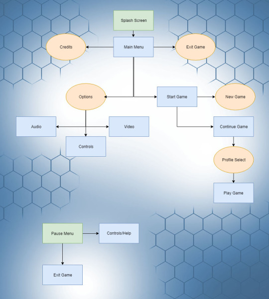
Here’s a simple flowchart detailing the way the menu system will direct the player into the game. It begins with a splash screen during the loading process. This gives the player a visual queue that the game is starting up. Then the main menu is opened with the following options:
Start Game > Takes the player to additional options
Options > Lets the player change game options
Exit Game > Exits the game application
Credits > Plays Credits for the game
If the player selects ‘Start Game’ they are then asked to either choose between starting a new play through or continuing from a previous save. Upon selecting start game the main menu will unload, the level will load and the player character will spawn.
Whilst playing the game the player character can pause and find an additional window detailing the player controls. The game can also be exited from this menu. I’m planning on having the player controls in the pause menu as it can be accessed at any time. Fighting games in particular like Mortal Kombat are notorious for having long combos that you have to remember and navigating the menu to find them is annoying. I want to avoid that in my game and have the pause menu be direct access to the control list.
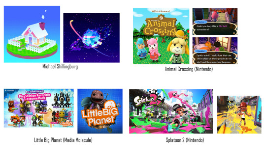
Whilst looking into some potential colour themes for my game I came across an artist and game dev called Michael Shillingburg who has a really unique and colourful style that I love. His great visuals would be perfect for a game aimed towards children and so I’ll definitely be looking at his work for inspiration when developing visuals for my project.
I also found an interesting detailing the differences between photo-realistic and stylised game worlds. I’ve decided to go towards a minimalist stylised approach and this needs to be seen in my menu/hud too.
‘The significant difference between realism and stylized is that with realism you are restricted to making things look ‘real’ while enhancing their visual language. With stylized you are free to play with the shapes and colors, exaggerate or remove details to enhance the look and feel in any direction. Doing so with realism would break the illusion of reality as it wouldn’t be viewed as what we perceive to be as ‘realistic’, it would not belong in our world.’ (Aava, 2017)
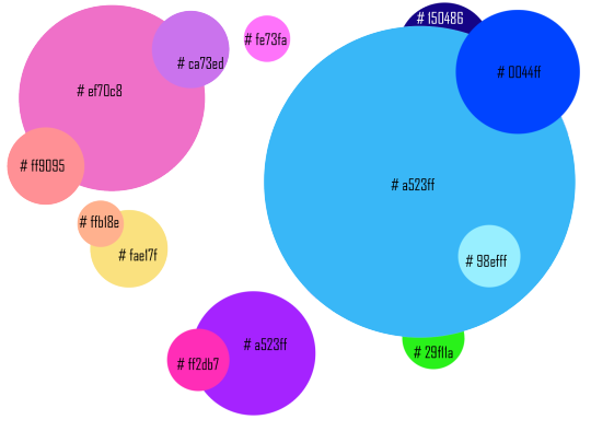
I created a colour pallete in photoshop by using the eyedrop tool and taking colours that I liked from art in my moodboard. There are a lot of colours however this is spread across the game environment, particle effects and UI/UX so not all of these colours will be seen all at once. Instead they’re spread across different environments to not overwhelm the player.
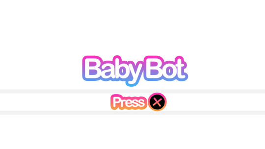
Game Title


Here’s my concept title graphic for my project. I also created an animated GIF to visualise how I’d have the title animate in game. A good use of this animation would be during a splash screen/loading screen. The pulsing animation gives the player visual feedback that the game has not frozen and it’s just taking a moment to load the next area. I chose the name BabyBot as most games popular with younger audiences have short names because they’re easier to search for online like ‘Fortnite’ or ‘Splatoon!’. The alliteration also makes the name easier to remember.
To create this graphic I simply typed up the title ‘Baby Bot’ changed the leading of the font to reduce the space between the words then I went into the effect and gave it a thicker stroke. I chose pink and blue as they’re both colours that are common on my colour palette.I like how the gradient creates purple in the middle too.

I then used the timeline tool to create 5 frames of the stroke reducing and enlarging. This gives it the movement.

I’ll use what I learnt in the future when creating animated features of my menu system. As I concept more of the projects assets I’ll also stick to a general aesthetic so it all blends together well.
My main inspiration for the title was LittleBigPlanet and it’s similar use of bold colourful fonts. I chose the name Baby Bot as it’s short, uses alliteration and refers to the robot characters which use baby like proportions which are common in cute characters. (Large Head, short limbs)
HUD Draft
I’ve created a draft for my HUD for my project.
I’ve drafted a health bar and ability interface so far.

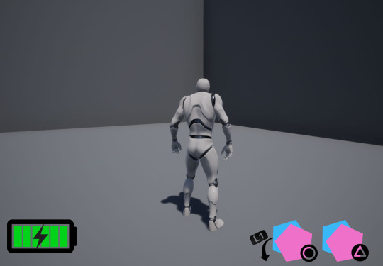
Here is a gif showing my concept for the ability interface. The player character will have four abilities that they’re able to activate with circle or triangle. They can hold L1 to activate the alternative ones. The symbol representing each ability will move forward to make it clear to the player what button activates what ability.
When the abilities are on cooldown the symbol will become transparent and then pop back into full opacity when it’s ready to be used again.
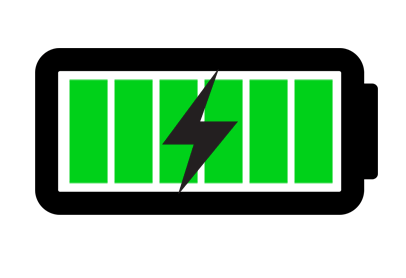
Here’s a gif showcasing my idea for the players health bar. As it’s a robot I thought it’d be fun displaying the health as a battery. As the player loses health it decreases and changes from green to orange to flashing red. This uses colours to represent the players health without relying on numbers. I have chosen this because younger demographics such as children will be able to see at a glance the characters health without having to stop and read text or percentages.
Splash Screen
Here is my wireframe. I took inspiration from games in my moodboard such as animal crossing. The splash screen in animal crossing is the game title with a simple (press start) button underneath. I will follow a similar format for my splashscreen.
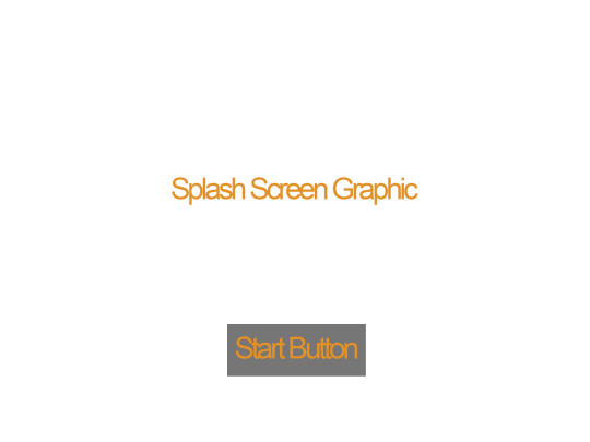
I then went into photoshop and created my finished concept from my wireframe.
Here’s the splash screen which will prompt the player to press X to continue. I might add additional information like a company name or a project build. The reason why I changed ‘Press Start’ to ‘Press X’ is because I’m building this project with the playstation controller in mind and children will have an easier time finding the X button rather than the start button.
Main Menu
I’ve drafted up my main menu with another wireframe. I plan to have three buttons which I planned before in my flowchart. Start, Exit and Credits. After creating my wireframe I then went into photoshop and used the 1920x1080 resolution as that’s what’s most common at the moment with monitors. I tried to keep withing the blue guidelines provided by Photoshop.
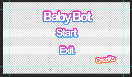
It’s a transparent background so it will showcase the game environment behind it. I’ve chosen a transparent background to give this menu a clear difference from the splash screen.
Here’s a GIF showing how the player will scroll through the options.

I like showing the exact button itself as it leaves no room for confusion on what the player needs to press. I’ll add a sound such as a click whenever the player scrolls through different options to give an additional indicator that they’ve moved their selection. When adding sounds to a game however it’s important to think about how often the player is going to be hearing that and if it’s going to annoy them. That’s why you don’t want anything set too loud or shrill.
Credits Screen
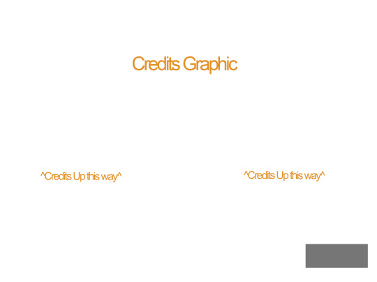
Here’s a draft for the credits screen. I kept to the same structure in my wire frame except that I moved the title slightly lower and larger so it overlays over the moving credits. I did this because the slow pulsing animation on the title is pleasing to look at.

Pause Menu
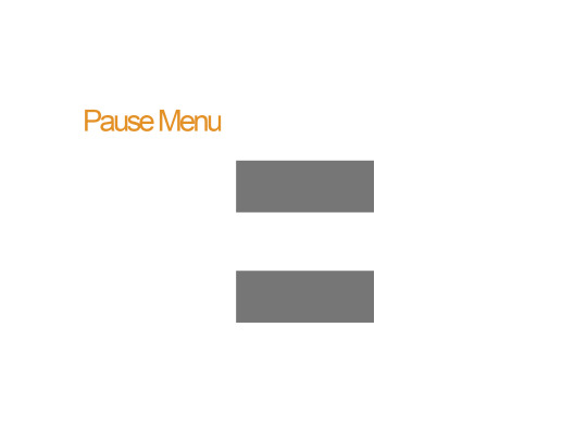
Here’s the pause menu when the player presses ESC or Option/Start. It has a transparent background and two large buttons. When creating my concept in photoshop however I put a slight angle on pause to make it appear more playful.
The widget will come to the viewport and blur the gameplay behind it. This is so the character can still see what’s happening onscreen even when the game is paused. They’re also able to open up the help menu which will display the character controls.
Controls Menu
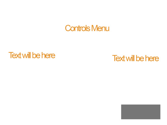
When the player selects help the player is taken to this menu. When creating the wire frame I went back and looked at the credits menu and kept to the same format. This is to simply keep the menu system to a similar structure as I don’t want every page being wildly different. Games in the industry usually have a set style and stick to it throughout which I what I’m aiming to do.
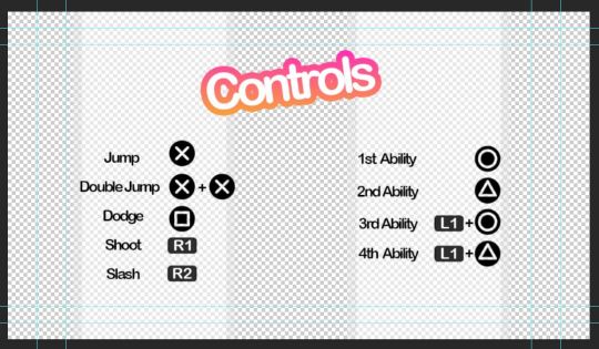
Here’s the controls menu to remind the player how to use their abilities. I added the transparent white walls so the black text stands out more. The rest of the screen will show the game environment behind it. The title “Controls” is also animated as you can see from this GIF.

In-Game Dialogue
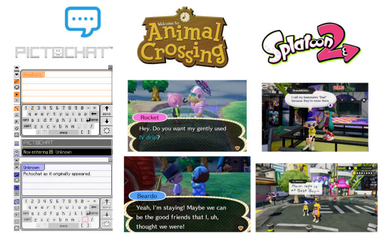
Here’s a moodboard of some ways of displaying text which I think will work well with the style I’m going for. I like the vaporwave aesthetic which often appropriates styles from 1990s-2000s. I’ll keep these three in mind when designing my dialogue display.
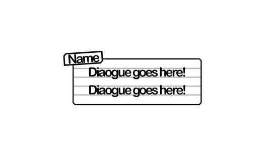
Here’s my draft dialogue box that’s heavily inspired from pictochat but I made the name box larger and off centre similar to animal crossing. I’ll also have different colours for the different character so it’s clear who’s speaking. I’m tempted to have the white background on the box slightly transparent so it doesn’t obstruct the players view of the game.
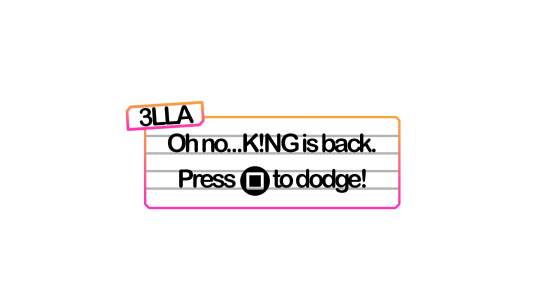
Here’s a draft dialogue box for sidekick character ‘3LLA’ (pronounced Ella) as she warns the player of the antagonist’s return and reminds them how to dodge attacks/dangers areas.
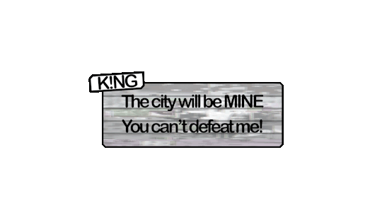
Here’s a draft one for K!NG who’s a malfunction buggy robot who acts as the main antagonist. I wasn’t too happy with this as I felt it was a little bland. I decided to go back and use filters such as offset and wave to mess up the text. I also made duplicates and switched off parts of the RGBs to get the shadows behind the first line. I like how the white text stands out against the background. I’ll use this method to create the distorted glitch affect for K!NG’s dialogue.
I’ll be having recorded voice lines playing alongside so I’m not too concerned with it being hard to read as it’s kind of the point with K!NG. None of his dialogue is informative to the player anyway rather it’s just ramblings of a mad robot.
Evaluation of Task 2
I enjoy pre production as it helps me organise my thoughts and ideas on the current task. It allows me time to look at games in the industry and select what I like and don’t like. I looked at games suited towards the same demographic and what I found was bright colours and simple layouts were favoured over more complex menu systems such as something you’d see in a game such as Fallout or Skyrim.
My biggest inspirations were LittleBigPlanet, Hello Kitty Roller Rescue and Splatoon. Animal crossing was also great when coming up for ideas for my in game dialogue.
Feedback I received from peers was that my idea generation was clear but to think more clearly on interactive elements I could add to my menu. I agree that an interactive element would make my menu system much more interesting. Interaction is also great for keeping the attention of younger audience which my game is aimed towards. In task 3, I’ll build my scene which will act as the backdrop for the menu and see what appropriate interactions I could add. I’m thinking of creating an urban scene to set the scene of the game from the get go. Appropriate interactive elements would be flickering lights or birds sitting on buildings which can be clicked on.
References
Aava, K. (2017). Realistic vs. Stylized: Technique Overview. [online] 80.lv. Available at: https://80.lv/articles/realistic-vs-stylized-technique-overview/ [Accessed 5 Oct. 2018].
0 notes
Text
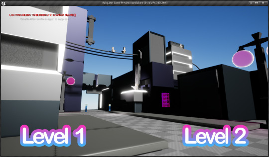
Menu Blueprints
Here’s how I made a simple menu loading system. I found this quite easy as I’ve done this before in previous units.
After creating a menu widget I create two events for the on clicked events.

This means after eventbeginplay the menu is brought to the players viewport and the mouse cursor is also brought up so they can select the buttons.

Then two branches for each level load and unload the previous level when the buttons are selected.

I have different spawn points for Level1 and Level2 so I placed this blueprint to move the player actor to the target point in the blueprints for the sublevels.


Level Streaming is so important as it allows you to only render the assets needed at that point in the game so you’re not putting too much strain on the system. You can have box triggers for example seamlessly trigger level streaming without the player even realising so they can move into the next stage with the previous stage behind them unloading.
With my menu system I’ll have a similar system to this. I’m going to separate my game into levels which the player completes to unlock the next. I’ll also have it so they can go back and repeat previous levels by selecting them on the main menu.
I also duplicated the ThirdPersonCharacter deleted the mesh and movement data and named it “Dummy”. This will act as the camera so when the player is in the main menu they can’t move about and no character spawns.


Eye Flicker Test

Here I placed a cube in the thirdpersoncharacter viewport just to simply test if the system I had planned would work.
I want the character to have floating expressive pupils which change between open and blinking. I also want to add different colours and shapes for different situations. Such as red for combat, green for happy, heart shaped for love etc.
I went into the blueprint and made us of the random float in range node which allows me to set an element of randomness to the animation but still being able to set a general timeframe. This will make the blinking look more natural. I tested this and thankfully it worked well enough.
I’ll build on this logic and create more complex and interesting animations with the eyes!

One issue I had was it was blinking too quickly and looked unnatural. I also couldn’t change the random float because it would increase the time the eyes were open AND closed. I instead reworked the logic to the one below.

This is much better as it lets me edit how often the eyes blink but keep the duration that the blink lasts the same. This makes the animation look a lot more natural.
0 notes
Text
Task 1
Technology
For my game I’m planning to have it compatible to be played with keyboard and mouse and also PlayStation gamepad. I want to give players the freedom to pick between a controller they’d prefer. This is to reduce the learning curve as they can learn to navigate the menu and controls with a device they might already be familiar with.
I’ve come up with the planned controls for the player character.
Controls (PlayStation Controller)
X – Jump (Double Tap- Double Jump)
Square – Dodge
Circle – 1st Special Ability (Holding L1 activates 3rd special ability)
Triangle – 2nd Special Ability (Holding L1 activates 4th special ability)
R1- Fire
R2- Slash
Left Analog – Movement
Right Analog – Camera rotation
Controls (Keyboard & Mouse)
Space- Jump (Double Tap- Double Jump)
V- Dodge
1- 1st Special Ability
2- 2nd Special Ability
3- 3rd Special Ability
4- 4th Special Ability
LMB- Slash (Main Attack)
RMB- Fire (Ranged Attack)
WASD- Movement
Mouse- Camera rotation
When creating controls for a game that can be played on keyboard and gamepad it’s important to limit the quantity of controls otherwise I’ll struggle to fit them all on the gamepad compared to the keyboard which has many more buttons.
When navigating the menu, the player will be able to mouse over and click with the cursor whilst However, when playing with the gamepad the player will have to use the analogue stick to cycle through the different options on screen. This means I’ll have to reduce the clutter on the menu to save the gamepad players from spending ages cycling through different menus trying to click something. This is so keyboard players don’t have a speed advantage of being able to directly mouse over and click.
Another thing to consider when choosing between keyboard vs gamepad is the difference in aiming. It’s well known in the gaming community that the mouse is a superior aiming device compared to the controller, because of this multiplayer games which are compatible with both control systems usually keep keyboard/gamepad players separate. However, some high level players have been accused of finding workarounds and using keyboard setups on consoles. This has led to Jeff Kaplan, Game director of Overwatch to make a statement regarding their stance against this practice in a PCGamer article.
The Overwatch team objects to the use of mouse and keyboard on console. We have contacted both first-party console manufacturers and expressed our concern about the use of mouse and keyboard and input conversion devices,"- "We have lobbied and will continue to lobby for first-party console manufacturers to either disallow mouse and keyboard and input conversion devices, OR openly and easily support mouse and keyboard for ALL players. (Chalk, A. 2018)
This was brought up after console players were frustrated with people using third party conversion devices to gain an unfair advantage. It also goes to show the lengths players will go to better their chances of winning even if costing them.
To get around that limitation, you have to use an input conversion device like the XIM4, which lists for $150 on Amazon—and that's without the mouse and keyboard. In other words, people are paying (quite a lot) for a significant in-game advantage. (Chalk, A. 2018)
As an aspiring game developer I’ll keep this in mind as I want to reduce any chances of players finding ways to exploit or bypass game mechanics. If players are able to perform attacks or complete stages considerably easier when using a different kind of controller, then I will feel I have failed balancing my game correctly. If I feel, there’s too much of a difference skill wise between keyboard vs gamepad in my project then I’ll have to make the decision to limit myself to one. I’ll choose gamepad in that case as I simply think it’s a more satisfying feeling to slash and hack at enemies with a gamepad rather than clicking on a mouse. Aiming in my game isn’t particularly difficult as the player will simply have to aim in the general direction of the enemy as is typical in most third person action-adventure games.
Interfaces
When it comes to the interaction between the control system and the player I don’t have any plans on using any special forms such as speech recognition or touch screen. Special interfaces like speech recognition although rarely used are interesting but don’t have a place in my project as I have no planned game content that would benefit from it. I also don’t want to create features which force the player to need a microphone as that’s just an additional device that they’d have to fork out money on. Likewise touch screen although essential for most mobile games is not something I want to apply to my pc game. Simply the keyboard/mouse or gamepad will be all the player needs to interact with all aspects of the menu and user interface.
Human Factors & Design Principles
Due to my demographic being aimed towards a younger audience, I need to keep the user interface as simplified as possible to ensure that the players can understand it. You can clearly see how different games have wildly different interfaces due to their different demographics and world settings.

(playm.de, 2018) Screenshot from Kingdom Hearts 3 by Square Enix Co.
Here is the still from the upcoming Kingdom Hearts 3, You can see how the interface is bright and colourful whilst not cluttering up the rest of the screen. The colours also stick to the theme of the game with the classic Monsters Inc graphic on the bottom left and the simple health/power display in the bottom right. In an interview with Tamara Knoss a UI/UX artist she briefly mentions the time and effort artist put into the interface and how that might surprise some people outside the industry.
What aspect of the job would be surprising to people looking in from the outside?
“The numerous, and lengthy discussions with large groups of people about “what exactly is the right shade of red for this brand?”
(Bay, J. 2018)
When designing assets and texturing I want to keep a single art style and colour scheme, so the game feels like one cohesive world. I’ll think about the colours I use and how players respond to them. Universally green is seen as good and red as a sign of danger so for example the player’s health bar turning from green to orange to red is a great way of warning them about their health percentage without text. This is good as my demographic is children which respond more to colours rather than plain text. I need to design a user interface which is friendly towards novice gamers, appeals to their shorter attention span and sticks to the style that I’m creating. Players should only really see what they need in that moment of time otherwise you’ll clutter the display and overwhelm them.
For example, in my project I’ll have the controls for the basic character movement, jump and camera rotation show up as a tooltip during the beginning but fade away as the characters progresses through the area. After becoming familiar with the controls it’s pointless to constantly display these tooltips as they’re just taking up space. I’ll aim to only display what’s vital at that point in time. Numerous games have also used systems such as only displaying the health bar when the player takes damage and hiding it when the player character is out of combat or at full health. This clears up the player’s screen, so they can fully enjoy the game environment.


(GameAxis, 2018) Call of Duty WW2 by Sledgehammer Games, Raven Software, Activision
Realistic FPS shooters usually have understated muted HUDs which are practical and give the player what they need without removing them from the high detailed worlds that the developers have created. At a glance of this screenshot the user interface is barely noticeable. In the bottom right there are indicators to show the players remaining ammunition and other weapons they’ve collected. These indicators however use transparency to allow the player to see the environment through them and not take away from their immersion. On the left side a fill meter also uses transparency and sticks with the khaki colour scheme. This keeps the players attention focused on the centre of the screen, so players can aim unobstructed whilst remaining on brand with the Call of Duty aesthetic.
A feature I really like from the Persona series is the HUD using a mixture of font and symbols to clearly indicate the player the controls for each action.


(Atlus.com, 2018) Persona 5 by Atlus
Not only is it visually pleasing to look at, but it indicates what character you’re controlling, makes it clear what you need to press and remains true to the Persona graphic that’s become synonymous with the series.
Due to the player character in my project having four special abilities’ I’ll have the icon for each ability display next to the button just like the Persona System. I’ll also have with the gamepad the icons switch between ability 1 &2 to 3 & 4 when L1 is held down. This reduces clutter and also makes it clear which button activates what ability.
The placement of the HUD and Menu system is important too. Players eyes are automatically drawn to certain parts of the screen. In western culture we usually scan from left to right (as that’s the direction we read text) so the most important features such as a mini map or health pool are usually on the left. Parts of the HUD that the player will be looking at less often are usually placed on the right such as ammunition. This is because although seeing your ammunition is useful most casual players simply fire until the character reloads automatically instead of manually doing it themselves but almost every player makes use of the mini map to help them navigate the game world and reach objectives.
I need to decide whilst designing my HUD and Menu system what I need to give priority to. I’m not using an ammo system but rather a cooldown system (where abilities have a short cooldown before they can be used again) so I’ll place them on the right-hand side of the screen, have them become transparent during the cooldown phase and pop back into full opacity when ready to be used again.
Feedback
A great way of showing players that an enemy they’re fighting is a boss is by displaying the creature’s health bar differently to how you’d usually show enemy health. An example of this is in the Dark Souls series.

(Dark Souls 3, 2016) Dark Souls 3 by FromSoftware
Boss characters are given a small cutscene and large health bar which remains for the duration of the fight. This foreshadows that the Boss will be a difficult enemy compared to the usual monsters found in the game and the player should prepare accordingly. In my project I’m not planning on displaying the enemy’s health rather the players will learn how many hits destroy an enemy simply from experience. I fully intend on using this feature for the Boss however as it’ll make the fight feel more epic whilst also giving the players a visual indication of their progress in the fight. If I don’t use this feature I risk the chance of players aimlessly hitting the boss not knowing if their attacks are making a dent in the large health pool. By showing their progress they can clearly see from how it depletes what attacks work, what doesn’t and stops them from getting frustrated or bored. This is also great when designing a game for a younger audience as they tend to have shorter attention spans.
Feedback whether visual, audio or physical is important as it lets the player know that their button press has gone through. Having different appearances for a regular button, highlighted button and pressed button is common in games however an audible indication like a small ding is satisfying too. I need to keep in mind though that anything the player will be pressing/navigating quite often shouldn’t be annoying. In my project the player will be dodging often to avoid hazards and attacks, so I don’t want to add a noise that’d annoy the player and drown out the music and ambience of the game. Gamepads also vibrate which is great for getting the players attention without relying on sound or visuals. This can be used for telling the player they’re standing in a damaging area of effect or they need to quickly perform an action such as dodging.
A good way to use audible feedback is when the player opens the pause menu the game music lowers in volume or changes completely. This immediately tells the player the pause was successful and lets them navigate the menus without blaring battle music playing.
(2156 words, not including references)
References
Chalk, A. (2018). Mouse and keyboard players are destroying controller users in Overwatch on console. [online] pcgamer. Available at: https://www.pcgamer.com/mouse-and-keyboard-players-are-destroying-controller-users-in-overwatch-on-console/ [Accessed 14 Sep. 2018].
playm.de. (2018). Kingdom Hearts 3 - Bild 8 | playm.de. [online] Available at: https://www.playm.de/2018/02/kingdom-hearts-3-11-388225/kingdom-hearts-3-bild-8/ [Accessed 14 Sep. 2018].
W. Bay, J. (2018). How to Become a Video Game UI Artist. [online] Gameindustrycareerguide.com. Available at: https://www.gameindustrycareerguide.com/how-to-become-a-video-game-ui-artist/ [Accessed 14 Sep. 2018].
GameAxis. (2018). Review – Call of Duty: WWII (PS4) multiplayer could have easily been a disaster - GameAxis. [online] Available at: http://www.gameaxis.com/reviews/call-of-duty-wwii-multiplayer-nearly-a-disaster/ [Accessed 14 Sep. 2018].
Atlus.com. (2018). Persona 5. [online] Available at: https://atlus.com/persona5/home.html [Accessed 14 Sep. 2018].
III, D. (2018). DARK SOULS™ III on Steam. [online] Store.steampowered.com. Available at: https://store.steampowered.com/app/374320/DARK_SOULS_III/ [Accessed 14 Sep. 2018].
0 notes
Text
Introduction to Unit 79
In this Unit we’re looking into interfaces and how they allow the player to control the character whilst also letting them immerse and focus on the gameplay.
It’s important to think about how feedback changes how the player reacts to the control system and how quickly they are able to learn it.
0 notes
Text
8 Animated Assets
Loot Chest
I’ve created a couple of simple assets and I’ll experiment with different animations and their potential uses in my project.

Here’s a chest model I’ve created. I want the model’s lid to jump up and spin before landing back down. To create this I started with the root joint at the bottom (this is required to work properly when I bring it into UE4) then I created one joint which was bound to the lid and the other for it to move up towards. I then made sure to copy and paste the exact same translate data so it’s a perfect loop.

Here’s a small segment of the timeline in Maya. It works very similar to how a Matinee in UE4 works. This was useful as I was able to pick it up quite easily.

Here’s the animation paused midway as the lid finishes it’s spin and prepares to fall back down. I’ll use what I learnt from this to create additional animations and also plan how they might be used in game. For example this chest will play this animation in my game when the player character hits it as it spits out loot.
Bollard Model

Here’s a simple bollard that I’ve made which will act as a barrier in my game. I created a simple animation without a skeleton to where it lowers and raises out the ground. When I implement this into my project however I could animate it without maya and simply use a timeline or matinee in UE4.
Tree Model

Here’s a skeleton for an animated tree I created which blows subtlety in the wind. This will be great for environmental scenes as it adds a small bit of movement which makes the scene feel more alive.
An issue I had with my tree and bench model was when exporting it into UE4 the collision was placed too high. The character would hover above the mesh so I changed the settings from simple collision to complex where it’s a lot tighter and allows the character to walk along the mesh surface like you’d expect.


I also added a hologram material to the tree to make it slightly transparent and give it animated moving lines.

I decided to remove the scanlines however as they were too noisy. I wanted to go for something a lot simpler. I created a material instance with the colour being a variable that can be changed.
RoadSign Model


Here’s a road sign I created in maya. The sign will comically spin in place when the player attacks it.
Holographic Sign

Here’s a sign which will slowly rotate with a hologram texture. I placed a joint to the centre part and bonded it to the skin.


I then placed a key on the start of the timeline and made sure to only key the “rotate y” so it only rotates on that axis.

In the graph editor I then went on tangets>post infinity>linear so it continues to rotate on that axis for the whole animation.

An issue I came across was when I placed my animated sign into unreal the two objects (the stand and the spinning sign itself) were not grouped together and so when I rotated/moved/scaled one the other was left behind. To solve this I selected both meshs and pressed CTRL-G which groups the actors together. This makes it much easier when placing/duplicating this animated asset.


Here’s my texture I created in Photoshop. I wasn’t happy with how it turned out so I had another go at creating a hologram material. I created normal maps on Photoshop and blended it with the colour map and a separate pink colour. I made the pink colour a variable so I can easily make different colour versions for variation. I also used the panner node to create moving lines (like a real hologram would) I also had it set to translucent not opaque so it doesn’t cast shadows as holograms themselves are made light.


Here’s the preview of the new material.

Here’s the new material placed on the model!
Robot Character Animations
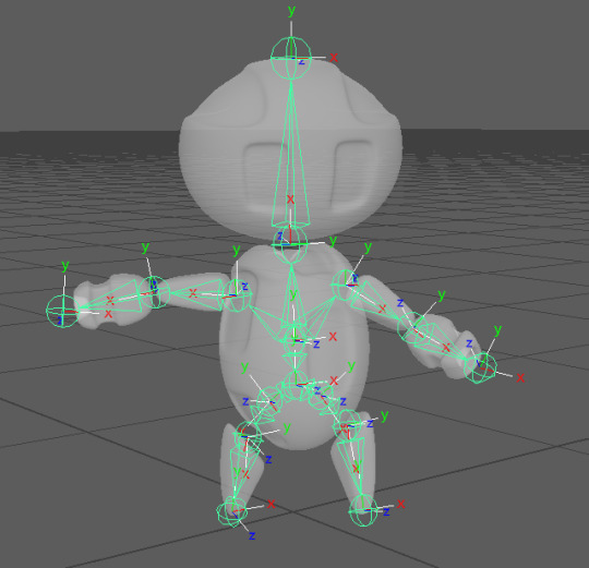
I designed a cute robot character in maya which I will then rig and animate to be later exported into unreal engine.I started with mindmaps/moodboards of ideas which later helped me draw up some simple concept art. I then modelled it in Maya and textured in substance painter.
I then placed joints and began rigging the skeleton however a major issue I came across was the joints were struggling to determine which part of the mesh they were supposed to be pulling so it morphed my character whenever a joint moved or rotated.


Here you can see when the shoulder joint was rotated other parts of the mesh such as the face and hip were also moving. I did some research and discovered skin weight which is how maya determines what part of the mesh is manipulated by the different joints. I read up on the “paint skinweight tool” and taught myself how to assign each joint the correct part of the mesh.

Here you can see the joints change colour from orange to green depending on how much of the mesh they control. The root joint in the centre is the parent of all the connecting joints so it moves the entire mesh and then they become less strong as it branches out.

When using the paint tool you change the value of the brush to paint the mesh white for where you want the joint to have control over. I’m really happy with the final result as now each joint works correctly. I’ll make sure to use this tool in future assets whenever I come across any mesh’s morphing in ways I didn’t intend.
I also did some research into ‘Squash and Stretch’. This is known as a principle of animation as by adding subtle squashing or stretching to the mesh during an animation gives the movement more life. I found this part really important when animating my robot character
‘Squash and Stretch gives life and flexibility but not only that! It can help convey what the material that something is made of. In the bouncing ball case, very little S&S will indicate a firmer material, like a ping-pong ball or a bowling ball. A rubber ball, would naturally have more S&S.’ (Hurtt, 2017)
My robot character is made out of metal so it wouldn’t make sense for there to be much S&S but also his limbs are floating so I can stretch the distance between the limbs during animations such as walking or jumping but the actual sections themselves wouldn’t really change. If I was however making an animation for something less dense like rubber then there would be much more movement in the animation.
I begun animating the IDLE animation for the robot. This includes the floating limbs moving up and down as they levitate and the head moving. It’s very subtle but will give the character some life when they’re not moving. I grabbed the shoulders, neck and hip joints and moved them at 30 frames and back to their original position at 60. This makes the movement very slow and smooth.


I’ll place the different animations as different meshes in Unreal to later show them off. I’ll make a video and add it to the end of this blog post.
I began working on the robot’s walking cycle. One issue I found was it look unnatural (even if it is a robot) I realised when someone walks it’s not just there legs but their arms, hips and torso which moves too. I manipulated the joints so that the arms swung opposite to the legs and the torso rolled from side to side as the legs switched weight. This came up a much more pleasing animation. I also gave him a little head tilt when walking which stays true to the cute character that I’m going for.

When I played it in Unreal however I realised it was too slow so I edited the rate scale.


I doubled the speed and realised I could make blueprints to change the animation speed in game which will be really useful when giving this character the ability to sprint.
Video
youtube
Here’s a video showcasing the animated assets in action.
Evaluation
I’m happy with my 8 animated assets as I’ve learnt about joints, bones, S&S and skin weight. These will be really important as I continue to practice with animations and hopefully create more complex sequences. My robot character will require many more animations such as different attacks and jumping so I’m glad I already rigged the skeleton in this unit as it’ll make the process much quicker.
It did take me awhile to get the hand of rigging models in the first few attempts. I had issues with placing joints/bones which weren’t necessary but after experimenting and watching how the animations play out I now have a better understanding of the process and my speed at creating animations is much quicker.
If I were to repeat the unit again I’d spend more time creating more interesting animations like the walking cycle. This animation although required lots of different joints to make it look realistic was really enjoyable and I’m really proud of the end product. I want my project to have lots of more complex animations rather then just the odd one or two.
It’s important to also think about the style of animation which I use. I’ve gone for very campy cartoon movements so for the sake of consistency in my project I’ll ensure all my other assets follow the same style.
References
Hurtt, C. (2017). Squash and Stretch: The 12 Basic Principles of Animation. [online] Animation Mentor Blog. Available at: http://blog.animationmentor.com/squash-and-stretch-the-12-basic-principles-of-animation/ [Accessed 17 Oct. 2018].
0 notes
Text
Mindmap

Here I’ve created a mind map of some ideas for animated assets. Some I’d use in my game however some I could just animate directly in UE4 if I choose to import these assets into my level.
After animating these assets I’ll also begin the process of rigging my 3D character which understandably will be a more difficult and time consuming task.
0 notes
Text
Introduction to Unit 74
In this unit we’re learning to rig and animate assets and 3D characters whilst also looking into time management. This is a useful skill to have in the industry as using your time efficiently and meeting employers/clients needs are essential for succeeding in creative media.
0 notes
Text
Character Redesign
I’ve decided to redesign my character along with the lore of the world. As I’m making a game targeted towards younger players I’ve created more cartoony, bright and also customisable characters.
0 notes
Text
Evaluation of Unit 49
I really enjoyed Unit 49 specifically learning how cameras can be used to guide the player but also purposefully raise tension in the player such as forcing them at a difficult angle when doing jumps, puzzles or avoiding enemies. I enjoyed researching games and how their use of cameras and controls have changed or stayed the same over the years. When doing research into the origins of the Warcraft franchise I found that when they were considering going from RTS (top down view) games to a third person MMO they brought one of their Gnoll models and just tried to make it work with the camera angle they wanted to go for.
"Basically, what happened was that one of the artists on the team just took the Gnoll character from Warcraft III and made it look good at the camera angle that we were using. He kept the same proportions, the same bright colours, the same silhouette with the exaggerated features - and we all looked at that and said, yes, this is what World of Warcraft is going to look like.
"Then he proceeded and did the Kobold, and from then on, that was... Well, it was like, why are we trying to reinvent this thing? Everyone loves Warcraft - let's just make this Warcraft. We don't need any futuristic spin on it, or scary versions of this character, compared to the Warcraft III one. Just make it Warcraft III - that's what the fans are going to love." – Samwise Didier
https://www.eurogamer.net/articles/the-making-of-world-of-warcraft-article?page=2
They were considering changing their art style to be grittier or have a different setting all together but they decided after opening up their Warcraft 3 assets and placing them in a third person angle they still liked the cartoony exaggerated style and stayed true to it. This ended up becoming a staple in future Blizzard games as they never really aim towards true realism that other games do.
I’ll keep how camera angles can manipulate a player’s perception of the environment and characters in mind when creating my game next year. Over the summer I want to begin experimenting with level layouts and creating floorplans for certain sections such as puzzles or boss fights. I’ll also try to block out what cameras I want to go for and how it relates to the character’s controls.
I already know I want the player’s camera to zoom from third person to over the shoulder when taking aim with their weapon. This will be automatic to not clutter the controls but also puts some pressure on me as the player can basically zoom in on certain models, characters or sections of my game. I’ll have to make sure to put higher detail in anything the player is able to get up close to and less detail in stuff that’s far out the way and inaccessible. This is so the game and environment still look detailed but is not as demanding on the PC.
If I was to do Unit 49 again I’d spend more time developing my controls and attempt to add some attacks. I’ll work over the summer to begin blocking out the control layout I have planned in UE4 but also connecting up my playstation or xbox controller as that’s what I feel will play smoother on.
0 notes
Text
Game Walkthrough (Unit 49)


The game test begins with the player simply starting in the default persistant level. This is filled with various cameras that I’ve used in the game as this is where I originally tested and placed the blueprints. The player can mess around with the different labeled cameras and enter the game through the “Enter Game” Trigger Box. This loads up Level 1.

Level 1 consists of a simple maze which the player must escape.

Here is the blueprint for the level. I’ll go into more detail and break down the blueprint and what purpose it serves now.

Upon loading Level 1 the players controls are disabled and a small matinee shows the camera panning across the maze towards the exit and then pans back to the player. A UI widget also is displayed with the prompt text “Escape the Maze!” This is to give the player clear direction and also a hint at what corner the exit is in.

Here the blueprint starts at the “Event BeginPlay” and disables the control input. It also brings up the widget to the player viewport.

Here the players camera is switched to the matinee camera and the matinee is also played. It then holds at the exit for a delay then reverses the matinee.

after switching back to the player camera the player movement is restored back to default and they are able to move again. The “Escape the Maze!” prompt is also removed from the viewport.

At the very beginning of the maze a text render informs the player they can switch between 3rd and 1st person perspective with the T key. This is done with my camera toggle which I made in the third person character blueprint.

Pressing 1 also switches the camera to an over the shoulder view if the player prefers that view. I kept it up to the player as they can use whatever camera they find controlling easier.
In front of the player is also a live CCTV feed which shows a birds eye view of the maze.

These screens are placed throughout the maze at various dead ends to help guide the player towards the exit. When I let people playtest my game a lot of them stopped at one of these screens and simply counted how many lefts or rights they had to make to get to the exit.
To make this I placed a 2D texture capture camera and made a material from it.


I also made sure to set the “Capture Source” to “SceneColor HDR” as it stopped graphical issues I was having with the material.
After building the lighting I found the maze was too bright and the walls were casting large shadows making some parts of the maze pitch black. To even out the lighting I placed a roof on top of the building and added lights to the interior. This helped by removing the natural sunlight from the skybox. I still wanted the birds eye camera though to be able to see through the roof. I set the roof to “Owner No See” and “Hidden Shadow” so it still cast a shadow over the maze even though it was invisible.


After completing the maze and finding the exit the player enters a triggerbox that loads level 2!


Level 2 is a small obstacle course made up of floating cubes the player must jump across.


Here is the levels blueprint. I’ll break down and go into each section seperately.
One of the main features of the Level is the player dying and respawning if they fall. A deathbox waits for the player and destroys the actor.

The player is then respawned at the location of two different target points (Depending if they’ve hit the checkpoint yet).


I created the checkpoint after Alex’s feedback as he found it frustrating having to restart the entire obstacle course when he was over halfway. The checkpoint also motivates the player to keep trying as there’s less punishment from dying.
The Level has a similar beginning to the maze. Player movement is disabled (to stop them from killing themselves straight away) as a camera overlooks the course following the correct path. It also shows the switch and pans over to the door it opens.

This not only shows the hazards of the area but also shows the player what direction they should take and hints what actions they should take to open the door.


After the camera matinee is finished and the player camera is returned to default they are free to move. The player can jump across the course in either 1st, 3rd or over the shoulder depending on what they find easier.
The first major hazard are three balls moving at different times threatening to knock off the player from a narrow walkway. A fixed camera switches the view to a far up top down perspective.


This camera was at first a side on view however players were getting confused with the controls and accidently strafing over the side. I thought of maybe disabling the movements keys except forward and back. Adding invisible walls on either side of the walkway and just having the balls insta-kill the player upon contact. I however prefered the player simply being pushed off as it’s scarier watching them fall. I instead simply adjusted the camera angle. If I was to keep the side on view however I would use blocking volumes to trap the player on a narrow path and disable the player keys (except W & S) in a similar way to how I disable the player movement at the beginning of each level.
After getting past the three balls the player must jump across three cubes. The centre cube has a large obstacle which moves up and down periodically threatening to crush the player.


This was really quick and easy to do. I simply set the matinee to play and reverse with a slight delay between it. This gives the player 3 seconds to jump before the cube comes down and stays down for another 3 seconds.
After getting across the player has the option to go either left or right. The camera matinee from the beginning of the level however guided the player to go right towards a switch. After walking across a narrow walkway the player is prompted to press E and the switch is activated.

This informs them with a text render that they’ve reached a check point and also opens up the exit.

The players camera is switched to a camera facing the door and the way towards the finish of the obstacle course is opened up.

This makes it clear to the player that they can now progress towards the exit. Upon opening the door however the narrow walkway that the player took is now set to rotate every 1.5 seconds. This makes the return trip considerably harder.

It rotates quite quickly and requires good use of timing and jumps to get across. This kills players quite a lot if they’re not used to the jumping. I placed this right after the checkpoint to make it less punishing.


Upon reaching the end of the game a simple switch prompts the player to press E. A congratulations message appears and after a few seconds the player is returned back to the persistant level where they can stop playing.
youtube
Here’s a short video showing a quick walkthrough of my level.
0 notes