Statistics
We looked inside some of the posts by moravict-blog and here's what we found interesting.
Average Info
Notes Per Post
1
Likes Per Post
1
Reblog Per Post
0
Reply Per Post
0
Time Between Posts
7 days
Number of Posts By Type
Text
15
Last Seen Tumblr Blogs


Fun Fact
In 2020, 44% of users from Denmark used Tumblr daily.
Text
Week 15 – Final Thoughts
This week we were assigned to talk about where we see the future of design heading.
One example of design that I think will change dramatically is architecture. The world is growing and people are evolving. Soon, we will need to accommodate to the growing population by building space efficient apartments and living situations in order to have peace in society. Another thing that will have to change is the outside design of the building. Tastes are changing and architectures have to accommodate to build things that people will find attractive and something they’d want to live in.
Another thing that I see changing is graphic design. Graphic design is a pretty new area of design and there is still a lot of growing to happen. Even in the past couple decades there have been so many new inventions, programs, and applications created for new artists to create works of art. Design is constantly changing and once you introduce technology into that a whole new world is created.
The last thing that I see changing is design and art in society as a whole. Like I said before, the world is constantly changing and there are so many things, inventions, and technology that will be created. It’s impossible to predict what will happen but we just have to work toward our goals and anticipate what will come next in the art world.
0 notes
Text
Week 14 – Your choice
There are a couple of items and products that have captured my attention now with my higher awareness of design.
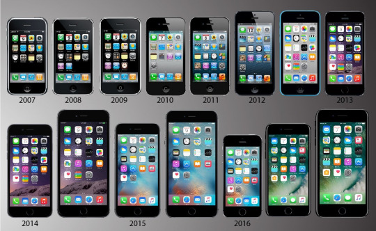
First off, the evolution of the iPhone is one product in particular that has caught my eye. When the first iPhone came out it was a thick, small, and had minimal capabilities. There were only a select number of apps you could have and they were very basic. The original iPhone was very basic and was only used for normal phone functions such as calling, texting, pictures, and such. By 2020 the iPhone had completely changed. It’s now skinny, thin, and the screen fills the entire front screen. The camera is above par and can do so many things. From scanning documents to taking live photos to recording in 4K, the most recent iPhone is truly a unique transformation and an example of how design in technology has transformed in this past decade.
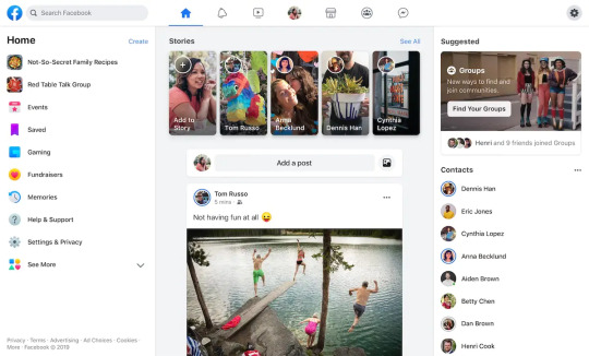
Another example of design that I found interesting is Facebook’s new web interface. Facebook has gone through many changes throughout the years but their new 2020 design is on of their most drastic changes! One word I’d use to describe this design is “round.” Facebook is a fairly new company and honestly hasn’t been around as long as other companies have been. Because of this, we’re bound to see and experience many changes as they find what works best for their consumers and advertisers. The new Facebook design seems to be directed to create a more organized setup and timeline. It does resemble it’s old layout but in a more modern way, this is probably so people can still find what their looking for.
There have been many design changes in this past decade it’s hard to choose just a couple that I found interesting.
Sources:
TwinCities. “Ten Years of iPhones.” https://www.twincities.com/2017/01/07/10-years-of-iphones-a-timeline/
Gadgets 360. “Facebook's Redesigned Desktop Interface.” https://gadgets.ndtv.com/social-networking/news/facebook-desktop-redesign-rolling-out-to-select-users-large-rollout-spring-2020-2161899
0 notes
Text
Week 13 - New Media
This week we were instructed to expand on the “digital aesthetic” as defined in our textbooks and provide contemporary examples. Digital aesthetic is essentially the acceptance of technologically influenced design which was thought to have infinite potential, designers during this time embraced hybrid styles inspired by science fiction, video games, the media, etc. It’s essentially the spread of digital artwork and the expansion of the idea itself (Eskilson, 391)
One contemporary examples of digital aesthetic is the original iPod. When you compare the original iPod to the most recent version of iPhones there are some notable difference. The iPod was originally designed to do one thing and one thing only; allow the user to listen to music. It had a simple screenface that was all white and everything was labeled in the same font, the only differences came from the song names and album artwork. Even though it was simple, it did what it had to do and it did it efficiently. Now a days the iPhone looks completely different and continues to change with ever year that passes. Every time a new iPhone releases we think that Apple has done everything they could but time and time again they come up with new ideas or software to include in the iPhone. This doesn’t only come from the physicality of the phone but also within updates to the system and apps. The iPhone and IOS hardware are constantly changing and will continue to do so for as far as anyone can tell.
Another example of digital aesthetic is branding. When you look at advertisements from the early 1900s designs you can tell they were all fairly simple and they all seemed to relate to one another whether through font, color palette, or group they were targeting. Now there is so much more variety and so many more groups that these brands are targeting. When you walk through the grocery store you’ll see cereal with tv show characters on them, cookies with kids cartoons, etc. Overall, what I’m trying to say is that there are infinitely more ideas that brands can use to target certain people. They have many outward sources to pull ideas from to produce a graphically pleasing image.
In conclusion, I think digital aesthetic can be interpreted in many different ways, it doesn’t just have one stagnant definition. It’s ever evolving, especially in modern day digital art as so many different ideas are being pushed out everyday.
Source:
Eskilson, Stephen. Graphic Design: A New History. Yale University Press, 2019, Pg. 391
0 notes
Text
Week 12 - New Media
This week we were instructed to expand on the fields that have the greatest impact on interactive design. According to Google, interactive design is defined as, “the practice of designing interactive digital products, environments, systems, and services” this can also include creating physical products, exploring how a user might interact with it (Google). I think there are many fields that have had a large impact on interactive design.
The first example of a field that has had an impact is semiotics. Semiotics is the study of signs and symbols and their use or interpretation (Google). This has had a large impact in interactive design because different signs mean different things to different people. An example of this is the biohazard sign, when designers were first coming up with this sign they had to take into account many different factors such as a color scheme and a symbol that could be recognized across many different cultures and environments. Since the sign could put someone’s life in danger if not understood, it was vital that they took into account how it would be interpreted by everyone.
Another field that has had an impact on interactive design is graphic design. Graphic design is defined as, “the process of visual communication and problem-solving through the use of typography, photography, iconography and illustration” (Google). Graphic design has had a major impact because it’s been used in all aspects of interactive design such as designing elements, planning products, or laying out plans for services. Graphic design is such a vast area of study that the user can really do anything and everything with it.
Overall, there are many more fields that have had an impact on interactive design but semiotics and graphic design are just two subjects that I decided to touch down on. Interactive design is a broad topic and there are many different elements one can discuss about it.
Sources:
Google definitions-
Interactive design
Semiotics
Graphic Design
0 notes
Text
Week 11 - Graphic Design
This week we were assigned to find out more information about the Citizen Designer.
As defined by Stephen J. Eskilson, the citizen designer is known as, “a professional who attempts to address societal issues either through or in addition to his or her commercial work” (Eskilson, 425). This essentially means that designers are deciding to branch out from the traditional jobs their field may carry and are now becoming immersed in confronting pressing issues in our society. From climate change to disease to politics, these are people who take issues that may hit close to home and address them through the work they create. Eskilson adds that this idea may have been created during the Arts and Crafts Movement by William Morris. Morris believed in the idea that design in high quality could be used as a social force to fight against the issues during that time, sounds familiar huh? (Eskilson, 425).
I think that this is relevant to learn about because it shows that designers don’t just have to do typical jobs such as creating new logos or redesigning a sports drink, they have plenty of more options. Designers can use their art to create graphics that fight against issues that they care and worry about. The “citizen designer” is an important role to have, especially in current day society. Art and design can be very powerful when used in the right context and should be continued to be used as so. It’s unfortunate that some may see this as extraneous or inappropriate, as seen in the book, because nobody should be silenced about showing how they feel.
Through design and art, changes can be made to society in order for the betterment of everyone. Actions speak louder than words at times. The Citizen Designer should never stop making designs to combat societal issues!
cite:
Eskilson, Stephen. Graphic Design: A New History. Yale University Press, 2019, Pg. 425
0 notes
Text
Week 10 - Graphic Design
This week we were instructed to expand upon some of the most interesting ideas from our typographic readings. The first idea from our reading that I found interesting was the development of the mechanization of typesetting in the nineteenth century. There seemed to be a lot of competition to get the best and most efficient machine out. There were two main types of industrial machines during this time, the linotype and the monotype. According to Stephen J. Eskilson, the author of our textbook, the linotype “could produce an entire ‘line of type’ set,” at once whereas the monotype would “used two different machines to produce hot type character by character,” (Eskilson, 48) both seemed to have their disadvantages and advantages. For example, the monotype would be easier to use if you had to make corrections but the linotype was a bit faster. These machines ended up putting handset typography out of work since there was no need for that anymore. I think it is interesting to see how far we’ve come as a whole not only in terms of typography but also in the design and mechanization of modern day machines. We as a society went from handwriting everything to having the ease of printing anything and everything we want from our homes with the click of the button. It’s interesting to see where our rooms stem from. Another point from our reading that I found interesting was the introduction of new technological programs in contemporary typography. While reading the chapter focused on this, (Eskilson, 411), I was amazed at how many programs and typefaces have been released in modern day graphic design. From Fontographer to Adobe Illustrator to FontLab there seems to be an infinite amount of options that only seems to grow larger as design progresses. The typography readings from this week helped me learn about the history behind the mechanizations of typefaces and made me hopeful for what's in store in the future.
Cite:
Eskilson, Stephen. “Graphic Design: A New History.” Yale University Press, 2019, Pages 48 and 411
0 notes
Text
Week 9 – Industrial Design
Brook Stevens was an inspirational industrial designer who brought hope and interest to the city of Milwaukee through his innovations and creativeness. Stevens worked with notable companies such as Miller Brewing and Harley-Davidson, both of which are now icons for the city that people from all over the country recognize. Stevens was always hard at work, no matter what the situation entailed. Even during World War II when the market appeal wasn’t at its highest, Stevens found a way to incorporate his ideas when he decided to transform the traditional army Jeep into a station wagon and a touring car called the Jeepster (Milwaukee Art Museum). Though Stevens fell into controversy with his phrase “planned obsolescence” his main goal was to bring people the best of the best. He knew the times were changing fast and new inventions were being created every day- thus the need to update our products frequently. Milwaukee fits into the history of industrial design because Stevens was an innovative and creative man, “he had helped to shape approximately 3,000 products for almost 600 clients over the years” (MAM) including everything from working on the original concept of the SUV to redesigning the wide-mouthed peanut butter jar. Brook Stevens was an industrial designer, design theorist, and much more. He worked on so many projects, big and small, and was a strong-willed man in all his ideas and thoughts. Truly, an icon for this city.
One of the things that I found most admirable about Stevens was that even though he had countless opportunities to work elsewhere, he decided to stay in Milwaukee and help it grow as a city because he saw many opportunities. Milwaukee is unlike other cities because as stated in the article, “ he had the advantage of proximity to a wealth of manufacturers” (MAM) which is true because although this city isn’t as large as others, you get a variety of clients from all walks of life. Stevens had the convenience of working with smaller companies but also big names, some of which he worked with in Chicago, without having to go very far. Overall, I applaud his choice to stay in Milwaukee because he made history here with his designs and ideas.
Sources:
Milwaukee Art Museum. “Brooks Stevens Archives.” Milwaukee Art Museum, mam.org/collection/archives/brooks/.
0 notes
Text
Week 8 – Industrial Design
This week we were instructed to post a combination of 10 drawings, photos and/or notes on design observations we saw in the world around us.

This is a pinch bowl I designed for my ceramics class. Before firing the bowl the first time, I covered the center with a yellow slip that would stay on forever. My plan was to cover the rim afterward (which was not covered in slip) in a light/dark green glaze. The reason I first covered the bowl in yellow slip is that so if the green glaze landed somewhere it wasn’t supposed to, it could be wiped away while the yellow will remain intact. Basically; slip = permanent, glaze = removable.

This is a hard slab sculpture I also made for my ceramics class. The hardest part about this design was getting the slabs to fit together as a square, this meant all the edges had to be cut on a 45-degree angle. As you can see in the lefthand corner I did a lot of shaving down to get the sides to fit. Ultimately the best method I found was to fold the corner of a paper in half and place it on the side of a slab, which would give me the exact angle I needed. A bit confusing but in the end, it really helped the piece come together. It took a lot of trial and error.

This machine is basically a mini stove/bake pan which allows you to make cake pops in less than four minutes. I think the design of this machine is really user-friendly because all you have to do is plug it in, wait for the red light to turn off and begin placing your batter! After that, you just wait until they’re cooked and you’re all set. There are no buttons on this machine so it’s pretty basic. Anyone could use this- from kids to adults.

This is a picture of my statistics homework. The use of a calculator or computer in statistics is almost always necessary. When computing formulas of the odds and probability of some problems, there are so many large numbers that having a calculator can be very helpful. Calculators are really useful in making graphs. Another helpful tool is Excel, this is often used to find the standard deviation, mean, median, etc. Overall just a great tool for the organization of a math problem.

I chose to add this picture of a freezer full of ice cream cakes because I wanted to talk about the packaging. The cakes themselves are pretty basic deserts but the packaging is bright, colorful, and eye-catching. Definitely, something I could see a kid begging his mom for. Even though they’re all in a basic box or cake tray, the illustration is what matters in this instance.

I made this flying cat in my 3D concepts class. The design of this project was very meticulous because all of these different parts had to work together to make it seem as though the cat was flying. This was also a pretty small object so the placement of some elements had to be spot on. We used a small clothespin as the base, the paper clips connected everything, and tape held it all together. All of these elements came together to make the cat fly. (the handle is on the left of the clothespin- you would manually rotate it to flap the cat's wings)

I had this graphic saved in my phone from last semester. I think it perfectly demonstrates the fact that all of us students were drowning in homework from finals- hence the laptop, papers, and pens- and that perhaps we need a break-with coffee! The large font size of the “NEED A PICK ME UP?” line is eye-catching because students do need a pick me up during finals!

This is my fridge at home. It was designed to essentially do anything and everything you need from one location. It has pop-up reminders, plays music, shows you the weather, etc. It’s a touch screen refrigerator making it easy for anyone to use. Nowadays it feels like all of our appliances are becoming more modern and this fridge is no exception, it really is a sign of the times. It was designed to be efficient but also provides the user with information and entertainment.

This is my sister's car radio. I like the display of this screen because it shows you what station you’re listening to while also giving you all the information about the song that is playing including the name and artist. There are various options on the left too that allow you to mess with the display and sound. In the right-hand corner it even shows you information pertaining to your phone like its connection to data and battery life.
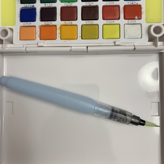
This is a watercolor pen. The bristles can be used in various different measures- you can create thick lines or add small details with the tip. the bottom half is filled with water so that once you squeeze it, the brush becomes wet and allows you to dip it into your color of choice. Without water, the paint wouldn’t become soluble. I like this design because it is versatile and makes creating artwork efficient and fast.
0 notes
Text
Week 7 – Architecture
This week we were instructed to write out two key principles of Universal Design and give examples of both in objects and environments that surround us.
The first principle that I think surrounds us in our everyday lives is most commonly known as #3: Simple and Intuitive Use. According to North Carolina State University, they define this element as, “the design is easy to understand, regardless of the user's experience, knowledge, language skills, or current concentration level.” This is definitely something we see in everyday objects and in the environment around us. For example, we can tell push and pull doors apart by just looking at them; is there a handle or not? This often tells us all we need to know in order to get through the door without needing instructions. (Well, most of the time. We’ve all had that embarrassing moment of trying to pull a ‘push’ door!) Another example is elevator buttons; there are usually two buttons with one above and the other beneath it. Without any instructions, we automatically know that by pressing the top button we are indicating we’d like to go up and vice versa with the bottom button. Simple and intuitive use is a principle of design that takes into account what we as humans have already been taught as members of society. These are things we need no instruction for, aren’t super complex, and rely on our use of intuition
The next principle of design that I think surrounds our everyday lives is low physical effort. North Carolina State University defines this as a design that can be used efficiently and comfortably and with a minimum amount of fatigue. This is a principle that I believe is becoming more evident in our lives every day. A great example of this is public bathrooms, almost everything in them requires you to touch very little! From the toilet that flushes automatically after you’re done, to the soap and water at the sink that senses your hand and deposits the exact amount it thinks you’ll need, and the paper towel or air dryer that you wave your hand across. These all really show how minimal physical effort we need to use in the bathroom. Not only does this help those who aren’t as able-bodied as others, it also helps everyone stay cleaner! But this isn’t a principle that is only shown in bathrooms, society is definitely is welcoming more technology that requires less effort from users.
There are many more principles of design I think we see in our everyday lives but these are just two that I found to be most evident.
Source:
North Carolina State University. “THE PRINCIPLES OF UNIVERSAL DESIGN.” Projects: NCSU, 1 April 1997, Version 2.0 https://projects.ncsu.edu/ncsu/design/cud/pubs_p/docs/poster.pdf
0 notes
Text
Week 6 - Architecture
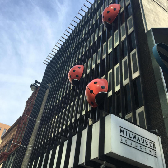
There are many interesting elements of architecture in the buildings around Milwaukee as I have discovered recently. The first architectural element I found that I want to talk about are the ladybugs on the Milwaukee building. These have always caught my attention because they’re such a playful, colorful element on the side of a very sleek and modern building. These are two elements that I would have never thought to put together but they really catch the passerby's eye. According to Rachel Owens from UWUM 89.7, “[the designer] was adamant that art is in the eye of the beholder, and he just thought they were cool” so there really is no backstory or reason for these ladybugs, they were just added because they could be! I think that this is a great and easy element of design added to an already built building that brought attention to it.
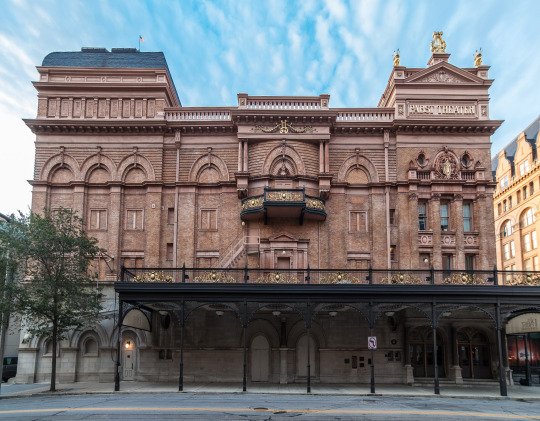
Another building with architectural elements I’m fascinated by is the Pabst Theatre. I’ve visited this building multiple times to attend concerts but I’ve always thought it was beautiful! The building was designed by Otto Strack in the style of European opera houses. Some of my favorite elements are the gold details, stonework, and arches surrounding the perimeter. According to the Pabst Theatre website, the building is made of “superstructure of cast iron and concrete — with only the stage floor and window frames constructed of wood.” This was clearly a pretty innovative and new idea for its time and age. This building has been in Milwaukee since the late 1800s and it’s here to stay, it’s really an iconic piece of architecture.
These two buildings possess elements of architecture that I found innovative and different. Milwaukee really is home to many interesting buildings and pieces of art that I have loved seeing as I grew up here.
Sources:
Rachel Owens. “The Story Behind The Giant Ladybugs On The Milwaukee Building,” WUWM 89.7, 31 March 2017, https://www.wuwm.com/post/story-behind-giant-ladybugs-milwaukee-building#stream/0
Pabst Theatre. “History of The Pabst Theater.” Pabst Theatre, https://pabsttheater.org/history-old/
0 notes
Text
Week 5 - History of Design
The first example of design from my reading that I’ve experienced in my everyday life is Theo Van Doesburg’s Study 3, Composition (The Cow). This piece of artwork was part of a collection representing a cow in a non-objective way. This reminds me of a project we did in my art survey class last year. We cut out pieces of paper and glued them together to show depth. Although this isn’t exactly the same as Van Doesburg’s artwork, I think that it shows that if you look at art in a non-objective way you can really imagine what you want to see. Both pieces of art are abstract and how “natural forms contain the essence of universal harmony” (Eskilson, pp 179). Basically, anything can become anything if you try hard enough.

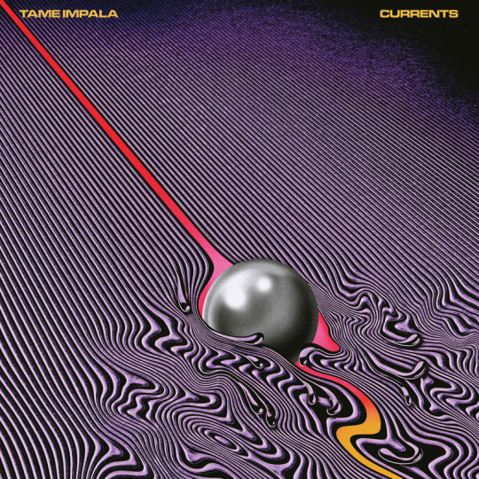
The next piece of design connected to my everyday life is Georgii and Vladimir Stenberg’s High Society Wager poster. This is a hand-drawn lithograph poster but appears to contain photo reproductions due to its handiwork. This poster reminds of an album by Tame Impala called Currents. The reason these remind me of each other is because they both contain a sort of warping of elements while having a nice flow. I think that Georgii and Vladimir Stenberg were ahead of their time when they created this poster because it looks like something straight out of the 80s. They both have that “psychedelic” feature that I really admire in art (and design).
The last piece that reminds of design in everyday life is Philip Johnson and Henry-Russell Hitchcock’s “Modern Architecture: International Exhibition.” Which shows exactly what the title explains. This reminds me of an art piece that I saw this past summer when I visited Ellis Island in New York. It was a representation of a village of the first people to come to the island and how they had set it up to house all the new immigrants. They remind me of each other because they’re both tiny examples of architecture, landscape, and design that encompasses an area of land.

First and third photos taken by me.
Robert Beatty, Tame Impala "Currents" album artwork for Modular Recordings/Interscope. July 2015.
Eskilson, Stephen. Graphic Design: A New History. Yale University Press, 2019, Pages 179, 202, and 259.
0 notes
Text
Week 4 - Found Object
This week I did as described in the assignment and went on a walk around my neighborhood. I live near the border of Milwaukee and Mequon so it’s a mixture of your typical suburban neighborhoods with fields of grass and crops. I didn’t necessarily find an object per se but I did analyze the elements of design in my environment. The fields of crops down the road from me are actually right next to the Mequon Nature Preserve. I thought this incorporated elements of design because Milwaukee is such a city condensed county compared to the rest of Wisconsin so Mequon’s decision to leave a giant piece of land untouched right next to such a developed area is interesting. I always love to drive or walk past this area because you can see the trees stretch for miles into the distance and it’s refreshing compared to being in the city all day. I can tell that a lot was put into the planning for the Mequon Nature Preserve. There’s a balcony where you can walk up to get a better view of the whole preserve. It also looks like there was some commercial landscaping in certain areas where there’s bushes, flowers, or trees planted into a design or trail. There are paths, a viewing tower, and even an education center. Although it’s winter and a lot of these elements were kind of hidden by the snow, I was still able to appreciate the preserve in its entirety. Every element put into this preserve was intended to be apart of the land itself or help visitors get a sense of the land. Overall, it’s clear to me that this nature preserve was a thought out plan aiming to conserve a piece of land where people could go to appreciate the beauty of nature that hasn’t been commercialized. It’s both a functional piece of land that also stands as a landscape of art.

Photo from the Summer last year:

0 notes
Text
Week 3 - History of Design
Over the past few days, I’ve been paying close attention to my surroundings and making design observations in the world around me.

This is the laptop I’ve had for the past couple of years throughout college. I like it because it has a sleek and modern design yet it is also simple. It is pretty thin and small which makes it easy to transport and fit into my backpack. It has plenty of storage space to carry all my photos, files, and documents that I need for school and for myself in general. It has a USB-C connector on the side which is helpful because I have other electronics that use this so I can easily charge it anywhere. The keyboard lights up when I need it to, it comes in handy if I’m in a dark room or if I just want to see them better. Overall, this laptop is designed pretty efficiently for me and my needs.

This is a wall of candles I saw while at the store the other day. This caught my eye because of the bright colors on the packaging and the promotion of the bright red sign. I think this is an interesting way to design a wall because the products and the marketing work together to catch people’s attention. The candles are organized in the same collection and set to a certain color palette so that they can play off each other. The sign in the middle is small yet is bright red and has the words “$10 off” in large font so that you want to read more! I was pretty intrigued by this fixture.

I saw this advertisement while wandering around the mall the other day and it immediately made me hungry. This sandwich shop is clearly playing off the idea that mall-goers will eventually get hungry, as I was, and placed their most appetizing foods on a board to lure them in. They also put the new deal they are offering in big bold letters and added “New!” with the price so that customers would be more inclined to come in because they already have an idea of what they could get and how much they’d pay for it.

I received this email from Lyft recently and thought it was an interesting example of a design. The offer “$5 off rides” is the biggest sized font on the page, making it clear what they’re advertising. The car on the bottom is “cute” and seems almost video game-like, implying what we already know, that this is for a ride share service. The deal also lets you know that this deal is only available for a certain time meaning you should use it now! The red font on the yellow background combined with the blue car really work together as primary colors to catch your eye and make you want to read it!

This is a hand-drawn design of a paper sculpture that I made for my 3D concepts class last semester. My idea behind this was to show my drawing from different angels while also including the measurements so you could get an idea of the size and dimensions. I wanted to lay out a blueprint of the paper design before I made it so that I wouldn't be lost once I started it. This drawing really helped me know what direction to head in and made my work more efficient than it would have been without it.

This is another hand-drawn sketch of an automaton (a machine or control mechanism designed to automatically follow a predetermined sequence of operations, Google) for my 3D concepts class. This project was first to be made out of cardboard and then wood. We needed to draw out our design beforehand because it would have been difficult to begin cutting and gluing the wood parts together without knowing measurements or if it would even work. I drew out what would be the top of the design, the inside, and also the framework. Once I tested it out in cardboard, I put the final wood piece together and it did end up working!

This is a scan of my notes from a film class I took last semester. The purpose of these notes were for us to understand how our cameras would work. To make our film come out nice we had to understand not only the mechanics on the inside but also the outside. We were using some pretty old 16mm cameras so it was crucial that we understood how to set the film speed, aperture, and ISO. If we didn’t know how to use these functions, our film could have come out blurry, too bright/too dark, or at the wrong speed.

This is a scan of my notes for a Japanese architecture and art class. We were learning about ancient art pieces in early Japan. Within these notes, I wrote down different aspects of the art such as the location it came from, the time frame, and the history behind it. I think these are all important aspects to the overall design of the art because it answers the questions who, what, when, where, and why. We can sit and judge designs all day but for me, I want to know the history and story behind why something is the way that it is.
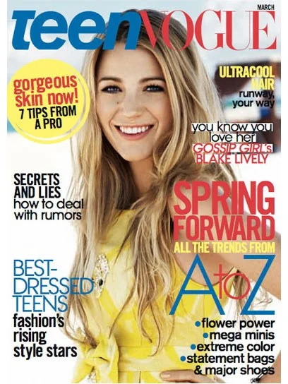
I chose this magazine cover because I think it ties into the section of our reading that discusses the portrayal of young women. Here we see some pretty stereotypical stuff young teens may be interested in; fashion, skincare, drama, and trends. This magazine was made a while ago but I think it would definitely catch the attention of a young teen today. It features a well-known actress and has eye-catching topics that intrigue the viewer to want to read more! The portrayal of American women in media has certainly changed since the late 1800s.
(Source: TeenVogue. “https://www.teenvogue.com/gallery/covers” TeenVogue. April 2008)

The last piece of a design observation I have is of the Walt Disney Concert Hall. I found this piece interesting because of its odd shape and reflective surface. An interesting fact about this building is that the glare and reflection of this building became so unbearable for nearby buildings and people driving by that they had to sand it down to make the surface less reflective. I think that this building is really cool because it’s unique and I’ve never seen anything like it. The designer of this building clearly wanted to make something that would stand out and catch people's attention, which I think it succeeds in.
(Photo: Walt Disney Concert Hall, John O’Neill, 5,368 × 2,585 pixels, 14 May 2012)
0 notes
Text
Week 2 - Design Thinking
After reading “Design Thinking” in the Harvard Business Review, I now have a more informed and logical perspective when it comes to how I think about design. When I thought about design beforehand, I thought it was the same thing as art; simply making something look pretty so that it would sell well or capture people's attention. I think this is still apart of design but it is so much more than that. Design is something that we use to make something functional, practical, and useful. It is all around us in everything we see. Companies aim to not only make something that they know people will buy because it’s sleek and modern but also make a product that will accomplish what they need it to do efficiently and accurately. The sketch, blueprint, and mechanisms of design come first before the embellishments. If a product looks pretty but doesn’t function as it should, it will only go so far in the million product market.
One example of design thinking in a product that I use is iPhones. Sure they look cool and everyone has one but to keep loyal customers around they needed to figure out how to combine functionality with appearance. From their website, they describe the iPhone 11 as, “A transformative triple‑camera system that adds tons of capability without complexity. A mind‑blowing chip that pushes the boundaries of what a smartphone can do” (Apple.com) This quote shows the buyer that not only will you be able to take great photos but you’ll also have a fast phone that accompanies it.
Another product that uses design thinking is Dr. Martens. They’re known for their iconic leather combat boots that can withstand a number of different climates and weather conditions. A quote from their website describes their 1460 shoes as, “grooved sides, yellow stitching, and a comfortable, air-cushioned sole” (Dr. Martens) I as a buyer am intrigued because not only does it describe the product as fashionably forward, it lets me know I’ll be comfortable too.
Overall, one of the most significant concepts I found from the reading this week was looking at design in terms of efficiency and functionality. I think this is something that is often overlooked in the design-art community when in reality it should be one of the most important aspects to look at.
Sources:
Apple. https://www.apple.com/iphone-11-pro/. iPhone 11.
Dr. Martens. https://www.drmartens.com/us/en/p/11821006. WOMEN'S 1460 SMOOTH.
0 notes
Text
Week 1 – About me
Hi everyone! My name is Victoria, I was born and raised in Milwaukee and recently transferred from MATC to UWM. Some of my interests include binge-watching Netflix, discovering new music, and hanging out with my dogs. My major is Design & Visual Communications which is why I decided to take this course.
I think design is one of the most important aspects of our society, it defines the way we look and perceive everyday objects and elements around us. My experience with design is honestly minimal, I’ve mostly been a pen and paper artist up until pursuing my major but I definitely want to learn more. Overall I’m really interested in the composition and outline planning that goes behind all the art we see represented in the real world.
I have a lot of inspirations in life but I would say the biggest one is nature. I love being outside because it’s refreshing and stimulating to me. There are so many beautiful places to discover that haven’t been touched by humans, I think it’s cool to see elements in their raw form. Another thing that inspires me is other artists; seeing their progress, thought process, and journey through their art only motivates me to create something of my own. My biggest art inspirations right now are Seerlight (digital artist, www.seerlightart.com) and Jonathan Chapline (painter, www.jonathanchapline.com), I discovered them both through social media!
Design definitely comes into play when I’m at the store. Comparing something as simple as the design of a cereal box could make me want to buy one over the other. When I recognize that a brand spent time and effort into the packaging of their product, that often tells me that they did the same with the actual item(s) inside. At times I’ve found myself buying something not because I actually cared about the product itself but because the packaging, design, or label was cool!
1 note
·
View note