
Last Seen Blogs
zickd
two roads diverged in a wood

anti-starscream
Starscream hate page

astranva
n o v a

louvesik
ꜥꜤ¡ണ⃕ᥲɾs’ 🏹❜꒱

1rbrduk
Amp
Text
Moving Image: Music Video Project
I’ve always had a passion for music and film, being able to combine the two for my dissertation project just seemed logical and fun. Creating something that stems from a passion would lead to a piece of work that I am proud of uploading as my final project and would also be used in my portfolio. I’ve taken inspiration from a range of different media formats spanning from books, film, music, and of course, music videos, to create something that stands out. I did not want to make a video that seemed like every other music video you see now on YouTube or any other social media platform and so I started planning on creating 3 videos that connect to create one long music video. There are three sections in the final project that are all edited in completely different ways with a variety of alternate editing and practical techniques, allowing the videos to blend and transition into each other.
Authenticity is something that I tried to capture in all of these videos, I wanted to be able to express myself artistically but also the artists own vision for his songs, as an authentic feel to music, or any form of media in general, leads to your work being taken more seriously artistically. (Frith, S. 2001.)
The three songs were made by my friend and artist Ether. The order of the songs are as follows: Float, Real and 1017.
1 note
·
View note
Text
BLAME! and it's inspiration. (annex)
Tsutomu Niheia Japanese manga artist and an architectural student, Nihei's early work were mainly wordless, relying on visuals and backgrounds to tell their stories. His cyberpunk-influenced artwork has gained a strong cult following worldwide. He has been drawing comics professionally since the mid-1990s. In 1995 he was awarded the Jiro Taniguchi Special Prize in that year's Afternoon Four Seasons Award for his submission, Blame!.
Nihei went on to launch his debut series Blame! in 1997. Following the success of Blame!, he next penned Wolverine: Snikt! (published by Marvel Comics), Biomega and many others.

While developing the ideas for this project I was rereading this manga and fell in love with it again. Not only because the story itself is incredible and I could talk about it for ages, but because the artwork quite literally speaks for itself. Although the story isn't very long, it is not an easy read. Blame! is an embodiment of the phrase "show don't tell". Through the entirety of chapter one there are 18 lines of dialogue and only two of which are spoken by the main character. Never once throughout the entirety of the story does the reader experience an unnatural exposition dump, no characters explain the plot points for the sake of the audience. If you didn't understand, you are meant to read it again until you do. Everything is communicated through context and action.
The story takes place in a structure called "The City", an insanely large cybernetic mess that was constructed by robots called "The Builders". Originally built to house humans in an unknown time in the past, these robots sought to the never ending construction of the city. Due to its never ending expansion, The Builders begin to go senile after millennia and the city begins to expand beyond earth, reaching far into the solar system, continuing to build on top of itself and creating new structures.

This is only a very small portion of the context of the story. There is so much to Blame! that it inspired me to want to create an environment for my videos that evoked a similar sense of overwhelming grandeur in a dystopian world. And so, I started to do further research and planning on what I wanted my final project to look like.
0 notes
Text
Further Research and Planning of Video 1 (Float)
Once I had the initial idea for the first portion of the project, I continued to research different dystopian and cyberpunk environments like the drawings from "Blame!". The use of my sets allowed for the enhancement of aesthetic appeal through the combination of practical effects with digital effects. it created a tangible realism as practical effects, such as physical props or sets, provide a realistic sense that digital effects alone often lack. The presence of physical elements on set can create a sense of authenticity and depth that resonates with audiences. (Prince, S., 2011.) Further enforcing the authenticity that I was aiming towards.(Frith, S. 2001.)
To find more set design ideas I searched through a variety of different sites and I stumbled across a few images that inspired the project further. Those along with some panels from "Blame!" is what lead to the final sets for the project.
The bridge:

The main inspiration for this shot was a "Blame!" panel that I attempted to recreate as an homage to the manga itself, combining my own ideas into it.

My budget was nowhere near high enough to be able to recreate architecture as complex as this so I had to tone it down a little bit but for the ones that know the manga, they will be able to recognise where I got my inspiration from.
Creating the bridge:
I used pvc sheets to create the main structure of the bridge, drawing out its shape and then cutting the sheet.

Because I wanted it to be 3D, I needed to cut some portions of the sheet only halfway so that the pvc was able to fold into itself and create the desired shape. I also used A LOT of masking tape when necessary to keep things from falling apart

I then got a larger sheet of pvc and made two large cuts allowing the pvc to fold into itself once again, forming the walls where the bridge would then attach itself to.

Once the rough shape of everything was ready, I put them together and began adding little details like stairs and texture on the walls.

The final steps were sticking on strings to the sets and spray painting it all in black which almost completed the entire look.

The final step was to create a clay mould that would surround the bridge, allowing me to create steps on the actual bridge itself and add far more texture to the bridge to make it look a lot more realistic. I wanted it to look old and almost as if it was starting to deteriorate and the clay allowed me to add those little details. I then repainted the bridge, leading to the final look.

The Cubes:


Once again using "Blame!" as a primary source of inspiration, I wanted the background behind the cubes to be similar to that of the manga. The City in the story is so large that the sky is completely shadowed by the size of the constructions and I wanted to do something similar

Exploring the architecture designs of Nihei I knew I wanted to do a sort of brutalist structure for some of the shots. After continuing to search for inspiration I stumbled across the video game NaissanceE and its captivating brutalist structures gave me the idea of combining cubes to make a structure.

I really liked the idea of the only source of light being an artificial one and the shapes used also emphasise the cyberpunk and brutalist aesthetic that's influenced by Nihei's work.

Creating the cubes:
I used thicker pvc and requested a factory to cut them out into a variety of different shapes.

I then super glued them all together like a reverse game of Jenga.

The final step was to spray paint them as well. I used a grey primer followed with a black matte finish to give them a somewhat metallic look.
The Gate:

For this shot I mainly took inspiration from a twitter post that I found while researching for this project.

I used two large sheets of pvc for the walls, using tin foil to create the shape. I then used Kraft paper to create the stone look by scrunching it up and then surrounding the tin foil with it. To give it the most convincing stone look possible I then used grey primer and black spray paint once again.

0 notes
Text
Bringing Float to life.
Once the sets were complete, I booked out the studio at the uni and put everything in front of the green screen.

For the majority of the shots I used the lights in the studio to give it a more realistic look in post, as if I was to edit in the light myself, it would not have looked anywhere near as convincing as the final shots did.

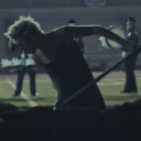
Once all the sets were shot, I then brought the original artist of the songs that I used to the studio and also shot him in front of the green screen to then keylight him into the sets I created.
0 notes
Text
Editing Process of Float.
Failed Keylight and Rotoscoping:
The initial Idea was to have the subject on a green screen and keylight him into the sets, however, what I did not take into consideration was the lights making the green bounce off of the subjects clothes and skin. The green on the subject made it almost near impossible to be able to keylight the green out of the video without removing portions of his body as well.
The solution to this was rotoscoping every single scene. This was incredibly time consuming as I had to go almost frame by frame to make sure that the rotoscope AI outlined the subject correctly as it is not always accurate. A lot of the time, I had to make adjustments to the outline as it would also pick up on the shadows of the subject. I also feathered most of the shots to make my life a little easier, as the outlines weren't completely perfect and sometimes the background would be inside the lines.
The lights didn't only make the green of the background bounce off the subject, it also made the green bounce off of the sets and so in post, I had to mask out the green background to make it black so that the sets wouldn't be only partially visible.
Creating the Shadows:
Once all the masking and rotoscoping was done, I put the clips where I wanted, resized the subject and put him in position in each clip. I then copy and pasted the original subject layer, flipped him vertically and placed the flipped subject at the feet of the original to start working on the shadows. For the majority of the shots, the light source is coming from the back, meaning that the subject will become a silhouette essentially, and a shadow would also be casted. To make the shadow blend in with the set and make it look more convincing, I added a camera blur to the layer and played around with the settings until it was to my liking. The same principal was done for every single shot that includes a shadow.

Colour Grading:
The colour grading is similar for most of the shots where the light source comes from behind. I used lumetric colour grading, set a high contrast, made the blacks of the subject match the blacks of the background and lowered the whites so they are barely visible making him look like a silhouette. For the backgrounds I also made it high contrast but I wanted the lights to be bright without making the set itself overly illuminated as I wanted it to look ominous and dystopian, like the original source of inspiration. To do this I made the blacks very dark but turned up the highlights significantly so that only the lights were affected and not so much the actual sets themselves.
Because I messed up during the shoots with the lighting, colour grading in this project was crucial to make it look believable as it is what allowed me to blend the subject into the sets as much as I possibly could and I am quite happy with how it turned out.
Typography:
I put the title of the song on the floor of the shot by making the text a 3D object and changing its X rotation to place it on the floor. To make it blend in, I used this video for help.

Transitions:
The transitions for the first video were very minimal as I did not want to take away from the sets as I wanted them to be a crucial part of the video, similarly to how the story of "Blame!" is developed throughout the manga, "Show don't tell". There are fading transitions, zoom ins and outs that were done using opacity, scale changes and motion blur. The camera wasn't actually zooming in, they were different shots but the changes in scale made it look like it was the same position but close up.
0 notes
Text
Transition from Float to Real.
For the first transition I used the Glow effect to and turned up the intensity and width of the glow to make it consume the subject. I then used Displacer Pro to create a melting effect. To make it glitch and be pixelated I used AE Pixel Sorter and played around with the settings until it was to my liking.

This section was heavily inspired by the franchise of Cyberpunk 2077, in particular the anime Cyberpunk Edgerunners. In certain portions of the show, some of the characters enter "cyberspace", a place in which the environment is very minimalistic in nature, mainly a black void with certain pixelated shapes floating around.

I wanted to create a similar environment as I felt that it suited the theme I already had.
To make it transition into "Real" I used this video of a light leak, changed the colour of it and played around with the opacity until they blended well together.
The audio used for the void section is also taken from the game.
0 notes
Text
Inspiration and Research for Video 2 (Real)
I wanted the videos to connect to each other efficiently but be completely different in their own regard so they could also be stand alone pieces of work. I continued working on real with the glitchy effects as it still fit with the original cyberpunk theme but made the editing style to the video different to the previous section of the project.
My main source of inspiration for this section was the music video for the song "More than ever" by Lucki. Not only is his nonchalant cadence effective and alluring due to the artists authenticity (Frith, S. 2001.), but the visuals to the video are extremely effective and enforce the authentic nature of the music. Layering and collaging clips on the main shots with VHS style glitches that are on time with the beat. The entire aesthetic of the song was appealing and I wanted to attempt to recreate something similar.
youtube
The music video director Lonewolf also inspired this video thoroughly. The recurring use of mix media, glitchy effects and handheld camera movement in his videos are captivating and appealing to the eye.
youtube
0 notes
Text
Shooting of Real.
For this shoot I travelled to Manchester with two cameras. My own hand-held camcorder and a DSLR that I booked out along with a tripod for some stable shots.
Although this is the second video of the project, this is the first one I shot and so this whole project was a learning curve. I went to Manchester for only one day and I was there for a few hours so that I had time to catch the train and go back home as I wanted to start the editing process as soon as possible. This made it so that this section was the least planned of the three videos in terms of cinematography as I did not give myself the time to shoot anything as creative as the other two videos. Regardless of that, I believe the video came out well due to the editing that elevates the shots.
However, the use of two different cameras allowed me to capture a wide range of visual perspectives and styles. The combination of DSLR camera and camcorder provided diverse angles, focal lengths, and visual aesthetics, adding richness and variety to the storytelling experience. (Gitner, S., 2015.)
0 notes
Text
Editing Process of Real.
VHS effect and screen tears:
These effects are prominent in the entire video. I used Omino Diffusion for the majority of the screen tares and played around with its intensity and settings on every clip, using keyframes to change how it affected the videos on the screen. I didn't want all of them to look the same so I made sure to randomise the effects on most of them. However, some of the screen tares are on beat as I wanted the editing to be synced with the song to make the visual experience a lot more appealing to the viewer and to elevate the editing and make it more effective.
Collaging and Layering:
Taking inspiration from "More than ever" by Lucki I stacked and layered the clips on a multitude of different shots, also making sure that they appear on screen synced up with the song. Each of the layered clips also have their own screen tear effects so they stand out from the main background clip similar to the Lucki music video.

Experimenting with transitions:
As the shoot itself for this video wasn't as well thought out as the others, I had to make sure the editing stood out from the rest and the transitions were a good way of doing so. I used AE Pixel sorter along with Displacer pro to create some of the swiping transitions.
I also used the collaged clips to my advantage by zooming into some of them to transition into the next clip.
Colour Grading:
I used lumetric colour once again, turning up the contrast and the highlights. As the video was shot at night I wanted the lights to stand out and create optical flares. I made the video black and white and changed the whites to a dark shade of blue to make the video stand out further from the other two black and white portions of the project. The colour blue was selected purposefully as the song itself has a blue atmosphere to it. It is an abstract perception of the song, however, I cannot help but think of the colour blue when listening to the track and I wanted to emphasise that to the viewer.
0 notes
Text
Inspiration for Video 3. (1017)
The main source of inspiration for the third portion of this project was the music video ‘R.I.P’ by Playboi Carti in which the artist is shown dancing in a warehouse with a multitude of people, with black and white crisp colour grading and slight flashing lights. I loved the aesthetic of the whole video and wanted to create something that had a similar atmosphere which is what lead me to make this portion with a sharp, high contrast black and white colour grade with a strobe light going off for most of the video.
youtube
However, the main standout aspect is the frame being split into three rectangular sections, a centre rectangle and a left and right rectangle which complete each video's frame. Having the frame split this way meant that I could manipulate the shots to my liking, being able to experiment with taking one rectangle out and replacing it with a different shot and it gave me the opportunity to play around with unique swiping transitions, mirroring, tracking and rotoscoping. The split frame was inspired by ‘Split/Whole time’ by Lil Yachty, who in the first portion of the music video has the frame split into three different sections as well.
youtube
0 notes
Text
Shooting of 1017.
Due to the split frame of the video, the shoot had to be well planned out so I knew what kind of editing I wanted to do so that the frame experimentation was successful.
I booked out the studio at the university and used a white backdrop and had a large strobe light set up in front of the subject. The majority of the video is shot with handheld camera movement to add more vitality to this section of the project. The song itself is very high energy and I wanted to bring that across to the audience through the camera movement by mimicking the unsteady movements of the human observer or the subject, and the snappy editing style. (Bordwell, D. and Thompson, K., 2019.)

0 notes
Text
Editing Process of 1017.
Framing:
To create the 3 square frame I used two black solid layers and changed their scale until they were super thin. I used the grid on after effects to place them where they would split the frame evenly.
Rotoscoping:
The first two silhouettes were done with rotoscoping rather than practical lighting. I knew I wanted to experiment with different forms of lighting and shadows and during the shoot I used a spotlight to create a shadow behind the subject.

I really liked how this shot turned out but I only saw how good it looked once the clips were edited together. After combining the two, I realised I wanted these silhouettes to be somewhat of a recurring theme, and to create a similar effect I rotoscoped the two clips that are seen at the start of the song.

Tracking:
Because the camera was handheld for a lot of the shots, stability was hard to achieve, especially when I wanted the subject to remain centred in the middle square of the frame. I repositioned a lot of the clips using keyframes to stabilise the camera movement and maintain the subject centred at all times. (As seen at 03:56)
Cuts and Transitions:
Quite a few of the cuts in-between the clips are static, but I made sure that they were all on sync with the beat of the song. The best part of this portion however, is the swiping transitions. I used key frames to change the positioning of the clips, swiping them up, left and right. The use of motion blur, along with the swiping clips that followed the hand of the subject, made it look like the artist had full control of the video, manipulating the frame to his liking. (04:00)
To enforce the idea of the subject being in control of the frame further, I made it so that in certain sections as he moves along the squares of the frame, different clips that are overlaying the main shot appear and disappear as he moves from square to square. (04:07)
1 note
·
View note
Text
Take Away. (annex)
I made loads of mistakes during this whole process, but I also learnt to stay persistent and believe in my vision. The whole project came out exactly how I wanted it to regardless of all the hiccups experienced throughout and I am incredibly proud and happy of my final project.
0 notes
Text
Bibliography:
Avnish Parker. 2022. Professional Light Leaks Pack - Film Burn Overlay Free Download - 100% Royalty Free. [online]. [accessed 14/05/2024]. Available from: https://www.youtube.com/watch?v=oNLb3ridjBM&t=1s
Bordwell, D. and Thompson, K., 2019. Minding movies: observations on the art, craft, and business of filmmaking. University of Chicago Press.
Cyberpunk: Edgerunners. 2022. [Show]. Hiroyuki Imaishi. dir. Japan: Studio Trigger.
Cyberpunk 2077 (Standard Edition). 2020. All Platforms. CD Projekt: Warsaw.
Frith, S. 2001. ‘Pop music’, in S. Frith, W. Straw, and J. Street (eds.) The Cambridge Companion to Pop and Rock. Cambridge: Cambridge University Press (Cambridge Companions to Music), pp. 91–108.
Gitner, S., 2015. Multimedia storytelling for digital communicators in a multiplatform world. Routledge.
lil boat. 2020. Lil Yachty - Split/Whole Time. [online]. [accessed 14/05/2024]. Available from: https://www.youtube.com/watch?v=h8mW3iA6O4M
LONEWOLF. 2018. A$AP TWELVYY - VIKINGS. [online]. [accessed 14/05/2024]. Available from: https://www.youtube.com/watch?v=oOWoV5B72i4
Lucki. 2019. LUCKI - MORE THAN EVER [Official Music Video][online]. [accessed 14/05/2024]. Available from: https://www.youtube.com/watch?v=7-QK_1oHoiQ
NaissanceE (Standard Edition). 2014. Steam. Limasse Five: Spain
Neutralious. 2024. Nobody's son. [Twitter]. 10th of May. [accessed 14/05/2024] Available from: https://twitter.com/Neutralious/status/1788720311971545343
Nihei, T. 1997. Blame!. Tokyo: Kodansha.
Playboi Carti. 2018. Playboi Carti - R.I.P. . [online]. [accessed 14/05/2024]. Available from: https://www.youtube.com/watch?v=GRoa6w-wnT4
Prince, S., 2011. Digital visual effects in cinema: The seduction of reality. Rutgers University Press.
Rage. 2023. (Sound Warning) Beyond the Blackwall Ambience | Cyberpunk 2077. [online]. [accessed 14/05/2024]. Available from: https://www.youtube.com/watch?v=MXN08ScQ7Wg&t=3s
SonduckFilm. 2023. Blend and Texture Anything in After Effects. [online]. [accessed 14/05/2024]. Available from: https://www.youtube.com/watch?v=L8NRd8gkk1c&t=21s
0 notes