mparrott-svad
Madelyn Parrott
SVAD Graphic Design Student at UofSC
39 posts
Don't wanna be here? Send us removal request.
Last Seen Blogs

sfiorandooci
ogni storia qua non é mai quella per dimenticarti
partialpress
Partial Press

wickedapostate
Of Jade & Catnip

millionairemindsets
Raja Verma

laradaros464
Untitled
Text
Sustainable Packaging Paper
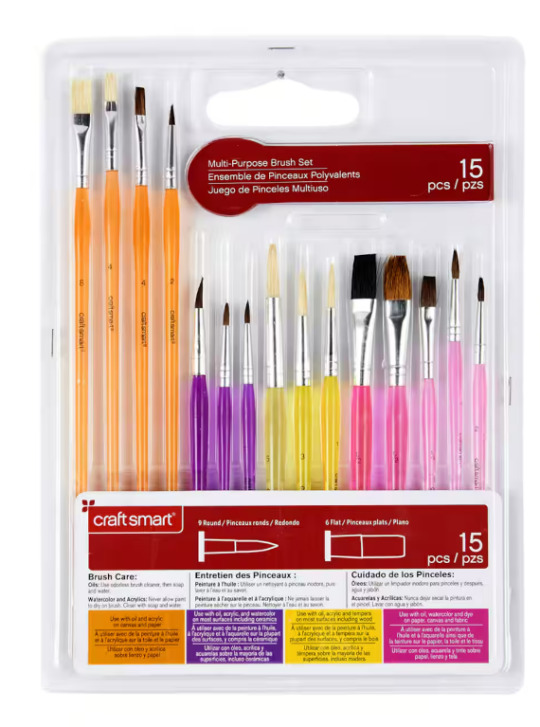
The product I decided to redesign is a pack of 15 paintbrushes that are in a blister pack, all laid side by side. It is an enormous amount of plastic for just a few paintbrushes, and while I understand it makes them easier to see, it is really only vital to see the shape of the brushes themselves, not the entire handle. My solution to the problem is recycled cardboard packaging, but also more in the form of a colored pencil case, where the brushes are grouped together tightly in rows, instead of laid out flat.
Although the original product is a pack of craft paintbrushes for kids, I have decided to design my paintbrushes for adult fine artists, mostly because I just did a kid’s project, and I wanted to branch out. But I can also see an adult audience being more aware of sustainability and quality when it comes to packaging, whereas the kids aren’t looking for this. Fine Artists especially, are more concerned about the environment. Artists, art collectors, and galleries are all becoming more conscious of their environmental impact, starting groups like the Gallery Climate Coalition (NYTimes).
Researching further into this demographic, fine artists are 59.9% female (Zippa). Although this is a majority, I don’t think it’s too major of a divide to design for solely females. Therefore, my audience will be across all genders. Additionally, 47% of fine artists are 40 years old and above (Zippa). This also informs the design because it needs to be more classic than trendy. I will be focusing on artists who specialize more in classical painting techniques than illustration, or modern art. This is also an interesting statistic because it shows that the audience is well into their career, so they are probably looking for more high-quality products. Fine artists, especially painters, need so many materials. Brushes, paint, paint mediums, canvases, and so many other tools are all a part of an artist’s kit. There is a balance between getting high quality materials, and also not spending a ton of money, especially because there are so many other products to consider. I researched that a 15 pack of oil paintbrushes can range anywhere between $10 and $75. I decided that these will be mid-range, priced at around $35. When deciding this, I looked into average salaries for artists in South Carolina. Artists make, on average, $40,000 (ZipRecruiter). In South Carolina, the average salary of the general population is %49,550 (ZipRecruiter). Since fine artists in South Carolina make about the median pay, the price of the brushes should be in the middle too. I am choosing to design for South Carolinians because that is where I am from, but also there is a pretty big arts sector here, especially in Charleston and Greenville.
Another aspect of the audience is education. 91% of fine artist have college diplomas, whether that’s associates, bachelor, or masters (Zippa). A big part of art education is art history. Most art majors are required to take a few art history courses to graduate, so it is safe to assume they have a more in-depth knowledge of art history than a regular audience. Because of this, a part of the design will center around art history. The packaging will display classical art, and that will speak to the audience.
I plan to design 4 different packs, including detail, filbert, flat, and assorted brushes. Each of these will have different classical art on the package design (However, I only plan to build one for the final). Having this knowledge of art history will make differentiating these packs easier, and also an exciting easter egg for the audience.
0 notes
Text
"What's Missing?" paper
For my What’s Missing project, I was assigned the Barebells protein bar. I did some research into the parent company, Vitamin Well, and discovered they had 6 brands. The first is Vitamin Well, which sells sports drinks. The second, Barebells, sells protein bars. Nocco sells performance drinks. Vitamin Well has 3 local brands overseas: Nobe, the Korean aloe vera drink brand, Smiling, the Swedish snack brand, and Tyngre, the protein powder and drink brand. As we can see, most of the brands are either protein snacks or drinks. Vitamin Well says they are making “better tasting and healthier alternatives to traditional beverages and protein-enriched products.” However, I have decided that Vitamin Well is missing a snack brand for kids.
The audience is twofold- it is the kids that the food is designed for, and it is their parents, because they are the ones buying it. It is important to look at the adult audience Vitamin Well is currently targeting with its products because they are already enticed by the brand and this wellness culture it fits into.
Based on the pictures on Vitamin Well’s website, their age range seems to be Millennials. Millennials are people ages 28-43. Millennials are known as the wellness generation, and are eating healthier and exercising more than previous generations (Nermoe). There is a whole wellness culture that sprung up around Millennials, including protein drinks, vitamins, supplements, and products that support a healthy and active lifestyle. The audience for Vitamin Well is a part of this wellness culture, and are looking for these healthy products. As for their lifestyle, they are always on the go, participating in exercise classes, going on runs, shopping for healthy foods, and most importantly for our brand, being a parent. This aspect of parenthood is really the key to the audience. Because they are balancing a healthy lifestyle with being a good parent, the products have to be portable and easy. If they are dropping their kid off at soccer practice, they need an easy and healthy snack to throw into their bag.
It is also important to note that Vitamin Well’s market started as the Nordic countries of Europe, and has since travelled to the US. Because of this, it is important to target that audience as well. Nordic countries have a significantly healthier lifestyle than people in the US. The diet there is mostly seasonal vegetables, unprocessed food, whole grains, seafood, and even reindeer meat (Austbo). Nordic people also rely on public transportation, and either take the subway, or walk (Austbo). This means they have an active, on the go lifestyle, making easy, portable snacks for your child a necessity.
Looking at pricing, a 4 pack of Barebells protein bars is almost $9, so these are not the cheapest option. In comparison, a Nature’s Valley 5 pack is $4.32. This informs us that the socio-economic class is probably upper-middle class. This also fits into the people in the wellness culture, who often have the means to pay for things like protein shakes and exercise classes.
As for the children, the age range is 5-10. These are young kids who are attracted to color, fun shapes, and patterns. They are in school, and also may be enrolled in extracurriculars, such as sports. This tells us they may need a packed lunch, or snacks for a sports practice. Around age 5 is also when choice becomes a big factor; they will start to become more independent and want to make their own small decisions (“5-6 years: child development”). This can help inform the variety of products in the food line, or different flavors. Children this young are also not really concerned with the health content of food, just if they like the way it looks and tastes. The children this brand target will really infer the design. Studies show that when it comes to food, color is most important to kids. Children are more likely to eat food off of plates with 6 or 7 different colors on it, where as adults tend to eat 2 or 3 (Lang). Food placement is also important, as food made into fun shapes is more appealing to kids (Lang). One product I am considering is a lunchable-style snack tray, and there is data that backs up kids preferences on that as well: along with more colors, kids prefer more sections of foods. The 3 section food trays are actually a reflection of adults’ food sectioning preferences (Lang). Kids also prefer food that is fun. Fun to look at and fun to eat. This includes finger foods, dips, being able to add and mix their own food, fun shapes, and portability (Magee). Overall, this audience is looking for food that looks fun, and is fun to eat. Balancing this with the nutritional appeal for parents will be key to the product’s success.
Magee, Elaine. “Kids Just Want to Have Fun with Food”. WebMD, 1 Sept. 2024, https://www.webmd.com/diet/features/kids-just-want-to-have-fun-with-food. Accessed 12 Mar 2024.
“5-6 years: child development”. Raising Children, 28 Feb. 2024, https://raisingchildren.net.au/school-age/development/development-tracker/5-6-years. Accessed 12 Mar 2024.
Lang, Susan. “Kids prefer lots of choices and colors on their plates”. Cornell Chronicle, 5 Jan 2012, https://news.cornell.edu/stories/2012/01/how-you-plate-food-kids-matters. Accessed 13 Mar 2024.
Austbo, Kariana. “What we can learn: healthy lifestyles in Nordic countries”. Southern Oregon University, https://sou.edu/academics/honors-college-democracy-project-2023-nordic-dispatches-week-four/#:~:text=Even%20seemingly%20small%20things%20like,can%20help%20Nordics'%20overall%20health.&text=Nordics%20rely%20on%20public%20transportation,a%20subway%20or%20a%20ferry. Accessed 12 Mar 2024.
Nermoe, Katie. “Millennials: the ‘wellness generation’”. Sanford Health, 12 Sept 2022, https://news.sanfordhealth.org/sanford-health-plan/millennials-wellness-generation/. Accessed 12 Mar 2024.
0 notes
Text
"Where am I?" Paper
The place that I am designing wayfinding signs for is dreams. Dreams are notoriously hard to navigate, and the more you try and focus on details, especially reading text, the harder they are to understand. The harder you try to take control of a dream, the more your mind seems to fight back. However, the unexpected and unreliable narrator that is our subconscious mind is what makes dreams so fun. My most interesting dreams are the ones that make the least sense. I want to create signage that is trying to lead you further into the chaos and mystery that is the dreamworld. Signs that lie, misdirect, and confuse even further, but by doing so, lead you down the most interesting path.
The audience for this 7–10-year-olds. Their life revolves around Saturday morning cartoons, playing neighborhood-wide hide and seek, and complex barbie doll dramas. This audience is whimsical, imaginative, and curious. They are natural explorers, even about things that scare them. They are also established in elementary school, and their lives revolve around school, especially friendships with their peers. Social relationships, then, would play a big part in their dreams. A young audience also gravitates towards color. Everything that is cool to a 7-year-old is garishly colored: toys, candy, and cartoons. This helps inform the signage as well, and how to capture the audience's attention. This audience is universal when it comes to gender, race, and socio-economic class, because everyone dreams.
Ages 6-9 are when children’s dreams start to develop. Around age 8, the child is the main character of their dream, and they are experiencing the plot as it unfolds, having corresponding thoughts and feelings about it. Dreams also become longer, with more coherent plot structures. Because kids are so curious, they will naturally want to follow these plot structures. If they were to encounter an interesting, colorful sign, they would want to figure out what it means and where it was leading.
A major inspiration for this is Alice in Wonderland, and how her journey through Wonderland is riddled with confusing characters, misleading signage, and general chaos and dreamy confusion. In the original book, Alice is 7 years old, so this is also a factor in the audience. The whimsy and color that dominate the style of Wonderland will also dominate the style of these signs.
Additionally, 7 is when kids start reading. They can “sound out or decode unfamiliar words”, as well as “use pictures and context to figure out unfamiliar words”. This is key to being able to follow signage; they are able to try and figure out what things say, and take in visual cues. However, still being at this preliminary reading level plays into the slight confusing nature of the signs.
Sources:
0 notes
Text
"Package an Egg" Paper update
My product redesign is an eyebrow “soap brow” makeup product. It is a small container of essentially a soap bar, that when a little bit of water is added, it makes a paste (sounds gross, but it’s not I promise) and you use a spoolie to style your brows. The problem occurs with the water, when I have to get up midway through my makeup routine to walk into the bathroom and wet the spoolie. I need to create a way to have the water connected to the product to avoid having to break the flow of my makeup routine.
The audience for this product is young women, particularly ages 16-26, which is roughly Gen Z. This is important because of the type of brow style this product helps create. “Soap Brows” are a trend that originated from TikTok, which entails fluffy, natural brows, held in place by either a gel, or soap, which when dry, acts as a gel. It is a makeup trend made by Gen Z, for Gen Z. This age of young women is also the most influenced by online makeup trends, and most active on TikTok, and most likely to encounter it.
The Soap Brow trend is also a part of a wider trend, which is known as the “Clean Girl Aesthetic”. This is a girl who keeps a modern, minimalist appearance, works out, drinks green juice, and most importantly, wears Clean Girl Makeup. This includes dewy foundation, lots of blush, and most relevant to this project, fluffy brows. The Clean Girl tends to have a specific color palette, including white, cream, pastel olive green, baby blue, and pale pink. It’s a physical aesthetic, but it is also a lifestyle. A big part of the Clean Girl aesthetic is documenting it, and it has become synonymous with online influencer style. Clean Girls on TikTok have a carefully curated life, and only buy products that can fit into this aesthetic. Since it is an online lifestyle, everything must be able to be photographed or filmed, and fit the Clean Girl illusion.
There has been discussion of the Clean Girl Aesthetic online that discusses the downsides of it, as it's a lifestyle only achieved by the wealthy. The modern lifestyle often portrayed online is not only through products, but often the space they live in. Clean Girls' online content is often filmed in a modern luxury apartment, where everything is white marble and plush carpets. This informs us of the socioeconomic class of the audience: usually upper middle class or upper class. Clean Girls spend their money on a lot of superfluous things, like a matcha from Starbucks every morning, premium gym memberships, and Aritzia loungewear. However, the rich girls who promote this lifestyle have their own audiences: usually younger girls who may not be as wealthy, but save up for a product that the influencer swears is life changing. This broadens our audience in both the socioeconomic class, which now starts with the daughters of working class parents, and also further informs the age range, which as stated before, starts with 16 year old girls.
This is also a product for a girl who loves makeup. She views makeup as almost a ritual, and its calming and enjoyable. This is why having to get up to wet the spoolie is a deal breaker: it breaks the flow. It’s frustration not born out of laziness, but interrupting the therapeutic joy of getting to sit down comfortably and get lost in the makeup. Because she loves makeup, she has a lot of it. Any product needs to work well, but also physically stand out amongst the other products. A girl who appreciates the aesthetics of a face also appreciates the aesthetics of packaging, and that packaging is the dealbreaker for which products are on her makeup shelf, and which are thrown in the pile in the back of the closet. But since she also has so many products, it has to be small enough to fit in her makeup bag. This is also key because the Clean Girl Aesthetic is also associated with lifestyle, like travel or going to the gym, so portability in makeup is important.
To fit this audience, the redesigned product must encapsulate the Clean Girl Aesthetic, be presentable as minimalist “art” on a shelf or in a TikTok, and be portable for the user’s lifestyle.
0 notes
Text
Package an Egg paper (ARTS 446)
My product redesign is an eyebrow “soap brow” makeup product. It is a small container of essentially a soap bar, that when a little bit of water is added, it makes a paste (sounds gross, but it’s not I promise) and you use a spoolie to style your brows. The problem occurs with the water, when I have to get up midway through my makeup routine to walk into the bathroom and wet the spoolie. I need to create a way to have the water connected to the product to avoid having to break the flow of my makeup routine.
The audience for this product is young women, particularly ages 16-26, which is roughly Gen Z. This is important because of the type of brow style this product helps create. “Soap Brows” are a trend that originated from TikTok, which entails fluffy, natural brows, held in place by either a gel, or soap, which when dry, acts as a gel. It is a makeup trend made by Gen Z, for Gen Z. This age of young women is also the most influenced by online makeup trends, and most active on TikTok, and most likely to encounter it.
The Soap Brow trend is also a part of a wider trend, which is known as the “Clean Girl Aesthetic”. This is a girl who keeps a modern, minimalist appearance, works out, drinks green juice, and most importantly, wears Clean Girl Makeup. This includes dewy foundation, lots of blush, and most relevant to this project, fluffy brows. The Clean Girl tends to have a specific color palette, including white, cream, pastel olive green, baby blue, and pale pink. It’s a physical aesthetic, but it is also a lifestyle. A big part of the Clean Girl aesthetic is documenting it, and it has become synonymous with online influencer style. Clean Girls on TikTok have a carefully curated life, and only buy products that can fit into this aesthetic. Since it is an online lifestyle, everything must be able to be photographed or filmed, and fit the Clean Girl illusion.
This is also a product for a girl who loves makeup. She views makeup as almost a ritual, and its calming and enjoyable. This is why having to get up to wet the spoolie is a deal breaker: it breaks the flow. It’s frustration not born out of laziness, but interrupting the therapeutic joy of getting to sit down comfortably and get lost in the makeup. Because she loves makeup, she has a lot of it. Any product needs to work well, but also physically stand out amongst the other products. A girl who appreciates the aesthetics of a face also appreciates the aesthetics of packaging, and that packaging is the dealbreaker for which products are on her makeup shelf, and which are thrown in the pile in the back of the closet. But since she also has so many products, it has to be small enough to fit in her makeup bag. This is also key because the Clean Girl Aesthetic is also associated with lifestyle, like travel or going to the gym, so portability in makeup is important.
To fit this audience, the redesigned product must encapsulate the Clean Girl Aesthetic, be presentable as minimalist “art” on a shelf or in a TikTok, and be portable for the user’s lifestyle.
0 notes
Text
12/7 Course Reflection
I feel pretty satisfied with the work I've put out during this semester. The magazine was such a big project, and I don't think I've ever worked on one thing for so long before. I tend to get tired of projects pretty quickly, so this was really an exercise in patience for me.
I think it turned out pretty good. I ended up constructing one of the magazines by hand, because I knew the pages would be a lot more sturdy that way. The found object of the hanging scales needed that thicker paper to support it. The copy without the objects was just printed using the print lab. I think the final illustrations and designs in the magazine were up to my standard as well. I planned to have two extra articles in there, but the page count had to be in multiples of 4, so I had to cut one. I still was able to add one of the extra articles, which I think will be a fun surprise.
The smaller assignments were some of my favorites because I think they were so fun and creative. The flatpack was a great introduction into craft, and a great way to get the creative gears turning. I also enjoyed working with the riso. It was pretty low stakes, and there wasn't a need for perfection. While simultaneously working on the magazine, which required perfect craft, it was a nice break to let loose and just be creative. I thought it was an interesting way to go about a design, thinking in terms of layering flat colors.
Overall, I think I really enjoyed being able to pursue topics and styles that interested me personally, and have a completed product that displays work that I'm proud of, in the form of the magazine.
0 notes
Text
10/27: Conversations with designers

This week I attached the actual found object onto my spread. I was pretty happy with how it looked visually, but during critique, people suggested that it felt more like jewelry than snake skin. I want to put the scales in groups instead of hanging them on the chains. The only problem is that the scales have a hole in them and they are made of metal, so there is no way to cover up the holes. It’s hard to balance something that looks good simply for the sake of looking good while also having its intended function. I also feel like the spread is unbalanced, so I will have to rework it anyway. I have a problem with my designs in that when I look at them for too long, I start to dislike them, so I am tired of even my first design. I think I will probably end up redesigning a lot of the spreads when it comes time to turn in the whole magazine.
The “how do you get in the mood” section really spoke to me because I have trouble feeling inspired to make art. What I find works best for me is to just get started. Momentum is key in churning out ideas. I liked some of the designers’ ideas of collaboration though. I do fund myself becoming more creative when I bounce ideas off others. In the “How do you invent form” section, Keetra Dean Dixon’s idea of “thinking through making” is also a great idea. I think when you have a predetermined idea of what you want something to look like, its hard to live up to your imagination. However, just making something and letting it go where it goes is a great way to find unexpected solutions. Art should be about exploration, and the more free you can be in the early stages of designing a project, the more unique the idea can turn out to be.
0 notes
Text
10/13: How to Create Form: Regurgitation, Reconstruction, Take the Matter Outside, Aberrant Type

I like the regurgitation idea because it deals with quantity. Take apart something and put it together a million different ways. I think quantity is a good exercise in art because not focusing on the quality lets you explore and make a mess. I think sometimes I get too caught up in making something perfect, and I don’t try enough ideas. Just churning out work and making enough ugly things can end up with something that works. The reconstruction technique is similar, but it focuses on the logic and structure behind the design. Taking apart something and working to fit it back together. This could be cool to take inspiration from a preexisting design and flip it around and make it unique. That way there is still structure, but it’s something new. I think this idea can be great for making a clean, methodical design, but I think the regurgitation technique is more my style. I like the chaotic approach that isn’t focused on greatness or perfection. That tends to be how I brainstorm.
This week we went into our found object spreads. I did a lot of sketches to get out different ideas. For some reason my sketches always look more interesting than when I move the work over digitally. I think it loses some of the texture and human touch. Something about the spread right now is not where I want it to be. Visualizing the final is hard for me because its hard to anticipate what it will look like without the actual object. My design right now seems very boring and empty, but I know the sparkly snake scales will add a lot of interest to the design. I am thinking of adding some sort of texture in the background, or some more typography.
0 notes
Text
10/6: How to Create Form: Form vs Concept, Physical Thinking, Alternative Tools


The reading talked about different ways to get out of the digital realm and expand your designs through physical means. I think sometimes Illustrator just cannot capture the look of a real drawing, and its important to know when to use other art mediums to get the look you’re going for. I think I get so caught up in the idea that graphic design is totally digital, but I really would love to break out of that mindset. I loved the case study with the toilet paper because its so unconventional, but a great way to get texture that just can’t be achieved digitally. I think a lot of my work seems very flat sometimes, and texture and like physical artmaking is a great way to add that dimension. I also thought the section on 3D design being incorporated into 2D is cool. I think the more ways you approach a problem, the more interesting ways you can solve it. My brain really doesn’t really work in 3d, but I can imagine doing something like making a 3d object/sculpture, photographing it, and then vectorizing it. An interesting idea for future work.
This week I refined my illustration spread. I think my illustrations were solid, so I really wanted to experiment with the typography, because I tend to gloss over that. I first was planning on doing something basic for the splash page typography, but then I decided to go wild with it and have interlocking letters. I liked the way that turned out, but since the illustration spanned both pages, I wanted the text to too. I did “Revenge” straight across, but the class liked the interlocking better. I decided to merge the two. I was trying to mess around in InDesign with the letters, but it wasn’t working. I had to go back and sketch the letters, and sketching is my favorite tool for design! Its quicker and you can generate more ideas and get to the bottom of the problem much easier than trying to force what’s on the screen to work. I am pretty happy with the typography, but I think I’m definitely going to do some editing on the second spread. The text might need to be broken up more, and looking at the printed colors, they need to be lighted significantly. I also want to invert the colors on the group of Heras and make the black parts the bright colors, for a Warhol- inspired look.
0 notes
Text
9/29: How to Create Form: Sprinting, Alternative Grids, Kit of Parts, Brand Languages


When it comes time to turn the ideas into actual work, it can be very hard. For me, the way it looks in my mind is almost never the easy it turns out. That’s why I’ve been trying to utilize ideas like sprinting, as discussed in the reading. I find that working with pencil and paper and just trying as many combos as quickly as I can, it quickly helps me think more outside the box and come closer to the vibe I have in my head. A lot of times, it gives me ideas I didn’t even think of before. Going straight into digital work is a quick way for me to come up with the most basic design ever. However, the computer is really helpful when I need to organize things on an actual grid. The book talks about alternative grids, and that’s something I would definitely like to explore in my magazine. A lot of my more organic sketches seem like they should be on an alternative grid but then I revert back to a normal grid because it feels safer. I wonder what it would be like if I started with an alternative grid and then built it from there. Something that looks organic but is structured by design.
This week we put together our first spreads. Over the weekend I did some sprinting to come up with different ideas for the composition. I found myself referencing a lot of other magazines which helped me get a sense for the possibilities. I love when an idea slowly starts to develop, and a small, throwaway element on one sketch slowly becomes the main focus of the others. When I started to actually illustrate my spread, I referenced a lot of Greek pottery. The main inspiration for the spread was Princess Diana, and how her husband’s cheating scandal was such a big event. I based the pose directly off of the iconic paparazzi picture of her in her “revenge” dress.
0 notes
Text
9/22: How to Get Ideas: Rhetorical Figures, Icon, Index, Symbol, Sandboxing, Co-Design, Visual Diary, Lost in Translation

I think that’s great about design is how it can be less literal, and still convey a message. rhetorical figures are great to use in design because the automatically have a connotation. The ideas of icons are similar to that. It’s interesting to see how far away from the literal concept you can get while still conveying the message, through the use of rhetorical figures like metaphors or a visual icon. The reading also discusses sandboxing and co design, which involve working with others on a design project. I often find this to be really difficult, because everyone has their own opinions and styles, and I find that college designers have a lot of pride in their own individuality. This can make it difficult to come to a good, and most importantly, cohesive decision about a project. I’ve been in groups where the final product was not exactly what I would have made, but that’s the reality of working with others, and I’m sure that show it will be with clients in the future.
Going forward in my design process, I want to try and use icons as much as possible. My magazine is on the Greek gods, and since they aren’t actual people I can photograph, this is a challenge I have to overcome, since photography is required. I also can’t take photos of the buildings in ancient Greece, because even if I could travel to Greece, those buildings are ruins now. This will require me to use a lot of visual icons. For example, a lightning bolt can represent Zeus, and a trident can represent Poseidon. The great thing about ancient Greece was that there were a lot of illustrations, so a lot of the iconography of the gods was already popularized, as seen above. At this point in the process, I am trying to brainstorm what content I want in my magazine, and what the first two spreads will be.
0 notes
Text
9/15: How to Get Ideas: Visual Brain Dumping, Forced Connections, Action Verbs, Everything from Everywhere

Getting ideas is the most relaxing but also somehow the most stressful part of creating for me. Its nice to just get all my ideas out, think of random connections, sketch whatever comes to mind, etc. Visual Brain Dumping from the reading is very low pressure, because it doesn’t matter if every idea is “good” or not. Sometimes the weirdest or “worst” ideas can lead to something great. But it gets so stressful when I start to fixate on the idea that I need to come up with the best idea ever. I’ve been trying to push myself to do more out of the box ideas, because I’d rather fail at something crazy then just do a “fine” job on something basic.
In the magazine project, I tried to come up with a more out of the box idea, particularly for the audience, which doesn’t even exist (people living thousands of years ago). Right now, in the process I’m conceptualizing what the look of the magazine will be. Ancient Greek style and motifs are iconic, so that’s easy. However, I want to find a way to combine them with something more creative, or modern. I think color is the easiest way to do that. Instead of the black and reddish orange illustrations, do lime green. I do want my magazine to have a classier, high-end feel to it, but I don’t want that to limit me creatively. Like the reading says, I’m getting inspiration from “everything from everywhere”. I’m trying to look at other magazines, ancient Greek designs, and just random designs I see online that I like. Pinterest is my best friend right now in the process.
0 notes
Text
9/8 How to Define Problems: Brand Matrix, Brand Books, Site Research, Refining the Creative Brief


The idea of a brand matrix is interesting in regard to the magazine project. Where does my magazine fit into the scope of all magazines? What about its branding makes it stand out? Every aspect of a brand should be designed so that it is unique to the mission of that brand, and unique amongst other brands. I think it’s important to be able to recognize a brand based off of tone or a “vibe” even if the name of the brand isn’t there. Site research is an interesting challenge in relation to my magazine. Since I’m doing ancient Greece, I can’t go on site and research. However, I still need to understand the surroundings of the audience of my magazine. I plan to research what life was like everyday in ancient Greece; what the people were doing, what they were buying, and how they interact with the subject of my magazine: the Greek gods.
This week we discussed readability v legibility in magazines. In my words, readability is when type is easy, clear, and comfortable to read. Legibility, however, can be harder to read, but still clear as to what it says. It means you can figure out what it says without straining to do so. The examples I chose above focus more on legibility. The one on the left is legible. It is not the simplest font, but I can clearly see what it says. Maybe it isn’t the best typeface for reading a paragraph, but it is still legible. The one on the right is neither legible or readable. Moving forward with my magazine, it will be interesting to play with the two of them. Especially with more experimental designs, not everything has to be legible to make an impact.
0 notes
Text
9/1: How to Define Problems; Brainstorming, Mind Mapping, Interviewing, Focus Groups, Visual Research

Brainstorming is a part of design that I’ve found myself pushing to spend more time on. In the past, I would just go with the first idea I can up with, but I’ve really been trying to explore ideas I wouldn’t normally do. When I am sketching, I try to scribble down ideas I think I wouldn’t like, because you never know where inspiration could take you. The case study on psychological states is interesting to me because it goes beyond sketching, and working to find associations in image databases can help the designer find connections in less obvious places. I think interviewing or focus groups as a design research method is really interesting, because as a creative person you tend to think you have to come up with a perfectly original idea. However, it could be beneficial to see what other people think. Visual research is also like this, in that getting inspiration from outside sources can often trigger new ideas for you. Its like saying you have to read to be a good writer; you have to study design to be a good designer.
Above is my flat design for the paper toy we made. I started with visual research to see what other kinds of paper toys were made. I noticed a lot of popular cartoon characters and animals, but I knew I wanted to design my own instead of using a template. I then brainstormed what parts of me I wanted to highlight, and decided that I really enjoy being at the beach, and as a kid I wanted to be a mermaid. So, I decided to design my own mermaid character.
0 notes
Text

Looking back on everything I’ve done in these two courses is really satisfying. I think I’ve been able to put together a lot of designs that I’m proud of, both in the amount of work I put into them, as well as how they turned out. It’s really cool to so the progression of skill and understanding of the basics of design over the course of the two semesters. I took ARTS 245 in the fall of 2021, so it’s been a long time since I’ve even looked at those projects. I can tell that I’ve learned so much since then, not only with technical skill with the Adobe tools, but knowledge of design concepts and my own style.
I think what I struggled the most with is feeling like my works have a sense of originality. There is this feeling that you should come up with a design fully on your own, and not be influenced by any other designer’s work, or else your design is derivative. But I’ve learned that there is so much value in looking at other designer’s work for inspiration and guidance. In my later projects in ARTS 246, I started to do more research before even picking up a pencil to sketch, and it helped me have a much clearer idea about what I want to do.
This leads into what I think my biggest lesson was over the course of the two semesters, which was the necessity for thorough planning. I have always had a tendency, no matter what artistic medium, to gloss over the sketching and preparations, so I could get right into the good stuff. Then, about halfway through the process, I wonder why things aren’t turning out the way I wanted. During projects like the Dog Letterform and the Same Difference Poster, I spent so much time perfecting the sketches that when it came time to start the digital process, it was so much smoother and I felt more confident that my design had a solid composition.
I’ve learned so much over these past two semesters, and it’s been so rewarding to see the progress I’ve made. I think I’ve finally gotten a good understanding of the basics of design, and I know it’s only up from here.
0 notes
Text

Here I have some pages from my process book so far. I wanted to go for a simple design, but with bold colors that really stood out. The neon pink is very out of my comfort zone, but I think it adds a lot of interest. One thing I want to explore is more interesting layouts of the text. I think the standard blocks of text are boring. I might also add drop caps to some paragraphs, which could be interesting. I also need to decrease the size of the lines because they are slightly distracted. At this stage in the process, my goal is to just start getting the elements on the pages as quickly as possible. It can become paralyzing to see so many blank pages and try to make each individual page as perfect as possible. Momentum is key in a project as ambitious as this one.
The final chapter in the textbook is full of type specimens. Originally they were used for size reference, or for designers to trace. Technology has come so far now, and we don't even have to think about things like that. There are infinite typefaces, and we can alter the size, shape, spacing, and so much more with ease digitally. However, I think there is something so purposeful about doing things manually with pencil and paper. Just like in the process of this portfolio, I tried to get a solid layout on paper before I even went in digitally. I knew if I could get it to look good on paper, the typography and composition would be even more elevated by the grid and tools on indesign.
0 notes
Text

Blog Post 11:
I’ve started to plan out my process book. I think the key to this project is to spend the least amount of time messing around in InDesign as possible. Every time I’ve gone into a project with a loose idea of what I want, it’s taken me a lot longer to get a result I’m happy with. This is of course because I don’t know what I’m happy with. To prevent this, I’ve done a lot of research into different page layouts, color schemes, and subtle design elements I can incorporate. I’ve also gathered all of my assets, so adding them to the template will be easy. With my sketches, I wanted to try a bunch of different ideas. I often have the temptation to go with the first idea that looks good, but I’m trying to push myself to think of new ways to do things so my designs don’t feel boring.
Chapter 10 in the textbook was about the typographic design process. The book says there are 5 steps to design: defining, gathering, ideating, synthesizing, and realizing. Defining is easy in an arts class because there are rubrics and project requirements. Gathering is where I’ve struggled the most over the years, but I’ve made an effort recently, specifically in the poster project and this process book, to research ideas similar to what I want to achieve. It helps guide me in the next stage of ideating. Ideating is the most difficult, because you have to force yourself to think outside the box. My most successful projects are ones where I try every possible idea.
0 notes