
Don't wanna be here? Send us removal request.
Statistics
We looked inside some of the posts by mpartg211 and here's what we found interesting.
Average Info
Notes Per Post
0
Likes Per Post
0
Reblog Per Post
0
Reply Per Post
0
Time Between Posts
5 days
Number of Posts By Type
Text
13
Last Seen Tumblr Blogs


Fun Fact
Tumblr has been banned in Indonesia for providing people with access to pornographic content.
Text

This 'illustration' was to be analog-to digital. Using some pictures I took last year of letters made out of pinecones, I printed them out and chopped them somewhat crudely with scissors. Printing out a forest picture I also took, I overlaid the letters in a very analog looking collage, embracing some imperfection in the image to add to it's authenticity, inlcuding some of the highlight on the page on the left side. By cutting out the letters rather crudely with scissors, the image has a lot more of that hand crafted clunky 'arts and crafts' aesthetic, which I found made this simple weekly exploration quite charming.
0 notes
Text
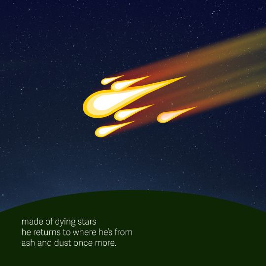
The prompt that inspired me this week was Dynamic Diagonals. Though the entire composition isn't necessarily dynamic with overlapping diagonals, I feel like the trail of the fireballs do the job of drawing the eye. They do overlap, too, making for a texture in their own right. A subtle star background has been blended in the background, giving the composition a bit more depth. The stars poking through trails of the fireballs I feel add a lot to the image. I haven't done much writing recently, so I figured instead of just a word I would write a haiku. I hope you enjoy this simple form of poetry.
0 notes
Text

The prompt for this week was Naive Mascot. I don't have much experience drawing mascot characters, but I do occasionally do art for a little indie game called Star Sonata, and the first mascot that came to mind as I was trawling the internet was this little fella. I think the original drawing of them was made in 2004, and it was a tiny raster image barely larger than a thumbnail (which I will show below). It had a lot of character, though, and while I wanted to redraw him in a vector format, I didn't want to make it too overproduced and fancy. After a little doodling, I settled upon a fairly flat design with simple gradients reminiscent of old, 2000s-era Flash games on the internet.
I also included some expression shots. At first, I only had his head, but there's only so much you can do with a round sphere, so I added in part of his body and arms to help convey emotion.
0 notes

Text

I believe I embodied this theme of Less is More throughout the process on this illustration. I started out with 'less is more' as my type, which I trimmed down simply to 'less.' The background, which was a gradient was simplified to a flat blue, a and the squares were both smaller and much more numerous, making something of an overlapping pattern. While I was quite happy with this design, it wasn't especially in the spirit of the word, so I gradually axed more and more elements until few remained, while maintaining enough to be an interesting design despite the use of fewer elements.
0 notes
Text

Loud Typography Exuberant, Eye-catching, Unmistakable
Ransom Notes Jumbled, Chilling, Analog
Fine Print Dense, Orderly, Deceptive
I went with Fine Print for this one. When I think of fine print, I think of packaging and warning labels and legalese. I brought these thoughts into my illustration, incorporating the fine print of the dangers of excessive caffeine in the cardboard holder of a coffee cup.
Adding in a slight vignette, a coffee colored background, and making sure no elements were extremely loud and saturated, it helped to make the picture somewhat 'bleary,' like you're needing a coffee yourself. The image is dominated with the overriding need for coffee, expressed in simple, lizard brain language.
0 notes
Text

Extreme Close Up
Abstract, Evocative, Dramatic
Night Spectacular
High-contrast, Neon, 'Reverse'
Big Book Look
Bold, Strong sense of Scale, Minimalist
The concept that inspired my illustration was Big Book Look. Though I do not feel like I was especially successful, I liked the contrast of a minimal background, large, eye catching text, and a small graphic element to accompany the text. The element I chose is a tiny rover from a sky-high top down point of view making their way across the orange Martian surface.
0 notes
Text

Pointing Fingers Accusatory, Direct, Focused Floating Heads Macabre, Simple, Photographic
Clenched Fists Rebellious, Powerful, Energetic
Though it was a hard choice this week of topics, I have always been in love with the graphic of a clenched fist, and I wanted to make a 'rebellious' poster of some description. I enjoy the energy of Constructivist posters, and after doing some research on their form and colour palette and a bit of iteration, I settled on a 'military recruitment poster' for a space navy composed of ex-slaves in the game EVE Online. Design wise, I kept the colours simple, with black, white, red and orange, and opted for a blocky, bold look. Constructivism makes great use of diagonal lines, and I split the poster not quite evenly in half, making a leading line that carries the eyes upwards.
The silhouettes are a battleship and four frigates from the game, as well as the spiral shell icon underneath the MINMATAR NAVY line. The frigates in particular have had their scale tweaked to demonstrate depth in a 3d space.
Finally, I put a slight grimy weathered texture over the works, because nothing in the Minmatar navy is clean or pristine. All in all, I think this poster turned out very effective, as it's eye catching, energetic, bold and inspiring.
0 notes
Text

Botanical Geometry
Natural, Precise, Repetitive
Expression of Speed
Dynamic, Energetic, Exuberant
Pixellation
Charming, Retro, Crisp
While there was a lot of themes from this weeks selection that interested me, with Botanical Geometry’s beautiful patterns and the blending of natural shapes with the precision of a pattern and the familiar nostalgia of pixelated designs, this week I settled on Expression of Speed for my topic, since I enjoyed the potential that came to my mind — a lot of things could be fast, after all, and I had a whole lot of images already coming to mind. At first I went with a somewhat more typical design of a zipping, segmented arrow, I decided to take the energetic nature of the designs and put it towards a more illustrative scene — namely the destruction of a silhouetted planet by an impossibly fast comet or rail gun. Like a high caliber bullet, the projectile punctures narrowly through the front in a razor-thin line, and explodes out of the back amongst magma, fire, and smoke. This treatment, with the ‘entry’ and ‘exit’ points truly does help capture the energy of the scene, with the diagonal line easily leading the eye up to the focal point.
0 notes
Text
My concept was inspired by some of my thumbnails - I liked the idea of overlapping spheres with various mixing colors. This was overlapping in the most literal sense, but I brought the concept further by animating and hue shifting the background, causing parts of the composition to vanish when the background approached a similar value to this. This change made it far more dynamic and interesting to watch, as although the background is the only color changing, even for the nontransparent shapes, the perceived colors seem to quite drastically. Programs used: Adobe Illustrator, Adobe After Effects
0 notes
Text

Three topics of interest: Square Format Compact, Solid, Uncomplicated Overprinting/Layering Blending, Contrast, Colorful Object Poster Simplistic, Focused, Bold Final selection: Overprinting/Layering I chose this topic because of the posters I researched, I was drawn to the colorful shapes and found it interesting how you could find some complexity in simple shapes with the power of overlapping layers. Keywords: Geometric, Pattern, Primary, Celestial, Bold
0 notes
Text

My concept this week was inspired by Bauhaus. Though it is not entirely in the style of the Bauhaus movement, it shares some principles, such as clean, orderly lines, a limited color palette, and a lack of ornamentation. The image has been tilted and zoomed in to give a dynamic sense using diagonal lines, and a slight 'shadow' is present beneath the letterforms and the colored blocks to add to this sense of movement.
0 notes
Text

#1 Process Thumbs While none of these thumbs made it entirely into the finished product, it is composed of many of them, such as the vertical block underneath letters of the first, and the diagonal angle of the fifth. Also included were my very Bauhaus inspired color palette.
The topic that I chose to inspire my design was Bauhaus.
History
The Bauhaus is a German artistic movement which lasted from 1919-1933. Its goal was to merge all artistic mediums into one unified approach.
Bauhaus design is often abstract, angular, and geometric, with little to no ornamentation, making for designs that are very clean.
The school was closed during WW2, with the Nazi regime disapproving of the movement.
My ideation words were: Tri-color, Unembellished, Geometric, and Simple.
0 notes