
Don't wanna be here? Send us removal request.
Statistics
We looked inside some of the posts by mtimm98 and here's what we found interesting.
Average Info
Notes Per Post
3
Likes Per Post
3
Reblog Per Post
0
Reply Per Post
0
Time Between Posts
10 days
Number of Posts By Type
Text
10
Last Seen Tumblr Blogs


Fun Fact
The KCSC sent more than 20K requests to delete posts related to prostitution and porn to Tumblr from January to June 2017.
Text
The Future of Design
After learning about historical and conceptual design this semester, I can try to predict what the future of design will look like. Today technology seems to be adding more while having less, for example the new Iphone is slimmer than ever while also updating the technology and making it faster but more complex. Somehow Apple has added 3 cameras without making the phone any bigger. Technology and design seem to continue to always be changing, in most cases they do so together. I think that design thinking strategies will continue to move forward and at the same time become more complex by involving more thinking outside the box and more accepting of ideas from all different kinds of people.
I think that contemporary design will live on because it uses clean and simple forms that seem to be able to pair with anything. Technology has led us to be able to have precise clean lines and I think that will continue or maybe even become more precise toward more complex shapes. Because we have so many designs that are made with the help of technology, I think that there will be a return to the desire of designs being handmade and custom made. Even today we have returned to some clothing designs from the past such as crocheted shirts, although they were still mostly made in a factory, I think it came back because it looks like the shirts are handmade.
One design that is already moving forward and I think will continue to move forward is the cellphone. As mentioned earlier the cell phone continues to become slimmer but more complex. So for the future of cellphones I believe that they will either become simply a sheet of glass or become a projection from the smallest projector. Bluetooth will be pushed to the next level by being able to project any picture onto a screen by simply using both fingers to sort of grab the image from your phone and swipe it into space and then onto the larger screen.
2 notes
·
View notes
Text
Postmodern Design
Postmodern design began in 1960 with architecture, this design appeared mostly in the interior of buildings. While walking into one of these postmodern buildings you will see a return to hand-made items, strong patterns, and wild approaches to decor. Other designs include, psychedelic and rock graphics, political posters, and graphics from Push Pin studios. These graphics include, loud colors and busy illustrations. One of my favorite Postmodern designers is Andy Warhol. I find his work interesting because he seems to take an ordinary thing like a can of soup and plays with the color palette. He seems to use colors that artists before haven’t touched, such as neon pinks, yellows, and purples. Andy Warhol’s work is considered Postmodern because it includes a new form of art called “Pop Art”, leaving most techniques of making art from before, behind. For example, Pop Art is a new form of art that uses a collection of things to produce the piece, also known as “Bricolage”. Warhol uses Bricolage by combining words with images to create his work. Some of my favorite work from him are those that look like a series of the same image. For example his famous work of Marilyn Monroe shows the same image over and over again but he adds highlights of different colors, I like these series because it shows kind of a glimpse into his thought processes while he’s creating his pieces. Because artists like Warhol were using a new form of art while leaving old styles behind, some people considered art like his to be anti-art. Warhol used images from new technology such as, comics, mass media, and advertisements, doing so also categorized him as postmodern. He took the photos and used a technique called “Silkscreen” which allowed for smudges that Warhol accepted in his work to make them look more handmade.

Andy Warhol’s famous Marilyn Monroe images
0 notes
Text
Helvetica
Helvetica is a typeface used by many companies today, probably being the most popular. The typeface is used so regularly because of it’s clean and clear appearance. Helvetica can look to be one of the more boring typefaces but it is the most strong and clean cut of all typefaces. Helvetica is a realist design and was developed in 1957 by Max Miedinger and Eduard Hoffmann in Switzerland and was also named “The Swiss Typeface”. The spaces between Helveticas letters is said to be, “like the spaces between music notes”, even and purposely placed. The type creates order and is there for the sole purpose of displaying a company’s product. There is no story behind the typeface, it was created to provide clarity while reading. A font that is similar to Helvetica is Arial, although Arial has more curved lettering, Helvetica is a display of sharp letters. The typeface has become more popular than ever before because of its neutrality and is used by large companies such as: Apple, Target, American Airlines, and many car companies such as Jeep. Because so many large companies today use Helvetica, I don’t think the font is outdated. Helvetica’s purpose is so neutral I think the font is timeless and it’s use is infinite. Even designers today use Helvetica to make sure their point is clear to the audience. Designers use Helvetica so frequently because it allows them to be clear and give them the chance to design freely around the font without disrupting the company’s or designer’s message. For example if you were to make a poster where the font is Helvetica you have the freedom to design the rest of the poster or the background with as much extravagance as you wish to, without taking away the message. For this reason I believe we will forever use Helvetica as a staple font.
0 notes
Text
The Plato Effect in Architecture: Designing for Human Diversity
After reading Christopher N Henry’s “The Plato Effect in Architecture: Designing for Human Diversity” I learned what “essentialism” and “universal design“ means. Essentialism is an unbiased truth to things that are what they are, found through science and philosophy. Universal design is a philosophy that one set of rules can be used for anything and anybody, for example The Vitruvian Man is a set of measurements based on the human body that can be used in architecture, design, and anything else. Universal design and essentialism tend to go hand in hand. A universal design tends to be scientifically and mathematically precise, in order to work in multiple instances. Henry has a couple issues with universal design. The first one is that although universal design exists most architects don’t incorporate it their work. Henry states, “The unwillingness of architects’ to relinquish Plato’s philosophy, and the detriment it has had on universal design’s progress cannot be overstated” (para. 7). He suggests that architects that do use these universal designs base them around those with disabilities and looks away from the perfectly proportional measurements of the Vitruvian Man. Henry states, “A truly universal design provides enough accommodations for success and removes all obstacles in the environment that make a disability debilitating” (para. 7). Henry goes on to say that the “one size fits all mentality” is good for strengthening variation but does not celebrate it. I agree with how the article ended because I think if everyone was equal as in the same environment there would be little room for creativity. If everyone had the same chance to give input on needs then there would be room for creativity while also covering the guidelines. There are alot of things that could benefit mass customization, things like; furniture, any kind of household appliances, and makeup would be perfect for mass customization. For those who have an idea for an interior space but not the skills to make it come to life , you are stuck with settling for something accessible.
0 notes
Text
The Modernist Architecture of Le Corbusier
Le Corbusier is one of the most famous Architects in history. Le Corbusier is a Swiss-French architect who studied under Peter Behrens at the Bauhaus. He designed the Dom-ino House which allowed architects after him to create walls that are not structural, also known as “Curtain walls”. Corbusier went on to create a building named Villa Savoye in which he established his “five points of architecture”.
The first point to his “five points” is “Support”. In this point he highlights the normally steel support beams he uses to elevate his structures and make the structure appear to be floating above ground. His second point is “Roof Gardens”. Le Corbusier loved to incorporate nature with his structures. In order to do so he added plants and furniture to a space that other architects haven’t taken into consideration as a habitable space, the roof. Thirdly Corbusier took his unbuilt structure the Dom-ino House and incorporated “Curtain Walls” to allow his third point to be possible, “Free design of floor plans”. His fourth point is “Horizontal Windows”, he emphasized horizontality by creating long strips of horizontal windows, some with which he emphasized with a small overhang that acts as a sun and rain shield. Lastly Corbusier also used his “Curtain Walls” to create his final point, “Free design of facade”.
Another building that incorporates Le Corbusier’s “Five Points” is called Villa Stein. As pictured below most of his points can be seen just by looking at the façade of the building. One point that catches the eye right away is the horizontal strip of windows. Corbusier is able to add this strip of windows reaching from one side to the other without spacing is accomplished by using his fifth point, “Free design of façade”. Another point that is seen in this picture is the first point, “Support”. The ramp and part of the second floor is supported by beams to allow them to look like they are floating. The second floor seems to go out farther compared to the first floor, making the first floor not apparent at first glance. From the picture there are two walls on both sides of the roof, this is because there is more of the building on the roof. On half of the roof there is indoor rooms but on the other half there is an outdoor space that goes along with Corbusier’s second point, “Roof gardens”.


Figure 1: Villa Stein by Le Corbusier.
One local building that comes to mind when searching for some of Le Corbusier’s “five points” is the Milwaukee County War Memorial. This building is similar to Le Corbusier’s work firstly by the base of the building. The War Memorial sits on many concrete columns lifting the structure off of the ground allowing the building to look like it is floating above ground. This structure also emphasizes horizontality with the windows and the overall rectangular shape of the structure. Most of the skyscrapers in downtown Milwaukee all use Corbusier’s third point. Each skyscraper uses the structural system Corbusier designed in his rendering of the Dom-ino House, allowing many glass windows to make up the “curtain walls”.
0 notes
Text
Madeleine Morley Articles
After reading Madeleine Morley’s articles "A Typographic Exercise to Readdress Design History's Gender imbalance" and "Celebrating the African-American Practitioners Absent From Way Too Many Classroom Lectures" I chose my favorite designer from each article.
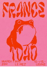
From the first article I chose Felicite Landrivon. I chose Landrivon because of her broad range of colors she uses in her designs. Landrivon has been creating graphic designs for underground concerts and independent screenings since 2010 (Brigade, pg. 1). One of my favorite graphic designs of hers is a pink graphic design with large red letters that look to be straight from a Halloween magazine, they read “France Toad”. Smack dab in the middle of the design is a friendly looking toad printed in red. Although there is little information about the designer, “France Toad” seems to be a very linear design, many of her other works have the large gothic inspired font curved around the narrative. Most of her work is very different from one another, some are newspaper like and some have more narratives than text.
The next designer I chose was Jerome Harris. Harris studied Design at Temple University and Yale University. He is now the Design Director at Housing Works. Housing Works is made up of thrift stores, an online shop, and a bookstore café, that all work to “provide socially conscious shops in our neighborhoods but jobs for clients who complete our job training program” (Housing Works, pg. 3). My favorite work of his is apart of a historical survey titled “As Not For”. Harris along with many others apart of this survey aspire to “question, inspire, activate, and challenge the design community and beyond with the objective of promoting deep history, design theory and aesthetics of African-Americans”. This design incorporates several black and white styles of graphic design. I chose it because I enjoy the sketchy aspect of some of the illustrations paired with the photograph cutouts and also the intent of the project.
Felicite Landrivon:
Jerome Harris:

Bibliographies
“Housing Works.” Housing Works. Accessed October 9, 2019. https://www.housingworks.org/.
“brigade__cynophile.” brigade. Accessed October 9, 2019. https://felicite.land/.
0 notes
Text
Decolonizing Design
After reading the article “What Does it Mean to Decolonize Design” by Anoushka Khandwala I am able to define decolonization in design. Colonization means to establish an area to make it your own with things like culture and traditions. When someone decolonizes a place or thing it means that that person is getting rid of colonization.
Design is heavily influenced by a person’s aesthetic. Sometimes while designers are creating their work they don’t consider how other people may interpret the work they’ve made. Khandwala mentions that everyone has their own background and opinion, “Realizing that the standards we’ve been taught are not universal is key to decoloniality” (par. 7). Although a designer may think their design gives off a specific message, someone may think otherwise.
There are many different ways to rethink decolonization. Khandwala explains “decoloniality is about reimaging something beyond the current system we exist in” and “decoloniality is about shattering the familiar” (par. 8). For example, if you take on a project that turns out to be inappropriate for you to take on, elect someone who is appropriate for that position. If you still want to be apart of the project there are other ways to do so. You can fund the project or even work on parts of it that are appropriate for you to do so. Another way to decolonize your work is to step back and put yourself in someone else’s shoes. Look at the fonts you are using, some fonts can be related to a specific cultures or even mean something completely different to them. Do your research, make sure that you can thoroughly understand what your design can seem like to a stranger. You can also incorporate those from a marginalized background into your work by hiring or partnering with them on your project. There are many ways to avoid colonizing your work, as Khandwala explains, “Ultimately there is no finite end that we’re trying to reach: decolonization is a process” (par. 11).
0 notes
Text
Deep Dive and Design Thinking
After reading “Design Thinking” in the Harvard Business Review and watching “Deep Dive” by IDEO I can create my own definition of design. I would define design as a plan describing the intent of an object that appeals to people’s aesthetic while also being completely and easily functional. While watching “Deep Dive” I learned the processes of designing an object. For the IDEO team, they needed to develop a new cart that met shoppers needs. The teams first step was to take into consideration the shoppers needs and then make those needs as functional as possible, a key aspect in any design process. Also while reading “Design Thinking” the Harvard Business Review described “design thinking” as “a methodology that imbues the full spectrum of innovation activities with a human-centered design ethos. By this I mean that innovation is powered by a thorough understanding, through direct observation, of what people want and need in their lives and what they like or dislike about the way particular products are made, packaged, marketed, sold, and supported”. A good, sellable design takes into consideration all of these things.
Everything sold in a store, even the building, has been designed. One designer Dave Kelly from IDEO said “Wherever you are look around, the only thing that’s not designed by somebody is nature” . One example of a piece of design that I own, is my miniature Bissell vacuum. Bissell noticed that consumers were in search of a small vacuum to be used in small spaces while still working as well as a regular vacuum. Bissell then took their new design and made it appealing to consumers by adding colorful plastic panels to them, for example my vacuum is lavender instead of a boring grey or black.
One of my favorite Mottos from IDEO is “encourage wild ideas, defer judgement build on the ideas of others”. They use this motto everyday throughout their workday, the workers sit around a table and go through everyone’s ideas while writing them down. Kelly also explains that everyone is “equal” in the work space, accepting everyone’s ideas and not letting any go without further investigation. At the end of the video the cart had the best part of everyone’s idea collectively making it a solid design. The only thing I can think to change about it is that in the beginning of the video when IDEO went to the supermarket to investigate the carts a mother had her infant in a car seat on the cart and on the new cart there is no spot for a car seat to sit.
0 notes
Text
William Morris
William Morris designed many things from furniture to stained glass, but during this time mass production was on the rise. Morris began to develop a socialist agenda which allowed him to become a very important figure in the Arts and Crafts Movement. I chose to focus on Morris’s stained glass work called “Minstrel with the Clarinet” and also on his mass produced furniture “Sussex Chair”.
The Arts and Crafts Movement began in the nineteenth century, when many designs came to life from furniture to prints. This movement had a lot of artists questioning what art would become in the future. Mass production and industry was on the rise allowing artists to easily reproduce important designs. Mass production of artwork allowed for cheaper selling prices allocating important designs to the working class.
During the Arts and Crafts Movement few designers emphasised the art of handmade work and how the advancement of mass production was destroying this aspect of design. Morris also believed that industry was destroying the environment, “Is money to be gathered? Cut down the pleasant trees among the houses, pull down ancient and vulnerable buildings for the money that a few square yards of London dirt will fetch; blacken rivers, hide the sun and poison the air with smoke…” (Morris, p. 38). Although he believed this of mass production he wanted everyone to get ahold of design, “I do not want art for a few, any more than education for a few, or freedom for a few” (Morris, p. 39). He created a company called Morris & Co. which designed work such as the Sussex Chair. This chair design “was a direct response to the contemporary fashion for elaborate ornament in otherwise shoddy mass-produced goods” (Eskilson, p.51). This chair fit the movement and was available for the working class whereas his stained glass work, Minstrel with Clarinet was created only for Morris’ friend Edward Burne-Jones. With these two designs from his company Morris shows that design should be available to everyone.
I agree with Morris completely. I believe that everyone deserves a well designed piece although that may require the design to be mass produced. I do have a deep respect for work that is unique and handmade, most of the time that is the reason I purchase that piece. Although industries have dented the health of our environment, I think it is important because it has created jobs and offers products to many people. As technology grows people will begin to develop more ways to clean up after our growth as we have been doing for a long time.
0 notes
Text
Week 1 - About Me
Hello, my name is Maci Timm I’m in my second year of Architecture and my first year of Design and Digital Fabrications! I was born and raised in Appleton and started my freshman year of college at the University of Wisconsin Fox-Valley. During that year I took all of my general credits and then decided to transfer to Milwaukee for my Sophomore year. I became interested in Architecture and Design my Junior year in highschool when I traveled to Manhattan, New York with my Fashion and Design class. While traveling we had the privilege of touring a few different design studios including those who create broadway costumes and architecture firms. Since this trip I’ve taken an interest in all things art, I love working with my hands!
I decided to take Art Survey firstly because it meets my requirements for my bachelor's degree in design and digital fabrication. Secondly this course also involves architecture. For my first two semesters at UWM I took an architectural history class in which we covered styles and eras of art in famous buildings. I am somewhat familiar with the content in this course but have not yet analyzed paintings or drawings (that aren’t buildings) from these eras. This semester I am also enrolled in an art history class called “Modern Art”. This course also discusses artwork from the 1850’s to today. I am excited to learn more about art and hear how my classmates view a variety of artwork!
Pinterest posts, nature, and fashion have been my go to sources for inspiration for a long time. For most moving is an irritating task but for me, moving into the dorms was another space to decorate and have fun with. Throughout the summer I had been slowly gathering things to put in my dorm. While doing so I decided I wanted to bring a lounge chair this year but finding one to fit in the tight space was difficult. The dimensions and design of the chair was a crucial deciding factor on which chair to purchase. Luckily a couple weeks before move in day I walked into one of my favorite stores TJMaxx and found a chair on clearance that fit the exact dimensions I was searching for!


1 note
·
View note