
Statistics
We looked inside some of the posts by muck-n-mire and here's what we found interesting.
Average Info
Notes Per Post
2M
Likes Per Post
976K
Reblog Per Post
1M
Reply Per Post
862
Time Between Posts
4 months
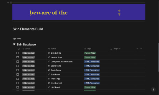
Number of Posts By Type
Text
12
Photo
3
Video
1
Note
1
Last Seen Tumblr Blogs


Fun Fact
130K people were victims of a chain letter scam that affected Tumblr in May 2011.
Text

How to: Accessibility [EN]
Part 01 - Visual design
It’s been a while since my last how to and felt like putting something together! First of all, HAPPY PRIDE MONTH! To everyone out there! Being in the queer community, i know the struggles we go through everyday and am wishing a very proud month to all of us <3
Moving on to the actual topic here: accessibility. It’s been shown here and there when discussing coding and skinning but WHAT DOES IT ACTUALLY MEAN!
Let’s go back a bit. For years people have been trying to achieve the impossible: an universal design. A design that is universal and usable for ALL people a one-size-fits-all design that will be usable and perfect for everyone. Now, there’s only one ‘little’ problem with this: people are different. I’ve always been overweight and whenever I’ve seen clothes that say ‘one size fit all’, I look at it very suspiciously. Bottom line is: every person is different, pain points and needs will also be different.
So what do we do? One different design for every person who is using our product?
Well, let’s make it equitable, let’s provide flexibility to cater for a broader audience, and let this audience choose what’s best for them. But! That’s doesn't take the responsibility from us, the designers (and coders) to make sure that we are making what we can to enable this flexibility.
------------- I've started a list which I then realised would be way bigger than expected, so decided to make each item into its own post. We'll start with VISUAL DESIGN!
Part 01 - Visual design
Colour
I’ve mentioned before about the importance of contrast and contrast ratio briefly. If you want to go into more details, you may have a look at W3 Guidelines. In short:
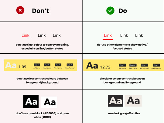
Don't rely on colour alone to convey meaning, information and actions;
Make sure there's enough contrast between foreground and background
Provide an option for light/dark mode
Light/Dark Modes
There’s a myth that dark mode is good for accessibility, because it improves text readability. (Personally, I’m a big fan of dark mode, as white/bright screens may trigger migraines). However, as everything in ux, the answer to ‘is it black or white’ is that it depends. As mentioned before, a good rule of thumb is not to generalise and provide flexibility.
When using light and dark mode, make sure the colour contrast ratio passes on both modes. Here’s a few tips for designing for dark mode (according to atmos article attached at the end of this):
Use tints (less saturated colours). Saturated colours can cause eye strain and will be hard to pass accessibility standards.
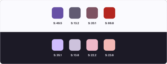
Image from Atmos website
Avoid pure black. Please. Pure black and pure white when used together might be the default instinct, but the contrast when used together is so strong it becomes hard to look at. Choose dark greys and off-whites/light grey when possible.
Be patient with your colour palette, inverting colours won’t make it necessarily good. Take your time to build a palette that will be suitable for both.
Target Sizes
First, what is this? This refers to the dimensions of interactive elements such as links, buttons, icons or touch targets. Basically, anything you can interact/click.
WCAG 2.2 established a minimum for pointer inputs to be 24x24. This is the space that should be provided for a clickable area.
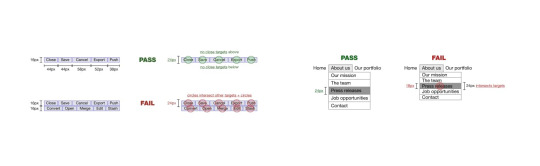
Image from W3 website
There's a number of exceptions and guidelines which I won't get into too much detail. It's important to think about the area which people are clicking into these elements. Also remember that this may be quite useful for users that are using the forum in their mobiles - so this is quite important (don't you hate when you can't click somewhere because you haven't clicked the EXACT area needed?)
In short:
Make sure target sizes are at least 24px
Make sure buttons look like buttons, anything that is clickable and interactive LOOKS like they are interactive
Make sure links are underlined (again, as an extra visual sign that they are clickable)
THAT'S IT!!
For part 01 at least. This is just the tip of the iceberg though. If you'd like to dive deeper into this, I highly recommend Stephanie Walter's content, as well as the Extra Bold book read. I'm attaching a few more articles and resources here too! If you've read all of this, you are a champ, I know this is longer than usual. Please like and share this content, let's get it out there!
Articles:
Designers Guide to Documenting Accessibility
Dark mode ui best practices
Dark mode best practices
Accessibility annotation examples
Colour accessibility tools
Inclusive components design
Accessible design in 60s
Target size minimum
Resources
Accessible colours
Accessible colour palette builder
44 notes
·
View notes
Text


Truth In The Eyes Skin - Free!
This is my newest baby, Truth In the Eyes. Majority of the design for the skin was made in a fever rush from around 10 in the evening to 4 in the morning on a week day, pretty much an outpouring of all my accumulated stress. Making the skin a reality was a different story altogether, but I am finally done! I hope you all like it, and please let me know if you are using it! (Somehow. Maybe like the post, or reply, or message me... I'd love to hear from you!)
Features:
Easy to customize color scheme, background and font style
Fixed top navigation bar with modal quicklinks area
Wavy shapes!
5 pre-installed member groups + admin and mod groups
All custom HTML templates
Guidebook webpage code + redirect row with staff links
Mix-and-match post/content styling codes (for headers, images and simple borders)
You can preview the skin here: https://truthintheeyes.jcink.net/index.php?act=idx
Please read the policies for skin use here: https://truthintheeyes.jcink.net/index.php?act=Pages&pid=2#one
Download the installation files here: https://ko-fi.com/s/2b22eeb70d
Also, I'm not sure if you noticed from the skin but I really really like thaibl / thaigl and especially pondphuwin. Haha. If ever you want to rp using thai faces, hit me up.
69 notes
·
View notes
Text
Notion Skin Building Guide - Free
get now on my ko-fi
[EN] Soooo, I did a thing! I've fallen completely for Notion and have been using like crazy. I decided to make an ultimate masterlist to keep track of my commissions and premade and thought - why not make it available? So this is a guide containing resources, to-do lists and much more.
It's free for use! So please, like and reblog if you use it.
[PT] Entããão, eu fiz uma coisa! Virei a doida do Notion! Decidi fazer uma masterlist das masterlists pra me organizar com minhas skins e pensei - por que não disponibilizá-las? Portanto, este é um guia que contém recursos, listas de tarefas e muito mais.
O uso é grátis! Se utilizar, por favor goste e compartilhe!
159 notes
·
View notes
Text


Sabotage free jcink skin
Sabotage is a retro, minimal, spy-chic full jcink skin meant to be simple and easy to read.
Live preview: illustrious.jcink.net/index.php
Download: https://ko-fi.com/s/3ed8eb1d05
Features
Fully responsive
Improved accessibility, optimized for screenreaders and keyboard navigability
Custom Profile
Custom member list
Six member group colors
Font Awesome 6
Basic custom BBCodes
Bonus BBCodes
CSS variables for quick customization
License: CC BY-NC-SA 4.0 This skin is free for non-commercial use, you may edit/adapt/share, as long as you leave credit intact and allow others to edit/share on the same terms.
38 notes
·
View notes
Text
As someone who has been the “blue collar” worker for museums (helping to design exhibits) - dear god I just want the museums to be local or borrowed on legal and agreed terms.
In my art history class we’re discussing museums and repatriation and I am so fucking angry
Just wait until I have some free time, I’ll post my favorite whiny bitch responses from European museums.
37K notes
·
View notes

Text
ADHD aka “the volume is turned up very loud and I’m paying attention but my brain doesn’t Hear It but when I put on subtitles I Immediately want to do something else with the show on in the background but then I miss entire episodes but if I switch to music im gonna spend 2 hours picking it and forget what I was gonna do initially but then discover that if I have music on in the background with my show I can watch it just fine”
1K notes
·
View notes
Text
Could possibly be a light colored granite as well judging by speck and texture!
goblin time!
i haven’t posted anything goblincore in a while, so here, i brought you some stuffs

you can wear this bottleneck as a ring!

these coins are completely regular but we found them buried in cement and spent like 5 minutes scratching them out

this is probably coal, it’s super black with golden specks on the outside and breaks easily

can someone tell me if this is quartz, marble, or some other type of rock? it’s sparkly and looks a little bit like bread

this is a piece of white porcelain covered in a material i’m not familiar with. most of the time, it looks black, but it’s actually reflective. here it is reflecting my pride flag.

and this piece of glass has a dinosaur skull in it

bonus:

512 notes
·
View notes


Text
ive got one foot in a fairy ring and the other in a mossy bog
23K notes
·
View notes
Photo
Malala is important. Women are important.
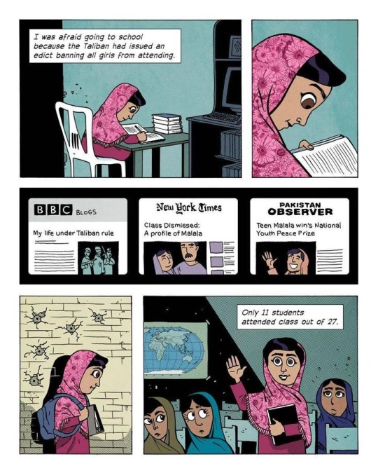
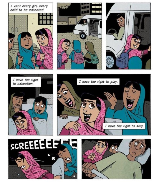


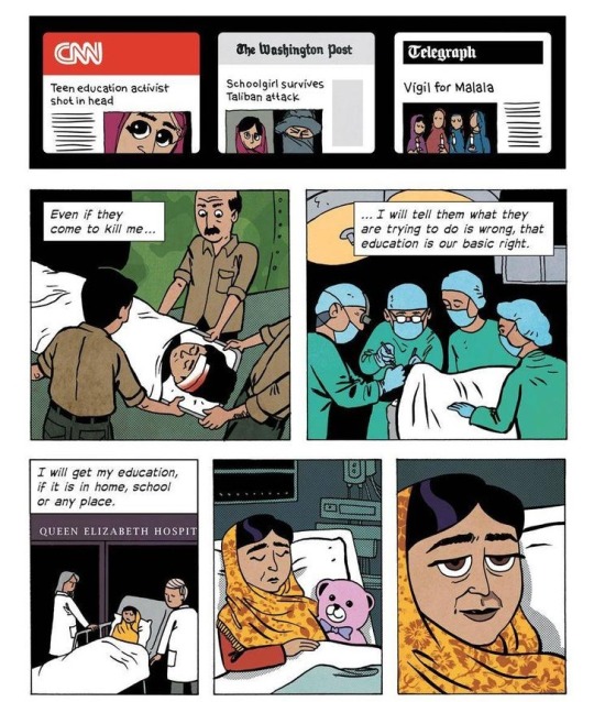

A version for tumblr that can be read without opening a new tab, since plenty of people would scroll past this story otherwise.
1M notes
·
View notes
Note
Edible mushrooms, beets, etc. they have a very earthy taste. But please don’t eat actual dirt and moss. If you want to eat wild foods learn how to forage, but this can be very dangerous so you have to be careful.
URGENT PLEASE HELP ME Hey.. do u goblins actually eat dirt and moss.. is it safe? How does it taste? How to pick moss? Help me please I WANNA EAT MOSS AND DIRT AND WORMS!!!
DONT EAT MOSS OR DIRT!!!!
It can make you sick!!! Moss and dirt both contain microorganisms which can make you ill! If you wanna eat something that kinda looks like dirt you can pull apart a plain chocolate cake or something tho! Anyone else have any other suggestions?
49 notes
·
View notes