
Don't wanna be here? Send us removal request.
Statistics
We looked inside some of the posts by mw-portfolio and here's what we found interesting.
Average Info
Notes Per Post
1
Likes Per Post
1
Reblog Per Post
0
Reply Per Post
0
Time Between Posts
6 days
Number of Posts By Type
Text
7
Last Seen Tumblr Blogs


Fun Fact
Tumblr Inc. is funded by 13 investors.
Text
BTP Reflection
The most valuable prototype technique I learned was during the first BTP assignment when I had to think of each screen to create to make the device easy to navigate or understandable. I learned how to make anything clear using color or symbols rather than words because I only had a small device to work with. I've utilized this method for the majority of the BTP projects that came after, but I can see it being used for a variety of other things as well, like my online portfolio or other prototypes that I'll make in the future.
The testing technique that gave me the most valuable information was when I tested the low-fi prototype and learned how to arrange things so that navigation is simpler and an application's layout is easier to read. I believe that testing a gadget's navigation will certainly be included in my future projects. Observing how non-designers perceive a device is quite informative, and they offer a different perspective when providing feedback. I would test my online portfolio to see how it should be navigated. I mention the online portfolio because I want to improve it throughout the course and this is what comes to mind right now, but it will undoubtedly be used in other projects in the future. The desirability test, which can improve an application's overall appearance, was very enjoyable to me. I will undoubtedly continue utilizing this testing technique.
This course started out enjoyable, but with the second assignment, things really pick up. I believe that the huge amount of assignments took the pleasure out of the course, which in my opinion was unfortunate because the course can be both entertaining and educational. Because we got workshop time to test with users for the last two BTP assignments, I most definitely enjoyed them. Since we are also enrolled in another subject that is quite time-consuming and demanding, the other assignment was more challenging for us to test on our own. It is easier said than done to find 5 testers for each prototype, therefore I would propose either lowering the number of testers or using workshop time to allow students to test their prototypes. Nevertheless, I believe that all of the assignments were necessary to learn about other UX fundamentals.
1 note
·
View note
Text
Assignment 3.1 Experience Prototyping - Wizard of OZ Prototype
A. Short documentation of your (very short) ideation process, assumptions, and ‘final’ version (before version) of your prototype.

The creation of this concept is to show how harmful airplanes can be to the earth's environment and wildlife. So we created a concept to bring more awareness to global warming in our concept every time the user sits on the airplane symbol and makes the ice cap melt the polar bear will say something that could be an incentive for the user to start walking and when the user starts walking it will snow and making the ice grow and the polar bear will say something which is supposed to be an incentive for the user to keep walking. We created this concept in Figma and the layout has a large length because the point is to set up the project on an angle where the polar bear shows up on the screen and the symbols will show up on the floor.

B. A short documentation of the preparation and execution of your test.
Test Protocol
Introduction
I will have to conduct testing for the Polar Bear Wizard of Oz prototype. The beamer will project the polar bear image and symbols onto the wall and floor. The symbols below affect the ice caps, the airplane symbol makes the ice caps melt and the walking symbol makes it snow and the ice cap grow.
Based on the user's actions the polar bear will have some message for the user. In order for this prototype to work you have to sit on the airplane symbol or physically walk on the walk symbol. Can I record you for this test?
Tasks
Sit on the airplane symbol
Walk on the walk symbol
Interview / Feedback
Did the messages from the polar influence your behavior?
Did the visual of the ice melting influence your behavior?
What would you improve on this prototype?
Debriefing
I appreciate you taking part in this test and providing feedback so I can improve our product. I want to remind you that the recording will be used for my building testing and prototype course and will only be available to my instructor.
C. Short documentation of the collecting and interpretation of your test results.
Based on testing the experience prototyping the testers enjoyed seeing the effects of choosing a plane or walking would do on the ice for the polar bear. The messages shown on the screen sometimes influenced the tester's behavior and also the melting of the ice made them change their choice of transportation.
I noticed that people got curious about what would happen if you let the ice melt and so most people after not trying to make the ice melt would just sit on the chair to see what would happen if the ice melted.
Link to the video of the testers.
D. Short documentation about the iteration on your prototype, including an ‘after version’ to clearly communicate the iteration.
After receiving the feedback from the testers, one of them mentions how we should add an are you sure option to make the tester rethink their choice right before they fully melt the ice for the polar bear.
I would add the “are you sure?” comment for iterating the product before the ice melts completely. I would also add a new frame and a message where when the user wants to walk first it would have the message say “Thank you for walking instead of taking the airplane, you are helping reduce global warming” this message would indicate to the user something good is happening and maybe giving them the incentive to continue walking. If I had the skills or time I would add for example reaching a destination that would make the experience more engaging to the users and they would have to figure out a way to reach the destination without melting the ice fully.
0 notes
Text
Assignment 2.2 Hi-Fi Prototyping
A. Short documentation of your (very short) ideation process, assumptions, and ‘final’ version (before version) of your prototype.
When designing the high-fi travel planner, I wanted to incorporate the logo's colors into the app to add accents. I wanted to keep the travel planner minimalistic and used the font “Montserrat” throughout the app to fit the company's visual identity. My assumption is that testers will appreciate the color accents throughout the app.


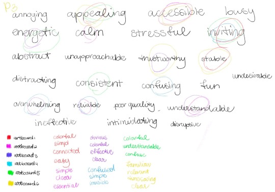
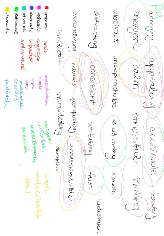
These are the artboards that will be shown to the testers to conduct the desirability test.
B. Short documentation of the preparation and execution of your test.
Test Protocol
Introduction
My name is Marledy, and I'll be testing my travel planner wireframe for my Building, Testing, and Prototype class. The travel planner allows you to schedule travel to various destinations and can schedule trips depending on departure or arrival times. Users can see the map of each line individually or collectively. The ability to view photographs of that location is available at some transfer points. When a user organizes a trip, they can see all the stops and transfer places along with the option to save their itinerary as a PDF and examine the map. In this test, you will be testing the desirability of my travel planner and if it’s visually appealing. I will be showing the testers 7 artboards for them to describe.
Hypothesis: the tester will think the color is a nice addition but will find the appeal to be too colorful, busy, or distracting.
Tasks
Show each artboard to the user and ask them to describe it by using 4 words
Show the users the list of 25 chosen words by me and ask them to pick an additional 4 words to describe each art board. (this step is to reduce respondent fatigueness)
Repeat with each artboard/frame
Interview / Feedback
What makes you perceive the artboard in that way?
Is it the font, colors, or layout?
What would you recommend to improve the desirability of this app?
Debriefing
I appreciate your involvement in this study and your suggestions, which will help me enhance the appeal of my product. You should be aware that the tape will be utilized for my BTP course and that only my instructor will have access to it.

C. Short documentation of the collecting and interpretation of your test results.
Based on testing the desirability of my prototype, I noticed the most common negative words that were chosen over all of the artboards were overwhelming and distracting. The most used positive words were understandable and the most neutral word was accessible. The most common word used to describe the artboards was simple.
After the feedback, with all of my testers, the overall feedback I received was to make the background color of the logo a bit lighter, the current location is too colorful maybe make the header colorful or make the button not all the way to the edge of the screen and maybe to list the locations in alphabetical order. For the time page, the button for now and departure and arrival was a bit confusing, did not know which button was clicked on. For the map page, it was suggested to incorporate the colors of the lines onto the button in a way it would not be overwhelming to a user's eyes. For the itinerary page, most people wanted transfer minutes to be added to the trip and made the background color white to be a bit darker. On the last page, the biggest feedback that was received was it seemed unfinished and to add all the lines as a list below each map individually or also add transfer points.
In order to improve the prototype, it was found that testing the desirability technique, providing the testers the choice to circle words, and asking them why they selected particular words, was very beneficial. Giving the user fewer words overall to describe each page would be better. Next time, I'd ask each user to select a total of five words to describe each page and offer them an iPad to circle their options.


D. Short documentation about the iteration on your prototype, including an ‘after version’ to clearly communicate the iteration.
For the improvement of my high-tech travel planner prototype's appeal. I made the decision to alter the main page by making all of the app's headers' backgrounds a lighter shade of gray. I reduced the size of the current location button and alphabetized all of the train locations on the start and end location pages. The iterations for the time and map pages were rather straightforward, particularly for the map page where the only thing added was the dots next to each train line and the addition of the titles for all the lines. To indicate which button is being used right now, I made the buttons on the time page clearer. The time required for a transfer was included during the iteration of the itinerary page. The most significant improvements were made to each individual line page, where more details were added, including all the stops and the transfer lines for each stop, along with the corresponding line color at the proper location.

0 notes
Text
Assignment 3.1 Exploratory Prototyping - A/B test
A. Short documentation of your (very short) ideation process, assumptions, and ‘final’ version (before version) of your prototype.
I chose to use the Picture Superiority Effect, and I subsequently chose to post some simple thoughts on my Twitter page. I wanted to demonstrate how comments that are accompanied by visuals can persuade people to accept certain beliefs. I provided six brief statements of my opinions, and one prototype will consist of tweets with brief opinions on a given subject. The identical opinions from the other Twitter stream will be supported with images. This time, some of these photographs are accurate, while others have been changed to make the testers believe they are authentic. This demonstrates how changed photographs can be used in false news to trick readers into believing something that isn't accurate.

Prototype A

Prototype A Survey
Prototype B


Prototype B Survey
C. Short documentation of the collecting and interpretation of your test results.
Click on the link below to see the results.
Prototype A results
Prototype B results
In the Twitter feed with images, the images that were altered were the Snow White quote, curious George, monopoly man, and cheetah and leopard print. The Mona Lisa and world cup images were correct.
The feedback interview revealed that participants considered prototype A's quiz questions to be extremely confusing. They said that adding images to the tweets might have made it easier for them to answer correctly.
In the feedback interview for prototype B, the majority of respondents claimed that the images were not useful and that they preferred to concentrate on the tweets themselves, however, this contradicts the results of the survey that they filled out. The tests' findings suggest that the images may have had some influence on the participants' responses. For instance, everyone but one individual correctly answered the questions in the tweets that had the correct photographs. Except for the cheetah/leopard print tweet, the remaining tweets included edited photos. They appear to have answered those questions incorrectly because the visuals subconsciously influenced their decision-making.
I find it interesting that the prototype B tester felt as if the images did not really affect/help them and in the end, the images did make an impact.
D. Short documentation about the iteration on your prototype, including an ‘after version’ to clearly communicate the iteration.
For my iteration, I would make the tweets themselves less opinion-based and more factual or misleading facts supported by altered images. Instead of creating a survey, since some of the testers felt like it was an actual exam they mentioned how they perform badly on exams in general. This could have altered their answer choice when taking the survey. I would change the format to asking them questions directly about recalling the tweets and seeing if the images would be a factor to help them remember the tweets.
0 notes
Text
Assignment 2.1 Wireframing
Assignment 2.1 Wireframing
A. Short documentation of your (very short) ideation process, assumptions, and ‘final’ version (before version) of your prototype.
We had to create a wireframe for a travel planner and there were specific requirements needed to create this wireframe. When coming up with my prototype I noticed that some requirements can be put in the same layout. Based on previous projects, I remembered that to remember to create certain requirements that make my prototype functional for a user.
My presumption is that my wireframe's clarity will allow a tester to quickly grasp how to use the travel planner. I developed a wireframe based on my comprehension of the requirements, and it should be simple enough for a new user to utilize.


C. Short documentation of the collecting and interpretation of your test results.
Based on testing my prototype, many users had trouble when prompted to put their current location as their departure. They also had trouble finding the maps icon to view the map of all the lines and the lines separately. Another thing the testers had trouble with was when they finished planning their whole trip and if they want to exit out of the screen there was no button that they could do that.
All of my users liked how simple the device was and minimal it was, the only issue was certain things were placed in different positions and there were missing buttons.
D. Short documentation about the iteration on your prototype, including an ‘after version’ to clearly communicate the iteration.
For the iteration of my travel planner prototype, I decided to change the home screen, by adding the map icon so to view the map lines would be easier. I created a page for the map where you can see the full map and below the map, there is an option to view all the lines individually. I changed the start/end location screen removed all the different map lines, lowered the location button and I also added the return button.

0 notes
Text
Assignment 1.2 Non-Visual Prototyping
A. Short documentation of your (very short) ideation process, assumptions, and ‘final’ version (before version) of your prototype.
I wanted to come up with sounds that are simple to learn after hearing them for the first time when I was coming up with ideas and sound families for my prototype. When creating these sounds, I wanted to avoid being unoriginal and to come up with something distinct and distinctive enough to be understood. I used the same component—a spring fastened to a mic arm stand—to build my sound family. I developed and produced a variety of noises for my prototype using a pen. Starting a run, stopping a run, moving more quickly than 10 km/h, moving more slowly than 10 km/h, reaching the halfway point of a workout, and achieving a goal are the six characteristics for which a sound was produced.
Sound 1 - starting a run (it matches a countdown which is a worldwide understanding of something starting)
Sound 2 - stopping a run (it matches the sound of something ending abruptly )
Sound 3 - running faster than 10 km/h (it matches the sound of something progressively going faster)
Sound 4 - running slower than 10 km/h (it matches the sound of something moving slow)
Sound 5 - reaching the halfway point of a workout (sounds very different compared to all the other sounds so it matches the half way sound)
Sound 6 - achieving a goal (It matches the sound of a jingle, which can resemble the completion of a goal)

B. Short documentation of the preparation and execution of your test.
Test Protocol
Introduction
My name is Marledy, and for my Building, Testing, and Prototype class, I will have to conduct testing for my fitness tracker paper prototype. The fitness tracker records a run; the user can use a stopwatch or a timer to record their pace; the device records their speed, the number of calories burned, and the distance covered. Users can establish daily, weekly, monthly, and yearly goals for each metric, including steps taken, distance traveled, and calories burned during a run. The user can browse their history depending on several time periods, such as a particular day, week, or month. I have created a sound that incorporates a run's start, midway, and end. When a goal is reached, and when the user is running slow or fast. I will present all the types of sounds there are for the tracking device. The user will listen to the sounds when they carry out a task and they will be asked what they think the sound means. Is it okay that I record you for this test?
Tasks
Start your run with the fitness tracker, and set the timer for 30 minutes. (I will play the start sound and the halfway sounds and see how they react to the sound) after this task, I will ask what the meaning of the sounds played is.
Start a new run, but this time set a timer for 30 minutes (start, increase speed, lower speed, and stop sound)
Set a goal of 10 steps on the fitness tracker, then achieve it. (achieve goal sound)
Interview / Feedback
When you tested the prototype, did one of the sounds seem confusing to you?
What was unclear about it?
What should I alter to make this sound clearer?
Debriefing
I appreciate you taking part in this test and providing feedback so I can improve my product. I want to remind you that the recording will be used for my building testing and prototype course and will only be available to my instructor.
C. Short documentation of the collecting and interpretation of your test results.
Based on testing my prototype, many users had trouble when listening to the faster-than and slower-than sounds. They had a hard time differentiating the sounds and would confuse the two with one another. They would not be confident when mentioning what it meant. I saw this happen through the majority of my users. They all liked the starting sound, and most of them mentioned how the sound reminded them of a countdown such as 3, 2, 1, or 1, 2, 3.

D. Short documentation about the iteration on your prototype, including an ‘after version’ to clearly communicate the iteration.
For the fitness tracker prototype iteration, I decided to edit the fast, slow, and halfway sounds by using Garageband. All the other sounds created for the device were raw and unedited sounds, and some people had trouble with the halfway sound. So I wanted to make sure to make the sound different from each other. By using GarageBand I would change the tone and pitch of the sounds. The faster than 10km sound the pitch was raised so the sound has a higher pitch and the slower than 10km sound has been slowed so it sounds deep and resembles the sounds of slow motion.
0 notes
Text
Assignment 1.1 1 Low-fidelity Prototyping
A. Short documentation of your (very short) ideation process, assumptions, and ‘final’ version (before version) of your prototype.
While brainstorming ideas for my prototype, I made a list of the screens I wanted to make a home screen, a lock screen, and many more screens. I wanted my fitness tracker to have a running, calorie, speedometer, stopwatch, history, and goal app. When creating my final prototype, I came to the conclusion that the running app could incorporate a calorie counter, speedometer, and timer. The running software tracks metrics such as the user's speed, calories burned, and time simultaneously. Instead of using words, all of these measurements are color-coordinated to make them readable. The user can pause or stop the monitoring when they start their run, and they can restart or stop it when the app is paused.
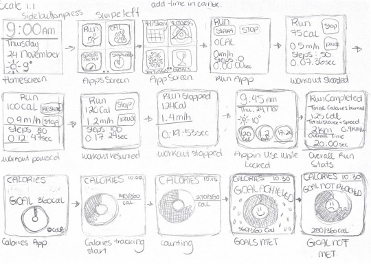

B. Short documentation of the preparation and execution of your test.
In order to prepare and test my prototype, I have outlined tasks for my users to complete The tasks are:
Open the device
Open the running app and set up the timer for 30 minutes and start tracking.
Lock the device and tell me how many calories you have burned.
Can you stop your run and tell me how much distance you ran?
Set a goal for 10,000 steps in a day
How much did you run in the month of November?
These tasks were selected to demonstrate all the device is capable of for the user.
C. Short documentation of the collecting and interpretation of your test results.
Based on testing my prototype, many users had trouble when prompted to open the device and lock the device. They always hesitated and then they would tap the home screen. The way screens were set up would make some users mistakenly go to the wrong interface. I noticed that when they had to go back to a different app they would forget to click on the app or immediately go inside the app meaning they were skipping steps. I saw that happen through all my users. They all liked that the metrics are color coded which can make them remember the meaning of the colors.
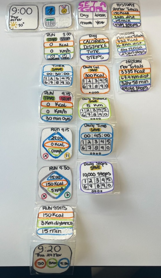
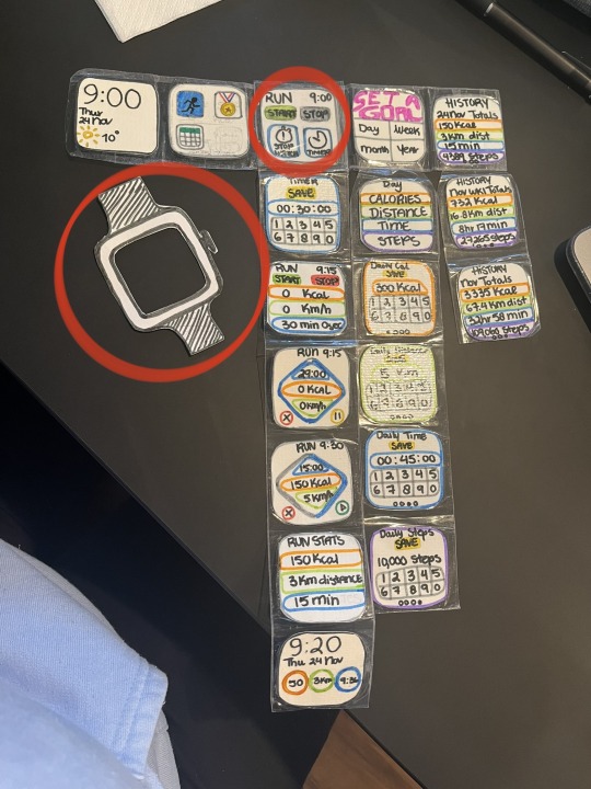
D. Short documentation about the iteration on your prototype, including an ‘after version’ to clearly communicate the iteration.
For the iteration of my fitness tracker prototype, decided to change the order of how the applications are set up because was confusing me testers a lot. I decided to add a frame around the device with a button so when the user needs to open the device they need to click on the button and when they want to close the device they would have to click it twice and clicking it once would let the device go back to the home screen which shows all of the applications. I decided to make the first layout of the run application simpler since one of my testers mentioned that it would not make the app look so cluttered.
0 notes