
mymightyjourney
My Mighty Journey
A 12,000 year journey up the Mississippi. A blog by Paul Nylander for the Gaylord Schanilec and John Coy book project.
111 posts
Don't wanna be here? Send us removal request.
Last Seen Blogs


trueviewguitar
Boss Katana Amps

digi-mar431
Untitled

gilhbert
dear diary,

goldmindcustoms
GoldmindCustoms & Toys
Text
Exciting news! The My Mighty Journey collaboration wins the Minnesota Book Artist award!
3 notes
·
View notes
Link
If you’re here for the first time, or have been reading along for years, you will quickly come to learn that this book project is very multifaceted, full of wonderful process tricks and turns.
While I tried to keep up with it on this blog as we were creating it, I have ten times as much information, photos, tips, and anecdotes stored away. With some work, it is definitely enough to make a book in its own right!
So to that end, I’ve started a mailing list to collect names of people who would like to see the next chapter of My Mighty Journey take place—a book on process and the stories from the Making of the Journey.
If you’re even remotely interested, please sign up on my Illustrada contact page, and I’ll be sure to let you know when and if anything happens! https://illustrada.com/contact/.
3 notes
·
View notes
Text
Best of the Journey: MMJ Highlights
I am a powerful waterfall.
I listen.
I pay attention.
I have a long memory.
You might find it hard to believe
but I have moved through time.
With those words, the story My Mighty Journey opens. It is a story of the evolution of a special place along the Mississippi river, as imaginatively told by the longest resident in these parts, the St. Anthony waterfall in downtown Minneapolis, Minnesota.

Our mighty journey began in June 2015 with the launch of the My Mighty Journey book project, as well as this project blog. For over four years I have chronicled the creation of the unique fine press edition of the book, in letterpress printing, as well as the transformation into the trade hardcover edition of the book, available wherever children’s picture books are sold.
My name is Paul Nylander, and I’ve helped create and print the My Mighty Journey images, and designed the trade edition. And I have a confession: even I have to admit, this blog can be overwhelming! So this post is your quick start guide to the key moments and posts that let you dive into all that is the My Mighty Journey project.
Understanding the project in a Tale of Two Editions
Who’s Who: Meet the MMJ Crew
Gathering Materials: The First Collection
Field Research: Canoe Tour of the Mississippi
How We Work: Constructing the Cover Image Waterfall
Vertical Waterfall: Wood to Water and Stone to Spray
Printing Plants: The Making of a Squash Leaf Block
Printing Animals: Fish & Snake
Woodcuts: The Sawmill Trio
Wood Engravings: The Washburn Flour Mill
From here, the two editions of the book diverge. The Fine Press edition, of which only 40 copies were produced, includes the original letterpress prints, paired with handset metal type and are hand bound.

Bear in mind: the images are 18 inches tall and 24 inches wide, so fully opened the book is nearly 4-1/2 feet wide!
Multi-color Type: Type Printing for the Fine Press Edition
Binding: Hand Binding the Fine Press Edition and Constructing the Cover and Clamshell Box
Meanwhile, the trade edition (also pictured at the top of this post) incorporates carefully scanned and color adjusted versions of the images, and digitally set type which reinterprets the images.

While still large, this book’s page size is a mere 9 x 13-1/2 inches, and the full spread is 18 inches wide, or about 75% of the original size.
Four Years in the Making: Recreating the Journey (illustrada design)
Read More
Scroll down to continue to read the blog from the latest entries. Or…
Jump to the Project Blog Index
Read from the Beginning of the Blog
Where Can I Buy It?
If you don’t yet have a copy of this wonderful story, I encourage you to check with your local bookseller (refer to ISBN 978-1-68134-008-1), the Minnesota Historical Society Press, or online at Amazon and Barnes & Noble.
2 notes
·
View notes
Text
Index of the Journey
(This post continues from the highlights overview)
In addition to the chronological list and thumbnail archive, I give you here an index of the entire 4+ years of the blog, usefully arranged by topic throughout the production of the book.
Highlights: An Introduction to the Project
Tale of Two Editions: Fine Press vs. Trade Edition
My discussion of the Design of the Trade Edition (over at illustrada design), and Scanning Away the Hours
Who’s Who: Meet the MMJ Crew and The Project Begins
Research: Wilderness Inquiry Canoe Tour, MHS Collections, U of M Archives, MHS Artifacts, Diane & Ernie
Journey of Color: What Color is Water?, Implying Nature, Ink Twice or Print Twice and Super Saturated Colors, Medicine Wheel
Printing Blocks:
Gathering: Collection 1, Aerial Photoshoot, Collection 2, Rough Sawn Blocks, Walk Through an Indigenous Garden, and a Walk Around the Falls
Wood, Bark, Stone & Bondo: Rubbings, Hand Sanding & Results, First Printing, Proofing & Planning, Stone, Pressure Printing, Sanding & Bondo
Opening Waterfall: Opening Waterfall Image
Spirit Island: Wood Becomes Water, Colors and Sky
Confluence: Early Design
Vertical Waterfall: Composition, Waterfall Spray
Plants: Nature Printing 101, Paul’s Garden, History of Vegetables, Walk Through an Indigenous Garden, Production Block 1, Continuation, Wrap-up
Medicine Wheel: plants, water mask, wrap-up
Animals: Fish and Snake, Remember the Fish, Fish on Display
Spearpoints: first tests, rubbings, platemaking
Woodcuts: Multi-color blocks, Wooden Apron, Sawmills, Lock & Dam, Fire & Ice
Engravings: Flour Mill, Flour Mill Continued, Wrapping up the Flour Mill
Text & Type:
Type Tests
Typesetting
Printing Begins, Set, Print, Repeat, Colophon
Binding:
Prototype: Sewing, Covers, Clamshell
Beginning Production Binding
Casing & Clamshell final
Video & Time Lapse: Hand Sanding, Sticky Ink, Crazy Lockup, Aerial Photoshoot, Fire Image, Sanding Limestone, First Production, Super Saturated (Wolves) Print, Choreography of Printing Type
Media: Bibliofile Podcast, All Events & River News
Where Can I Buy It?
If you don’t yet have a copy of this wonderful story, I encourage you to check with your local bookseller (refer to ISBN 978-1-68134-008-1), the Minnesota Historical Society Press, or online at Amazon and Barnes & Noble.
0 notes
Text
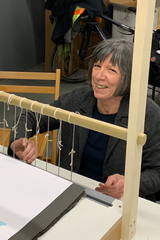
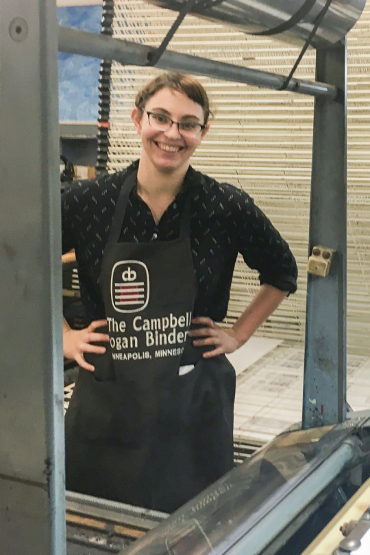
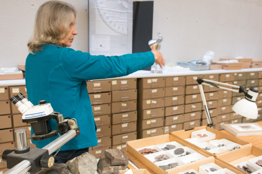
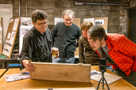
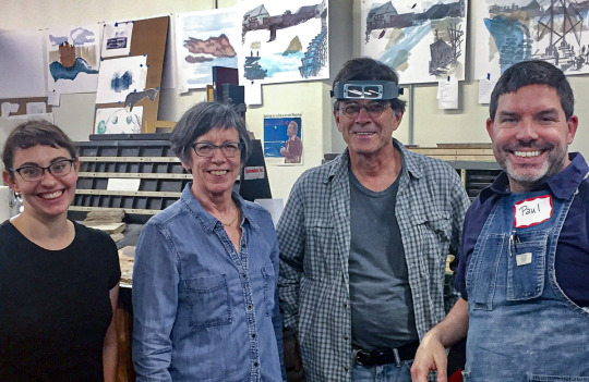
My Mighty Journey: Who’s Who
At a group gathering celebrating August birthday’s, I was reminded that there have been so many wonderful participants over the years, it was high time we tried to remember them all! Of course, it is impossible to thank everyone who has influenced this project… but we’ll try!
Here is a look at the colophon (the back matter) for the fine press edition:
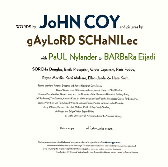
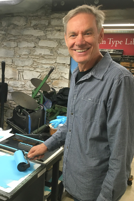
Author John Coy, here tasked with inking some type for the printing of the text in the fine press edition. Turns out, authors make great printers, too!
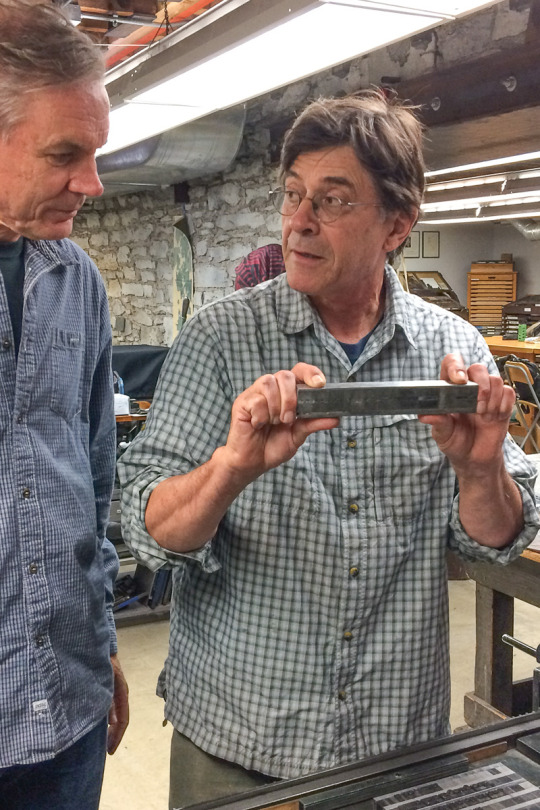
Illustrator and engraver extraordinaire Gaylord Schanilec, here showing John the proper way to carry metal type to and from the press bed.
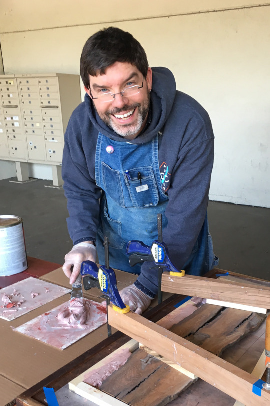
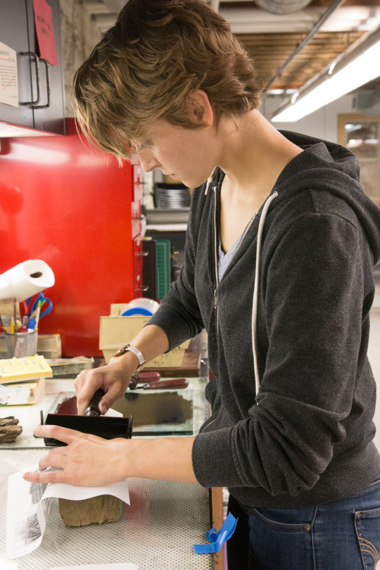
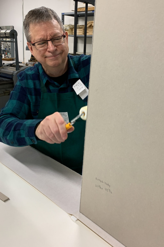
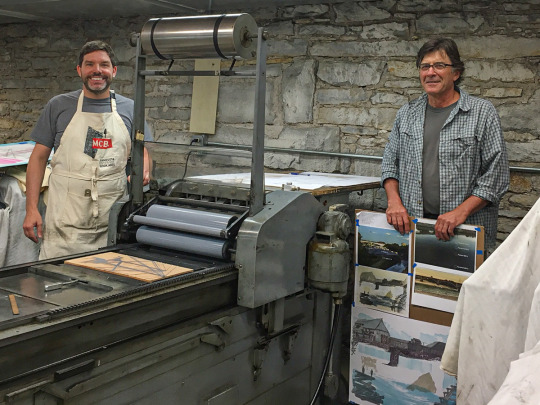
This is me, Paul Nylander. Doing a little block stabilizing with Bondo. Printing and ink mixing is where I spent most of my time.
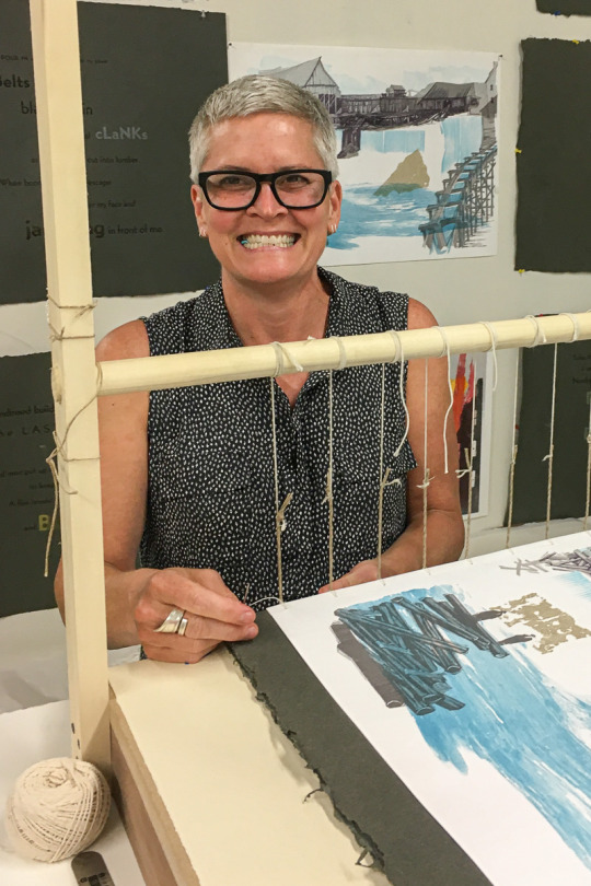
Barb Eijadi, in addition to sewing the binding and coordinating the binding production, helped immensely through most of the project, including printing and block building, and especially the detailed work on the plant prints.
Sorcha Douglas was instrumental in organizing the interns, and did a great deal of printing herself. And block work. And cataloging. And sweeping.
Emily Pressprich was an early intern, starting at the beginning with me. Not only was she there with us for the first collection, Emily helped compose the initial blocks prints, and gave us the great idea of the concept boards for early image development.
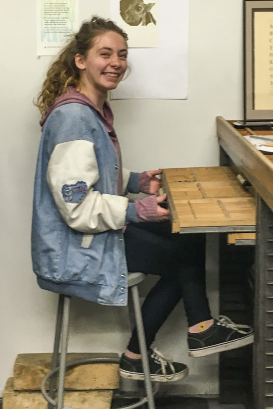
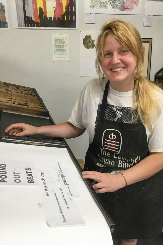
Greta Lapinski was always bundle of energy through image printing and shown here setting type.
Paris Fobbe also helped infuse the group with an unbridled energy, to see us through the type setting and printing, and has circled back to help with binding work as well.
Rayan Macalin, in high school at the time, was a real trooper who helped us through the type printing.
Kerri Mulcare was also offered an experience, steady hand when it came to printing the type and images.
Ellen Janda was always there to help out, through production of a number of the images.
Hans Koch is a relatively late addition to the family, but a great guy always willing to lend a hand. He joined us during the type printing, and has stuck with us through the binding and box making.
Monica Edwards Larson, and active printer herself at Sister Black Press, also decided to come in, and has been helping with the sewing and other aspects of the binding.
Anna Shepard, a binder and educator, has also started to help out, especially with the laborious work of cover making.
In addition to the production crew, we had a number of people offer special assistance at various critical stages of the project.
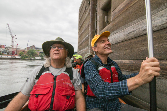
David Wiggins was a consultant and advisor well before the project started, and was gracious enough to take John, Gaylord and I on a Wilderness Inquiry canoe tour of the Mississippi.
Patricia Emerson of the Historical Society, who so graciously allowed us access to the state’s collection of spearpoints and other artifacts.
Diane Wilson and Ernie Whiteman for their support, encouragement, and explanations and for sharing the Dream of Wild Health with us.
Printer extraordinaire Elies Plana, visiting from Barcelona, spent a few weeks working with us—we made him help build boxes.
Master binders Rebecca Staley and Matthew Zimmerman, visiting from Rohode Island also spent a few weeks helping out, and sharing great tips and ideas.

Our aerial drone photographer, Michael Welsh.
Shannon Pennefeather and Dan Leary, of the Minnesota Historical Society Press, the most patient and supportive publishers we could have asked for.
And everyone else I don’t have pictures for! We thank you all!
A few extra parting pictures… because we’ve always found time to have fun!
But most of all, we thank the river and the waterfall.

2 notes
·
View notes
Link
In today's StarTribune Variety Section (starting on page E1) is a great little article by Laurie Hertzel about four new Minnesotan children's books changing the landscape—including "My Mighty Journey."
In Hertzel’s words, “The scope of time is apparent from the first words of this impressive book, which traces a waterfall on the Mississippi River from the robust days of the woolly mammoth to its more restrained incarnation today: ‘For those who came before, those now, and those to come.’
“John Coy’s rhythmic, pounding story of Owamniyomni, also known as St. Anthony Falls—which, over time, has migrated 15 miles upriver, an astounding fact—employs verbs that bring the surging power of the water to the page: ‘People pour in. ... Booms break, logs escape, crashing ... and jamming.’
“Gaylord Schanilec’s collage illustrations and dramatic typography keep the pulsation going. Eventually, the falls grow calm, contained. ‘I am no longer as massive as I was. ...But I am still powerful. I am still here.’
“A note at the end explains how the book—years in the making—came about, with author and illustrator working closely together and with many others, walking the river, collecting bark, wood, roots, stone and other natural objects to use in the images.”
It is a great synopsis. Although she doesn't give me attribution, Hertzel’s description of one very important part of my design work on the trade edition, the "dramatic typography" as positively supporting the "rhythmic, pounding story," felt particularly good.
Shortcuts:
Book Launch Party: October 5, 2019
Best of My Mighty Journey Posts
Blog Index
Project Who’s Who
1 note
·
View note
Link
Planning ahead: although our book launch party for the trade edition is scheduled for October 5th (save the date!), other scheduled activities are also starting to be locked in. Including this very special talk at the Minneapolis Central Library’s special collections area.
Seating is limited, so sign up early. In addition to talking about the fine press edition, the library has arranged an exhibition of some of Gaylord Schanilec’s other work. Join us up on the 4th floor on November 2nd, 2019!
1 note
·
View note
Link
Two public discussions with the US Army Corps of Engineerings regarding the future of the upper falls at St. Anthony.
This coming Tuesday, Aug. 13 at the Mill City Museum (704 S 2nd St, Minneapolis, MN), 6-8 p.m. And next Monday, Aug. 19 at the Michael Dowling School (3900 W. River Pkwy, Minneapolis, MN), 6-8 p.m.
In addition to this informative article in the STrib, information on the “Disposition Study” but he US Army Corps of Engineers can be found at https://www.mvp.usace.army.mil/MplsLocksDisposition/.
1 note
·
View note
Text
Tale of Two Editions
It has been just over four years since the first post, and the formal start to the My Mighty Journey project. If you are just joining us, I encourage you to check out the Archive of all posts, or consider jumping to the beginning to read all the posts in order.
But for those of you who have been here for a while, you may not realize that there are actually two editions of My Mighty Journey. I hinted at this way back in 2016 (”Scan Away the Hours”) when I started scanning the preliminary images.
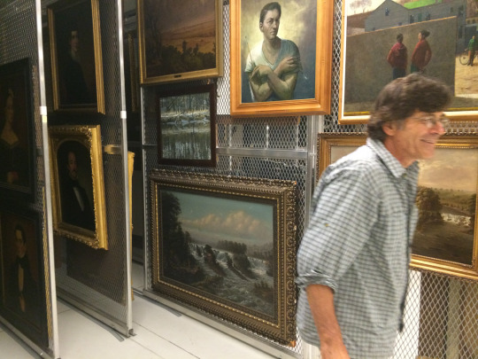
First, the fine press edition, in all its beautiful handmade glory (and mammoth box, which I’m posing next to).


The work of binding and box making continues, and a number of folks have helped us with this laborious part of the project. Here, Elies Plana helps Barb apply glue to one of the Cave paper cover turn-ins back in February.


And here, Rebecca Staley and Hans look on as Matthew Zimmerman, tightens up some of the stitching in the fine press edition. (And my apology for all the overhead shots—trying to capture the working materials without interrupting the artists at work!)
Gaylord has also begun exhibiting the book and prints, most recently in the ongoing exhibition at the Groveland Gallery, and back in February at the Wisconsin Academy of Sciences, Arts & Letters in Madison, Wisconsin.

Well, the scanning continued. By the early part of this year, all 16 of the final images have been scanned, and I’ve been doing color corrections in preparation for the trade edition of My Mighty Journey, to be published in October by the Minnesota Historical Society Press.

This is actually the edition that started it all, bringing author John Coy together with Gaylord Schanilec to create the natural illustrations.
Unlike the fine press edition, this trade edition will incorporate Johns words into each image, and will be mass produced by a commercial printer. The generous page size of 9 x 13-1/2 inches allows us to reproduce the images at about 75% of their original size across the spread of the book.

This has created an entirely new look and feel for the images, and I eagerly look forward to sharing more about this second edition of My Mighty Journey with you.
In the meantime, the book is available to order from the Minnesota Historical Society Press as well as Amazon and Barnes & Noble and your favorite local bookseller. Just look up ISBN 978-1-68134-008-1.
0 notes
Text
Artist Talk @ Groveland 6/20
Next Thursday, June 20 at 7 PM, Gaylord Schanilec will offer a “guided tour” through the pages of My Mighty Journey. Join us for this special inside look at the creation of the 16 images of the book.

Prints will be available for sale. Refer to the Groveland Gallery website for more details.
GROVELAND GALLERY
25 Groveland Terrace
Minneapolis, Minnesota 55403
0 notes
Link
Coming up next month 2 – 5 on Saturday, June 8, 2019 will be the opening of a Groveland Gallery exhibition of My Mighty Journey. If you will be in the Twin Cities, this is your change to get a first-hand look at the completed fine press edition of My Mighty Journey, along with prints and other work by Gaylord Schanilec.
GROVELAND GALLERY
25 Groveland Terrace
Minneapolis, Minnesota 55403
1 note
·
View note
Link
Here we go again? I was just working on the “collapse” image from My Mighty Journey when I saw this article in the Minneapolis paper—another plan to tunnel under the river! We all hope this isn’t a repeat of the October 4, 1869 disaster!

1 note
·
View note
Text
My Mighty Journey featured by the Wisconsin Academy
A new exhibit of Gaylord’s work, featuring the first public display of the My Mighty Journey book and prints will be opening Friday, February 15, 2019 at the Wisconsin Academy of Sciences, Arts, & Letters’ James Watrous Gallery. Located in the Overture Center for the Arts in Madison, Wisconsin, this light-filled gallery will also feature work from Gaylord’s past projects.
But here is a sneak peek: the dogfish, a mascot of our project and a member almost as long as me, will be making its first public appearance as well.

Like any good piece of artwork, the fish needed it’s own sprucing up in preparation for the event—thankfully Hans was up to the job!

Event Details:
Exhibition runs Friday, February 15 – April 7, 2019 at the Watrous Gallery in Madison, Wisconsin. Opening reception Friday 2/15 at 5:00, with artist talk at 5:30.
Learn more at the Wisconsin Academy’s event page.

1 note
·
View note
Text
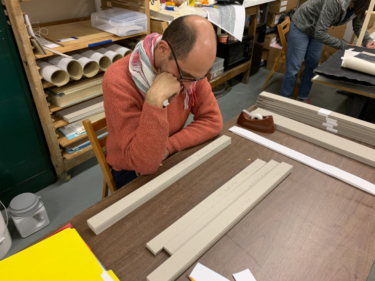
Casing and Clamshell
The sewing of the book, especially this book, is something that tends to get noticed. But we actually spend more time on the book covers (known as the “case”) and the clamshell box which will house it.
The book uses a modified form of the Keith Smith Single Sheet binding—that is, each page is separately attached to the 10 supporting cords. As we left it in the last post, the book block was done, but uncased.

The sewing is exposed in this binding, and so the cover boards are each attached, one at a time, using these cords. But first we build the covers!
These are book binding board (nom. 0.092) covered in a special run of Cave paper—indigo and walnut dyes, finished with a special Sumanigashi-style marbled white. Being Cave paper, it is very uneven. We need a lot of glue and work to bring the cover under control.


This is nipped in the standing (binding) press, then the turn-ins are trimmed and glued down. All but the spine edge, which is glued only once the cords are run through and glued themselves.

You see we’re using some Cave paper for the filler sheets, which is ultimately covered up with the pasted down end sheet.


In the end, the paper is flat and smooth, with this beautiful visual and tactile texture.
But as an unsupported binding, this book definitely needs to live in a box. That is the second part of this post, the clamshell box making. We start with two large trays, one to hold the book, and one to cover over it.

The trays are wrapped, taking care to make all the specialized cuts to create neat, perfect (and hopefully invisible) corners.

Since the cover will have an inlaid title piece, we use a two-layer laminated board case for the box, one with a window cut out. This label is also on Cave paper, although the natural variety. We developed all sorts of jigs and guides to help make this a repeatable process.


Finally, the case is assembled, and the trays are glued into place. We use the standing press again, along with some purpose-built filler boards, to make sure the trays have very good adhesion to the cover.


And the end result? A marvelously tight fitting custom clamshell box. Measuring nearly two feet high and two and a half wide (closed!) is is no small box. But it will do its job very well to protect the limited copies of the book as it travels and is stored in special collections all over the world.


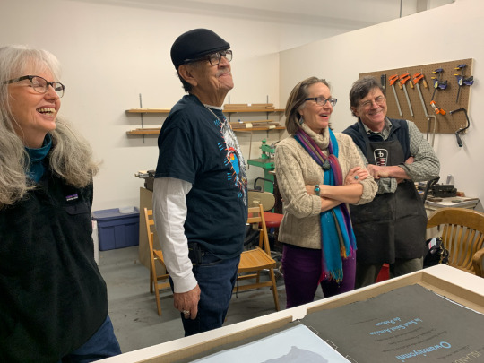
On finishing the first copy, we were happy to have our special friends, Diane Wilson (on the left), Ernie Whiteman and his wife Christina, pay us a visit. Christina gave us a wonderful first reading of the book—truly the culmination of the mighty journey! It was so wonderful to see their reaction to the finished book, the prints and type, and to hear someone reading John’s powerful words.

Now, only 40 more copies to go!
2 notes
·
View notes
Text
Binding Begins
With wrapping up the printing at the end of 2018, 2019 will be the year of the binding for the My Mighty Journey team. So it is fitting that, almost two years to the day from the first “dummy” binding, we’re trying to remember just how we did it before. And how to do it better this time!
The primary difference being, back then, we only had to do one copy. Faced with 40 numbered + 1 unnumbered display copy, we knew we needed to tighten up the process.

We start with building up the book block itself. The image sheets are scored and a 1/2 inch tab is used with a light, archival adhesive to mount the sheets onto the back side of the printed Cave sheets.


As is common with hand-bound books, we’ve created all sorts of positioning jigs and guides to make our work both easier and more consistent. On this day, Hans applied the adhesive and Barb carefully positioned the sheet onto the Cave paper.

We develop a checklist as well, to make sure we adhere the correct image onto the appropriate text sheet, namely the text for the next image. The final construction has the text always on the left hand, or verso, page and the image on the right hand, recto, page. Although this is a single page binding, and we don’t need to worry about signatures, it can still be tricky to remember exactly which image goes where!

One by one, the images are assembled with their Cave carriers. Once the stack is complete, we’ll recheck alignment, and then drill the binding holes.

This particular binding stars something like a stab binding, but the sewing is completely different, allowing each page to turn freely and lay completely flat.
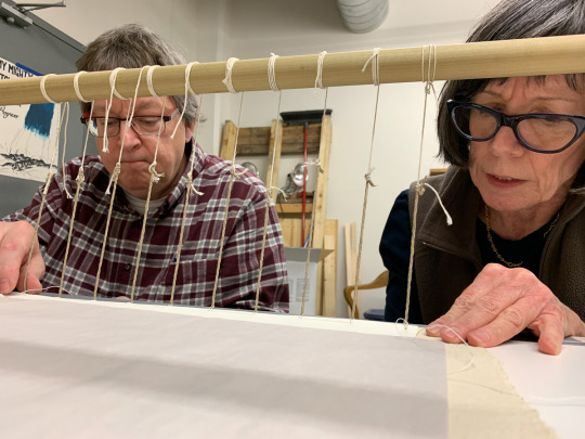
As before, we use a sewing frame to help hold the binding cords, ten in all, taught. And page by page the book is assembled.


With improved technique, Barb is able to sew an entire book block by herself in about a day and a half. Maybe a little faster as we get more proficient.

And so, just like that, the first book block is completed. We haven’t attached the covers yet, and still have the clamshell to build. But it is a momentous occasion: it is the first time that any of us can actually see what the finished result will look like.
And of course, we have to see the vertical waterfall, the image of the early falls when it was so large, you have to “turn the page” to see it. Magnificent!


0 notes
Text
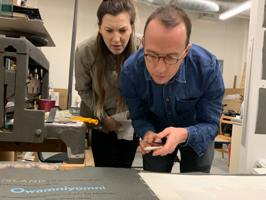
Printing the Colophon
The colophon is the part of a book that explains how the book was made. You may be familiar with it’s modern incarnation, the copyright page, which usually appears at the beginning of a book.
But traditionally, this was the last page of the book. And the last page printed.
In fitting with our style on this project, we couldn’t just print plain old black text. No, we had to have fun. And so, this final day of type printing came to be our most complex day of type printing. Even John joined us in the fun!

Here, Gaylord is placing his own name. If you’ve been following along in the blog, you’ll notice a few differences here versus the type we’ve been printing for this project.
First, there is a lot more of it.


It is four colors, with five sections of colored type, plus black.

We’re not printing on Cave, but on a nice sheet of Reeves printing paper (which itself will lay, like the images, onto of the Cave paper). This compromise was to ensure the integrity of the smaller type on the page.
The other complication is that, as a numbered edition, each page is separately numbered at the time of its printing. No room for mistakes here!

So, we swap out the appropriate numbers between each print—itself not really that bad, as we were already removing the numbers to hand ink them, in this case in brown.

In the end, printing goes flawlessly, with 40 unique numbered prints ready for binding. Plus one blank, for the unnumbered exhibition copy of the book.

And with that, the type of the book is now completely printed.
Time to start binding!
0 notes
Text
Set Type, Print, Distribute, Repeat.
Over the past three and a half months, we’ve continued printing the type. Week by week, page by page, we’ve finally come to the conclusion of the Cave paper prints.

This is production work, so the goal is to create consistent prints throughout the run. Given the complex nature of these runs, we can only complete one 40-page run per week. One page of text.
Here is how a typical week’s run works.
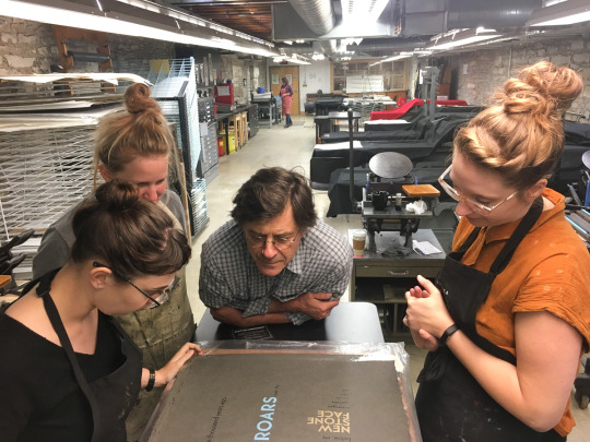
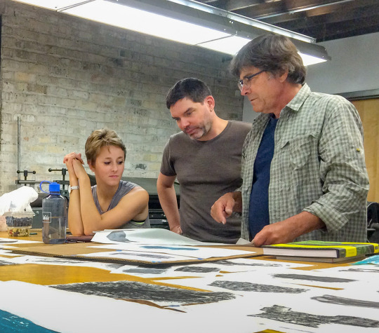
The typesetting of each page actually begins a few weeks before printing. This Gaylord mocks up on the computer, to give some guidance to the typesetters. Literal cut and paste allows us to manipulate the paper mock-ups to get a sense of composition. I talked about this in the first typesetting post, back in June.
With the composition basically determined, we set it—usually into a 90p x 80p block. This consistent text area, roughly 15 x 13 inches, helps maintain consistency from page to page. And then we proof it at Gaylord’s shop, and start tweaking… line spacing, letter spacing, general flow and readability. We also finalize the spot colors to be used at this point.

As with the images, Paul has mixed most all of the colors for the type. We ended up with a fairly consistent use of a water blue, stone brown, and black for the bulk of the type. But many of the images contain additional special colors, with such names as “Wolf Blue,” “Panic Yellow,” “Garden Green,” and “Chokecherry Red.”
The other advance step is the paper sorting. The effort largely headed up by Barb has done a wonderful job of this, creating consistently varied sets of the Cave paper. Gaylord or Paul then dampens the week’s sheets the night before printing.
Day of, we cart the dampened paper, the days type, ink, brayers and other supplies over to MCBA. Their large Vandercook SP25 press is large enough—just barely—to accommodate the full size sheets of Cave paper.


Although the basic process is the same for every page, the colors, the layout, and the choreography of the printing process is always different. It is a fun challenge, as a group, to figure out the most efficient process each week.


No matter what the particular details, we always inspect each and every page. Each person with a color station is responsible for their own color consistency.


And as if consistent color wasn’t enough of a challenge, one week we even decided it would be great to include a split fountain of two different inks—black and white—on a single block of type.
Fortunately, Hans was up to the challenge, developing a technique to get a consistent spread. With just the right amount of blending in just the right place.


You get the feel of the fine flour dust settling through the mill!
Another unusual challenge was the French spelling that Father Hennepin would have used when he decided to name the falls of St. Anthony of Padua. We researched the printed form of his journals and found that he spelled Padua as Padouë, with an umlaut over the ‘e.’
Lacking this special character in our Bernhard Gothic type sort, Gaylord reappropriated another character to built it. A colon would have been a logical choice, set onto of an ‘e’ that had been trimmed down. Unfortunately, both of the colons in the font were damaged. So, a semi-colon was sacrificed—with Gaylord hand cutting the curve of the second dot with his engraving tools.

In the end, it worked perfectly. As did all of the little adjustments we had to make along the way.
Back at Gaylord’s shop, the dampened sheets needed to be restraint dried to ensure their flatness, and then sorted and stacked in anticipation of the binding.

We always made a point of saving out one of the prints, to hang in our growing gallery of the project.


And so it was that, by the end of November 2018 we had finished printing all of the text pages on the Cave paper. It is fair to say that John was pretty happy.

0 notes