
Don't wanna be here? Send us removal request.
Statistics
We looked inside some of the posts by nabillasp-viscom and here's what we found interesting.
Average Info
Notes Per Post
1
Likes Per Post
1
Reblog Per Post
0
Reply Per Post
0
Time Between Posts
2 days
Number of Posts By Type
Text
16
Last Seen Tumblr Blogs


Fun Fact
Average visit duration of Tumblr.com is 10 mins and 25 secs.
Text
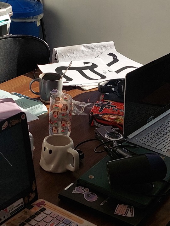
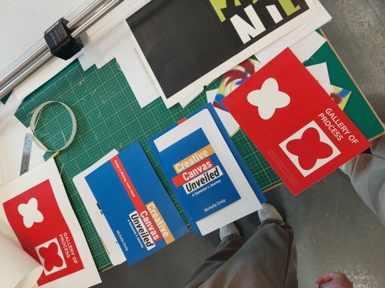
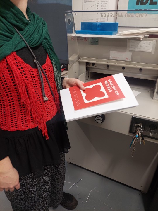
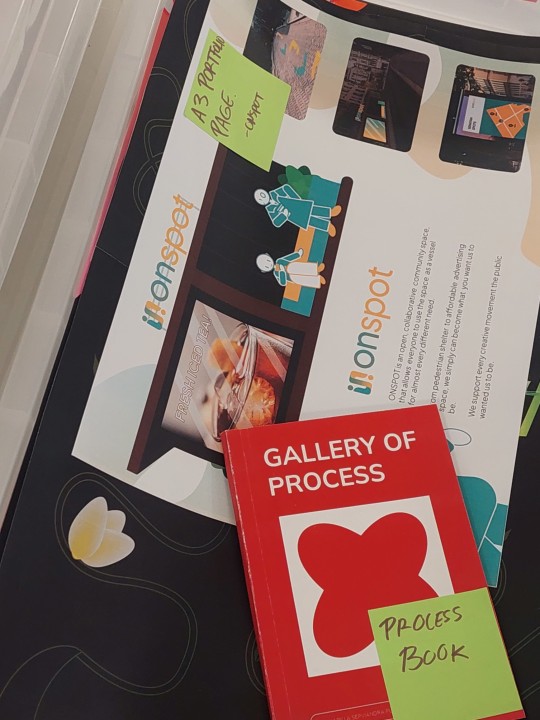
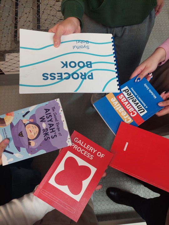
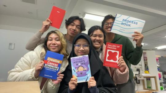
WEEK 9: My Galore of Autumn 2023.
It reached week 9. Time flies so fast, can you believe? I reached the point where it's time to submit Process Book, a book that consists of my work that I had done in AUB Viscom. A lot happened in the process of making, from layout to binding.
This also marks my time as an exchange student of AUB has come up. It was such an honor and great experience to be a part of Visual Communication in AUB!
0 notes
Text
WEEK 8: Presentation for 15-Minute City
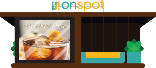
Finally reached presentation! This is a bit from my slide. Because my difficulty on defining my space purpose other than as collaborative community space, I asked Mark for a feedback to make it more clear.
Mark recommended me to add people so people will get the context better from the first sight. Below is my fixed illustration after the recomendation.
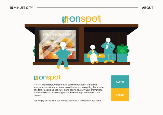
0 notes
Text
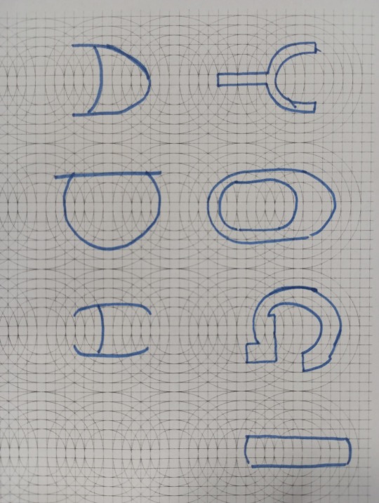
WEEK 7: 1-1 TUTORIALS
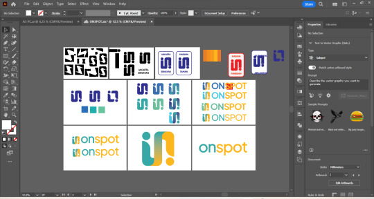
Some sketches I had done for ONSPOT, my 15-Minute City.
First Logo

Chose the color blue because it is a relaxing color. Picked the shape because it symbolizes people and and connection that is also a vision for ONSPOT.
Fixed Logo after 1-1 and Studio Day:

Picked contrasting color that is less 'corporate' and rounded the corners to make it softer and dynamic. Added a logotype so it will be more memorable for the people and more clear as brand identity proposition. The font that I used is Plus Jakarta Sans. An iconic font for the greatest city branding that ever happened in Indonesia.
0 notes
Text
WEEK 6: Think, think and think.
I often found myself wanting to enjoy a bit of nature but also the city without really going to the garden or a greenhouse. I also want to sit while enjoying a book or a coffee, having a chat with friend without really having to stay in a cafe that is crowded, or library that mostly has limited rule to not disturb the others. I want to know a space that still made me aware of what’s happening around myself. I want everything in some kind of ‘balance’, the middle of everything despite of chaos.
Then I did some research, and parklets suits the tone.
Parklets seemed like a very versatile vessel for many things. How about turning parklets for some place to promote yourself as the neighborhood artist? Maybe the local coffee shop have an event to promote? What if you just want to sit after having sudden marathon out of nowhere in the middle of the night?


0 notes
Text
WEEK 4: 15-Minute City
We have a briefing for a project named 15-Minute City. The task is to create a brand identity for a product or service within a 15 minute city that has a unique selling point.
I wonder what I can make?
0 notes
Text
WEEK 4: MUSTIKA, in The Poster With Overwhelming Placement of Illustration
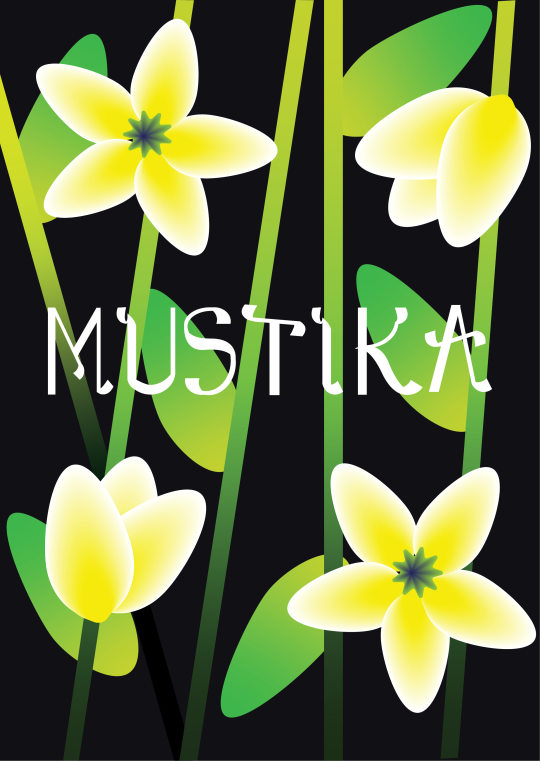
That's it. That's the post! It's half-intentional since my laptop also has a bit of problem as I try to give my best. I know if layouting is still not my best forte despite me often worked in layouting, so I want to get more feedback about it.

Some sketches I did.
0 notes
Text
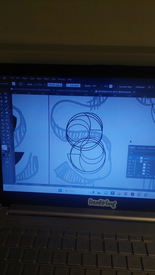
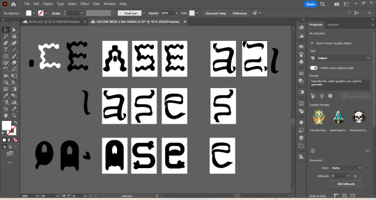
WEEK 3: Swirls and Twirls
I liked the letter that challenged me the most, hence why I picked this one. These are all the process that had me gone thru the developments of letterform.
Note: the scribbled 'TOO FAT' is an example given from Mark for thoughts that I can add for process book, hahah
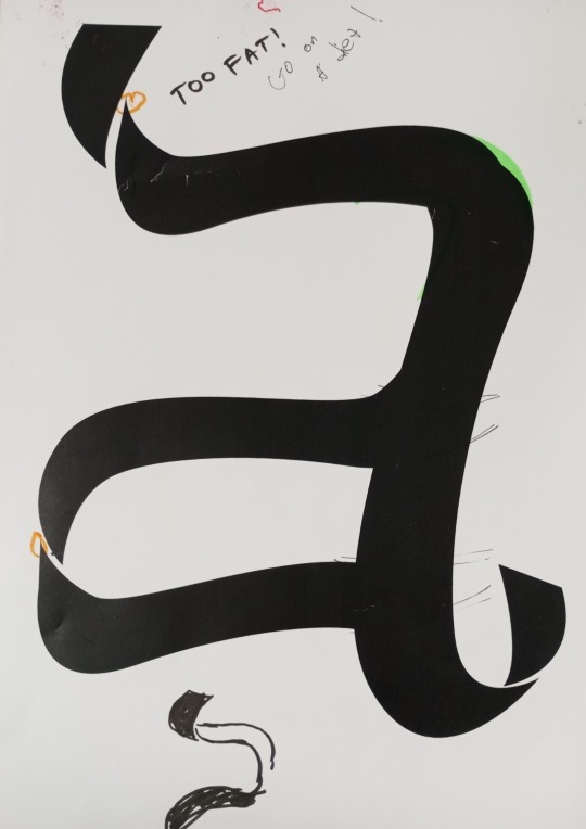


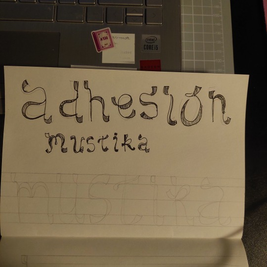
Below was my development for MUSTIKA (finally found a name for the letterform, yay!). Initially I was about to use the word adhesion, but the more I try to develop it, the more I realize if it's barely readable. A good design has the ability to deliver a context, and a typeface is good if it's 'invisible'. Since the first shape did not fulfill any of those, I scrapped the entire thing by trying to make it more clear but still keeping the ribbon-like characteristic.


0 notes
Text
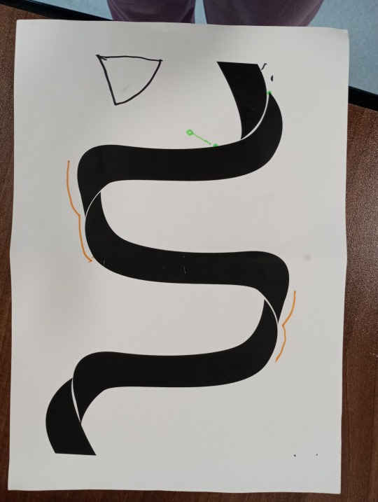
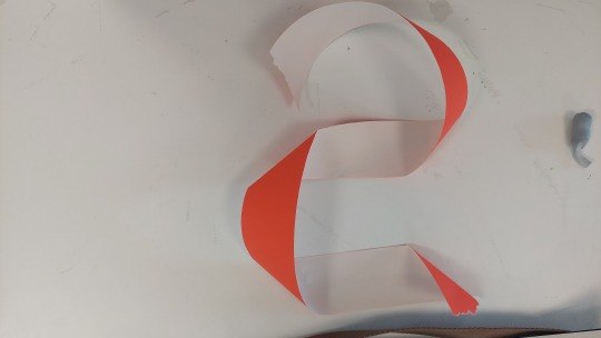
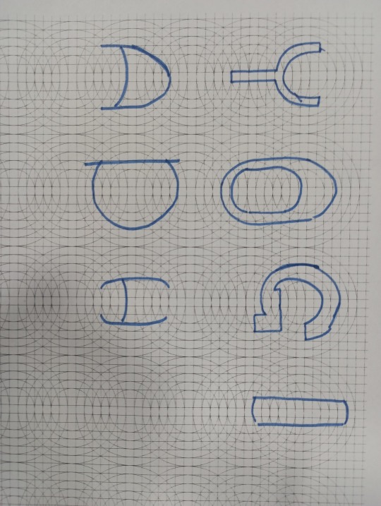
WEEK 3: Letters for Ribbons, Jasmine Flower, and Hanacaraka.
These are all my sketches for the Intervention + Interpretation to present the next day. My inspiration is mainly about ribbon, jasmine flower, and a bit of Hanacaraka (ancient Javanese script). :)

0 notes
Text
WEEK 2: Intervention + Interpretation Briefing
We have a workshop about letterforms. Throughout the daywe will be given different prompts to explore and experiment with creating different letterforms at the various different stations!
Station 1 - Observe (On campus)


Station 2 - Create (Tables in Studio)


Station 3 - Shape (Tables in Studio)


Station 4 - Manipulate (Macs in Studio)


After all these observations, we are assigned to make letterform based from what we make on workshop.
0 notes
Text
WEEK 2: Collection = Interpretation Presentation
Presentation is getting near. Our group worked it remotely till morning for our morning presentation. We mapped out the datas and took turns for our design.


A photo of us after our presentation and feedback session. Syaiful, Georgina, and me. Revisions are awaiting for us, but we are glad we managed to deliver it.
0 notes
Text
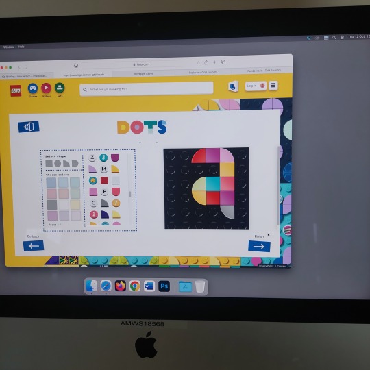
WEEK 2: InDesign Refresher
Can't believe I made something from a software that I barely understand or comprehend, InDesign.
The last time I used InDesign was in my earlier semesters, but that was only once or two since I do most of my work at Adobe Illustrator. Apparently, nothing is too complicated like what I thought at back then. Jordy gave us an easy explaining. Cool.

0 notes
Text
WEEK 1: Illustrator Refresher
It's been a while since I touched Adobe Illustrator. Happy to learn new and re-learn old things I've previously had been taught.


0 notes
Text
WEEK 1: Supermarkets = Playground
One of the biggest challenge for this brief is not only the cohesiveness of our posters, but also the duration for collecting our data. We only have 5pm-6pm of our chosen day to do it.
My group consisted of three people: Myself, Syaiful Bachri, and Georgina Wynn. I am very glad we had an easy flow of communication and open discussion for this project. After a lot of arrangements for some methods on how and what to collect for our data, we decided if we want to focus on shoes in the supermarkets. However, we still need to find a clear definition for this to work, which, will be given by Mark and Jazzy for the next presentation.


Photos of me collecting datas in ASDA near my accomodation.
0 notes
Text
WEEK 1: First Ever Group Project and The Mundane Things That Have Potentials.
On my third week here, the Level 5 finally introduced to the real class. We were introduced to Units, or the course that we will be making for this whole semester.
Our first project named Collection = Interpretation. The brief was making 'a series of graphic system or convention that communicates information about a specific moment in time to the viewers' with our allocated group.
The aim was to make an interesting infographic from the most boring data ever found.
Let's see what we can do!
0 notes
Text
Induction Week 1: A short hello.
We were introduced to Visual Communication of Arts University Bournemouth! On here we met Hannah Byles (First Year Unit Leader) and Mark Pavey (Second Year Unit Leader) for a short hello. We were introduced to some procedures and also 'Process Book', which is a collection of your work for every unit.


We were also asked to make a 'MeMeMe', which is a short introduction about ourselves. It's not a mandatory for second year/Level 5, but it's welcomed. Can't wait to start the journey for this student exchange!
0 notes
Text
Hi, this is Billa :) This space is a cloud gallery of everything I had done in (and for) AUB Visual Communication in Fall Term 2023 <3
1 note
·
View note