
Don't wanna be here? Send us removal request.
Statistics
We looked inside some of the posts by namannnnnnnn-blog and here's what we found interesting.
Average Info
Notes Per Post
1
Likes Per Post
1
Reblog Per Post
0
Reply Per Post
0
Time Between Posts
3 hours
Number of Posts By Type
Text
16
Video
1
Last Seen Tumblr Blogs


Fun Fact
25% of US internet users with an annual income of $80-100K use Tumblr.
Text
REFLECTION

A to the K Studio held by Andy and Karen has for sure been my best design experience at RMIT till now. I was able to learn so many new things from both the experts. Being able to create our own typeface is every designer’s dream. Andy helped me through every step of the project whether it being reviewing my work or helping understand something in the spftware. Both the teachers have always beene readily available to help.
This is a great studio where I got the oppurtunity to enter the vast world of code. Codding was something I was always very afraid of because it seemed too technical for me but, I can surely say it was so much fun to learn and do coding. Running my own code without any errors was a feeling which is something out of this world. Hours of discussions trying to figure out the problem and then solving it gave a great sense of empowerement.
I was lucky to get such understanding and helpful classmates and teachers to help me in this studio. Some difficulties are always theree and the major difficulty for me was time management. Being able to manage job and three other subjects with continous assignments is a tough task no doubt but, our teachers were also very understanding and helped the students by giving extensions in some subjects. Other thana that there was no other problem or difficulty which I faced in this studio except for the fact that due to covid the stuio was 75% online. We were lucky that we did go to the the uni for some classes and denjoyed the experience of designing togther as a team.
0 notes
Text
MAJOR ASSIGNMENT-TYPEFACE AND SAMPLER
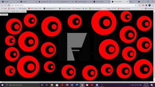
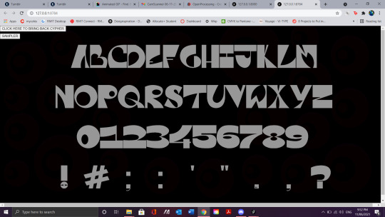

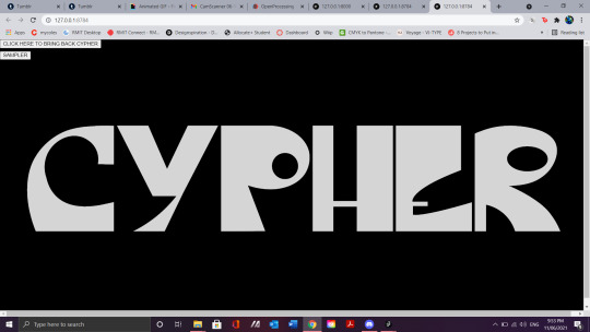
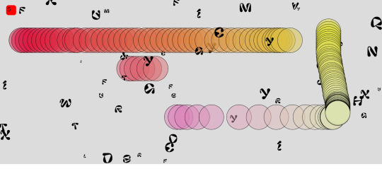
The time has come! Typeface and the sampler are ready. This was a great assignment and I had a lot of fun doing it. The challenges were very tough but also made the assignment much more fun and enjoyable. Being able to solve problems and difficulties with the help of my teachers and classmates gave me a great sense of satisfaction. I completed the assignment step by step and gave full attention to each and every detail. I had made my typeface based on the theme of Cypher. I got this theme from a video game called Valorant in which, Cypher is an agent known for his eye and other superpowers. I wanted to create an abstract display font and was successful in doing that. With the sampler, I was very nervous and faced many difficulties and hurdles along the way. I was able to achieve what I was hoping for. A Sci-Fi typesampler which is interactive with the user and also presents my typeface well without compromising any detail. The sampler had fun elements in it which may attract the users and viewers to interact with it.
I am very thankful to both my teachers, Andy and Karen for their amazing insightful feedbacks and reviews which helped me improve my work at every stage of this assignment. My classmates also helped me a lot and It was fun working with everyone.
0 notes
Text
FINAL SAMPLER
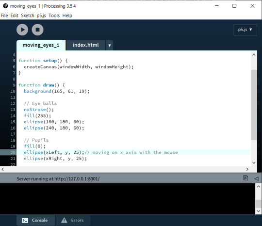
We are several weeks into the the stuido and the typeface is ready, I am now comfortable with the coding software and ready to work for my typeface sampler. Too clearly have a theme for the sampler, I took a paper and decided what my typeface reflected and what I wanted to relate it with. After deciding that, I began brainstorming ideas for my sampler on a piece of paper.

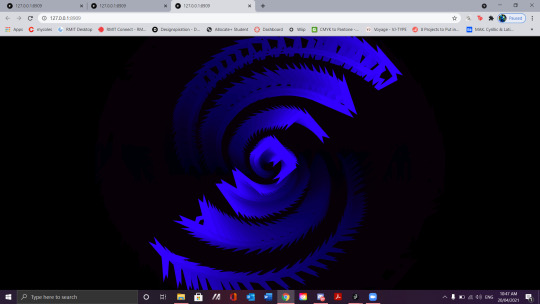
I had the main idea of presenting my typeface using the code we had made i class where each letter when typed, came up on the screen. Along with this I want to make my code interacative and hence base don my theme of Cypher, I wanted something related to sci-fi and the most intriguing idea I got was to play with eyes of cypher. I have seen codes where eyes move with the mouse pointer. They look creepy but very mind bending at the same time. It will help me engaging the user with the sampler. The eyes can be a bit distracting and might divert users attention from the typeface so, I want to keep an option where the user can remove and add eyes on screen. I started developing my sampler by making the eyes which follow the mouse. I took this moving eyes code from https://openprocessing.org/ where someone had explained the code of the moving eyes.

Using the preload function I can also add a sci-fi environment sound to the sampler to make it feel creepy and more interactive with the user. I also wanted to add the jiggly letters code which was taught in class where the letters moved randomly but that did not go well with my theme and hence I stuck to my basic idea of the sampler.
This was a very tough task for me as even though we had leanred a lot of things in the Hour of Code classes but something which I wanted to add in my sampler were still unknown to me. That was not a problem as Karen always helped me through the problems by providing me with reference links or explaining it herself. Andy had already mentionaed that Karen and Andy will not spoonfeed us they would help us if they see that we have done some work and we are stuck on a particular point.

My classmates also helped me a lot with the code of my sampler. This took a lot of time but eventually with a lot of research and tutorials online. P5JS references, and with Karen’s help, I was able to achieve my goal. There were still some mistakes in my sampler which Karen pointed out and I fixed them with her advice. I still made some mistakes in my sampler but this was my first experience ever with coding so I was not very upset about i. I will definetely give more time to coding and improve this code and even make new codes for my portfolio.
0 notes
Text
SAMPLER CODE TEMPLATES
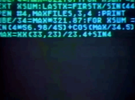
In week 8, we started coding for the sampler. Karen provided various random ideas and codes which we could use as it is like a template or mix it with some code of our choice for our sampler. The main focus with these codes were that they should help present out typeface to the viewer so that they can clearly see and get an idea of what the typeface looks like.

We made a code in class where random letters scame up on the screen. This was achieved by using the ‘random’ variable. We mixed this fucntion with some interactive code like changing colours with mouse or drawing a snakae with mouse pressed. This will help in gaining and maintaining the viewers attention to our sampler.

The main code which had attracted my attention was the code in which we could type any letter on our keybiard and it would show up on screen. I like this idea as my typeface was a display font and it is important for the viewer to see each letter closely and notice the details. I had decided to use this code with some other code of my own choice and creativity to have some originality in my own sampler.
P5JS reference which was provided by Karen has helped me a lot in clearing so many doubts and understanding different functions of the code.
0 notes
Text
TEXT Pt2
As moving forward, things are getting more interesting and trickier. After we have learned how to load our font, customize it’s position, spin and color. Till now we have been writing just a few words, How do we write a paragraph? That is what we are going to look at in today’s class.

As moving forward, things are getting more interesting and trickier. After we have learned how to load our font, customize it’s position, spin and color. Till now we have been writing just a few words, How do we write a paragraph? That is what we are going to look at in today’s class.

In the class, we look at how to enter a large piece of text into a paragraph. We learned how to align the paragraph and the functions required to make a paragraph just like we do in other software.

A new element of Frame Count was added which is used to give animation to the design we code in P5JS. Frame count is used for the animation speed so more the number of frames, the faster the animation will run. These function s were used and we created a body text paragraph with a wave motion moving up and down and changes its leading on its own.
0 notes
Text
TEXT
I am now starting to get a little comfortable with the software now and learning new things from Karen’s tutorials and YouTube. It is now time to step up a bit and start working with text. This is the first step towards making the type sampler for the final assignment. It is important to understand how to work with text and other functions because that is what will help me make my type sampler.

We started of with the basic by loading a font in P5JS using the pre load function. I am aware of working with text in other software and how to align the text. The only difference in P5JS was that the alignment point of the text is different from that in other softwares. That was the tricky part to work with.
We were also taught about using variables so that we don't have to mention our font name in every line. We could just use that variable which will act as a shortcut to using the font for the text. We also played around and experimented with angle modes and text size and colors. We mixed and experimented with the code we learned earlier and decided to change the color of the text using the mouse.
After the students gained a good amount of knowledge and skills for working with text, we moved on to the next step. We loaded more than font and started working with more than one variable. Karen taught us some other functions as well, which could help some in the type sampler. We also had a lot of fun working with angle modes and spins and making the text spin with mouse movement just like we changed color of the shapes.
0 notes
Video
tumblr
CHANGING COLORS
As we move ahead and get our basics strong, we started expermenting with things like colour. As a newbie to coding, this was amazing to watch and learn how we could change the colors by moving our mouse.
To learn how to do that, we had to learn how it works. We understood about the X axis and the Y axis and how it will effect the colors of the shapes. We could use this function to change the background color aswell. This was tough at the first sight but when Karen broke down every single step and explained how it worked, it got easier to understand and experiment with.
Karen also showed some random coding to play around with uing the same functions which were taught in the class. It was very interesting to make the code and gives an amazing satisfaction when the code works without any errors in it.

0 notes
Text
BASICS
We started the Hour of Code in week 2 and it was held by Karen. We had downloaded the software before and were ready to get started. We started fromo the very basic thing as setting up a canvas. The short forms and the semi colonss were fun to use and made me feel like a coder but I knew this was just the easy part.
Karen explained how the short forms in P5JS work and how same function repeats itself in the code. It is important to pay attention to detail ad the smallest of thing might make the code suffer and it wont work. P5JS requires math and i was scared to hear that!
However, We did not go that deep in the first class. We played around with some shapes and colours. Learned some basic yet fun things like changing the colour of the object by just moving the mouse. We can customize these settings and change other features of the object with the mouse movement.

The main activity and task was to make the same initals we had made in the first class of this studio using only two shapes but this time, using P5JS. It was a bit challenging as everything was new and I had no idea how to modify the shapes. But, with the help of Karen and the P5JS Reference which Karen showed us, things got much more easier.
0 notes
Text
“HOUR OF CODE”
Along with making a typeface, this studio also gave students the exposure to enter the wide world of coding. I have no experience in coding and hence I was nervous and afraid of coding in this studio. Karen assured us that it was going to be easy and we will start from the basics.
The excitement of learning to code was fresh and new and I was ready to gete started and learn new things to code and design ussing the P5JS software. I have seen a lot of typography design work by some designers on social media and so I was excited to try it out and explore and make new things using it.
0 notes
Text
WEEK 13

The studio has come to an end :( Today was our last class of the studio and I was not able to attend it due to some personal problems. I was able to ask a classmate about what happened in class and everyone just shared their works and gave feedbacks and discussed their problems.
I posted my work on the discord server and clarified my doubts and problems. I am very thankful to Andy, Karen and all my classmates who helped me, whether it be related to any technical difficulties or a doubt related to the assignment.
This studio was a beautiful journey which came to an end and I am so grateful because I learned so much from this studio in every aspect.
0 notes
Text
WEEK 12
Starting of today’s class we discussed how far we are with the entire project and how much is left. Andy shared some amazing interesting case studies to help us with our assignment. Karen helped the students in solving the doubts they had regarding the technical stuff related to coding and github.
Later, everyone posted their works in progress of their typeface and let Andy review it and suggest some changes if there were any. I was done with my typeface and was working on other parts of the project. Andy gave me some reviews and suggested some changes which I changed on the spot. Apart from that, I was ready with my typeface.

I was satisfied with the result of my typeface. I had some other ideas which I wanted to include in the typeface but time being a big concern for this assignment I did not include those type designs in this assignment. It was a great achievement for me actually have my own working typeface just the way I wanted it to be. It fulfilled all the aspects I had in mind while designing it.

0 notes
Text
WEEK 11
Everything is coming in place I am ready with my typeface after making all the necessary changes in it. The class then shared and discussed about their typefaces and gave feedbacks on each other’s works. A big brainstorming session was held in small groups to decide how could we all present our typeface in a uniform manner to the viewer. If some students do not have numbers in their typeface how can we make a pangram which suits everyone. The main and the most practical idea that came out of this discussion was to use the name of our own typeface.

Everyone printed their own typeface and also helped in printing out the typeface for the students who were online (myself included). This was done to figure out how we want our samplers to be in order and have some uniformity in all the samplers for all the typefaces. Instead of just discussing about the font it is always good to have something in front of us to actually think about it.
After deciding to work on the names of the typeface, the class was divided into smaller groups and everyone discussed and brainstormed names for their font. Everyone helped each other in finding names for their typeface.
Andy provided the class with a pdf which included several questions regarding our typeface and the project in general which would help us in writing our artist’s statement for the typeface we have made. Andy had also shared various examples of artist’s statement by different designers which made it more clear for me on how to write an artist’s statement as I have never written one but it was a great exercise and I will definetely use it in my future projects.
0 notes
Text
WEEK 10
With the typeface in progress, I had a list of doubts which i wanted to clarify in the class. I cleared out my dountrs regarding the software and the doubts related to the final assignment itself. Everyone discussed and talked about the challenges they are facing. This helped me a lot because I got answers to a lot of questions which I was not so clear about.

Apart from discussing and solving problems, everyone also discussed and reviewed each other’s works in progress. Everyone gave their suggestions and feedbacks to each other’s work and how it could be improved. I personally gained a lot of feedback to help improve the shapes of some of my letters. I also got new ideas for my typeface sasmpler and how it could be made better.
In the meanwhile along with this class, I was working on my typeface and trying to complete as much as possible so that I could clear my doubts on the spot without forgetting about them.
0 notes
Text
WEEK 9
I brainstormed, designed and sketched my typeface on paper. I kept inclcuding as many ideas I saw and got in my head into the the typeface by drawing it. I kept taking inspirations from different typographers and designers. After I had made a good set of letters with which I was satisfied, I then scanned those letters and popped them in Illustrator and began the process of making my own typeface.

I made some minor tweaks and changes while working in the software itself. I wanted to keep the main theme of the typeface that I wanted which was very abstract and unreadable at some point but, as a part of the assignment I did not want to take any risks and improved the legability of my typeface design.

I had also made some lowercase letter for my typeface but, while actually working in illustrator and making those lowercase letters, I was not very satisfied and decided to make my typeface into a Display typeface with no lowercase letters.
0 notes
Text
WEEK 8
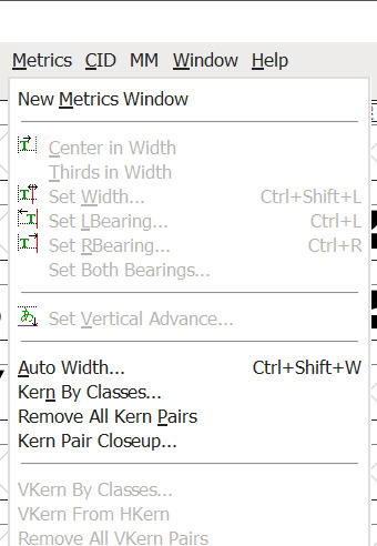
Moving forward with the process of building our typeface and learning a new software like FontForge class was started by discussing and reviewing some works in progress by other students. Andy taught the class about setting kerning in our typefaces. We discussed the different ways of setting the kerning of our typeface. We could either set our kerning based on eye level or fix the size of the kerning in metrics.
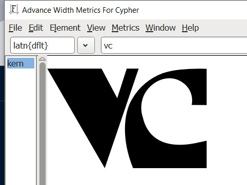
We learned that different fonts could use different kerning and I wanted a monospaced typeface so the kerning in between each letter stays the same. Apart from setting the kerning of the entire typeface, we learned that we can set kerning metrics for two letters individually so whenever those 2 letters are typed together, the kerning is different from the rest.
Apart from these new tutorials in FontForge, we also discussed and solved various problems faced by students while working in FontForge. Listening and providing solutions to these problems helped me understand the software much better and helped me get comfortable in the software.
Apart from FontForge, I worked more on my typeface, collecting ideas and inspirations and incorporating them in my typeface. I made more designs of some letters and glyphs which I want to include in my typeface for the Final assignment.
1 note
·
View note
Text
WEEK 7
It’s Game Time!
From now, I started working on my Major Assignment where we have to make our own typeface and a Type sampler for our Typeface using code. I had a clear image in mind of how I wanted my typeface to look like. I am a designer who is fond of abstract designs and typography which falls apart from the regular design and typography. I like designs which are minimal and loud at the esame time. So, this was the direction I was aiming for.
This was a big oppurtunity. I wanted to create my own typeface not only for this assignment but for my own portfolio and for personal use too. A typefacee which I could use in graphic posters and merchandise design. I started to collect inspirations from my favorite designers on Instagram and Behance. I searched for inspirations on Pinterest as well. I created several mood boards.

Learning from previous assignment, I started drawing some letters to understand the style and theme I wanted to go for. I made some designs to have a center of focus of how I want my typeface. The more designs I made, more experiments I did, the more ideas I got both for my typeface and the sampler.

I did not start working on the software yet but I was paying attention to what was being taught about the software in class and took down notes. I used those steps and techniques on random typeface that I made in illustrator. It was a fun experience and Andy shared a lot of tips and tricks with the class on how to use the softwares and function efficiently and quickly.
0 notes
Text
WEEK 6
We started the class by looking at everyone’s final work and giving our reviews and opinions towards it. After that Andy conducted a small activity where we were divided in pairs and we were asked to combine our prototype typeface with our partner’s typeface. I don’t recall who I was partnered up with but we had fun combining our typefaces. My partner had used clips for their typeface and it was a difficult task to combine newspaper and hair clip to make a letter or a typeface. However, we brainstormed our ideas and came up with a simple letter “E” ade with newspapers and hair clips.
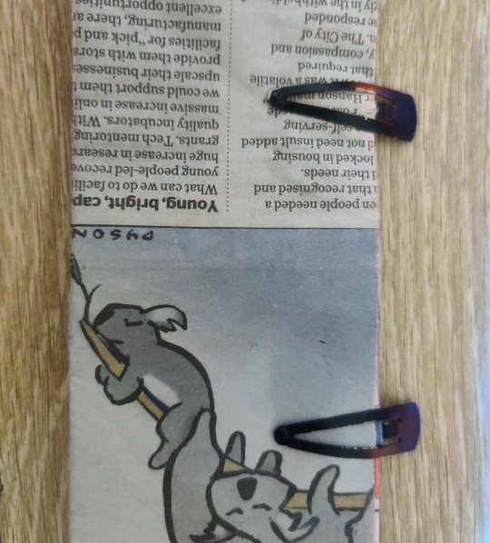
This helped us think in a different direction and come up with diverse ideas on how the two typefaces could be combined with each other and still hold their individual identities.
0 notes