
Don't wanna be here? Send us removal request.
Statistics
We looked inside some of the posts by natashahyleet3 and here's what we found interesting.
Average Info
Notes Per Post
0
Likes Per Post
0
Reblog Per Post
0
Reply Per Post
0
Time Between Posts
17 hours
Number of Posts By Type
Text
17
Last Seen Tumblr Blogs


Fun Fact
25% of US internet users with an annual income of $80-100K use Tumblr.
Text
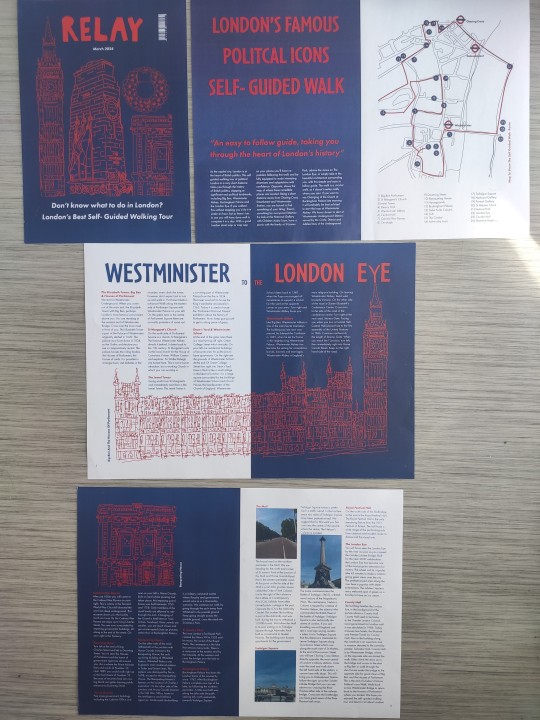
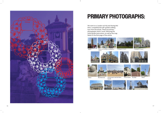
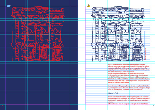
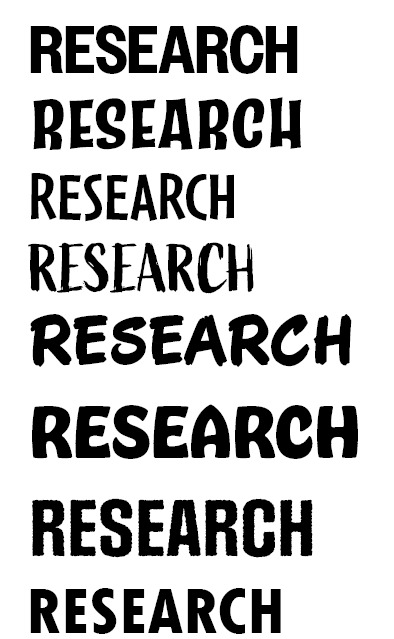
Final Print Out Of Places Of Words Project:
This is my final print out for this project. For some reason, the blue background is a slightly different colour especially on the first double page. I have checked that the colours are the exact same for all backgrounds on my InDesign file and that they are all cymk colour. Apart from this, I am happy with how it turned out.
0 notes
Text
Process Book Printing and Binding:
With Jordy's help, I printed out my process book and front cover. I then used the creasing machine to create the spine and created another one further along to help the pages turn easier. Then Jordy used the hot gluing machine to stick all the pages together, followed by trimming it down on the guillotine. I did get Jordy to trim it down a little more as the crop marks were still showing. Therefore, it may be a little smaller than my original size of 17cm x 23.5cm. Overall, I am happy with how it turned out and it was nice to see all my work completed in one book.
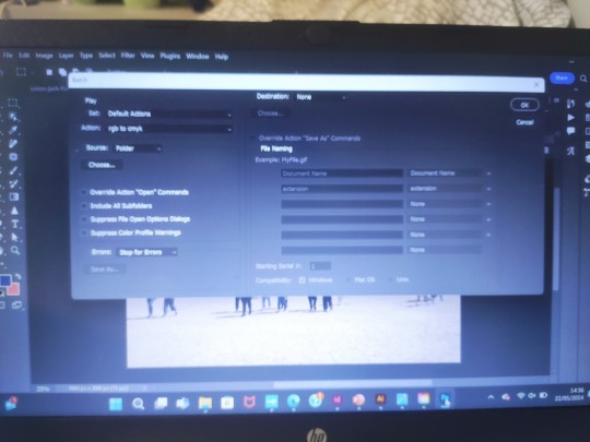
Some of the pages did come out a little blurry, so next time I would make sure that all the images are properly linked and converted to CMYK colour. If I had to improve my process book, I would probably change the background colour to make it stand out a little more from the standard white background, or include a pattern or something to make it look more unique.
0 notes
Text
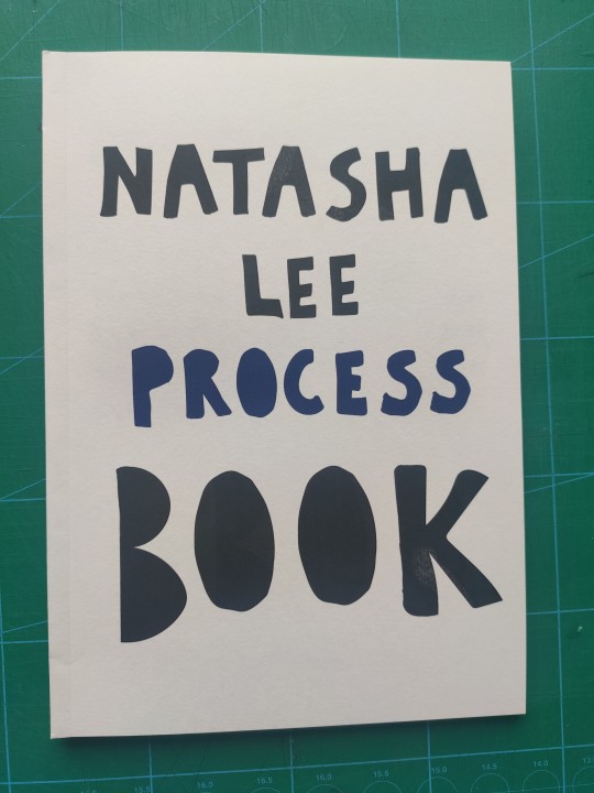
Process Book Contents, Bibliography, Front Cover
I then added a contents page for my process book and a bibliography for all the research I had done for this unit.
I decided to stick with the front cover I had done last time as I quite liked the typography element I had created. I also liked that the 'Process' stood out in blue. The only thing that I added was 'Natasha Lee Process Book' on the back page.
0 notes
Text
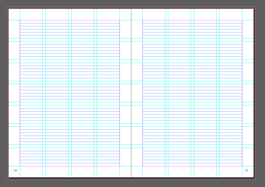
Process Book Places For Words:
This is the Places for Words section of my process book:
Some images to show how I used the grid:
0 notes
Text
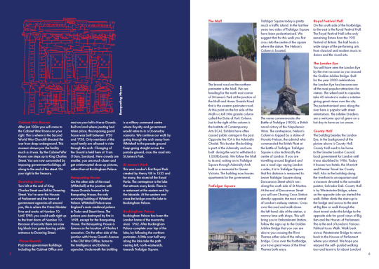
Printing Out My Final Magazine:
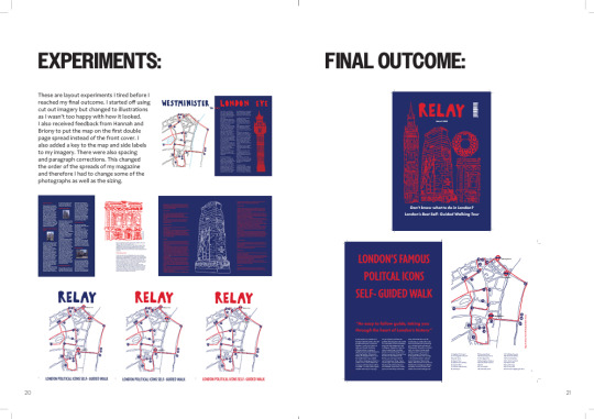
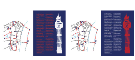
I printed out my magazine and wasn't too happy with the text and photographs being very squished together on the last double page spread. I had a bit of problem as I thought that it would look inconsistent if I created spacing between them when there was no spacing with the other subheadings and body text for the other landmarks. I also did not like how it looking without spacing. Therefore, just for these three photographs, I ignored the baseline grid and started all my photographs a tiny bit below it. I think that it looks a lot better like this.
This is my final outcome for the Places Of Words project:


At the group tutorials, Hannah and Briony were happy with my magazine outcome and there were no changes that were necessary.
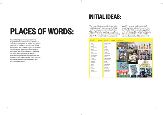
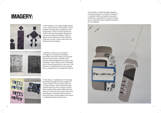
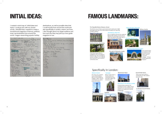
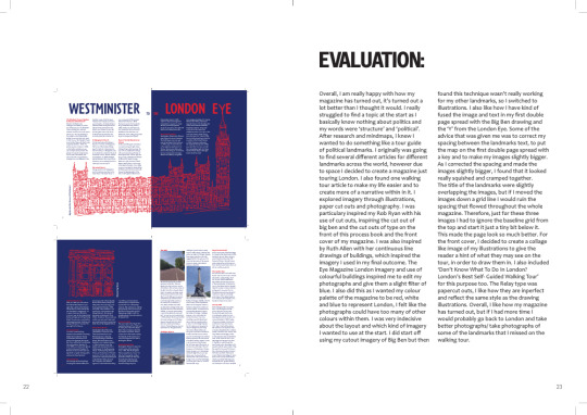
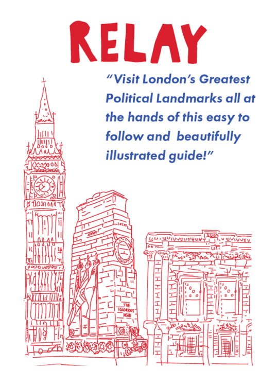
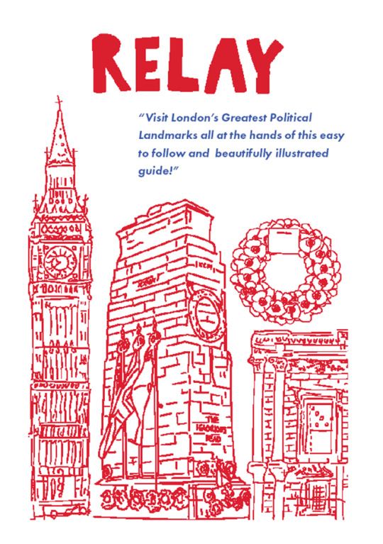
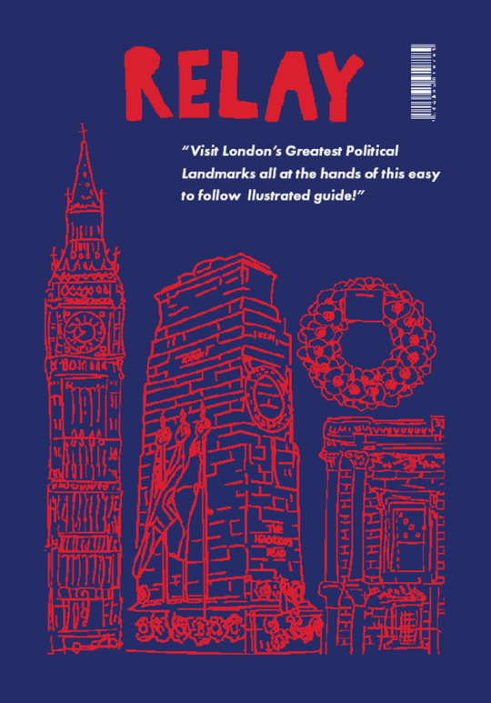
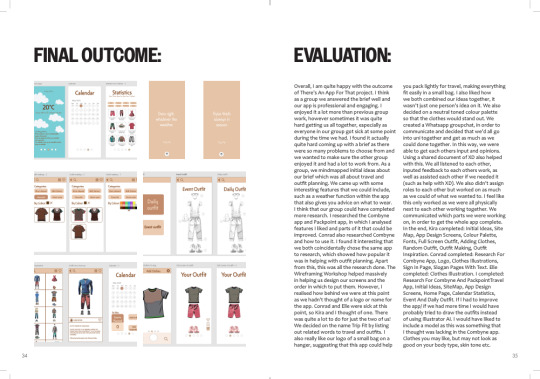
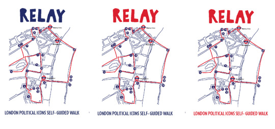
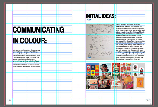
Overall, I am really happy with how my magazine has turned out, it’s turned out a lot better than I thought it would. I really struggled to find a topic at the start as I basically know nothing about politics and my words were ���structure’ and ‘political’. After research and mindmaps, I knew I wanted to do something like a tour guide of political landmarks. I originally was going to find several different articles for different landmarks across the world, however due to space I decided to create a magazine just touring London. I also found one walking tour article to make my life easier and to create more of a narrative within in it. I explored imagery through illustrations, paper cut outs and photography. I was particulary inspired my Rob Ryan with his use of cut outs, inspiring the cut out of big ben and the cut outs of type on the front of this process book and the front cover of my magazine. I was also inspired by Ruth Allen with her continuous line drawings of buildings, which inspired the imagery I used in my final outcome. The Eye Magazine London imagery and use of colourful buildings inspired me to edit my photographs and give them a slight filter of blue. I also did this as I wanted my colour palette of the magazine to be red, white and blue to represent London, I felt like the photographs could have too many of other colours within them. I was very indecisive about the layout and which kind of imagery I wanted to use at the start. I did start off using my cutout imagery of Big Ben but then found this technique wasn’t really working for my other landmarks, so I switched to illustrations. I also like how I have kind of fused the image and text in my first double page spread with the Big Ben drawing and the ‘Y’ from the London Eye. Some of the advice that was given me was to correct my spacing between the landmarks text, to put the map on the first double page spread with a key and to make my images slightly bigger. As I corrected the spacing and made the images slightly bigger, I found that it looked really squished and cramped together. The title of the landmarks were slightly overlapping the images, but if I moved the images down a grid line I would ruin the spacing that flowed throughout the whole magazine. Therefore, just for these three images I had to ignore the baseline grid from the top and start it just a tiny bit below it. This made the page look so much better. For the front cover, I decided to create a collage like image of my illustrations to give the reader a hint of what they may see on the tour, in order to draw them in. I also included ‘Don’t Know What To Do In London? London’s Best Self- Guided Walking Tour’ for this purpose too. The Relay type was papercut outs, I like how they are inperfect and reflect the same style as the drawing illustrations. Overall, I like how my magazine has turned out, but if I had more time I would probably go back to London and take better photographs/ take photographs of some of the landmarks that I missed on the walking tour.
0 notes
Text
Front Cover:
I knew I wanted the front cover to be a kind of collage of all the illustrations I had done. I just wasn't sure on how I wanted them collaged together or the colours of them/ background colours so I played around with all of them in mind to see which I liked best.
These are the original illustrations/ parts if them I had done before collaging them together:
These are some of the versions of the front cover that I had:
This was my final out come for the front cover of my magazine:
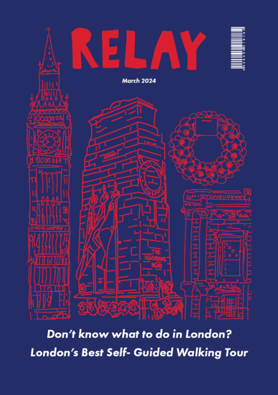
I added a barcode and date to ensure it looked like the front cover of a magazine. I also added the writing at the bottom to let the audience know what it is about and to draw them in.
0 notes
Text
Magazine Acting On Feedback
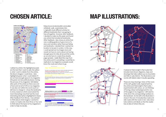
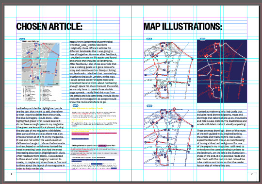
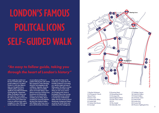
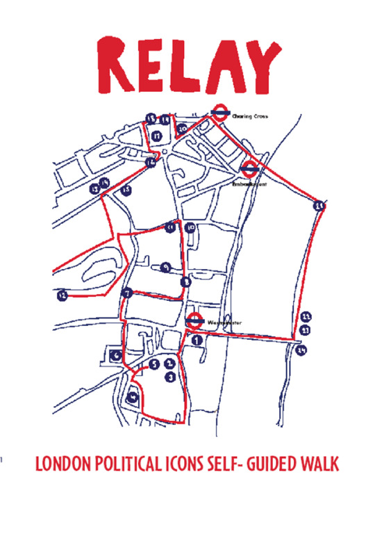
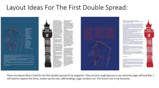
After receiving feedback, I decided to shift all my pages. I decided that I had my second and third double page basically complete. I would just create the first double page with the introduction to the walk and the map image. I made up a quote and also the end part of the introduction as I wanted all the text to line up nicely and the article one wasn't quite long enough. These are some process photos on how I got the final outcome of the first double spread.
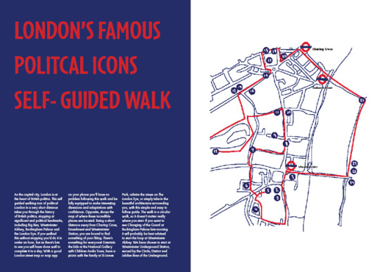
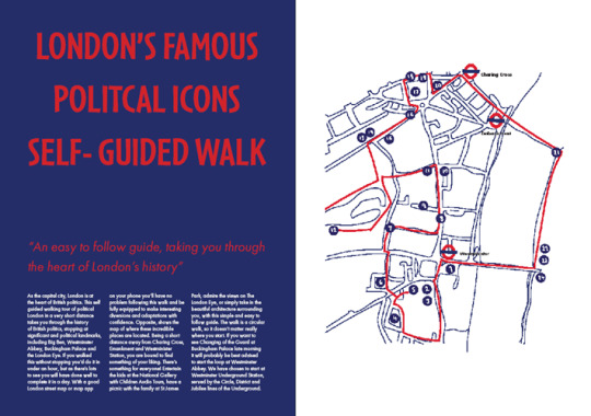
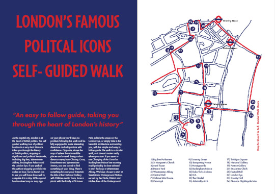
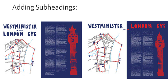
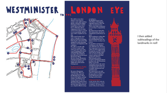
I also added a key to the map as well as a label describing what it showed.
For the second double page spread I changed the spacing between the landmark descriptions, as well as the ragged edge paragraphs. I also added a label to describe what the illustration showed. All the text shifted as I had moved the introduction to the first page.
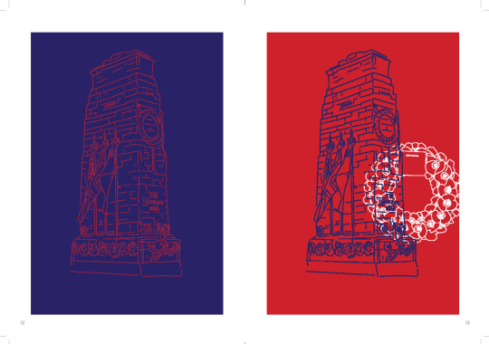
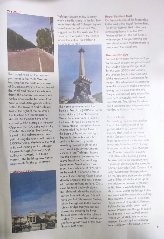
For the third double page spread, I had to rethink my layouts slightly. As all my text had moved places due to the spacing change, it would not make sense for the Banqueting House to be on the right page. My article is a walking tour so the order of it is quite important and if I changed the order it would just be confusing and wouldn't work. Therefore the Banqueting House illustration i moved to the left and the other photographic images to the right. I also made the Banqueting House image slightly smaller after feedback. I also had to find new photographic imagery for the landmark descriptions on this right page. I tinted them with blue and used Photoshop to covert them to cmyk colour as I forgot to last time. I did also try adding the Cenotaph drawing but I felt like it took up too much space and I was running out of space for the text.
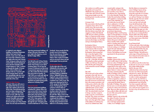
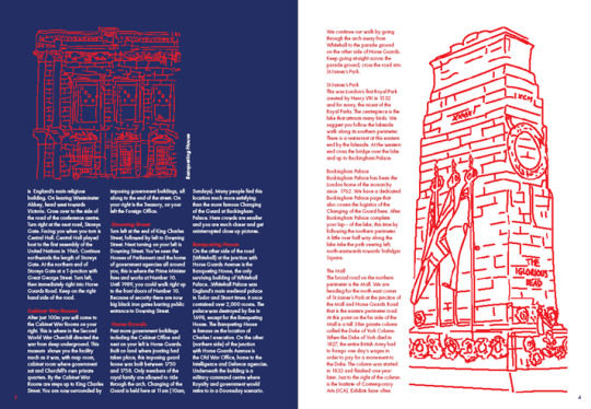
Editing my photographs:
I also experimented with different photographs and the placement of them to see which I liked best. I went for the second image for the final outcome of my third double page spread.
0 notes
Text
1 to 1 Tutorials
These are the pages I showed to Briony and Hannah for feedback for my magazine.

They gave me a lot of advice such as to change the body text to book instead of medium so it would read better. I should also remove the line spaces between the subheadings of the landmark and the body paragraph as the subheadings looked like they were floating. Also as they were a different colour, it wasn't needed. I had a lot of wonky edged paragraphs due to the nature of my magazine, so at some places, the text would start on a new line. This wasn't needed and I should delete this spacing. The title of my magazine 'London Political Icons Self Guided Walk' should also be on the first double page spread, instead of the front cover. I should keep my column widths consistent at one column. I could also make up quotes in order to draw the reader in. I should also make my photographic images slightly bigger and ensure that they are the same column width apart. It was agreed that the map, should be on the first page spread as it could be quite hard to keep referring to the front cover for it. To do this, I could shift all my pages and have the first double page spread as an introduction with the map. I should have also added a key to the map.
I also showed them an idea for the third double page but I was unsure if I liked it. I thought the imagery looked less detailed than the other two. However, both Hannah and Briony liked it and assured me it looked alright. They did give the advice to align the image either to left or the right and not the centre and to make sure my text is all the same column width apart.
I also showed Briony my Process Book so far and she gave me the advice to reduce the heading sizes as they were too big. I was advised to arrange them to the left to match with the body text. I should also ensure that my body text is all at a consistent column size of two columns. I should also make sure make my images fit a column width and to make sure they were big enough and legible. I could also include final outcomes separately and quite largely on one page.
0 notes
Text
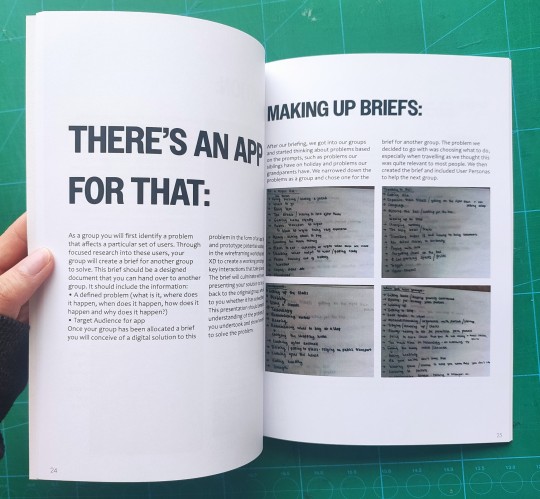
Process Book There's An App For That
I started laying out my work from There's An App For That Brief:
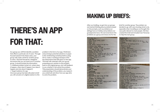
Some images of how i used the grid:
0 notes
Text
First Double Page Magazine:
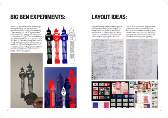
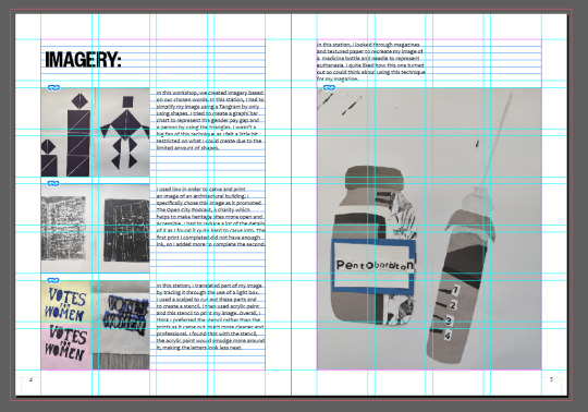
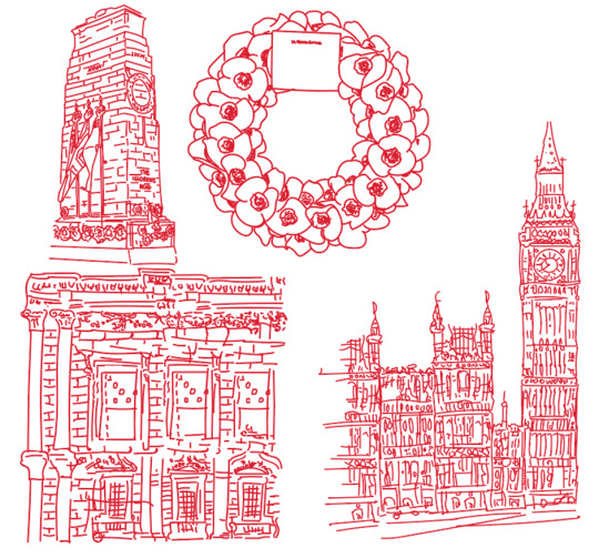
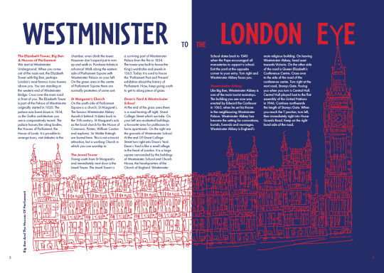
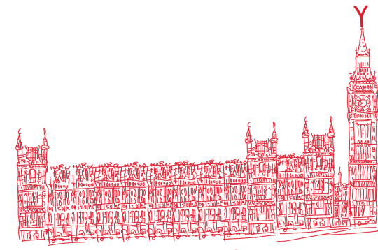
As the banqueting image is an illustration, I thought that the first page didn't look like part of the same magazine as the second page because of the cutout. Therefore I decided to try drawing the Big Ben to see if I liked how it looked. As I was drawing it, I thought about drawing the Houses Of Parliament too and drawing quite a big image that would flow on two pages, inspired by some of the magazines I had researched earlier. In the end, I quite liked how it looked. As Big Ben is the first landmark that comes up in my article, this image has to go on the first double page. Therefore, I thought about putting the map on the front cover and this could give a quick overview to the audience of what could be visited on the walking tour. I really liked how my cutout type looked but I wasn't sure it made sense with my work as I wasn't using any cutouts for my imagery anymore. Therefore, I experimented with typography and found one that looked similar to my cutouts. This font was called Cafeteria.
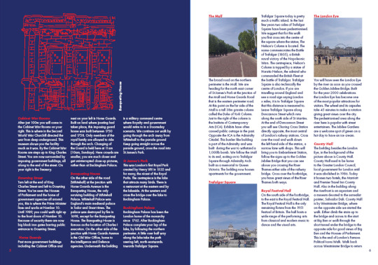
Big Ben And Houses Of Parliament Illustration:
First double page spread:
It is a similar layout to the previous spread in terms of the colour and placement of the heading, however the image goes across two pages.

I did really like my cut out typography and I did decide to put it as the front cover of my magazine as I did like how it looked. These were ideas I had for the front cover of my magazine:
This was the one I chose in the end:
0 notes
Text
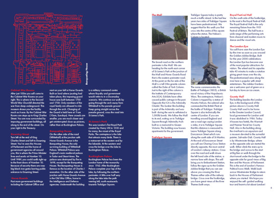
Second Double Page Of My Magazine
These are layout ideas I had for the second double page of my magazine. The blue rectangles are where I would Include an image. I attempted to do a cutout of the Banqueting House but I just did not see it looking good or working out.
I remembered I had kind of done imagery with the Banqueting House before. Previously, I had unpicked the Banqueting House by drawing out certain parts that I liked and by labeling it. After feedback, I wasn't too keen on using this imagery as by layering it on a photograph taken, you could lose the details of it. I was worried that if I did not include a photograph behind it, it may be hard to tell what the image actually is. Therefore, I decided to put all the parts together in a way to create a whole image/ illustration of it. In the end I quite liked how it looked:
For the other page, I used photographs I had taken when I went to London. I used Photoshop to filter the photos very slightly to blue, to stick with my colour palette. This is how the second double page turned out looking:
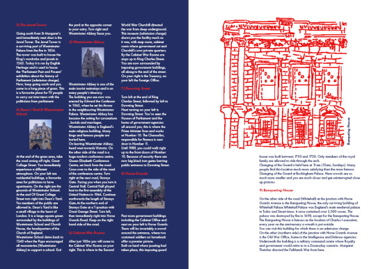
For the body text, I used Futura Medium, a font that could be read quite easily, especially on the coloured backgrounds. For the subheadings I used the same font but in Heavy Oblique to stand out from the body text. I also used the colour red to ensure that all the colours of the Union Jack was incorporated on that page and to also stand out.
0 notes
Text
First Double Page Spread Of My Magazine
I sketched out layout ideas I could possibly do for my magazine. I knew I definitely wanted a background of blue or red to make my magazine stand out from the standard white colour.
I set up my InDesign document. Based on my layout designs, I was pretty sure that I wanted 3 columns for my text so I set this up.
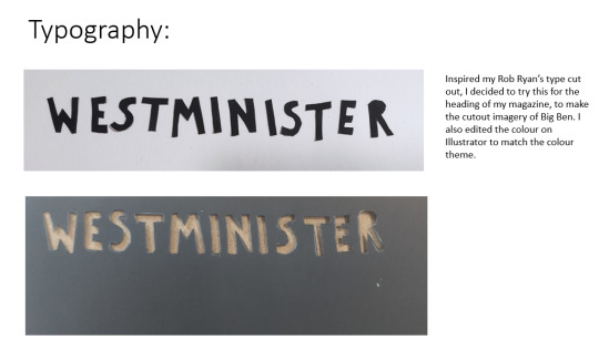
I used my cut of Big Ben and scanned it in to change the colour of it on Illustrator. I was also pretty sure I wanted to use cut outs for my imagery but after laying it out I wasn't sure it had the effect I wanted it to. These are rough layout ideas I played around with. I eventually found a layout that I liked.
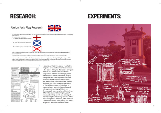
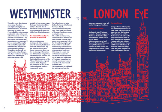
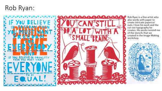
I then started using cutouts of text inspired by Rob Ryan to match the cutout of Big Ben. I cut out "Westminister To The London Eye" for the heading of for the first double page spread. I played around with the layout and colour of this text. I quite liked how it looked in the end. I also used Photoshop to get the exact correct colours for the red and blue of the Union Jack.
0 notes
Text
Process Book Communicating In Colour Work
Feedback from Briony, for my process book was to reduce the size of the headings, to arrange it to the left to line up with the body text, to put the text into two columns to make it easier to read, and to think about if certain images could be read or not- were they necessary or should I make them bigger. I should fit my images to the column width and maybe include final outcomes quite large on one page. I was also advised to print out a page to see if the text size/ image size were okay. I was happy with the body text size but changed the size of the subheadings to make them slightly smaller.
Print out:
This is the final result of the Communicating In Colour brief in my process book.
Here is how I used the grid for some of my pages:
0 notes
Text
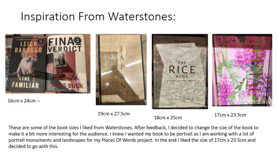
Process Book
After feedback about my process book, I decided to change the size of it to make it a bit more interesting. I went to Waterstones to look for book sizes that I like. In the end I decided to go for the size 17cm x 23.5cm.
I started looking at typography, I wanted something bold and structural with a bit of personality to explain what my work showed for the title. In the end, I decided to go for a font called Owners Narrow. I chose the font Candara for the body text, a font that could be read easily.
I also set up my baseline and modular grid with 4 columns and 7 rows. I added page numbers at the bottom of the page in the same font as the body text.
I decided to start putting in the Communicating In Colour work as this brief was completely finished. I played around with the layout, and placement of type, until I was happy with it. These were also how some of the pages looked before feedback (large subheadings, different column sizes for different text etc).
0 notes
Text
Magazine Process
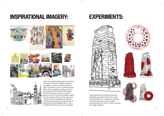
After the tutorials, I looked briefly at Rob Ryan as I am thinking about doing cutouts for my imagery. I also liked his typographic skills with the use of cut out. This is something I could possibly do with my headings of my magazine.
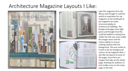
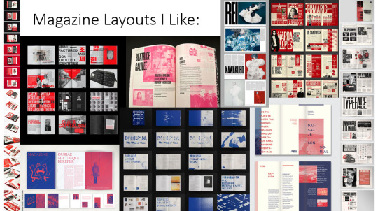
I began looking at magazine layouts I like. This is an architecture magazine that I got from the library which I liked:
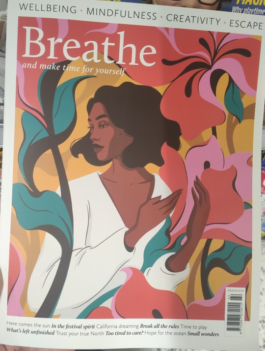
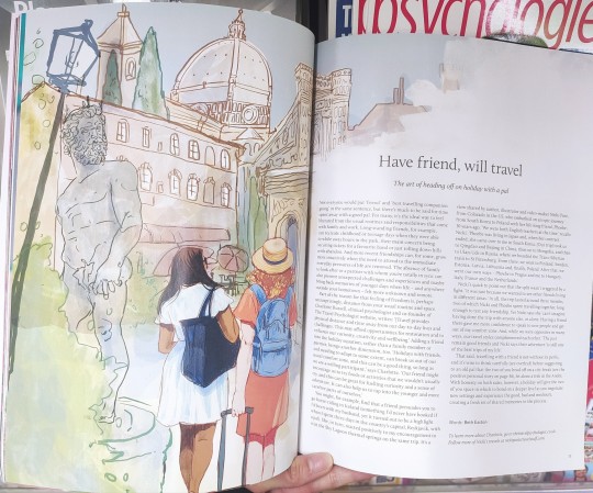
I found this magazine from Asda. The illustrations reminded me of the drawings I drew of the Cenotaph and the poppy wreath. I really like the layout of the magazine too with the imagery flowing slightly onto the next page to tie the pages together. I could think about doing something similar to this, especially if I choose my illustrations as my imagery. It also included small paragraphs with subheadings and body text. This is is similar to how my article will look like due to different text for different landmarks. I think this magazine layed the text out it an effective way to not make the page look disjointed or to not flow as well. I could bare this mind when I create my article.

I also looked at Pinterest for layout inspiration too. As I want the main colours of my magazine to be blue, red and white to represent London, I tried to find layouts that use these colours to help me think about how I could use each of them to make certain parts of my magazine stand out.
0 notes
Text
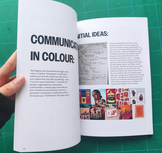
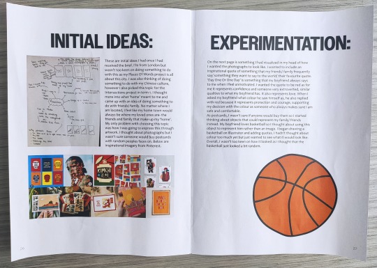
Communicating In Colour Part 3
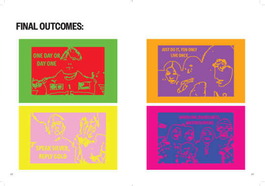
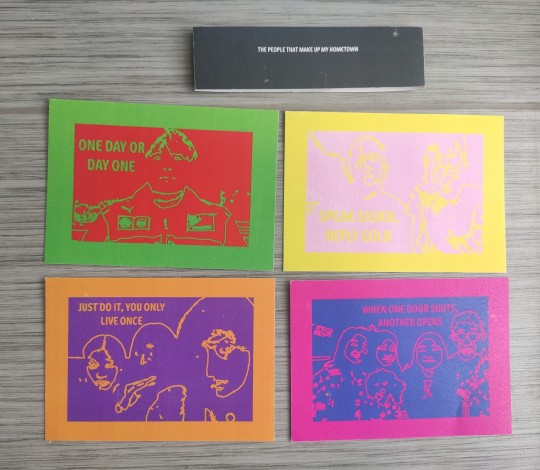
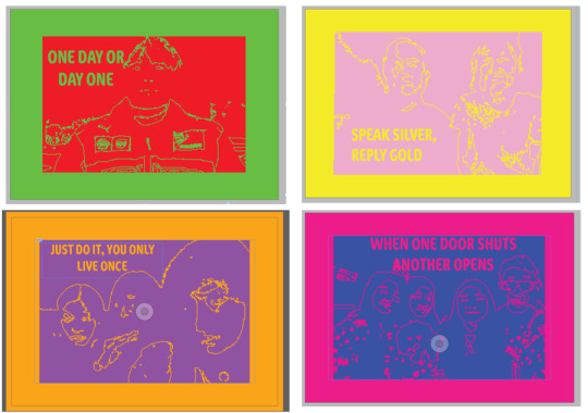
These are mock ups that I printed to check that I was happy with how the colour printed and that I was happy with the size of the bellyband (326mm x 40mm).
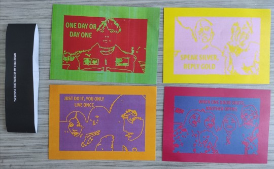
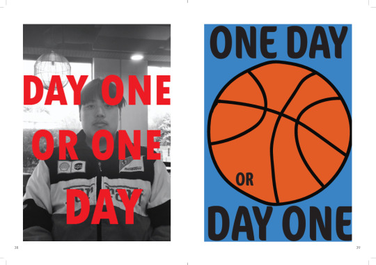
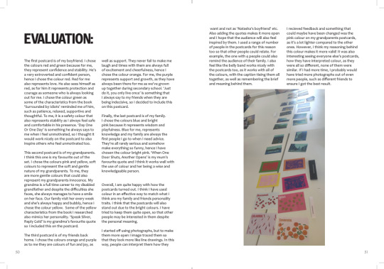
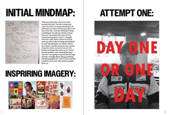
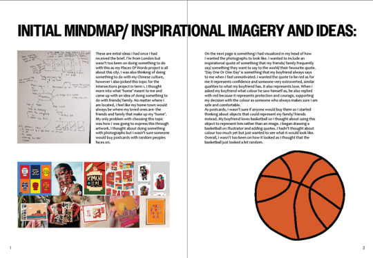
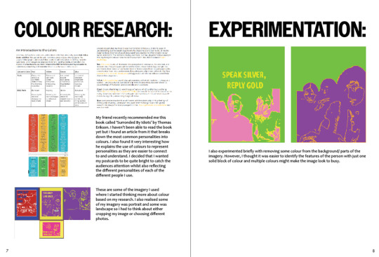
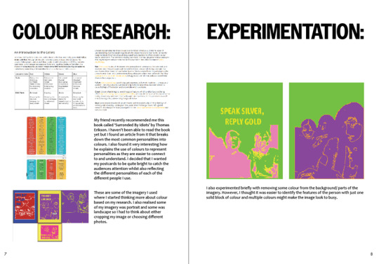
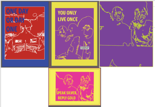
This top left one is of my boyfriend. I chose the colours red and green because for me, they represent confidence and stability. He's a very extroverted and confident person, hence I chose the colour red. Red for me also represents love. He also sees himself as red, as for him it represents protection and courage as someone who is always looking out for me. I chose the colour green as some of the characteristics from the book 'Surrounded by Idiots' reminded me of him, such as patience, relaxed, supportive and thoughtful. To me, it is a safety colour that also represents stability as I always feel safe and comfortable in his presence. 'Day One Or One Day' is something he always says to me when I feel unmotivated, so I thought it would work nicely on the postcard to also inspire others who feel unmotivated too.
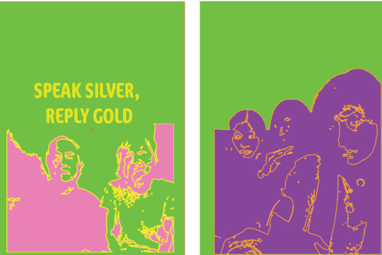
This top right one is of my grandparents. I think this one is my favourite out of the set. (It looks better in person!) I chose the colours pink and yellow, soft colours to represent the soft and gentle nature of my grandparents. To me, they are more gentle colours that could also represent my grandparents innocence. My grandma is a full time career to my disabled grandfather and despite the difficulties she faces, she always manages to have a smile on her face. Our family visit her every week and she's always happy and bubbly, hence I chose the colour yellow. Some of the yellow characteristics from the book I researched also mimics her personality. 'Speak Silver, Reply Gold' is my grandma's favourite quote so I included this on the postcard.
The bottom left is of my friends back home. I chose the colours orange and purple as to me they are colours of fun and joy, as well as support. They never fail to make me laugh and times with them are always full of excitement and cheerfulness, hence I chose the colour orange. For me, the purple represents support and growth, as they have always been there for me as we've grown up together during secondary school. 'Just do it, you only live once' is something that I always say to my friends when they are being indecisive, so I included this on this postcard.
Finally, the bottom right one is of my family. I chose the colours blue and bright pink because it represents wisdom and playfulness. Blue for me, represents knowledge and my family are always the first people I go to when I need advice. They're all rarely serious and somehow make everything so funny, hence I have chosen the colour bright pink. 'When One Door Shuts, Another Opens' is my mum's favourite quote and I think it works well with the use of colour and her being a wise and knowledgeable person.
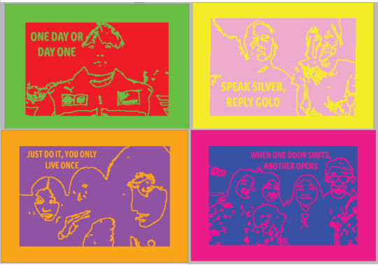
Final Outcome:
Evaluation:
Overall, I am quite happy with how the postcards turned out. I think I have used colour in an effective way to match what I think are my family and friends personality traits. I think that the postcards will also stand out due to the bright colours. I have tried to keep them quite open, so that other people may be interested in them despite the personal meaning. I started off using photographs, but to make them more open I image traced them so that they look more like line drawings. In this way, people can interpret them how they want and not as 'Natasha's boyfriend' etc. Also adding the quotes makes it more open and I hope that the audience will also feel inspired by them. I used a range of number of people in the postcards for this reason too so that other people could relate. For example, the one with 4 people could also remind the audience of their family. I also feel like the belly band works nicely with the postcards too, as it works with all of the colours, with the caption tieing them all together, as well as remembering the brief and meaning behind them.
I did mess up on the bellyband slightly when glueing it together. I forgot to leave an extra few millimetres at the front so when I glued it, it ended up being too small. I did take it apart and fix the sizing, so hopefully the back of the bellyband isn't too noticeable.
Communicating In Colour Bibliography:
https://www.shortform.com/blog/surrounded-by-idiots-colors/https://www.bykerwin.com/which-colours-are-used-in-pop-art-pop-arts-bright-palette/#:~:text=His%20iconic%20portraits%20of%20Marilyn,an%20atmosphere%20of%20creative%20innovation.
0 notes
Text
Communicating In Colour Part 2
As this is only a weeks brief, I had to look through my camera roll for previous photos I had taken as I wouldn't have enough time to go back home where the majority of my family/ friends were. These are images that I tried that didn't work/ ones that I didn't include for my final outcomes. I hadn't thought about colour properly yet, I just wanted to see if this style would work for other imagery.
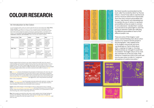
Andy Warhol Research:
Some of the bright colours that I used to test my images reminded me of Andy Warhol's work so I researched his artwork and pop art colours.
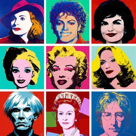
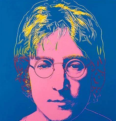
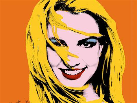
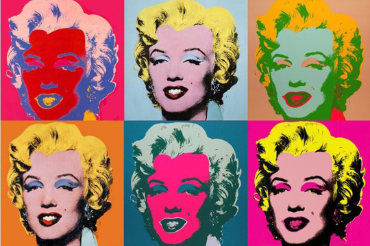
Warhol used techniques such as screen printing to create imagery with vibrant colours, often using repeated imagery. He challenged traditional artistic normalities through his iconic works. In his Marilyn Monroe pieces he uses colour to capture both her darker side of fame and her celebrity status. He explored the relationship between media and celebrity culture. I really like his work as you can really see how colour affects imagery. I like how just one image can be interpreted so differently by just changing the colours. His works stand out, with the use of colour capturing the eye as well as having meaning behind it.
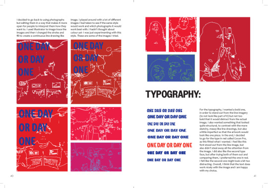
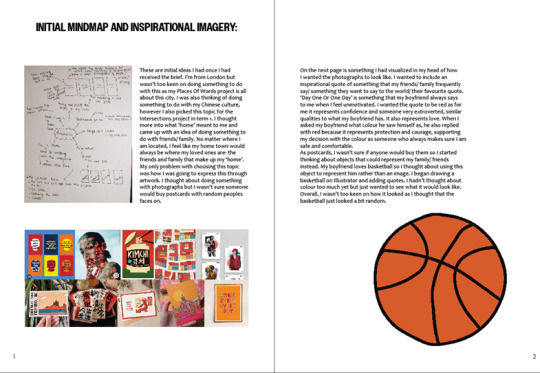
These are some of the imagery I used where I started thinking more about colour. I also realised some of my imagery was portrait and some was landscape so I had to think about either cropping my image or choosing different photos.
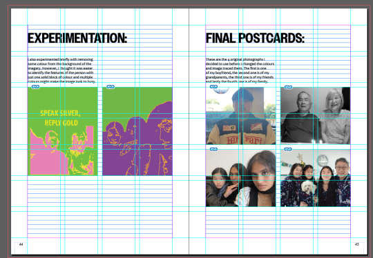
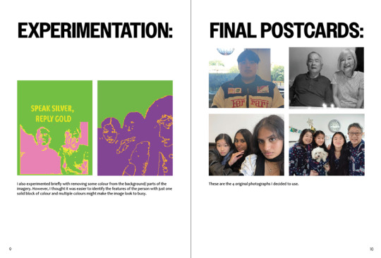
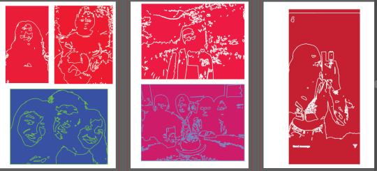
I also experimented briefly with removing some colour from the background/ parts of the imagery. However, I thought it was easier to identify the features of the person with just one solid block of colour and multiple colours might make the image look to busy.
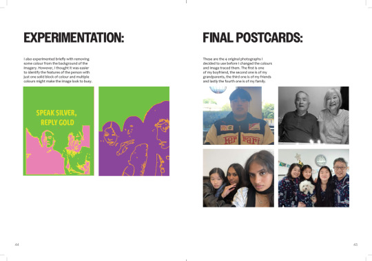
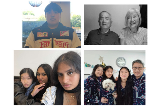
These are the 4 original photographs I decided to use:
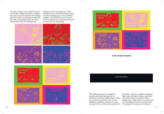
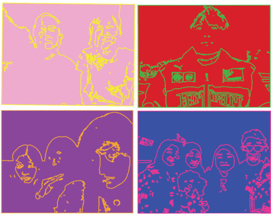
These are how they turned out to look after I image traced them, changed the colours and removed parts of the image that I did not like:
I decided to add a a border of colour to make the image pop out more:
After adding the border, I thought the outlines were kind of getting lost so I decided to make them slightly thicker:
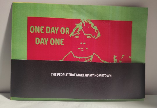
For the bellyband I needed to make sure it would not clash with any of the colours used for the postcards. Therefore I decided on keeping it plain white with black writing or plain black with white writing. I decided on a black background with white writing, a darker colour to contrast with the very bright postcards. I also decided to add 'The people that make up my hometown' to tie the postcards together.
0 notes