
Statistics
We looked inside some of the posts by nateorr25 and here's what we found interesting.
Average Info
Notes Per Post
3
Likes Per Post
3
Reblog Per Post
0
Reply Per Post
0
Time Between Posts
4 days
Number of Posts By Type
Text
17
Last Seen Tumblr Blogs


Fun Fact
In Q3 of 2020, 31% of US users access the Tumblr app daily.
Text


Here is the turnaround sheet I did for my chicken character which is for my canned project, I’ve never done a turnaround sheet before and only ever really drawn a character once at one angle and left it so it was fun and rewarding to finally see a character I designed in all detail, I think that over the weekend I will take these pictures into photoshop and colour it nicely and maybe even make it an animation of him turning and add it to my blog. This is one of the posts still left in my drafts.
0 notes
Text

This was a small task we had which was to make our own Tetris pieces on photoshop, I want for a BMO square piece, a Pac Man backwards L piece and a puzzle rectangle piece. the aim was to put everyone's Tetris pieces together and make an animation of them falling into place but we didn't have enough time.
0 notes
Text


Here is my chest which I’ll have my key in which I’ve now painted on the inside and finished the exterior which had quite a few places where the paint had chipped off, I still haven’t done the bottom but as soon as the rest of the paint dries, I’ll finally move onto getting that done. I recreated the paint I had last week which was made of a lot of brown paint, a decent amount of black, and a small amount of red, peach and yellow. This was one of the posts left in my drafts.
0 notes
Text


Here I have painted over the wood again with a darker colour because when I add the ‘steel’ parts around the grooves which I’ll use cardboard with or maybe some more wood and I’ll use metallic paint, and the leaves and roots going around the chest, I wanted to have a nice contrast between the colours. While re-painting the chest I accidentally painted the chest shut so I had to use a clay tool to open it, it left cuts and cracks in the wood but it actually matches the aesthetic so I may try and cut the rest of the chest up. Next I started painting the inside of the chest black to cover up the wood splatters from when I was painting the sides. Next I will finish painting the inside and paint the bottom, then move onto the steel and leaves. This was one of the posts left in my drafts.
0 notes
Text


Here are my aged paper and wood projects we did in class, while making the paper looked aged, we folded, sanded, rubbed coffee on them and put graphite in them. Whereas for the wood we chipped away at it, put coffee on it, and graphite again and finally, sanded the edges. This was one of the posts left in my drafts.
0 notes
Text

Her is my review for the Wes Anderson film ‘The Life Aquatic With Steve Zissou’, as well as my drawing of a strange sea creature, I used the same creature I drew in the background of my last film review drawing. This was one of the few posts still left in my drafts.
1 note
·
View note
Text

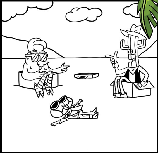
Today I finally finished my comic page and I am extremely happy with how it turned out. I think the simple cartoon style works really well with the story I’ve gone with which is, a group of three characters, a chicken named Gus, a cactus dressed as a cowboy named Rocco and a lizard named Pogo, are skateboarding away from two alien monsters in a yellow car with stolen money in a briefcase, they start off in a city and then eventually make it to a cliff and jump into the ocean. They escape with the money and float away. The whole reason we had to make a comic page was to explain why our other project, which was to make a clay figure or model inside a can, mine was the chicken Gus with a pile of books on a beach sitting in his can drinking a coconut cocktail, so I made my comic a heist and ends with Gus escaping and living the rest of his life in the Bahamas with the stolen money. I decided to not have my title at the top and instead have some nice clouds like in the other panels for two reasons, one, I felt like if I had a title it would make it feel like the start of a comic and this story picks up right towards the end, we haven’t actually seen the heist itself, or the planning or why they want to rob the aliens in the first place, all we see is the three running from the aliens and since our task was to show a sort of origin story but not the whole thing, just the part of how they end up in the can, it felt off and out of place so I just went for the clouds, two, I wasn’t sure how I was going to layout or even draw the title, I wanted it to be bubble writing with either green or orange as the base but I was too unsure. While I do have several small issues with my page, like the ‘screech’ onomatopoeia being a little scruffy and the second panel being a little blurry with lots packed into it, I love how the page looks. Some things that stand out to me is how the background isn’t just boring old white and it’s actually the background to the bottom panel, also how things are coming over the boxes, like the palm trees, the characters, and the car, which really makes you feel involved in the heist.
0 notes
Text
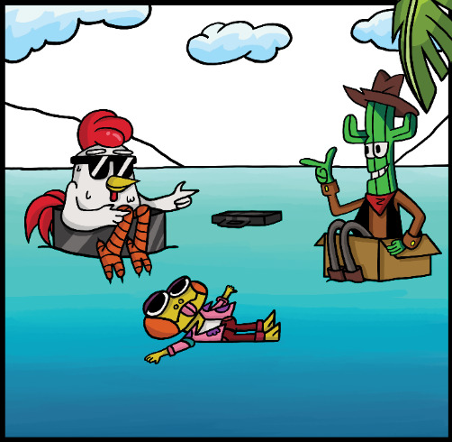

Today I have finished my comic page panels, all I have left to do is add the title, 'Cactus, Claw, Cluck and Cash'. I'm very happy with how this page turned out, especially the colours, the sky and ocean for the last three panels were simpler since I just copied and pasted them from the second panels and stretched them out, which saved me a lot of time and looks just as good as if I had hand drawn it again and again. When drawing the last panel where they are floating in the water, all I really had to do was use my rough sketch to outline the ocean, the characters and the mountains, then pasted in the ocean and sea, then coloured everything else, this was by far the easiest panel I've done, and I think it works well. The last panel I did was the sixth, which was also very simple and rewarding. I would say that the most difficult part was drawing the characters in this perspective. I think that I could have drawn the skateboards a bit nicer but when I tried any other size and angle, it didn't look right so I left it as it is now.
0 notes
Text
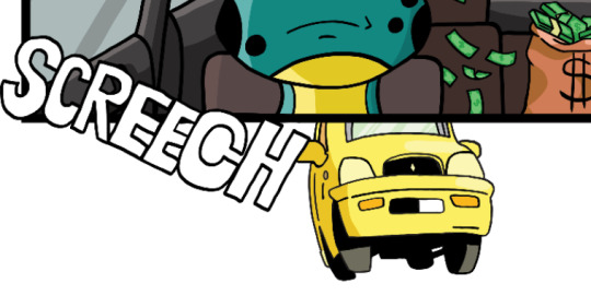
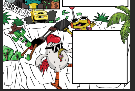

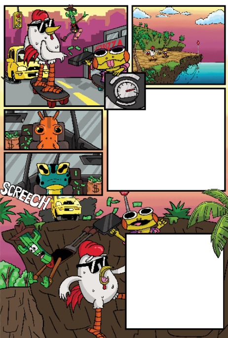
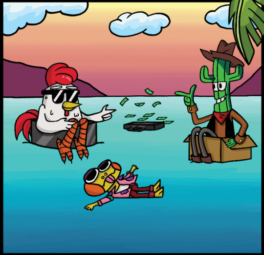
Today I finished my seventh panel but sixth overall. This frame is actually the background of the page so the sky is actually going up behind the other panels which is a detail I'm very proud of, This panel shows the three characters mid air after jumping off of the cliff and we can see the car skidding to a stop in the background with the onomatopoeia word 'screech', I was going to add some of the money going behind the other panels but I tried to do it in between the fifth and the undone sixth but it was clear what it was even with the colour so I decided to leave it out, I also added a palm tree going over the sixth and eighth panel which I think looks really nice because it adds some depth and more colour to the frame. I previously stated that I thought the second frame didn't look right since there wasn't much green on the page except for the money and Rocco (The cactus) but now that these trees and more money has been added I think it makes it look so much better, Next I will do my eighth panel since that is easier than the sixth.
0 notes
Text


I’ve just now added some sand to the base without glue. I simply just used a spoon to sprinkle the sand around the can and around the books and starfish. I actually like how this looks but I only wish I could glue it down but that would probably not look as good. I especially like how the sand surrounds the props, looks very natural like the books have been dropped onto the sand and left a mark. I probably will not add any sand to the can since I have changed my mind and I think the tin foil does actually make it more realistic that he landed in a pile of rubbish in the ocean.
1 note
·
View note
Text


Here is my label which I had already drawn onto my worksheet weeks ago, which today I coloured in and photocopied to a smaller size and then stuck onto my can. I really like how the finished result looks since it matches the cartoon vibe, looks stylised, and the vibrant colours match the rest of the props/decorations. I especially like how the palm trees and chicken go well with the surrounding starfish and green books. If I could do anything differently, I would probably add some sand around the base of the can which I still have time to do so I might, I may also maybe fill the can with more tin foil and add some and to the surface. I would only add a small amount just to make the can match the aesthetic and get rid of the fin fools which I’m not fond of. But in perspective, I do really like how this model has turned out.
0 notes
Text


Today i added my can and decorations to my beach base. I added the sand last week as well as making the books, the coconut drink and starfish so all I had to do today was hot glue them onto the base. I really like how it looks all together, I would like to have something in the can instead of the tin foil but I’m very rushed for time and the idea that the three land in a pile of floating rubbish helps the fact it’s in there, maybe in the last panel of my comic where the three characters are floating away I will add some more floating things like a bin bag filled with things and maybe an oil canister.
0 notes
Text

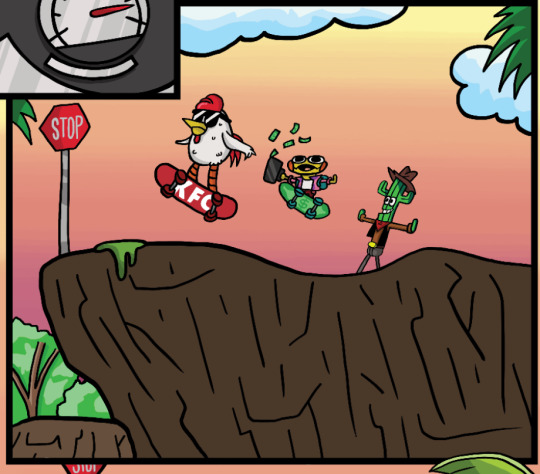
Today I finished my second panel but fifth overall. I decided to make the path up to the cliff be covered in rocks to give it some depth and colour variation, I think this panel looks better than it did but I think I need to make a few changes, for example, get rid of the grass on the island in the background, add shadows to the dark brown cliff and shadows to the palm trees, I do like the ocean and sky gradients, the stop sign, the vines, the characters and the cliff in the foreground and the palm tree at the front. Hopefully, like I’ve said several times before, the panel will hopefully look better once the page is completed and maybe I’ll change the colour of the cliffs in the other frames.
0 notes
Text

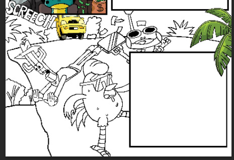
Today I drew my bottom two panels for my comic. I think that I prefer my first sketch for the shot of them floating in the ocean since I got Pogo’s (the lizard) pose a bit better but I will be taking some ideas from this one, like the fact that they are celebrating instead of just sitting with emotionless faces, since they just successfully stole a briefcase full of money. I do like the second draft of the larger picture better though since the car, cliff, cactus and palm trees look nicer and cleaner, also I think the new pose and expression for pogo work better with the frame, I also like how the word screech comes over the edge, that is something that I will take over to my comic page since I already have a few things going over the edge.
0 notes
Text


Here was our task from today, we were told to copy the style of the sweet tooth comics and draw our own character, a deer person, a pig person and a squid person, I tried to go for sickly looking skinny people with eye bags, desperate looking eyes, and scribbled hair to show the art style and obviously adding the key details for the animal characters like the antlers, the snout and for the squid person I wanted to have a large circular forehead and large eyes since I wanted to have it be more of a person than a squid, I think I did a pretty good job capturing the disturbing and eerie style.
0 notes
Text


Here is my review for the movie ‘The Mask’ starring Jim Carey, I went into detail about how the show edges onto an older audience since it was based on a violent comic series but failed back to a family film obviously to attract more people to watch it. It is a goofy film that has some cool ideas but I think are exacted poorly. We were also asked to design our own mask so I went for a tribal looking one with symbols and some antlers, I really like how the symbols and the eyes go hand in hand and match the vibe well, even though the symbols are only circles and lines.
1 note
·
View note
